Ten Unique Kitchens Designs
- Words
- Caroline Kurze
We love good food and we love to cook, so naturally we were thrilled when we discovered that Berlin-based publisher Gestalten released a new book entitled Kitchen Kulture that celebrates the kitchen as the new living room, a space for social gathering, collaborative cooking, event hosting, and communal dining.
The room that used to be a service area relegated to the back of the house is now the multi-functional hub of the home. Who needs some inspiration on how to transform their kitchen into a lively space should definitely dip into this book. It offers creative kitchen solutions for any size and budget, uncovering the full potential of today’s kitchen.
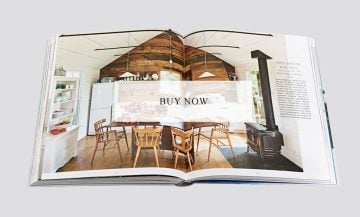
In the following we present our Top 10 Unique Kitchen Designs from all the amazing ideas that you’ll find inside the book. You can purchase it directly by clicking on the last image at the bottom of the article for €39.90.
Image © Shinkenchiku-sha
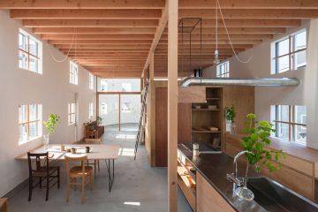
Kobe-based Yo Shimada /Tato Architects designed this home for a young family in Hikone. It is a white oval cylinder punctured with 42 windows and accented with hanging wooden boxes. The kitchen is built in the same visual language with a steel countertop that demarcates the work surface. Utilities, from air ducts to light cables, cross the space exposed as visual elements, while the windows form a mosaic of views of the grassland outside.
_
Image © Studio Pitari
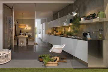
Gamma von Arclinea is an exceptionally modern kitchen concept. It provides straight-forward, flexible solutions for the most diverse design needs. The units reflect the company’s core values — quality, functionality, customization, and socializing — and give you an almost endless variety of worktops, finishes, and door styles to choose from.
_
Image © Hannes Henz
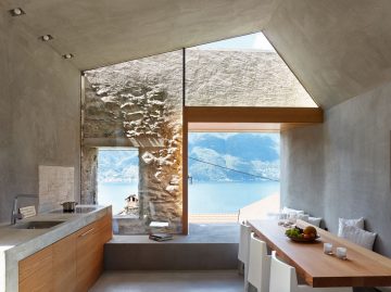
The renovation of this historic house in Scaiano, on the Swiss-Italian border by wespi de meuron romeo architects produced by Reto Vanzo Schreinerei raises the interior to contemporary standards of comfort while emphasizing the archaic simplicity of the original stone walls. Glass and larch wood framing give onto vistas of the stunning Lago Maggiore. The kitchen counter is designed as an extension of the concrete staircase, and is set over a series of wooden cabinets. An inset fireplace and over-head lighting reduce the need for additional furniture.
_
Image © Takumi Ota
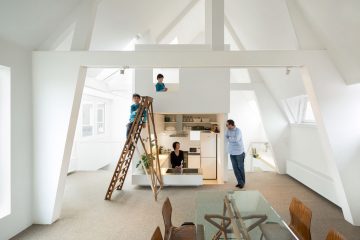
Amsterdam is a wonderful city for many reasons, but the weather is not one of them. The family who occupy this duplex unit are used to a less gloomy climate, so they asked Mamm Design to make their home as bright as possible. The architects responded by putting the kitchen, bathroom, and bedrooms in a tower rising through the apartment. This allowed them to open up the surrounding spaces and let the light shine in. The sunken kitchen sits at the heart of a spacious living and dining area that opens onto a decked terrace.
_
Images © Peter Jurkovic
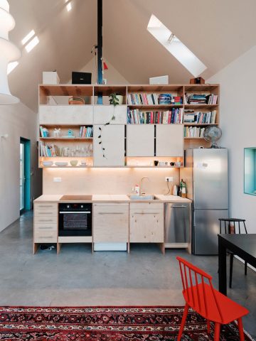
Bratislava-based JRKVC challenged themselves to build ‘a small house on a small plot for a reasonable price.’ The resulting 85-square-meter IST house, built for €85,000, takes inspiration from the humble materials, pitched roof, small windows, and gánok (porch) of Slovenia’s folk architecture. You can take a tour through the home here.
_
Images © Achim Hatzius
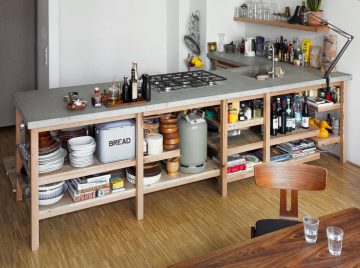
This spacious kitchen unit exudes a raw simplicity that comes as a welcome counterpoint to the increasing complexity of our everyday lives. Berlin-based designer Rainer Spehl has twinned a solid oak frame with a concrete worktop by betonWare to create a kitchen that does exactly what a kitchen should do. It has a sink, cooktop, and loads of open storage and preparation space. The materials are sturdy and in it for the long haul.
_
Images © Brett Rubin
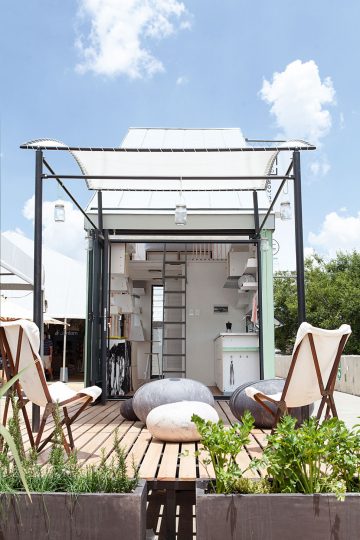
Life Pod is a 17-square-meter prefabricated home designed for the South African context, manufactured in Johannesburg, and delivered and installed on-site. Architect Clara da Cruz Almeida and designers DOKTER AND MISSES arrange the micro-kitchen underneath the sloped roof, with laser-cut plywood and bent, powder-coated steel storage containers mounted on vertical channels above stainless steel counters. The utilities are designed for easy connection to conventional electrical and plumbing supplies or to off-grid energy generators.
_
Images © Patric Dreier
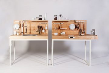
Few of us probably think much about the fine motor skills and strength needed to prepare a meal, but these things can present a whole range of challenges for elderly and disabled people. Dirk Biotto’s ChopChop kitchen module is all about removing these problems and providing an innovative approach to dinner. The design packs numerous solutions into one compact unit. They include a frame that allows you to adjust the countertop to your height, an extendable hose that brings water to where it is needed, a sloped sink that makes it easy to pull (rather than lift) things in and out, and an embedded grater and milled groove that mean you can grate carrots and butter bread one-handed.
_
Images © Stephen Clement
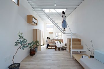
When Tato Architects designed this house, they wanted to challenge the conventional division of architecture and furnishings. Stairs, laundry space, and handrails have a distinctly furniture-like quality, while sofas and closets look like architectural elements. The concept is also reflected in the kitchen, which is built around the stairwell between the first two floors. The dining table doubles as a partial roof for the stairwell, while a kitchen unit serves as an extension of its sidewall.
_
Images © Stephen Clement
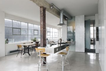
This East London apartment was a garment factory in a former life. Its heritage is still very much visible today, as Solenne de la Fouchardière of design company Ochre has filled the vast space with concrete-gray tones, industrial details, and retro metal furniture. The kitchen worktop, meanwhile, has something of the sci-fi about it, appearing to almost hover in mid-air between a translucent strip of wall at one end and a single column at the other. Stool-height chairs can either make a breakfast bar of the worktop or allow cooks to rest their legs as they rinse, chop, and stir their way to a feast. The rustic wooden surface of the dining table brings a bit of country into the intensely urban surroundings, and the mismatched chairs make everything feel nice and relaxed.
_
