Playful Paper Art By Katrin Rodegast
- Words
- Jessica Jungbauer
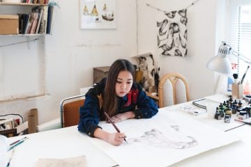
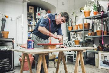
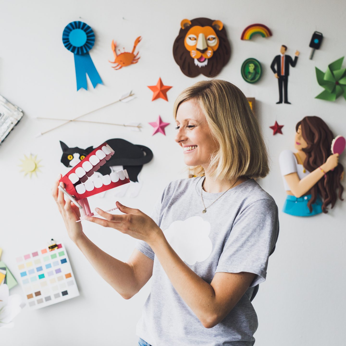
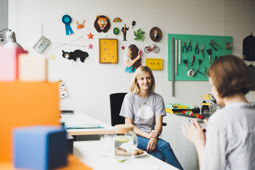
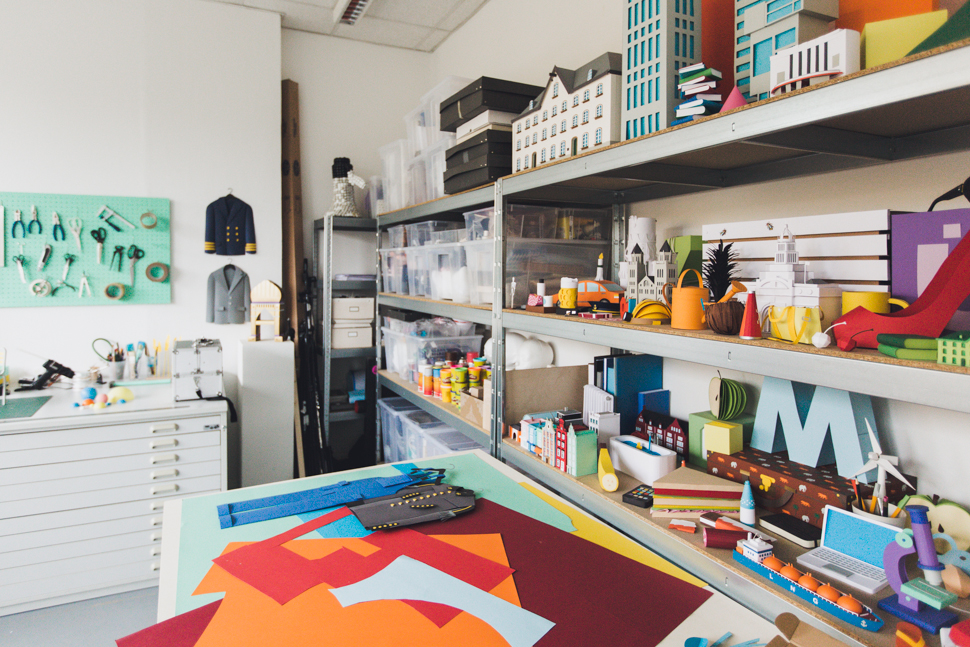
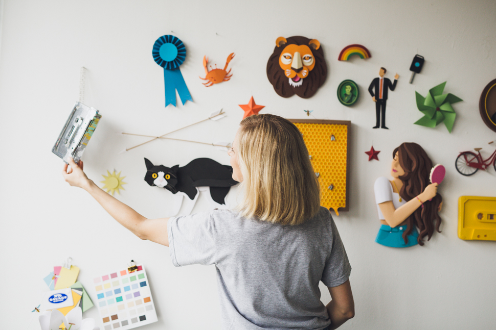
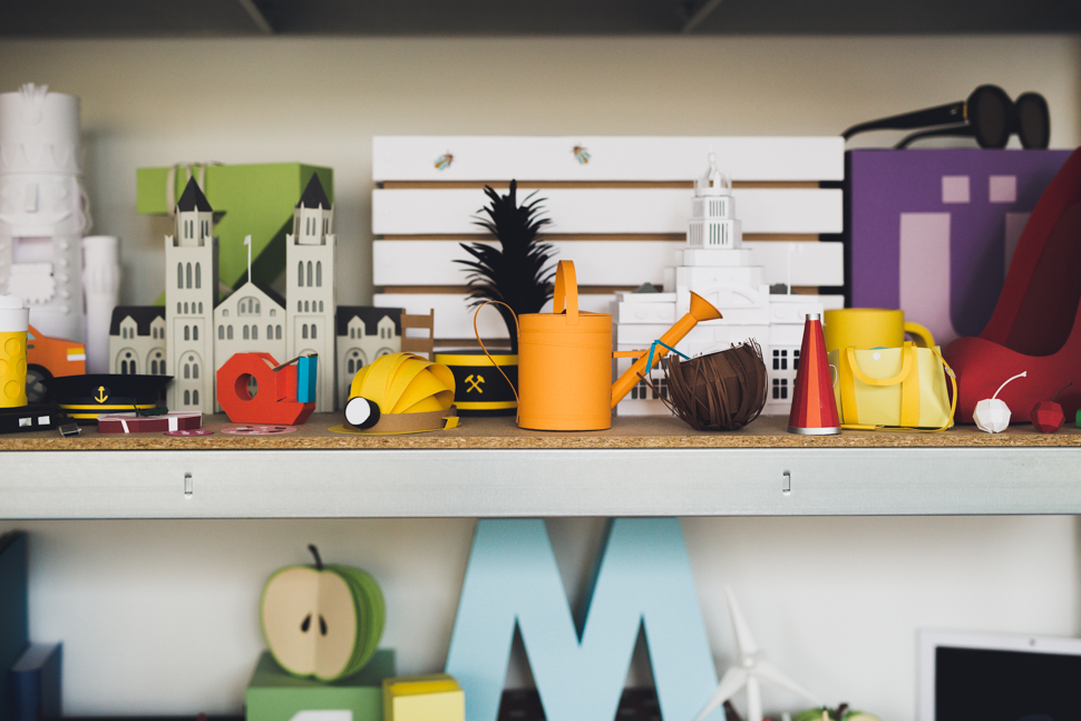
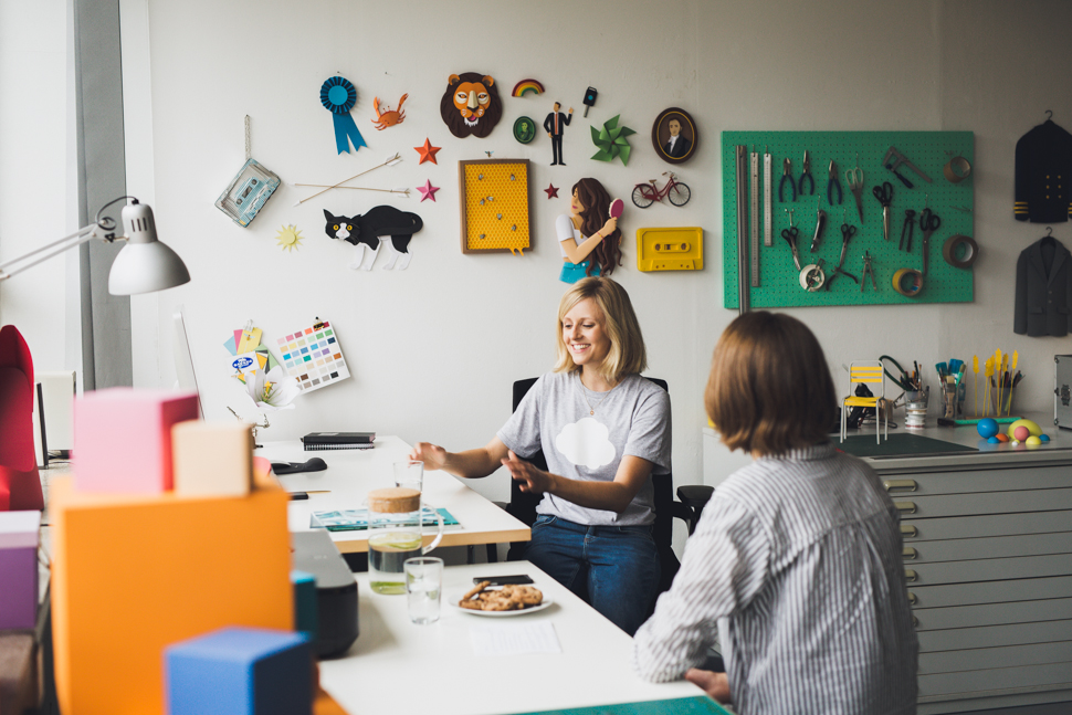
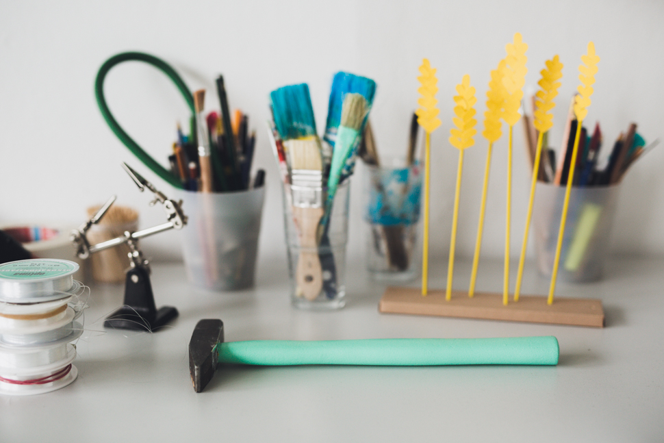
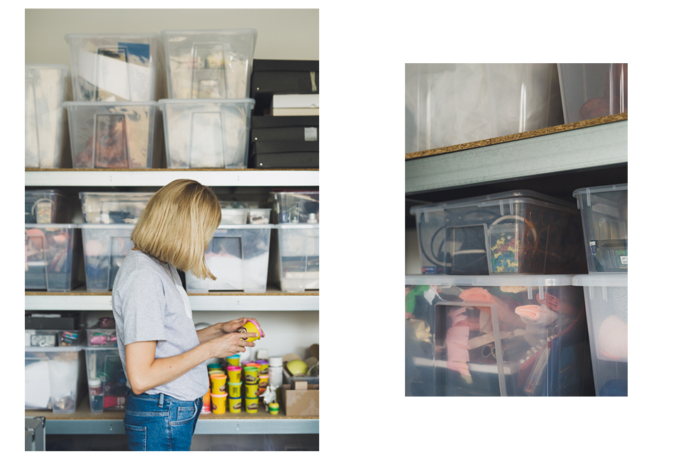
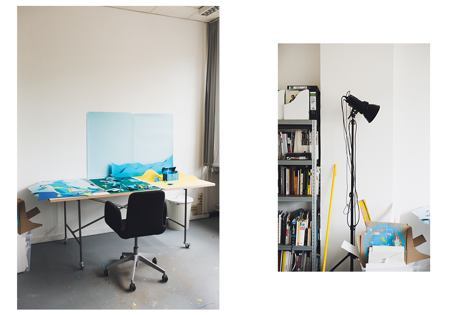
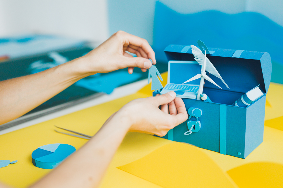
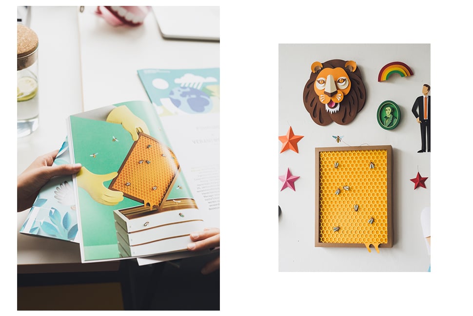
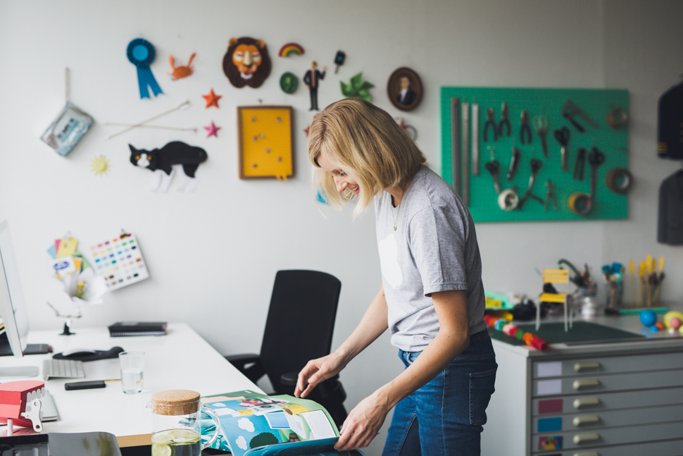
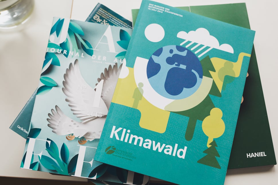
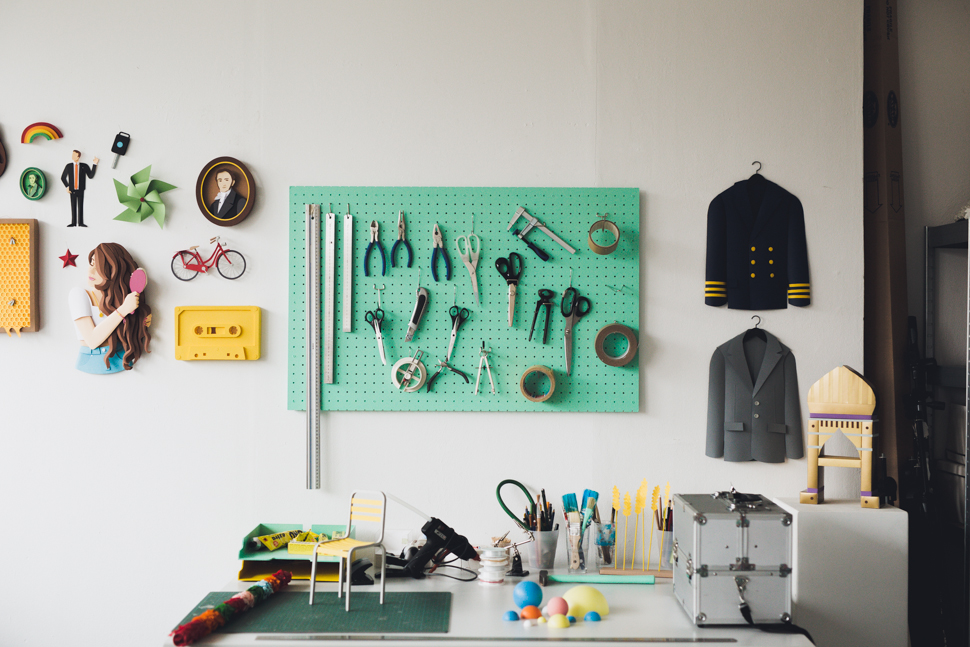
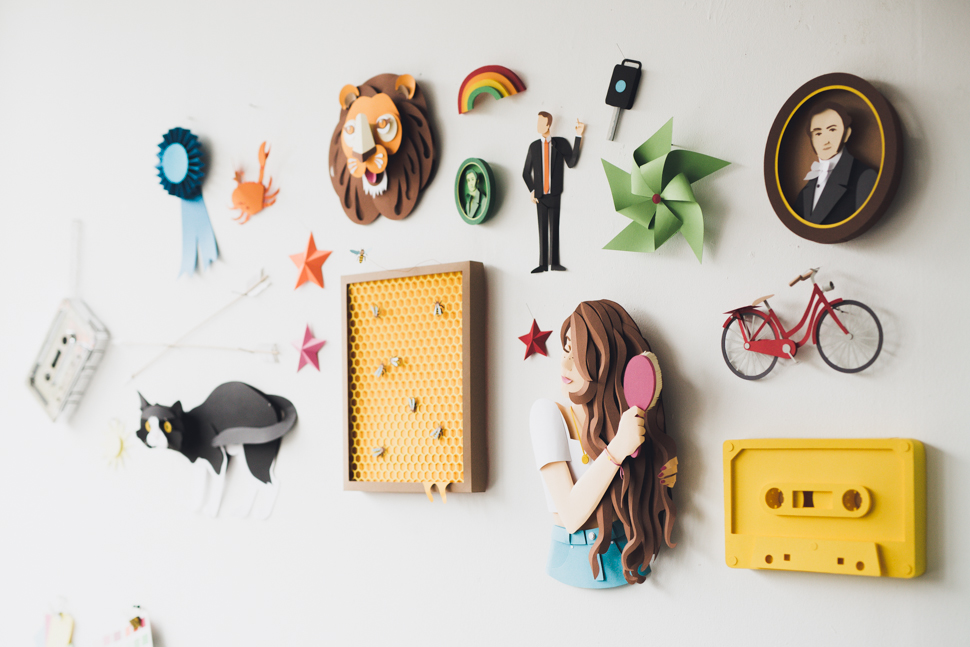
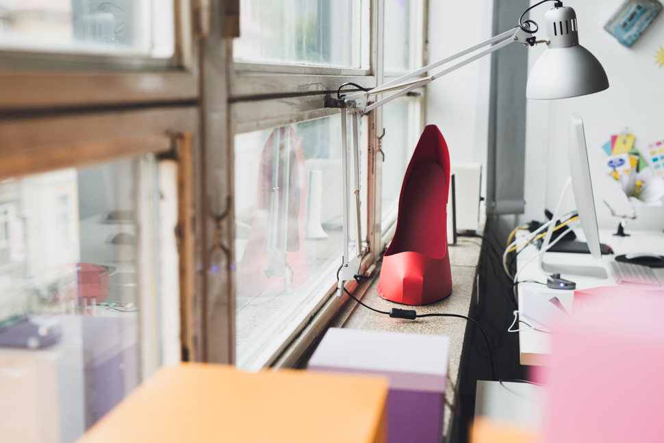
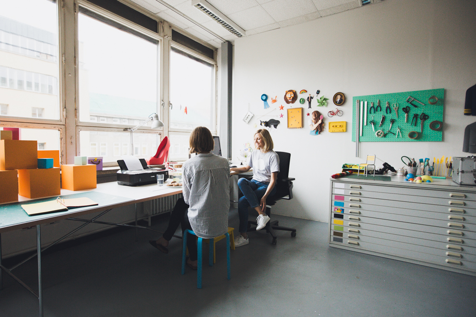
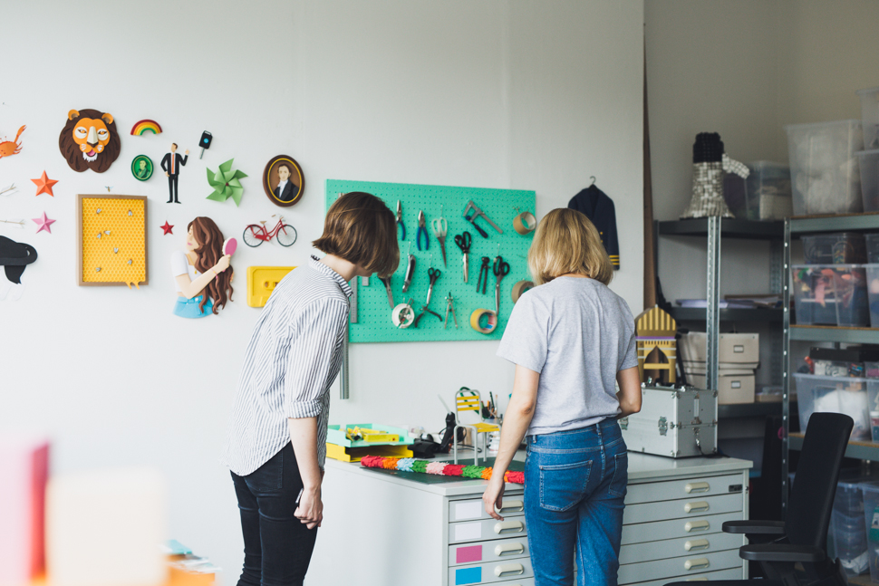
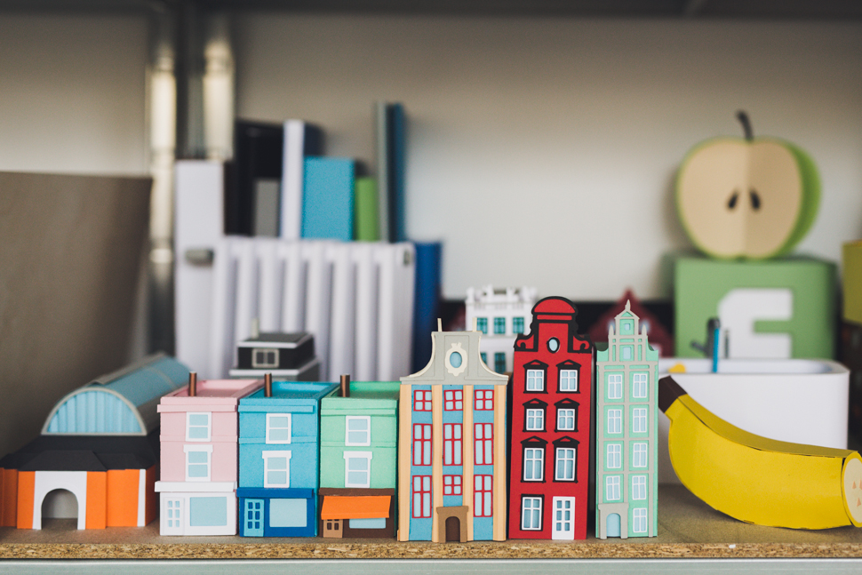
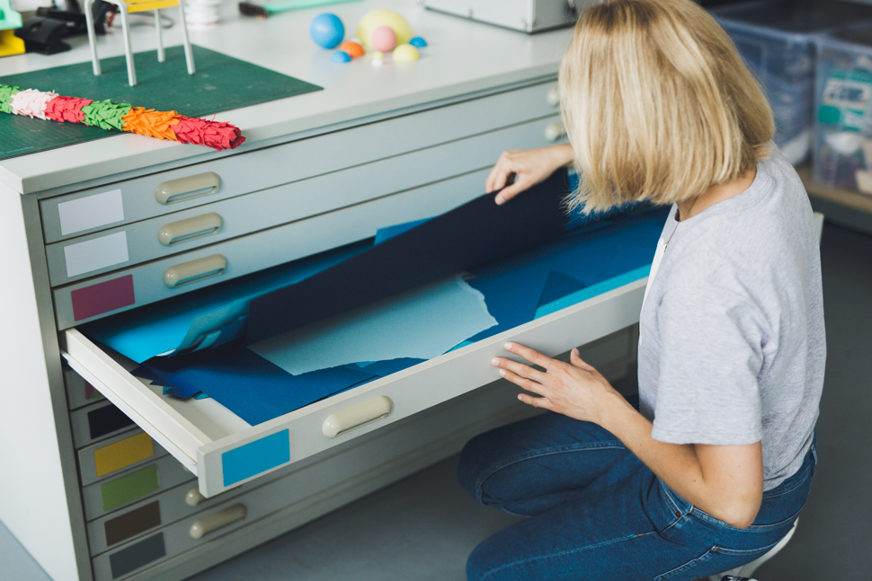
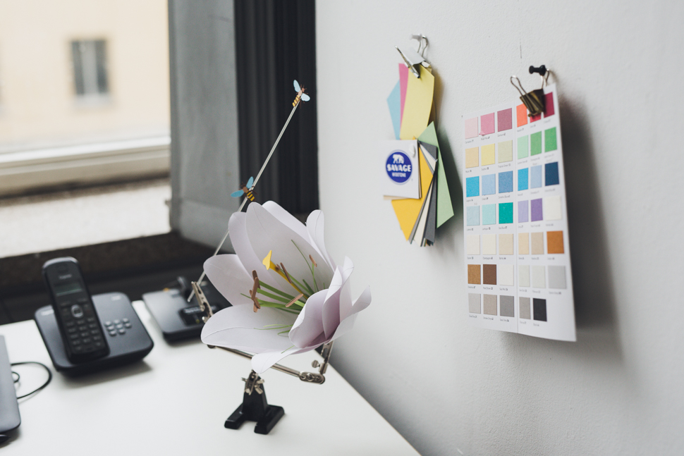
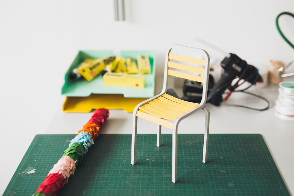
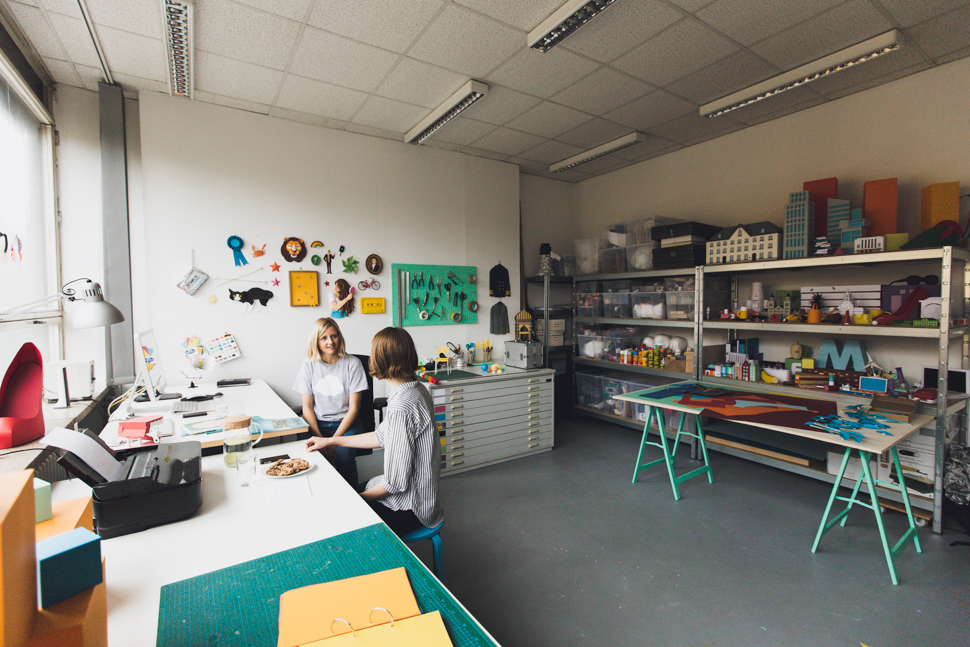
Illustrator and graphic designer Katrin Rodegast has been creating paper art since she was a child, now she works for clients such as The New York Times, Wired Magazine and Coca Cola. We paid her a visit at her studio in Berlin-Mitte, which was located in an unexpectedly dreary multistory office building just off Alexanderplatz. When we arrived, there was no doorbell and Katrin had to pick us up at the entrance. Then, we were led up the stairs and down an artificially lit hallway until we arrived at her place, where suddenly her numerous colorful paper illustrations livened up the whole space.
Over homemade lemonade and chocolate cookies, we chatted with her about becoming an illustrator, how to find your own style as well as what has been the most exciting project to date…
Did you always want to become an illustrator?
Katrin Rodegast: I always knew that I wanted to do something creative. When I was little, I used to create my own magazines using collages with the copier from my father and handed them out to kids in the neighborhood. After finishing school, I did an apprenticeship as a media designer in an advertising agency. After that, I studied communications and graphic design where I thought there was too much of an emphasis on typography – so that’s when I got into making illustrations. Working with paper and other analogue materials was completely new to me and I realized that this was my thing.

What makes working with paper so special to you?
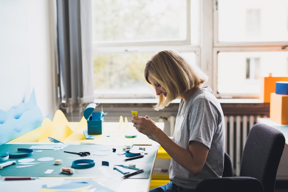
Katrin Rodegast: For me, paper is a really extraordinary material, because it’s ever-present and versatile. We use it daily and everybody has once made something with paper. Therefore, we have a feeling for how these objects could have been made. Yet, in our daily lives, we often see paper as a printing or packaging material rather than a creative medium. Another huge factor is that you can almost illustrate anything with paper.
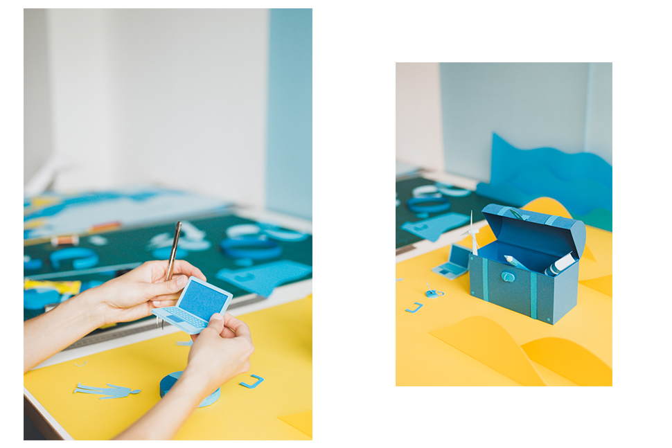
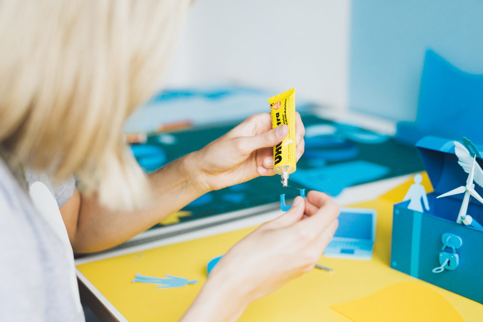
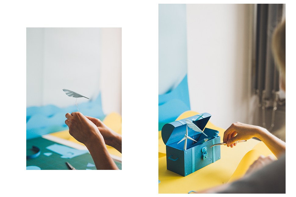
In general, how do you approach a new project? What are the steps from the beginning to end?
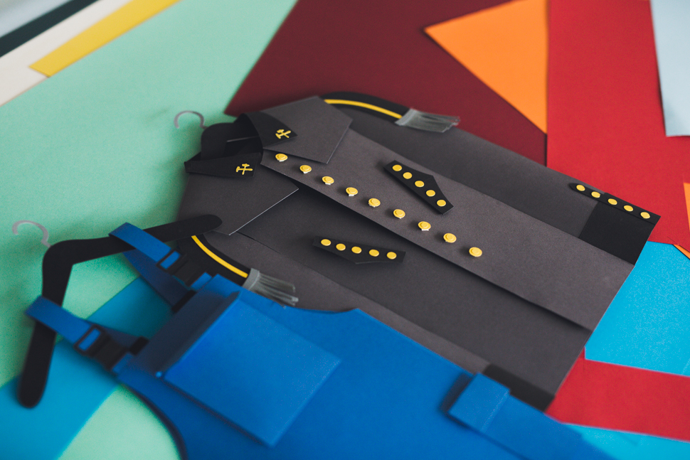
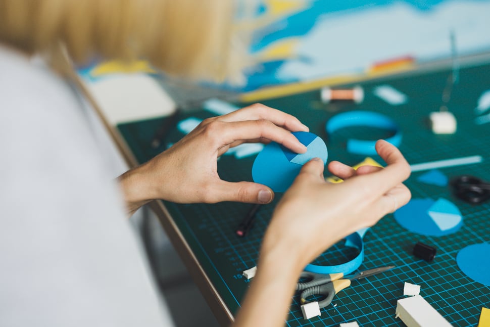
Katrin Rodegast: Most of the time, I get a briefing and a deadline. Then I start with some drafts according to client’s guidelines. Although the objects have a playful aesthetic at first glance, there’s actually a lot of planning that goes into them. When I finally work on the paper objects, the design is already done and that’s when I can focus on their architecture. But depending on the illustration, the process is almost always different. For instance, sometimes it only takes me a few hours, whereas other times it takes weeks to be completed.
Over the last few years, you’ve garnered some big-name clients. Is there a special project that stands out from all the others?
Katrin Rodegast: Actually, every project is different, but to illustrate the cover story for The New York Times Magazine was really something special. It was just before the re-election of Obama in 2012 and the topic was election financing. So the art direction team asked me to build five different sights in Washington, DC out of dollar bills. For the cover, they wanted the White House made of bills, because it was really a strong symbol. A lot of work went into the production because I had to construct architecture models for each of the different buildings. An architect has an exact plan for this, but you don’t get something like this for the White House. Even on Google maps, these buildings are pixelated. So I had to make up my own construction out of photos and found myself thinking more and more like an architect. This was really pushed my boundaries, but in a good way.
When exactly did you decide to go freelance and start your own business?
Katrin Rodegast: During my studies, I was already working as a freelance graphic designer and built up a strong client base. In 2011, after I had worked with Sarah Illenberger here in Berlin, I opened up my own studio for illustration and paper art.
Speaking of Sarah Illenberger, did you have any role models or mentors along the way?
Katrin Rodegast: I wouldn’t call them role models, rather creatives whose work has inspired me. When working with Sarah, I was impressed with how she always came up with all these great ideas using simple objects. In terms of working with paper, the artworks of Thomas Demand had a big influence on me. His photos of various rooms and different scenes, all made out of paper, look so hyperrealistic. And this goes into every last detail: when he builds his life-size trees, every single leaf is made of paper. Fritz Kahn, is another artist from the 1800s who’s work has impressed me. Also a doctor and author, he created medical illustrations that can be seen in the book ‘Man-Machine’ for example, which explains what’s going on in our bodies. He was a pioneer in infographics and has inspired many more artists after him.
How do you develop your own style as an illustrator? I can imagine this can be quite difficult…
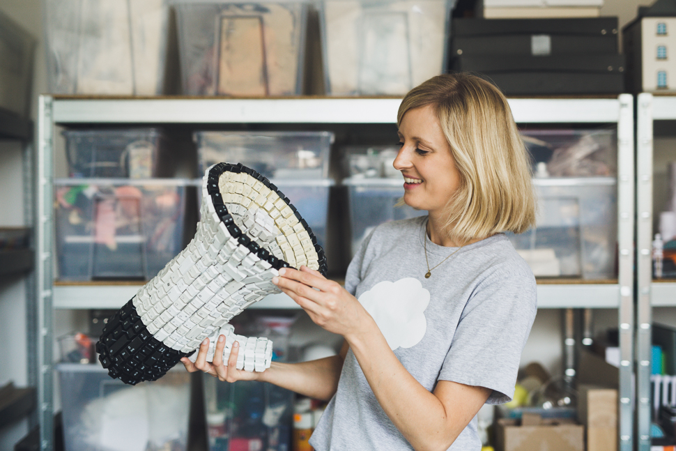
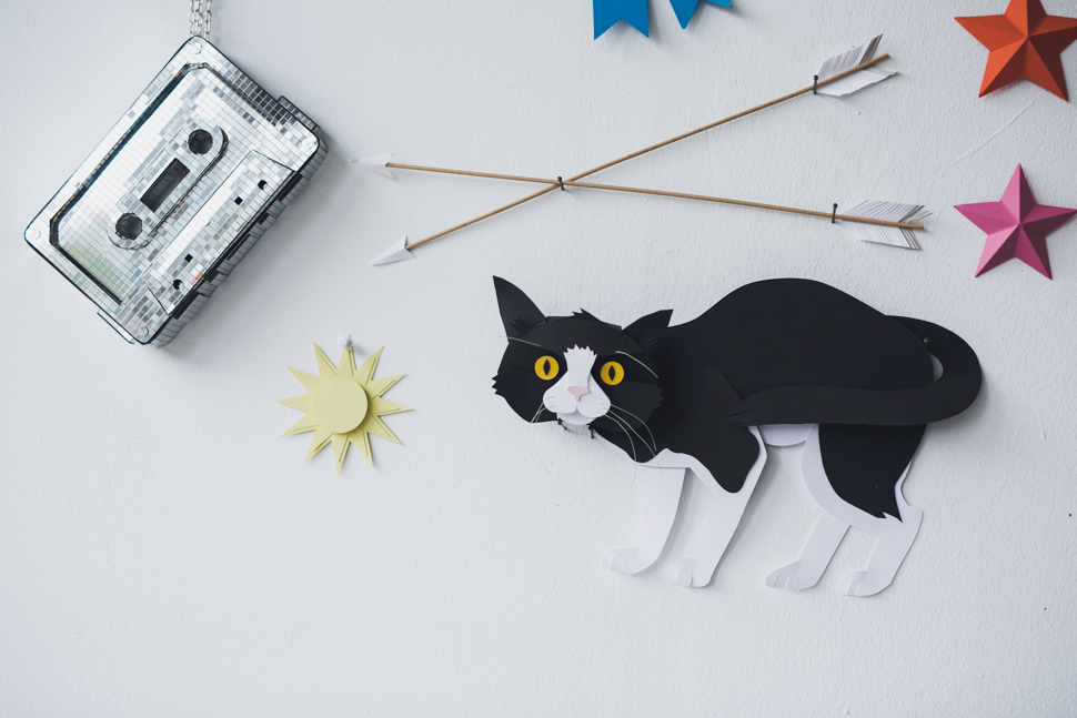
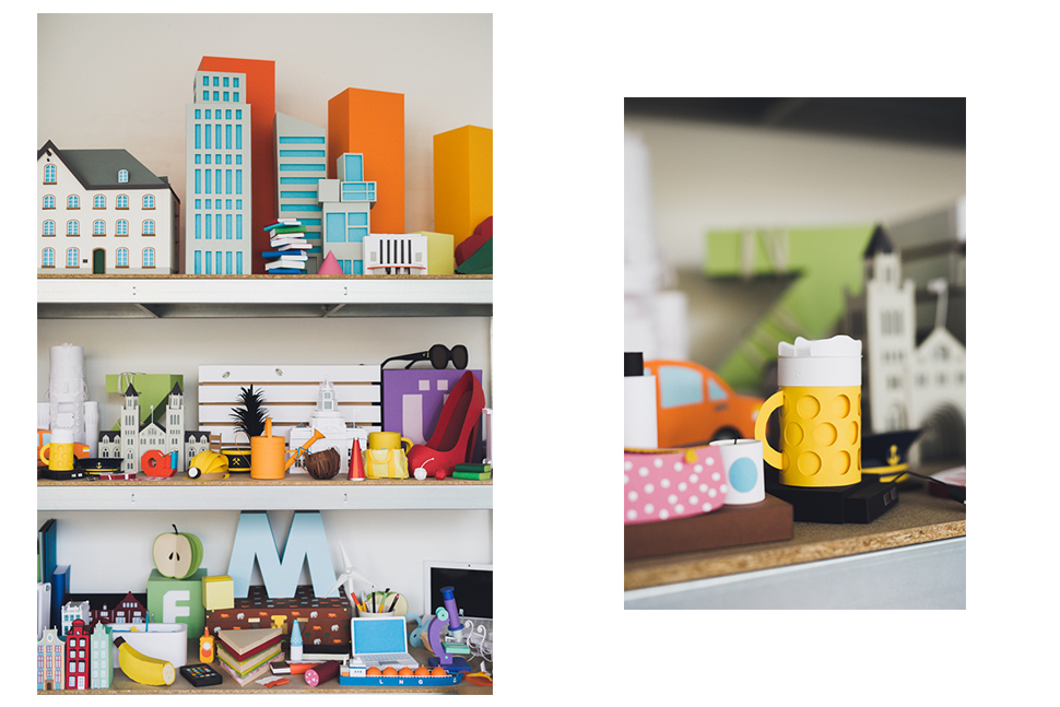
Katrin Rodegast: You have to experiment with different things and use everything you’ve learned. To create something new, you have to combine things in an unknown way. My background in graphics and typography is still very important to me, because it was back then when I learned how to work with colors harmoniously, for example. Maybe this is also why my illustrations are really graphic and simple.
And also very colorful. Do you have a favorite color?
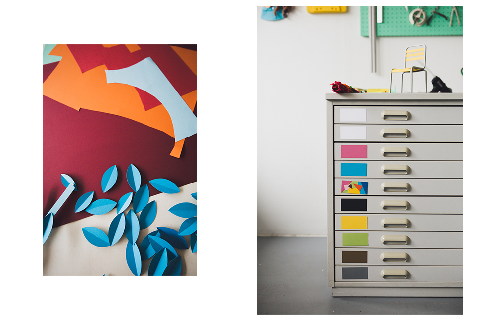
Katrin Rodegast: Blue. Although you wouldn’t notice it, because personally, I prefer to wear black, white and grey. (laughs)
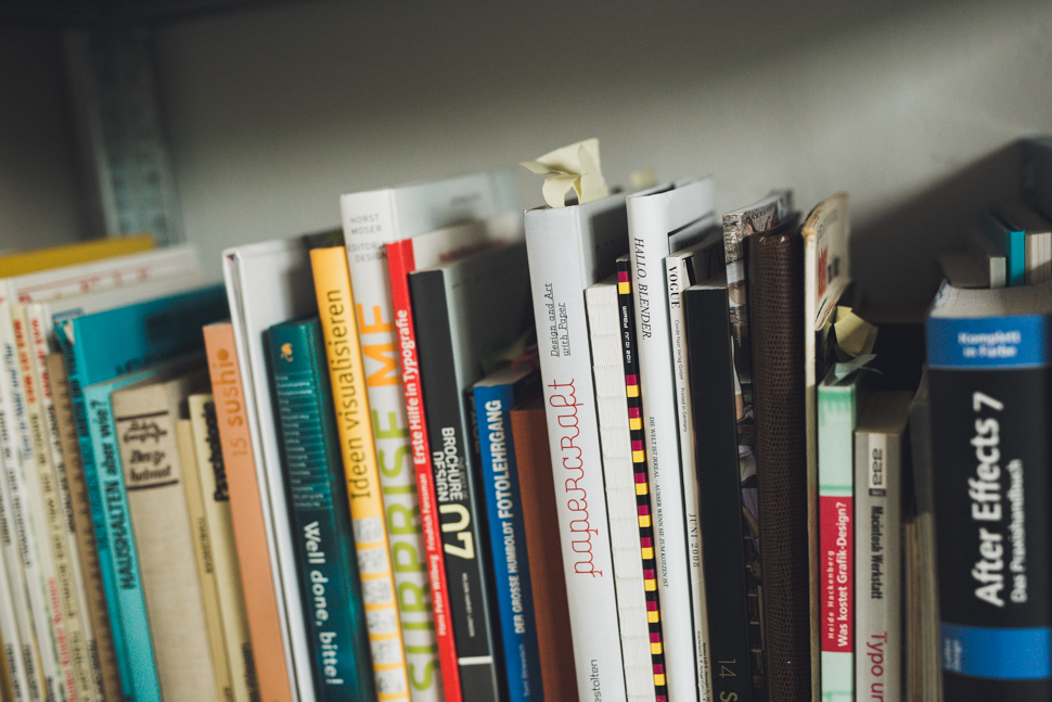
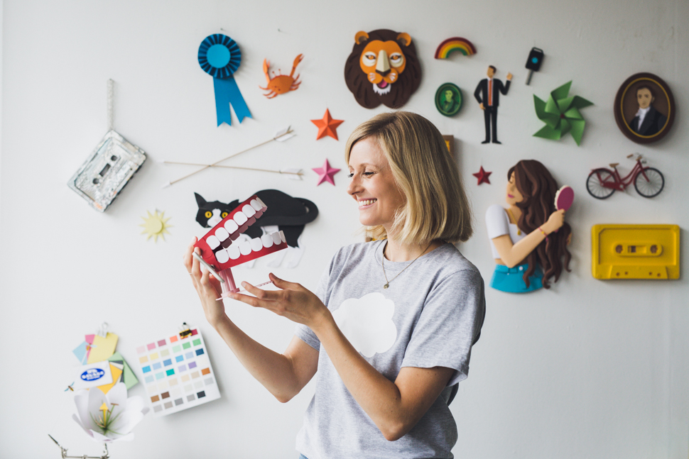
Where do you get your inspiration from?
Katrin Rodegast: I try to be as open as possible and look everywhere for visual and storytelling elements – it can be everything from a cool restaurant, an old biology book, a movie, song or theater play. When I’m traveling, I also really like to go to local supermarkets and look for extraordinary packaging or exotic products. Traditional crafts like Mexican tapestry also always give me a lot of new ideas.
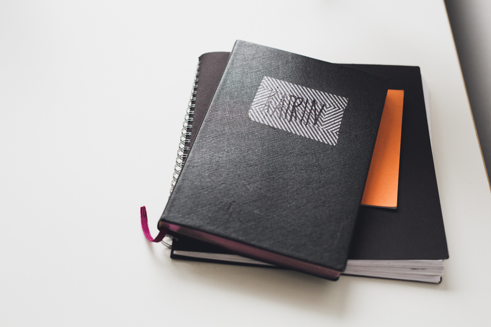
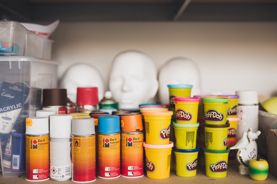
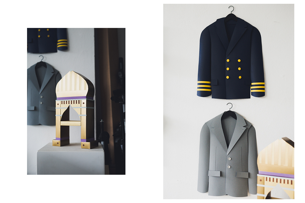
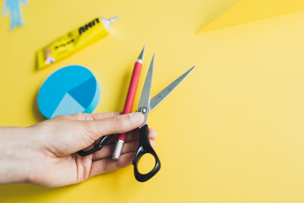
You primarily work with your hands. Do you notice a trend towards more and more craftsmanship these days?
Katrin Rodegast: Oh yes, indeed. More and more clients want to see something ‘real’ in magazines or advertisements. Of course, it’s always more work to build something out of paper or other materials that are analogue. But at the same time, this is what makes it so special. Especially, when you look at 3D illustrations in comparison to paper. We’ve already gotten so used to digital aesthetics that seeing something handmade feels new and fresh.
What’s next? What are your plans for the future?
Katrin Rodegast: Right now, I’m working on various paper illustrations for different clients. In September, there will be a series displayed at the IFA in Berlin, but I can’t reveal anything about it yet. Then there are also two film projects, where we combined paper with digital elements. It was a collaboration with animation artists, which is another area that has really impressed me.
Photography by Ana Santl, Interview and Text by Jessica Jungbauer
