Top 10 Mesmerizing Shop Designs
- Words
- Anna Dorothea Ker
In the space where design meets architecture meets fashion, innovative concepts abound. With light, display, tactile experience as foremost priorities, collaborations between forward-thinking design studios and brands with big ideas can produce enthralling spaces that are as much about the visual and physical experience as they are about the activity of shopping.
We’ve selected 10 of our favorite retail interior spaces from around the globe which caught our eye for their realization of a strong artistic vision through a well-considered use of space, craftsmanship and materials.
_
1. LATE NIGHT CHAMELEON CAFE BY GARY CARD, LONDON
All images © courtesy of LN-CC
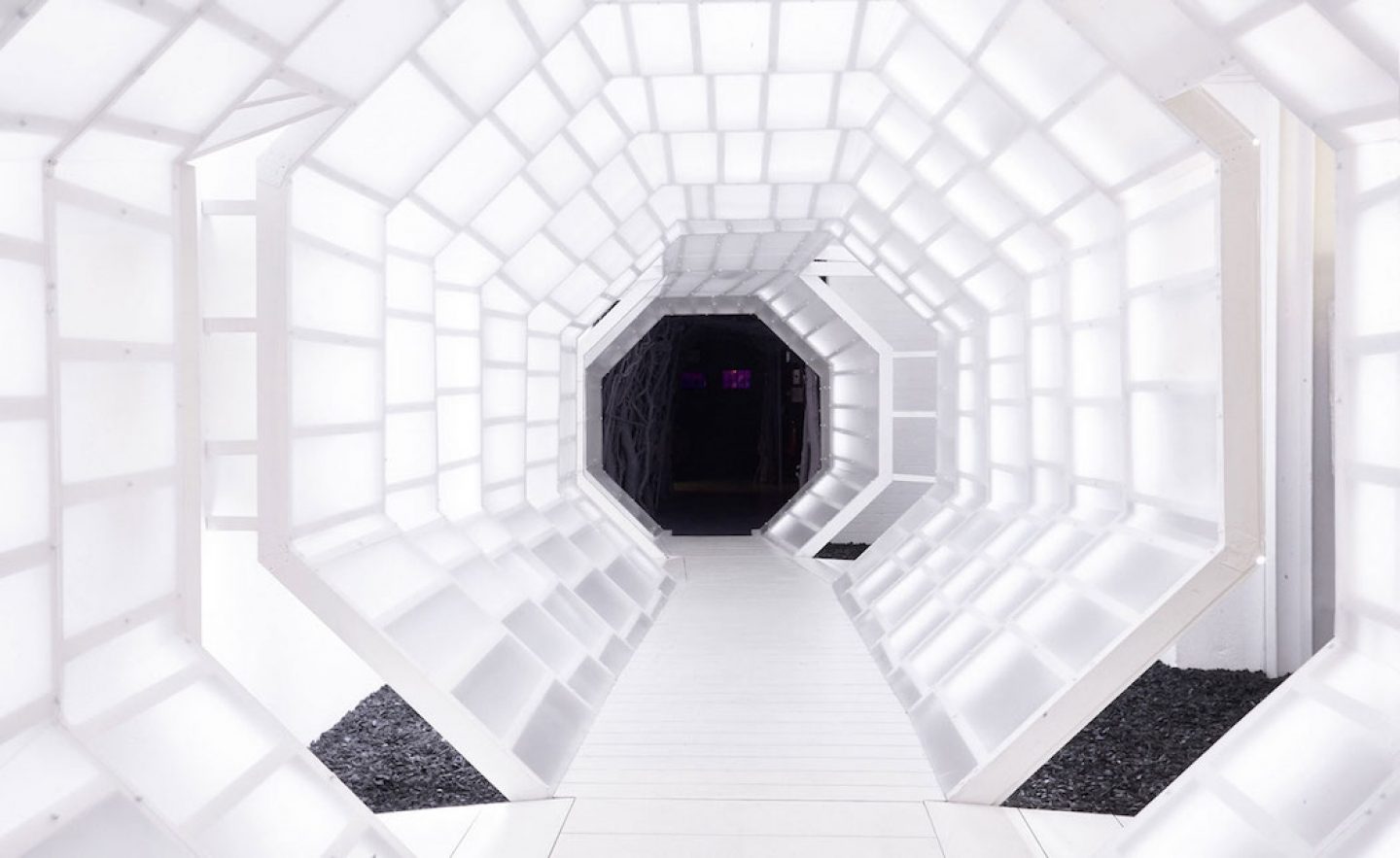
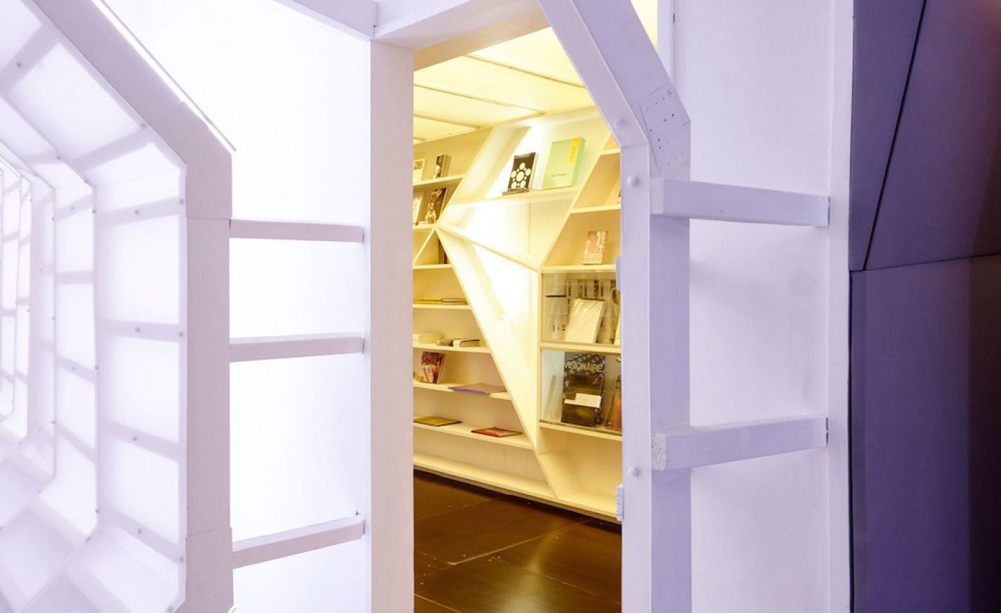
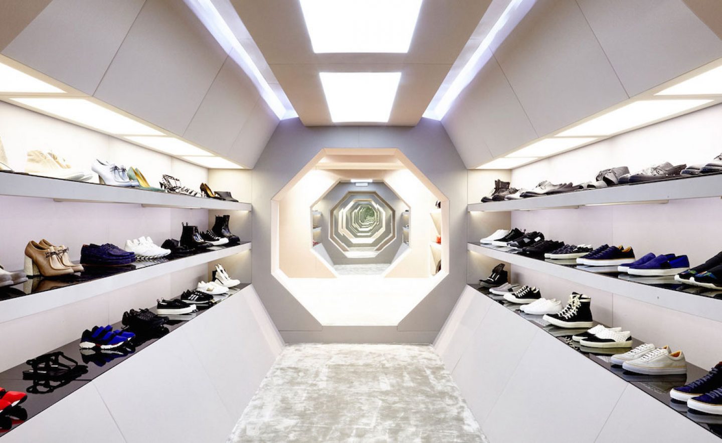
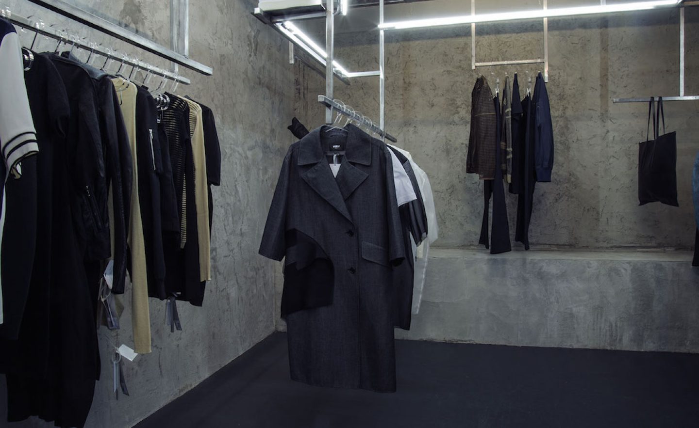
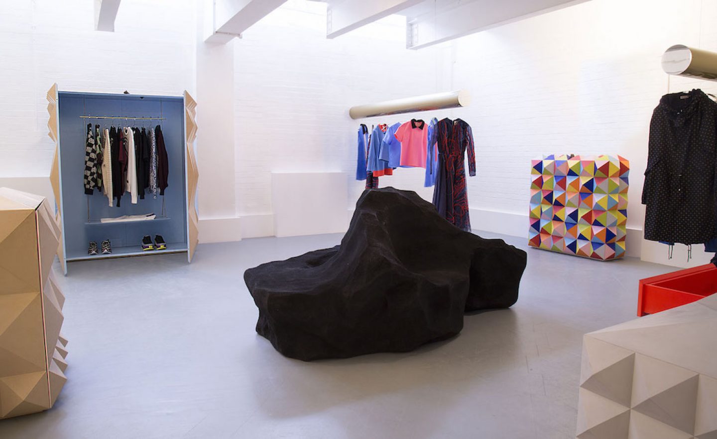
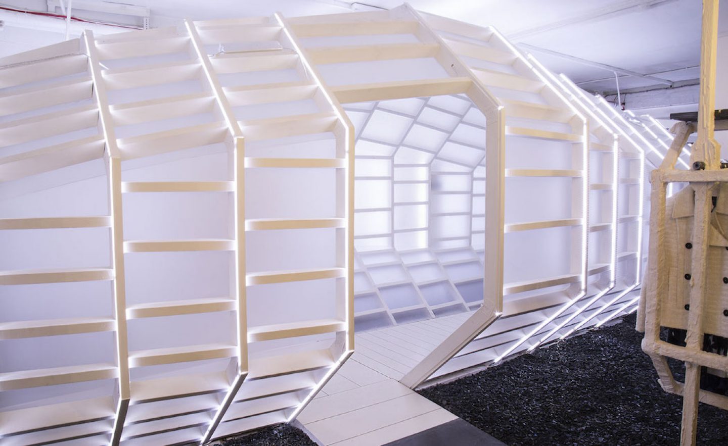
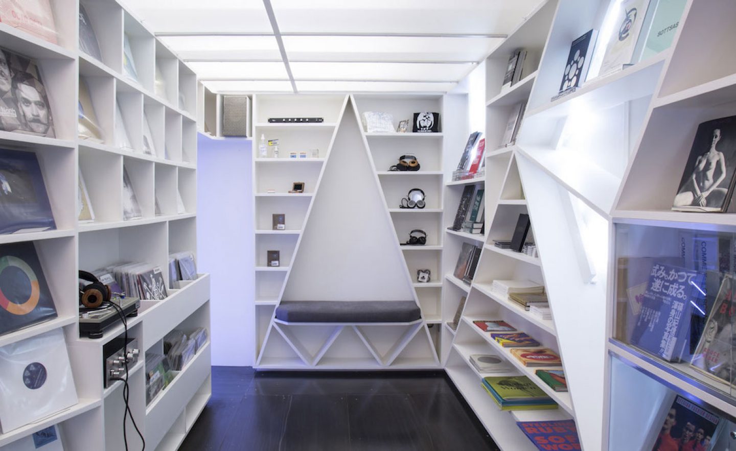
Celebrated avant-garde fashion store LN-CC (Late Night Chameleon Cafe) enlisted designer Gary Card to renovate its multi-purpose space after bouncing back from administration in 2014. The underground boutique houses a bar, club and art gallery space featuring Alberto Biagetti-designed display cases in addition to its clothing, changing room and till areas. Speaking of the idea behind the redesign in an interview, Card stated, “The idea wasn’t so much to re-design as it was to re-fabricate. I wanted to retain the look of LN-CC but turn the saturation down on it. We’ve joked about giving it a baptism of white emulsion, but that was almost the philosophy, a fresh start, a blank canvas, stripping out the warm wood charm of the original and making a starker, more focused space.”
18-24 Shacklewell Lane, London E8 2EZ, United Kingdom
Visit by appointment only
Designed by Gary Card in 2014-2015
_
2. SAINT LAURENT OMOTESANDO FLAGSHIP STORE BY HEDI SLIMANE, TOKYO
All images © courtesy of Saint Laurent
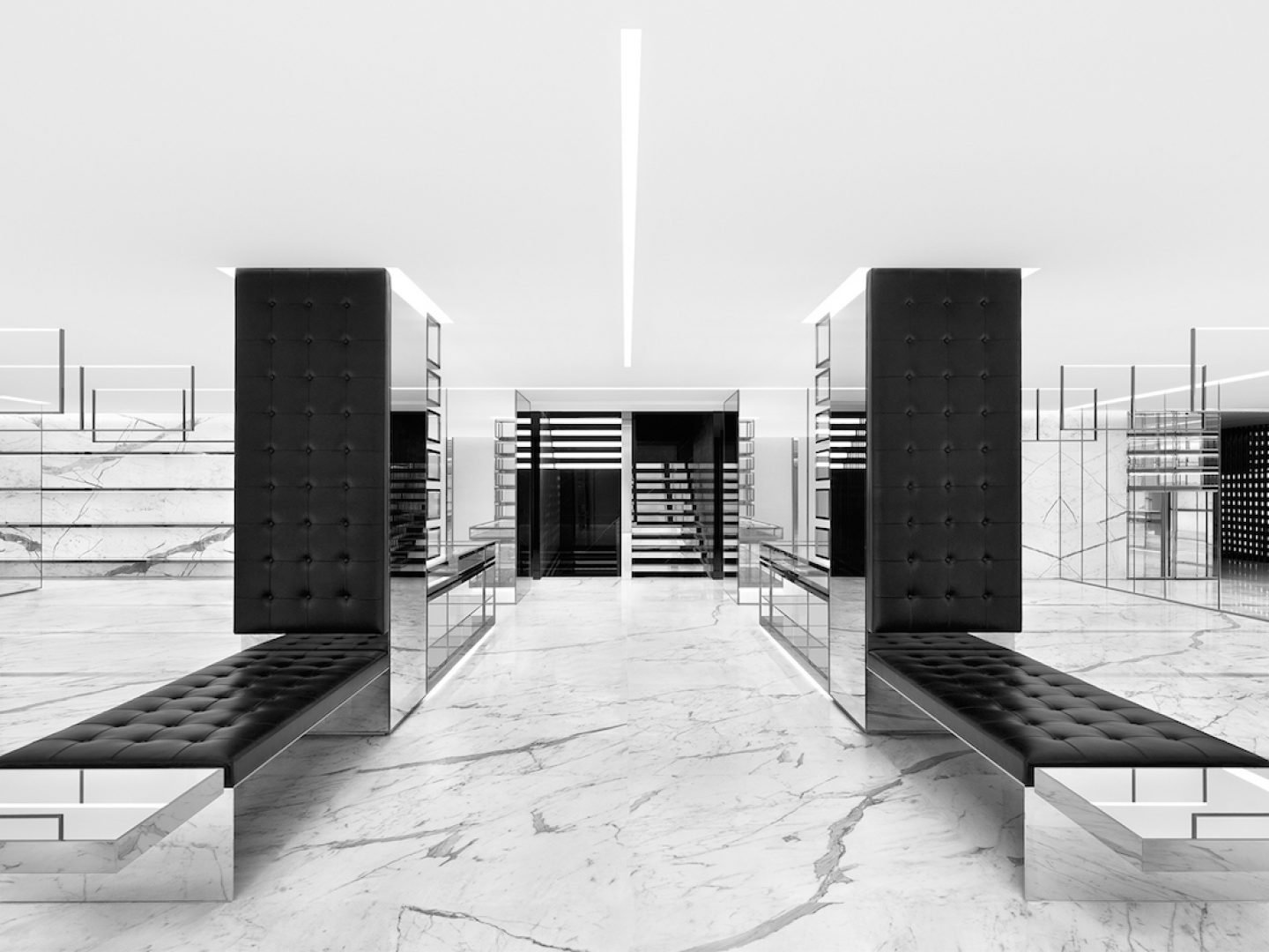
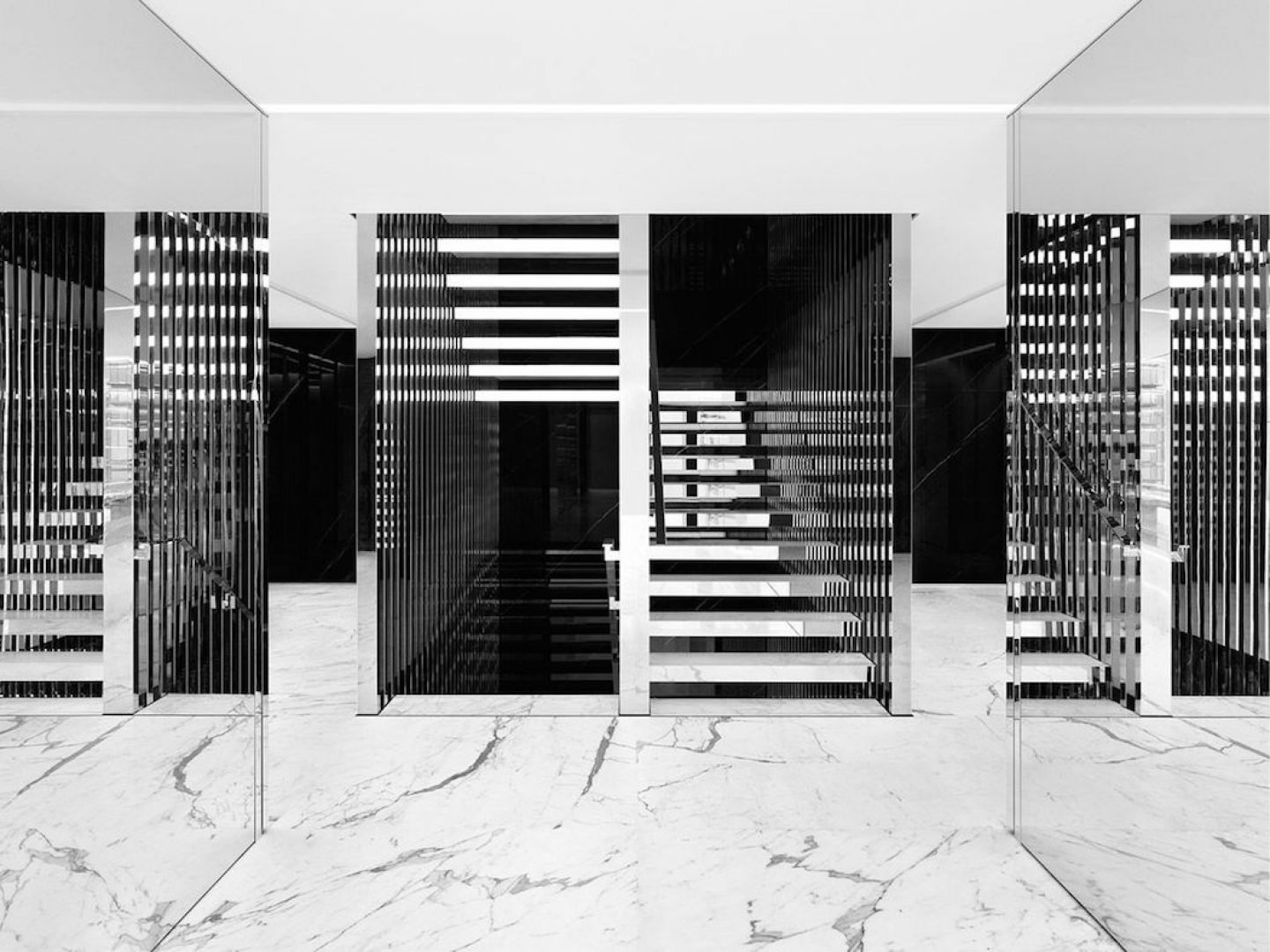
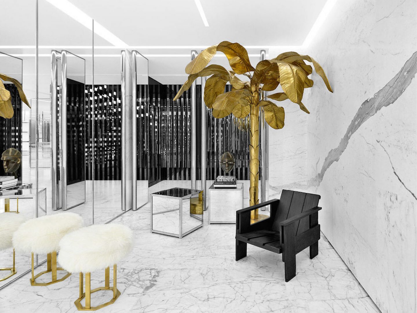
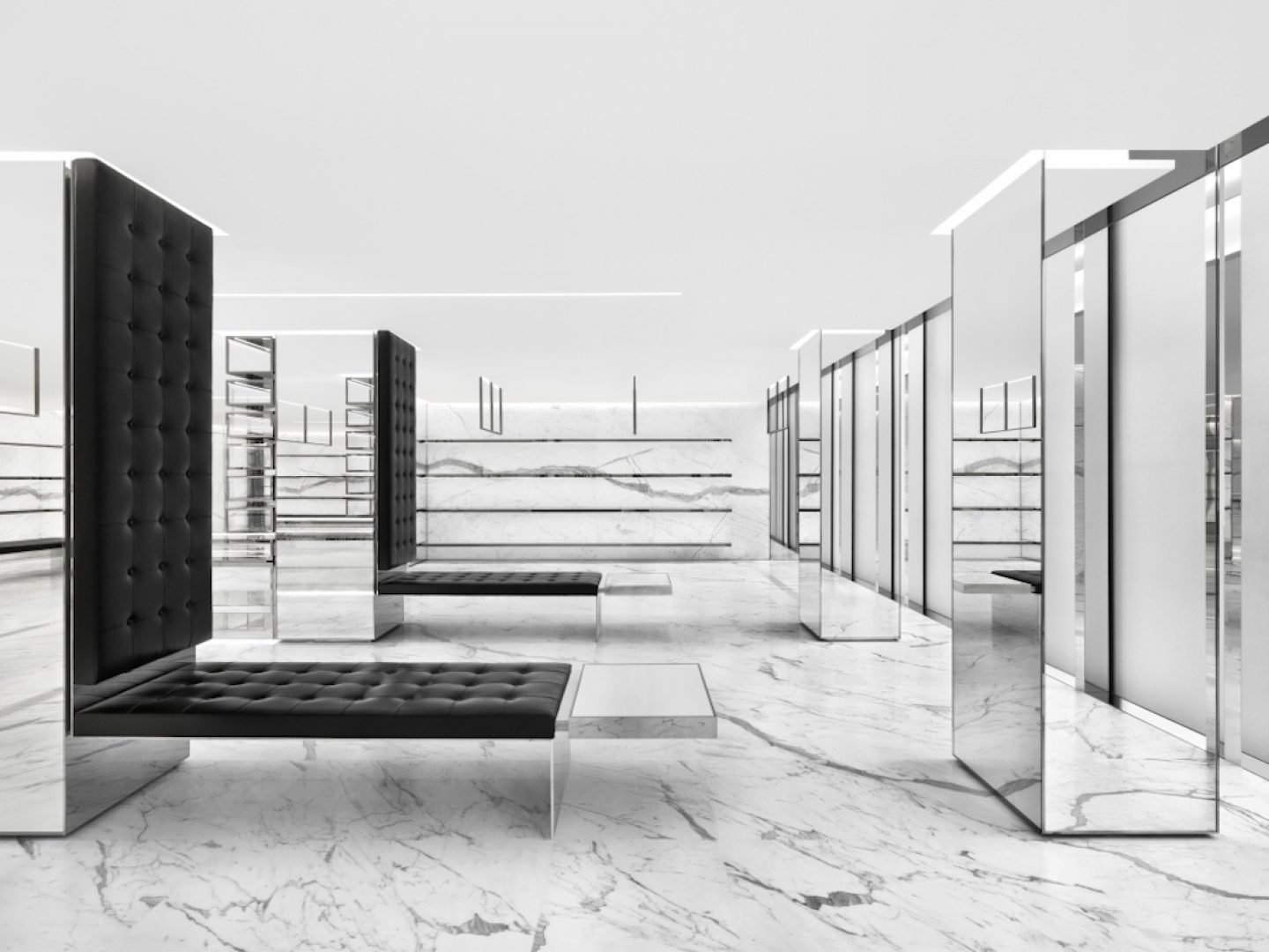
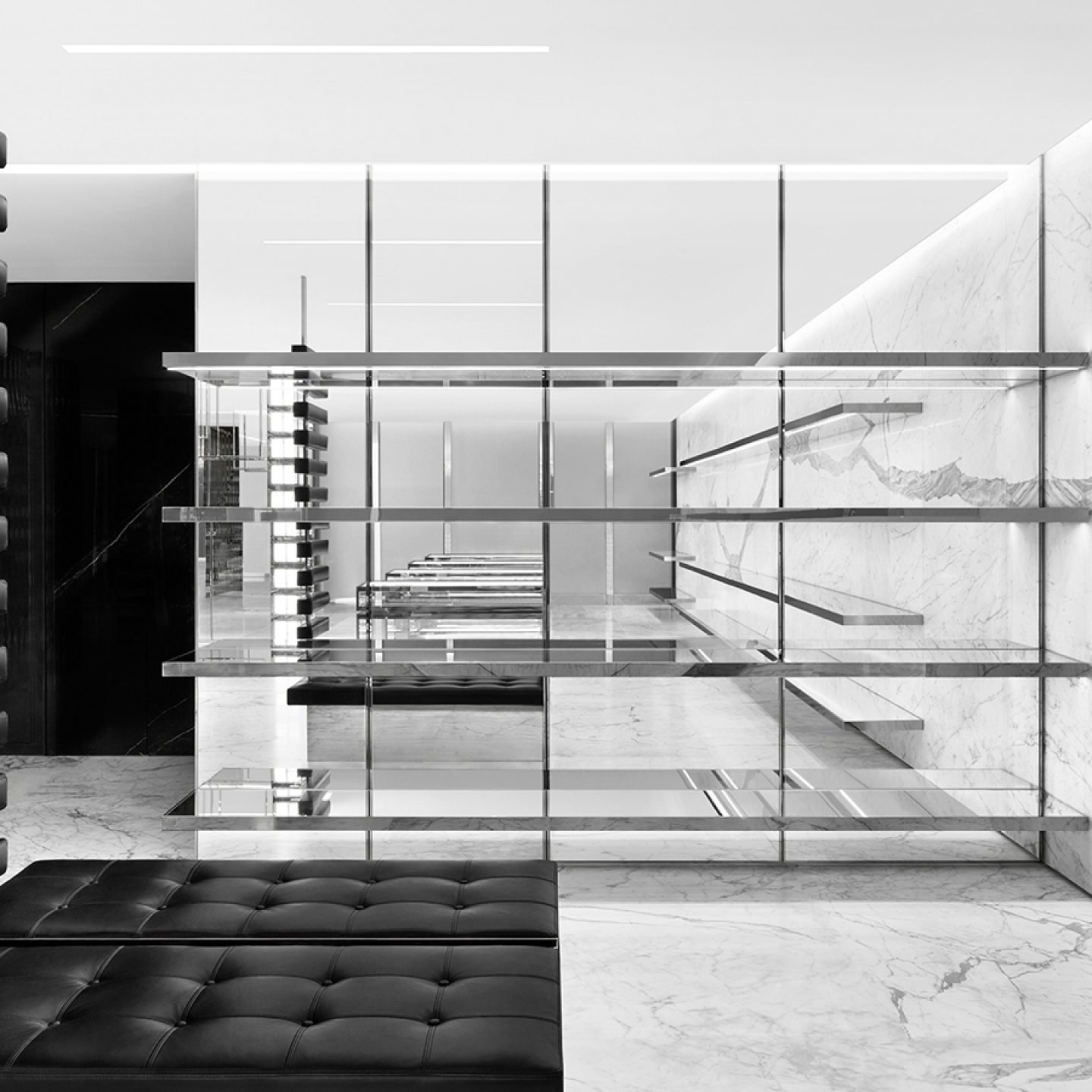
Iconic luxury fashion house Saint Laurent’s largest store to date takes the form of a three-storey, 10,000-square-foot space in Tokyo’s prestigious Omotesandō avenue. Designed by the label’s creative director, the fit out closely follows the trademark style of minimal luxury found across its other stores. Black marble and leather, glass, brass and gold accents were complemented by a range of surf boards designed by 18-year old Los Angeles-based artist and muse to Slimane, Lucia Ribisi, that went on sale before the opening.
Saint Laurent Omotesando Flagship
4-3-10 Meiji-jingumae, Shibuya-ku, Tokyo, Japan
Mon – Sat 11:00 – 20:00
Designed by Hedi Slimane in 2015
_
3. SND CONCEPT STORE BY 3GATTI, CHONGQING
All images © Shen Qiang
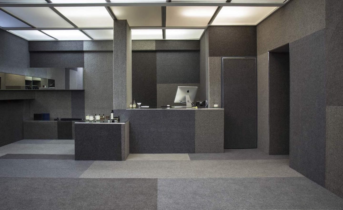
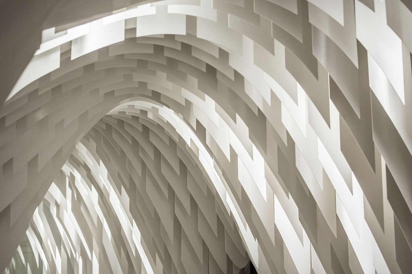
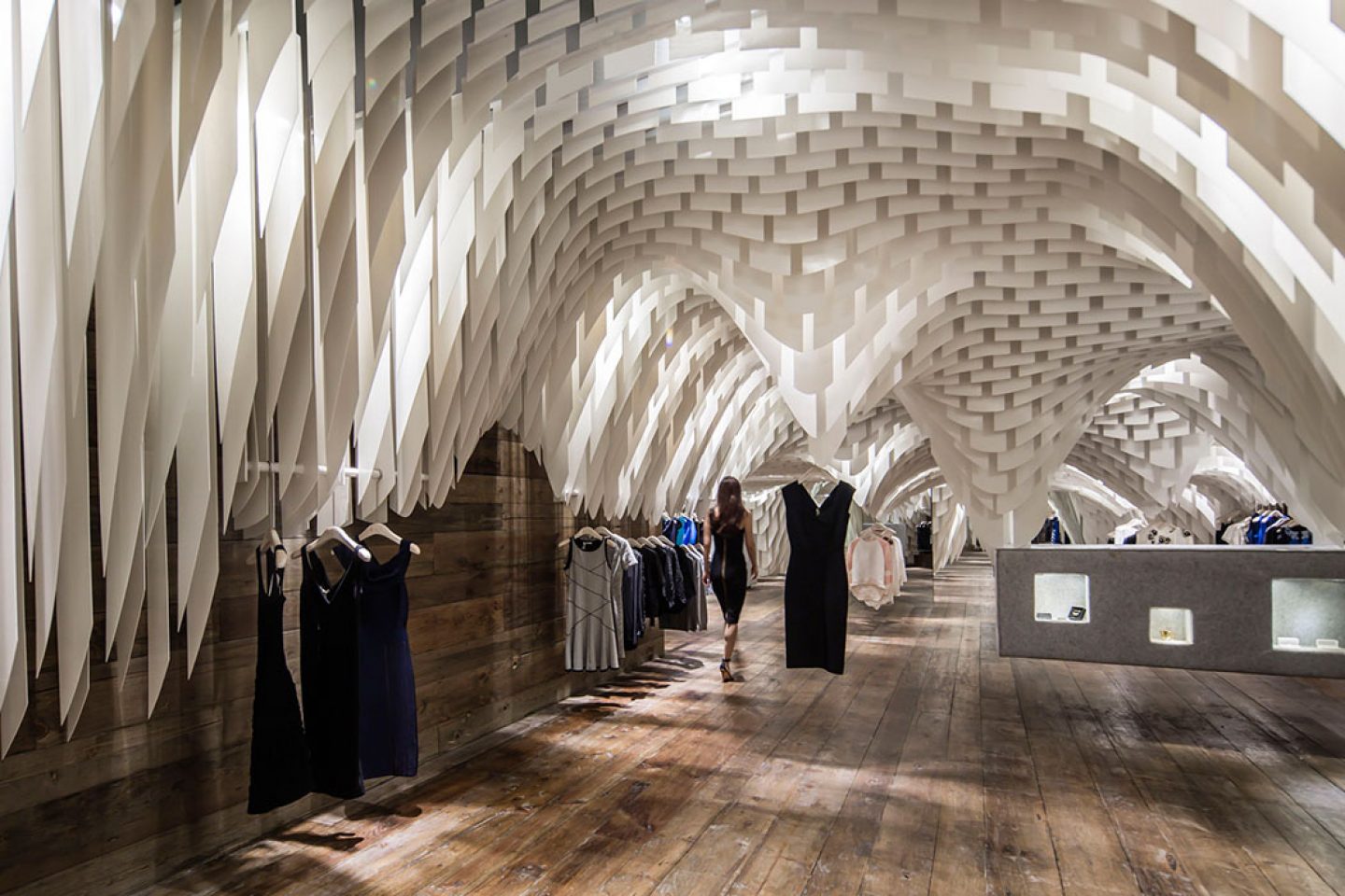
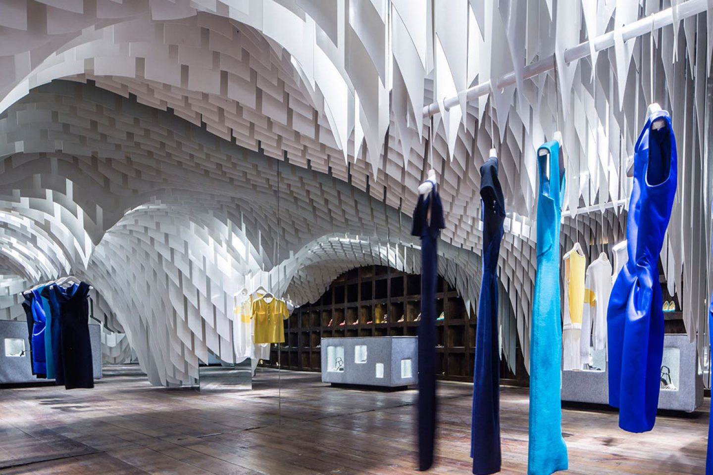
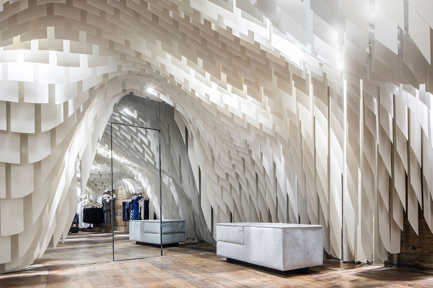
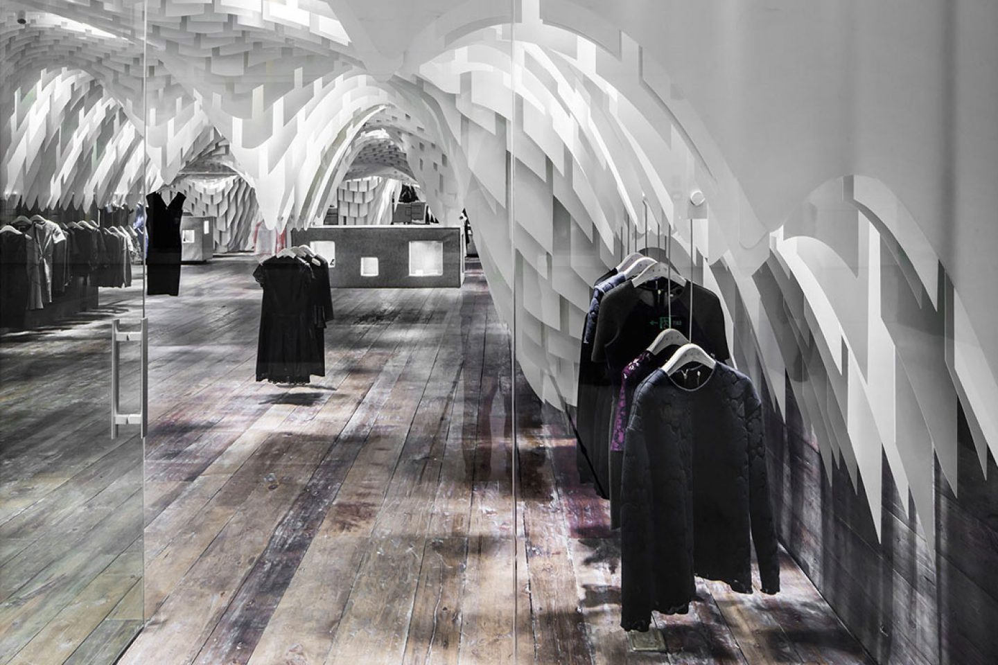
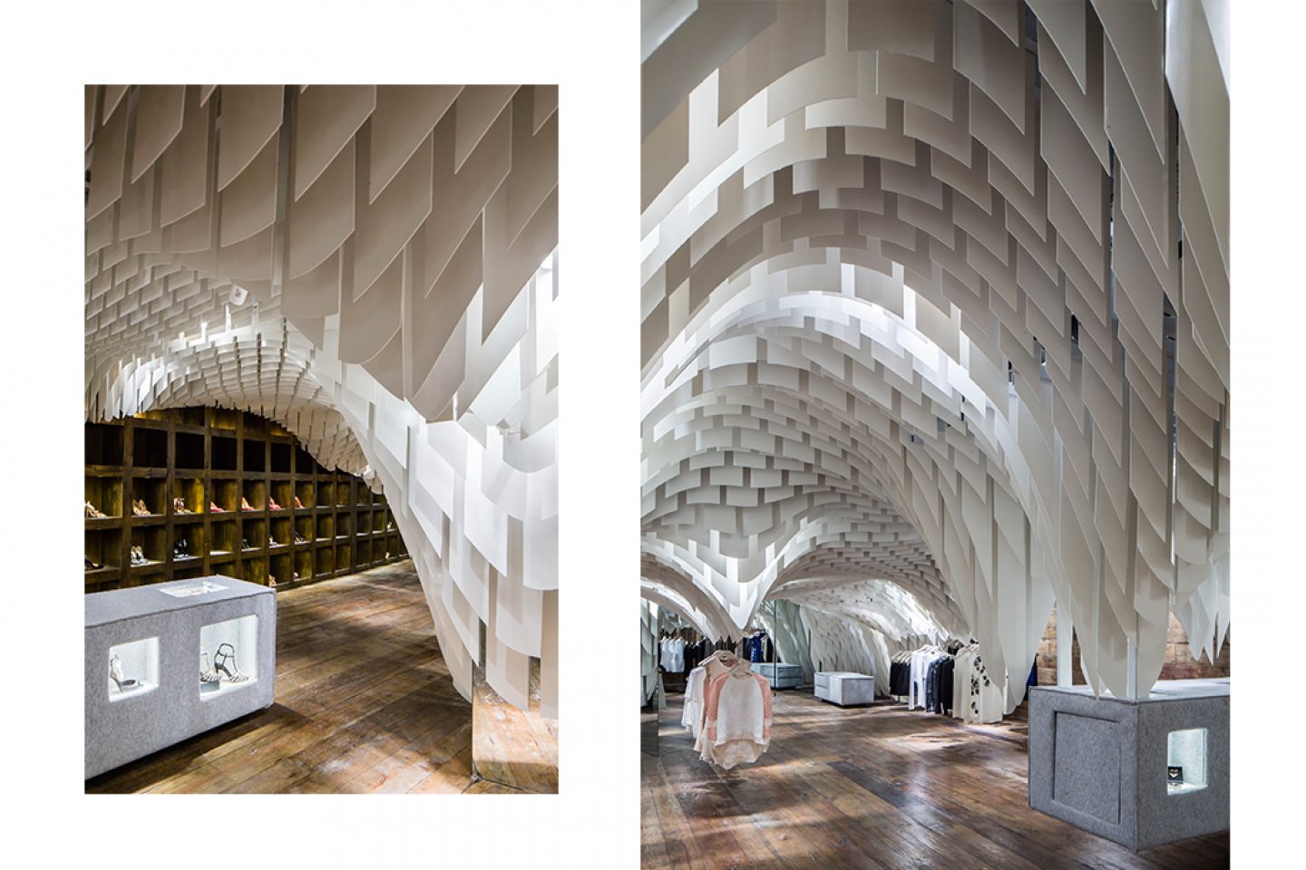
Design studio 3GATTI created an ethereal arched sculpture for the interior of the SND concept store located in Chonqing’s World Financial Center. Constructed from fibreglass pieces that optimize light in the store, the sculpture hangs over suspended clothing rails, backed by wall mirrors that hang above a timber floor. A statement from the architects explains, “This heavenly ceiling is surely the protagonist of the space; we chose recycled timber as a dark background for the floor and walls to make the ceiling emerge from the general environment. Finally we designed simple cubical volumes covered with soft grey felt as the only furniture which the shop could use as sofas, cash desk and product displayers.”
World Financial Centre Mall, Chongqing, Yuzhong, China
Designed by 3GATTI in 2014
_
4. THE POOL AOYAMA BY NOBUO ARAKI, TOKYO
All images © Atsushi Fuseya
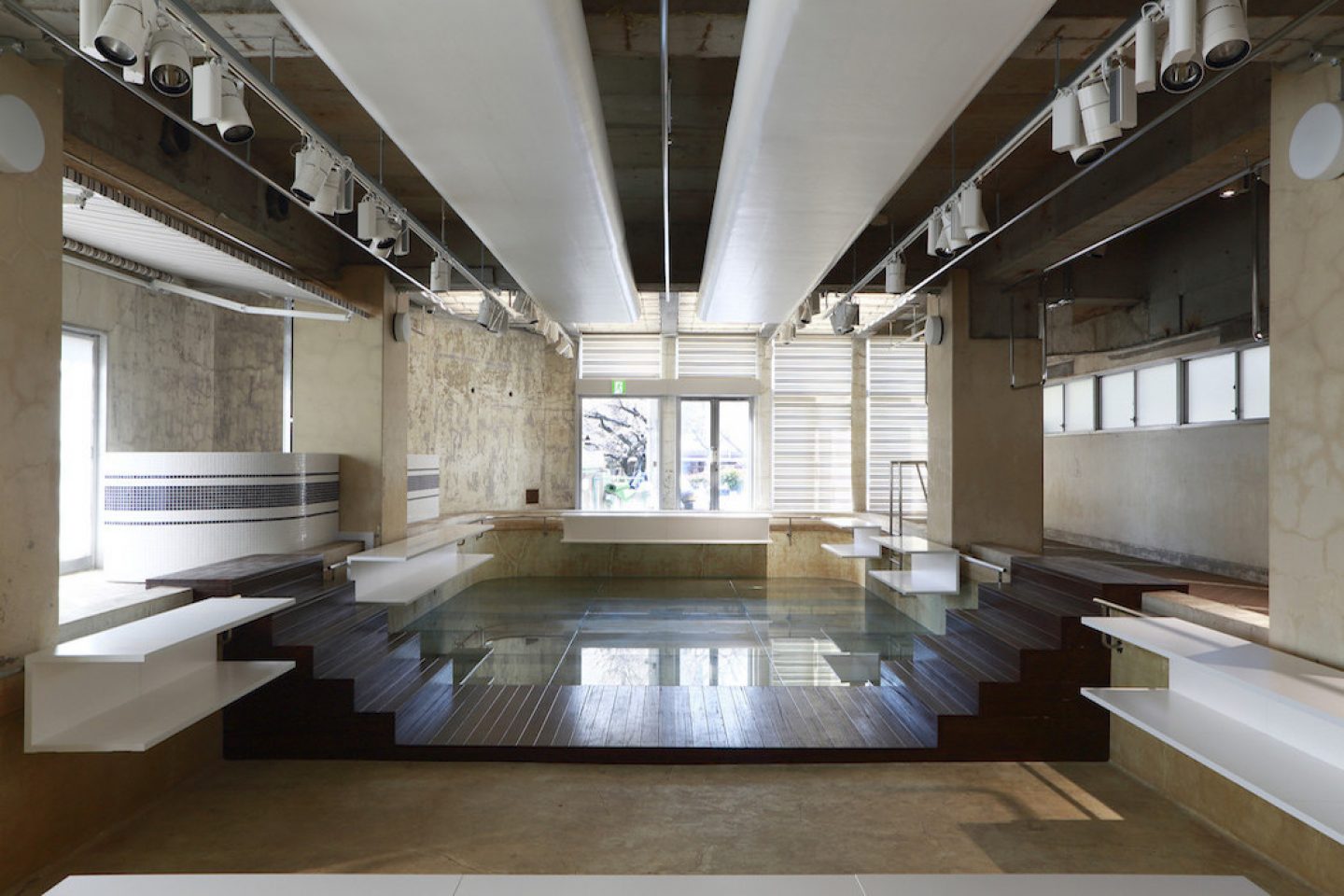
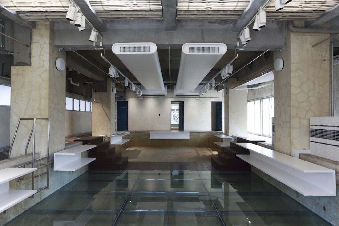
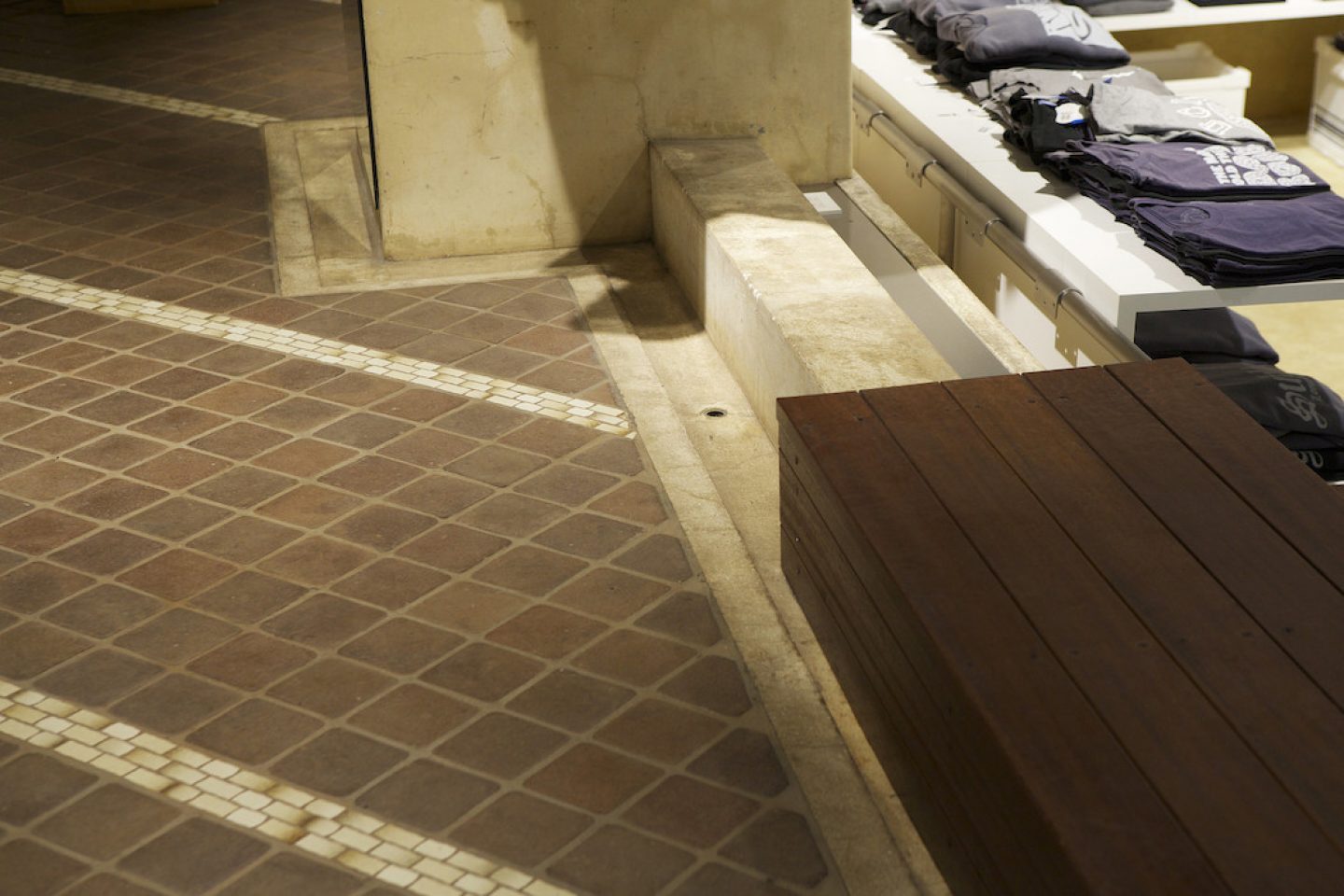
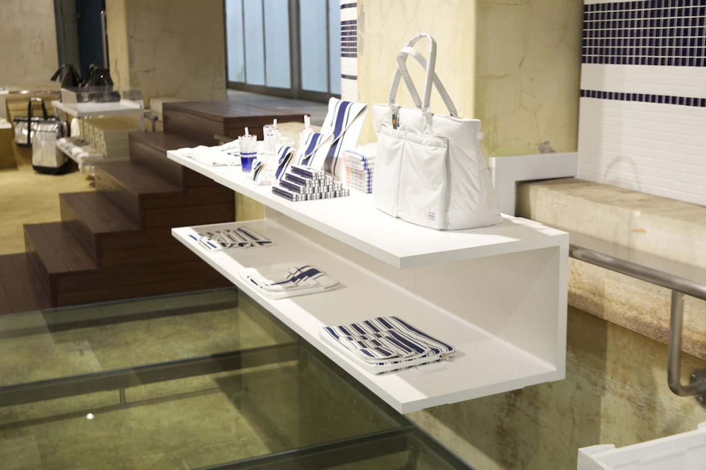
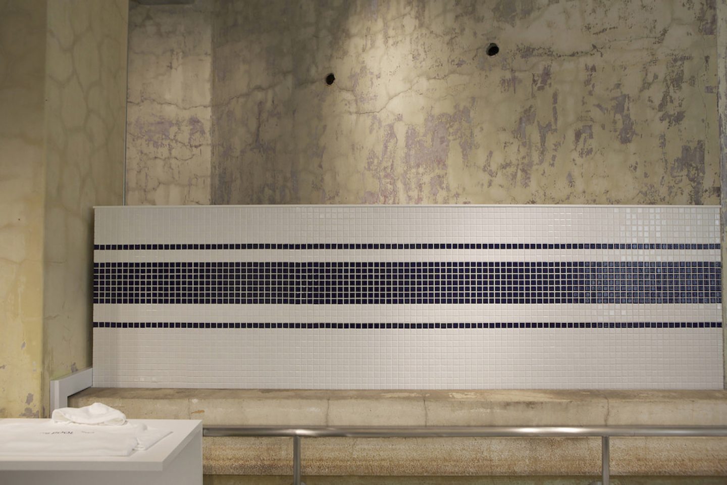
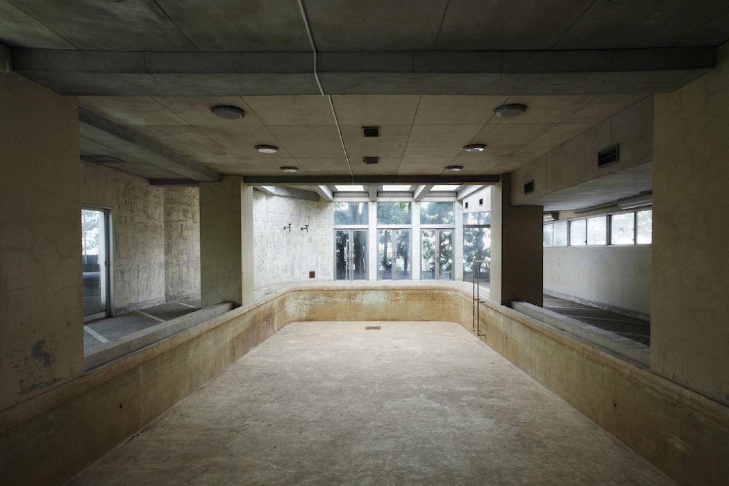
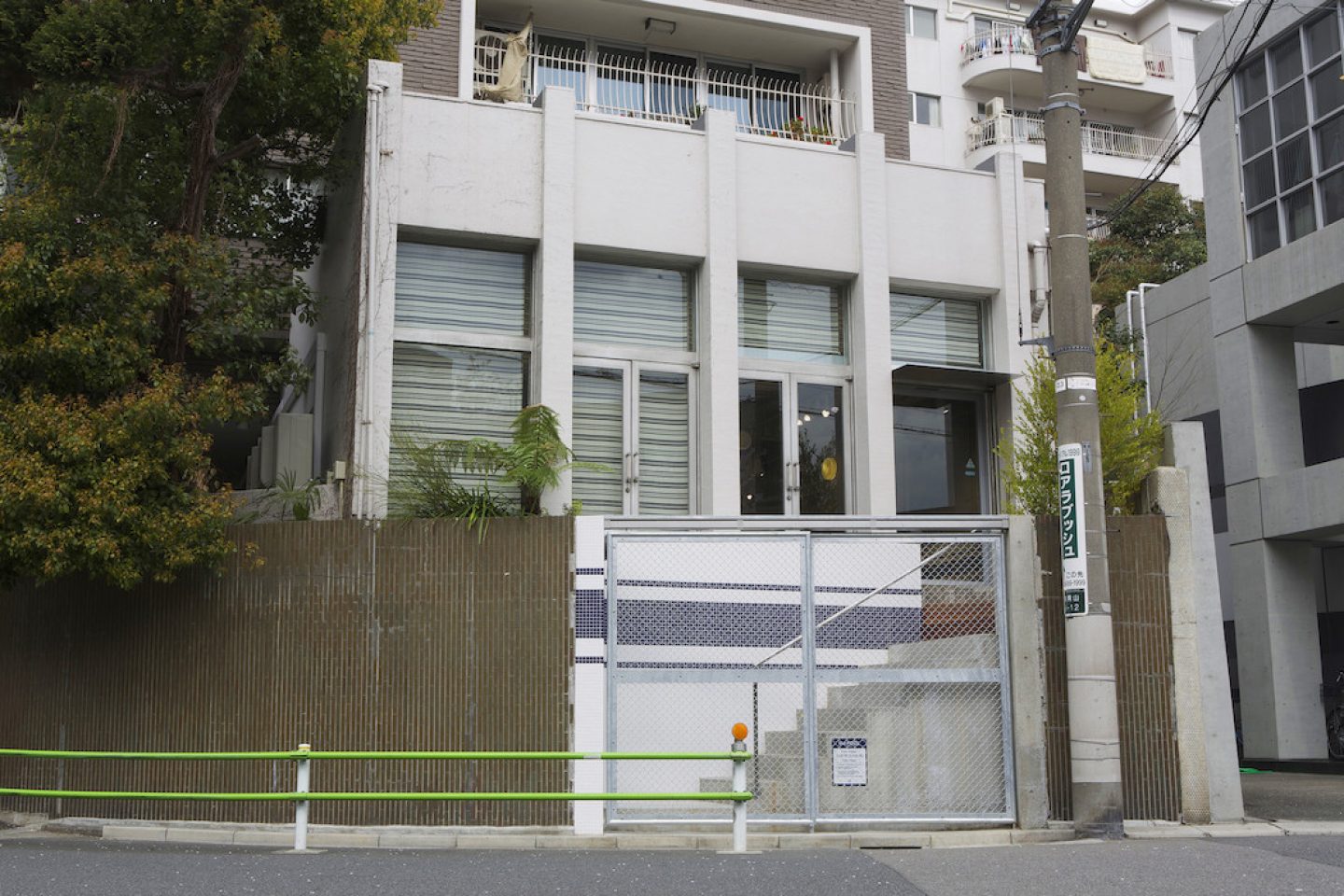
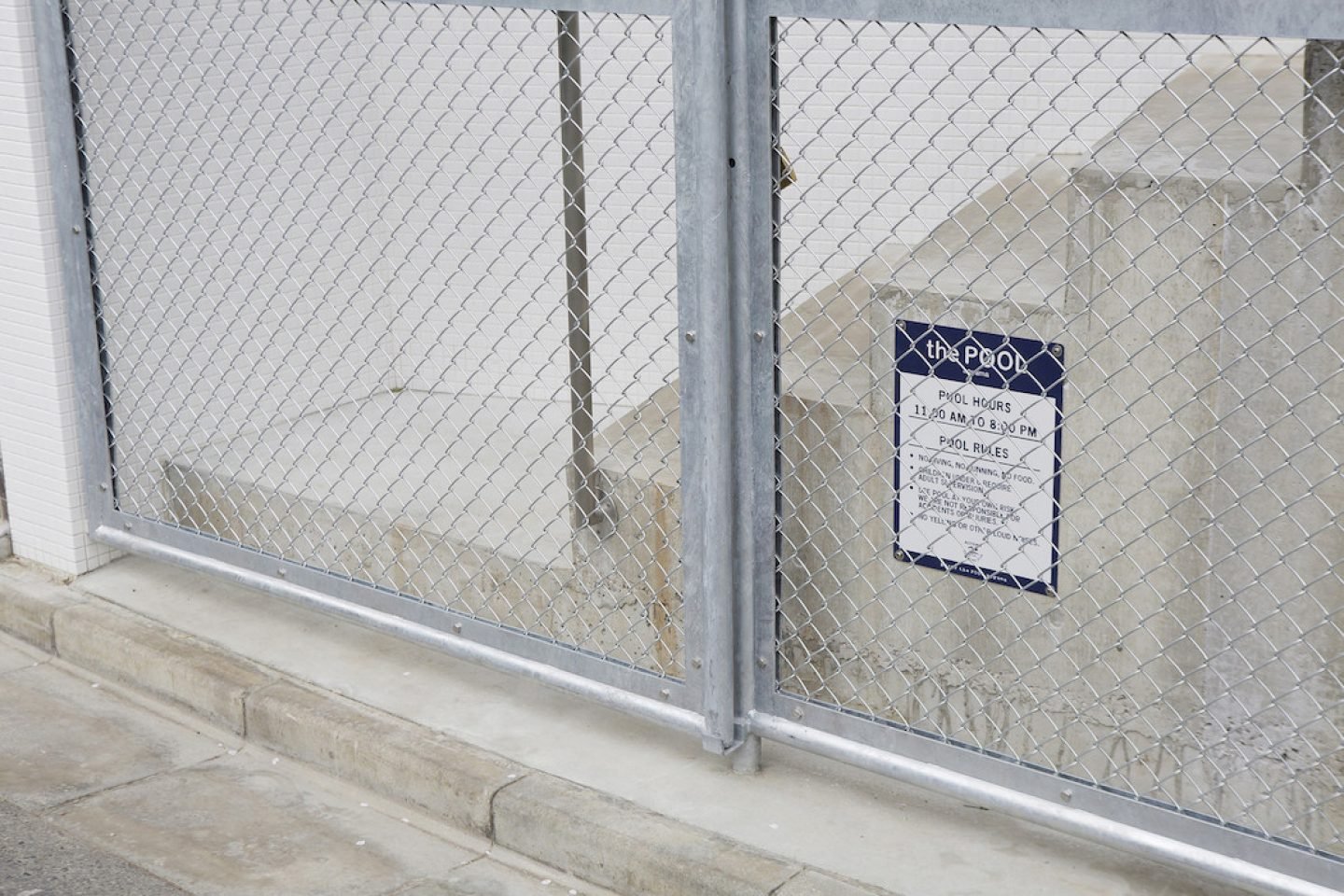
Japanese firm Nobuo Araki transformed a former swimming pool on the ground floor of a 1970s apartment building into a space for concept store The Pool. The original design of the space was retained and optimized for light and retail display. The architects explain, “On our first visit to the empty pool, we were drawn to the soft light that filled the space, and the charm of the well-worn walls and floor that had come through decades of use. Accordingly we have retained the beauty and allure of the original interior through a minimal amount of alterations and furniture. In addition to offering increased functionality, the newly designed interior also allows daylight to continue to permeate through the glass ceiling.”
Chateau Toyo Minami Aoyama 1F
5-12-24, Minamiaoyama, Minatoku, Tokyo, Japan
11:00 – 20:00
Designed by Nobuo Araki in 2014
_
5. FEIT WEST VILLAGE BY JORDANA MAISIE, NEW YORK
All images © Nicholas Calcott
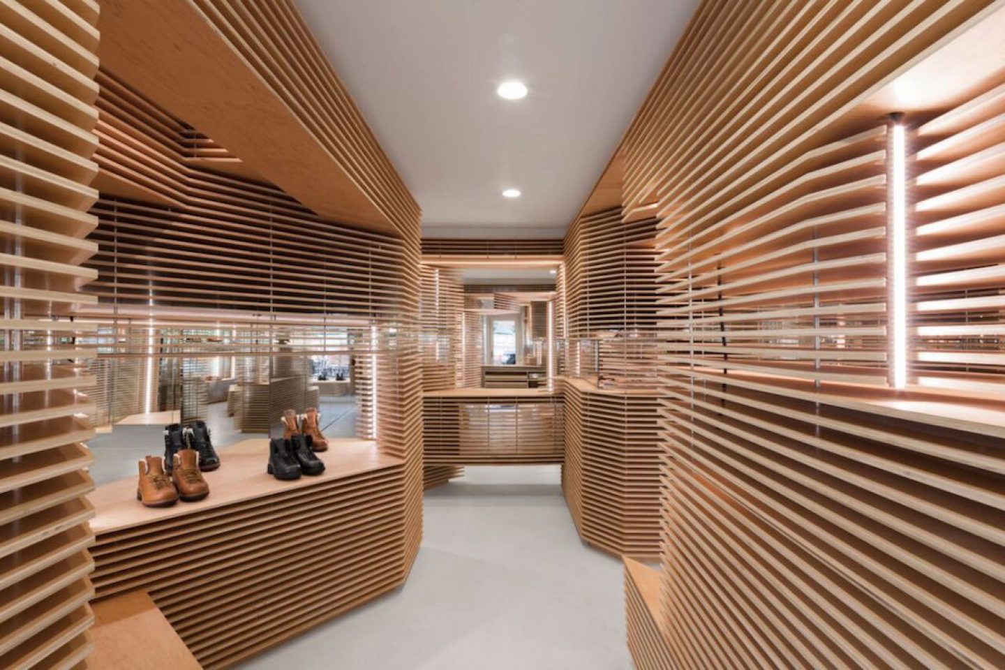
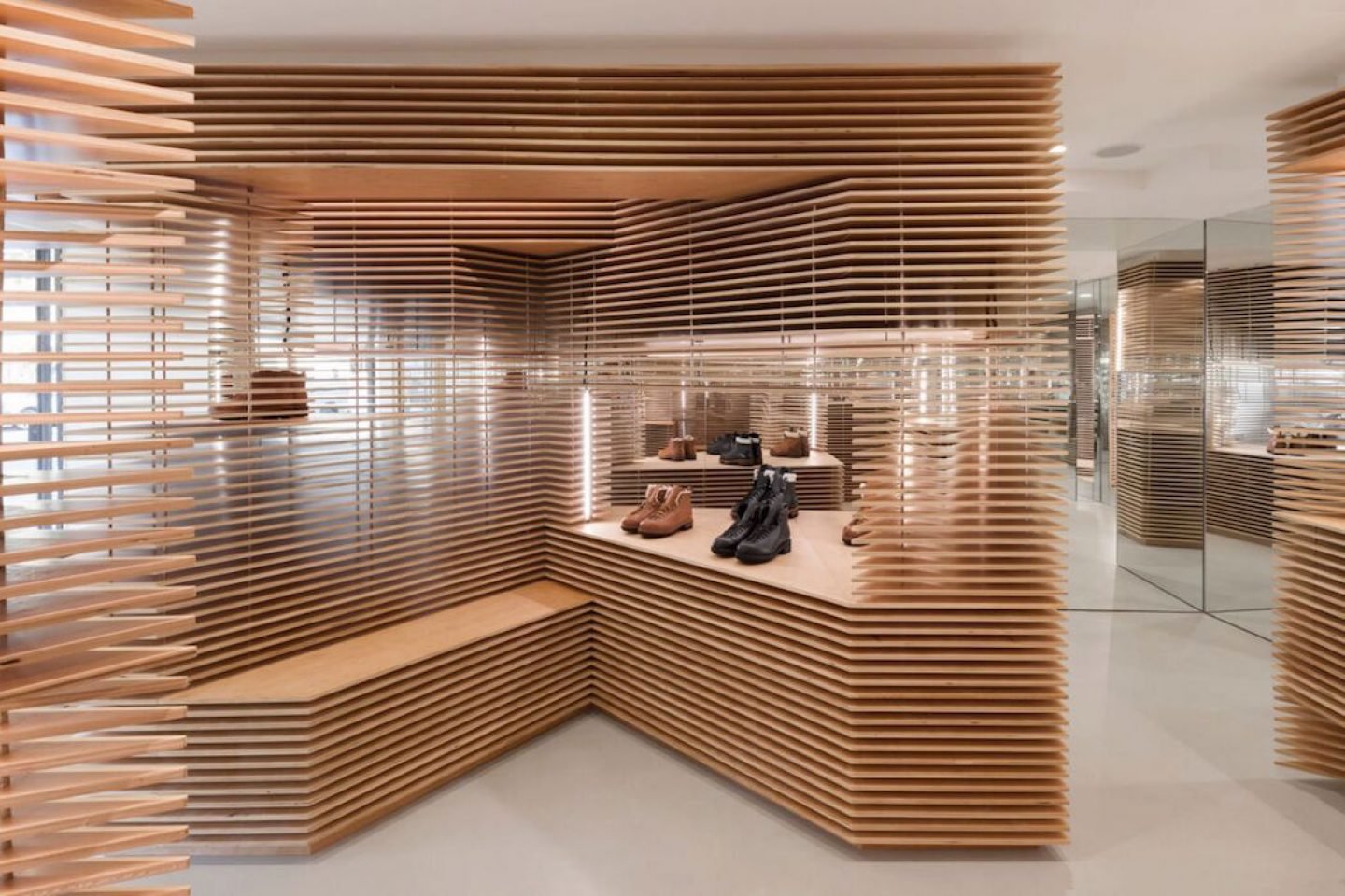
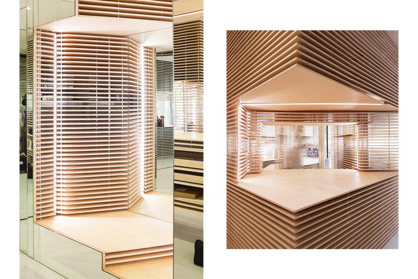
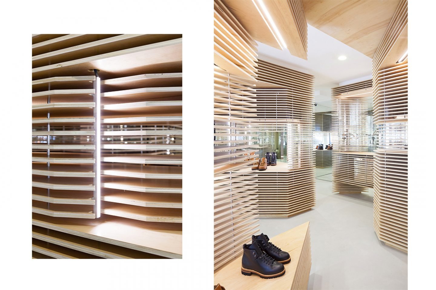
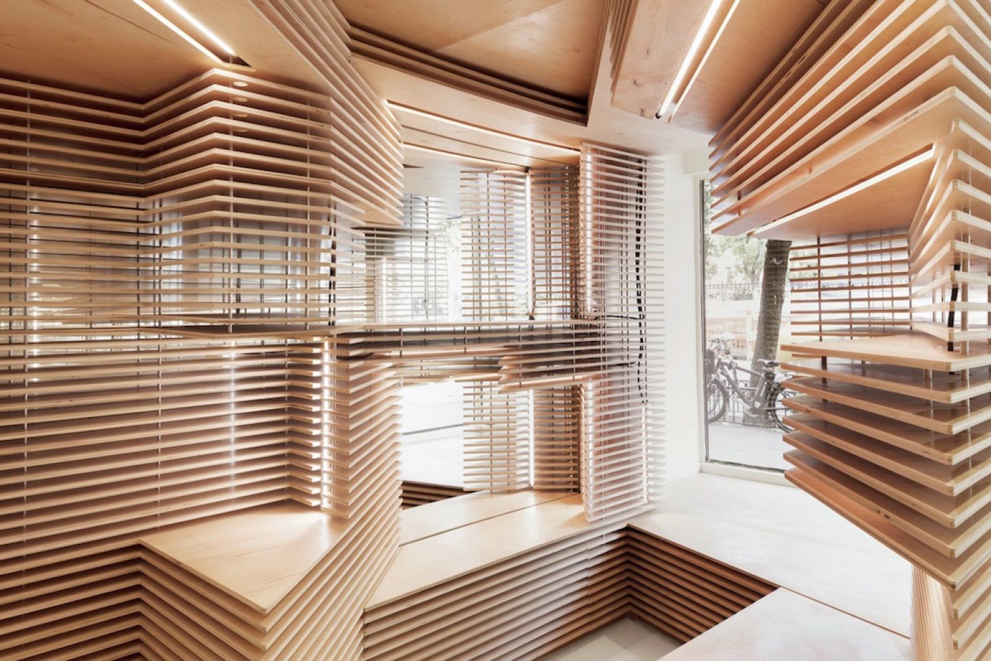
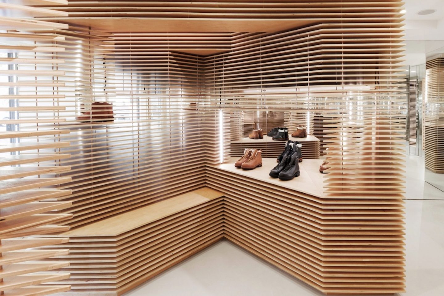
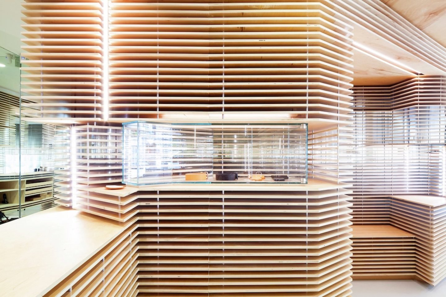
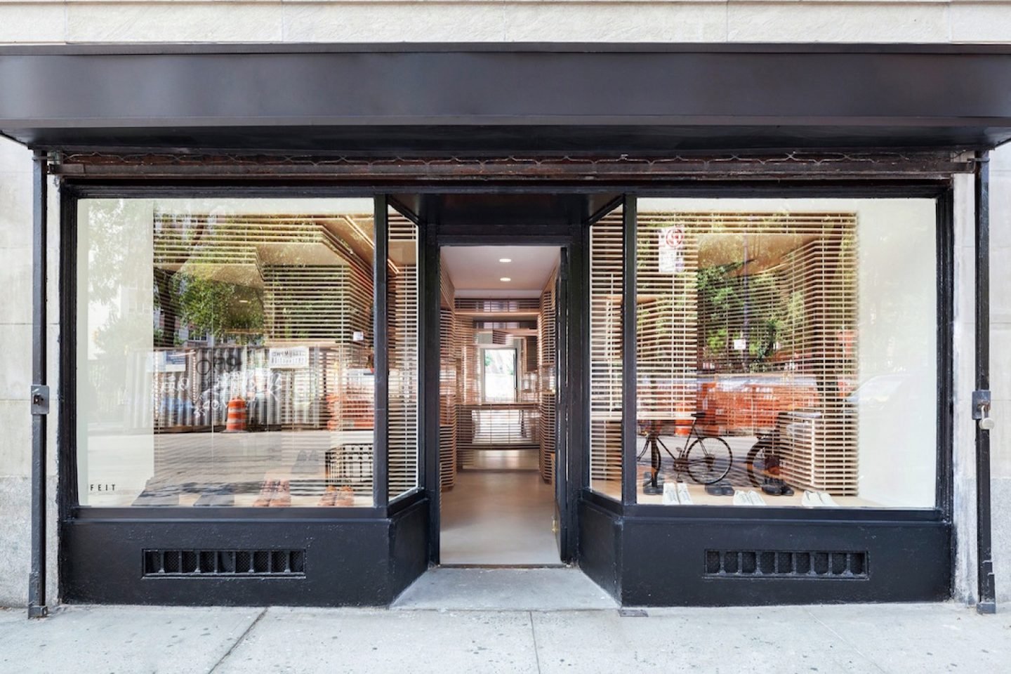
Luxury footwear brand FEIT worked with Australian designer Jordana Maisie to create a warm linear interior for its second New York store, located in the West Village. Constructed from layered Baltic birch plywood cut using CNC technology, the geometric installation is backed by mirrors and adjustable LED lighting. Speaking of the intention behind the design, Maisie states, “The interior has a unique identity – prioritizing process, craft and innovation, while pushing the tension between what is handmade and what is machine made.”
11 Greenwich Ave, New York, NY 10014, United States
Mon – Sat 11:00 – 19:00, Sun 12:00 – 18:00
Designed by Jordana Maisie in 2015
All images © Sean Marc Lee
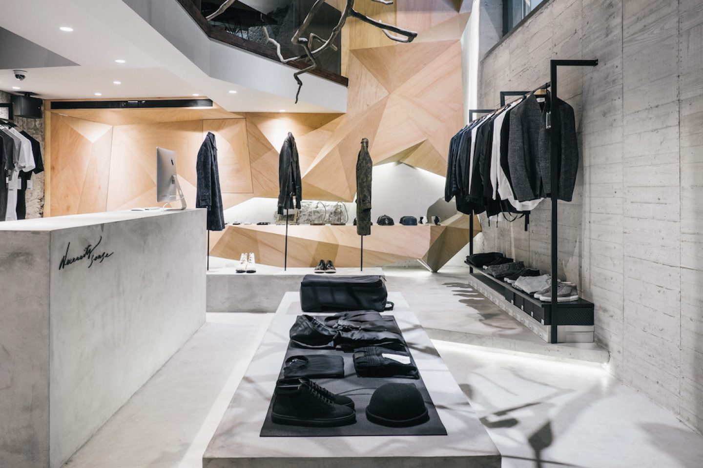
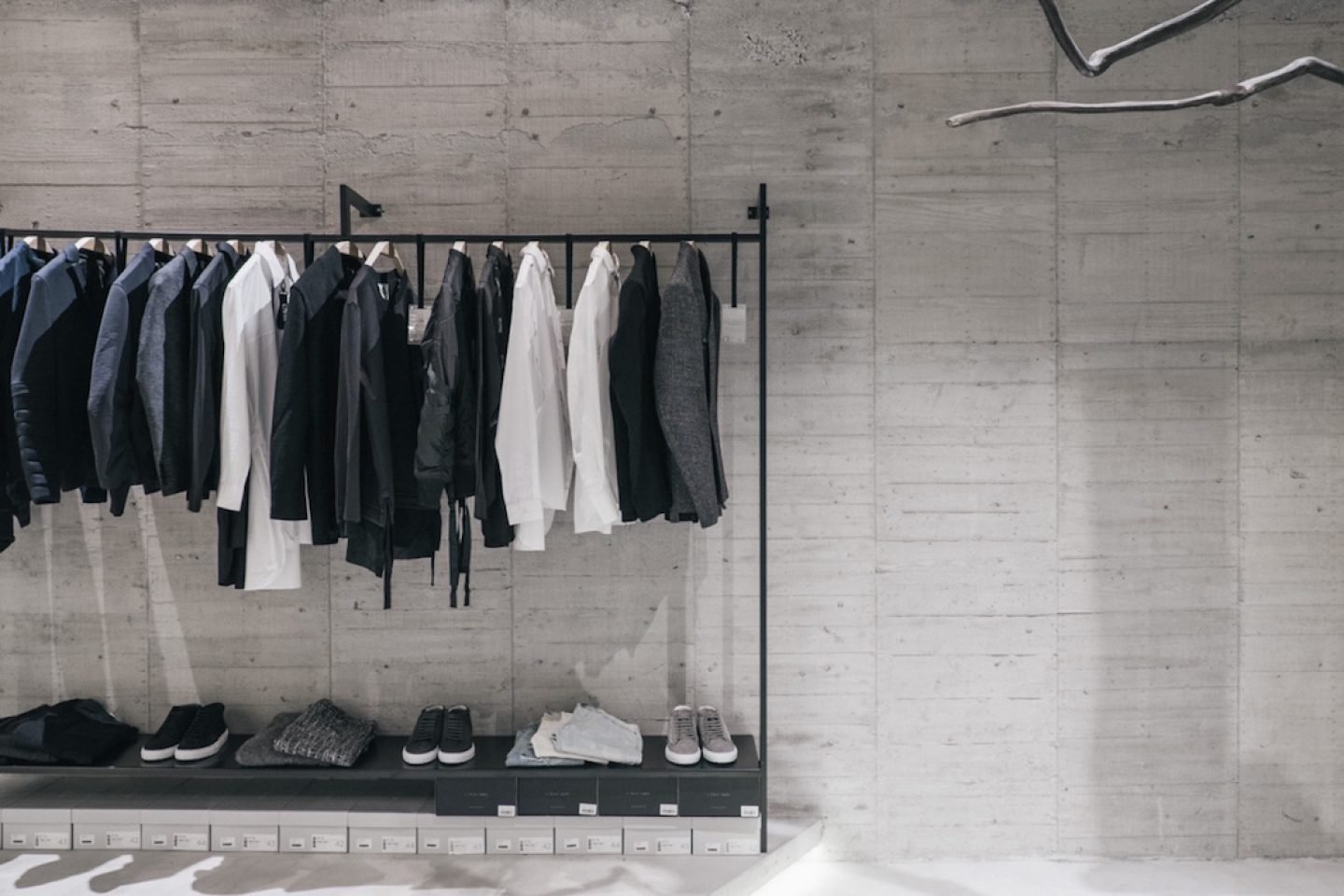
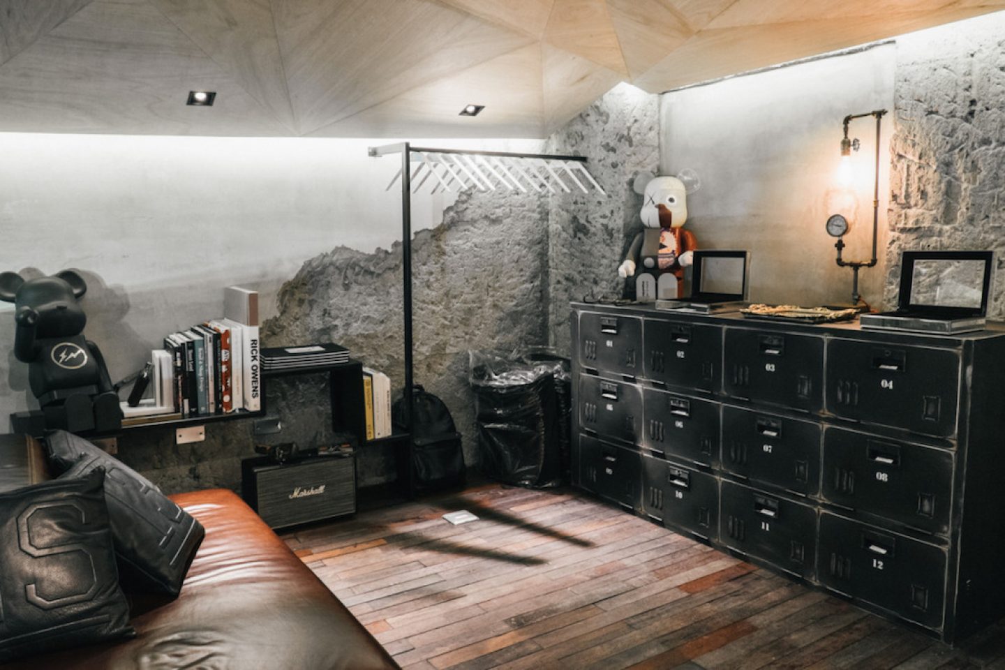
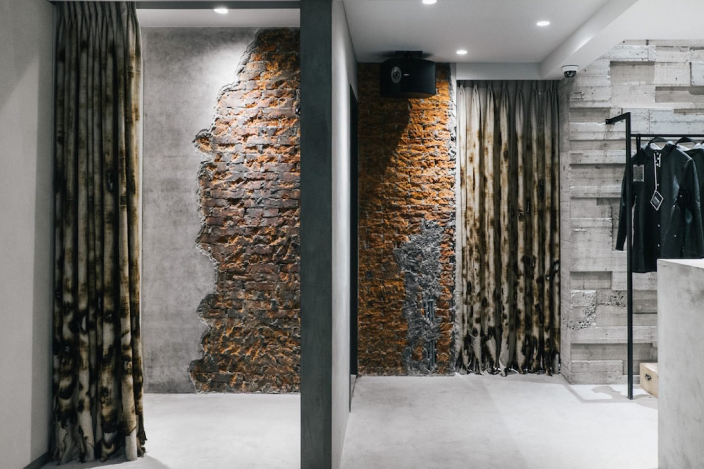
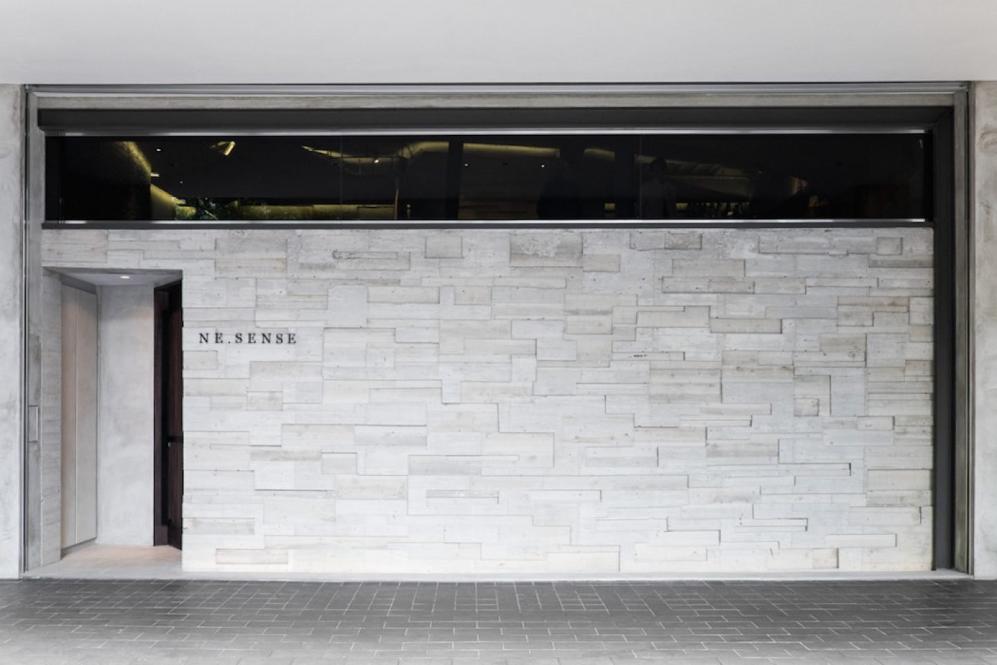
Independent Taiwanese fashion brand Ne-Sense enlisted design studio Yun Yih to fit out a showroom inspired by the five elements of Chinese philosophy: fire, water, earth, wood and metal. In a recent interview, the three brothers behind Ne-Sense state, “The waterfall design in our bathroom tap is inspired by rain, but what engages customers most is the exposing concrete interior and dangling branch in the middle. Other interior decorations such as the Medicom toy and vintage ornaments are from our own collectibles. They’re sentimental pieces that represent our journey.” The project received the IF Design Award 2015.
No. 52, Section 2, Keelung Rd, Xinyi District, Taipei City, Taiwan 11052
Mon-Sun 13:00-19:00
Designed by Yun Yih in 2013-2014
_
7. HEIKE STORE BY AN DESIGN COMPANY, HANGZHOU
All images © Wang Min / Liu Yujie
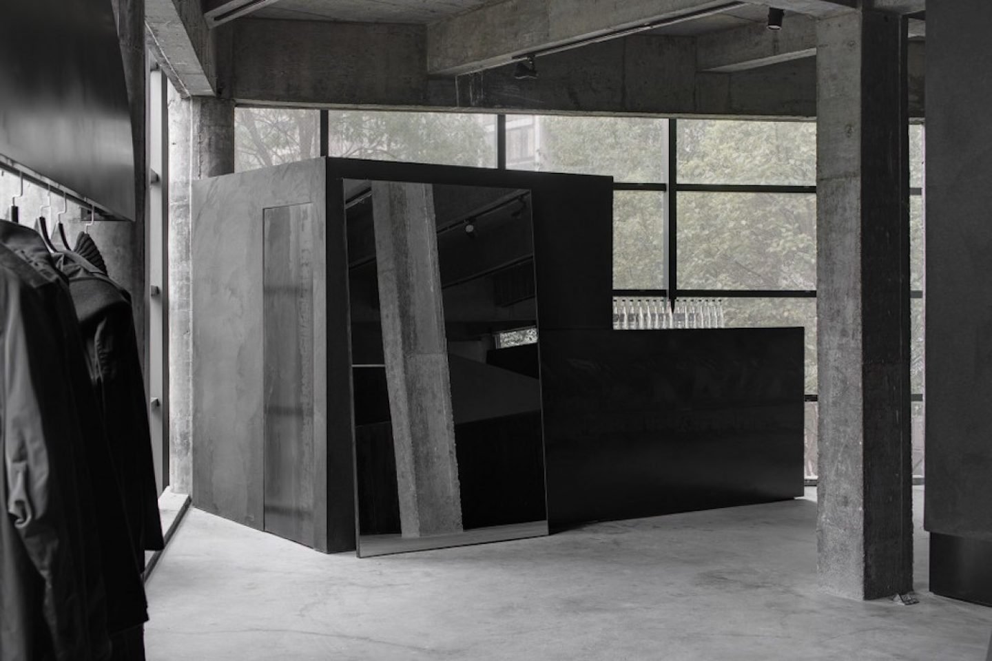
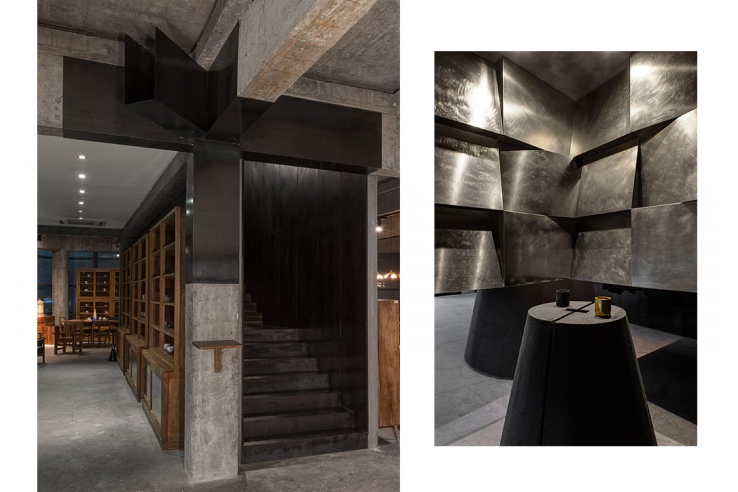
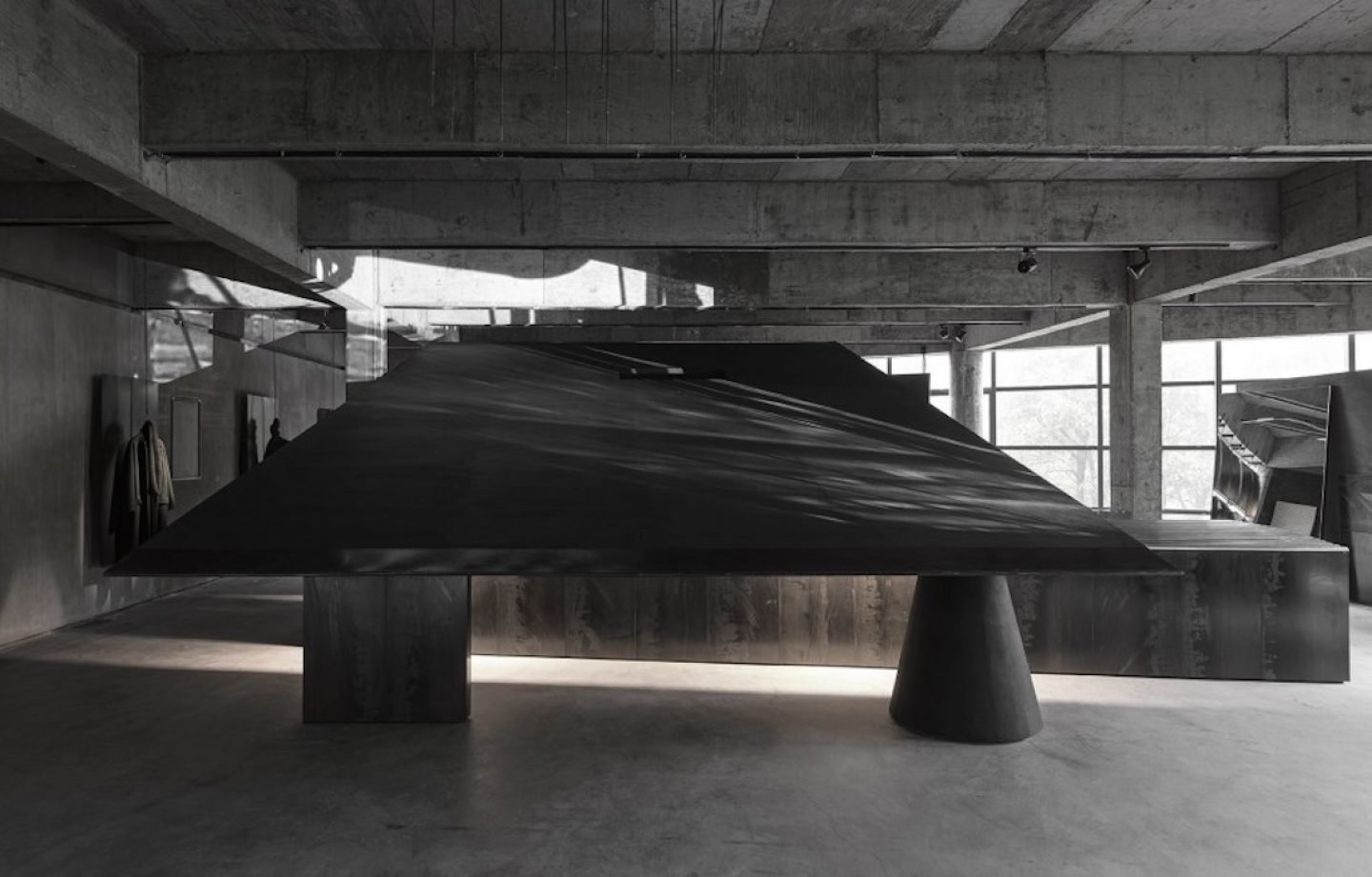
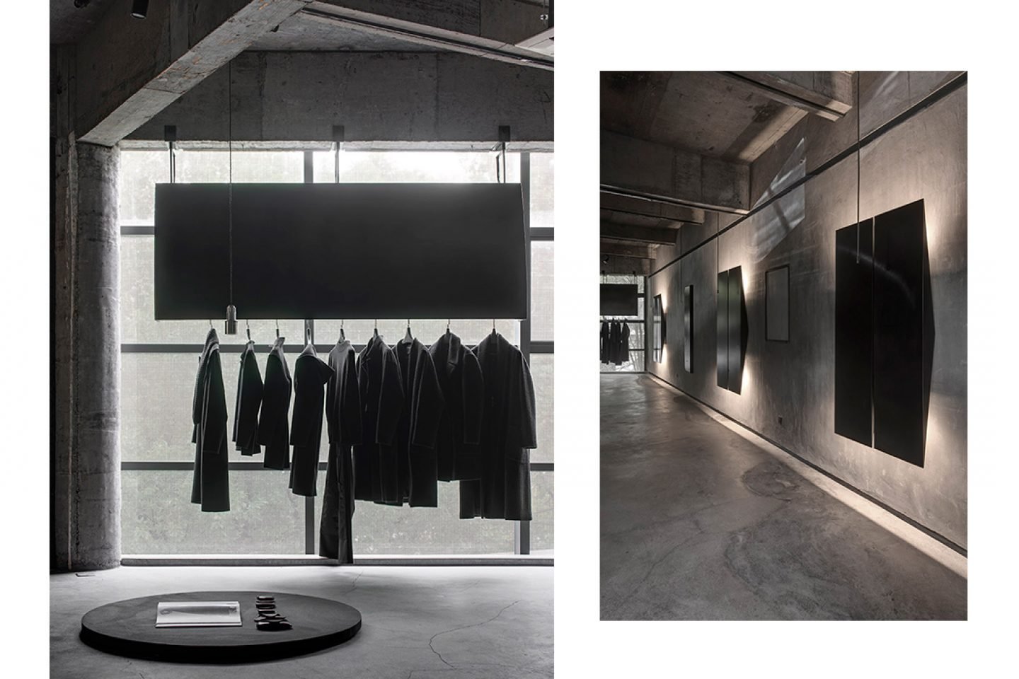
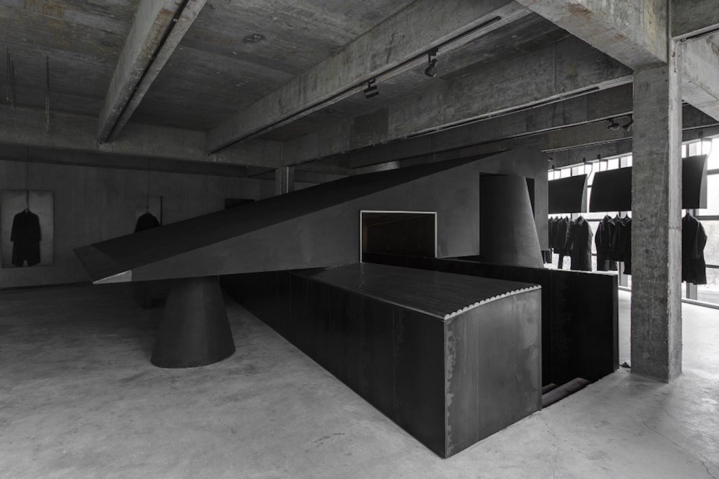
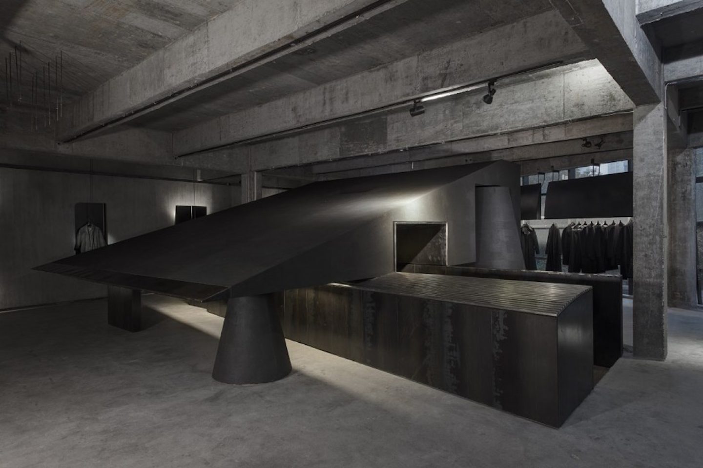
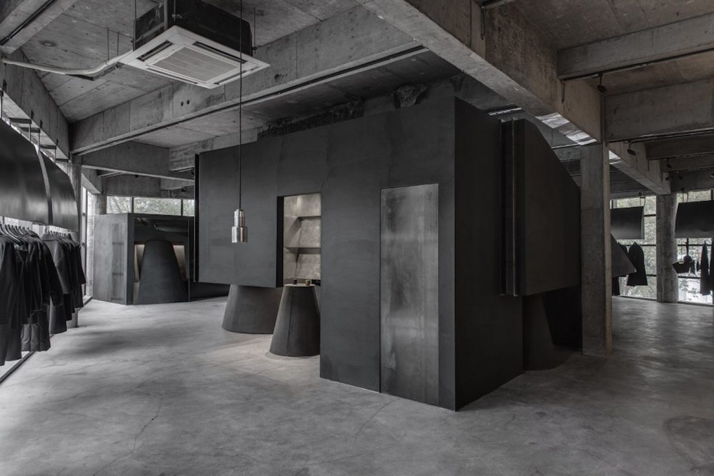
An Design Company turned a lofty third-floor concrete-shelled space into the home for clothing brand Heike. Accessible through a furniture store on the floor below and up a narrow staircase, the store is surrounded by glass on three sides, propped up by pillars. Back-lit panels and architectural-style lamps illuminate suspended racks of clothing, creating a calming yet moody atmosphere. A central large black slope acts as the centerpiece, inviting reflection on the interplay of light and shadow.
Binjiang District, Bingsheng Road 4309, Hangzhou, China
Designed by An Design Company in 2016
_
8. ALEXANDER WANG FLAGSHIP STORE BY VINCENT VAN DUYSEN, LONDON
All images © courtesy of Vincent van Duysen
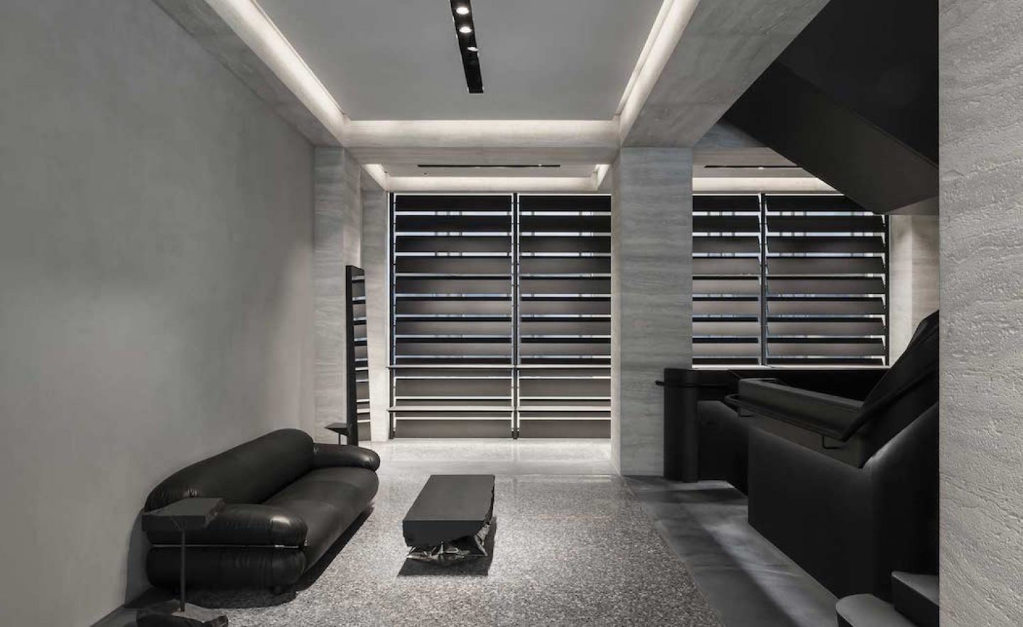
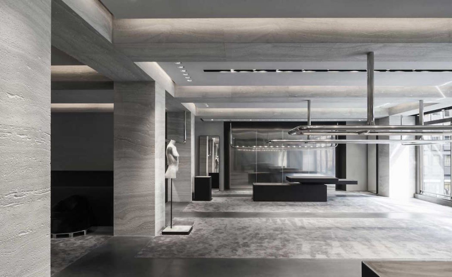
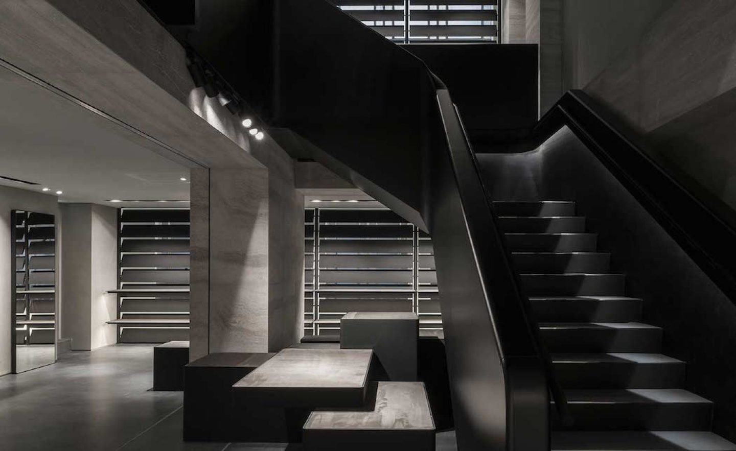
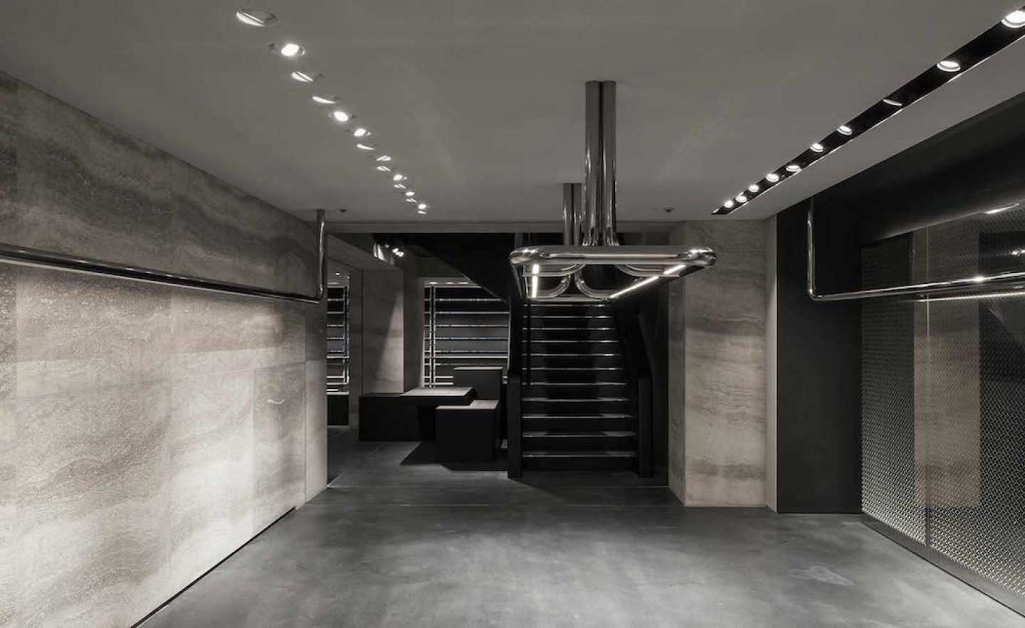
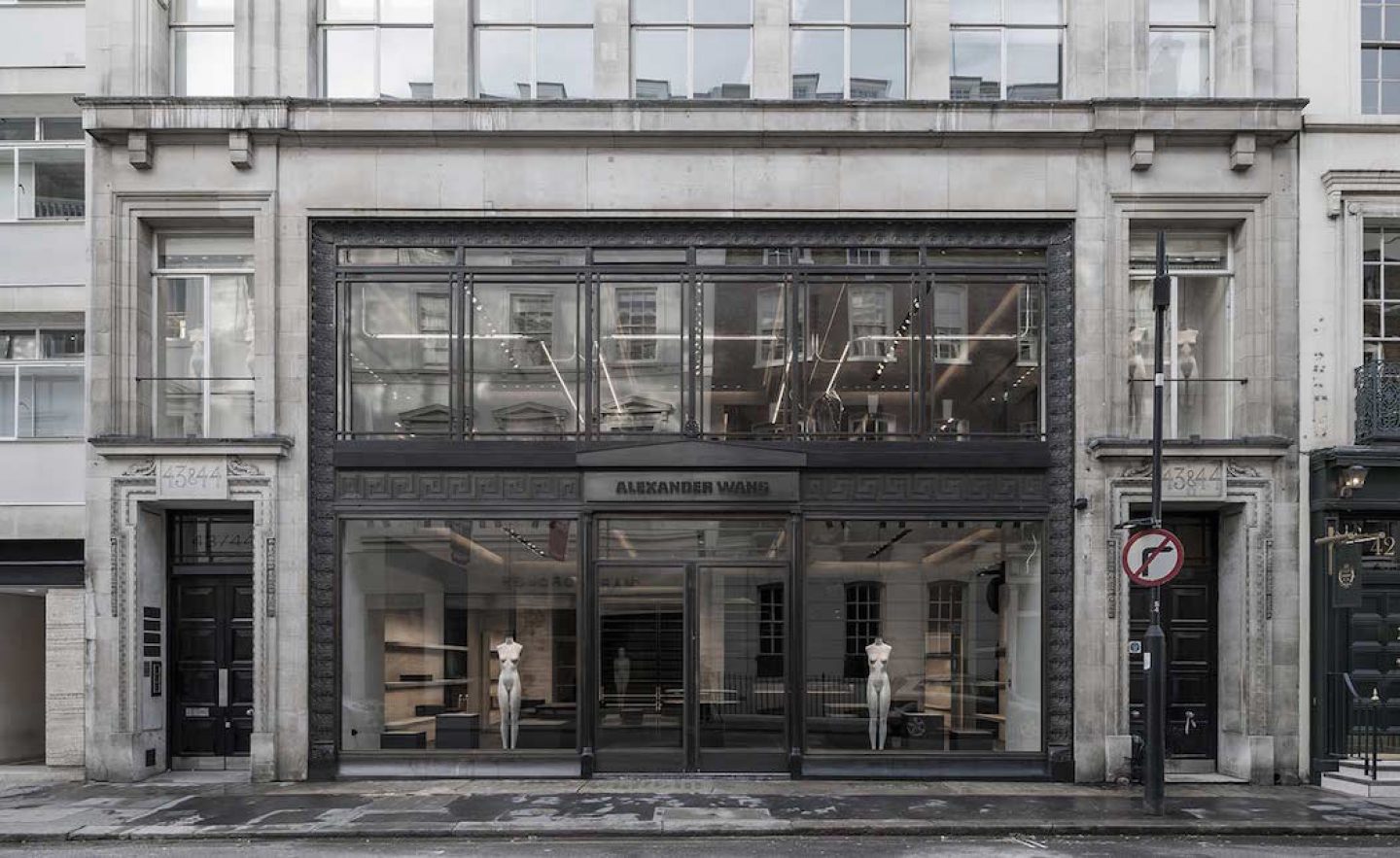
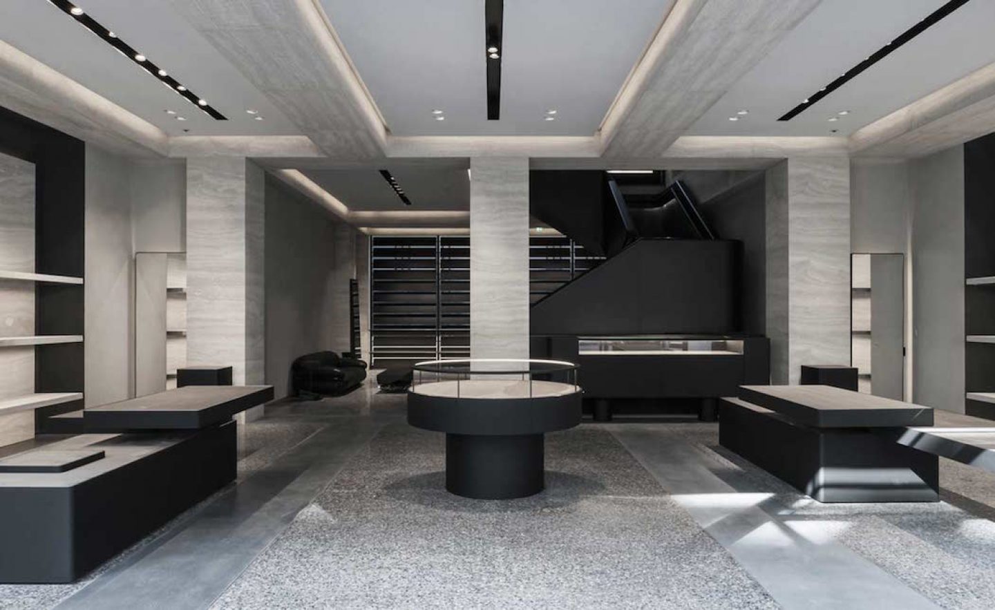
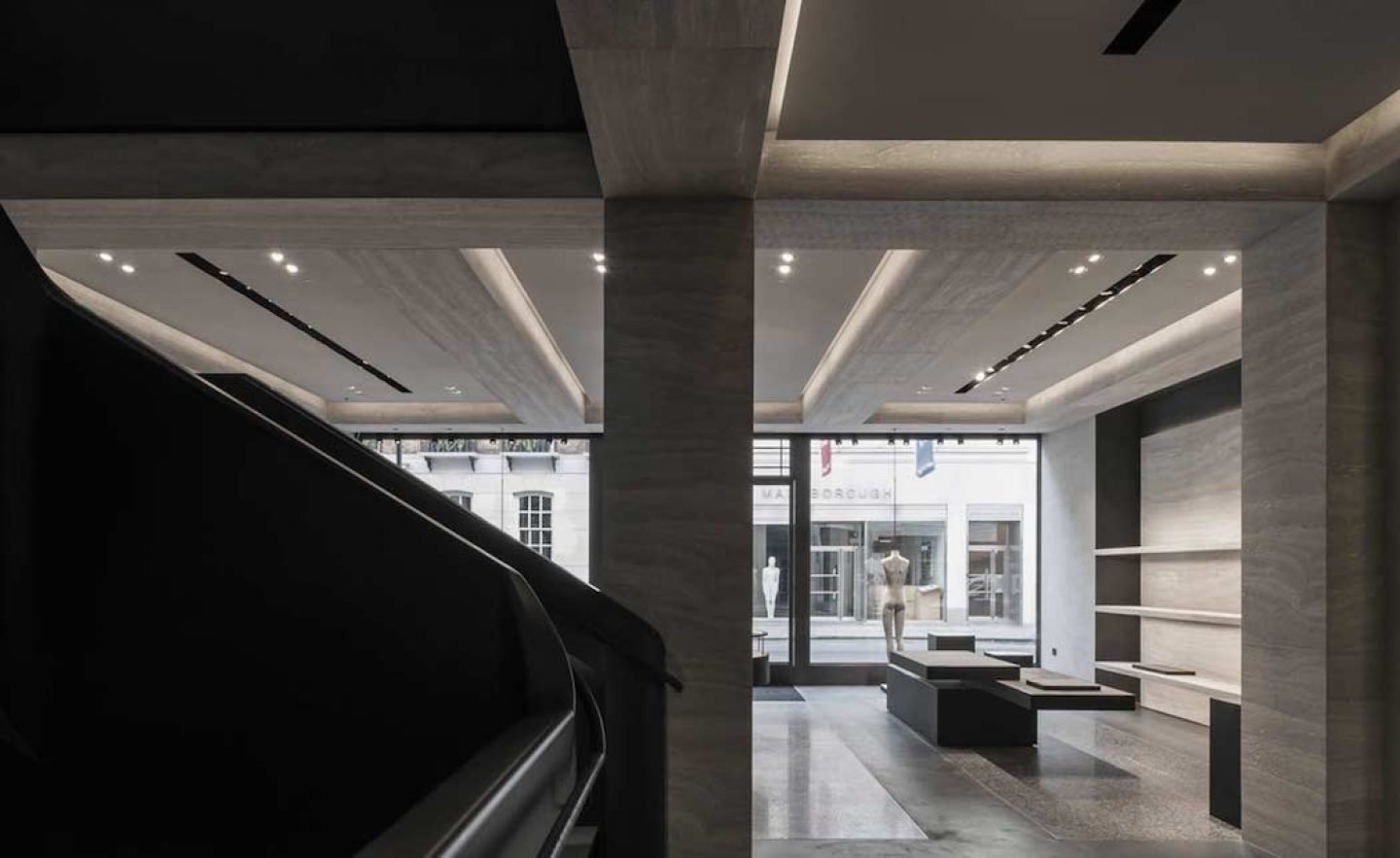
Belgian architects Vincent van Duysen were tasked with creating a flagship space for the New York label in London. Focussed on offsetting Wang’s trademark ‘industrial athletic’ style with van Duysen’s signature emphasis on material and craftsmanship. The luxurious three-floor emporium also encompasses custom and classic furniture, design, sculpture and contemporary art. Speaking of the project, Vincent van Duysen states, “Starting from the existing building structure, interior design concept creates a powerful and sober space defined by primary architectural elements: a strict grid of columns, beams, and in-wall niches. In opposition, elegant, curved and continuous chrome tubes define part of the display fixtures in combination with a composition of black platforms with rounded edges and tactile surfaces.”
43-44 Albemarle St, London W1S 4JJ, United Kingdom
Mon – Sat 11:00 – 19:00, Sun 12:00 – 18:00
Designed by Vincent van Duysen in 2014-2015
9. ACNE STUDIOS BY BOZARTHFORNELL, PARIS
All images © Bozarthfornell Architects
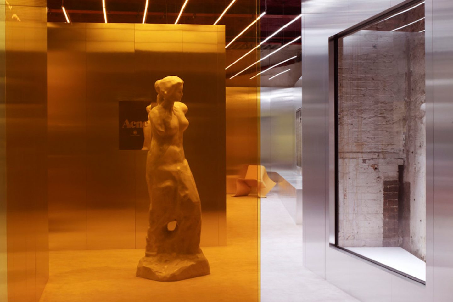
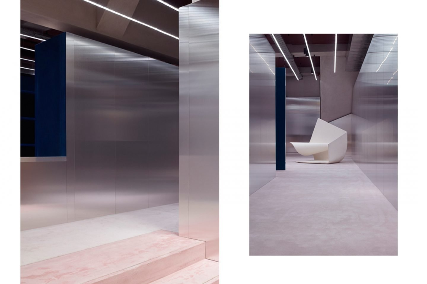
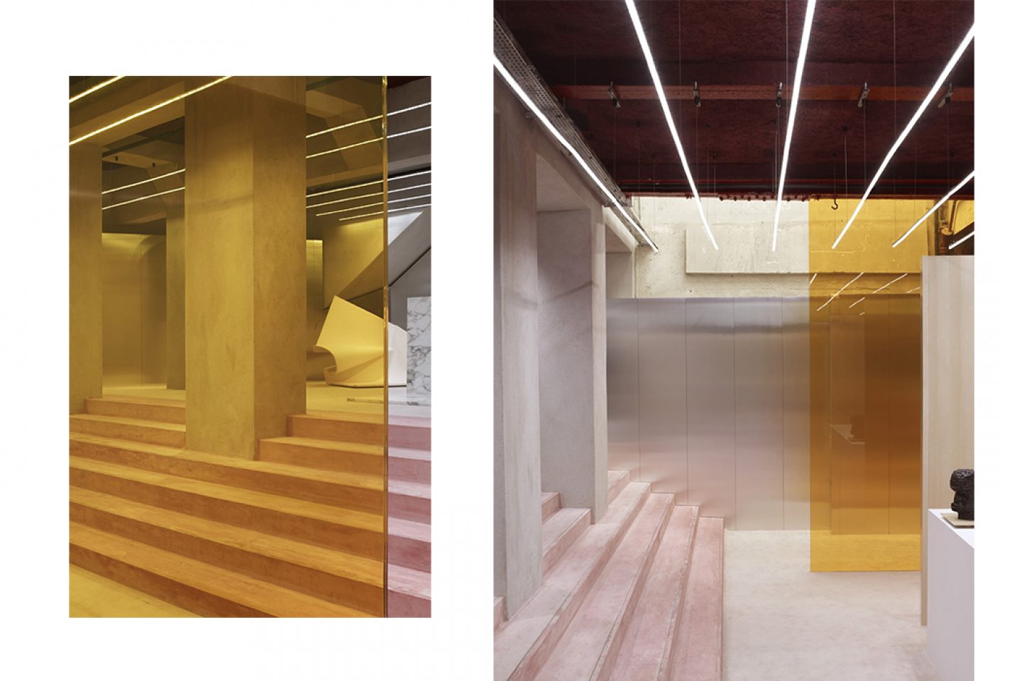
Stockholm-based Bozarthfornell Architects is the studio responsible for ensuring the interiors housing Jon Johannsen’s cult brand reflect their local surroundings. For the Rue Froissart store in Paris, situated in a former metal shop lacking in natural light, Bozarthfornell installed a series of calm fluorescent lights and an amber-colored glass wall which captures the attention of passers-by. Speaking of the intention behind the multi-functional space, the architects say, “The layout of the partitions invite the customer on an almost endless journey through the scattered spaces, which materialize in a different way depending your first direction at the point of entry.”
3 Rue Froissart, Paris, 75003 Paris-3E-Arrondissement, France
Mon – Sat 11:00 – 19:30
Designed by Bozarthfornell Architects in 2011
_
10. DAMIR DOMA ST HONORE BY MARCH STUDIO
All images © courtesy of Damir Doma / Mathilda Clahr
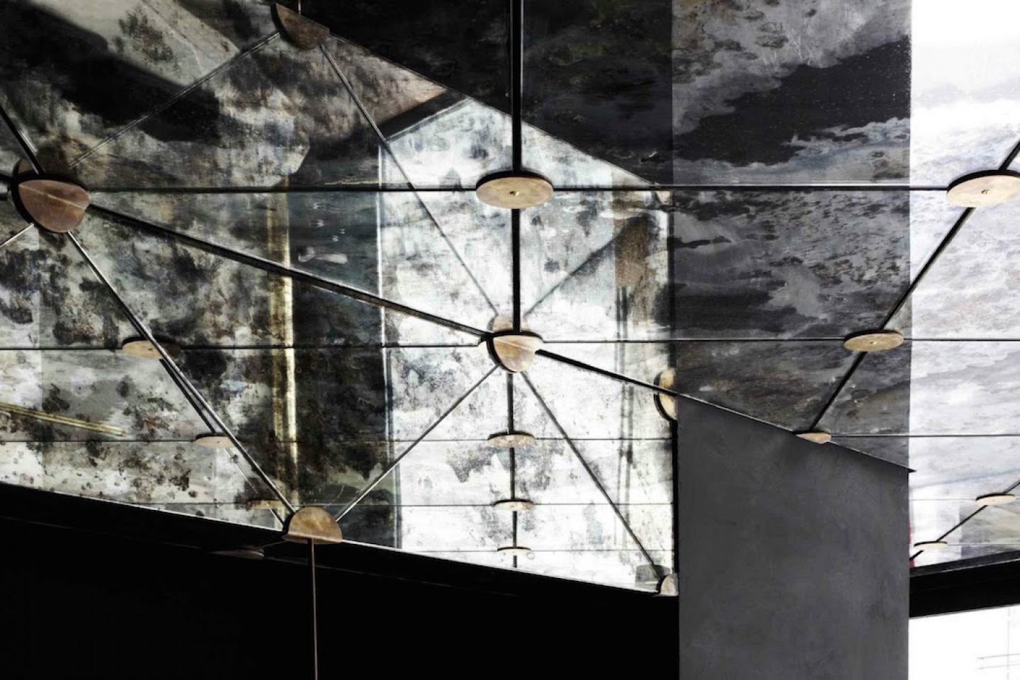
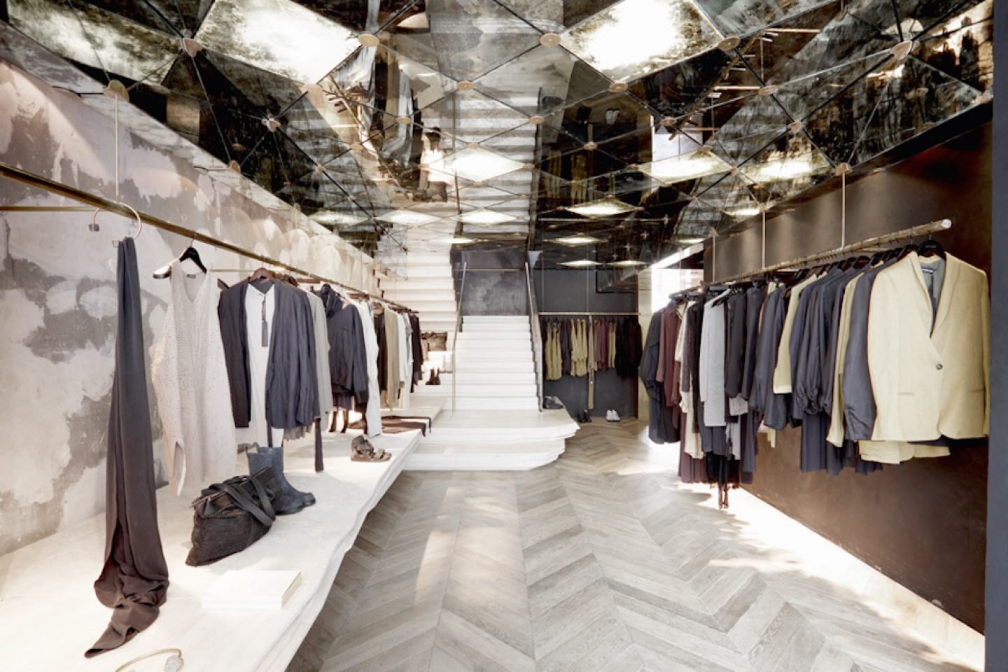
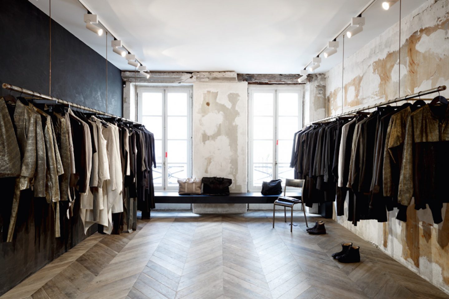
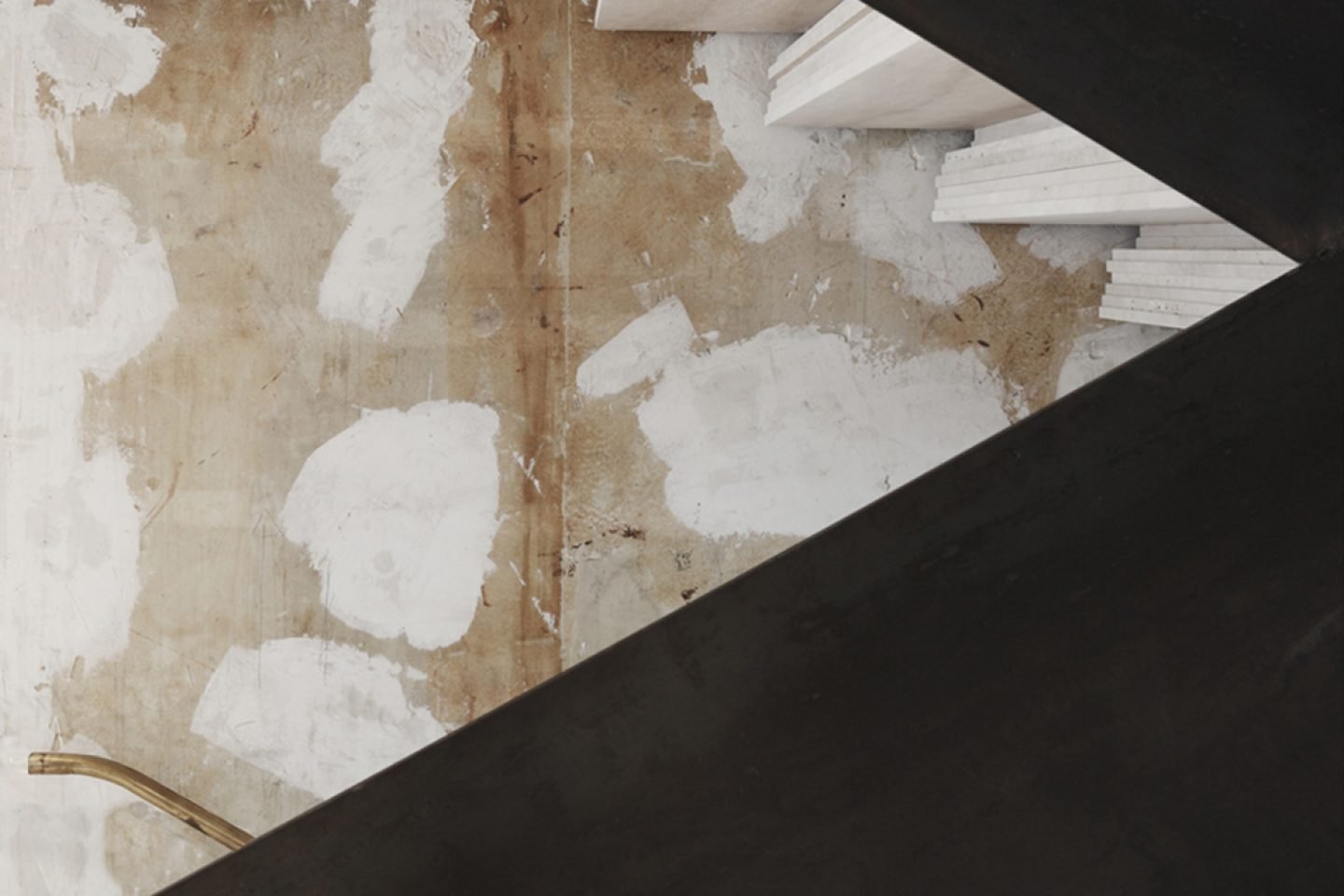
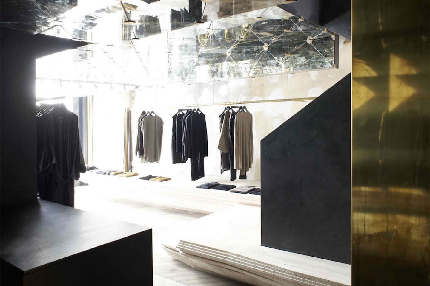
Melbourne practice March Studio fitted our designer Damir Doma’s Rue St Honore space in a raw yet elegant style. Layers of texture, steel and mirrors connect the herringbone floorboards with the centerpiece staircase, formed from slab of stone. Each element comes together to create an extension of the cult label’s slick and mysterious design ethos.
54 Rue du Faubourg Saint-Honoré, 75008 Paris, France
Mon – Sat: 11:00 – 19:00
Designed by March Studio in 2012
