The Architecture Of Peter Haimerl
- Name
- Peter Haimerl
- Images
- Clemens Poloczek
- Words
- IGNANT magazine
The German architect Peter Haimerl is noteworthy for his progressive, striking designs that seamlessly balance the historic and the modern.
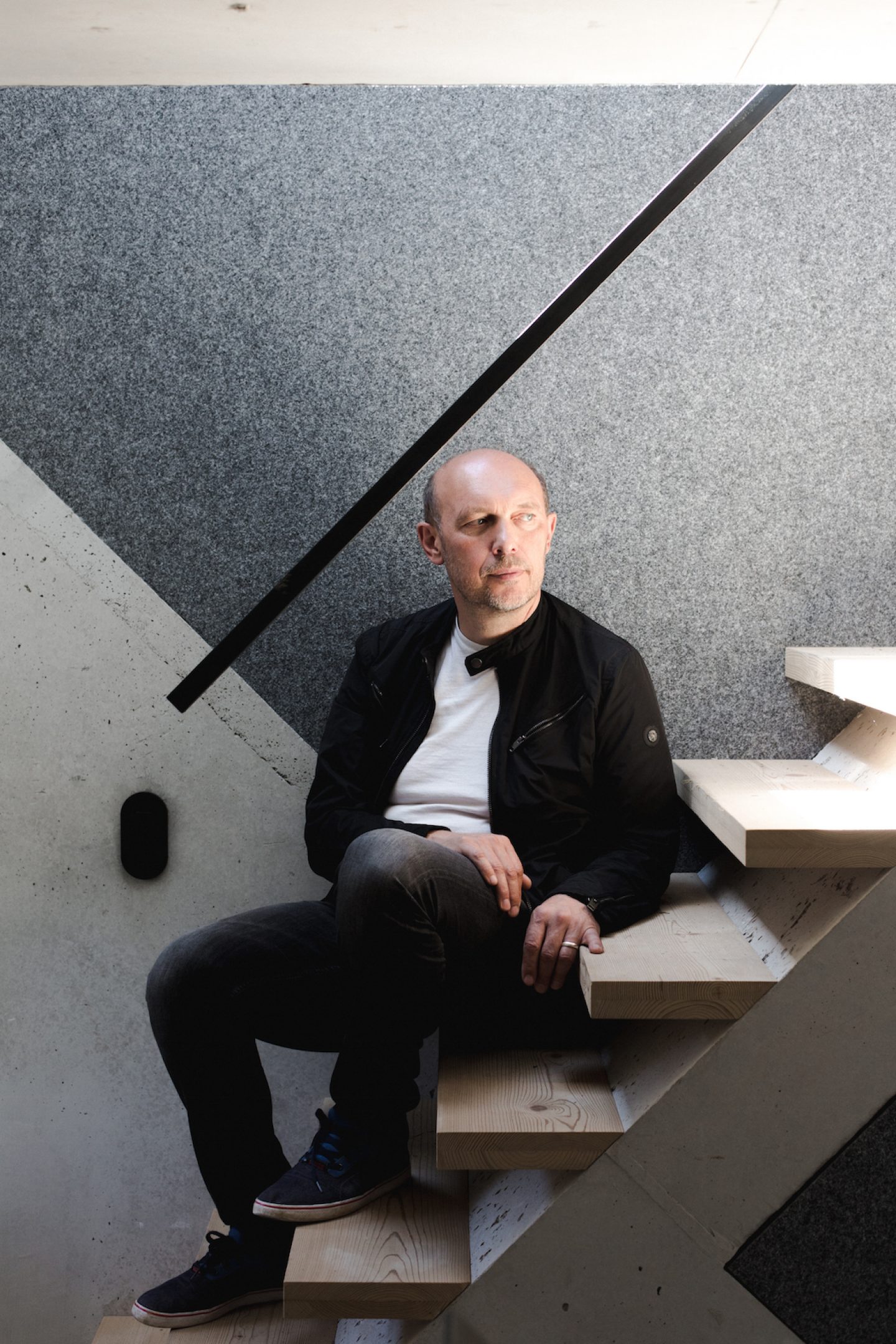
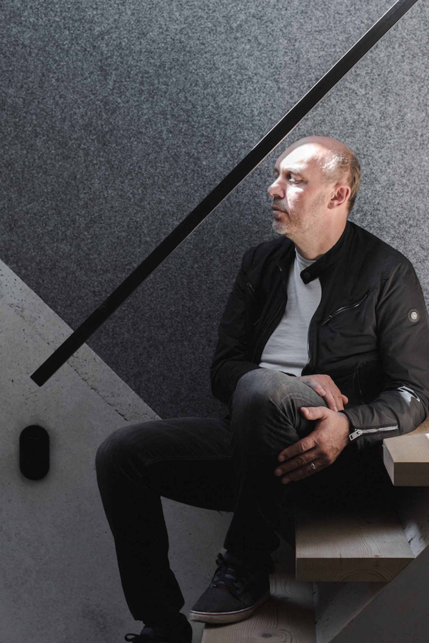
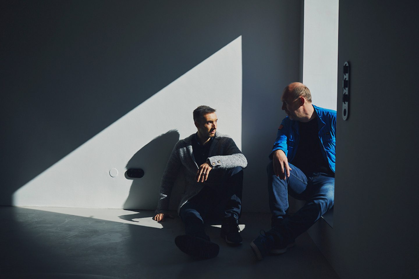
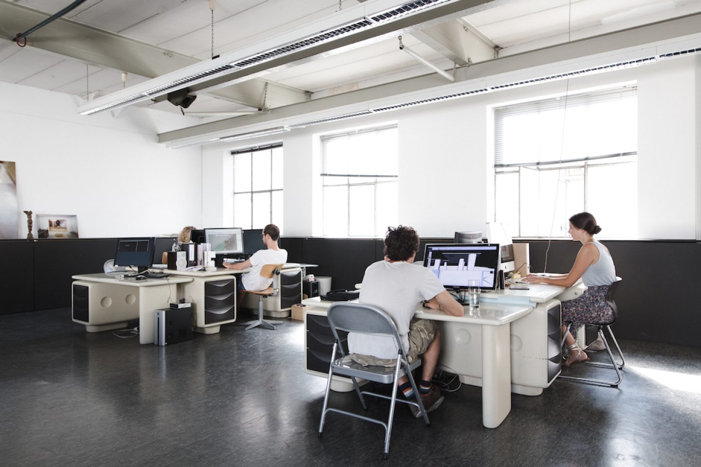
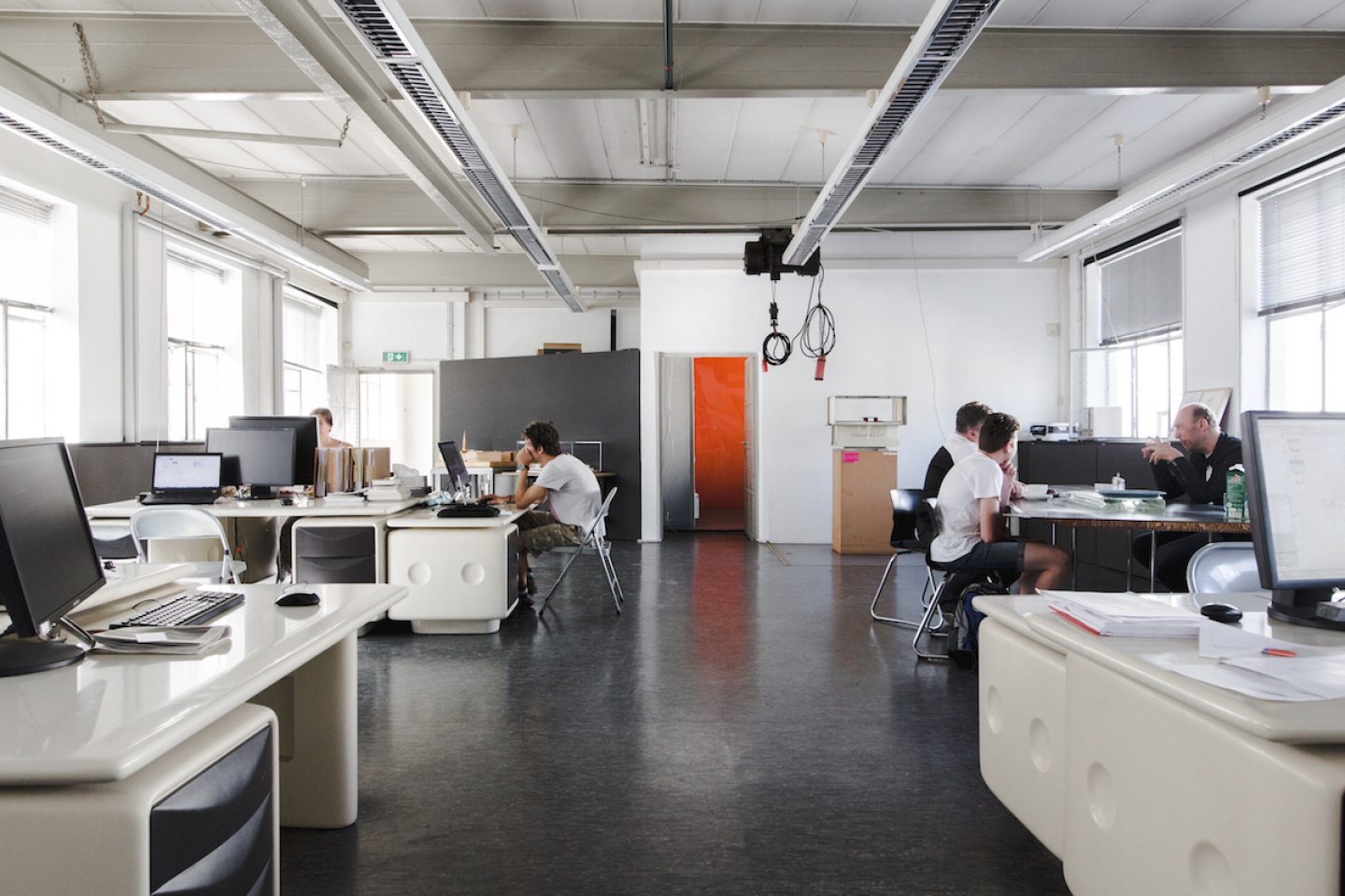
One of his most intriguing projects, Verweile doch! (Stay a while!) lured us down to Munich, where we met with Haimerl at his office before paying a visit to the renovated farmhouse. There, the renowned architect shared his take on the preservation of history, client compromise and the courage required to push forward urban development.
Please introduce the project ‘Verweile doch!’ (Stay a while!)
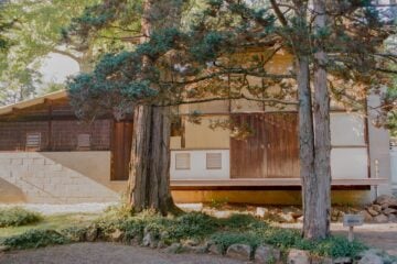
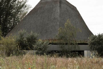
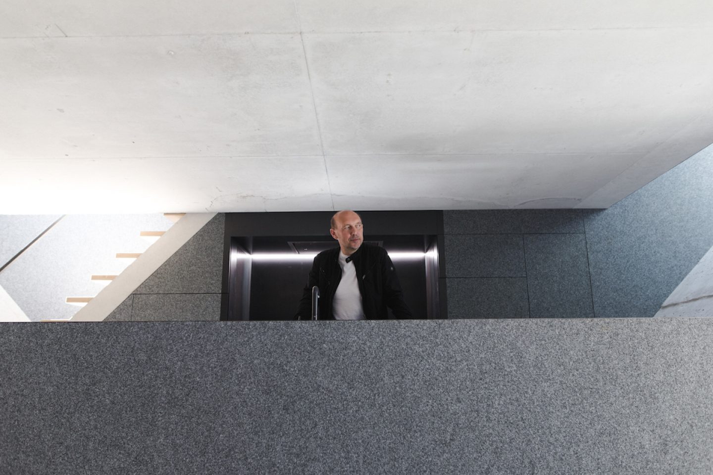
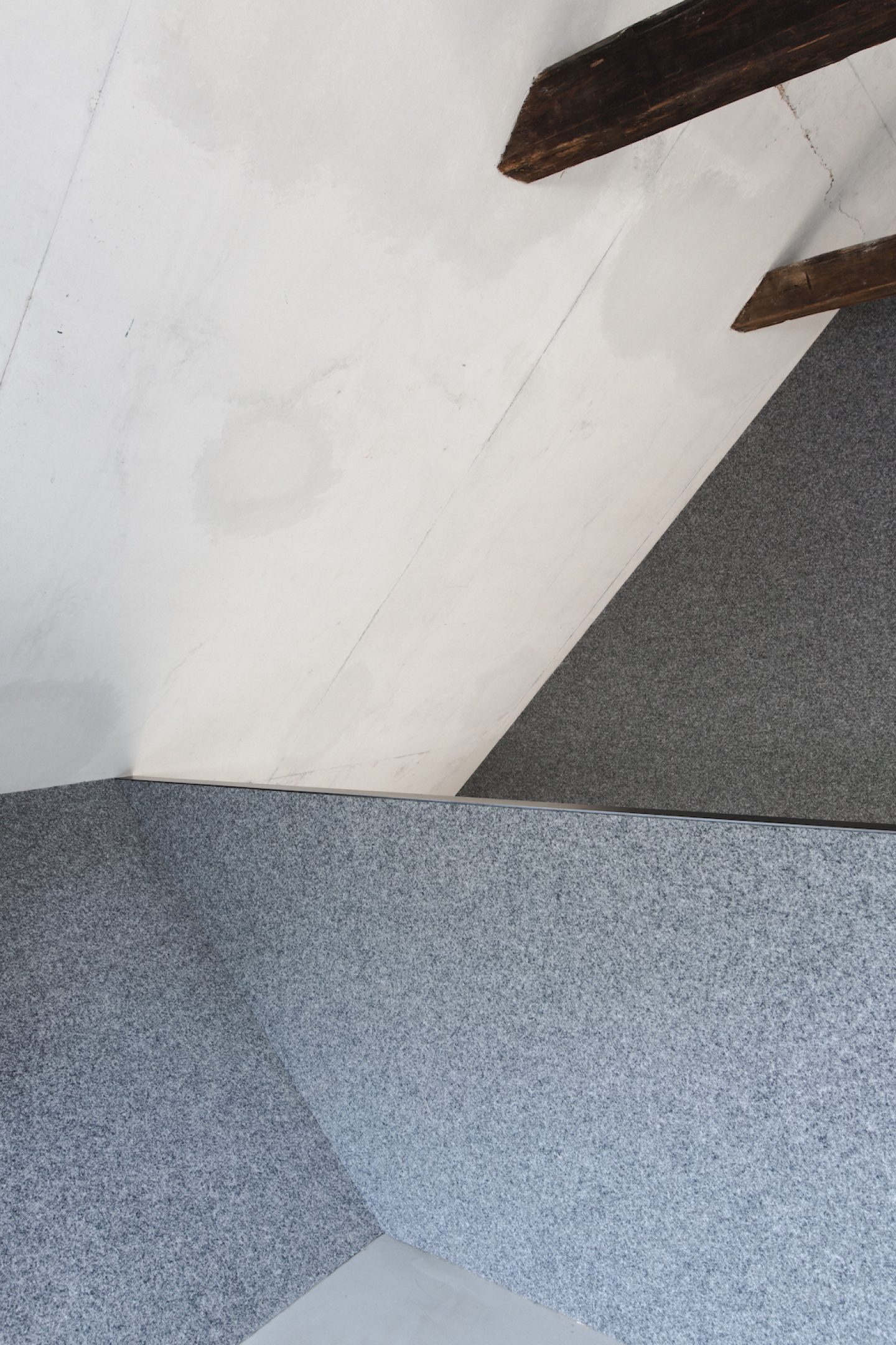
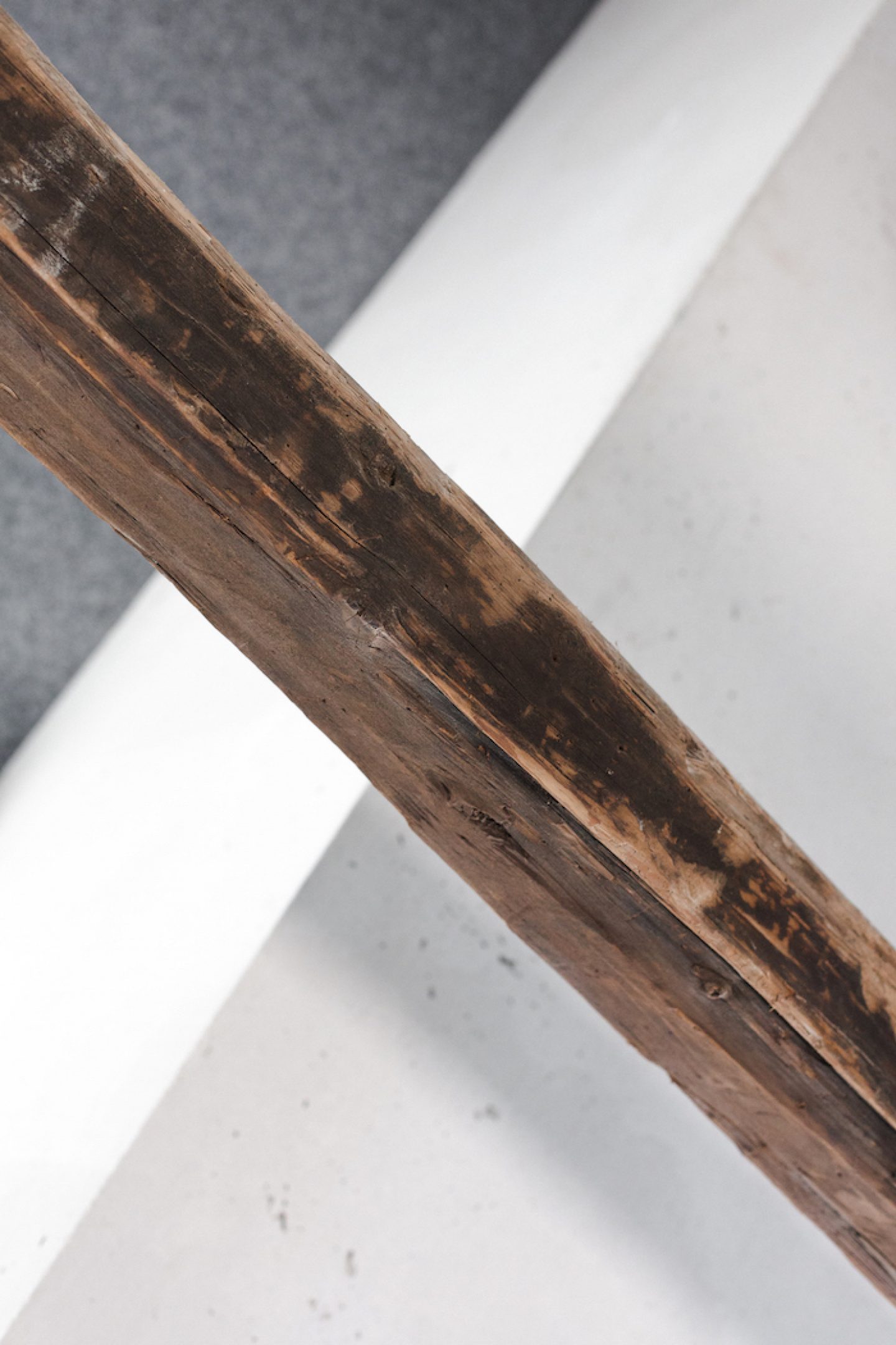
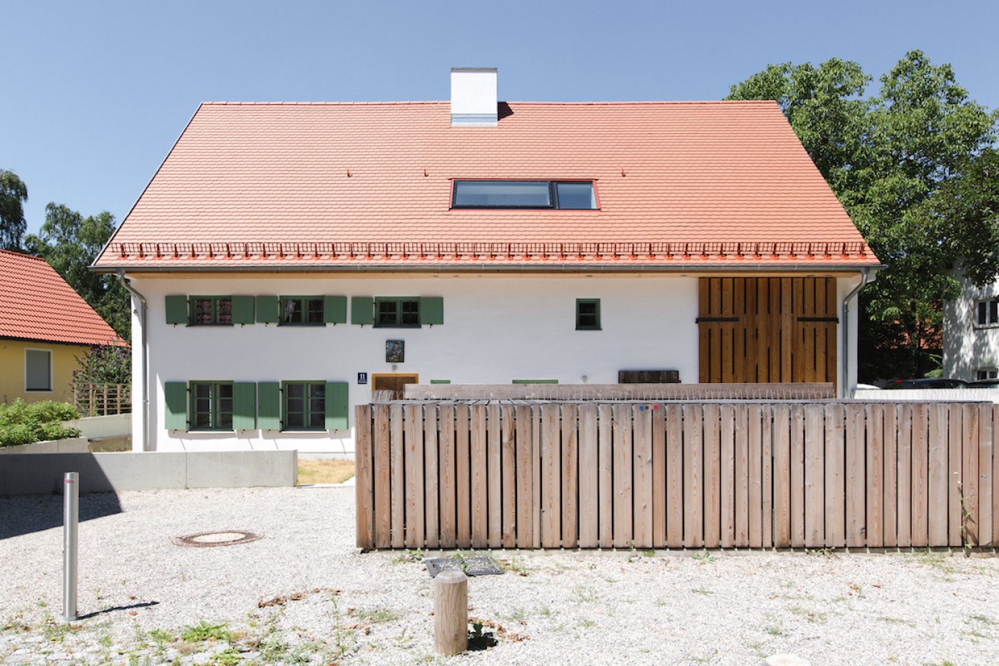
Yes, so this conversion of an old farmhouse in Riem close to Munich, is the last more or less preserved farmhouse in this area and it is a listed building. The house had stood empty for around 30 years, and the last occupant had tried to restore it using non-standard means, and then Stefan F. Höglmaier from Euroboden acquired it, as he’d seen our previous work, and thought that we might be able to transform this building too. It was a really exciting project for us, as the house is archetypal of farmhouses in the countryside surrounding Munich, with a 45 degree angled roof. Though hardly any historical features remained in the stable – everything had already been ripped out – only the living quarters had some historical substance left to them, such as door pieces, timbered walls, and many layers of color. Our job – and this was the main challenge of the renovation – was to take the historical features and amplify them. So to the house’s historical story using interventions with new components, so as to update it for modern times.
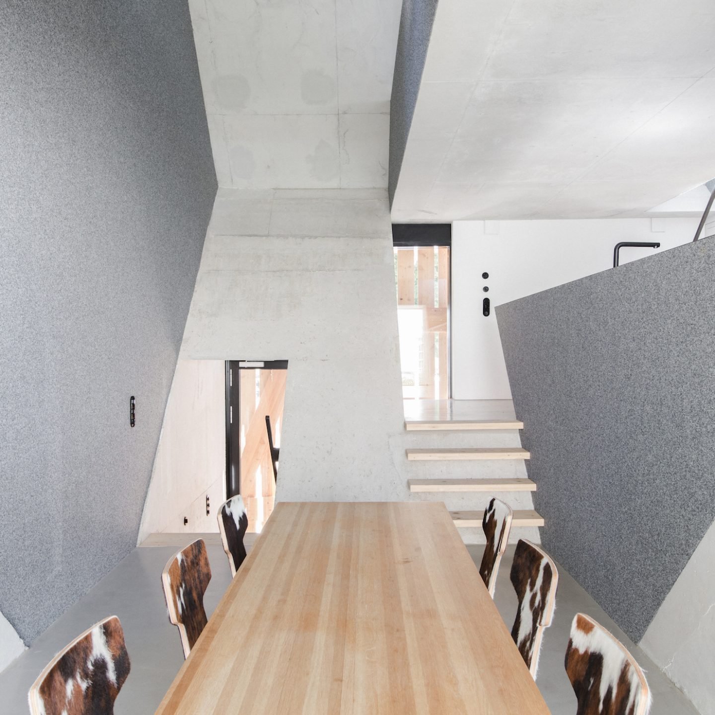
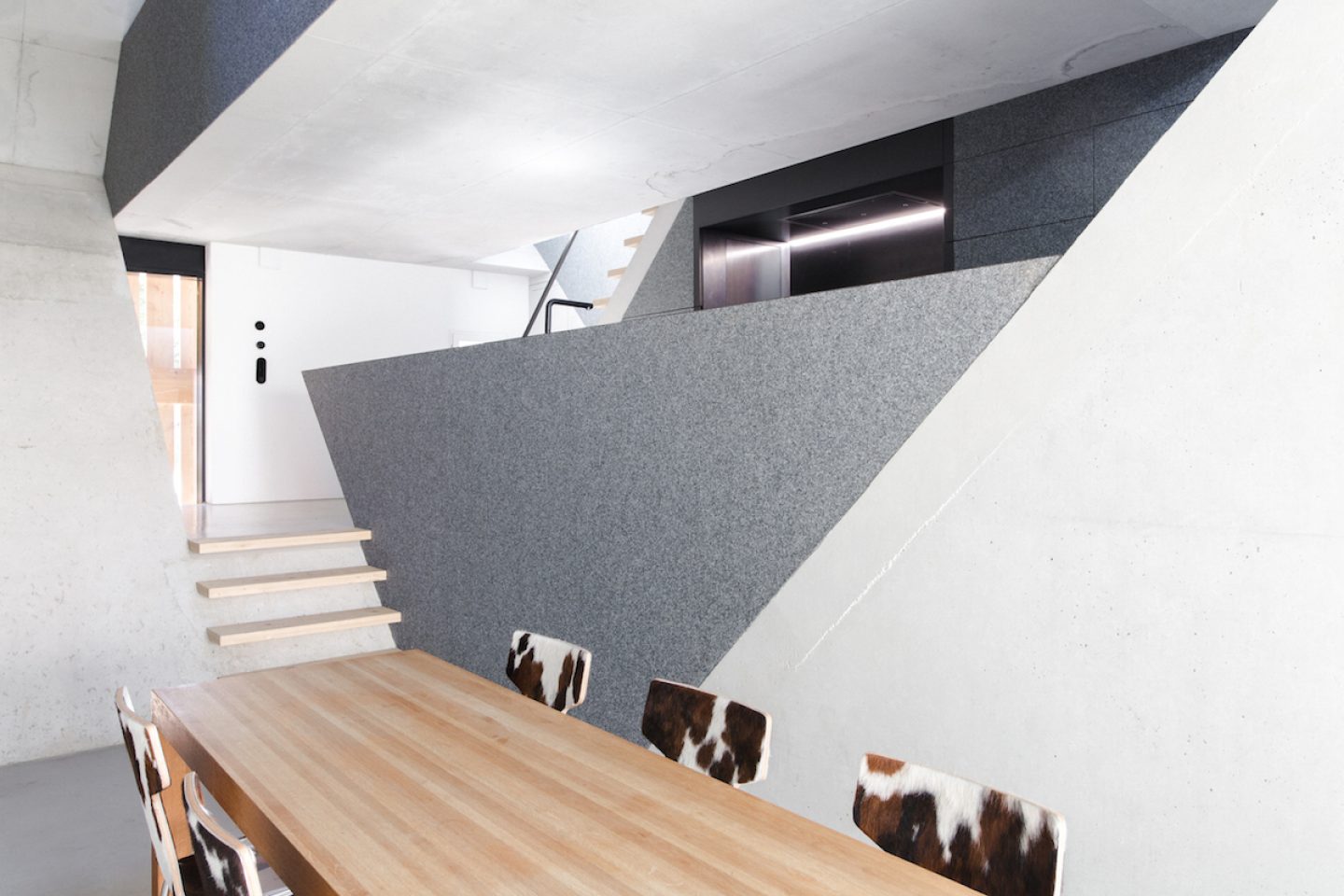
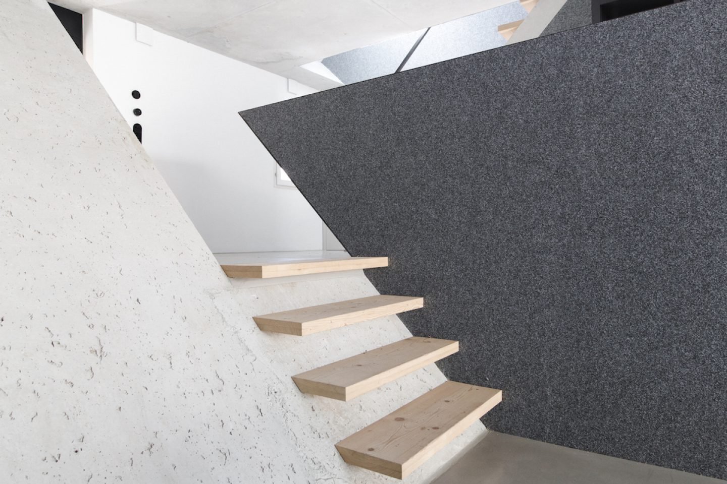
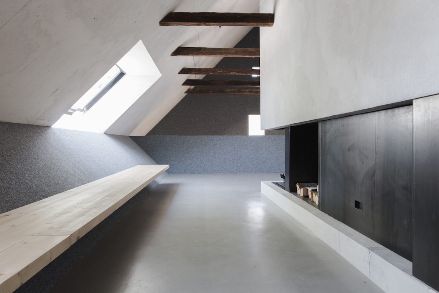
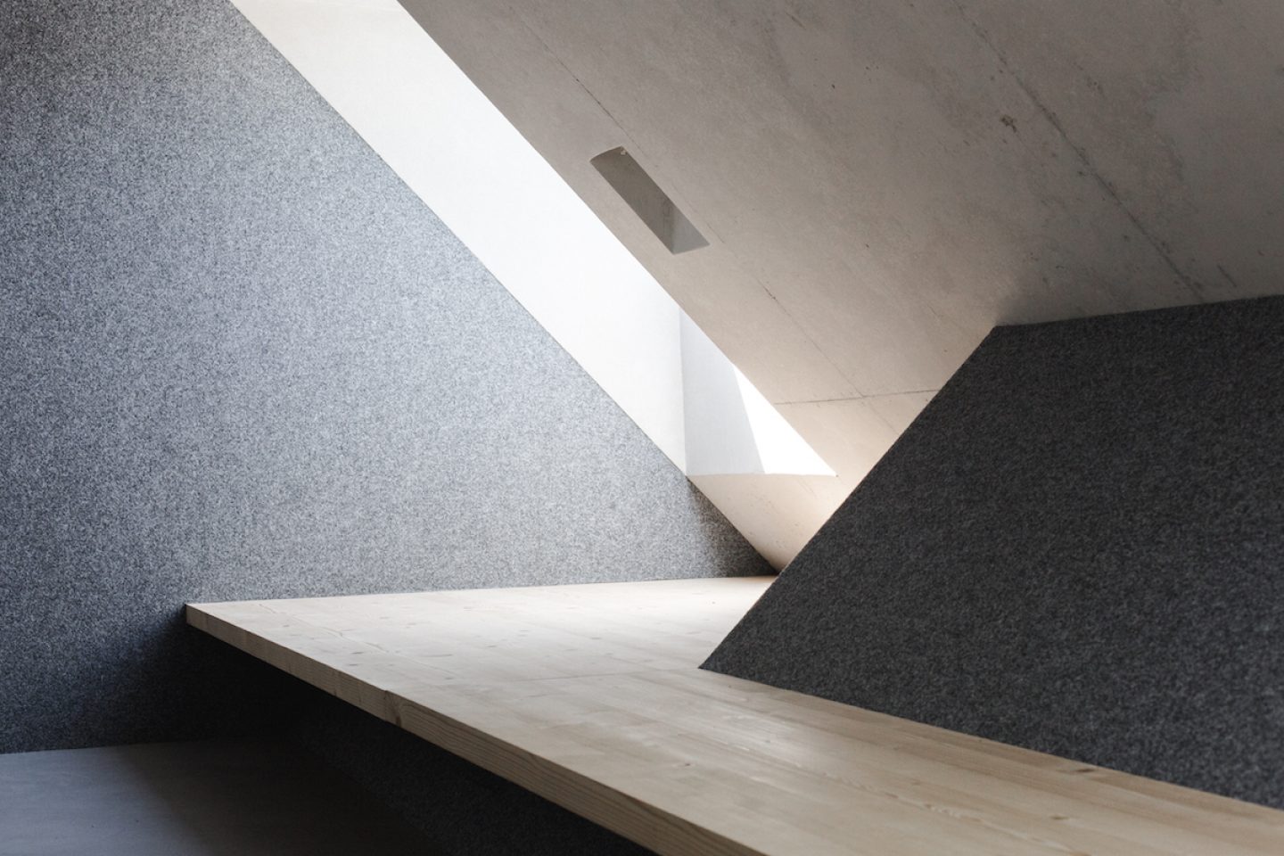
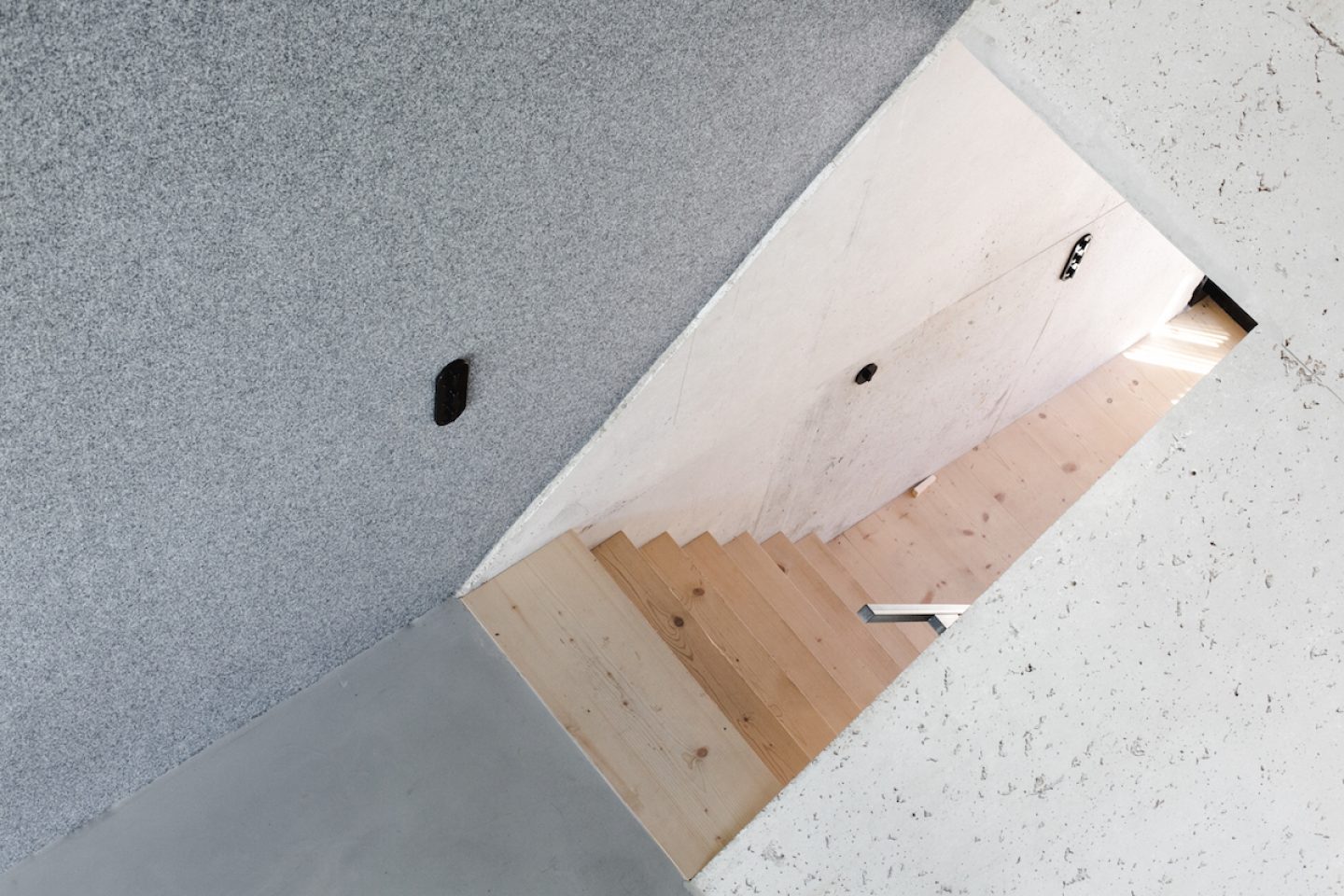
The building had a 45-degree angled roof which inspired me to the idea to mirror the roof downwards, creating a prism of sorts, and this prism is reflected all throughout the house. In the historic living areas, the lower sides of the prism fold upwards, so it stays intact. And in this way, two living spaces naturally separated out from each other, so we have a double house. The first home is more or less situated under the prism, and the second space is in the middle oft he prism. Just like that, this intervention, which tips a square to the side, created the framework for the restoration.
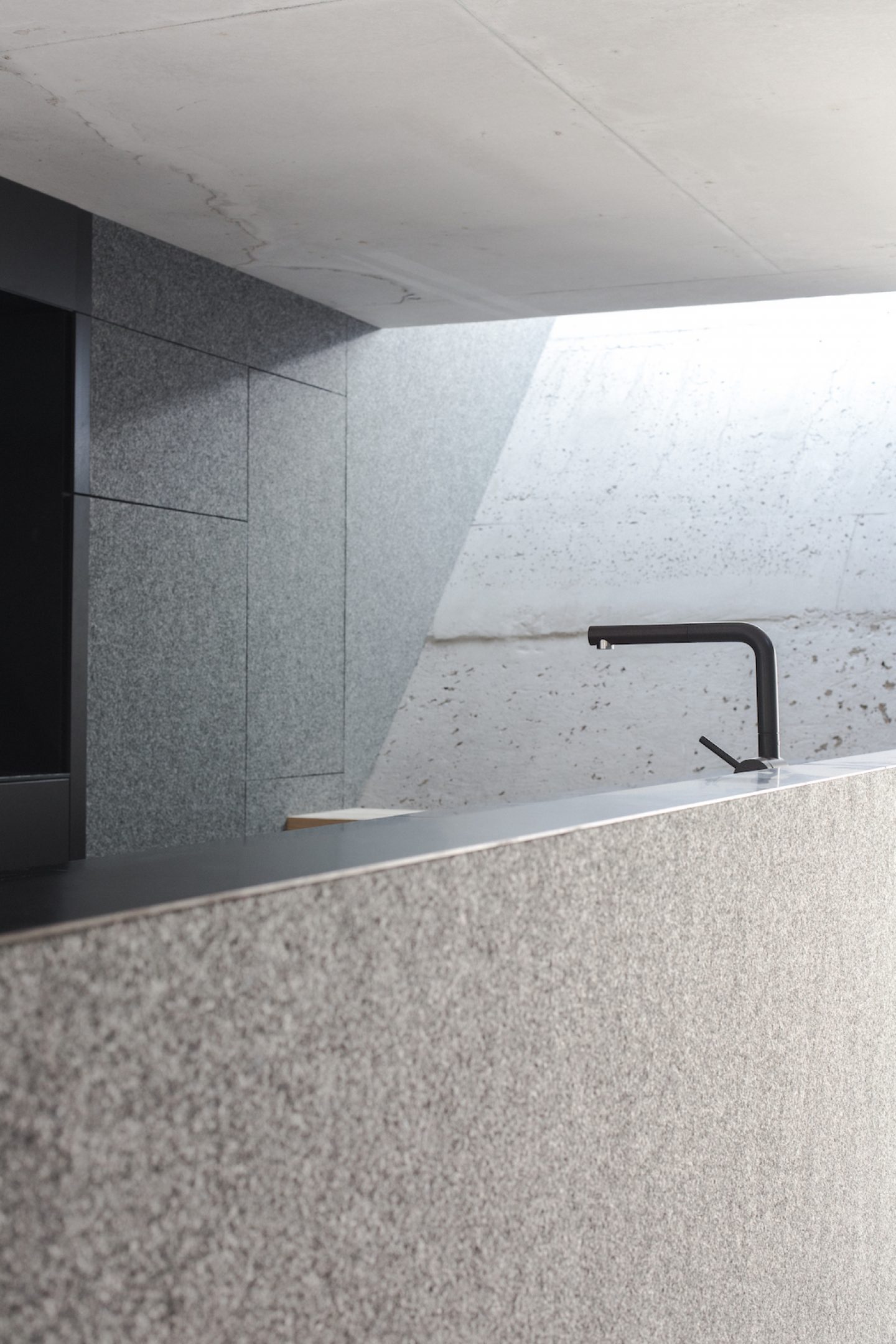
We tried to make this square on the west side completely visible, so that we can also have a very high spatial impression. So the ceiling is 8 meters high, which is not entirely unusual for a relatively small apartment, but on the other hand, those 8 meters allow us to install lower false ceilings. When you’re in the kitchen, for example, the space is just 2.10 m high, but there’s a direct connection to a seven meter high space, so that the experience is not overwhelming but rather offers an intriguing sense of space.
We were lucky that a chronicle of the building history already exists, dating back to 1705, which was either the first mention of the building or the date it was built. And then there’s simply a chronicle of the life of this farmhouse. It was nicknamed ‘Cobblerfarmer‘s house’ by the people as the farmland was very small and so the farmer needed to pick up work as a cobbler on the side. And this cobbling-farming business developed itself over the course of 200 years. After 200 years was up, they had approximately tripled the farmyard in size and also in terms of modern farming techniques.
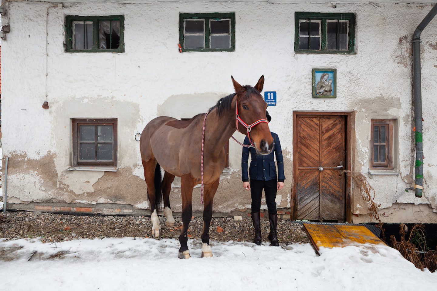
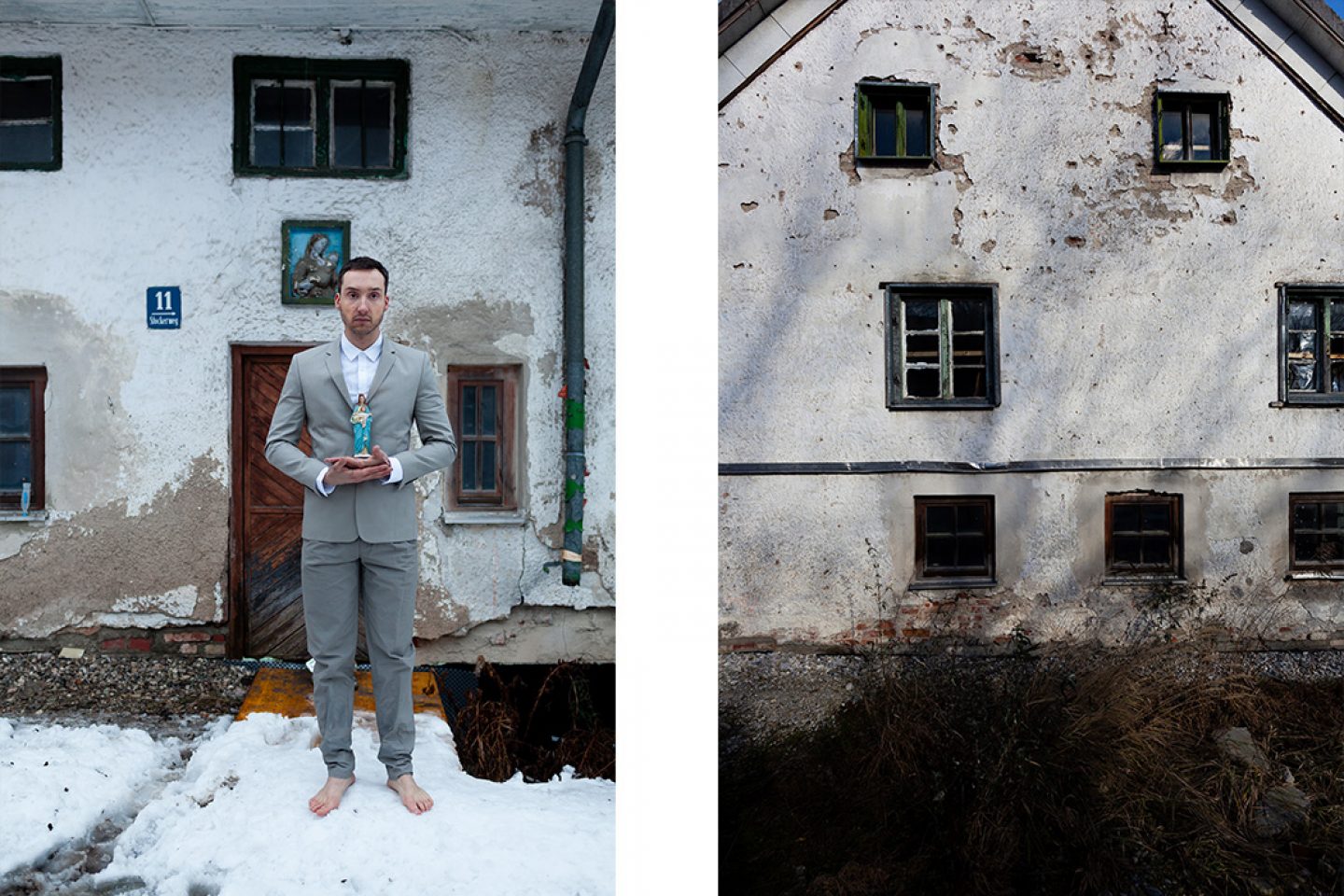
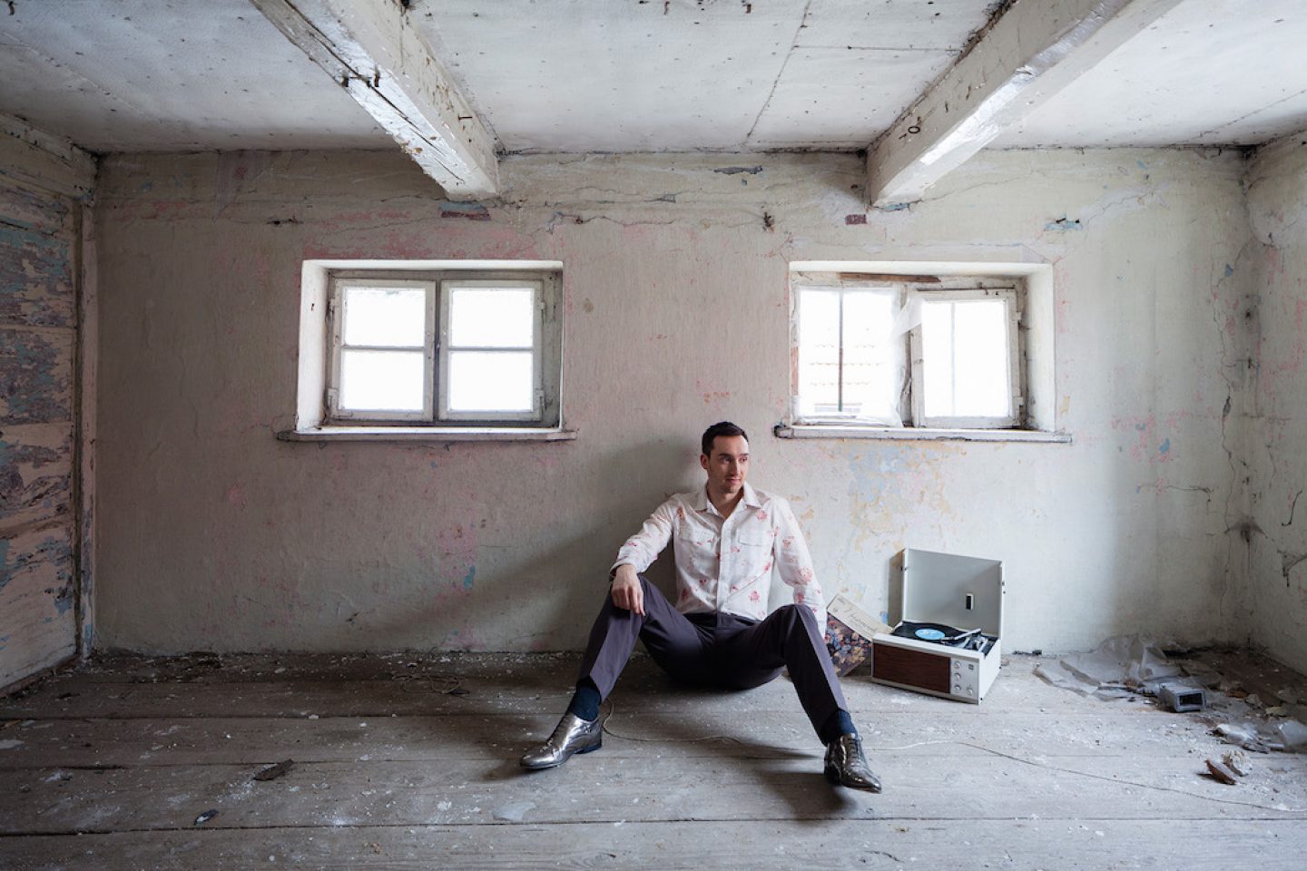
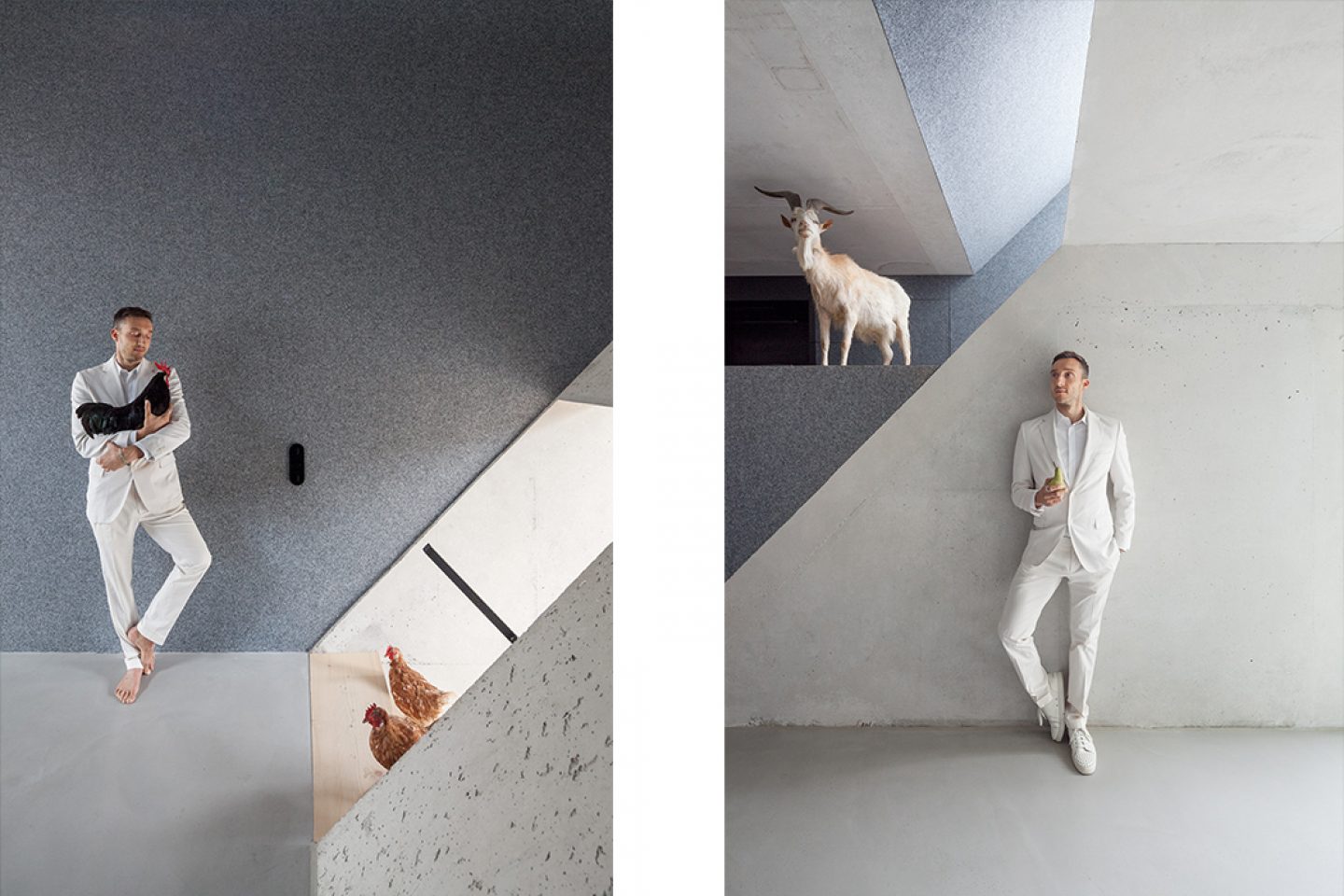
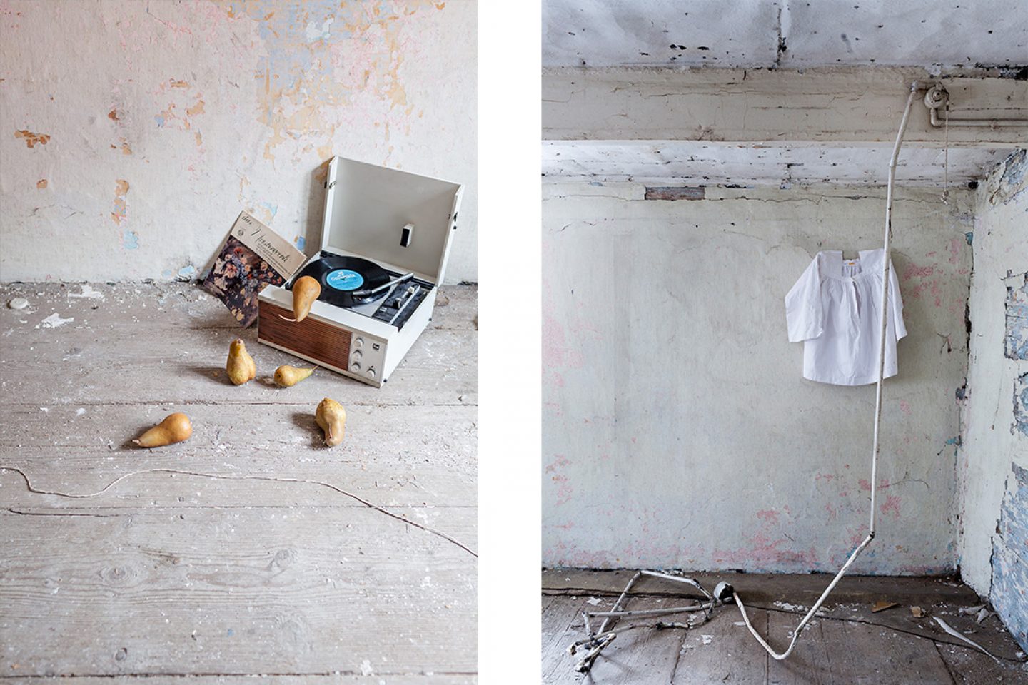
Due to urban expansion and development in the 60s, and a second conversion of the farmyard, land prices increased enormously. The farmer at the time found himself to be a millionaire, and I think he even had 30 racehorses! But at the same time, the guy was a very pious man, who walked barefoot to Altötting three times a year. The family at this time were very integrated into village life—they had a pear tree under which they played a gramophone. All sorts of stories like these were recorded, so we turned them into a kind of photo story. We often do this kind of thing to explain the historical context of a project better not only for outsiders, but also for ourselves.
I find it quite unusual to have this tradition and then these materials such as concrete or felt. What was the deciding factor in your choice of materials?
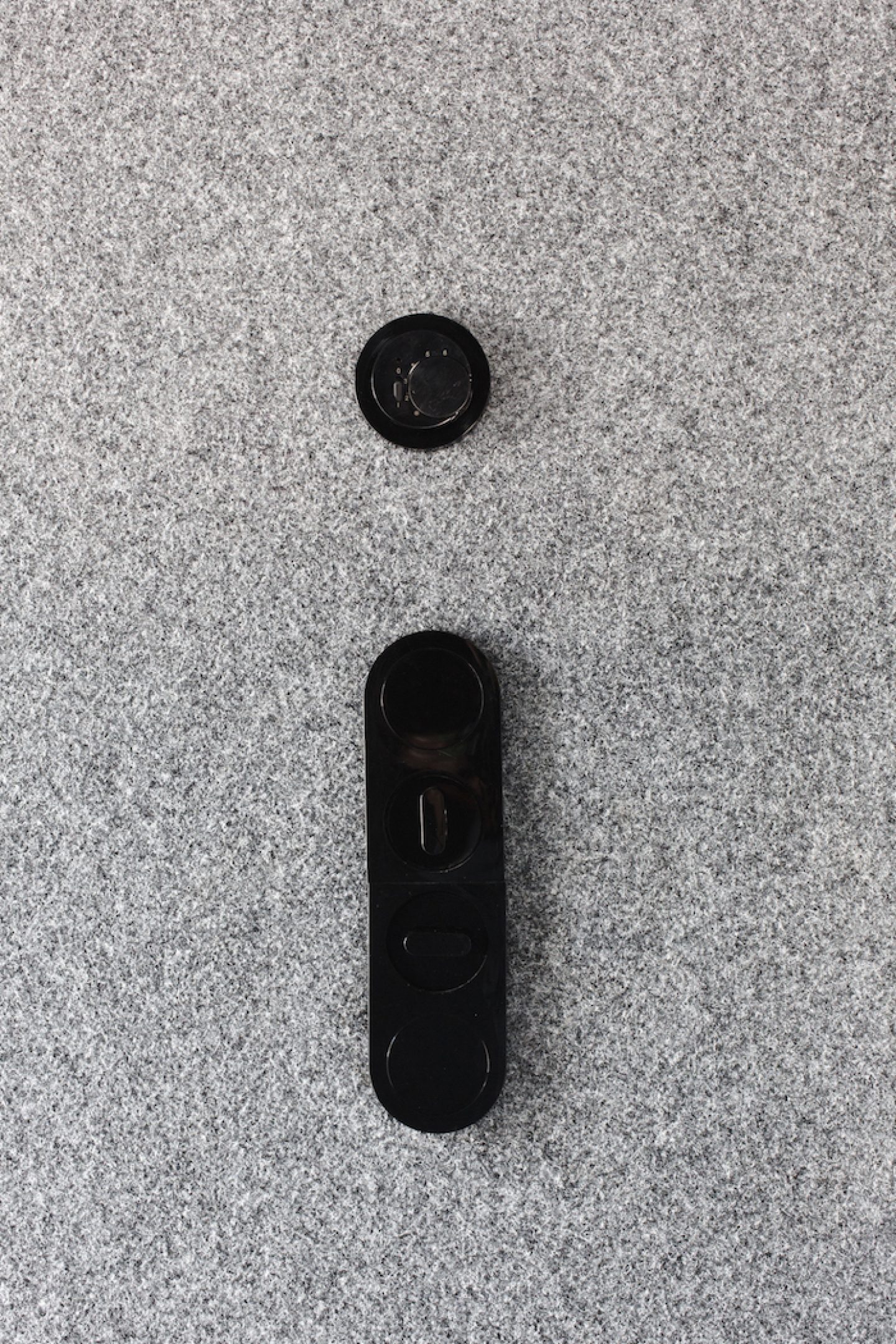
Well, we used concrete for the standard reasons: That’s to say, it’s a very high quality building material, without being gendered, so to speak. That’d be completely inappropriate. We wanted to reflect the tradition of the area, the farming lifestyle. Concrete is also very easy to deal with. And the second material, felt. reflects the original details of the building as it was first built, its warmths and these bright layered colours. Concrete provides a nice contrast to this, it brings out the historical elements well.
So there is already a contrast between the exterior and the interior elements of the building. What was the deciding factor in this?
So basically I really want to preserve as much of the building’s history as possible, but if it’s not naturally apparent, I don’t need to force it. So the building’s exterior now looks similar to what it used to, but the interior was completely gutted. I did not want people to look at it and think, “Ah, that’s great architecture, those are great proportions, that’s a great surface,” but instead “Aha, that was originally built so well.” And actually, we could be very flexible with the building due to the clarity surrounding the project, and the building’s highly transformable nature.
Last Image © Julian Baumann for Euroboden
How did that work for the owner? Were you given complete artistic freedom, or how did the process unfold?
It must be said that Stefan F. Höglmaier is a dream client of sorts. He allowed me a lot of freedom on one hand, but on the other he intervened very strongly in terms of usability and spatial division. But always on an architectural level, which is really helpful for everyone involved in the project.
And what about this pile of dung outside?
Oh yes, that’s a personal fun touch as it reminds me of being a child, growing up in a rural area, where piles of dung were very important for farmers. It somehow represented prosperity: The more crap, the more the cows have to eat. A small pile of dung meant things weren’t going so well. I really like this idea, and secondly, the dung pile has to be replenished, so taken down to the field when it’s empty, and in this way it becomes a kind of motif in and of itself.
"A small pile of dung meant things weren’t going so well."
I’d like to turn to the art project that was created to explore the transformation of the Cobblerfarmer‘s house. (2015)
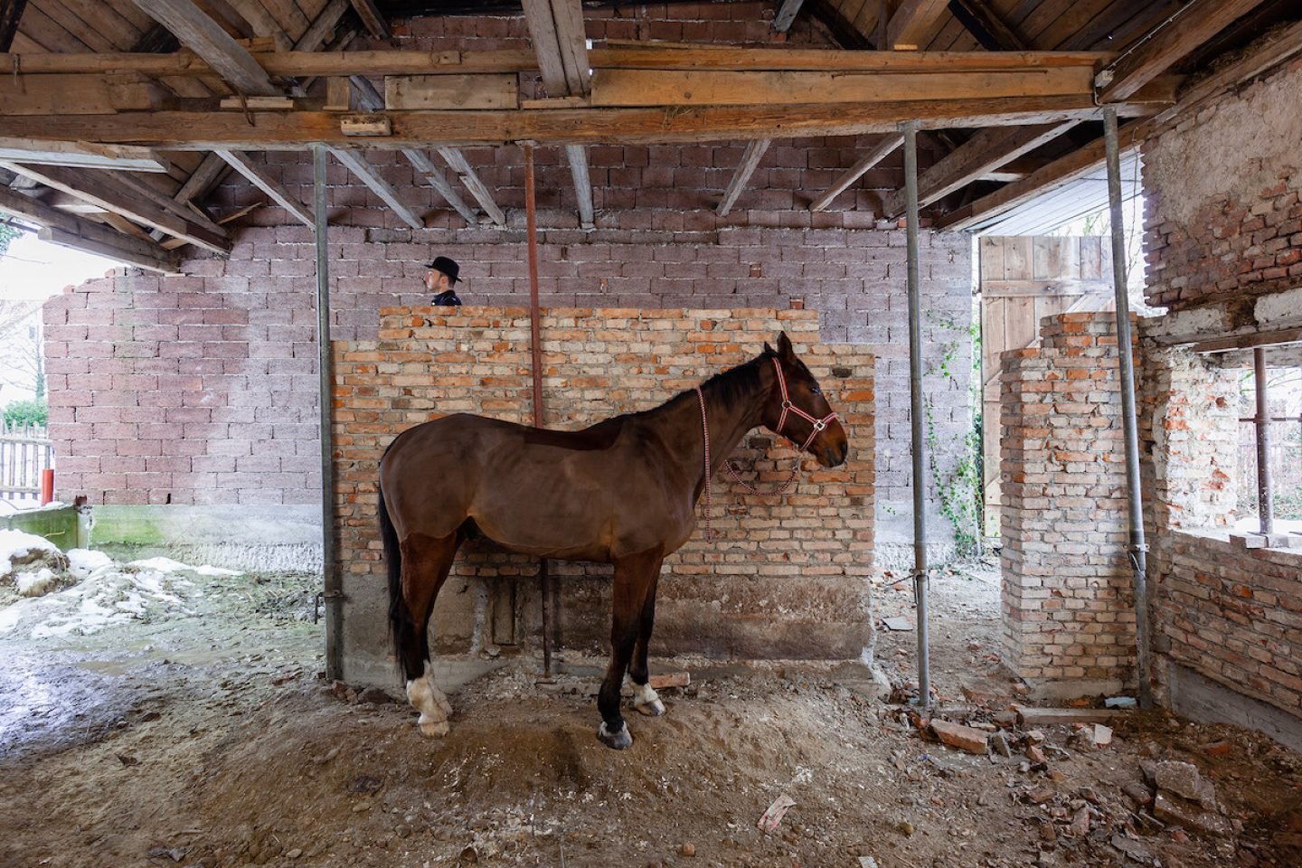
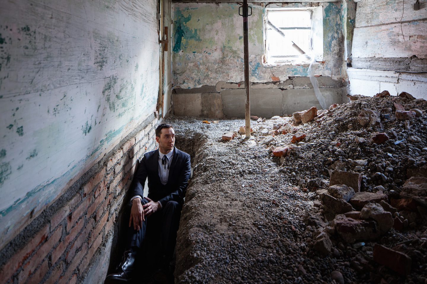
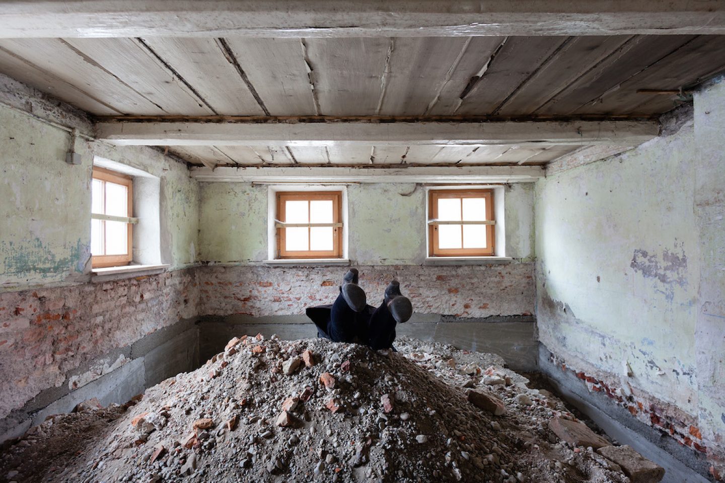
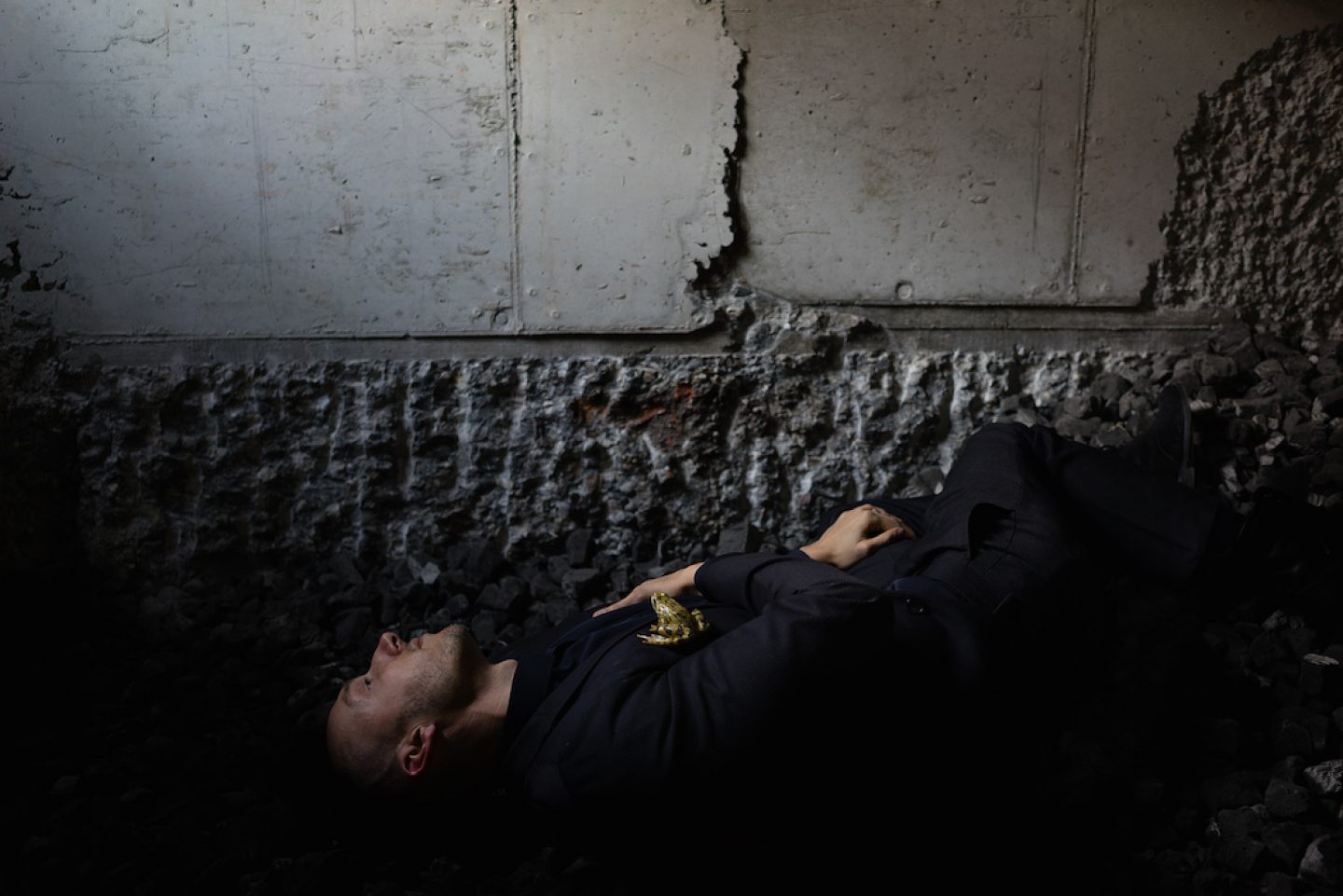
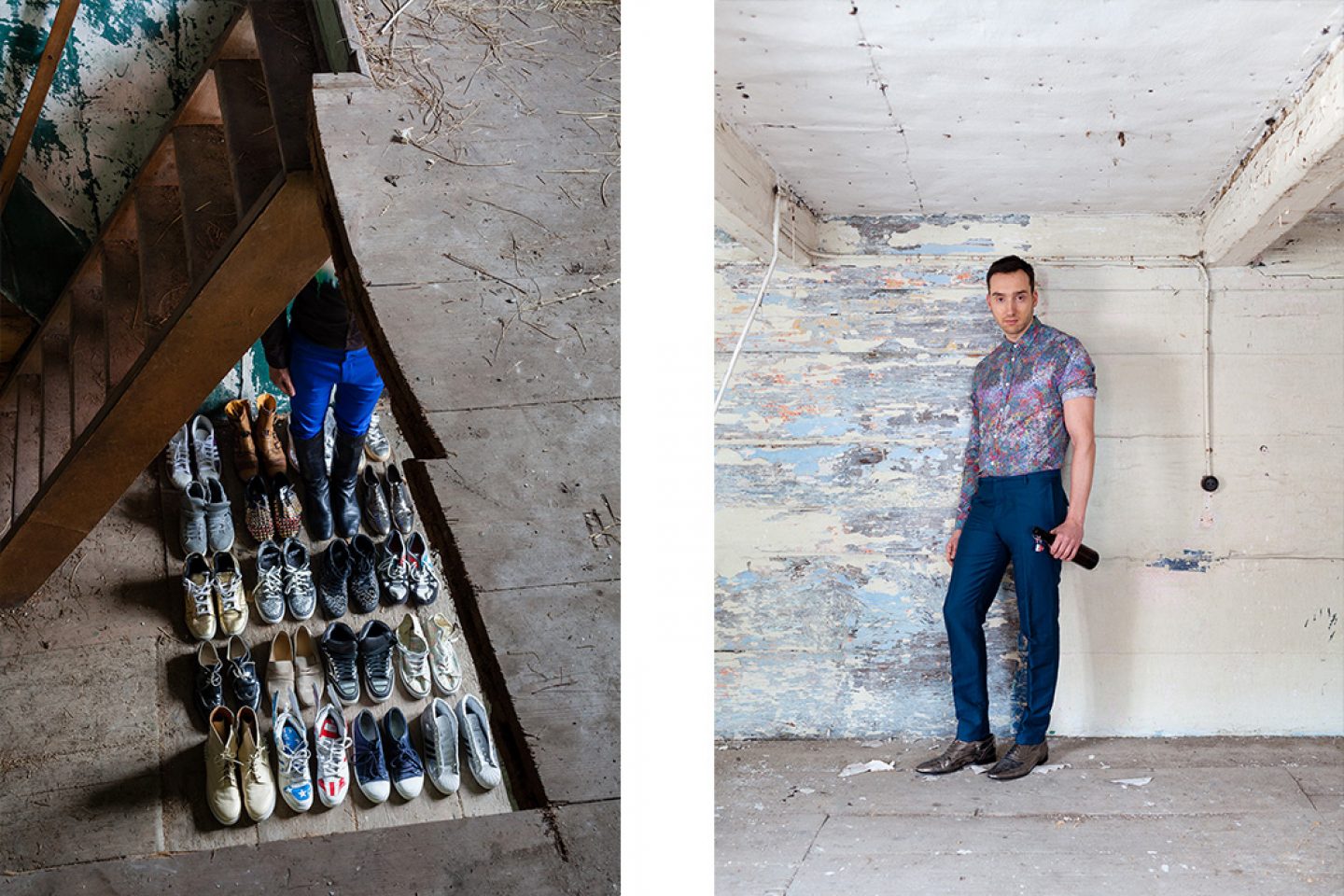
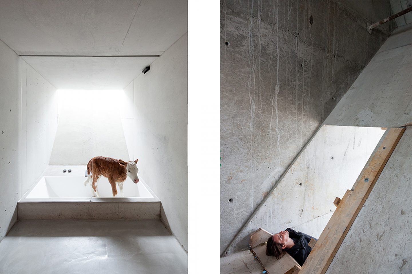
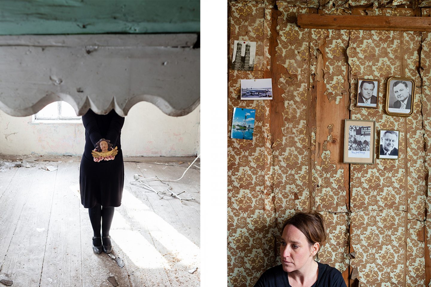
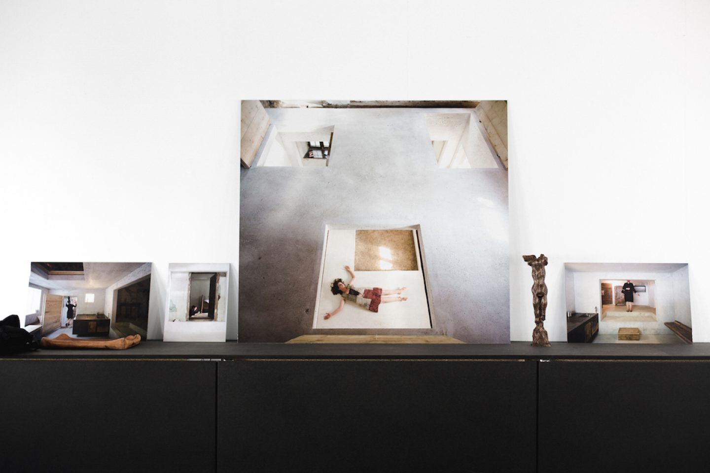
This was created in collaboration with the artist duo beierle.goerlich. Taking the historical cobbler-farmer as a motif, the current cobbler-farmer is Stefan Höglmeier from the company Euroboden – he’s the owner who initiated everything. This art project tells the story of the cobbler-farmer over the centuries. In Bavaria, faith and traditional beliefs are very deeply rooted. People lived their lives, then they usually go to purgatory, and then if they confessed their sins they usually went to heaven. These three phases are represented in this series of photographs.
There are scenes which show a scaffold, or the moment when the cobbler-farmer moves to heaven, or is hanging on a rope, all of which recall a Bavarian church painting. The purgatory phase symbolises the stage of construction for us: raw, unfinished and hard. Then there’s the phase where the house has been completed – in theory, transformed into a heavenly state – and here the cobbler-farmer resurfaces in a white suit. He has his cattle and his goats with him, so it’s an idyll for a farmer – only he has turned into a calf. This story ties in nicely to the architecture, which is perhaps the most special part. When we think of the house now, we don’t only think of its geometric shapes or furniture or surfaces. Instead, it too has become a pure work of art.
All images © Peter Haimerl / Jutta Görlich / Edward Beierle
Would you describe yourself as someone who is very attached to their home? Looking at your portfolio, your projects are located all over the world, yet something keeps drawing you back to Bavaria, to its traditions. What kind of significance does this region hold for you?
I’m completely of the opinion that architecture must be fundamentally connected to a place. I’m completely of the opinion that architecture must be fundamentally connected to a place. The classic Swiss approach would be that you simply work with the materials and push the project forward in this way. I don’t think this is a bad approach, but actually I think it’s much more interesting to account for the character of a place, an area of land or a city. I think it’s important to incorporate the spirit of the, say, citizens or industry of a place if you want to create something modern. I think it’s important to incorporate the spirit of the, say, citizens or industry of a place if you want to create something modern. Of course, you can’t just create something that’s totally bound to a location or an epoch, however.
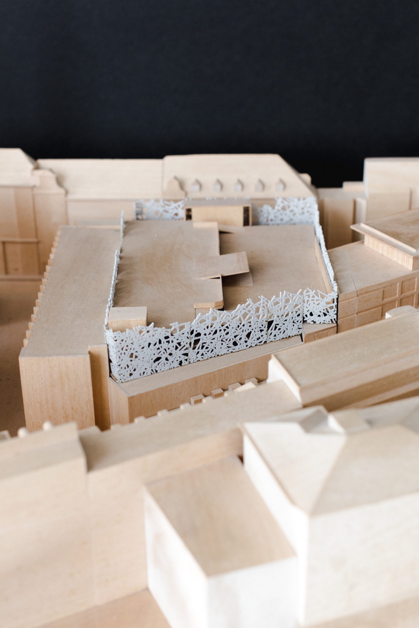
But then on the contrary we have the example of the Salvartor Car Park, where you can’t really incorporate tradition. The car park is 100% traditional, it’s actually one of my most traditional projects.
It sounds like the carpark presented a special challenge. Do you have other projects in mind where you say, I’d like to continue in the same direction? Or are there any particular directions you’d like to take upcoming projects in?
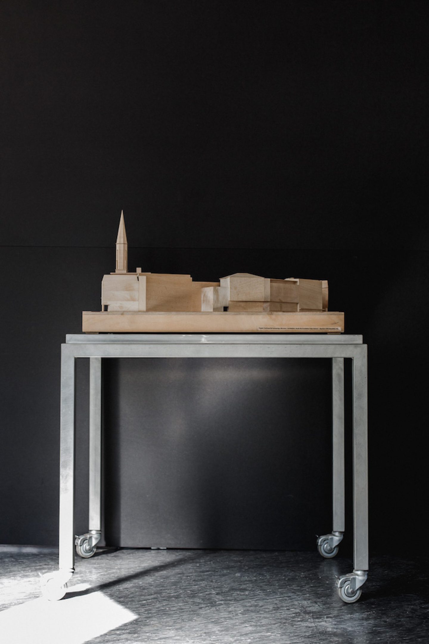
Well, there are so many projects I want to implement. What I’d really like to make time for is a very modern compact urban development. We recently participated in a competition which we didn’t win, because I wanted to connect computer structures with medieval and classical spatial city elements. That’d be my ultimate goal, but it’s really hard, as it’s not part of the current Zeitgeist. We really need courageous cities these days and especially Munich has to be more courageous because of its growth.
How open to compromise are your projects in general, taking into account that the client expresses his wishes. I imagine there are certain expectation of a project, but then at some point of course there’s a limit as to what can happen, or is it really the case that you say to the client: Alright, I’m at your service now, and I’ll run the project the way you want?
That’s a tough question, but the bottom line is that I’m 100% not willing to compromise. But at the same time, I also try to respond to the needs of the clients. That is, we need to ensure that the client and I work together to realize the concept and their wishes. I’m willing to compromise in so far as that I can imagine moving on from a concept altogether, but I can’t imagine starting to realize an idea and then have it be questioned or challenged after we’ve already started rolling it out.
And has it been the case that someone has said, I’ll give you the freedom you need to complete the project the way you want, but then it turns out that the project either – shall I say – dies, or ends up looking completely different in the end?
If that were the case, I would bring things to a halt immediately. Although I must say it has never happened. But most clients would reconsider and then we’d find common ground again. But actually, for me, it’s unthinkable to create a project laden with compromises. At the beginning of my career, as a young architect, I wasn’t quite as assertive as I am now, and didn’t really understand the implications that changes might have, which led to a lot of compromises. That annoys me when I think back on it now.

And what might also be hard to anticipate – for example with the black house or the concert hall – is the contrast of the building in relation to its surroundings. Are there common issues with local residents or are they usually somehow fine with it?
What do you mean by issues? Well, won’t there always be issues when there’s a stark contrast between architecture and the surrounding area?
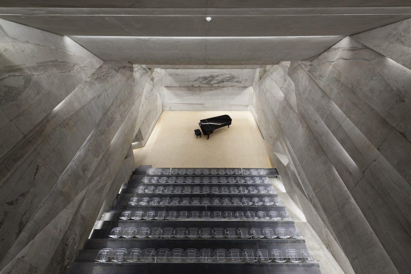
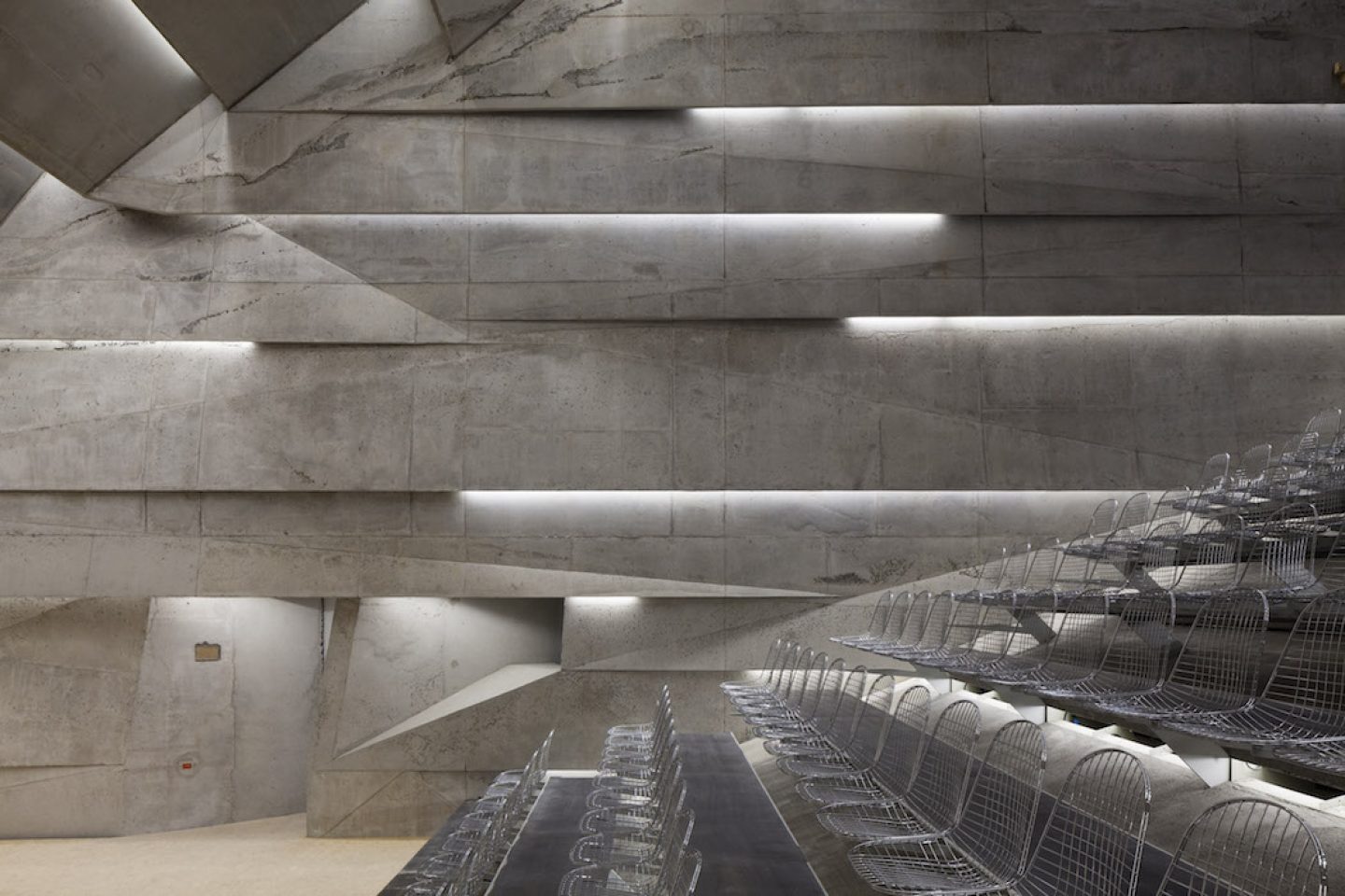
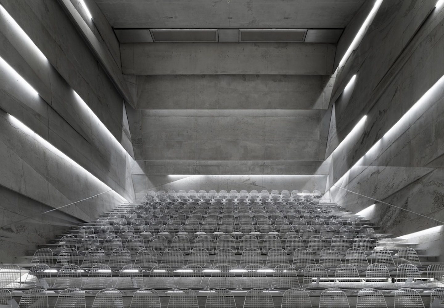
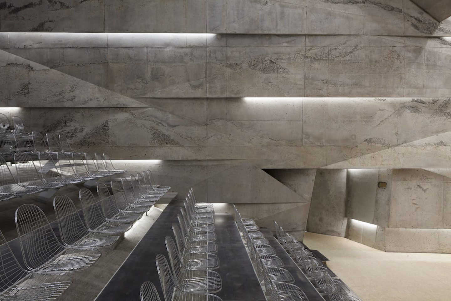
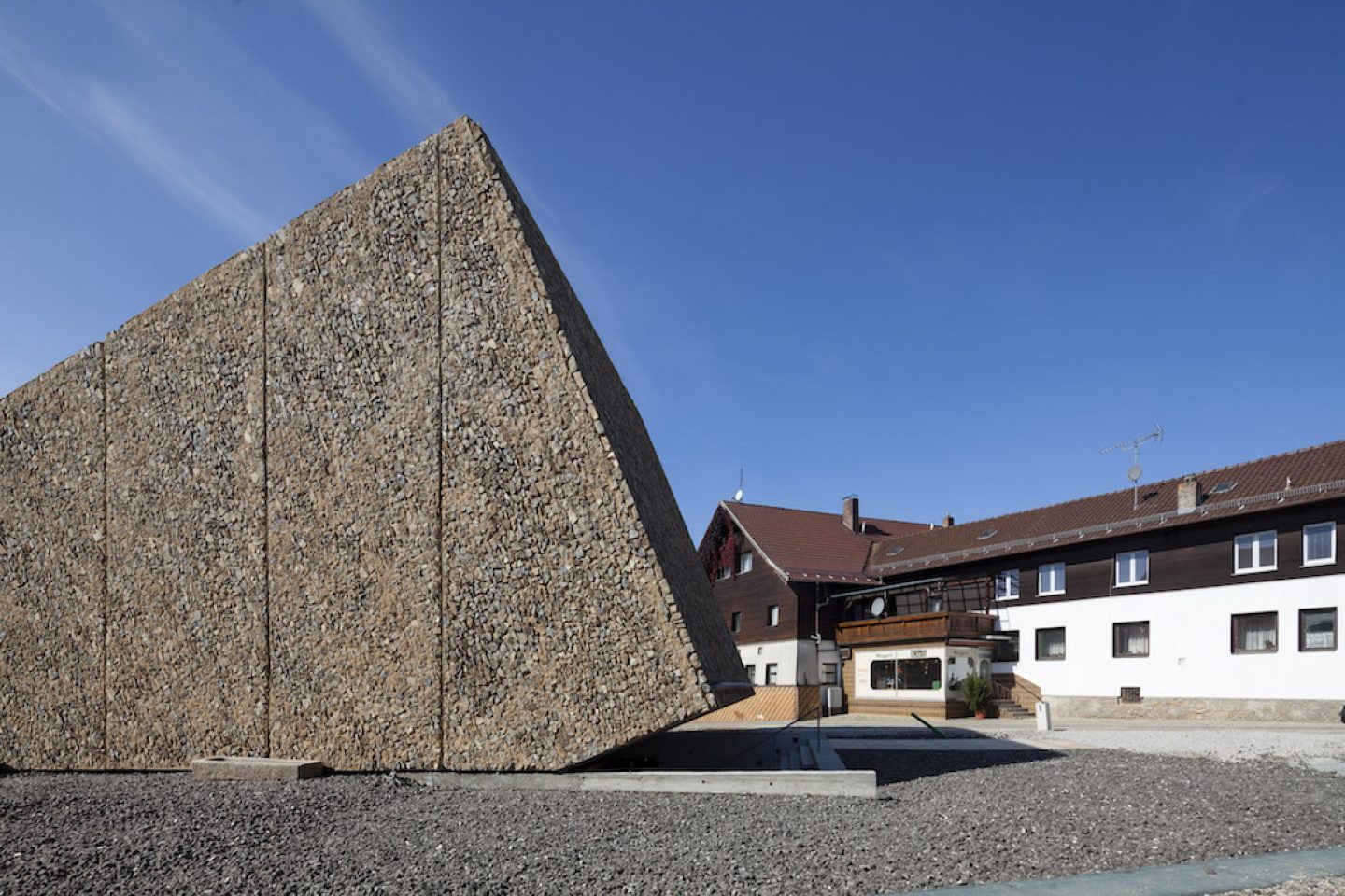
Yes, well I have to say, taking Konzerthaus Blaibach as an example, which was always rumoured to have not come across well with the locals, and that’s why they started protesting against it. I think there are too many architects who are afraid of public opinion. In fact, the issue there wasn’t about the architecture, so no, I haven’t really encountered any problems with the architecture itself. No, not once. So I think that it’s overrated. I think there are too many architects who are afraid of public opinion. A lot of people don’t actually have an opinion about what kind of architecture they’re surrounded by.
All images © Edward Beierle / NAARO
But I imagine this is very difficult, as not many people are willing to risk their reputation to work on projects that require such courage?
No, I think there’s no risk involved here.
I think we only have to take a look at the urban design of the 1960s to understand how un-urban our architecture was. There isn’t even a vocabulary for it. I think it’s really entrenched in people’s mindsets now—Modernism has made such a mark—that no-one is able to think of anything else. Something has to change—or some time has to pass—but I think the past few competitions we partook in are already starting to head in that direction, so they’re a little more substantial, a little more chaotic.
This interview was edited and condensed. All images (unless otherwise stated) Clemens Poloczeck, taken exclusively for IGNANT.
