On Essentialist Design With MYKILOS
- Name
- Mykilos
- Project
- Connected Speakers
- Images
- Clemens Poloczek
- Words
- Anna Dorothea Ker
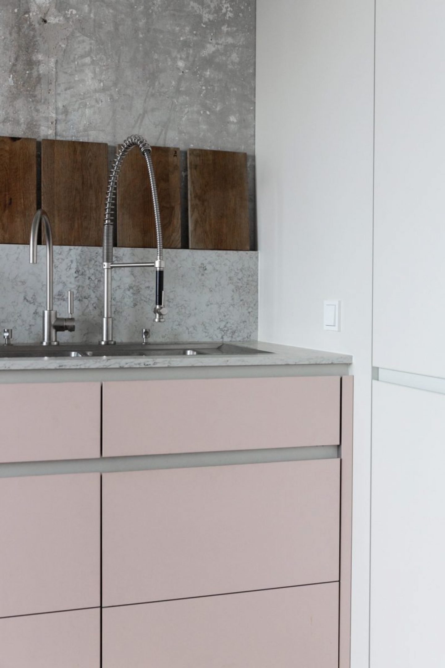
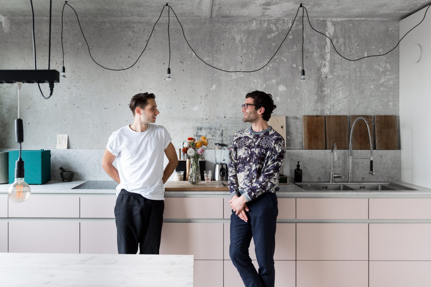
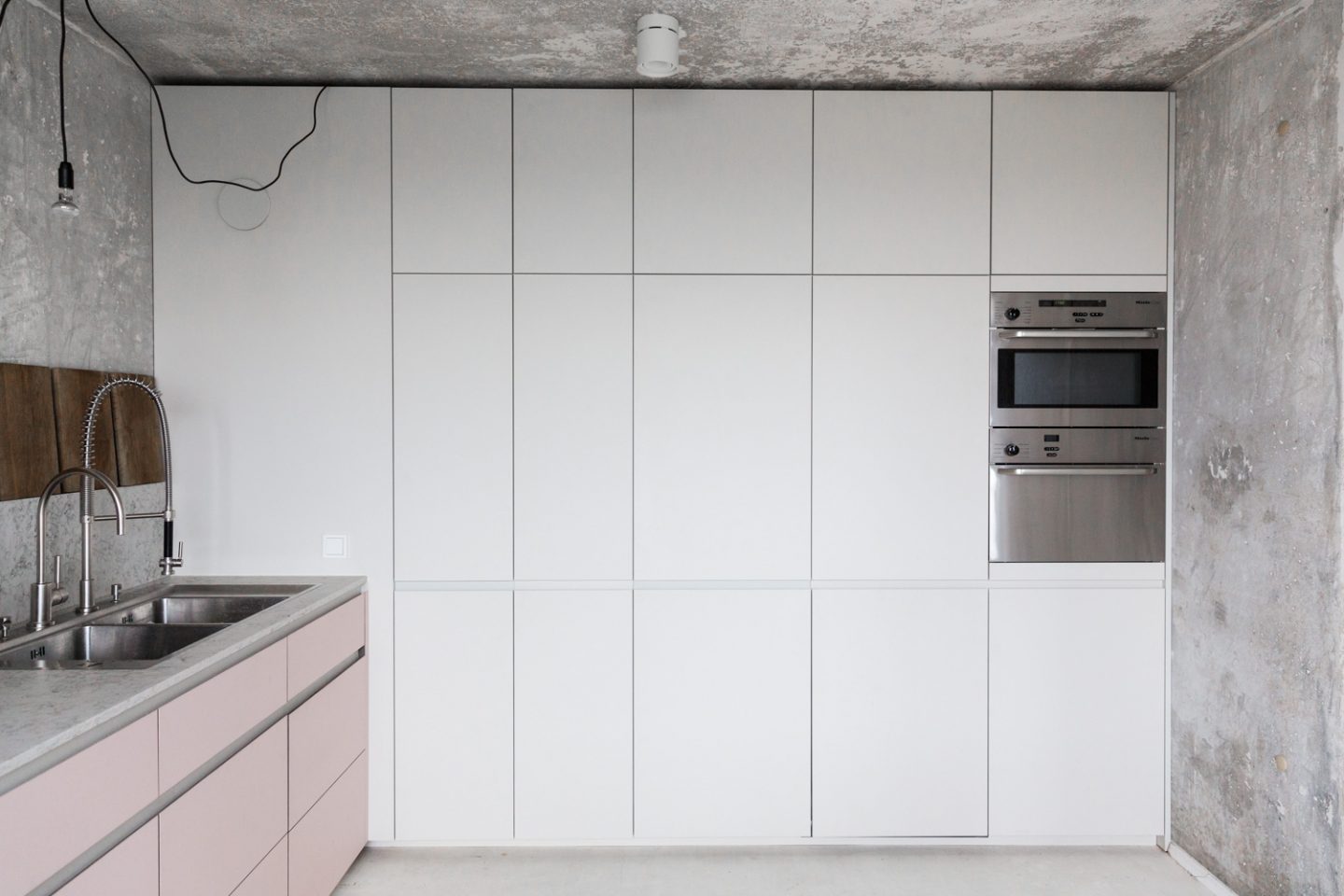
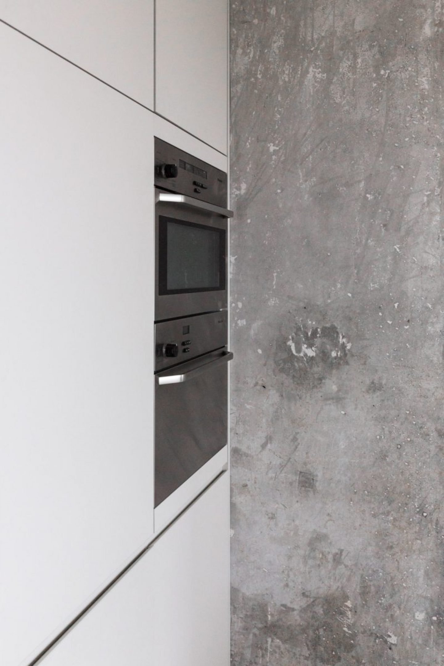
Sleek industrial styles, shapes reduced to their simplest form and contrasting textures in tones of pink, black and grey: The aesthetic of Berlin-based design label MYKILOS is as distinctive as it is adaptable.
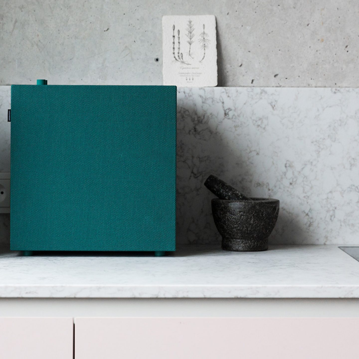
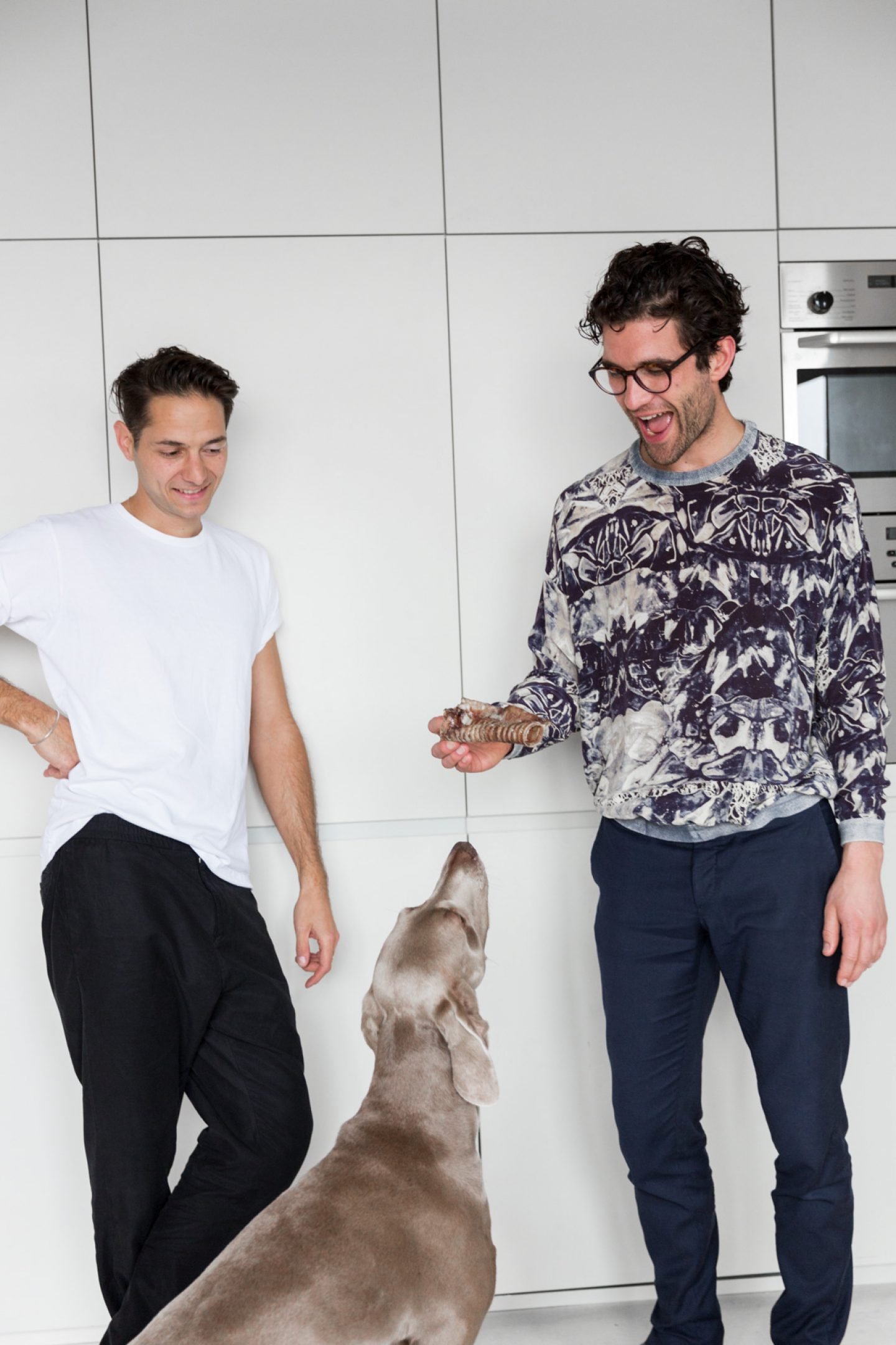
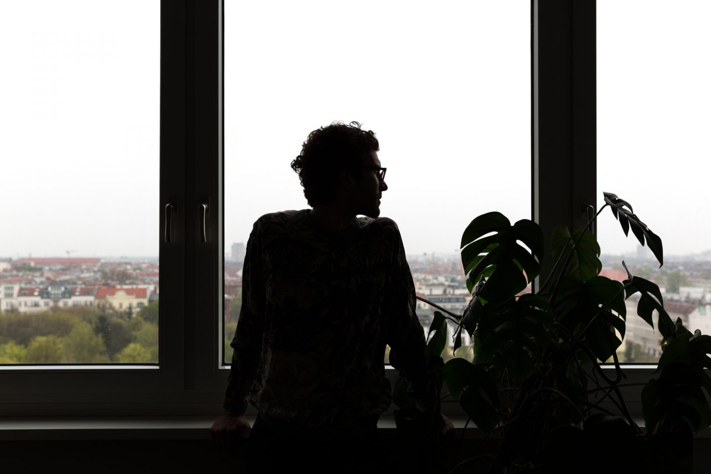
The elements forming MYKILOS’ vision are equally shared by audio brand Urbanears. Known for combining minimal design with cutting-edge tech, the brand has just released its latest product: the Connected Speakers, a high-tech design that deserves pride of place in any room it graces with its top notch sound system. To mark the release of the Connected Speakers – which come in two practical sizes and in six stylish colors, from neutrals to brights – we collaborated with Urbanears to visit the design duo behind MYKILOS. Meeting Philipp Schöpfer in the designers’ showroom and Daniel Klapsing in his Berlin-Mitte apartment, we got the lowdown on the fascinating story behind the label’s origin, the things that keep it ticking and the elements of essentialism that the Urbanears and MYKILOS have in common.
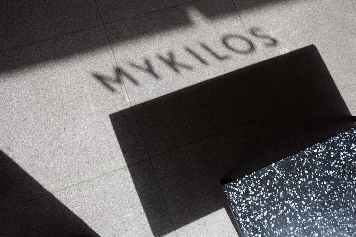
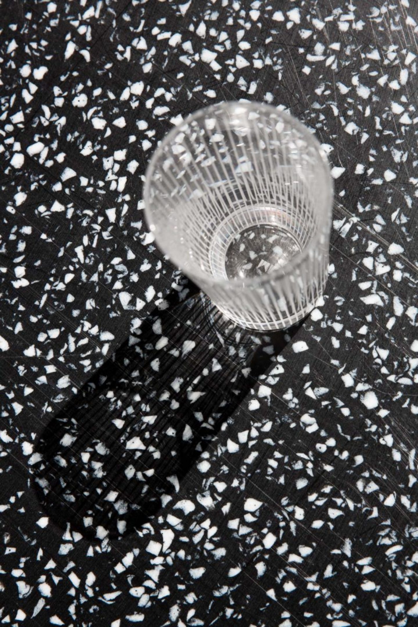
MYKILOS is the design label connected to the studio 45 KILO, which creates interior concepts and kitchens both for private homes and for offices such as Spree Studios and Agency V. How did 45 KILO – the interior studio – lead to the founding of the design brand, MYKILOS?
“We were too impatient so we thought, “f**k it – let’s just do it ourselves!””
Daniel [Klapsing] and I started to work on projects together at the Bauhaus-University and realized we enjoy furniture design, and that we worked well together in that domain. So we just started creating our own furniture – often for friends or for ourselves. We lived together at that time and whenever we needed something new for our apartment, we’d just make it. For example, we weren’t so keen on the tables at the school, so we created our own version of them. That was the first step. Then we wanted to start developing designs for other brands, so we started visiting fairs and exhibitions and realized it’s really hard to get access to producers, and takes a long time. We were too impatient so we thought, “f**k it – let’s just do it ourselves!” and set up a group show of the best designers from the Bauhaus school, the first time in Milan 2009.
That exhibition was called “My Bauhaus Is Better Than Yours” which could have been a citation of Walter Gropius, just arguing with Johannes Itten about which concept of the school is the right one. But actually it was a pun on a hard-core techno piece by ABS called “My House is Your House“
The exhibition became a great success, partly of it’s provoking title I guess. After two years of curating exhibitions across Europe and Middle East we founded a label under the same name, together with Daniel Burchard and Manuel Goller, fellow graphic designers from Weimar. We developed the brand for a year before we started realizing that unfortunately we had different perspectives on how to further develop the company. We decided to focus on our own designs rather than being a platform for many designers, so we handed the company over to Daniel and Manuel and we continued working under the name of our design studio: 45 Kilo. A year later Daniel and I started MYKILOS and once again started our own production. The idea was to have our own label, to be able to decide exactly how each product was produced with the fewest compromises. Both in terms of production, clients and communication.
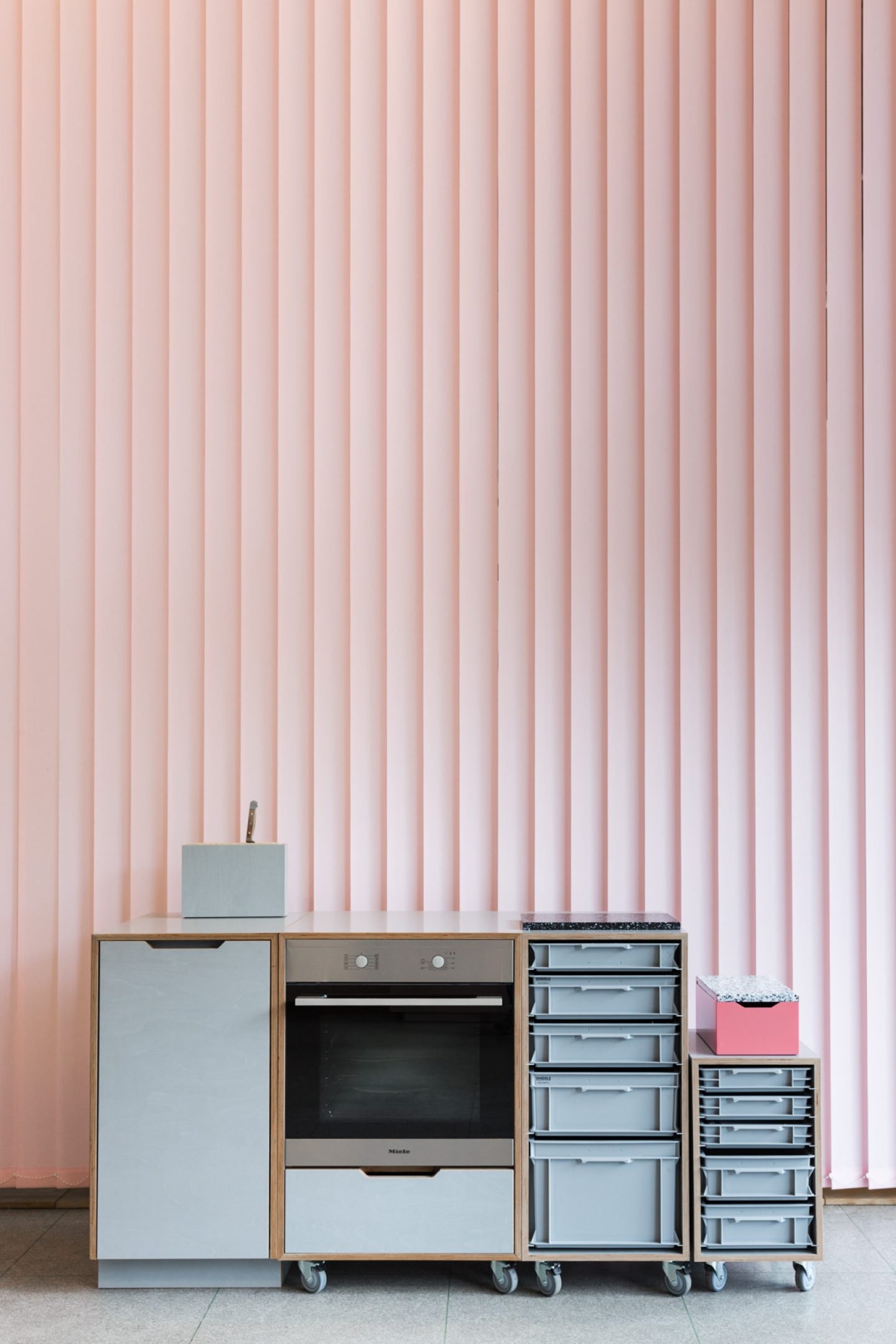
The connection today between 45 KILO and MYKILOS is that 45 KILO does the design and the concepts – it’s the service provider. Everything that has to do with serial production and distribution goes under the label MYKILOS. When an interior project is realised through 45 KILO, then of course we incorporate products from MYKILOS. We want to focus more and more on kitchens with MYKILOS. They’ve have always been a strong interest of ours. Daniel and I used to cook together a lot and from that we found ourselves involved in everything to do with kitchens. The kitchen has become a very important room in an apartment – especially with open-plan living: it’s not only for cooking and eating in, but also for living and potentially working. MYKILOS’ products and kitchens will all be about cooking and eating: enjoying life basically.
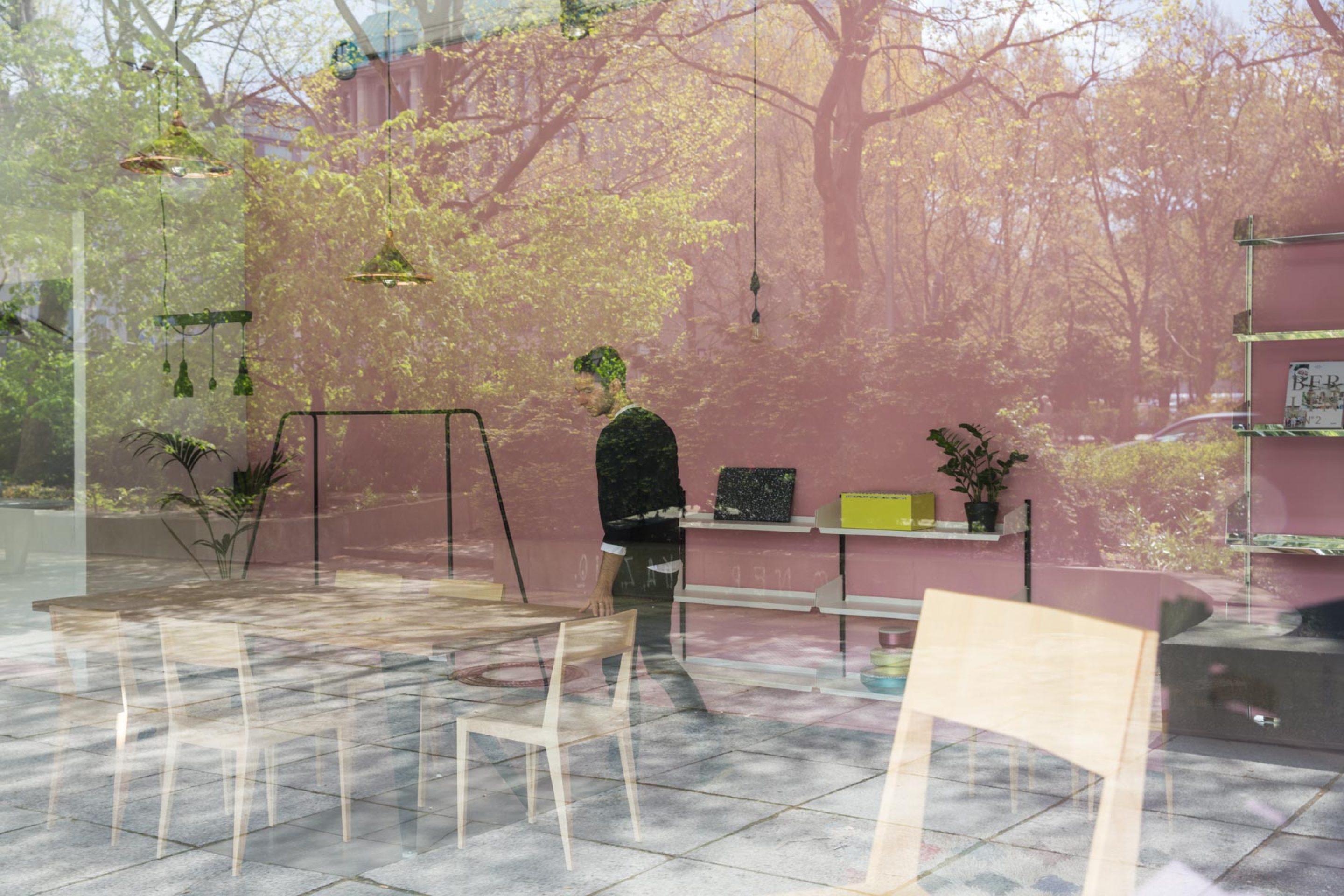
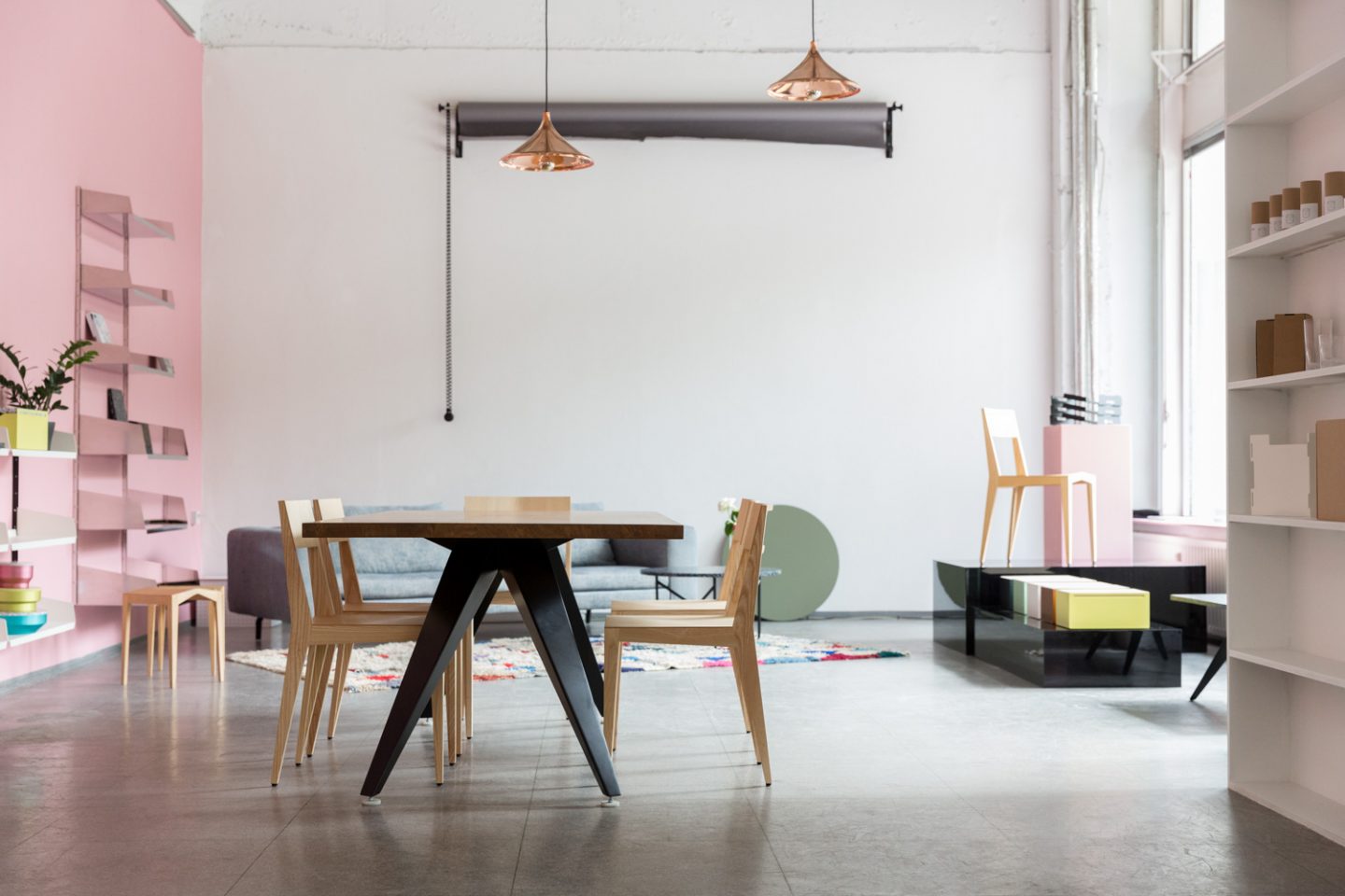
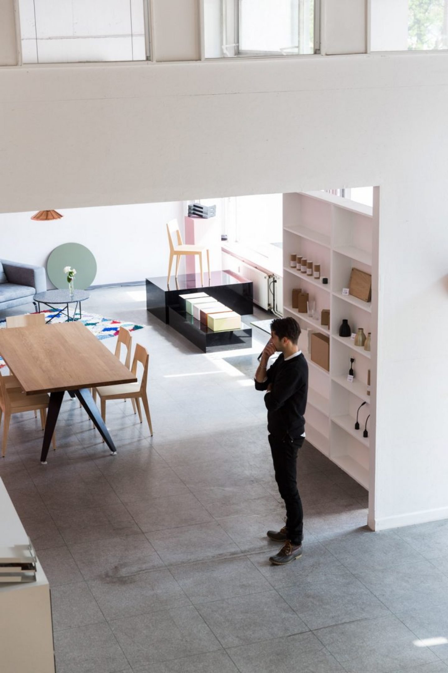
We’re here at your showroom on Leipziger Straße. Minimal and industrial, with a generous amount of pink. What’s the concept behind the fit-out?
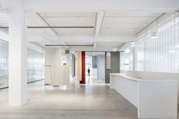
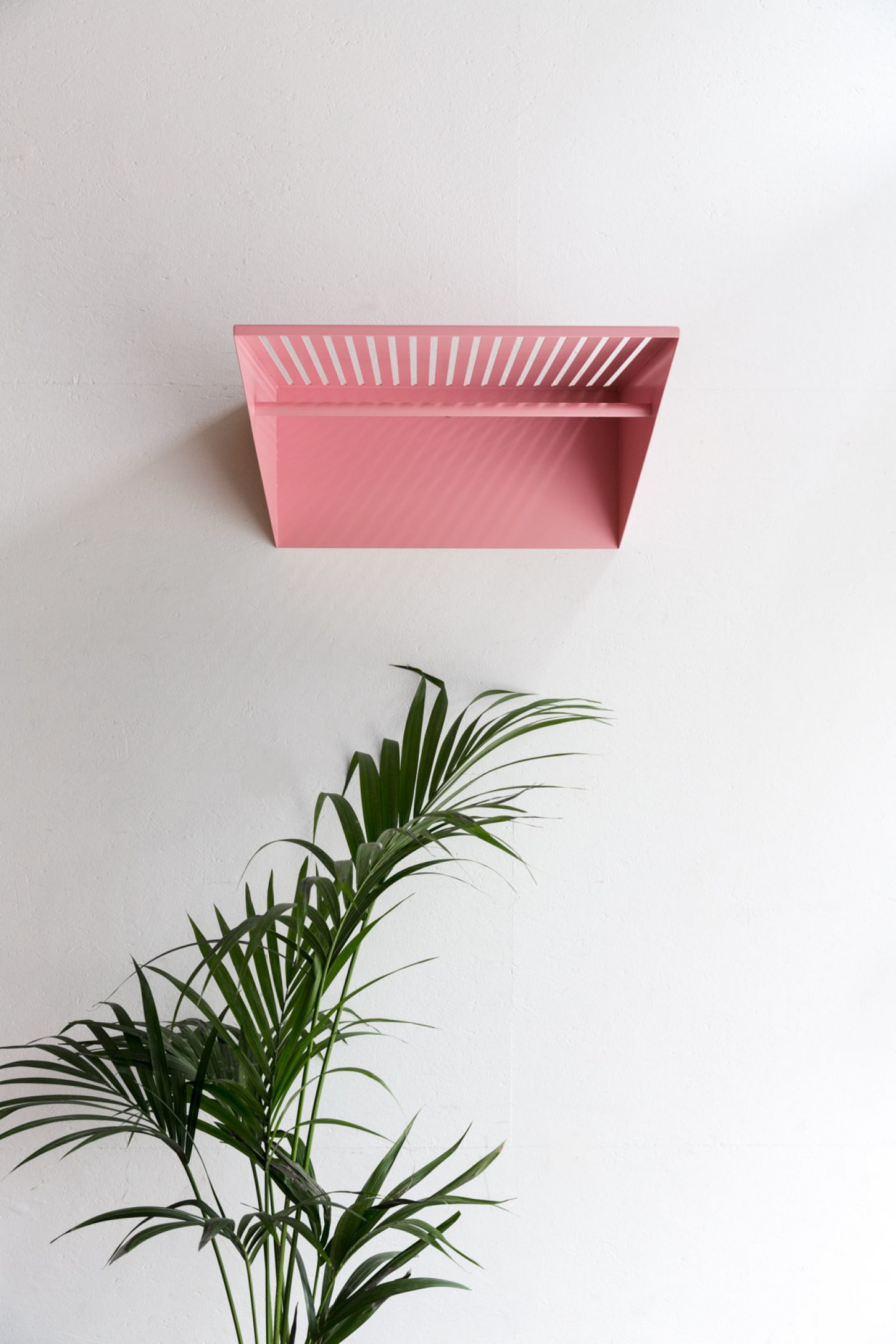
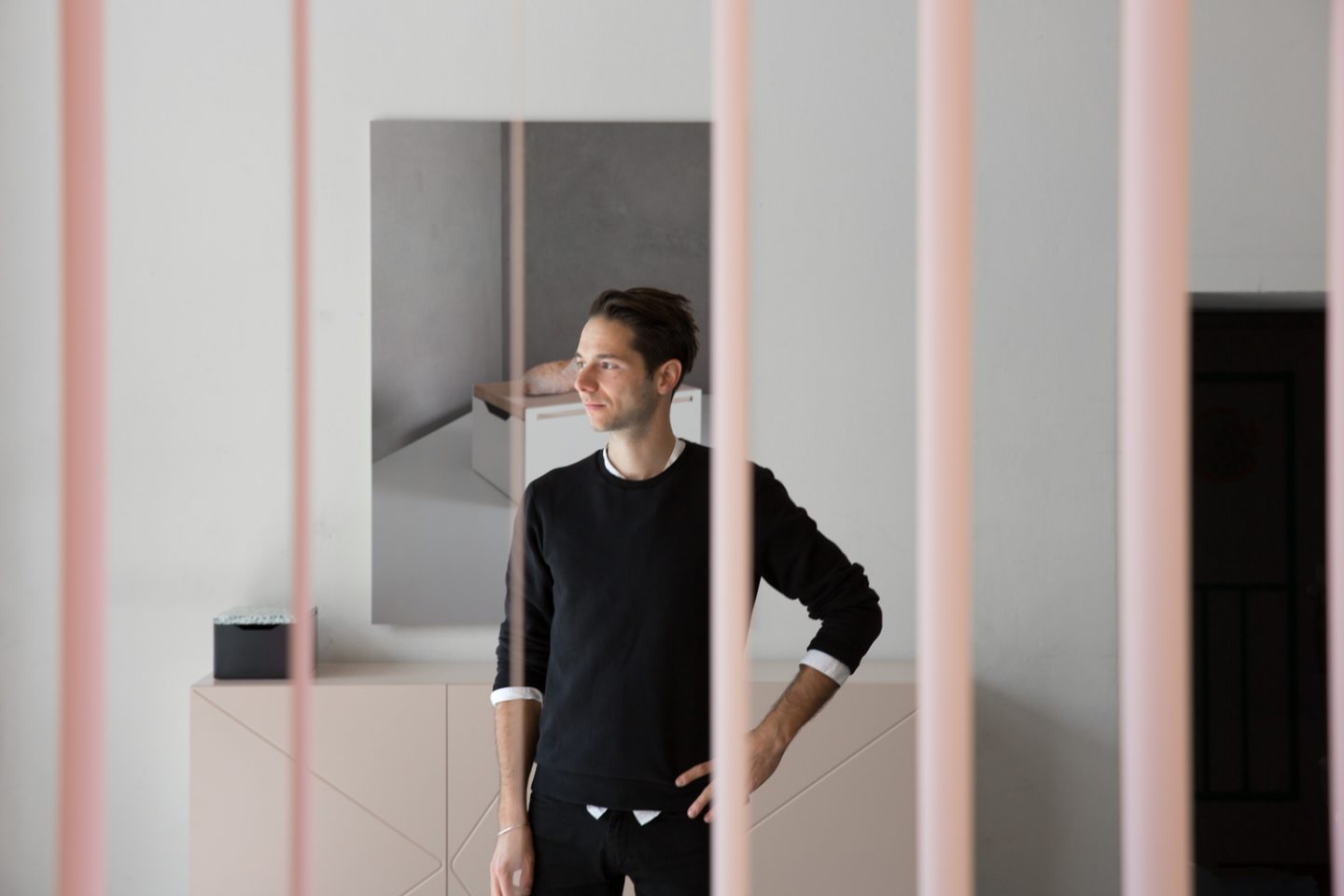
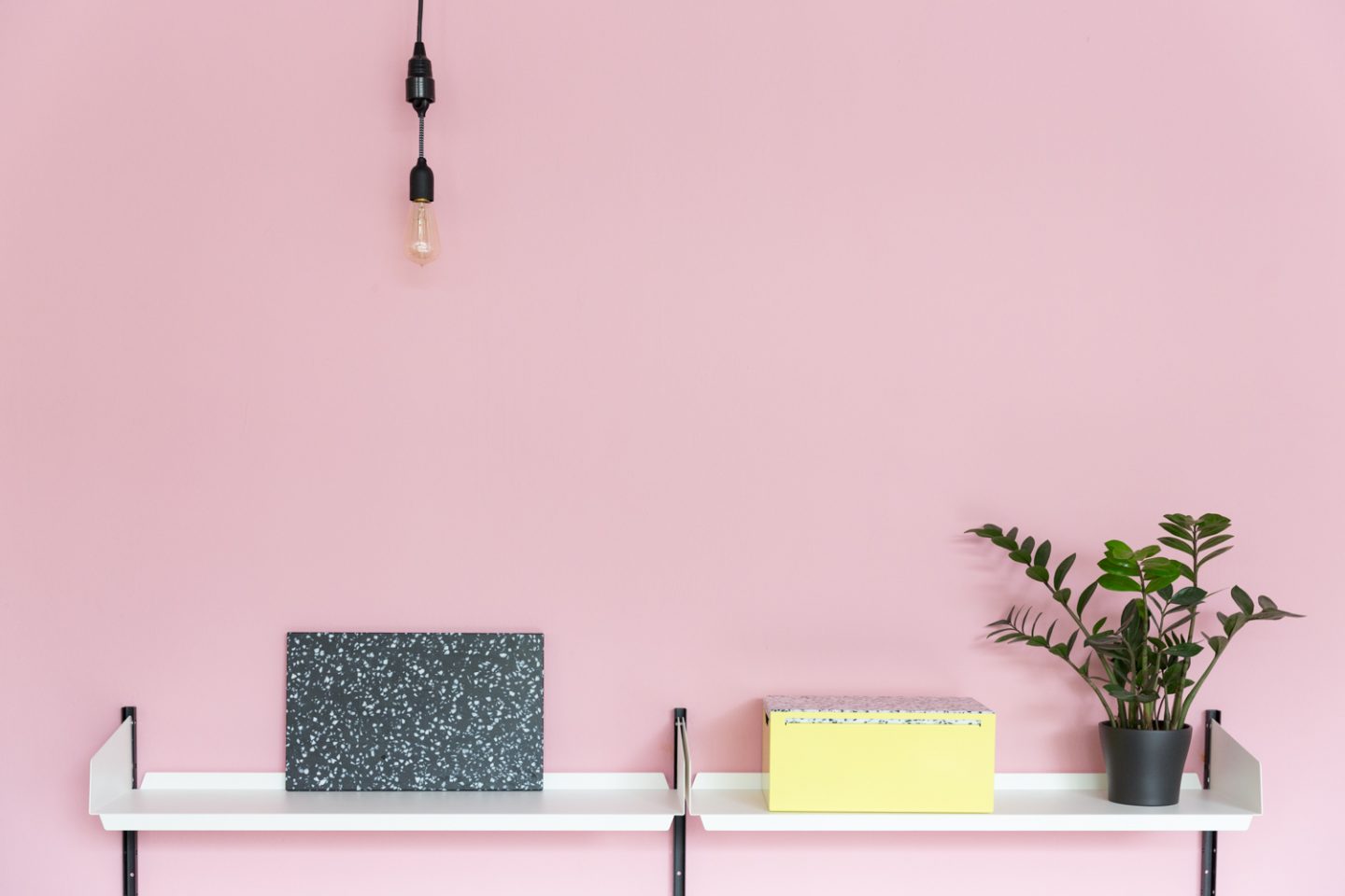
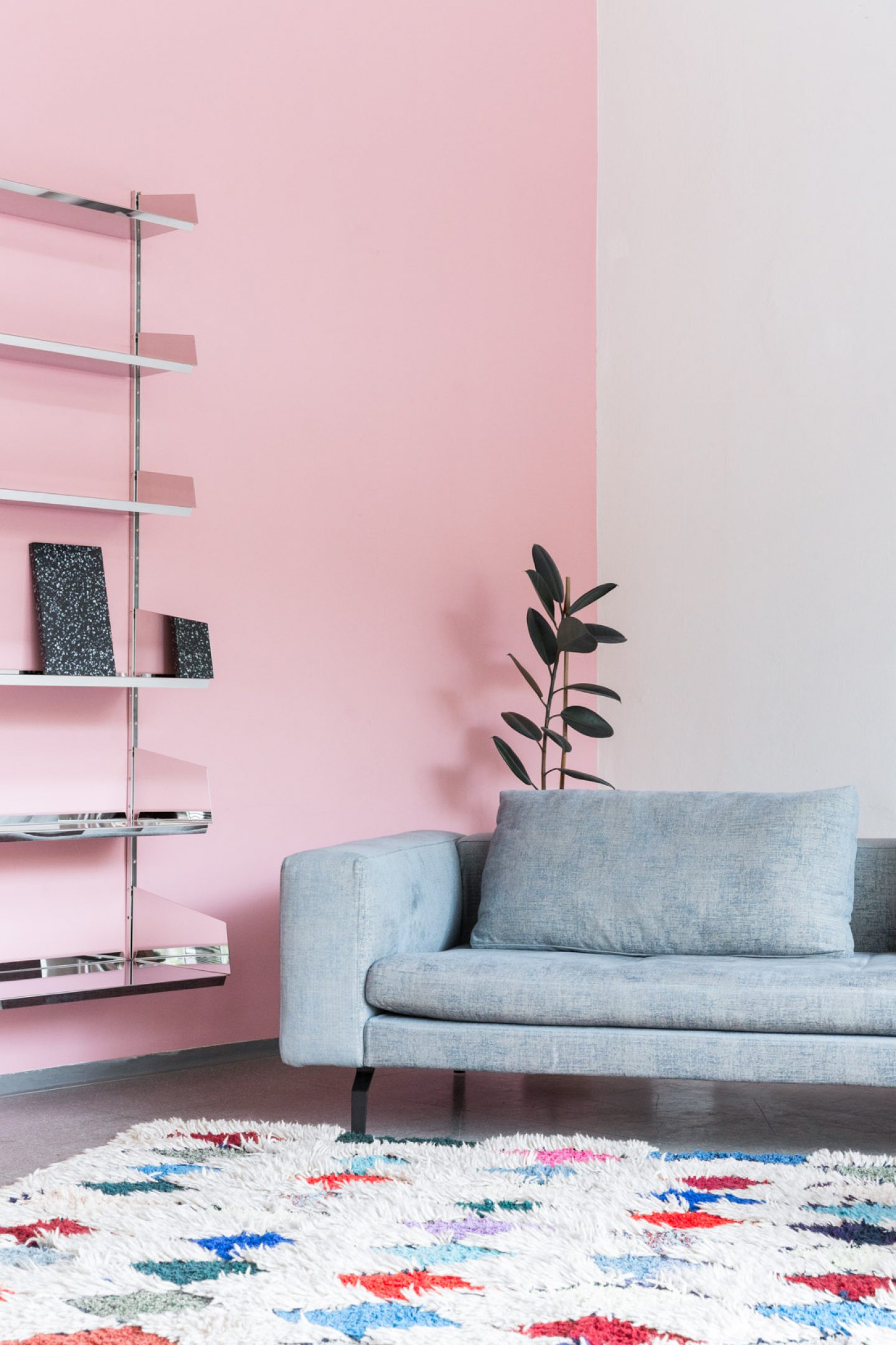
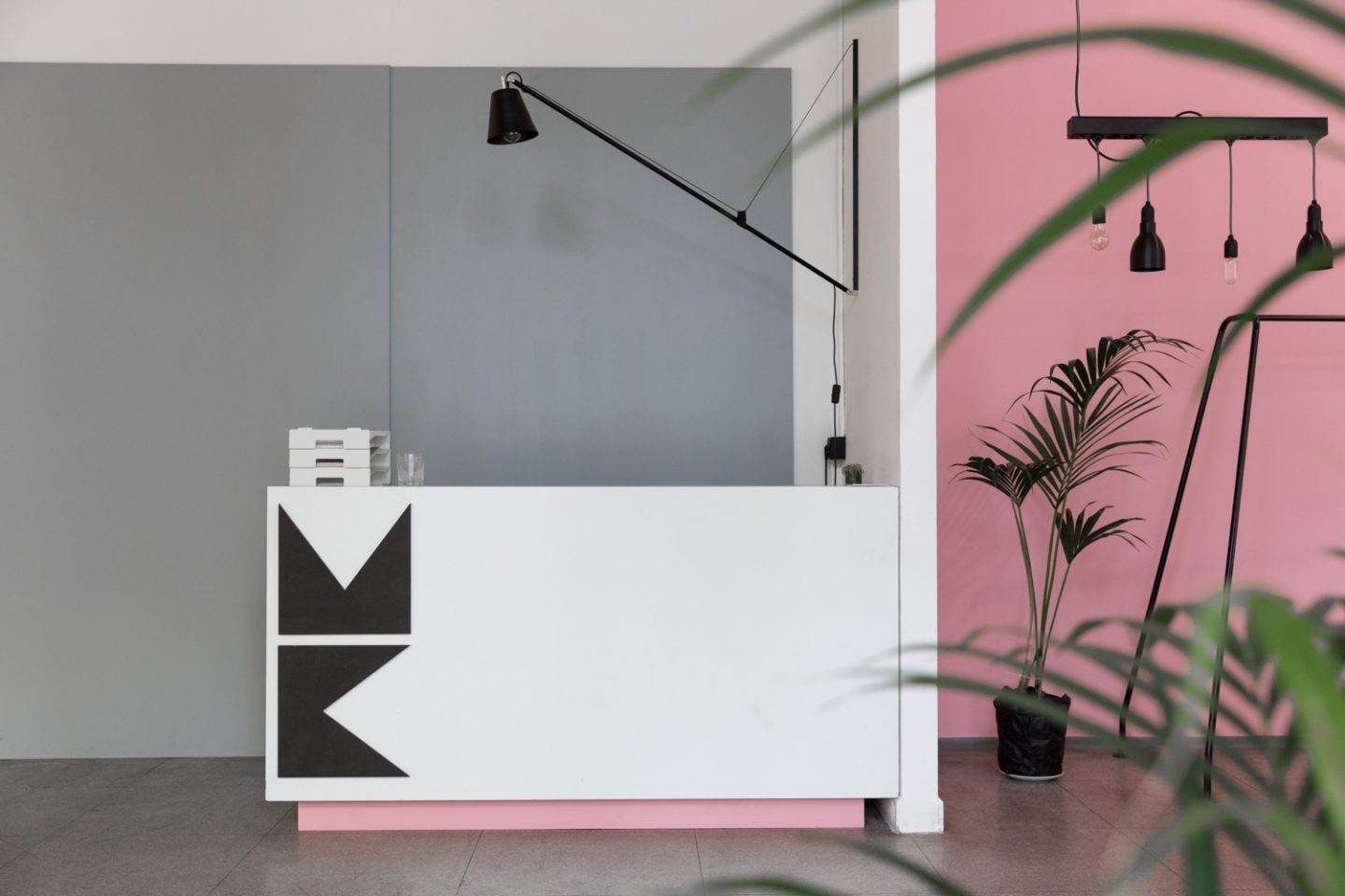
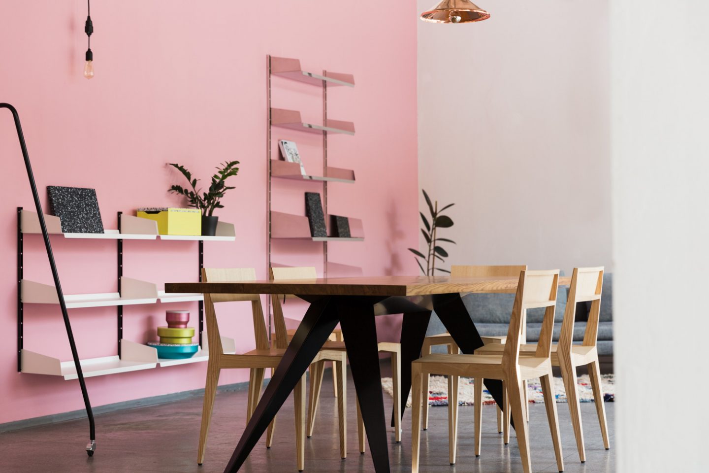
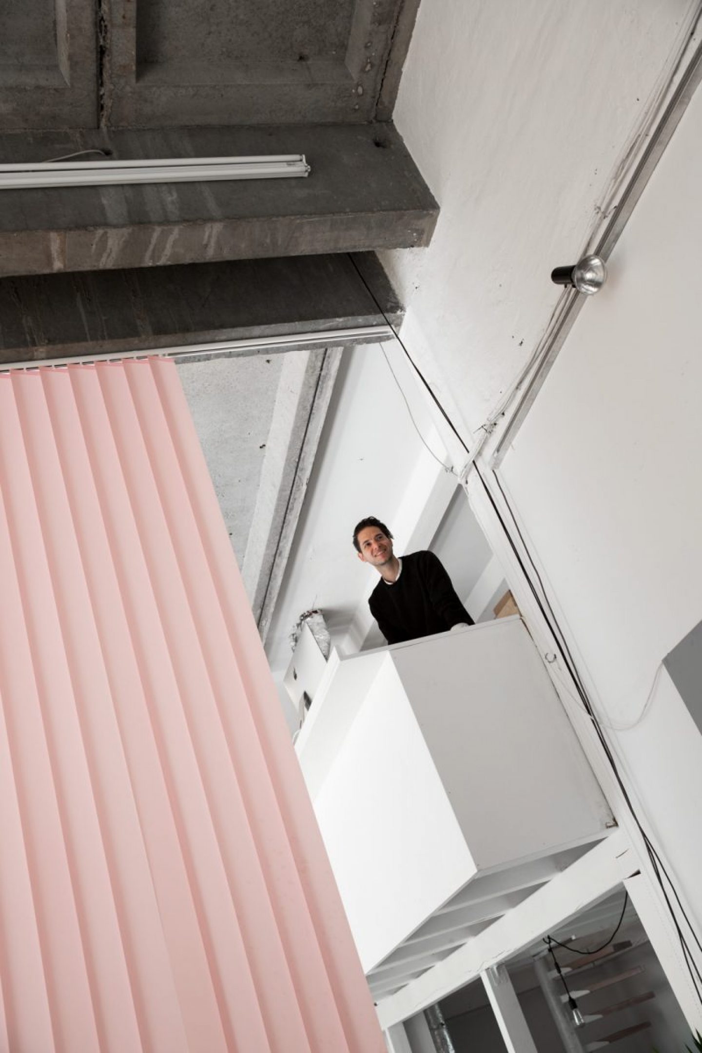
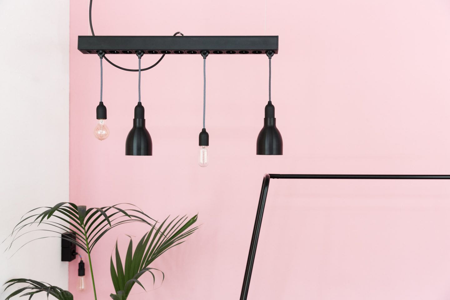
Our showroom “MK Studio” is also a pop-up space that we use for events, shootings or other occasions. We have the luxury of having a lot of space and we want to make the most of it – to present our projects and invite our clients here, but also work from here with openness and transparency. We’ve divided it up a bit: on the right side there’s the MK Studio, our showroom and shop presenting the MYKILOS products. And on the other side we showcase our system kitchens, the MK1, 2 and 3. Upstairs and in the back we have the office. The color choice of pink began last year with this curtain, as we wanted to divide the room without building a solid wall, so we started working with this curtain blind that you find in a lot of offices and doctor’s rooms – and usually seen as boring. We managed to find a company who also produces this blind in pink, and as soon as we saw that, we said “sure, why not?!” From this curtain the pink theme evolved, also to the walls. It’s become our corporate identity color, together with black, white and light grey, but that can also change. For a while we had this shade of yellow which you can still find across some of our product ranges, but we’ve also always worked with other colors, it’s a seasonal thing.
How would you describe your personal aesthetic, and to what extent does that reflect the design philosophy of MYKILOS?
Clean, reduced and straightforward. On one hand, that’s my personal style and on the other, I think it fits really well with the business. We want to leave out everything that’s unnecessary, and reduce things to their essence. That’s about it, I think [laughs].
And how about your personal interior design approach to your home? How does it similar to and different from Daniel’s, given that you used to live together?
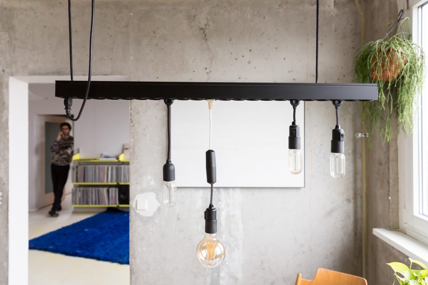
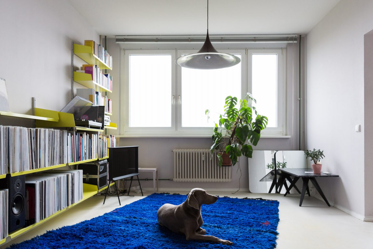
I think we have pretty similar tastes – which makes sense with our common job, of course – otherwise the whole enterprise would be on shaky legs [laughs], so I would describe it as “same same but family”. I have a young daughter, and at my place there are a lot of warm tones and a lot of different styles mixed in together, which is due to my daily life, and the daily routines of my girlfriend and daughter, which I really like. It’s clean and reduced, but still warm due to the family element and the Altbauwohnung. And at Daniel’s I’d say it’s pretty much the same minus the child [laughs] so more pared back and a lot cleaner due to his Plattenbau also. But the same principle applies for both of us: Reducing the unnecessary so as to concentrate on what counts. Without ending up in a white cube, of course.
And how would you describe the working relationship between you two?
“When it comes to the core business, we always come back together.”
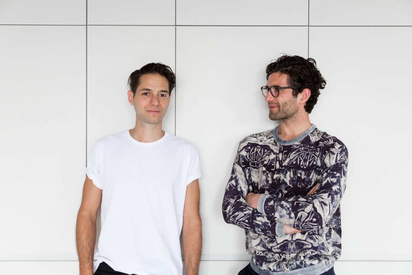
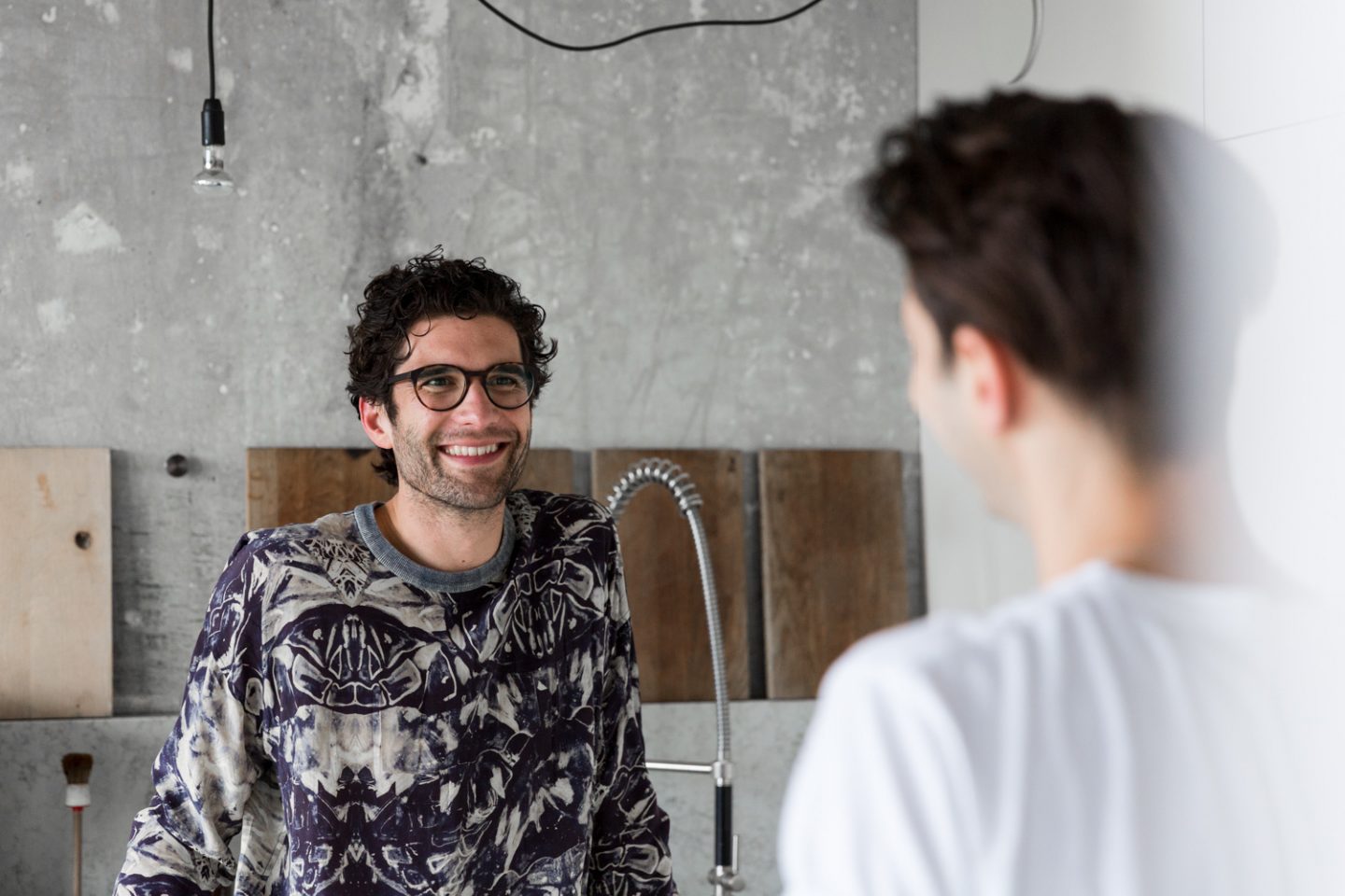
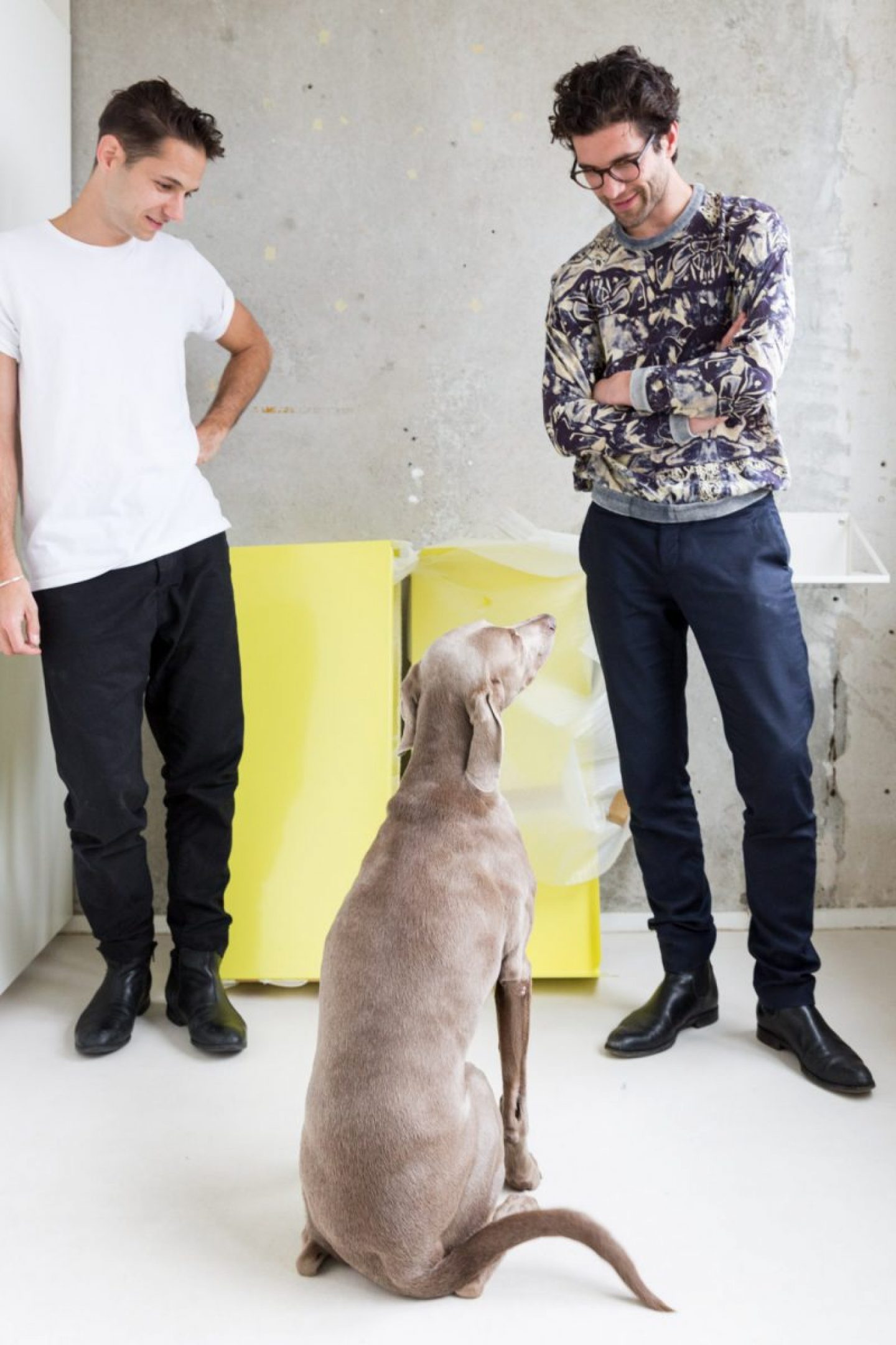
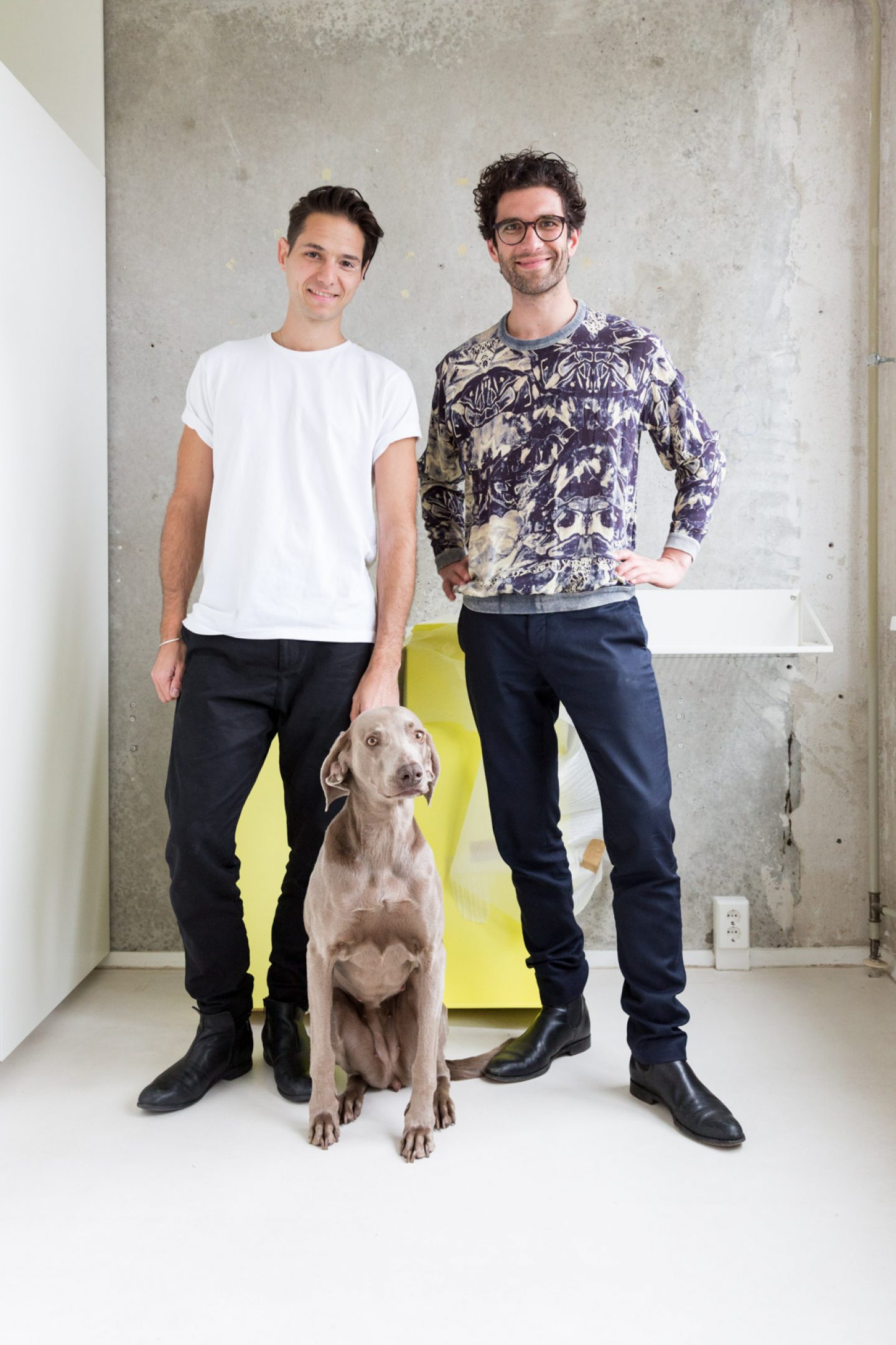
It’s developed a lot since the beginning – we’ve been working together for 10 years, and of course the structure of our company has evolved over that time, so we’ve come to divide up roles. I take care of the production and the distribution as well as the product side of things, and he’s mainly responsible for the interior and kitchen projects. But we make lots of decisions together. We used to do everything together, because it was just the two of us taking care of everything as a duo – we were like a married couple, and people thought we were, which I can understand [smiles] – but of course it gets to the point where you need to split things up. We’re always exchanging ideas and when for example we develop a new project, that’s something we work on together. When it comes to the core business, we always come back together.
Your product range includes tables, lights, office and kitchen accessories. Could you share a story behind a favourite piece?
One of my favorite products – which is one that represents our story pretty well, or at least has accompanied us on much of our journey, is our Chair 3. It was one of our very first designs – we started to create it in 2007, and we presented it at a design fair in Berlin that year in a very different version from what it is now. We worked on this chair for about eight years, going through many different steps, and took a long time to develop it to the point that it was ready for production. That was because we were doing everything ourselves – we weren’t working with a producer to guide the process and tell us where we needed to make compromises.
“The look and feel of objects is very important to our work.”
And in 2016 we finally found the right producer for this chair, Mattiazzi, who make it in an amazing quality. The design was originally modelled off Jasper Morrison „ply chair” – a classic, which we discovered as students and wanted to build ourselves, so we created our own version. We found that pretty easy to understand, in terms of both form and materials – but as we were building it we realised we could improve on it. Vitra produced the chair for several years, but always had to put a sticker under it saying “This is not a chair”, because it didn’t fulfill its purpose as a chair to sit on – it was more a statement, a sculpture. And so we wanted to create a version that was functional – that looked good but was also ergonomic. Through a process of many, many steps we came to the V and A shapes in the surfaces. Looking at the chair it appears rather uncomfortable and edgy– but when you sit down there’s this “Aha!” moment as you realise it’s actually comfortable. I’m proud of the outcome.
What are the key steps in your design process when adding a new product to your collection?
A big part of our process revolves around developing existing products further. We start with an existing product that we love but also see the potential to evolve further, to update, given the possibilities in terms of materials, finish and production processes that may not have existed when the product was first launched. This redesign process requires solid knowledge – of the product itself, and the priorities fuelling the designer or architect and producer when they first created it. So we get deep into that, interpret it and use the knowledge to push the product further.
Another example of how we work is when there’s a specific niche or requirement that needs to be fulfilled. Maybe a client will say, “we need this 8-person table with sound insulation, with inbuilt electronics. Then we’ll take our “Easy” base and adapt it – that’s how the “Big Easy” table came to be – so we also redesign and develop our own existing products too. But we haven’t stopped working for other design brands. When a good company likes to work with us, we’re happy to work like a regular design studio, just developing a design – not a product.
When it comes to the senses, sight and touch are of course high on the agenda in what you do. But how about sound? In which ways do you incorporate listening into your work process?
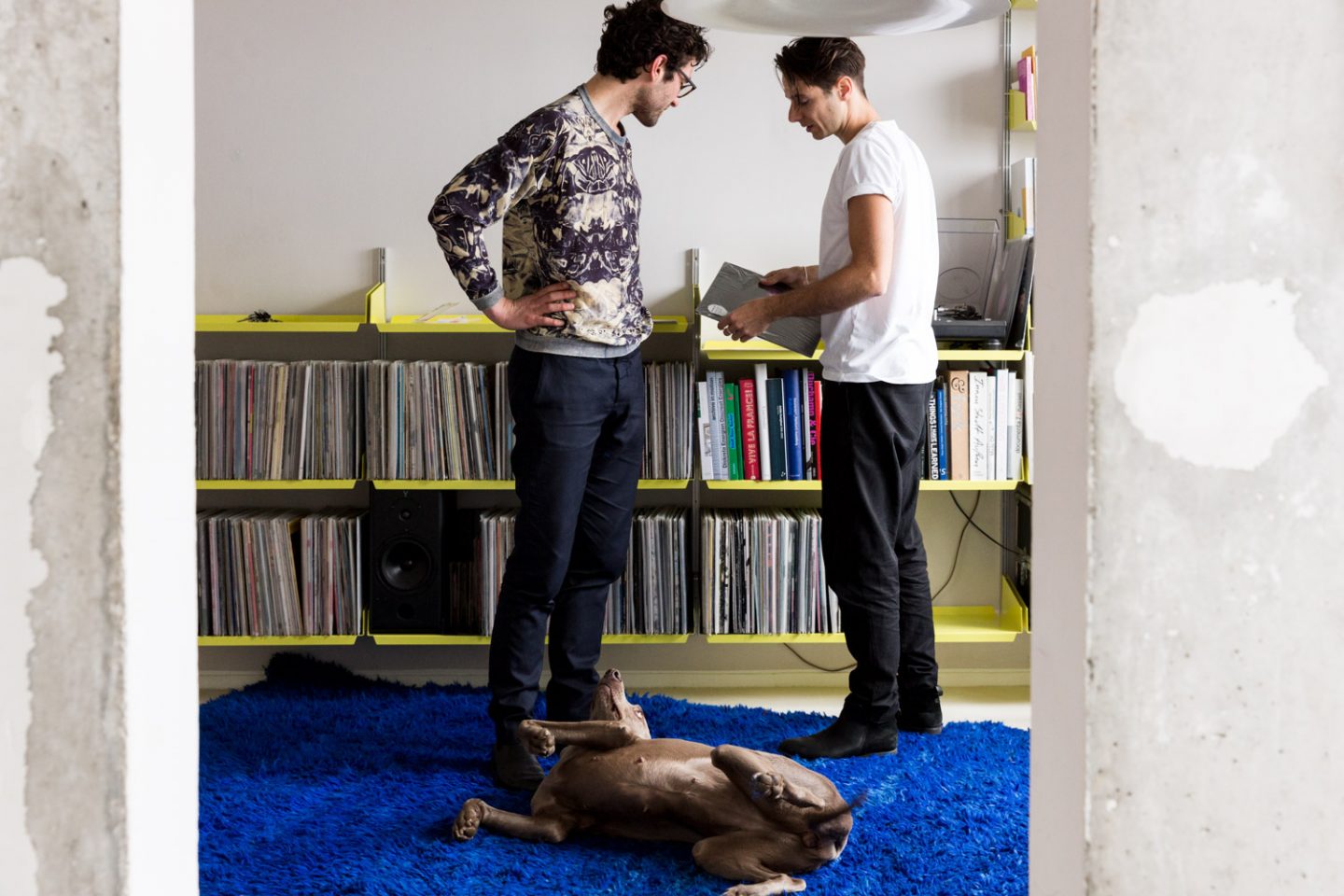
Daniel and I got to know each other through music. Daniel used to DJ at parties in Weimar and I started to do the same at that time. I just asked Daniel if he wanted to DJ together without already knowing him. He was open-minded and said “why not”. So we did and it was really fun –and we started playing at parties together more often. The other passion is cooking together. And then came design. So these three elements have been the building blocks of our friendship. Music has always been an important topic for us – it’s what built our base. I’m still very involved with music – I still spin and collect records. At the same time, I’m also very sensitive when it comes to sounds, smells and textures. The look and feel of objects is very important to our work. Though our designs are often very stripped back and minimal, they’re not emotionally cold or hard – we want them to feel good whilst embracing function and aesthetics.
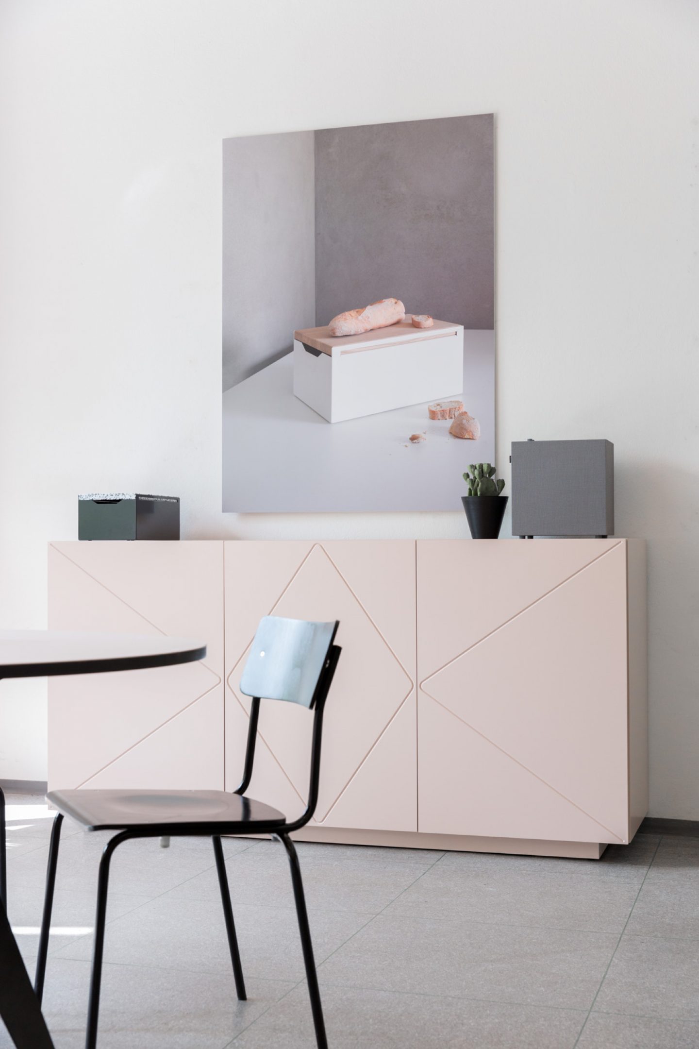
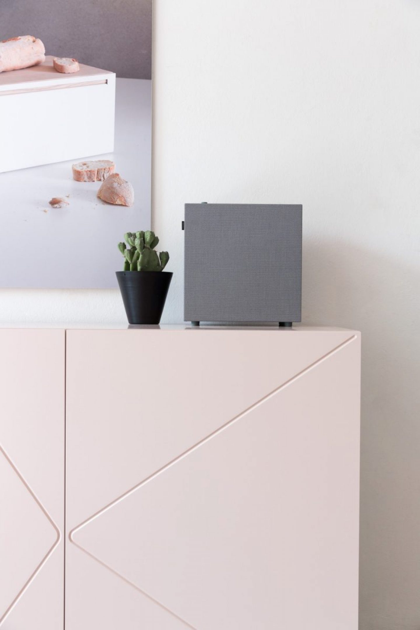
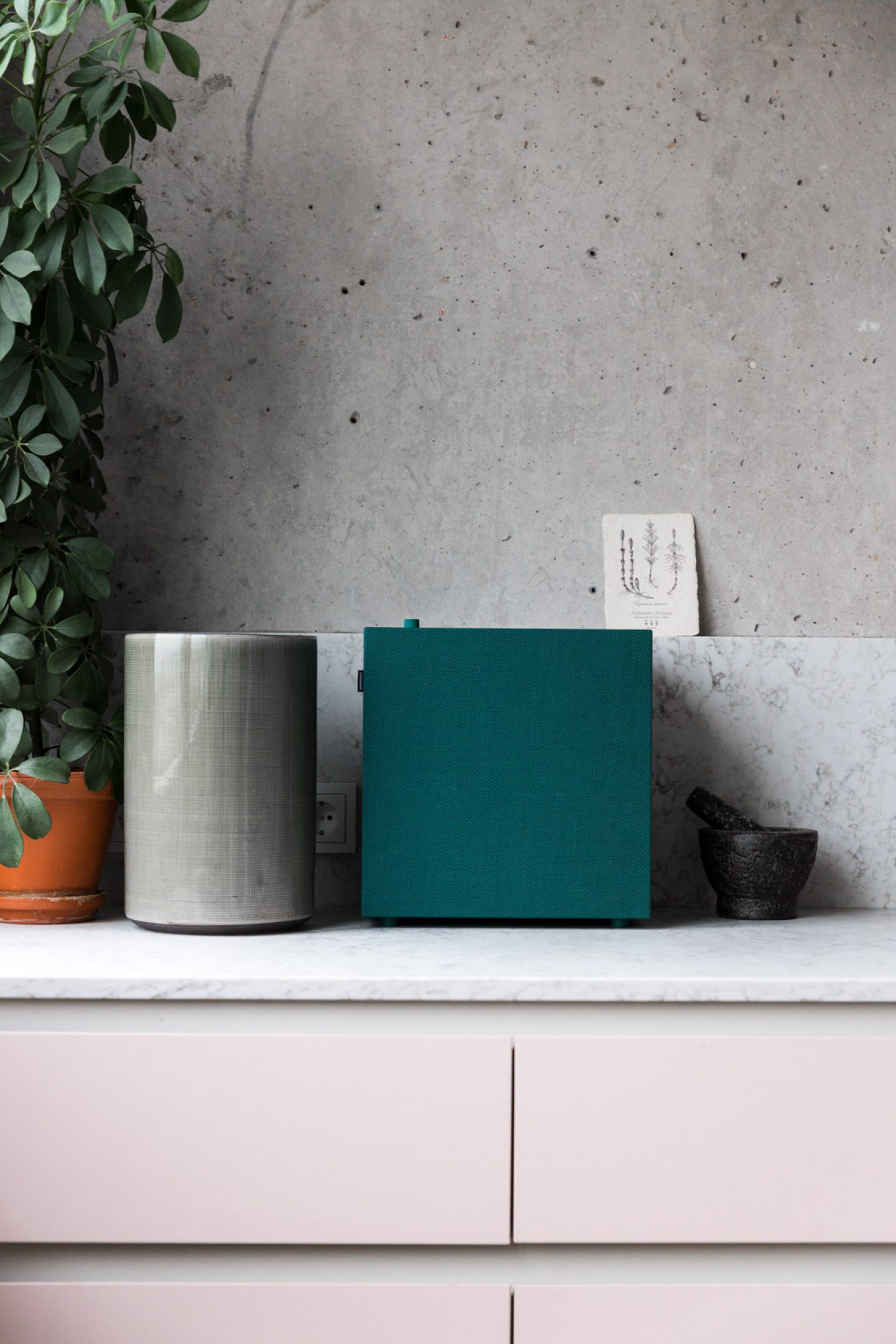
I have to admit these speakers fit so perfectly with our range that I could just place them in one of our kitchens and they’d work with the overall concept. That means I would’t have to build it in, install it or hide it away. Whenever we fit out a kitchen for a client, or even work on our own showroom, we of course incorporate products from other labels. And products like the Urbanears speaker bring us further, because electronics aren’t something we do. This box works quite well for us – it’s a pure form, this cube, relatively hard and clean, but at the same time the fabric it’s covered in gives it a kind of softness. It’s not just cold and hard with stark edges, although that’s the kind of shape it is – but instead it’s warm.
When it comes to the finishing touches and electronic accessories for your interior concepts, what do you look for? For example, the new Urbanears connected speakers were designed super minimally with no cables and in a monotone color palette. How could you imagine them fitting in to one of your interiors?
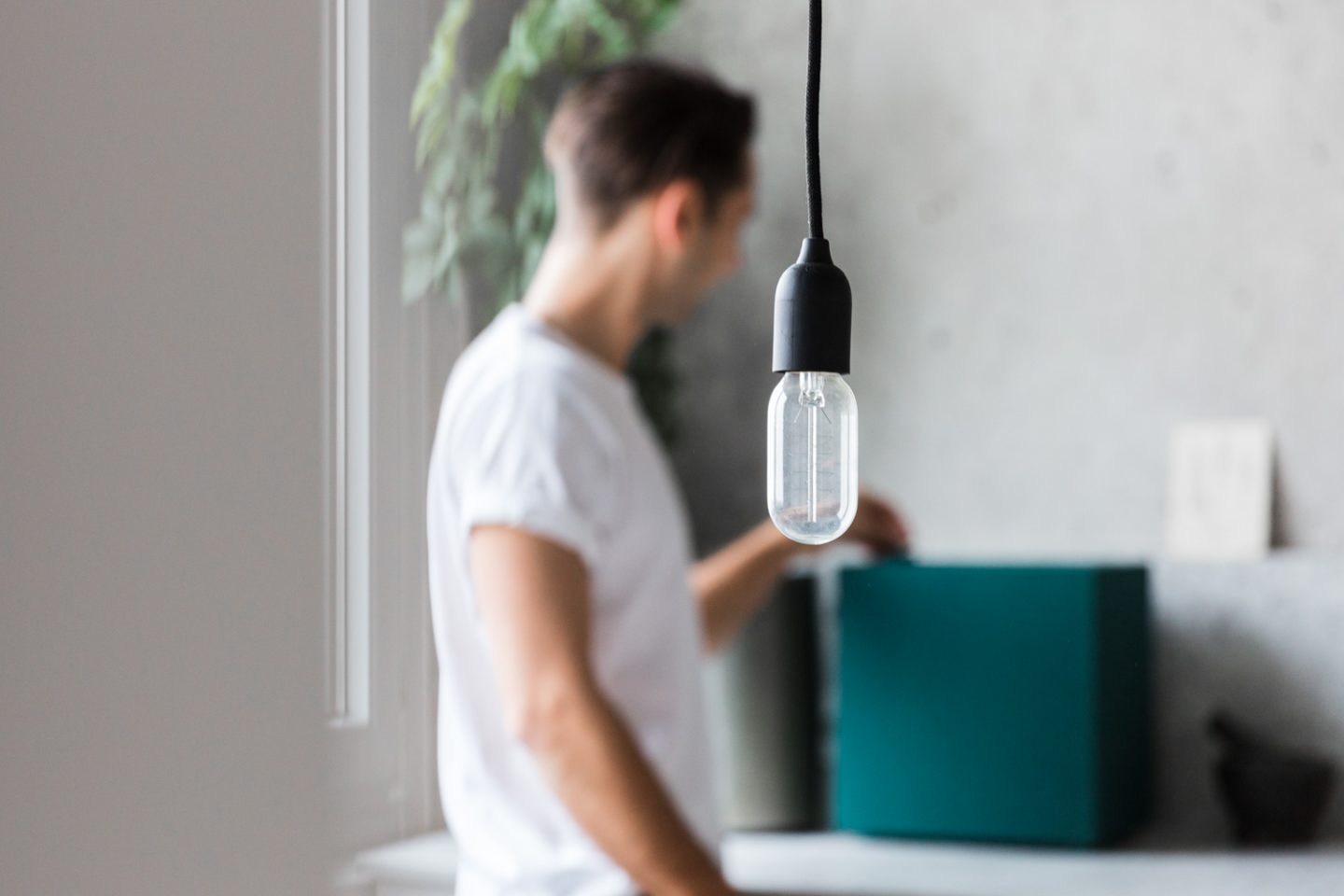
I have to admit these speakers fit so perfectly with our range that I could just place them in one of our kitchens and they’d work with the overall concept. That means I would’t have to build it in, install it or hide it away. Whenever we fit out a kitchen for a client, or even work on our own showroom, we of course incorporate products from other labels. And products like the Urbanears speaker bring us further, because electronics aren’t something we do. This box works super well for us – it’s a pure form, this cube, relatively hard and clean, but at the same time the fabric it’s covered in gives it a kind of softness. It’s not just cold and hard with stark edges, although that’s the kind of shape it is – but instead it’s warm.
–In collaboration with Urbanears–
All images © Clemens Poloczek for iGNANT. Interview and text by Anna Dorothea Ker.
