Balance And Form Inspired By Shibusa
- Name
- Alexander Kilian
- Project
- Shibusa
- Images
- Alexander Kilian
- Words
- Rosie Flanagan
Shibusa is a Japanese aesthetic principle associated with subtle, simple and unobtrusive beauty. It is most often characterized by the balance between two opposing elements in a single object or frame.
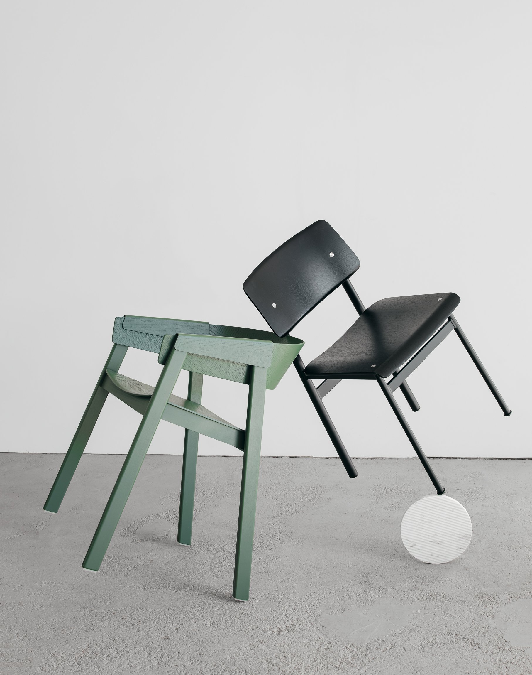
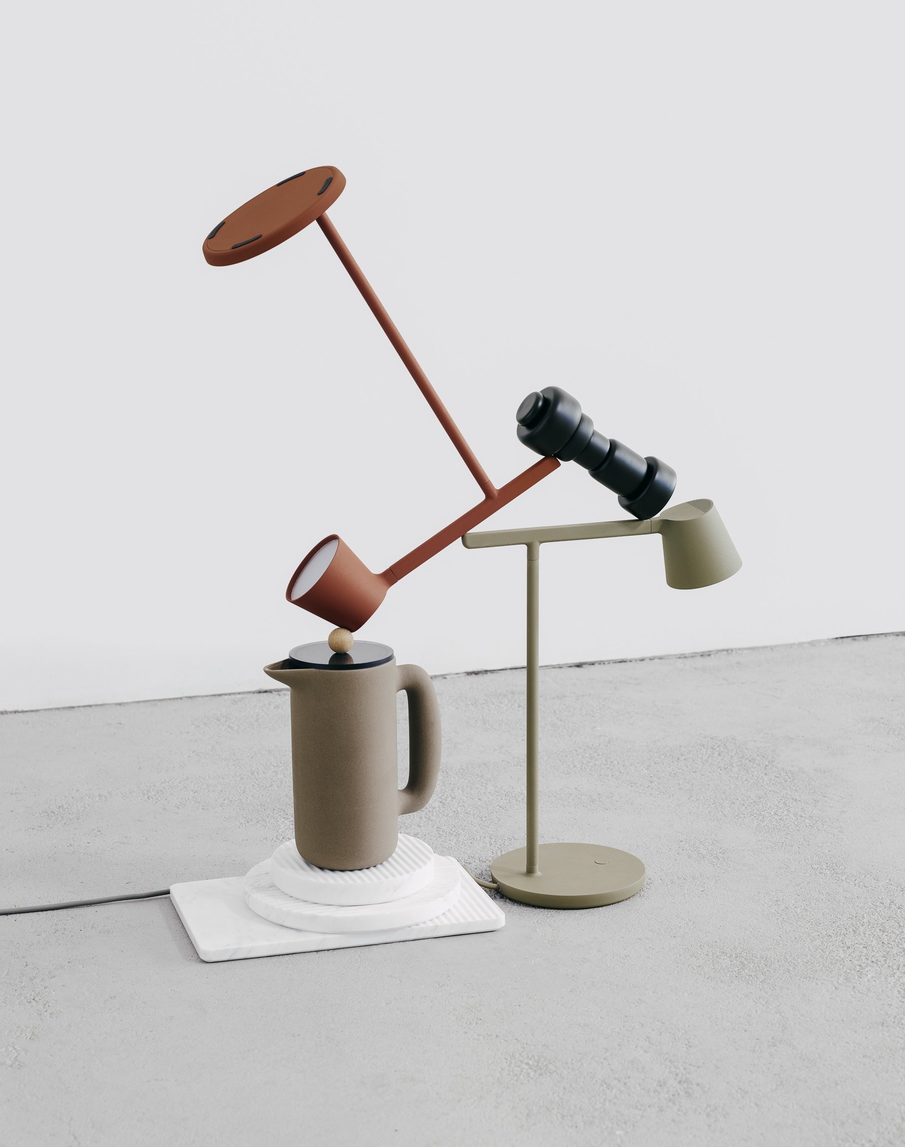
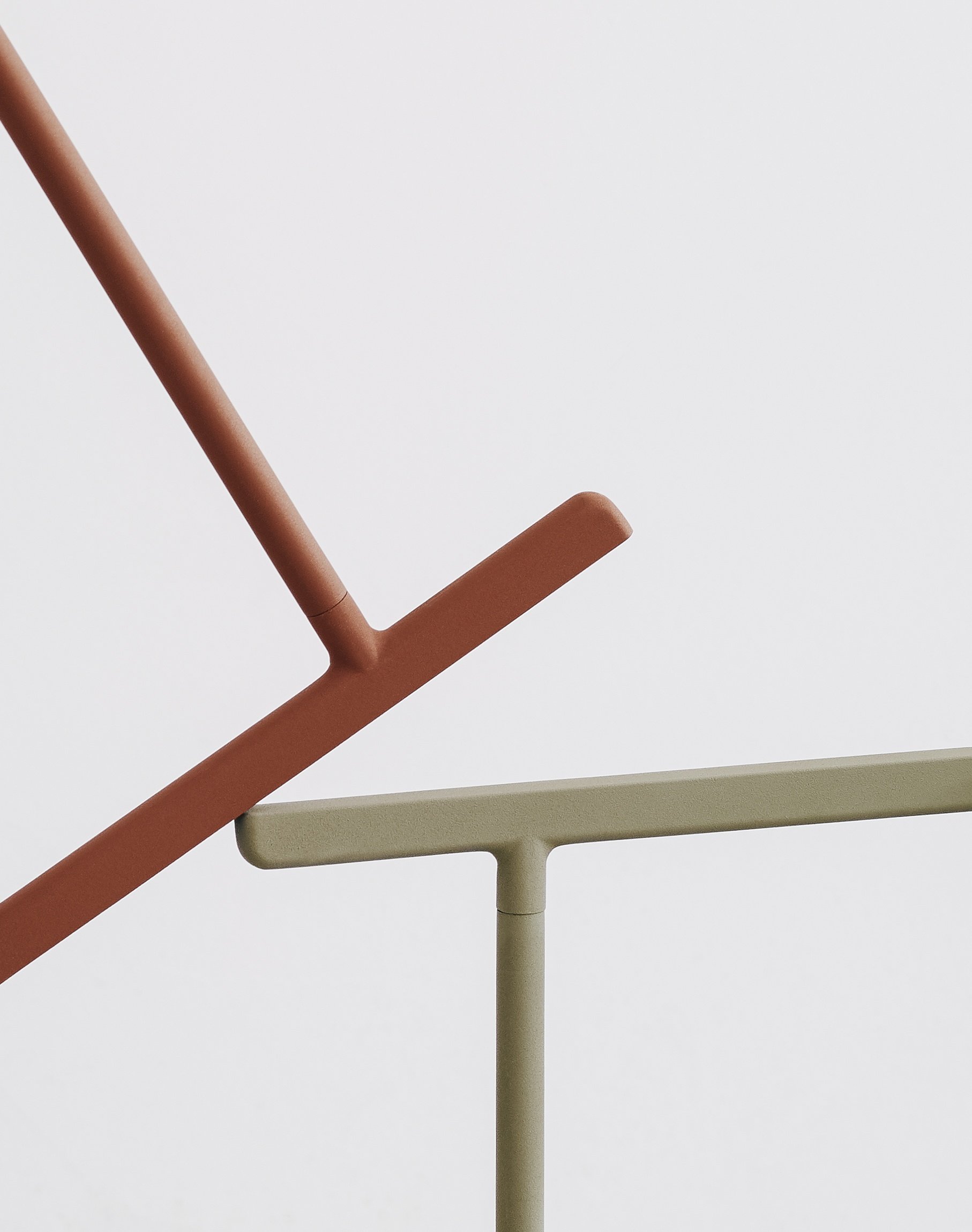
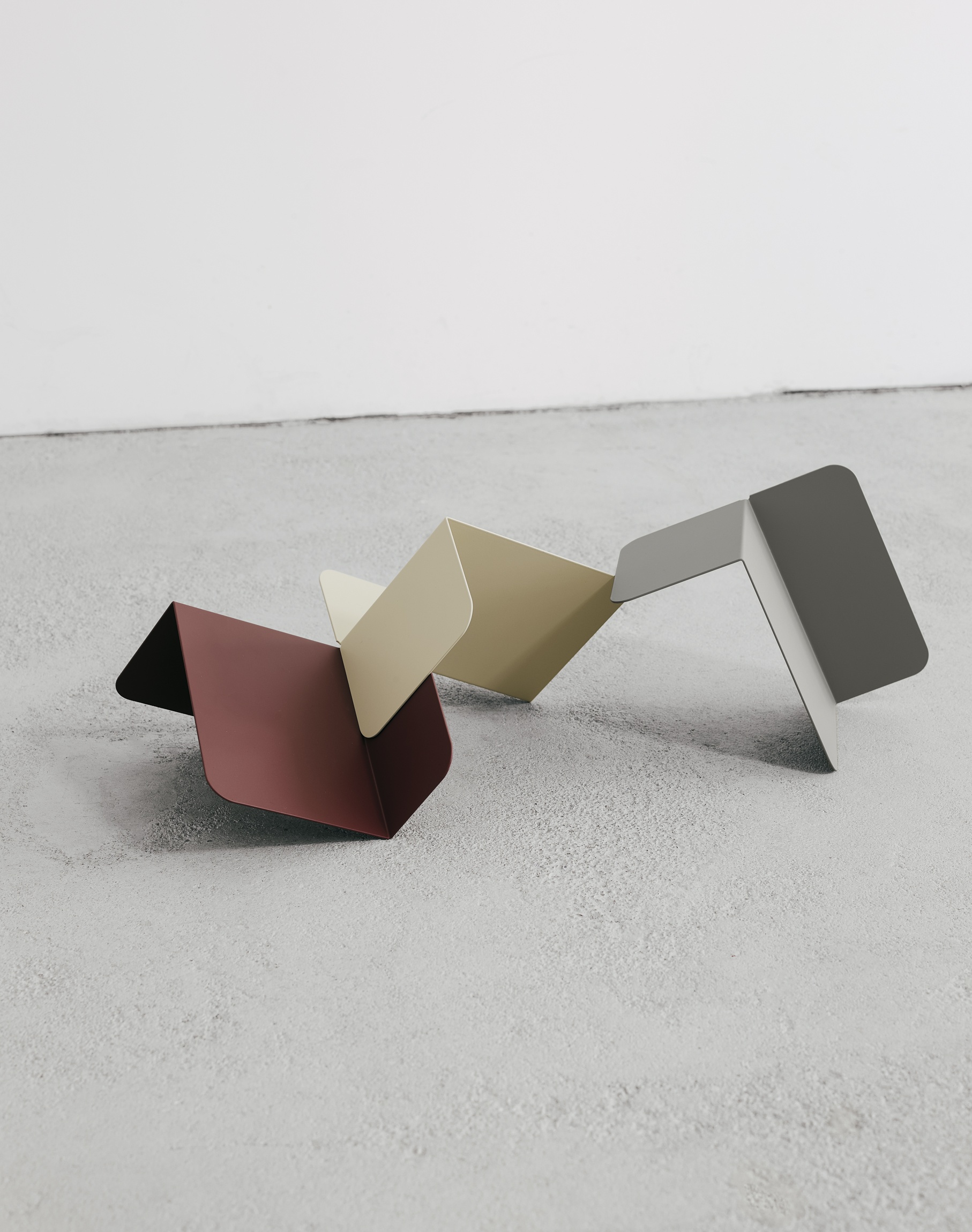
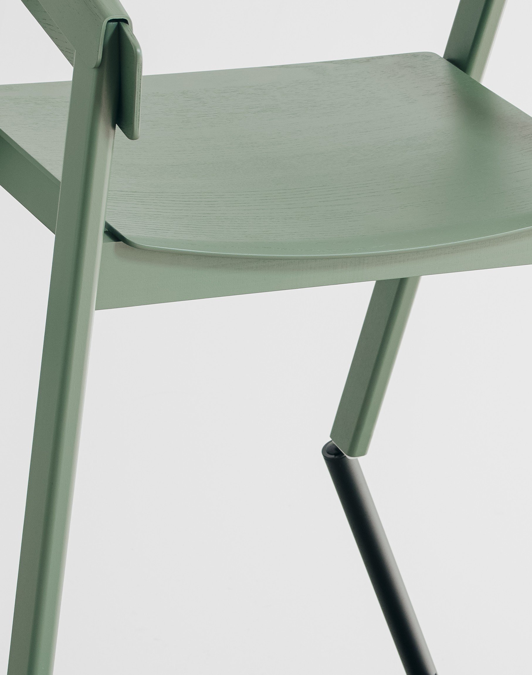
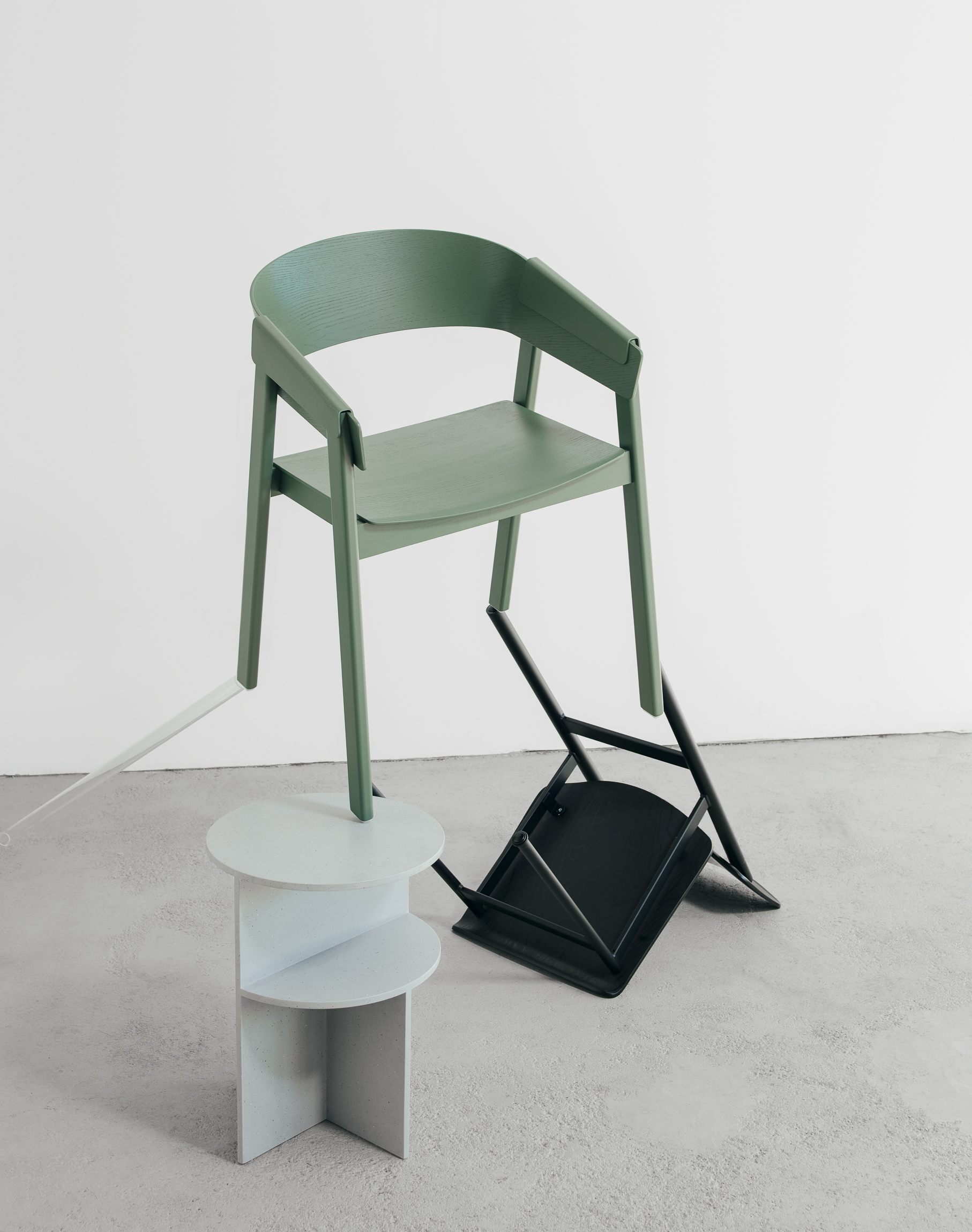
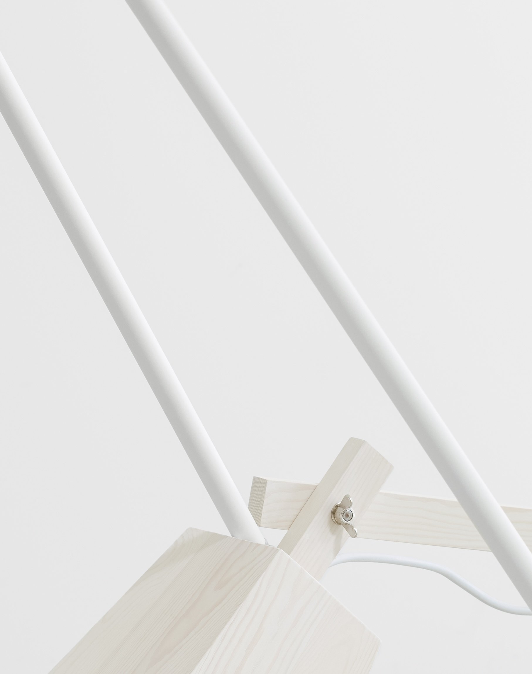
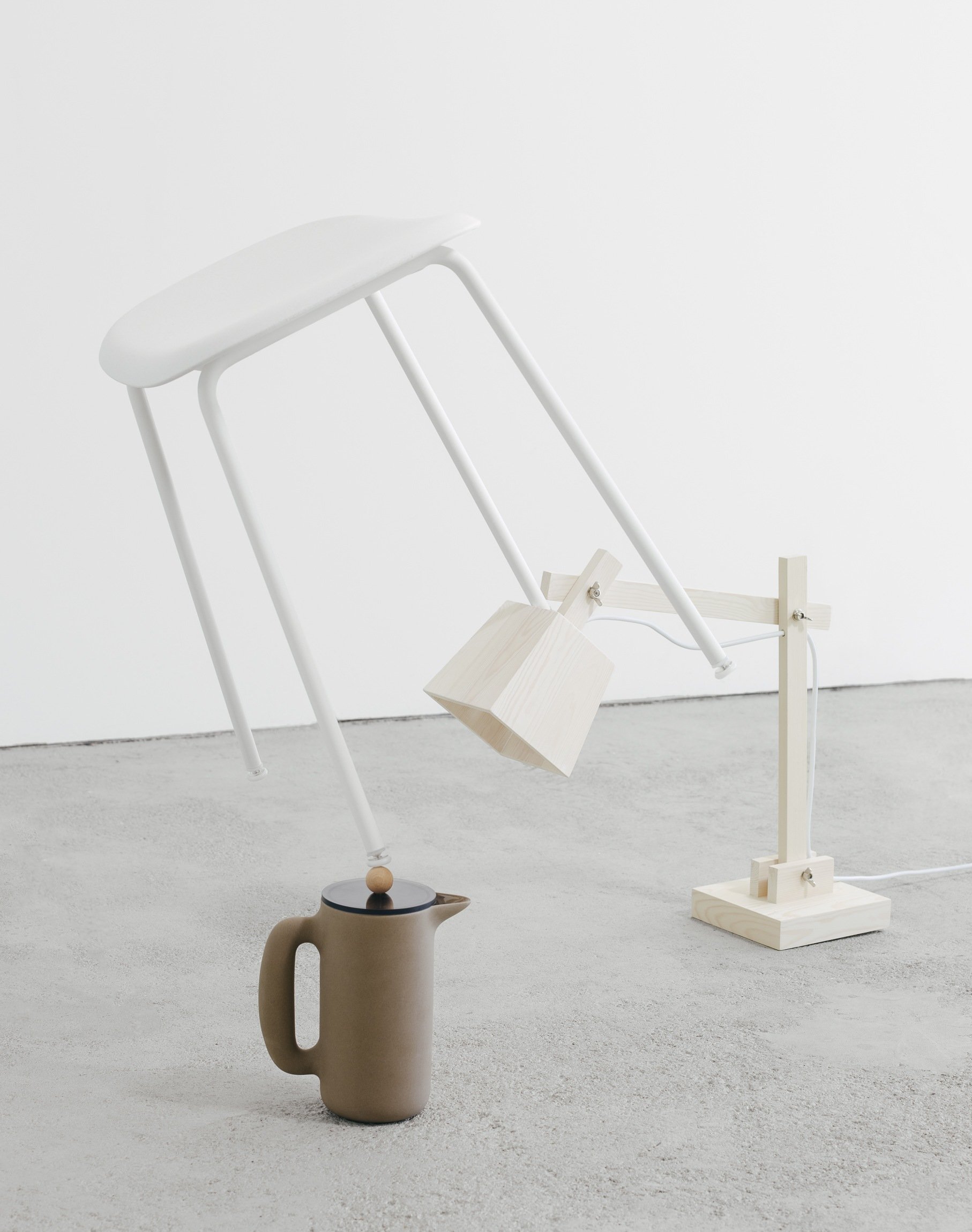
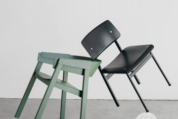
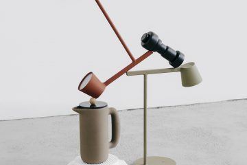
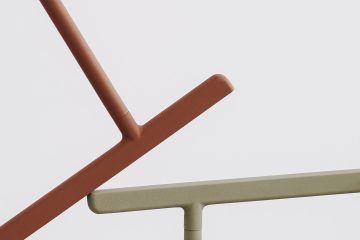
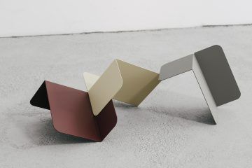
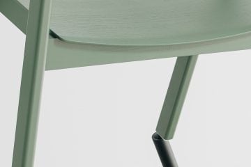
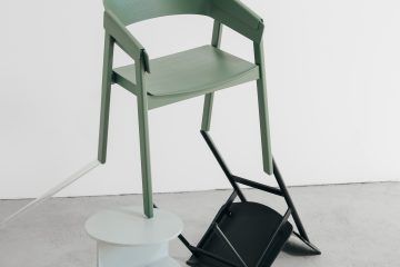
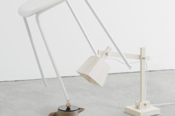
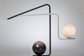
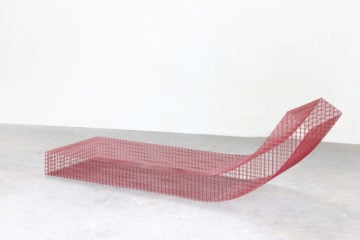
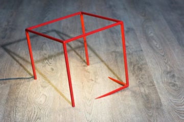
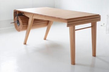
In the latest editorial for IGNANT, shibusa was used as the starting point for an abstract exploration of balance and form. In ‘Shibusa’ Muuto design pieces in muddied colors were arranged standing at odd angles, and piled together in strange configurations. Drawing conceptually from the seven elements of shibusa—simplicity, implicity, modesty, naturalness, everydayness, imperfection, and silence—the household objects appear to float, poised as if about to fall from their strange gravity-defying positions. This harmonious balancing act was captured by Berlin-based photographer Alexander Kilian against a clean concrete backdrop. Through his lens, their status as everyday objects is suddenly razed—‘Shibusa’ asks that we marvel at the ordinary instead.
Photographer: Alexander Kilian
Creative Director: Clemens Poloczek
Production: IGNANT Production
Location: Berlin
Year: 2018
In cooperation with Muuto.
