Living Lagom with Jonas Bjerre-Poulsen of Norm Architects
- Name
- Jonas Bjerre-Poulsen
- Images
- Alexander Kilian
- Words
- Anna Dorothea Ker
Focusing on the essentials is a central thread running through the life and work of Danish architect and founding partner of Norm Architects, Jonas Bjerre-Poulsen, whose design philosophy embodies the Swedish concept of “Lagom”: the harmonious balance point at which nothing more needs to be added or taken away.
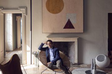
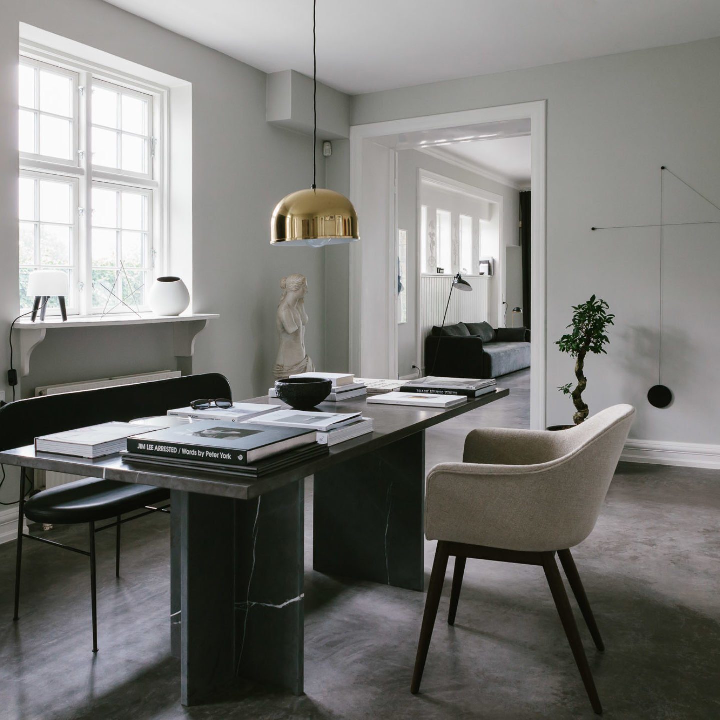
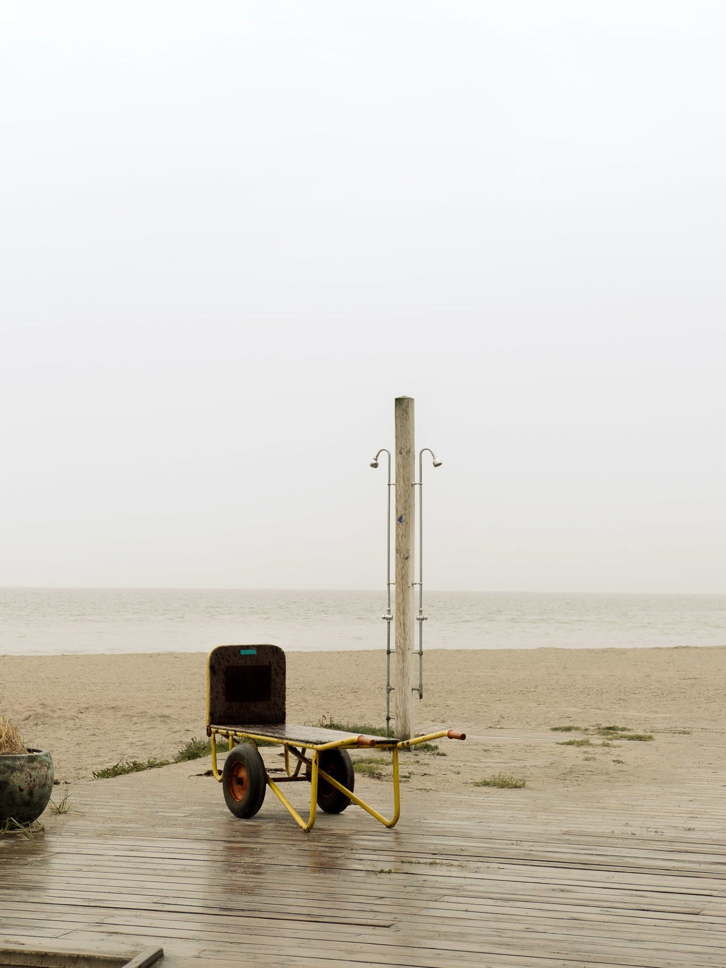
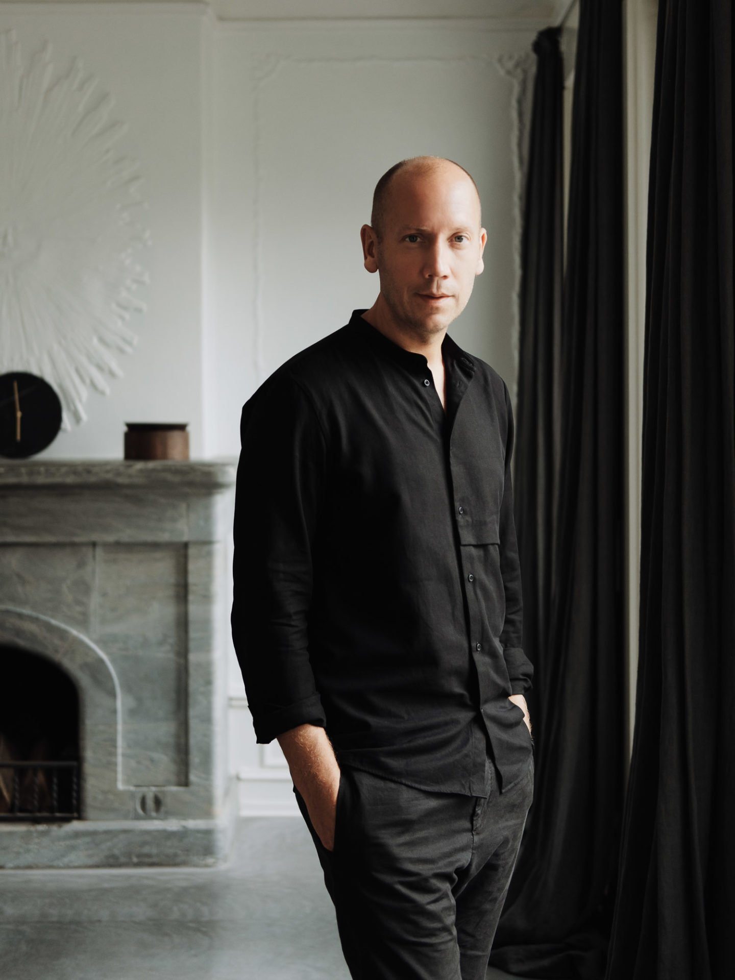
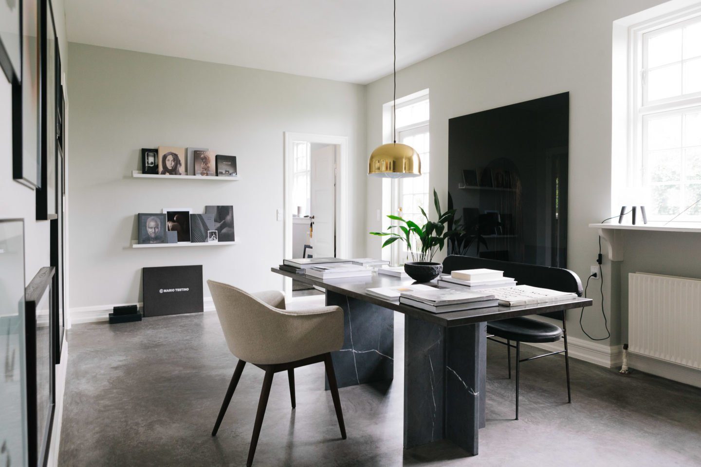
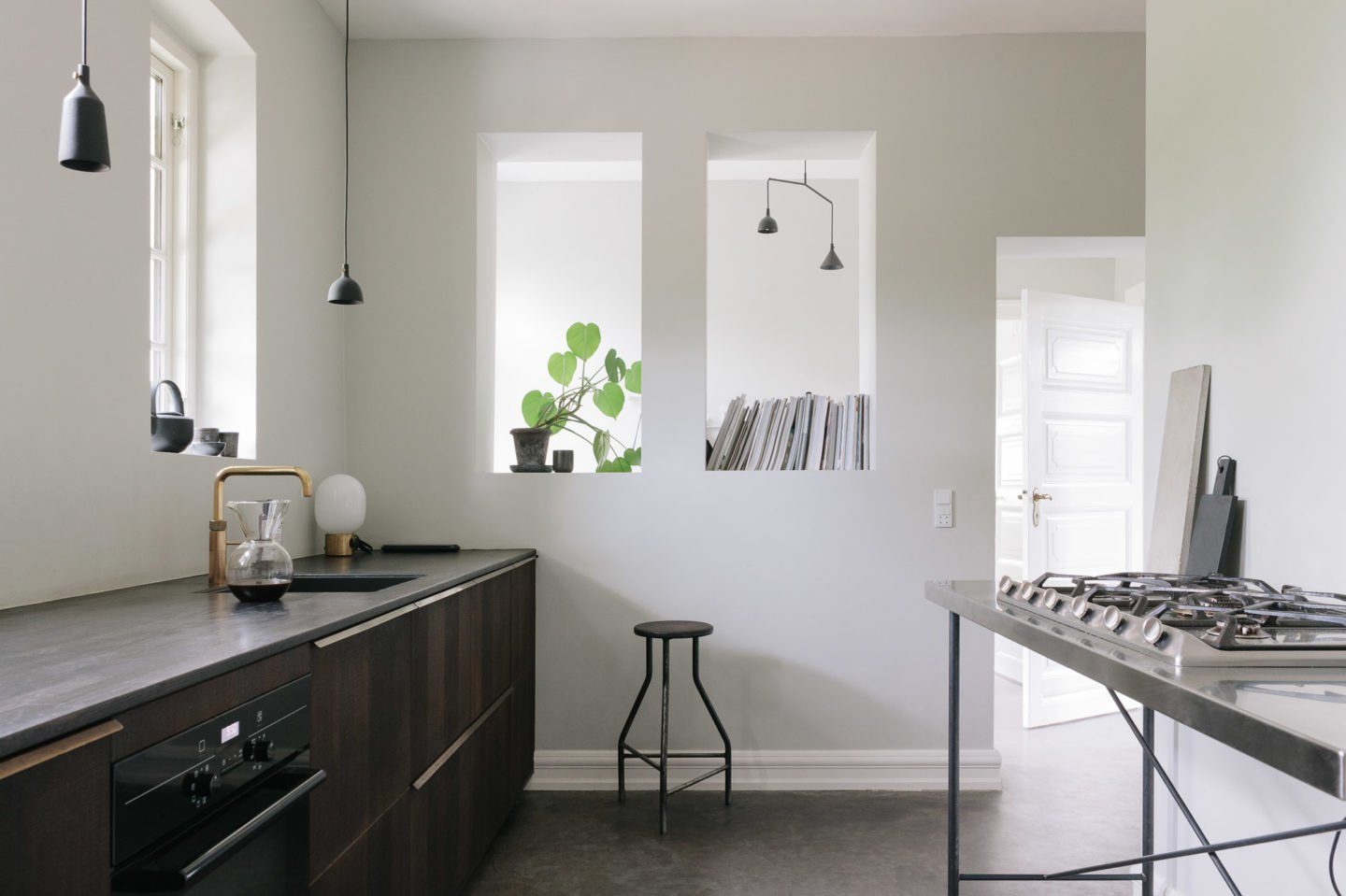
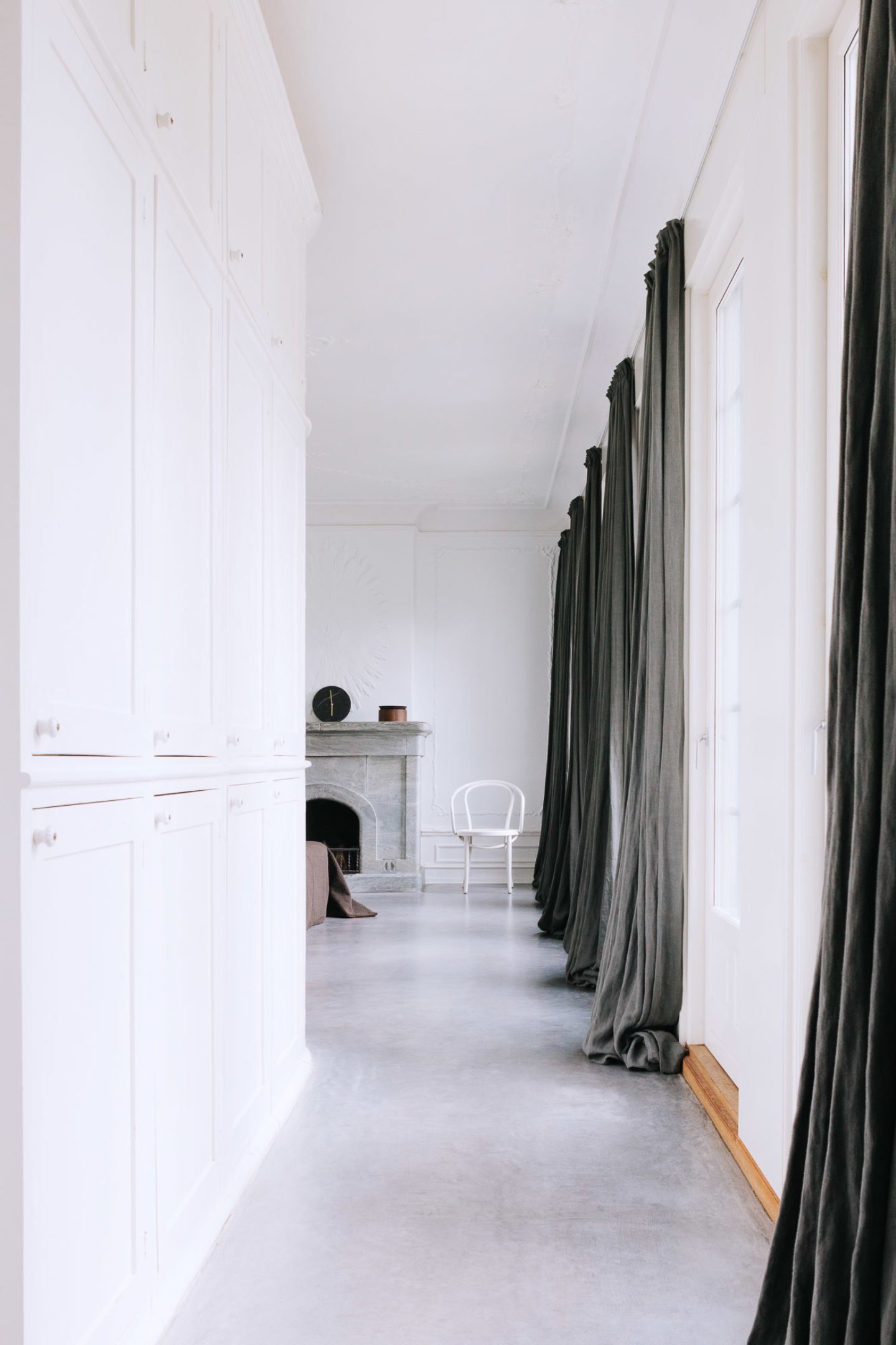
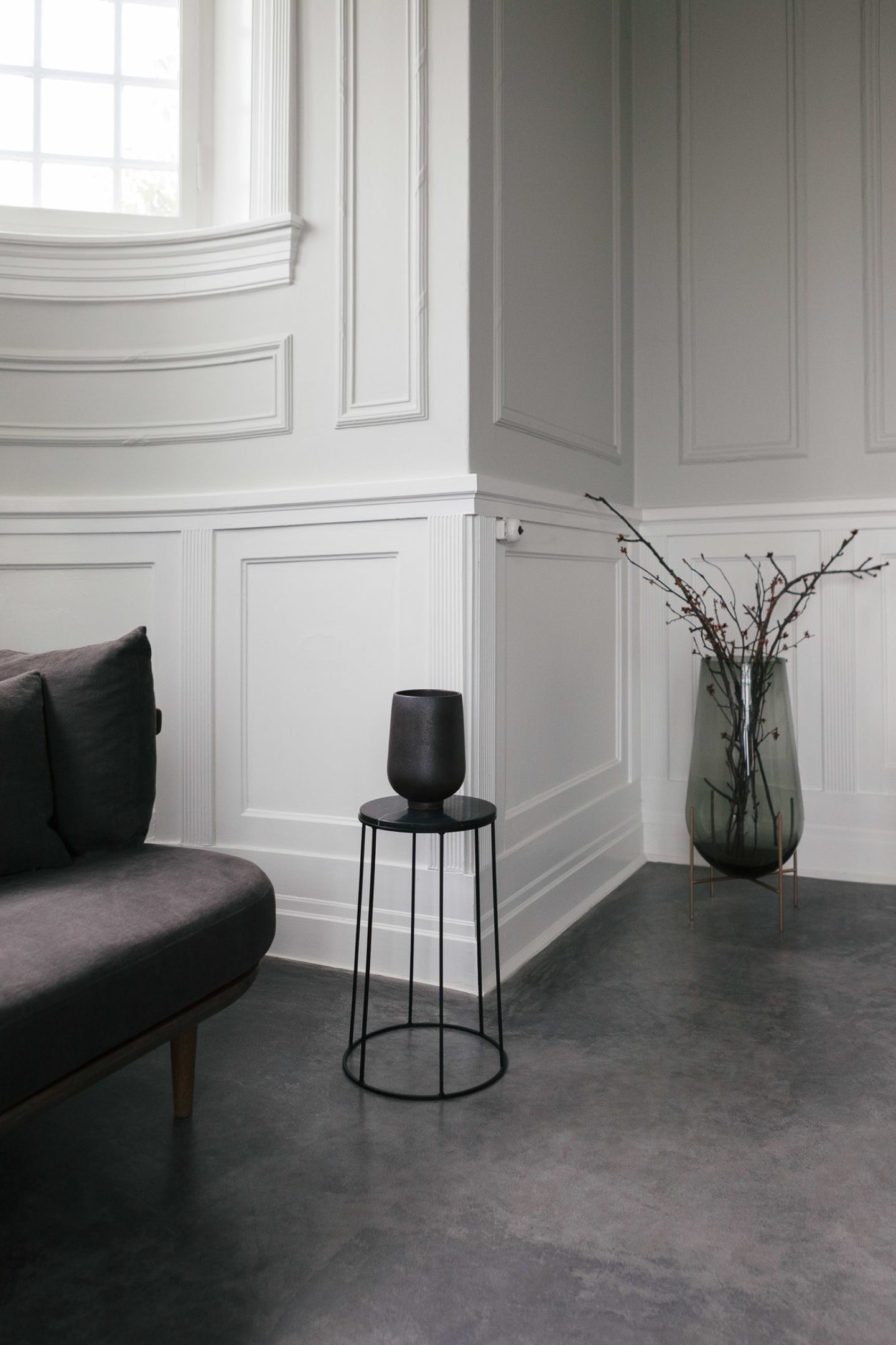
The Lagom lifestyle is embodied by the minimalist Samsung QLED TV, with its perfectly flat, borderless screen and ambient mode, which allows it to remain a subtle element of its surroundings. Together with Samsung, we travel to meet Bjerre-Poulsen at his home in a small fishing village just outside of Copenhagen. After giving us a tour of his spacious home — a 19th century villa which Bjerre-Poulsen renovated together with his wife, balancing out the original mouldings and ornamentation with smooth stone floors, neutral walls and natural materials, we sit down with the distinguished architect at the marble table in the dining room, overlooking the sea — today a hazy grey. Bjerre-Poulsen often works from here in the morning, and today he opens up about Norm’s human-centric design principles, sharing his views on paring back to create room for what’s important, why “Old Nordic” is the new “New Nordic”, and the key to feeling at home everywhere.

Reduced forms, natural materials and a neutral, harmonious palette are trademarks of your visual language. Which other elements are essential to the trademark Norm aesthetic?
There is a pursuit of timelessness in all of our work. We talk about this a lot, as some people think it’s utopian to create something timeless, given that everything connects to the period in which it was made. But more and more we’re seeing a fast-paced approach to design, of the kind that we’ve seen for years in fashion. It changes all the time. People don’t buy clothes because they need them; they buy them as a visual expression of their own identity. So it’s more about culture, and less about need. In both design, architectural and interior works we try to do projects that are all about meeting real needs for humans. We’d much rather do something that’s more quiet and withdrawn, but will be more durable — both in terms of aesthetics, and also in terms of using high-end materials that will actually last 10, 20, or 100 years.
Of course we want to create things that are nice to look at — sight is our most important sense as human beings — but we also want to consider all other senses. An object should be nice to touch, and it should sound nice when you walk on the floor, if you sit on a chair or lift it up. We want to round things off so that they’re nice for the sensitive parts of your body. Your lips, when you drink from a cup, or the rounded edge of a handle for your hand. Designing cutlery is actually one of the most difficult things — it’s about touching all the most sensitive parts of your fingers, and then touching your mouth. The way you shape cutlery with the smallest details — also the balance and weight — these basic human elements, both in terms of need and how objects actually touch the human body, are universal, and transcend cultural preferences. It works all over the world, because it meets what is essential to being human.
"We always try to find a sense of balance in our projects. The point at which there’s nothing to add, and nothing to take away."
This holistic starting point to creation is at the centre of your practice, which as you say encompass design, architecture, photography and art direction. How does your expertise in each of these fields influence your work in the others?
I think it’s about a certain way of looking at the world. There’s no difference in the overall approach I take to architecture, interiors or design. It’s basically about the same things. Doing architecture, it’s about understanding the needs of your clients — so if it’s a family, how do they live, what are their preferences, how do they host guests, and so on — and then we combined that with the knowledge we’ve gained about what is pleasant for human beings in general. That’s one type of analysis. Doing design work is another thing — we need to understand the basic needs for using an object, as well as the client, the market and how it’s going to be communicated. But the two processes aren’t that different. It’s strange, as it was only until recently that they were so divided. And then you had a few people breaking down the boundaries. Today it seems very accepted that people are working across all sectors.
Then we have photography, art direction and strategy — those are more intangible in many ways, because it’s all about communication. But there are common principles we apply across the board. We always try to find a sense of balance in our projects. The point at which there’s nothing to add, and nothing to take away. So it’s a constant game in the creation process of adding an element and then taking it away again, to find the exact point at which a design is so simple that it will stand the test of time, because you don’t get tired of looking at it, but it has so much character that it stands out as something special. That also applies to how we work with photography, for example. It’s really about emphasising what’s important by ignoring all the irrelevant things. It’s all too easy to photograph everything. Focussing through the lens to concentrate on a motif or a shape is more difficult. It’s the same with design — there can be so many things going on that it all blurs together, and nothing becomes important. So I think it’s very much about focus.
Your definition of balance as the point at which nothing needs to be added or removed embodies the Swedish principle of “Lagom”. What other applications does this principle have beyond aesthetics?
If I understand “Lagom” right, it’s “just enough” — which also extends to not having to many things. Every item you own takes up space in your conscience that preoccupies you. Having fewer things means having fewer things to worry about, and it’s easier to live life. When I was at architecture school, I did an experiment — I put rice in all the cupboards in the kitchen. After a year, I threw out anything that still had rice in it, as I hadn’t used it for a year, it probably wasn’t necessary. That’s how I look at my home now. If there are things I don’t use anymore, that take up space, then I get rid of them. The moment I give it away or sell it, it’s out of my mind. I think it’s about freeing yourself of your possessions.
When we started our practice ten years ago, we spent a whole year discussing what we wanted to do. We realised we were minimalists in many ways, and we loved that simple way of living and working, but at that time, minimalism was not a positive word. So we sat down and wrote a short essay called “Soft Minimalism”, to try and re-invigorate the concept. It was all about saying you can have a simple life, you can decorate your interior in a simple way, you can make simple objects, but if you use natural, good quality materials, that provides a lot of character.
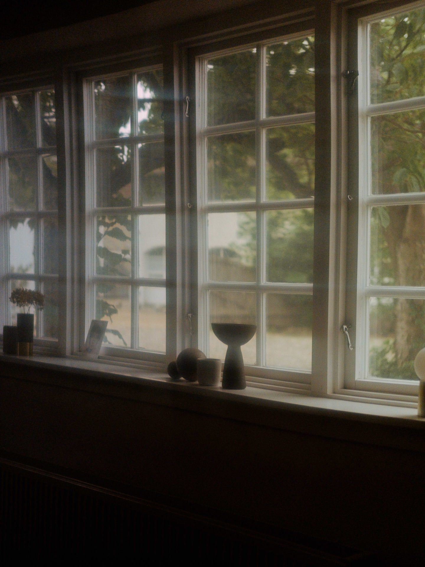
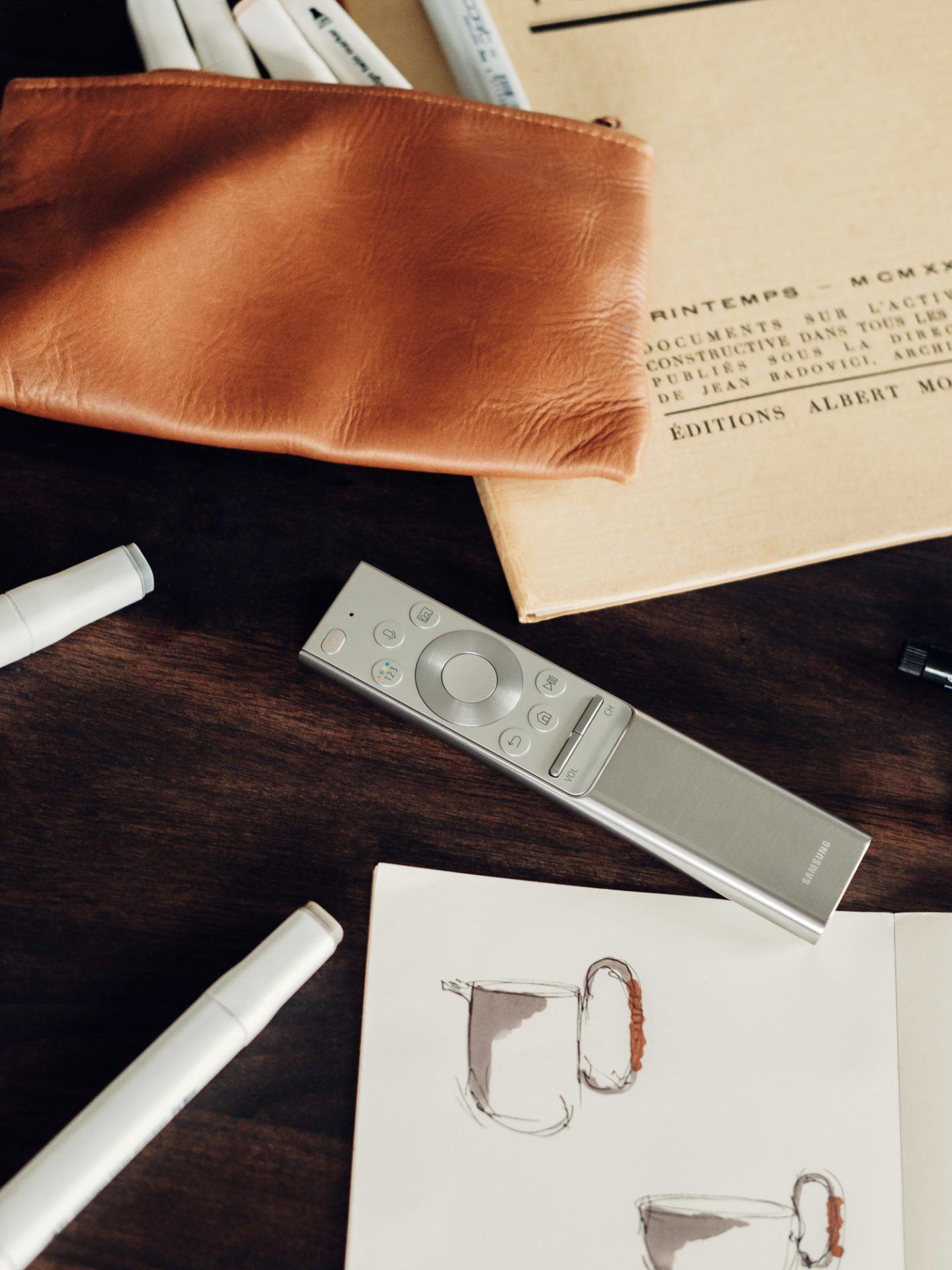
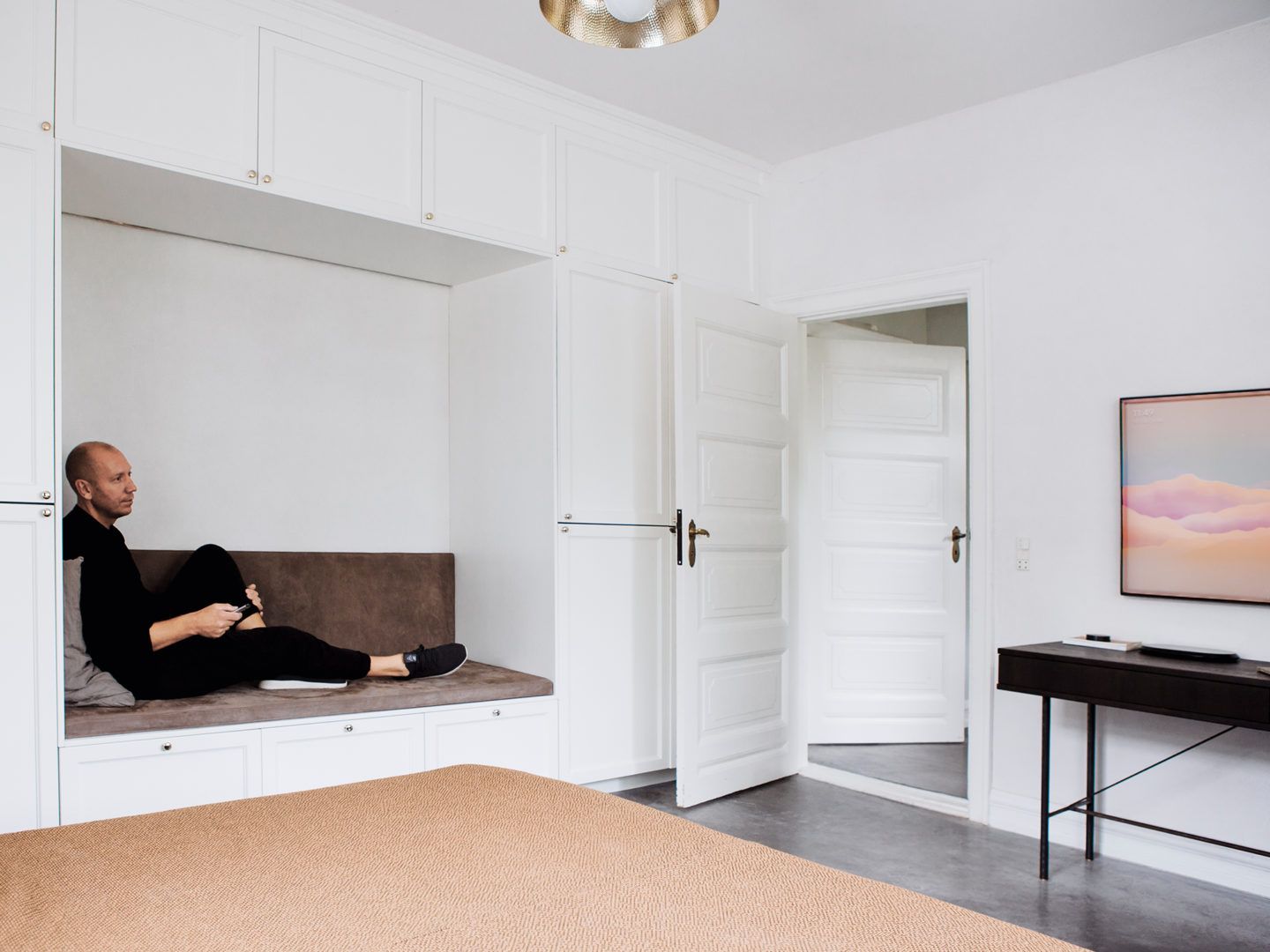
Lagom is one of the major lifestyle trends 2018. You can discover more ideas for interior design and TV integration in the Samsung Entdecken blog.
By paring back, you naturally create more space for other things. What else do you want the spaces you design to make more room for?
It’s about looking at space like a blank canvas, where you need to have the colours and palette to unfold life in the apartment — the people coming into the house, the food you eat, the gatherings you have. I think the space itself needs to withdraw a little bit to make room for human interaction. If the space itself communicates too much, it takes the focus away from the life being lived within it. I love going to art museums and seeing colourful artworks and installations, and going to different places that burst with colour — but that’s to look at the space itself. In my home, I want to have a sanctuary. There’s so much going on when you go to work or if you enter the world via your phone. Actually having this refuge where you can withdraw to, and be calm and not have something that wants to communicate with you all the time, that’s a good thing.
Speaking of technology, the Samsung QLED TV is designed to blend seamlessly into its surroundings, only “communicating” with you when you wish. What considerations come into play when integrating technology like the QLED TV into your interior concepts?
I like technology that doesn’t look like technology. I think the issue, whether it’s cars or phones or televisions, is that technology has been at the front line of innovation — it’s the future. Designers want to shape the future, so they design very futuristically, which I often think is a mistake. We’ve refined how we decorate and shape things and build our world over so many years. Why try to push things in a direction that doesn’t feel homey and natural or human, but feels futuristic, like a foreign object? Luckily, a lot of design is now going in the opposite direction. So we’re finally seeing tech being designed as objects, on the same level as furniture, lamps or cups — especially in terms of tactility, and materials — which turn pieces of technology into things you want to own, instead of just pieces of plastic and aluminium.
Thanks to its Ambient Mode, the Samsung QLED TV blends into its surroundings, becoming a harmonious element of the room and allowing the picture to come into focus. That’s often how we work with items, where they just become doors with a handle. I like to tuck things in so they feel integrated or bespoke, and I think that the Samsung QLED TV does the same in many ways, with its super thin frame. It almost becomes part of the architecture. Because it’s turned off most of the time, it needs to look as unintrusive as possible. There’s this interesting effect on people where it’s really hard to escape the typology of an object. To break out of designing something that looks like something else, it’s good to look at completely different types of objects. So if I were to design a TV, I would start my research looking at everything but a TV. Then maybe I could trick myself into designing something that doesn’t look like a TV. When I put up the Samsung QLED TV, the first thing I noticed was that the sound is amazing. Taking all the tech out of the screen and into the connection box and keeping the screen that flat is really smart. Being so close to the wall, it almost isn’t noticeable — except until you turn it on, of course.
How did you approach the process of designing your own home — what were the similarities and differences to your approach to client briefs?
The decision to move here, to the outskirts of Copenhagen, was very much about the place itself. It used to be a small fishing village, with 4-5,000 people living in the area. The area is surrounded by protected nature — forests, fields and of course the sea, and you can walk everywhere. At the same time, I’ll be in the studio in the centre of town in 25 minutes. Working in town, then coming out here — it’s a breath of fresh air. We first moved into a fishing cottage just 200m down the road, and were there for 10 years. We renovated that also — it was from 1860, one of the first houses in the area. When the family grew, we looked for a bigger house. Doing simple, minimal architecture, I never imagined myself moving into a place like this, with mouldings and ornamentation. I was very much in favour of Adolf Loos’ “Ornament is Crime” essay, which holds that all ornamentation should be a natural part of the materials you use. So if you see an Adolf Loos interior, it’s full of clean lines, but very expressive marble. It seems pretty decorative, but the decoration only comes from nature.
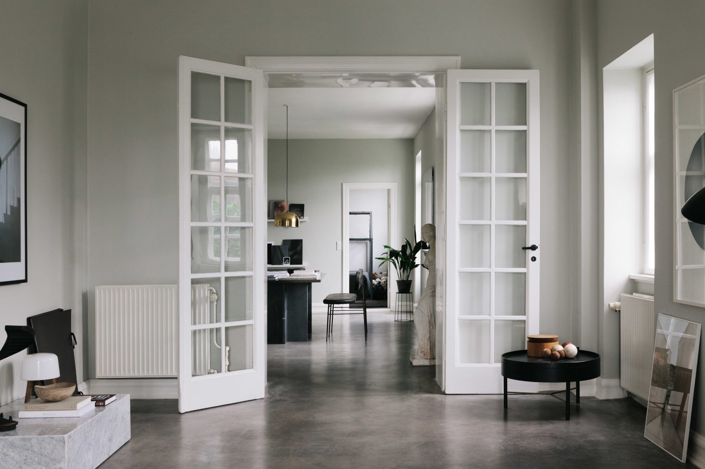
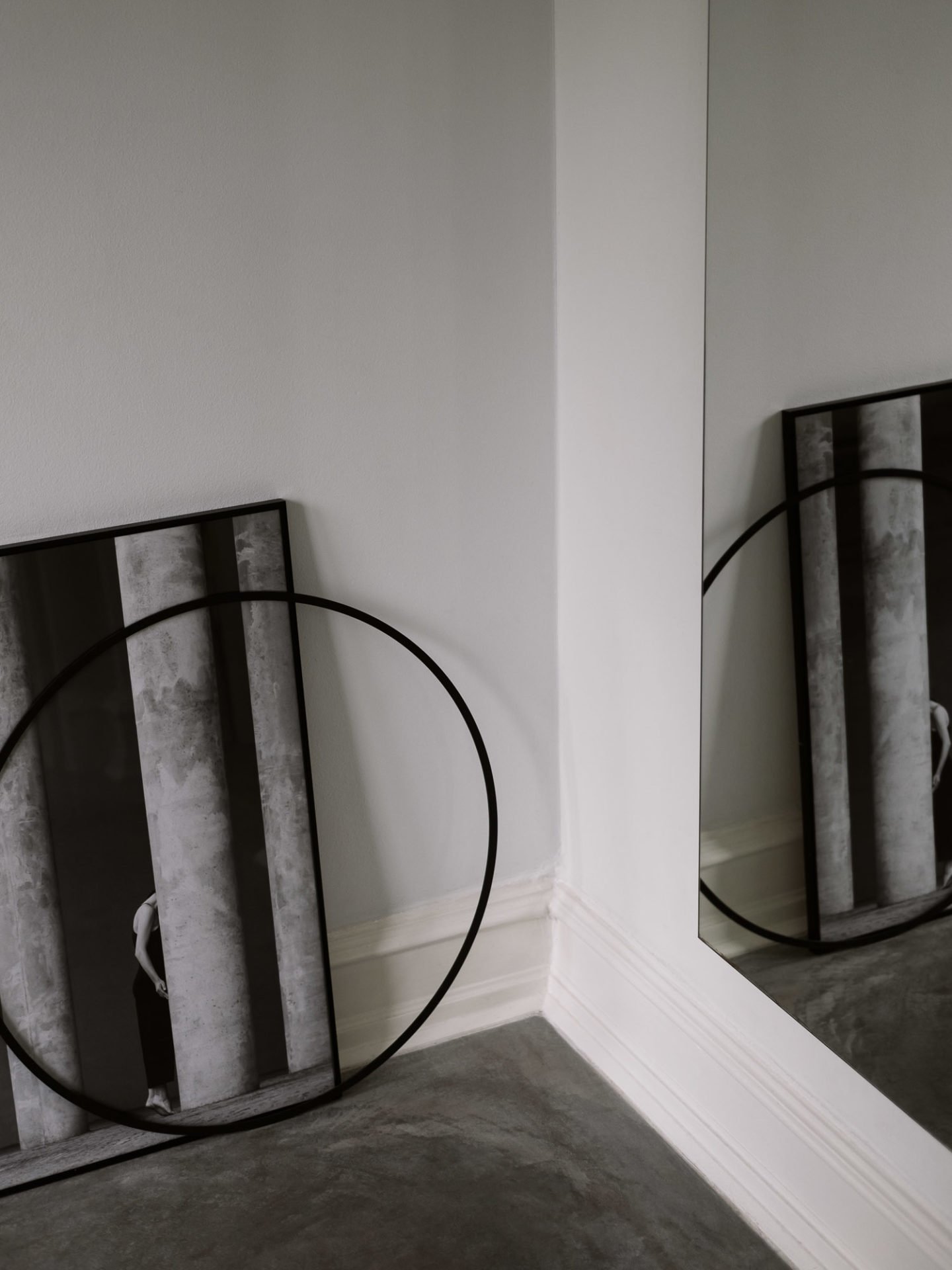
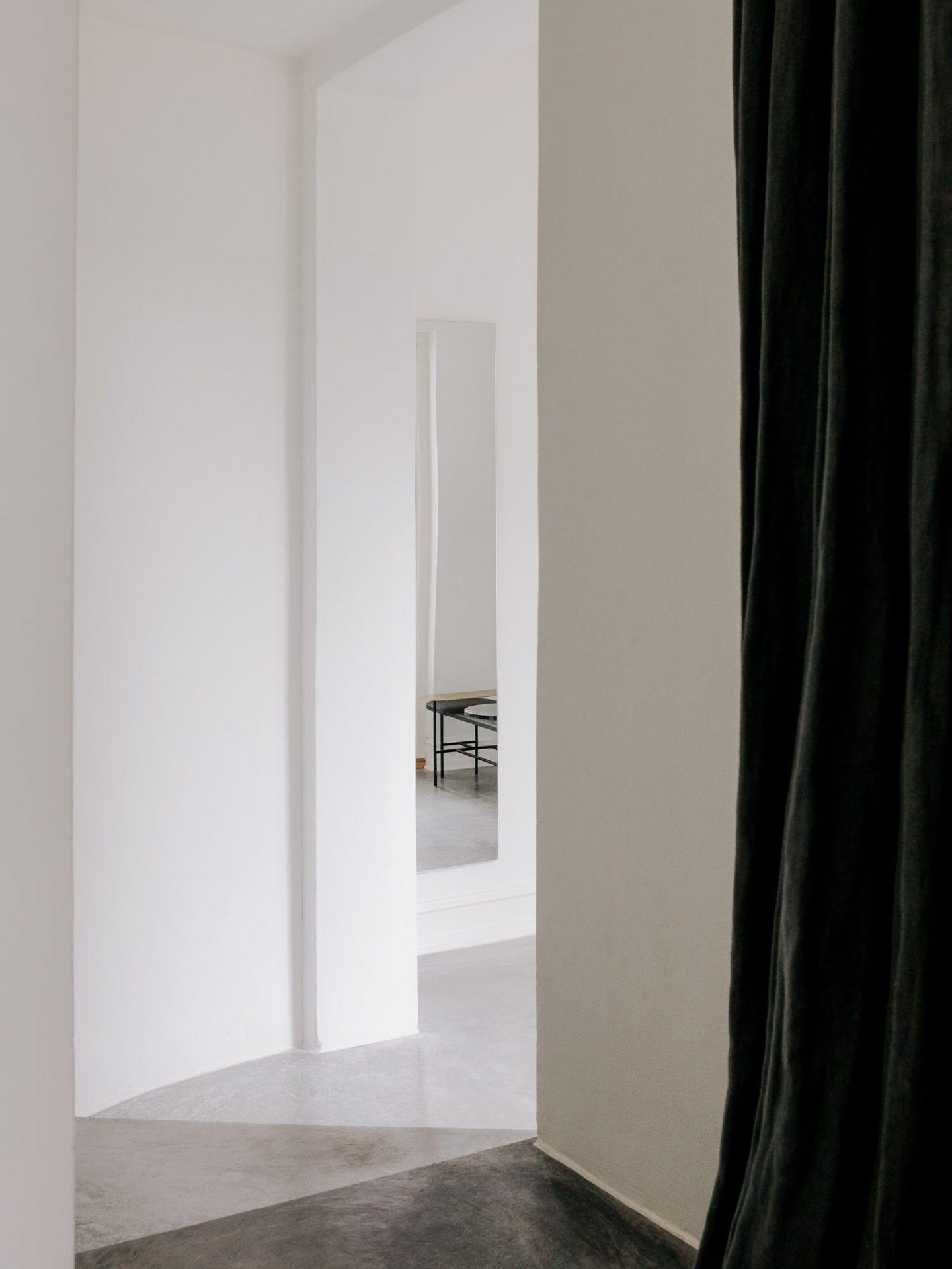
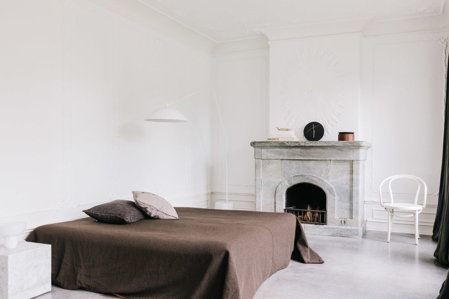
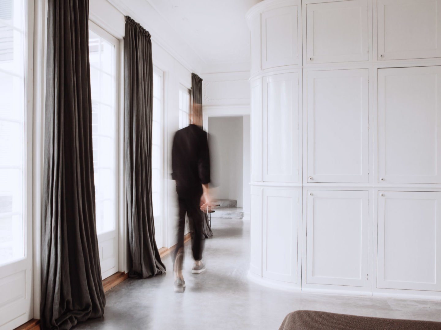
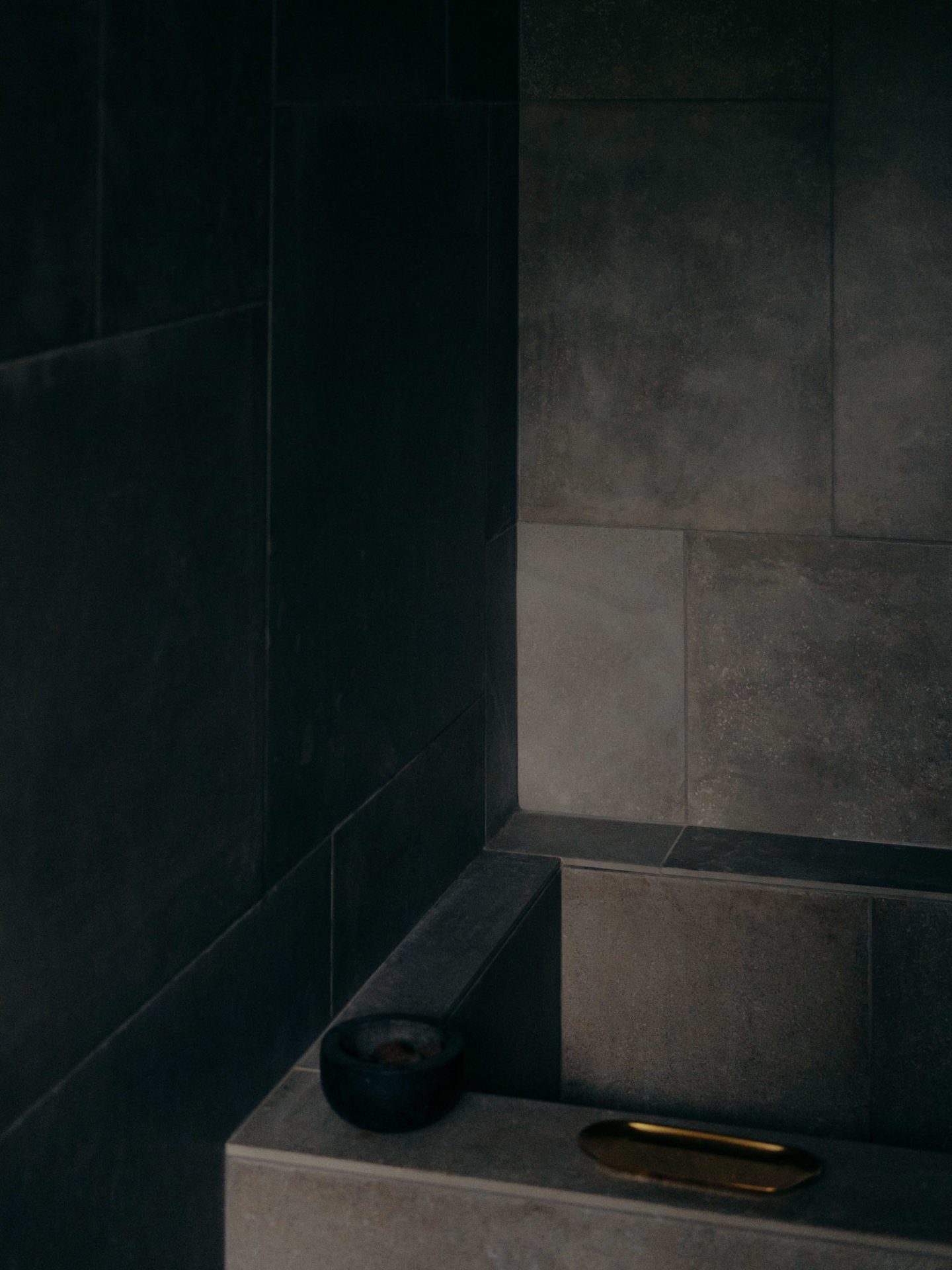
When I saw this house, I was a little sceptical as it was different from what I had imagined living in. But there was a certain old world charm to it. It also reminded me a little bit of Rome, so there was an element of nostalgia that appealed to me. We bought the house, and it was very much about finding the balance between its history and making it contemporary enough to feel at home in. So we kept the old mouldings and big fireplaces, but added completely sleek stone floors that unite all of the spaces in a much more contemporary way. And then finding “Lagom”: stripping away and adding until we found the perfect balance. Even though we used natural stones and historic references — in the bathroom, for example — it’s very contemporary at the same time. There are also big metal cabinets downstairs, and we’ve stretched long elements of the kitchen to increase the space. We cut holes like niches between different spaces to let in daylight from all sides. I’m not completely there yet, but I’m still working on it.
Aside from a physical space, what meaning does the concept of home mean to you?
If you are not that attached to physical objects, I think you can feel at home in many places. It has a lot to do with comfort. The basic idea of dwelling for human beings is feeling protected from the outside, and having some kind of universe you can control, because it’s so chaotic outside in the world. I can feel as much at home in a small boutique hotel in Japan, or visiting friends somewhere else if there is the feeling of security and comfort. We think a lot about this question when working with commercial interiors, actually. Even ten years ago, work was one thing — an office looked like an office, in the extreme it was cubicles, not that humane — it was about being part of a machine. Going there, fulfilling your part of the task to earn money, and then going home. That concept has changed dramatically.
Today there’s a blurring of lines — people want private homes to feel like boutiques or galleries, so they’re taking elements from retail, culture and hospitality and bringing them to their home. They want to display their favourite objects on pedestals, they want their bathroom to be an ensuite. So we see all these elements coming from elsewhere into the feeling of home. In the other direction, when people go to work, they want their office to feel more like home, too. It’s not just about having a desk and a chair and a computer. In order to attract and retain the right talent, especially within creative industries, going to work should also feel like coming home in many ways. It’s about considering how built environments can be optimal for human well-being. From Enlightenment through to the rational philosophy of Modernism, human beings have been thought of as parts of a machine. Too much thinking about hygiene led to bathrooms being highly clinical and functional, with no tactical surfaces. Offices became about efficiency, assembly lines, not about how the workers should feel. That’s all dramatically changed — I think home can be both at work, traveling, in hospitality spaces and at my actual home.
Who were your personal inspirations in architecture and design when you were starting out?
There are so many, but I’ve always had a fascination with old architecture. Just before I started at architecture school I spent a year in Rome, trying to become a painter. In my spare time I would go around studying the architecture in the city. Rome’s amazing, as it has all the periods of great architecture within it — everything from classical Roman through Renaissance, Baroque and Rococo. Then generally I think Modernist architecture — so everything from the Pacific Group in Los Angeles in Mid-Century Modern times, who did all the case study houses — they were very inspired by traditional architecture from Japan, and developed a new way of looking at the West Coast while working with the same principles — blurring the lines between in and outside, and having these columned structures with glass panels that allowed nature, not the walls, to be the environment. Richard Neutra, the Eamses, Rudolph Schindler, and earlier, Frank Lloyd Wright.
Then the Bauhaus, De Stijl, Adolf Loos in Vienna, the British Arts and Crafts movement, and of course Scandinavian Modernism, which was called “Functionalism” here. To me, of course, the big names in Danish or Scandinavian architecture — Björn Ludson, Arne Jacobsen, Alvar Aalto — they were all inspired by continental European Modernism, and they looked to Le Corbusier and Mies van der Rohe for inspiration. And they did their own versions, but if you look at an Aalto building, it’s more connected with nature in many ways than was the case for his continental European predecessors. He was so inspired by nature that his buildings became something different. You can see, globally, that even before Instagram, the great architects were connected and inspired by each other, and used all of these elements. Coming back to minimalism as a way of life, you can see the common denominator between all these movements that I’ve been inspired by in my work.
The interesting thing is that it often relates to the economy. If you look at the aesthetic expression of a culture that’s been rich throughout time, whether it’s Classicism or Renaissance or Baroque through to the expression of the ‘70s, it’s always been in times where they had too much money to spend when they could experiment. They knew they could replace things, so expression became very decorated — colourful, gold, red shiny plastics. If often related very much to that time. After that period, it was something that was considered kitsch or ugly, stuck in its time. If you look at all the other periods I mentioned before, whether it’s traditional Japan or Scandinavian Mid-Century Modern, you can look at a wooden spoon or a chair from that time and it’s the same. There’s a certain timelessness that is related to periods that experienced the opposite of wealth. They had to consider, “If I make this object, will it endure?” So the expression became a lot simpler and a lot more natural.
When we started our company in 2008, we had used the year from 2007-2008 to plan our company — that was before the financial crisis. All the designers in our generation were inspired by what was going on in Dutch design. They were setting the scene in terms of architecture and design — they were making lamps that were red plastic horses, they were taking replicas of Rococo chairs and burning them, dipping them in resin and selling them off for a fortune. They were making architecture that’s now called the “Dutch Disease” because it’s falling apart. It was very much not in vogue when we said we wanted to name our company “Norm”, and pursue the norms and standards of what had been refined through centuries in Scandinavian design. Then the financial crisis hit and suddenly there was a shift from “plastic fantastic” to something that was much more toned down.
Selected Works by Jonas Bjerre-Poulsen
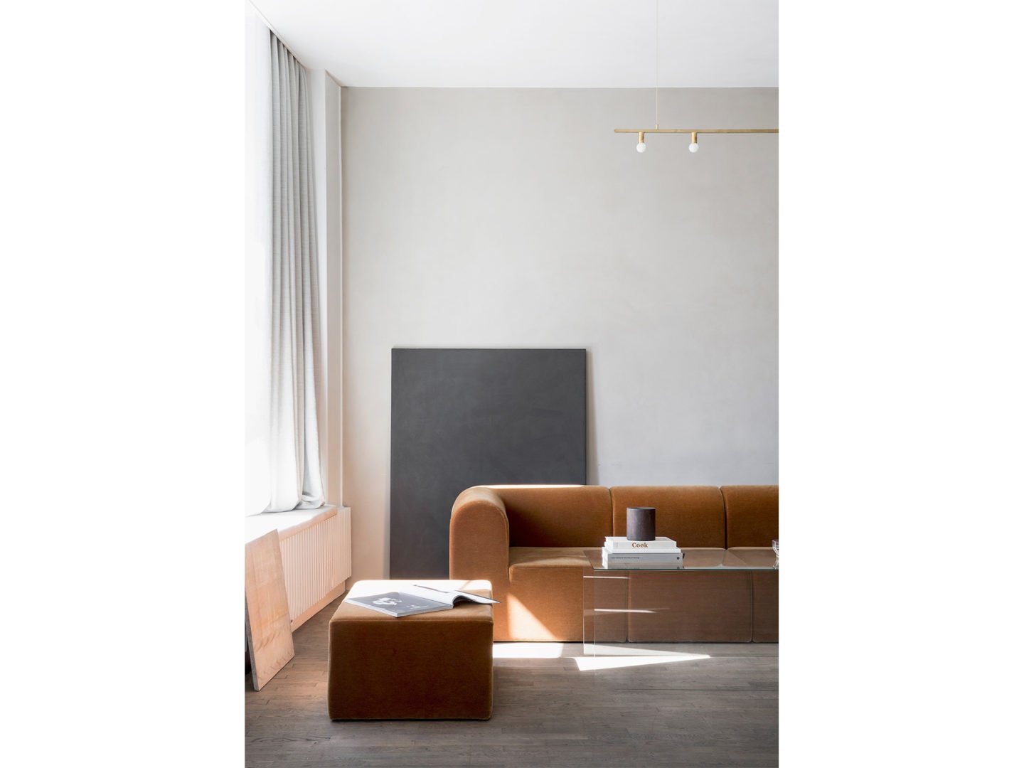
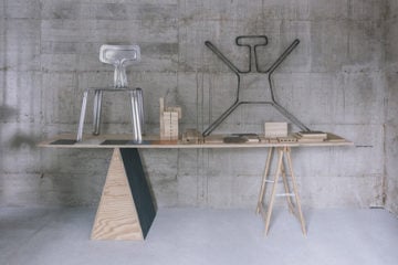
Image 01: Kinfolk Gallery
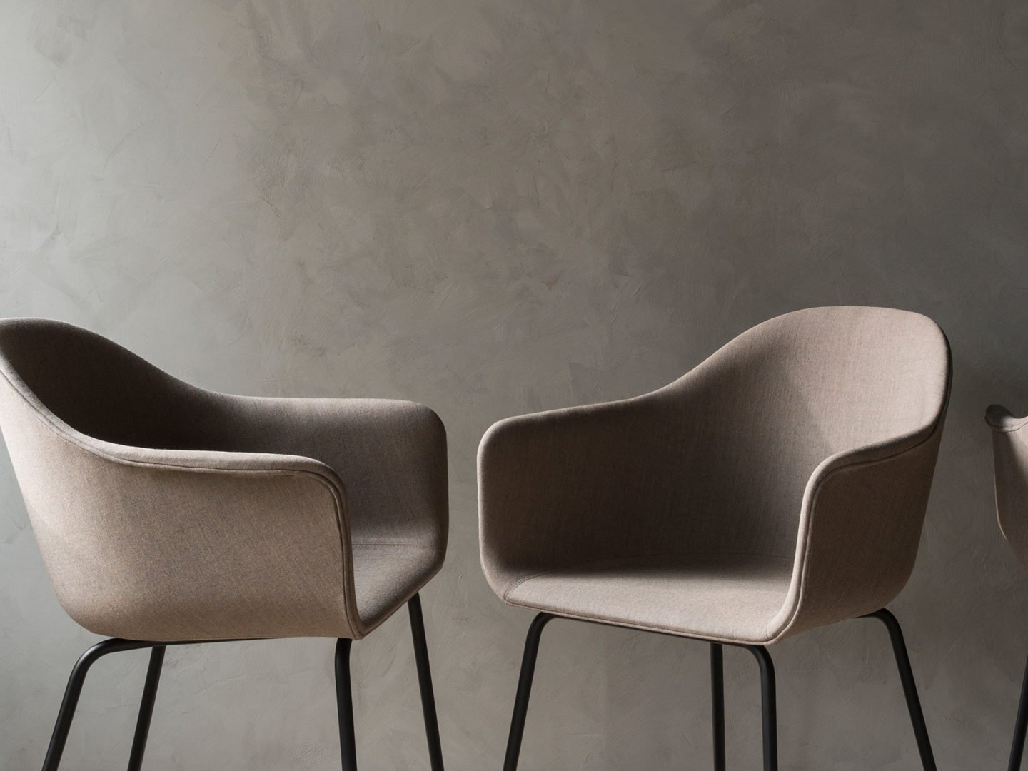
Image 02: Harbour Chair
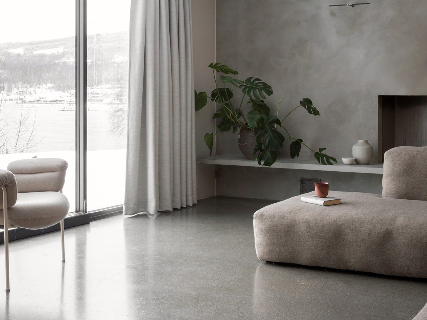
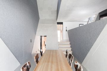
Image 03: Gjøvik House
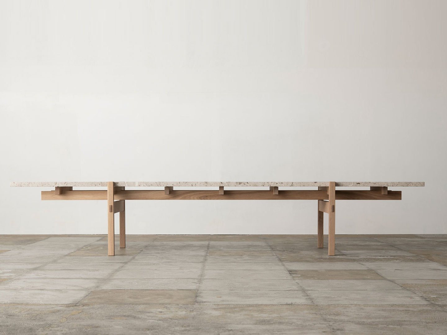
Image 04: Norm x Karimoku Coffee Table
Image 05: PH House
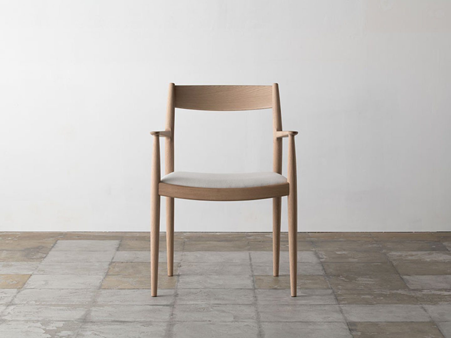
Image 06: Norm x Karimoku Dining Chair
"The basic idea of dwelling for human beings is feeling protected from the outside, and having some kind of universe you can control, because it’s so chaotic outside in the world."
In what light do you think the architecture and design of our present moment will be remembered?
It’s always hard to say when you’re in the middle of it, but people are talking about a second golden age for Scandinavian design. Today, it’s no longer regional, though — it’s global, as with social media we exchange ideas much faster. In the ‘50s and ‘60s you were lucky if you got your hands on something from somewhere else, so it was very much about local designers working with local companies. But today it’s more a state of mind. As an art director for Menu, for example, I curate design from all over the globe. The designers we work with to create the collection are based in Taipei, Tokyo, Los Angeles, New York, across Europe — but they all work with what I would call Scandinavian design. We’re kindred spirits all around the globe. And then you have much more experimental, expressive movements going on too — like-minded people can get together, inspire each other. There seems to be a boom with Danish design companies spreading abroad, though. That’s also the case for Danish cinema and culinary movements. We used to be known for potatoes and stew — but then with Noma starting the New Nordic movement, that changed everything.
Do you think “New Nordic” is still relevant as a term?
The phrase has lost its meaning a bit, as everything became New Nordic once the term gained success. The bread you bought at gas stations was New Nordic [laughs]. And then people kind of strayed away from it, because it became too much. When Noma was founded, New Nordic meant “terroir kitchen”, which had been done in France and Italy for ages. It just meant working with what you had around you instead of importing ingredients. And then one of the co-owners of Noma started Muuto, the design company. They used the phrase New Nordic for their design — though their expression was much more colourful and more Dutch inspired in many ways. Like Muuto, Hay became the New Nordic, which was not at all traditional. What is going on now with a lot of the companies, it’s Old Nordic coming again instead of New Nordic, though there’s no specific phrase for it.
This feature is part of an ongoing collaboration between Samsung QLED TV and iGNANT. Read part one, a visit to VAUST Studio in Berlin, here.
Interview by Anna Dorothea Ker | All images © Alexander Kilian for iGNANT Production | All videos © Nathan Ceddia for iGNANT Production
