Pastel Rita Cafe, A Colorful Project By Appareil Architecture
- Name
- Appareil Architecture
- Project
- Pastel Rita
- Images
- Félix Michaud
- Words
- Steph Wade
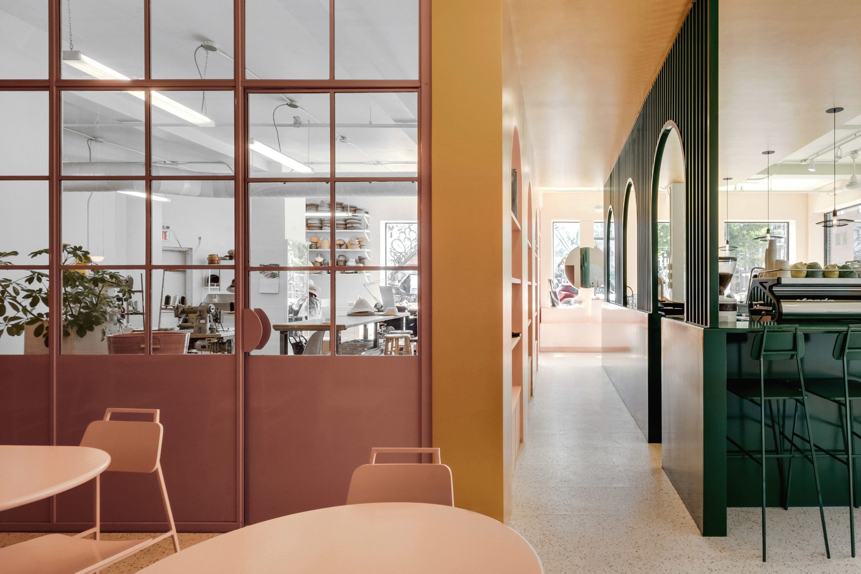
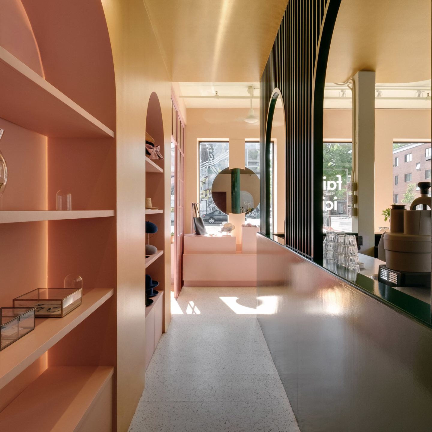
In Montreal’s creative Mile End neighborhood, Appareil Architecture has transformed an empty building into a color-blocked artist workshop and cafe, named ‘Pastel Rita’.
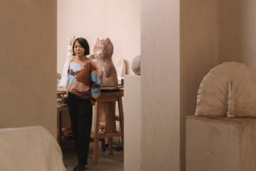
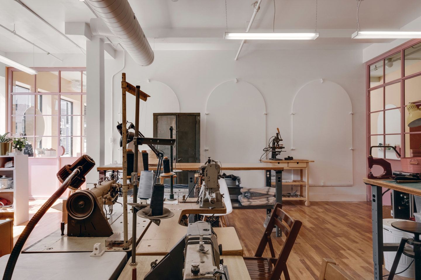
‘Pastel Rita’ has multiple spaces that are differentiated by color: a cafe and bar, an artist workshop, and a boutique shop showcasing the artists’ creations. We spoke to Kim Pariseau, founder of Appareil Architecture and lead architect of the project from her studio in Montreal. Kim tells IGNANT how the visual concept came together, and why the owner’s grandmother played an impactful part in the cafe’s philosophy.
You had a strong artistic vision for the design of the cafe, which is backed up by the actual artistic purposes of the cafe. How did these two concepts come together?
We tried to base our proposition on the core of the client’s personalities, and not only on the purpose of the space. The two owners of ‘Pastel Rita’ are a colorful couple; Gabriel is a famous music artist with a vibrant clothing style, and Veronique is the owner of Bouquet, a handbag brand known for their colors. Therefore, the colorful atmosphere of the space reflects who they are as people.
Why was the space color-blocked in the chosen colors—did the location impact the decision in any way?
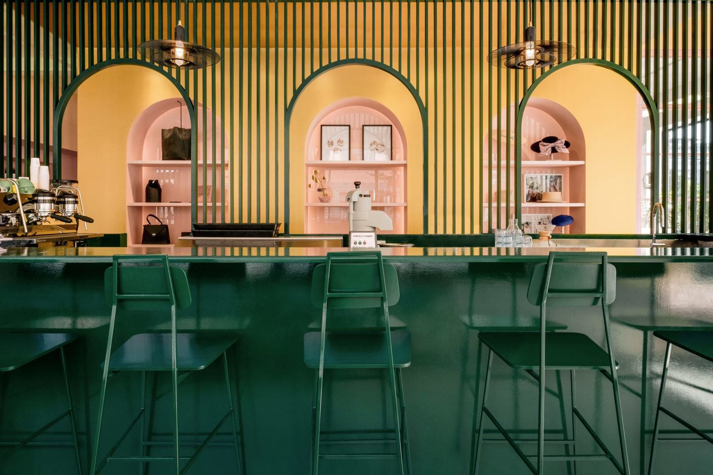
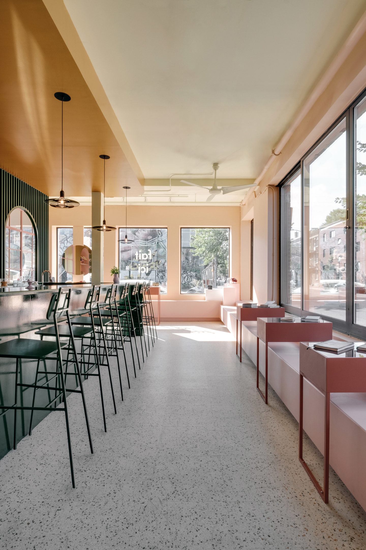
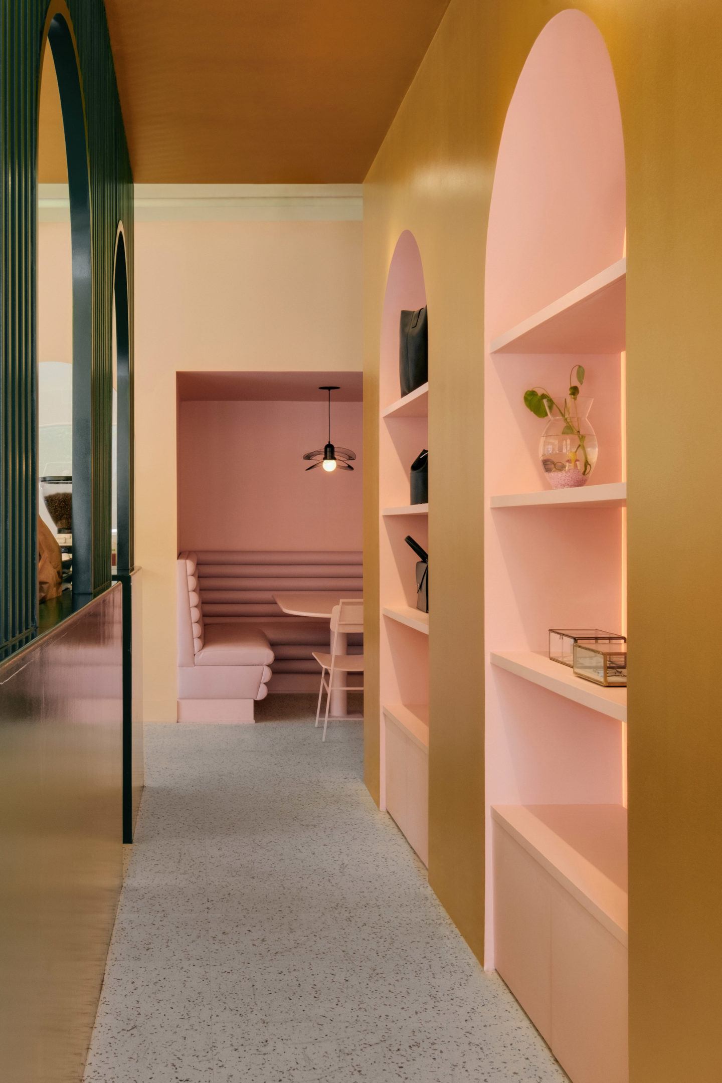
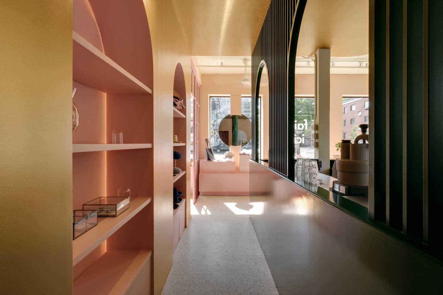
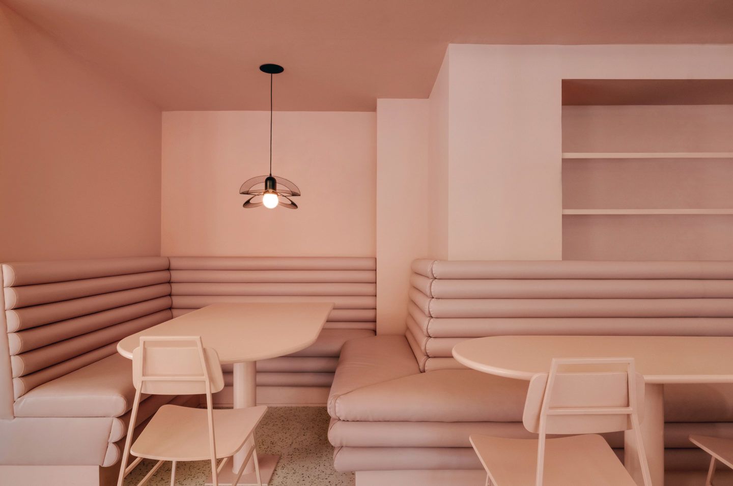
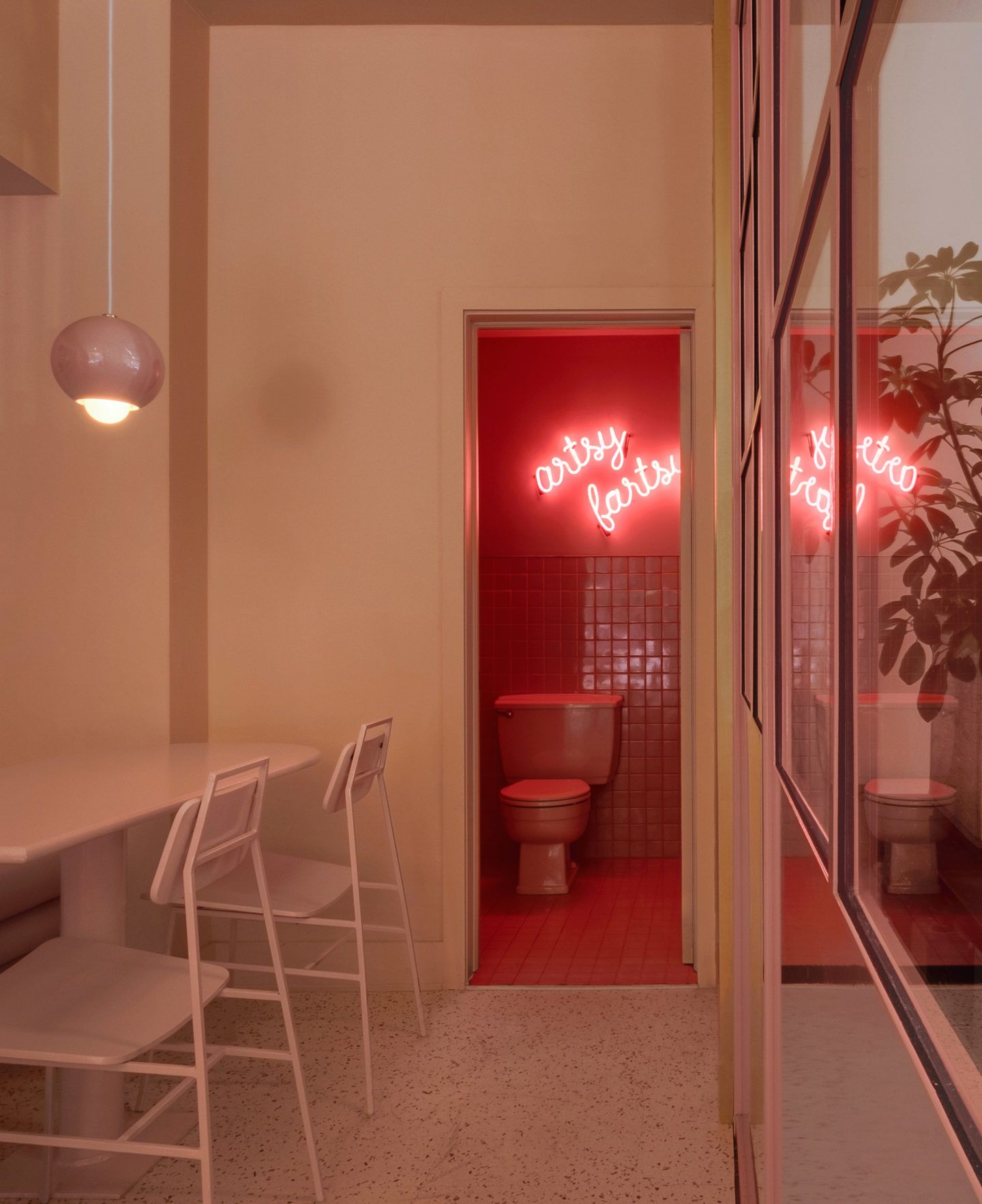
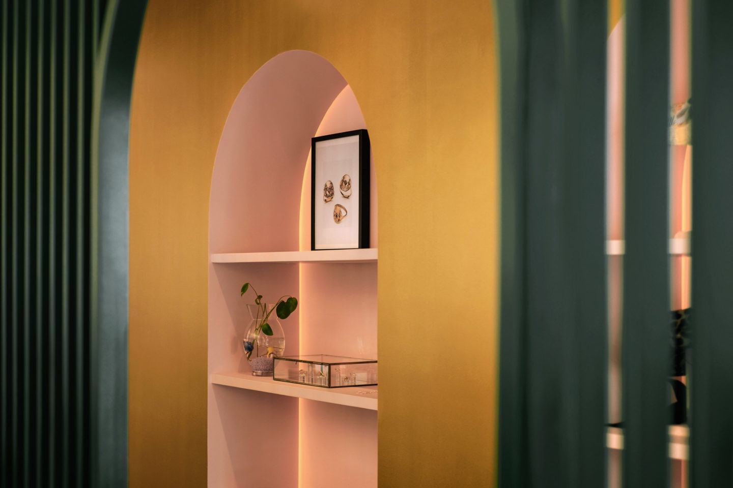
‘Pastel Rita’ is located in Mile End, a neighborhood full of artists. We thought that these color choices would be unique and would hopefully attract them. Each color is related to a specific use of the space. So the soft pink aims to create a coziness in the seating area. The dark green defines the cafe area and the color makes the bar stand out from the pastel atmosphere. The gold is used for the boutique to add a luxurious effect to the artisans’ products that are on a pedestal. The multicolored result of the entire space attracts attention and stands out from the usual style of the neighborhood.
Why did you contrast the multiple purposes of the space?
The owners came to us with the idea of creating a place where Gabriel could have a cafe, and Veronique could have her workshop and a boutique to showcase her work, all in the same venue. So we divided the layout to highlight this unique collaboration, and to create interactions between each of these areas. This decision allows the public to have an exclusive look at the work of artisans while they are drinking their coffees.
Why did you urge the owners to visualize the cafe and it’s ‘flow’ differently than they had imagined?
Since the beginning, Gabriel and Veronique had a clear vision of their customer base. In order to be attractive to the customers, we wanted to work with them to propose a direction that would stand out and have a different look. So we aimed to push further the idea of a pastel interior, by paying attention to every finer detail and element of the space. The result creates an atmosphere that is unique.

How did the owner’s grandmother influence the design?
It was important for Gabriel that the atmosphere in the cafe should be as welcoming as when he visits his 104-year-old grandmother. She has a colorful personality and her door is always open to everyone. These values were transposed in the cafe by a large bar in the center inviting people to gather around, just like a big table at a family reunion. It creates a place where the creative community can meet without any pretension.
All images © Félix Michaud
