“Work Should Be Enjoyable”: An Interview With Industrial Designer Tom Chung
- Name
- Tom Chung
- Project
- Beam Lamp
- Images
- Lauren Kolyn
- Words
- Steph Wade
The pragmatic and practical design approach of Tom Chung seems uniquely bound to life in the two opposing cities that he has called home: Vancouver and Toronto in Canada.
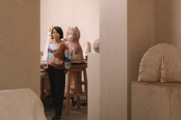
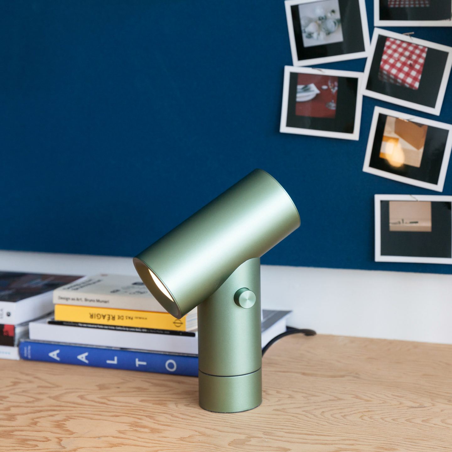
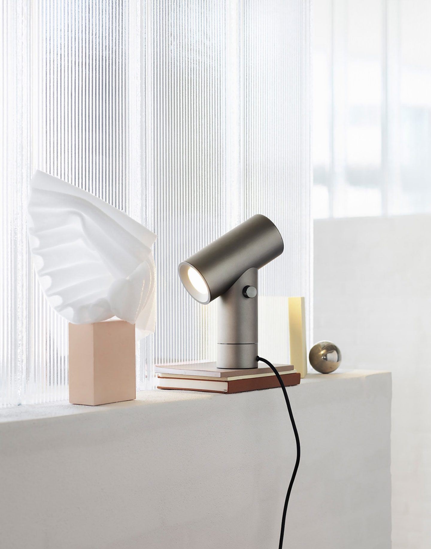
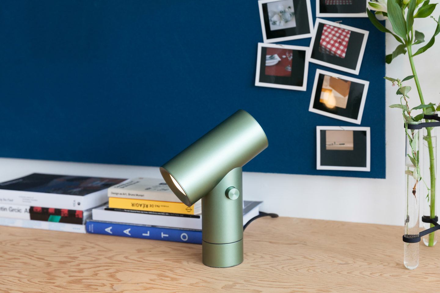
Chung was brought up in Vancouver, a city famed for its wilderness and outdoor activities. It was here that he saw a common reductionist attitude towards design; people only wanted things that were practical, without unnecessary flounces. A resident of Toronto for the past six years, Chung’s studio practice has been further shaped by the industrial constraints of Canada’s largest city. Yet, despite the logistical differences of life in these two places, from them Chung has curated a unique approach to minimalist design—one that is thoughtful and practical. His studio maintains a focus on material objects and interior space, combining contemporary culture with local industry. His recent design for Scandinavian design company Muuto is evident of this. The ‘Beam Lamp’ is an anodized aluminum lamp that shines dimmable light from both ends of its sleek cylindrical shape, intelligent in its function and execution. We visited Chung at his studio in the quadrangular area of West Bend, where we spoke to him about the necessity of versatile design, and why you shouldn’t ever take yourself too seriously.
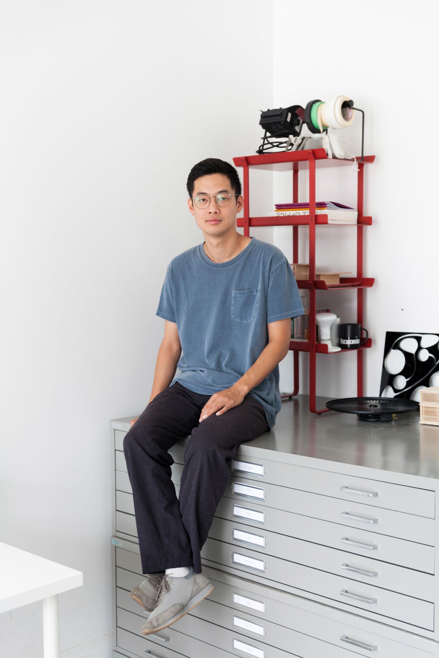
Minimal forms, versatile light solutions, and a clean, neutral palette are trademarks of your visual language. Which other elements are essential to the trademark Tom Chung aesthetic?
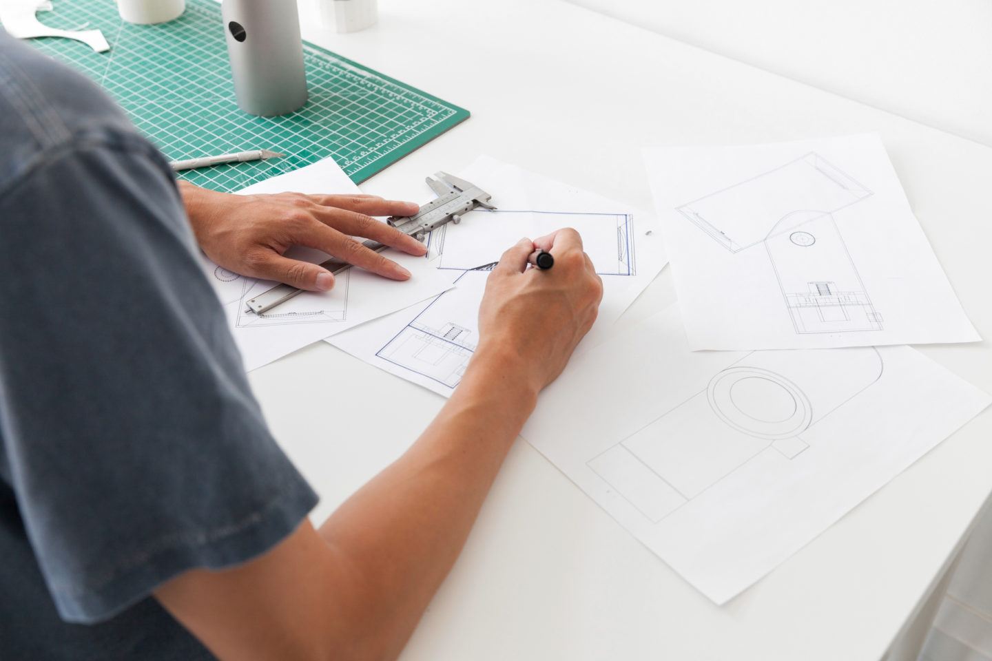
Growing up in Vancouver, you spend a lot of time outside. So the equipment and clothing you have, need to work. You end up with objects that have a pared-back ‘performance’ aesthetic, such as a camping stove, fleece jacket or a snowshoe. The objects you want to keep are the ones that don’t get in your way. Now, having lived in Toronto for six years, I’ve had to figure out a way to make my own prototypes and designs that function in the same way. I’ve been working with huge industrial metal shops in the boroughs surrounding Toronto, which lends
itself to creating really basic geometry, and limits your color palette to a stock color or raw material. I’m obsessed with prototypes that have a realistic durable finish, such as anodizing or powder coating.
You’re based in Toronto, but collaborate with different brands and designers all across Europe. How does this shape your design identity?
Canada is a bit odd; you have a geographically massive country with a relatively small economy. It was sort of the only way to make an industrial design practice work—to go and exhibit work to European brands. When you’re starting out, shipping can be the most expensive part of an exhibition abroad. So my first collection was all small items or knockdown pieces that I could bring on the plane. There is something nice though, where if you are thinking about logistics from the very beginning, it translates at mass production; the product is easy to produce and efficient to ship. You also cannot rely on extravagance or scale to sell your idea.
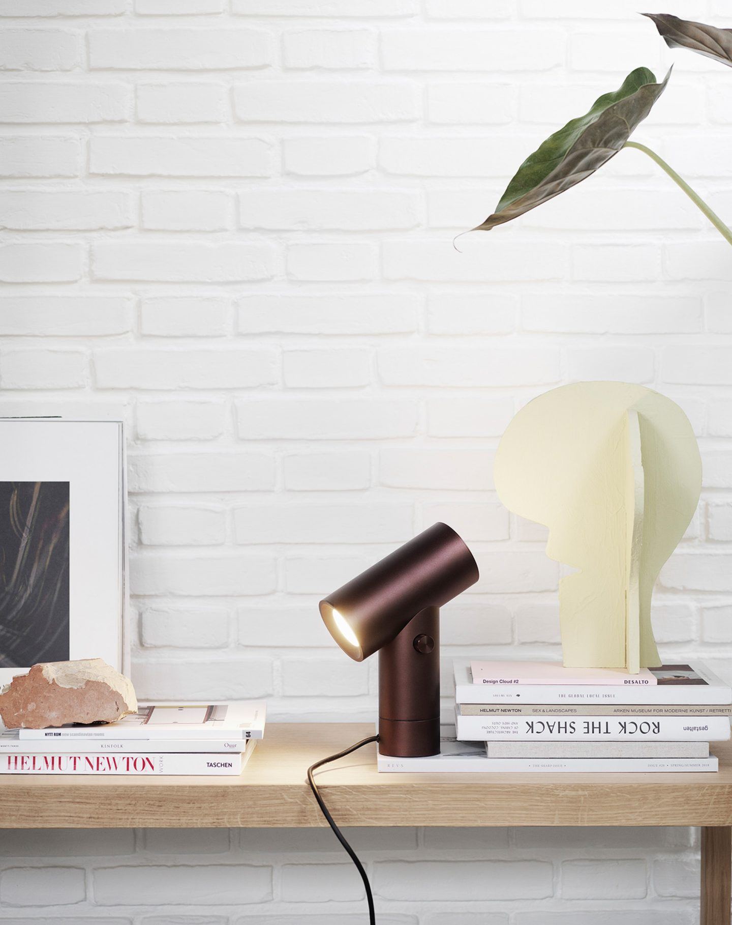
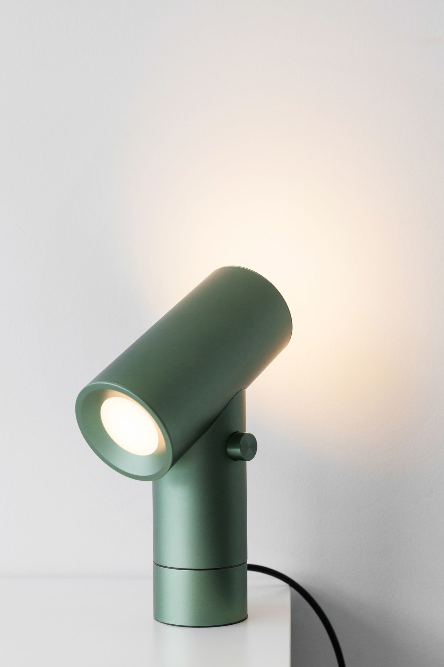
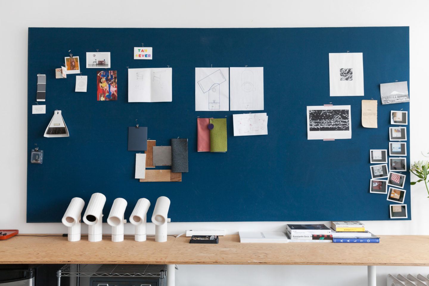
You’ve said, “My approach to design is driven by the human experience of space”. Why is this important to you? And how do your luminaires reflect this?
In addition to product design I also design interiors. I spend a lot of time thinking about space as a result. I don’t necessarily mean volumetrically speaking, there is an effect when you place the right chair or lamp within the perfect context. For example, the chairs in the Jardin Luxembourg have become such a widespread icon you may think nothing of them, but when you see them in the gardens in Paris they are the most spectacular piece of design you have ever seen. There is also a practical element, when designing a space you may encounter a spatial condition that you can solve with a new typology of object.
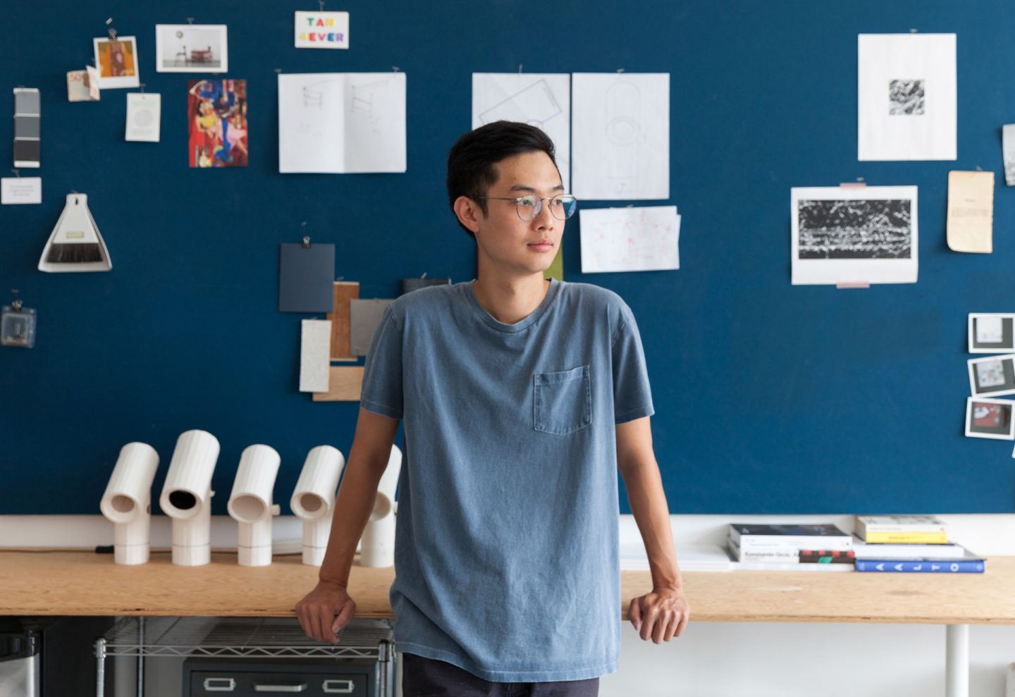
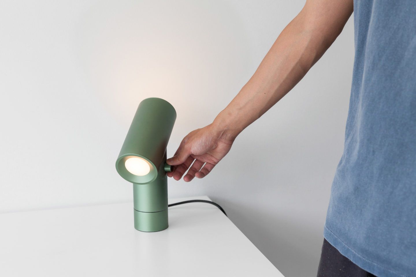
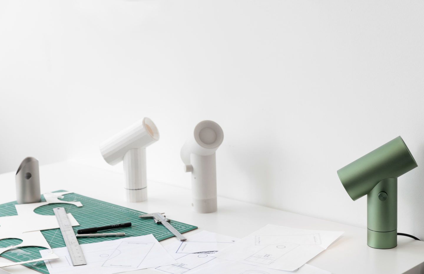
The idea for the ‘Beam Lamp’ came while renovating your childhood home. Was the desire to create a functional and adaptable object influenced by any sentimental element there?
The house hadn’t been renovated since we moved there in the early ’90s, but the 100-year-old house had undergone a patchwork of renovations by many previous owners. The owners directly before them blew out the living room to create a double height ceiling, and divided it from the entryway with a glass pane etched with a gigantic illustration of a swan. We replaced the swan with a two-sided bookcase and wanted to light up into the living room and down into the entryway from a single point. This is where I started to think about placing two lights on an angled beam, and how you could control each source.
You have a playful conception of design, does this relate to your attitude to work?
For sure, when I left a full-time job to start my studio it became apparent that nobody was forcing me to do anything anymore. If you think about it that way, work should be enjoyable and you shouldn’t take yourself too seriously!
In collaboration with Muuto.
All images © Lauren Kolyn

