The Art Of Balance: A Conversation With Ana Domínguez On Graphic Design And Absurdity
- Name
- Ana Domínguez
- Images
- Ana Domínguez
- Words
- Steph Wade
Barcelona-based art director and graphic designer Ana Domínguez feels most comfortable when creating eccentric interpretations of art.
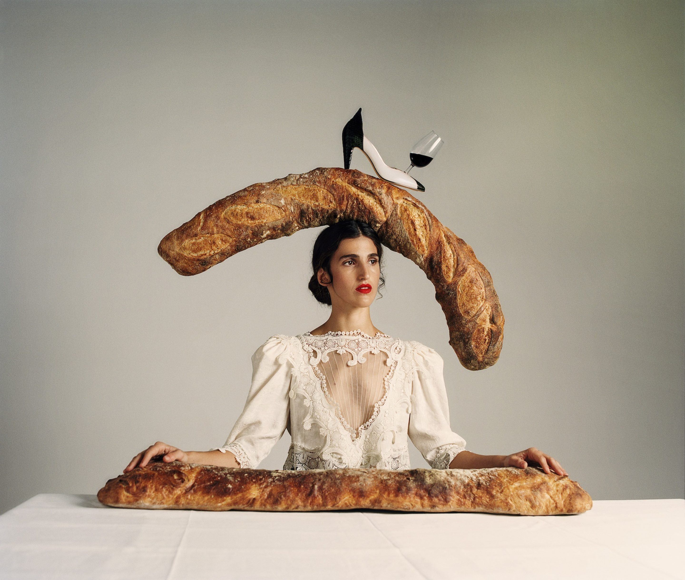
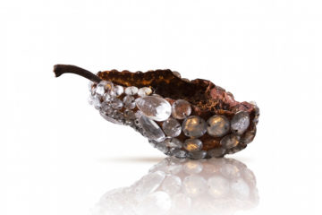
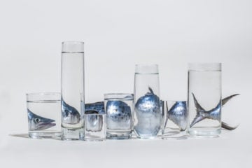
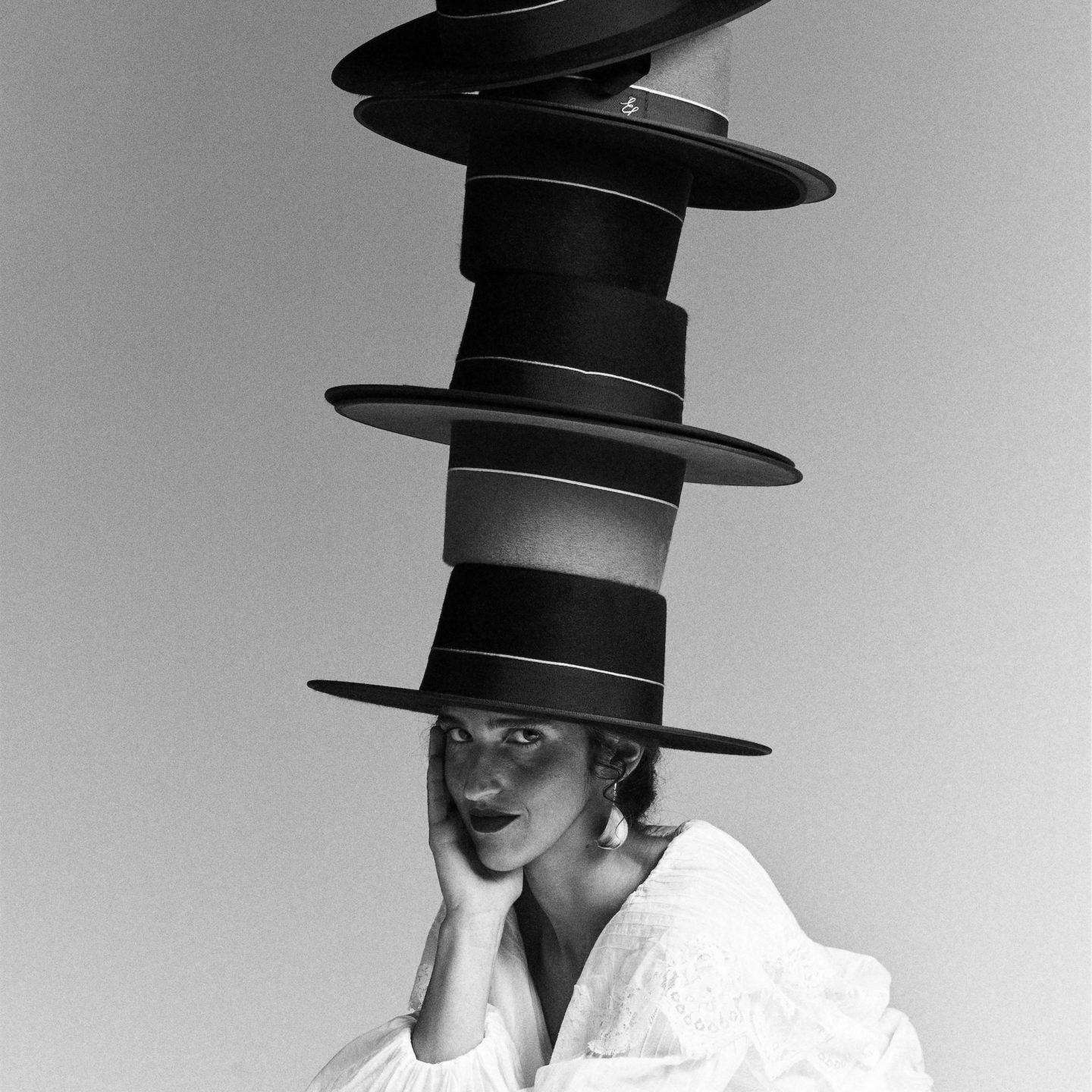
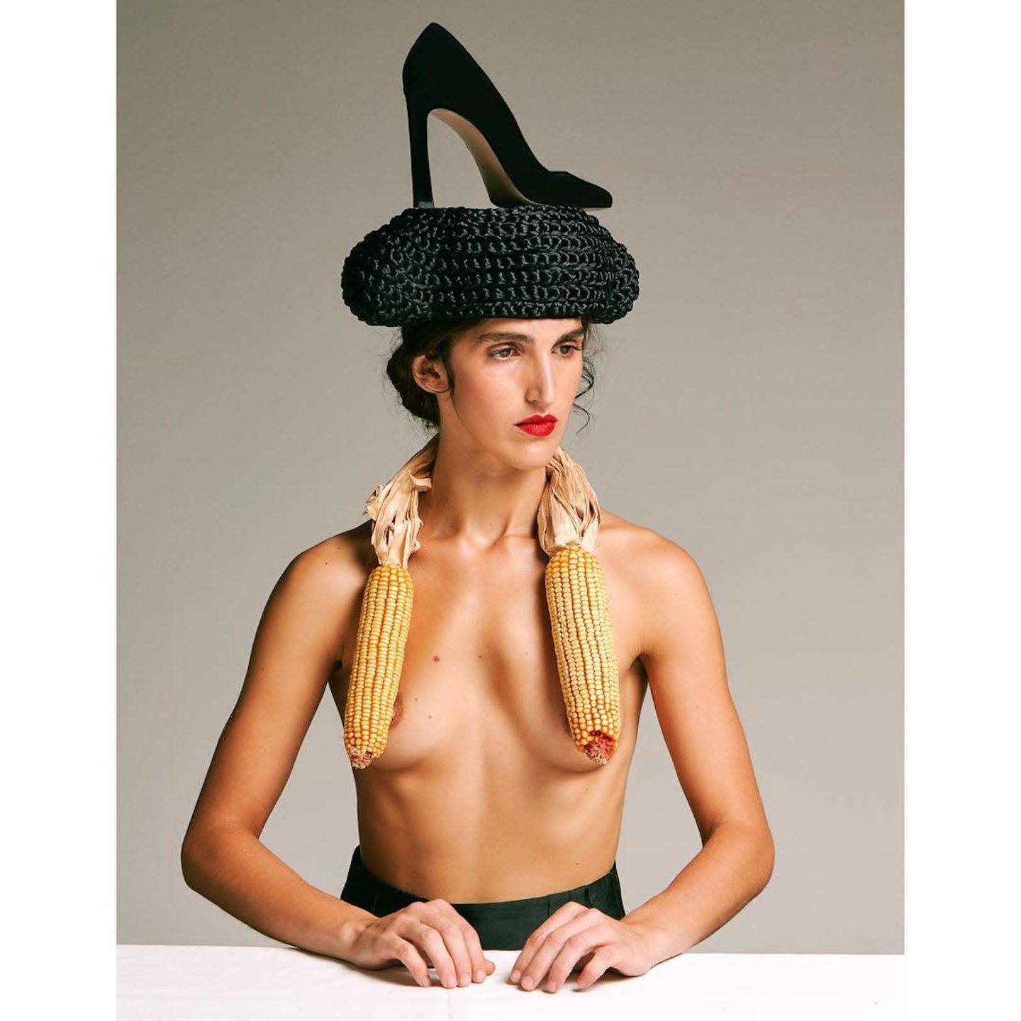
Rather than stick to the conventional still life format for example, Domínguez’s abstract work is conceived from literally anything: objects, animals, humans, and food, transformed into striking and flamboyant compositions. Much of Domínguez’s art direction concentrates on balance—through artful layering of multiple objects, and also through balancing color and composition together. This considered approach comes naturally to her, and is inspired by the likes of Pablo Picasso, Salvador Dalí, Fischli Weiss and Irving Penn. We interviewed the designer at her home in Spain; there she spoke about how daily life provides her with fascinating revelations and why composition is crucial in an over-saturated digital world.
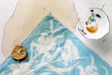
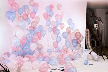
Vogue 1988 – 2018 Vogue Spain. Art Direction Ana Domínguez. Photo © Nacho Alegre
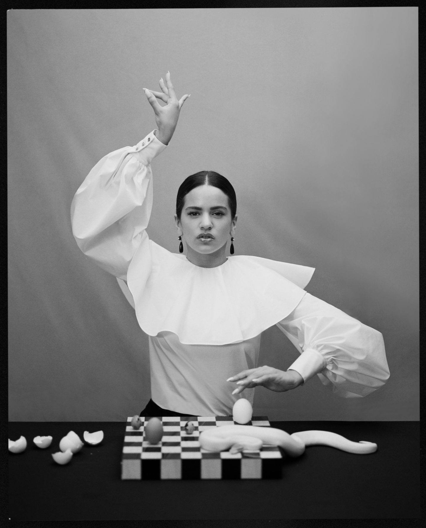
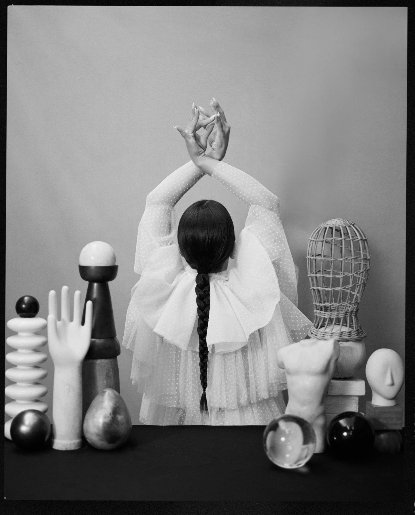
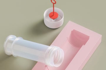
Rosalía, Vogue Spain. Art Direction Ana Domínguez. Photo © Camila Fálquez
What is your creative background, and how did you come to work as an art director and graphic designer?
Photography was one of my main interests while studying graphic design in Barcelona. Looking back, I realize this two-discipline combination has been a constant in my working years. I was deeply lucky to meet people with very common interests during those years; two of them were Omar Sosa and Nacho Alegre (founders of Apartamento Magazine). Our creative process was like a game from the very beginning; we would mix an idea with a material and found ways to play with it by creating striking compositions. Making our own art direction projects without a brief or a client was how we would spend Sundays. From these collaborations, I started working for commercial projects and splitting my time with graphic design. So it was a natural transition. Working for two studios where most of the projects were related to culture, had a significant influence on me.
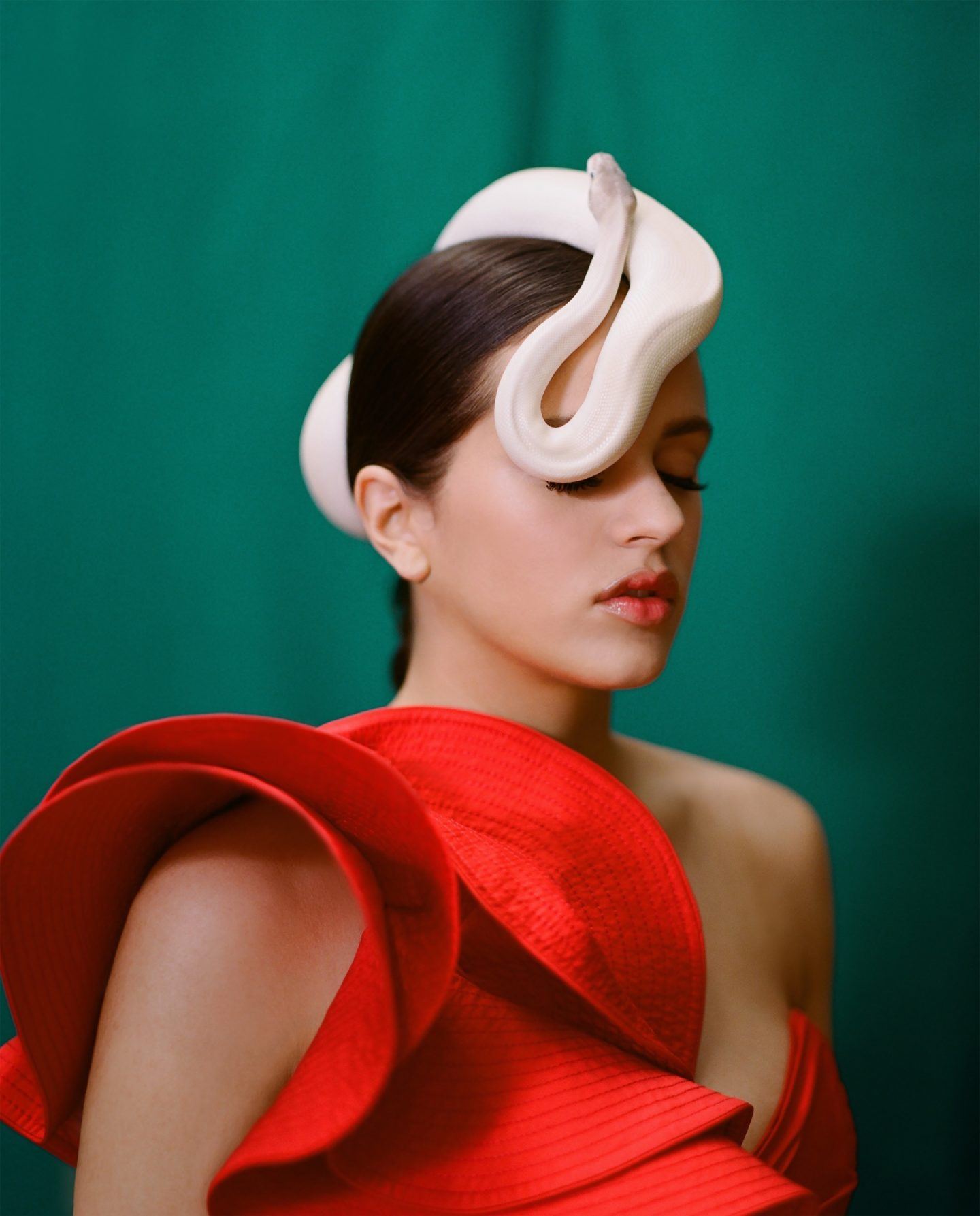
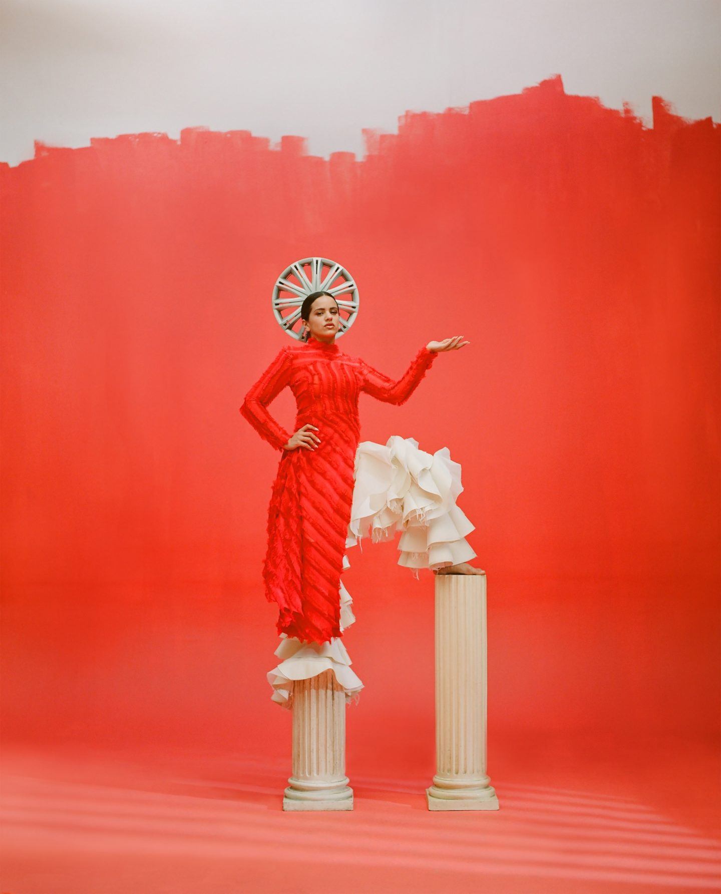
Rosalía, Vogue Spain. Art Direction Ana Domínguez. Photo © Camila Fálquez
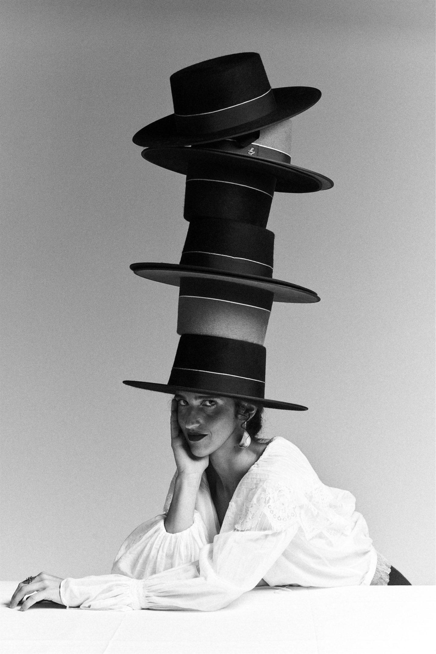
Vogue 1988 – 2018 Vogue Spain. Art Direction Ana Domínguez. Photo © Nacho Alegre
How does your graphic design feed into your art direction?
At first, my art direction mindset was influenced by every graphic aspect I had learned, either formally or conceptually. This relationship inverted through time and now art direction is what feeds my graphic design work. Since my initial approach is always graphic, it shows in the composition, the use of color and the execution of the idea. I seek for harmony and imbalance, and this way of thinking allows me to try new things. The idea that anything can be a graphic element or a still life depending on the point of view, fascinates me. Lately, I’ve been captivated by creating still lives with alive people, because even if the outcome is not that meticulous, it can be regarded as a graphic piece of work. Daily life offers me fascinating revelations as well. I feel comfortable in the absurd by making foolish interpretations out of something regarded as solemn.
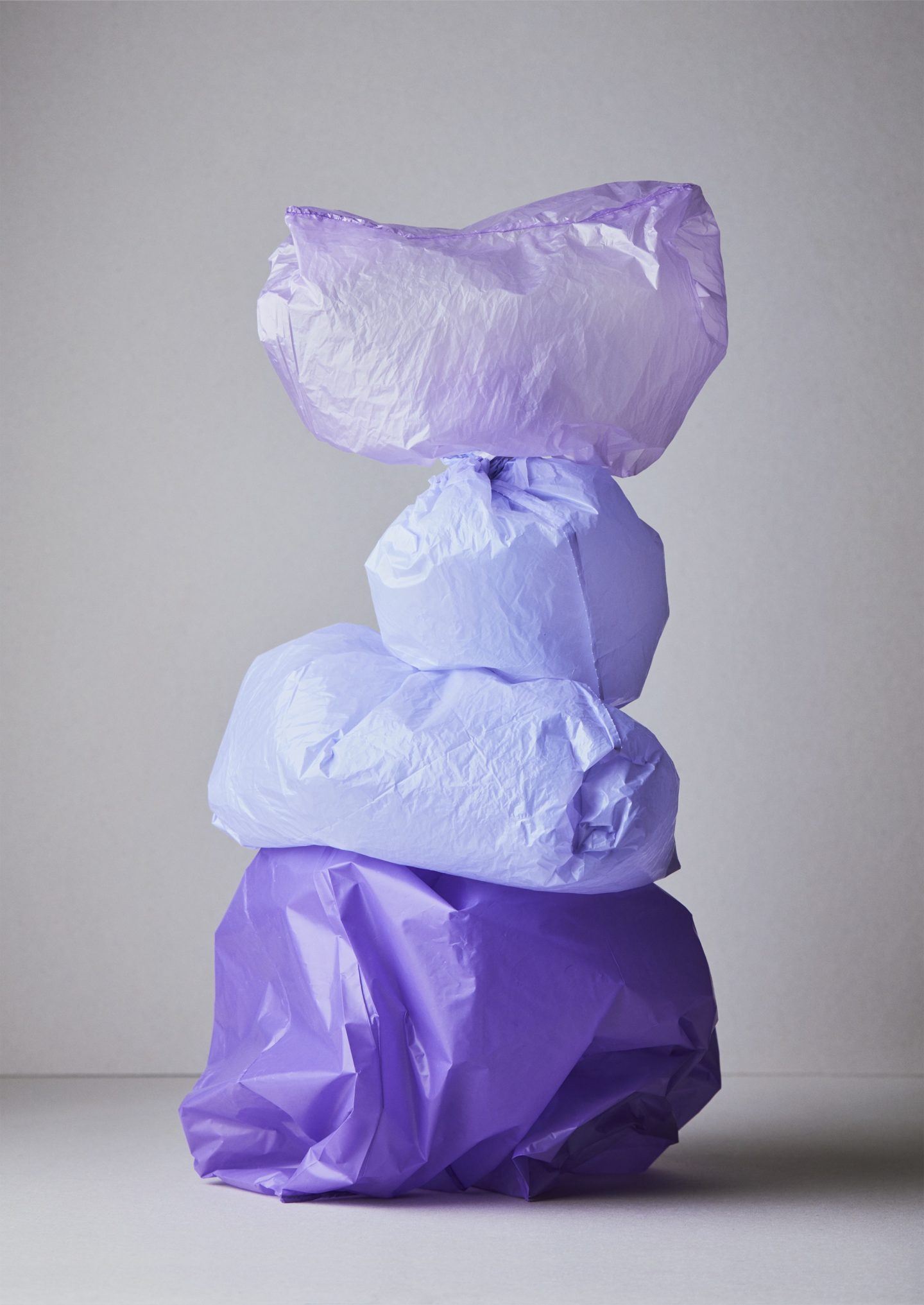
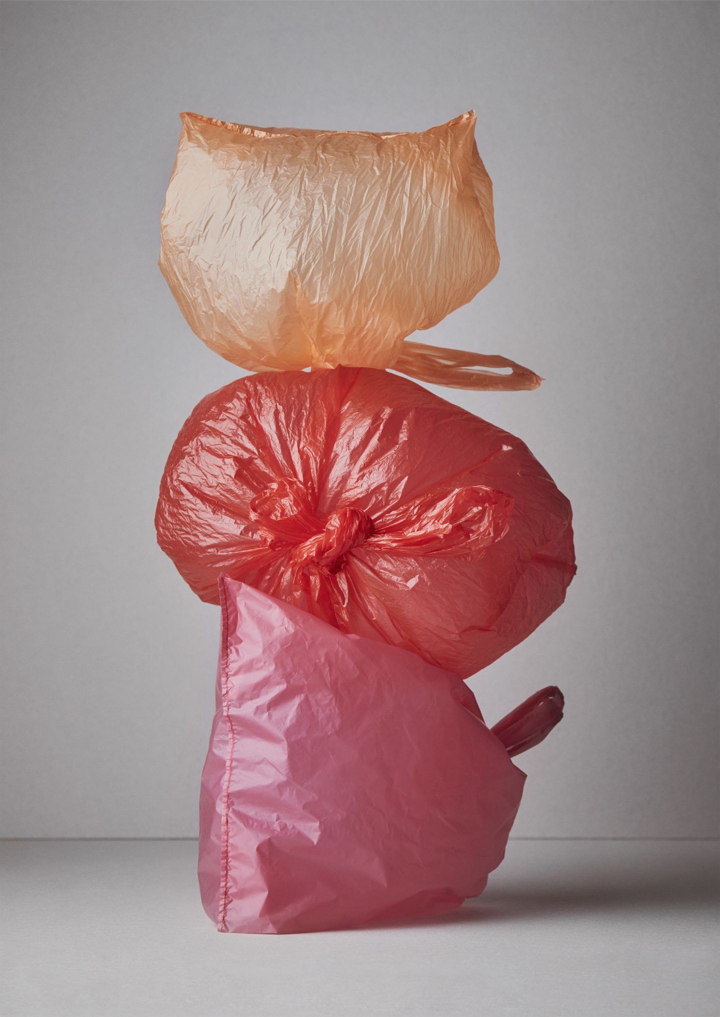
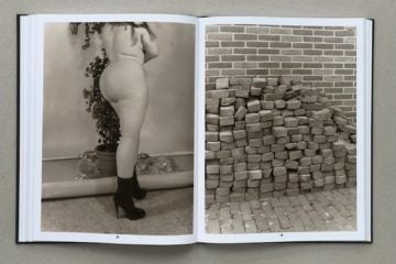
Concept and art direction Ana Domínguez and Omar Sosa. Image © Nacho Alegre for
Apartamento Magazine issue 19
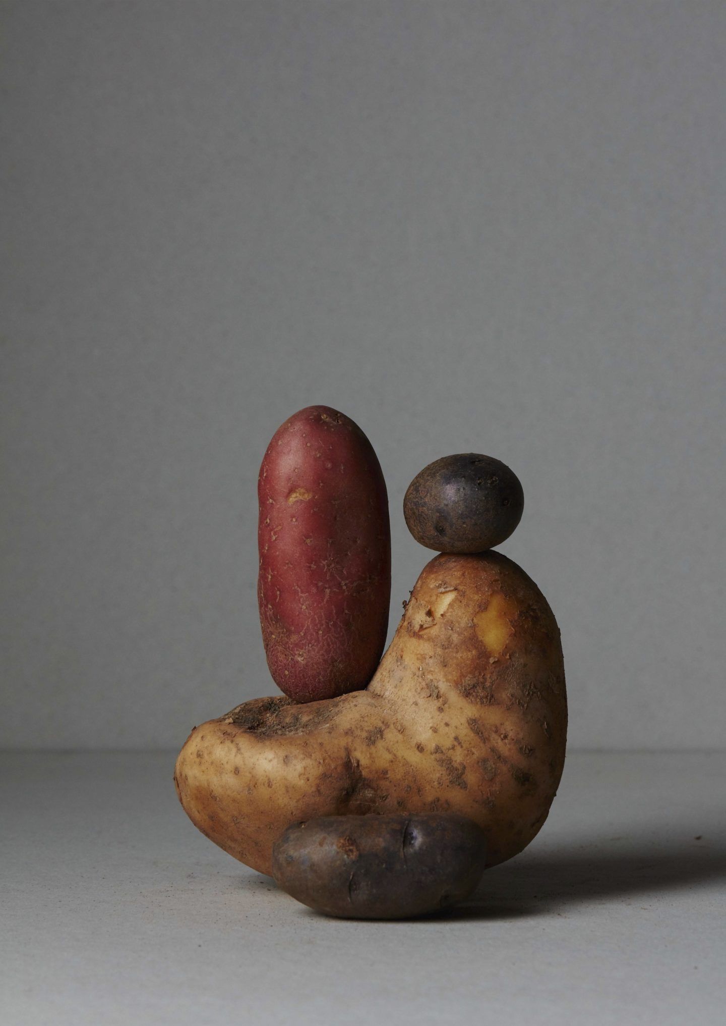
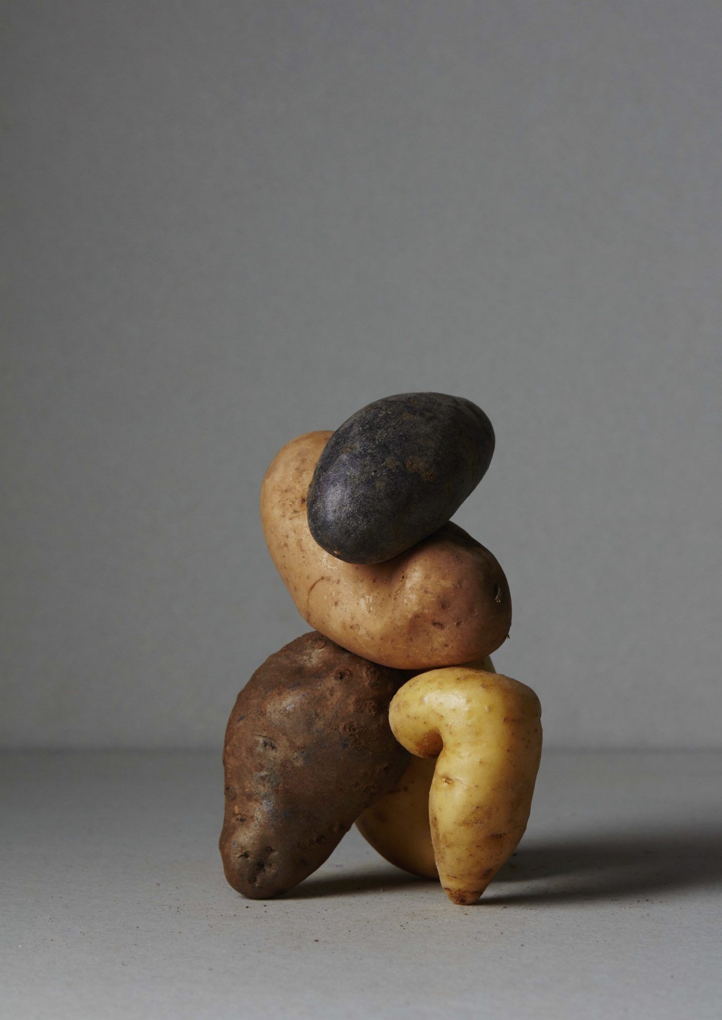
Concept and art direction Ana Domínguez and Omar Sosa. Image © Nacho Alegre for
Apartamento Magazine issue 18
It can be argued that still life art often provokes introspection and reflection in the viewer. Do you believe this to be the case?
I do, it provokes a change of perception and stirs the visual values of the viewer. In a world based on selling visually pleasing images, composition can be crucial to change any element’s perspective. It adds even more value when there’s a conceptual background behind it, since you can create a new vision for things that have always had a very fixed cultural image.
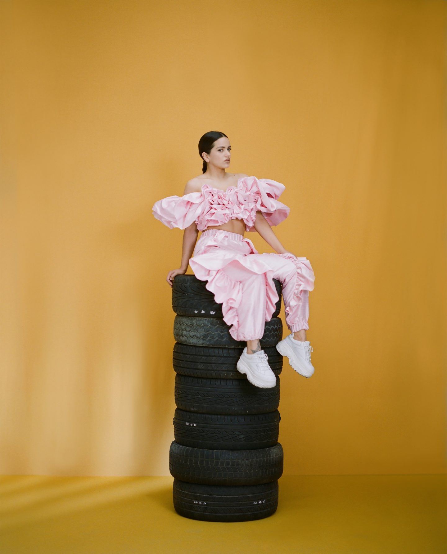
Rosalía, Vogue Spain. Art Direction Ana Domínguez. Photo © Camila Fálquez
Graphic design has become imperative to so many facets of modern day life. What is the most important element of graphic art to you?
Anything can be experienced from a graphic perspective, even the tiniest decision in our lives has an outcome that follows us for less or more time. I most appreciate a graphic piece of work by the visual pleasure it makes me feel, and that is translated to the harmony it transmits. These two ingredients are essential in my daily life, so graphic work must act like a mirror: if there’s a correspondence with my way of seeing things, it will make me happy.
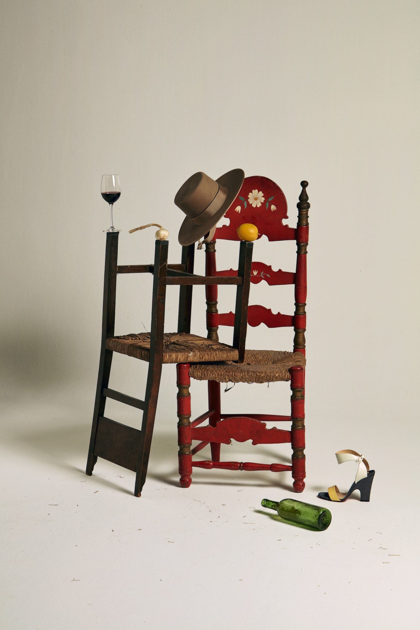
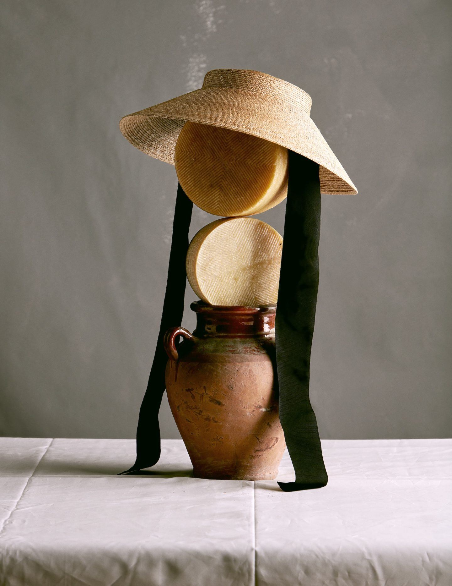
Vogue 1988 – 2018 Vogue Spain. Art Direction Ana Domínguez. Photo © Nacho Alegre
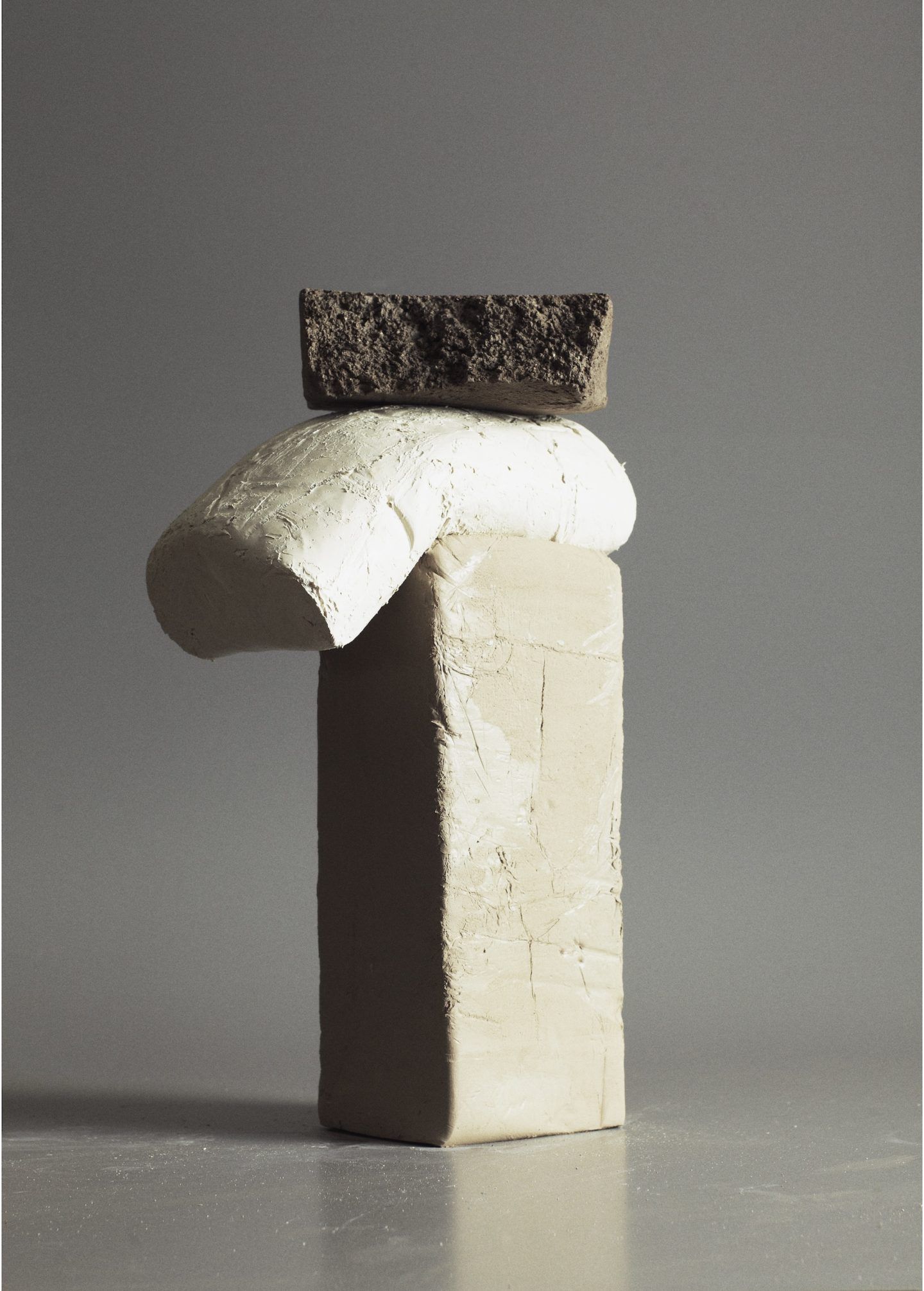
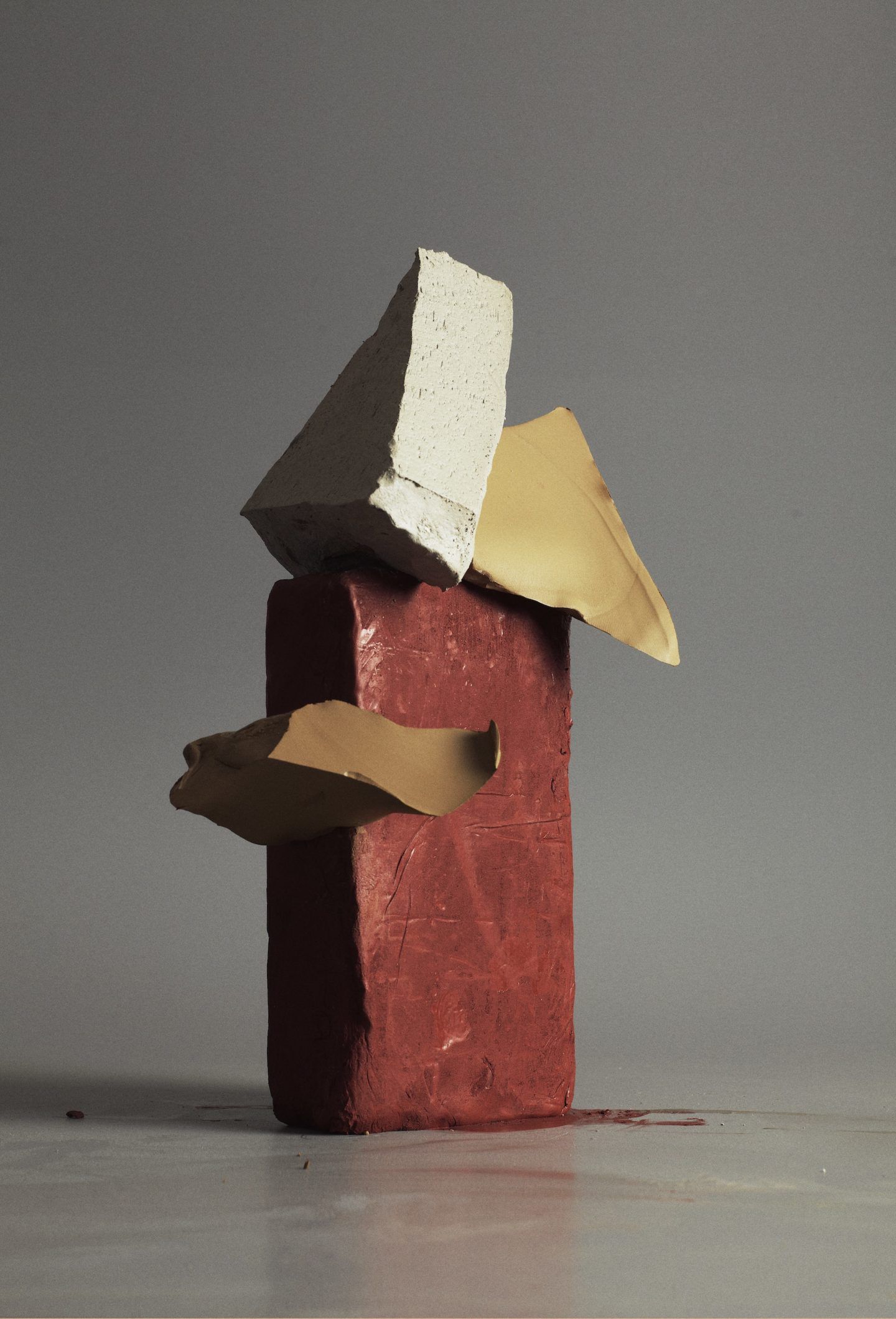
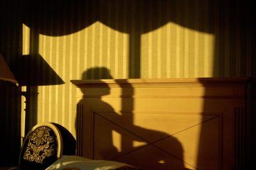
Concept and art direction Ana Domínguez and Omar Sosa. Image © Nacho Alegre for
Apartamento Magazine issue 11
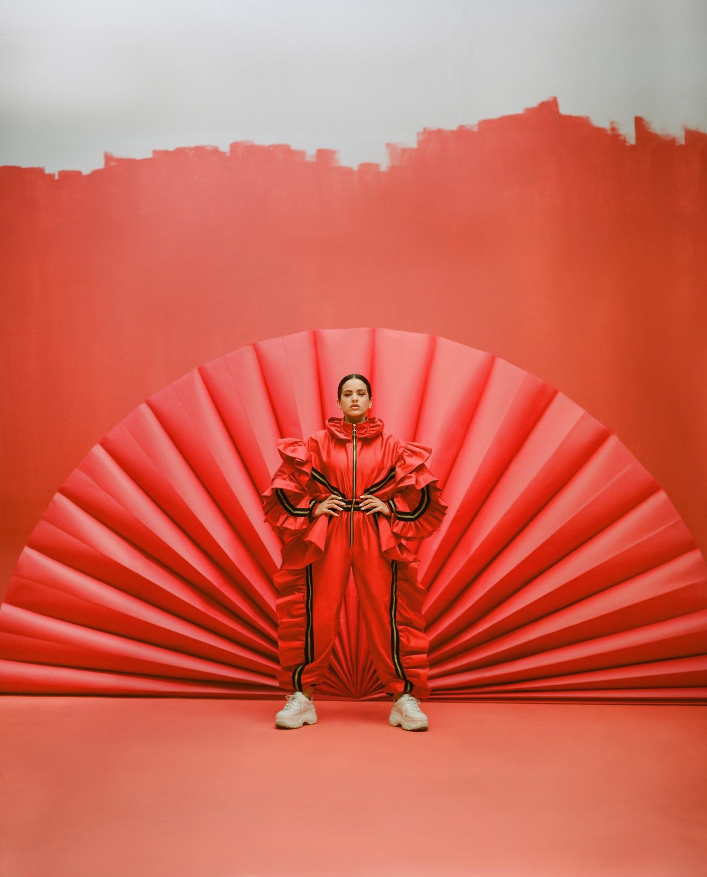
Rosalía, Vogue Spain. Art Direction Ana Domínguez. Photo © Camila Fálquez
