Between Past And Present, Estudio Persona On The Design Principles Inspiring Their Craft
- Name
- Estudio Persona
- Images
- Estudio Persona
- Words
- Devid Gualandris
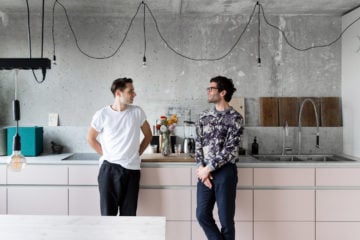
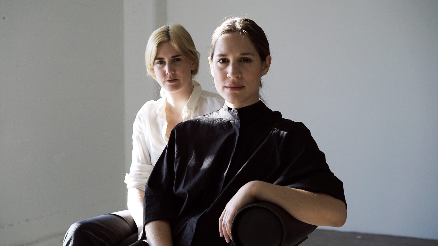
Since starting their practice Estudio Persona in 2014, Uruguayan designers Emiliana Gonzalez and Jessie Young have entered the world of aesthetics with their eclectic and elegantly crafted designs that feature muted colors and sculptural shapes. We talked to the duo about their design influences and fascinating approach to furniture—one that flows between product and narrative; and one that is innovative, yet immersed in references of the past.
Gonzalez and Young’s story is one of coincidence and fate but also of boundless perseverance and serious intent. Both originally from Montevideo, Uruguay’s capital, the two women moved to Los Angeles independently of each other; foreigners in a new city away from home, they became friends out of their mutual experience and shared interests. What first started as an explorative project between an industrial designer and a young artist quickly evolved into an admirable design studio which has seen itself in fairs, clients, and exhibition projects across the globe.
Their collections celebrate simplicity while extending the limits of form and volume
At the core of their practice lies a desire to unearth the full potential of raw natural materials and a creative expression reflective of their cultural identity and heritage. Unifying Uruguayan and American backgrounds, their furniture collections celebrate simplicity and minimalism, while extending the limits of form and volume through a meticulous composition of signs and details. From the Art Deco and Brutalism movements influencing Uruguay’s design scene, to the structural construction of American artist Carl Andre and the aesthetic modernism of Japanese architect Tadao Ando, their work is a study of design principles, movements, and their interconnections. In this interview, we explore how such movements are made contemporary and newly relevant in the hands of Estudio Persona.
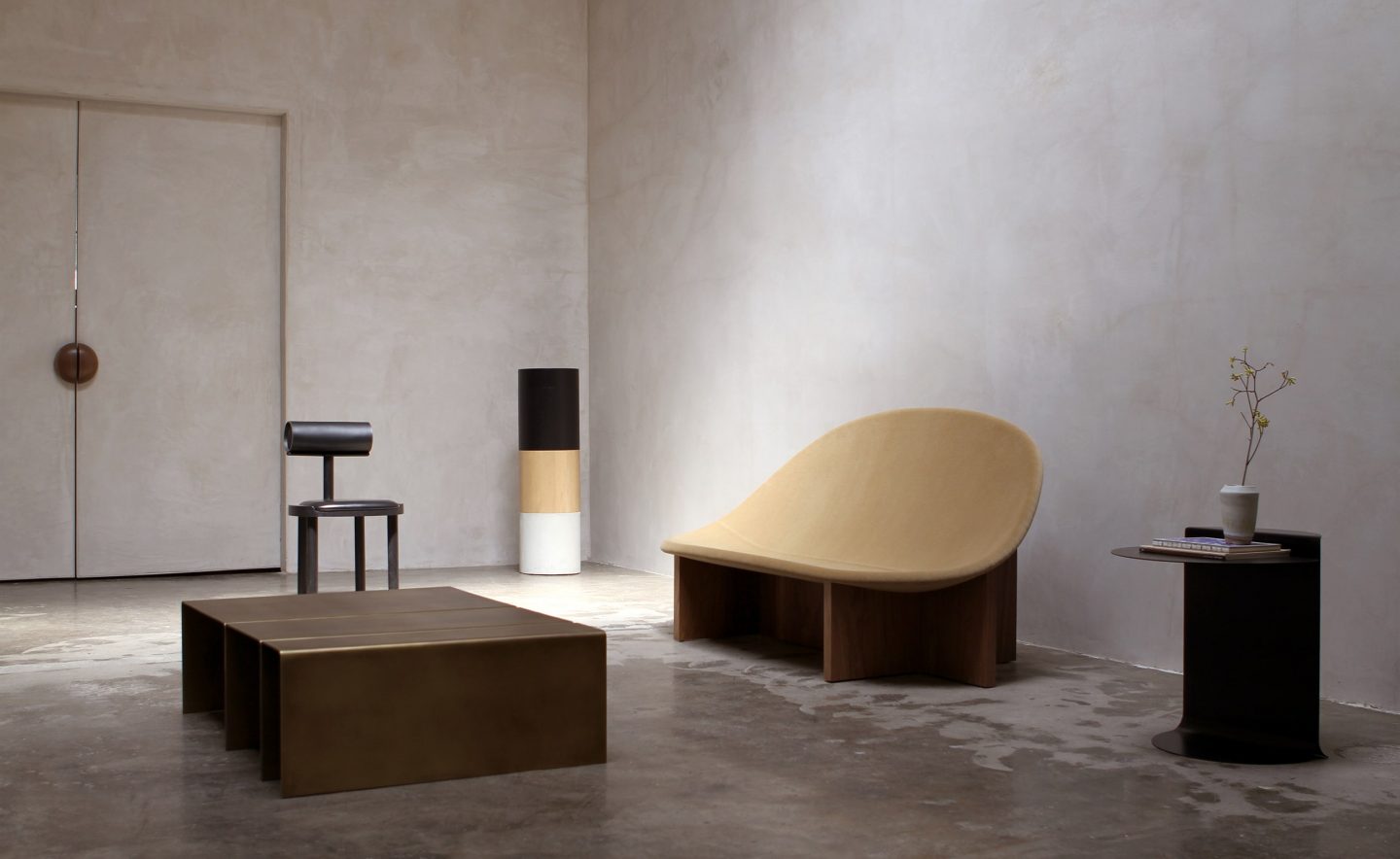
In his ‘Ten Principles for Good Design’, German designer Dieter Rams wrote, “Good design is as little design as possible. Less but better—because it concentrates on the essential aspects, and the products are not burdened with non-essentials. Back to purity; back to simplicity.” What makes a good design? Are material quality and craftsmanship essential when going minimalist?
What seduces us about minimalism is its subversive quality; the idea of something looking remarkably simple but being incredibly complex to make. In a lot of cases, a minimal product requires more study in its construction than an ornamented piece. For us, Dieter Rams’s concept of minimalism is rather accurate, but not because we depreciate non-essential decor in design; it has to do with context. Rams conceived his notion of minimalism in a post-war Germany; today, we are living in a content defined by a lack of empathy and human contact, existing between technology and a pandemic. Ornamental design may speak volumes in this era. We come from a small country and we don’t feel comfortable being loud; we savor the idea of an object warming a space, without being flashy—an object that questions perspectives in a subtle and timid way.

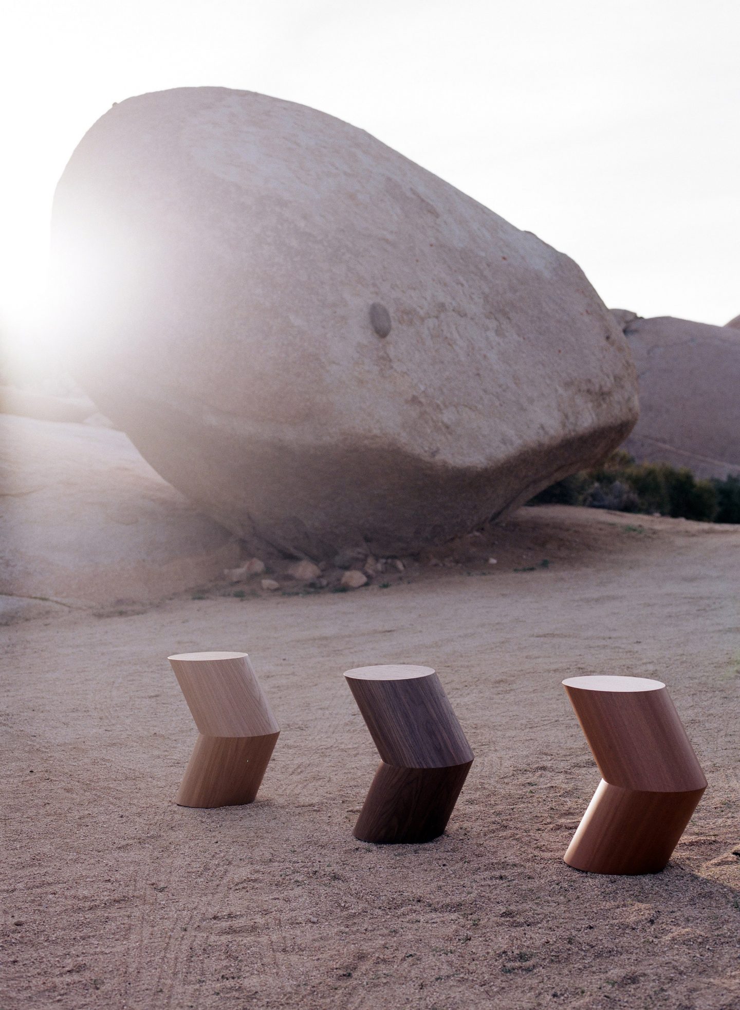
Sculptor Constantin Brancusi helped shape the principles of radically reductive and non-representational minimalism, through the use of simple shapes, jagged and angular geometry, as well as repetition. Your ‘Arrow Table’ is reminiscent of Brancusi’s 1918 ‘Endless column’. How are these principles reflected in your products? How do you blend functional and sculptural shapes with simplicity?
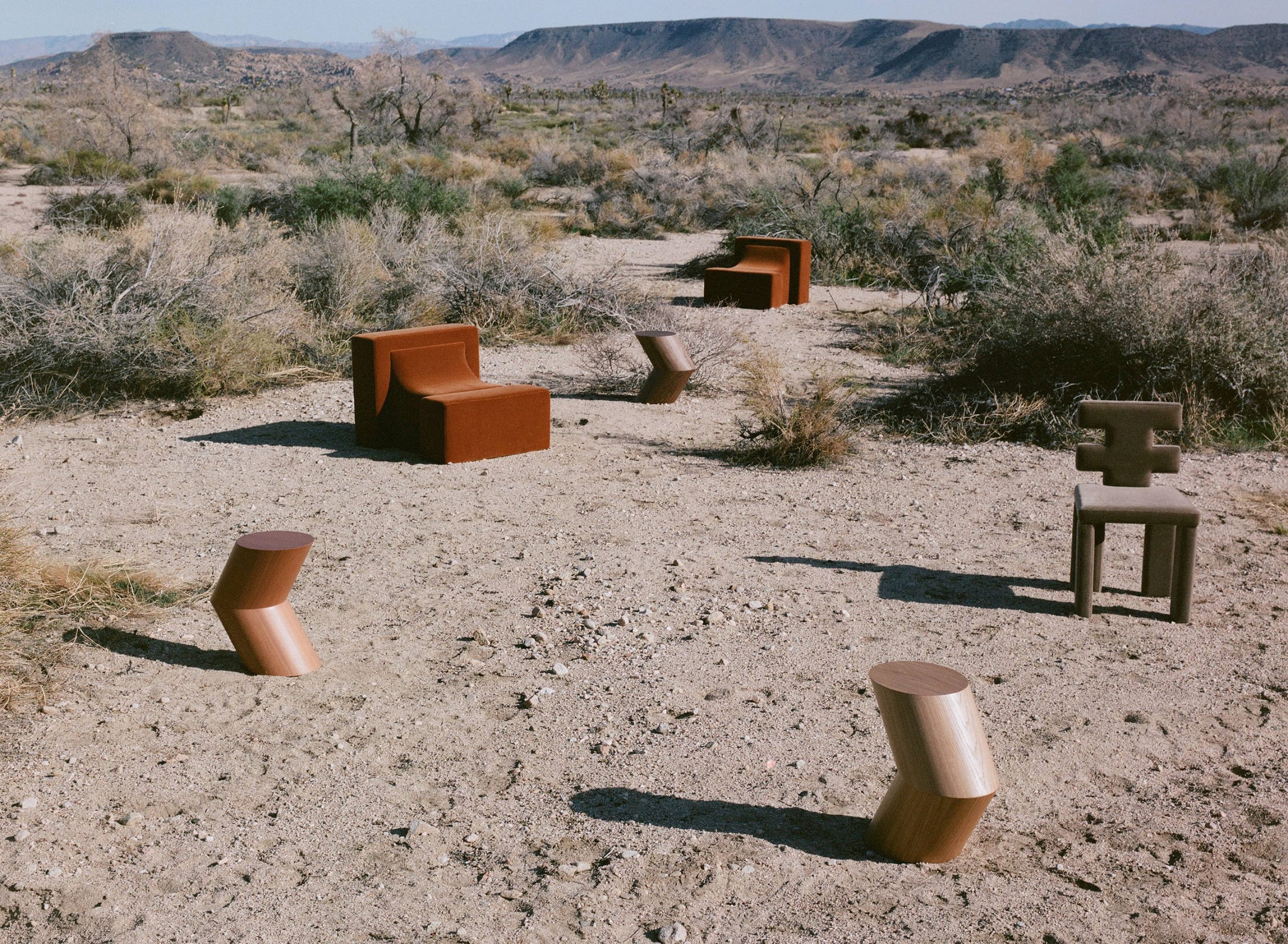
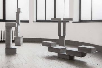
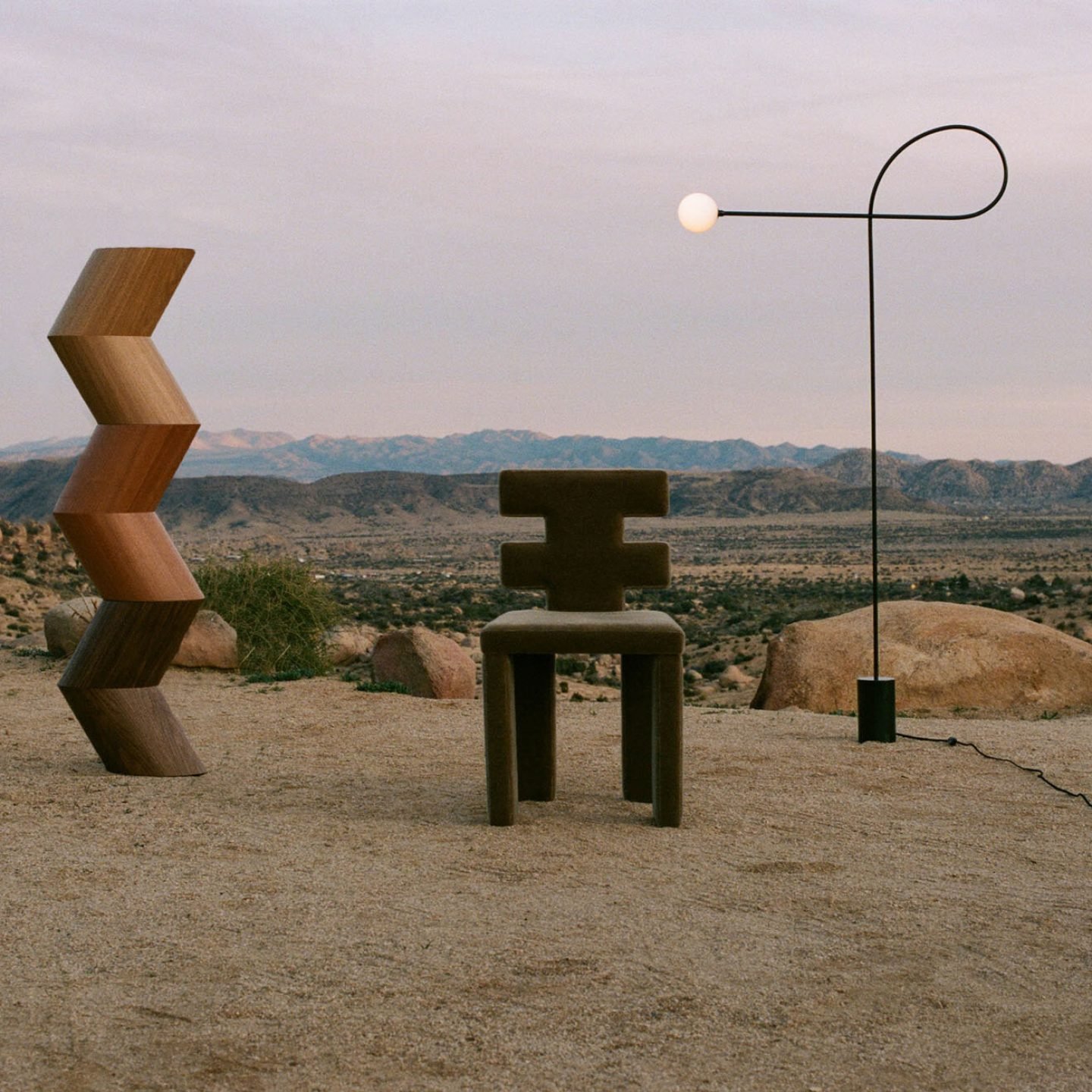
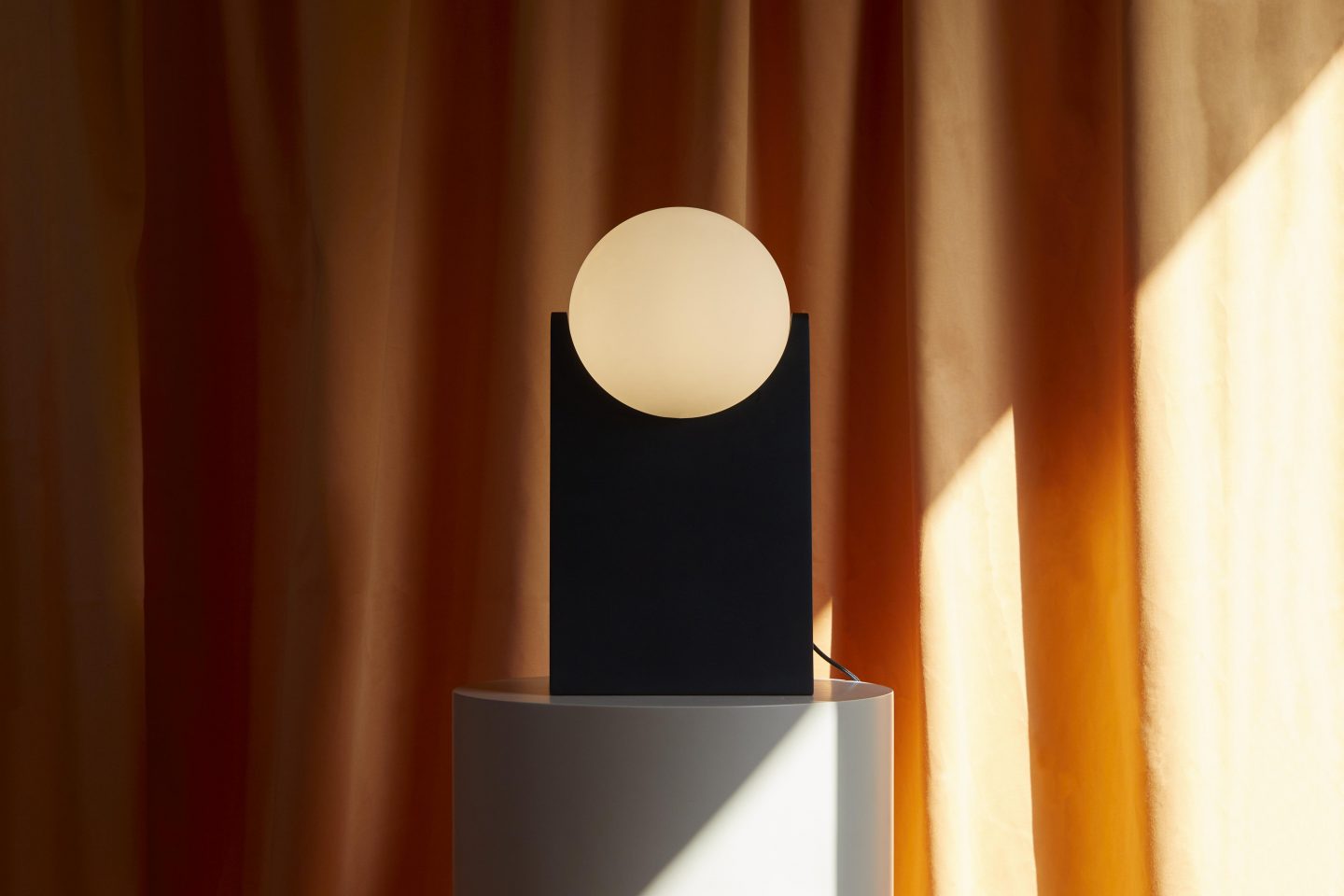
The ‘Arrow Table’ was initially conceived as an installation piece to be paired to a ceiling pendant for an exhibition that got cancelled due to the current pandemic. Our latest collection named ‘Connection’ plays precisely with the concept of repetition of simple shapes. The ‘Arrow Table’, as well as the ‘the H Chair’ and ‘Block Chair’ are all composed by placing and altering the same shape within each design. The latter honors the minimal sculptures of American artist Carl Andre, who, intrigued by structural construction, carved material blocks into geometric, modular objects. The sculptural aspect of our final product results from our need for storytelling. Simplicity is the key to how we conceive our furniture pieces in a space; we aspire to sustain a dialog that blends in with the very space they inhabit—functional objects that invite you to participate in a room, with immersive effect.
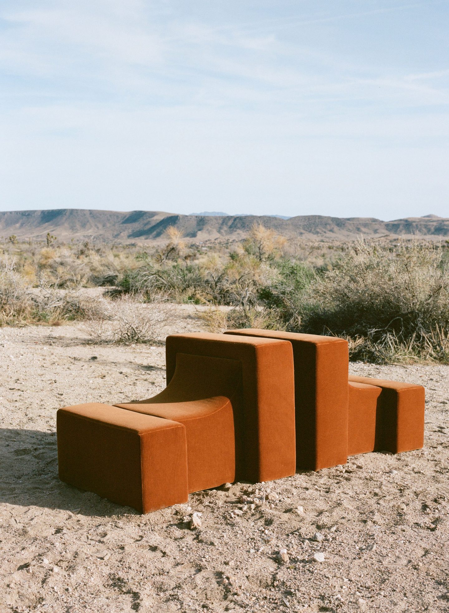
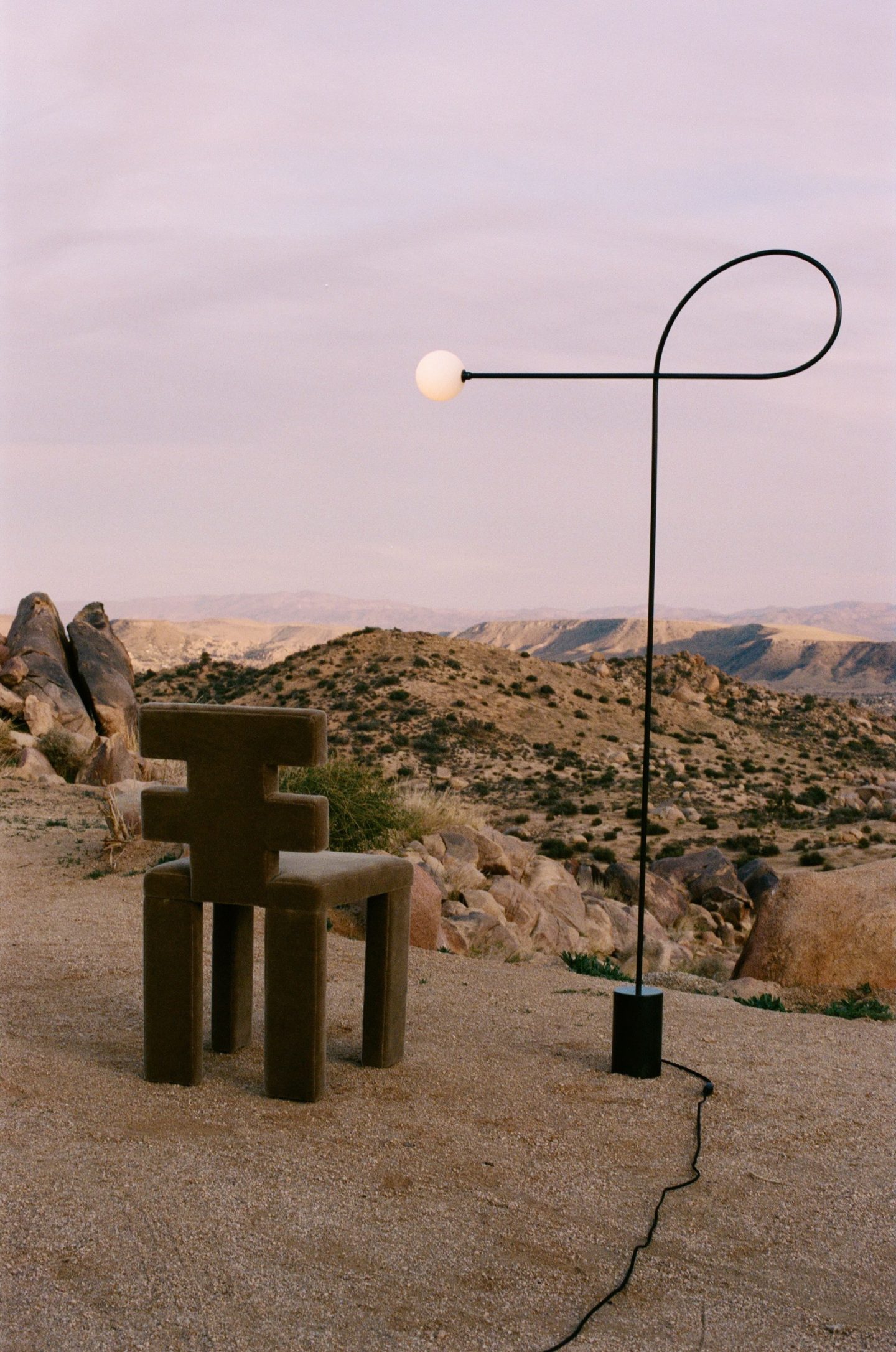
Your work is inspired by the popular design movement Art Deco, which saw a move from the elongated organic curves of the Art Nouveau to a more modern age of design. How do you convey an Art Deco aesthetic in your design?
The Art Deco movement combines very diverse elements, such as metal work, stained glass, carpentry, and bronze decór, as well as a very special volumetric handling. The sensual, geometric aspect of the design movement is something we are fascinated by and can relate to. In Uruguay, however, the movement had some very distinctive features such as the absence of color—it was still Deco, but with a very low level of chromaticism. This is very different from how the style is known in Europe or in other Central and South American countries, such as Mexico. Its regional influence is best reflected in our constant exploration of shapes and in our restrained color palette.
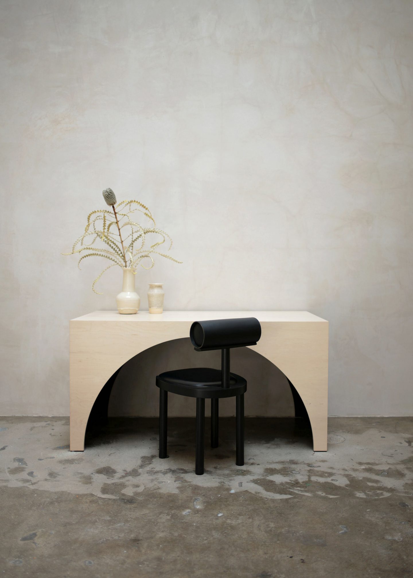
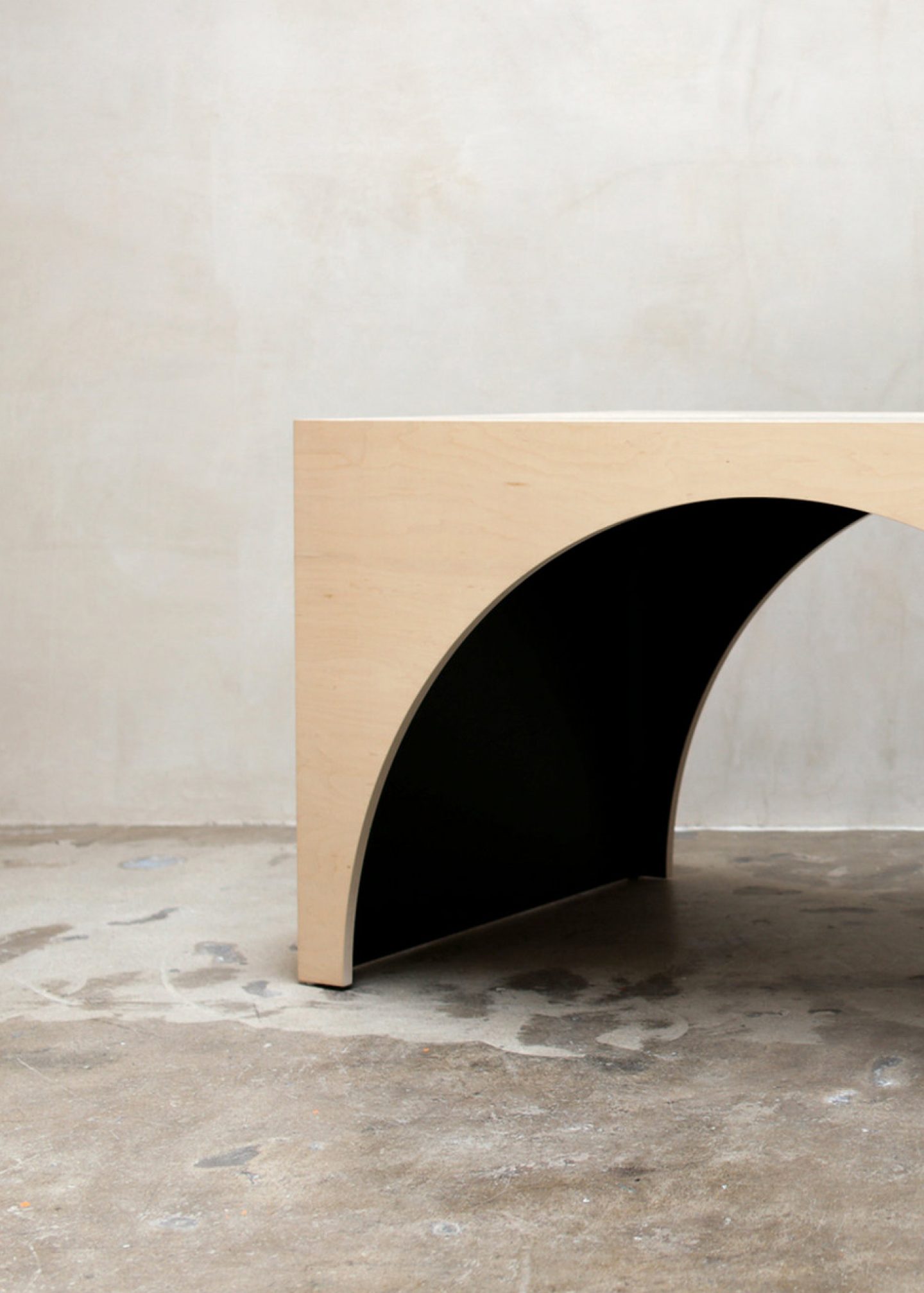
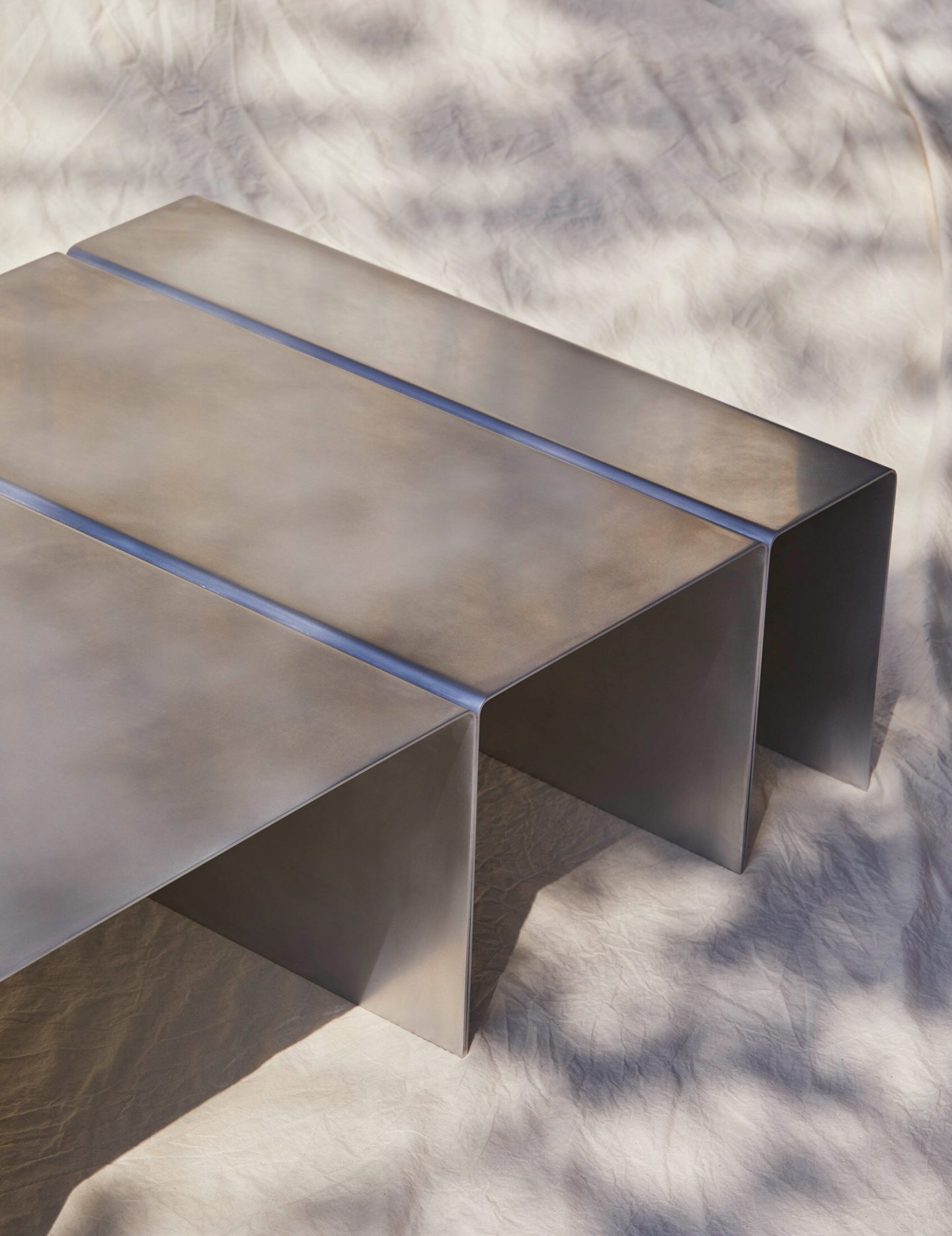
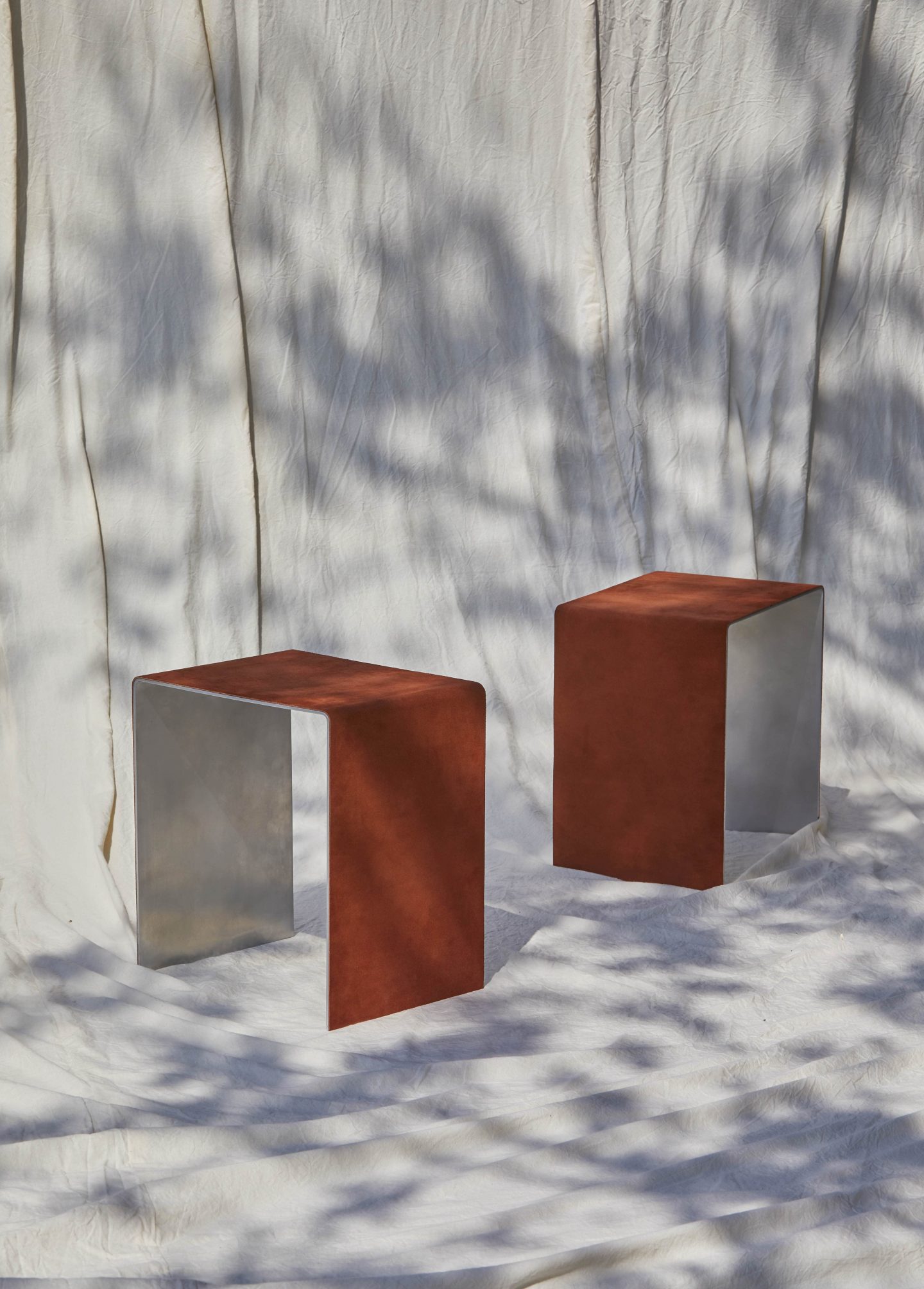
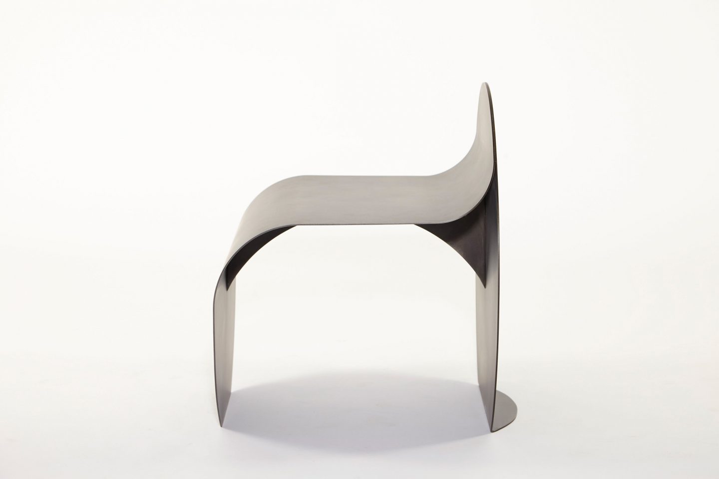
Your pieces are not only muted in color but also sculptural, featuring raw materials such as metal and leather, as shown in your ‘Segment Coffee Table’ and ‘O Stool’. You describe your work as inspired by the Brutalist architecture of your native country, Uruguay. How is Brutalism manifested in your designs?
Brutalism in Uruguay was cemented by a specific political context in which a prosperous and educated population was able to welcome a new environment of conceptual buildings and a more modern approach to architecture—this very rational placement of simple volumes generated a solid aesthetic across the capital of Montevideo. The notion of beauty and style that Brutalism offers by being sincere in its construction, the raw and honest components that characterize the movement are the principles we try to emulate with our pieces. We are constantly inspired by the repetition of angular geometries found in Brutalist buildings, and their visually striking graphic quality.
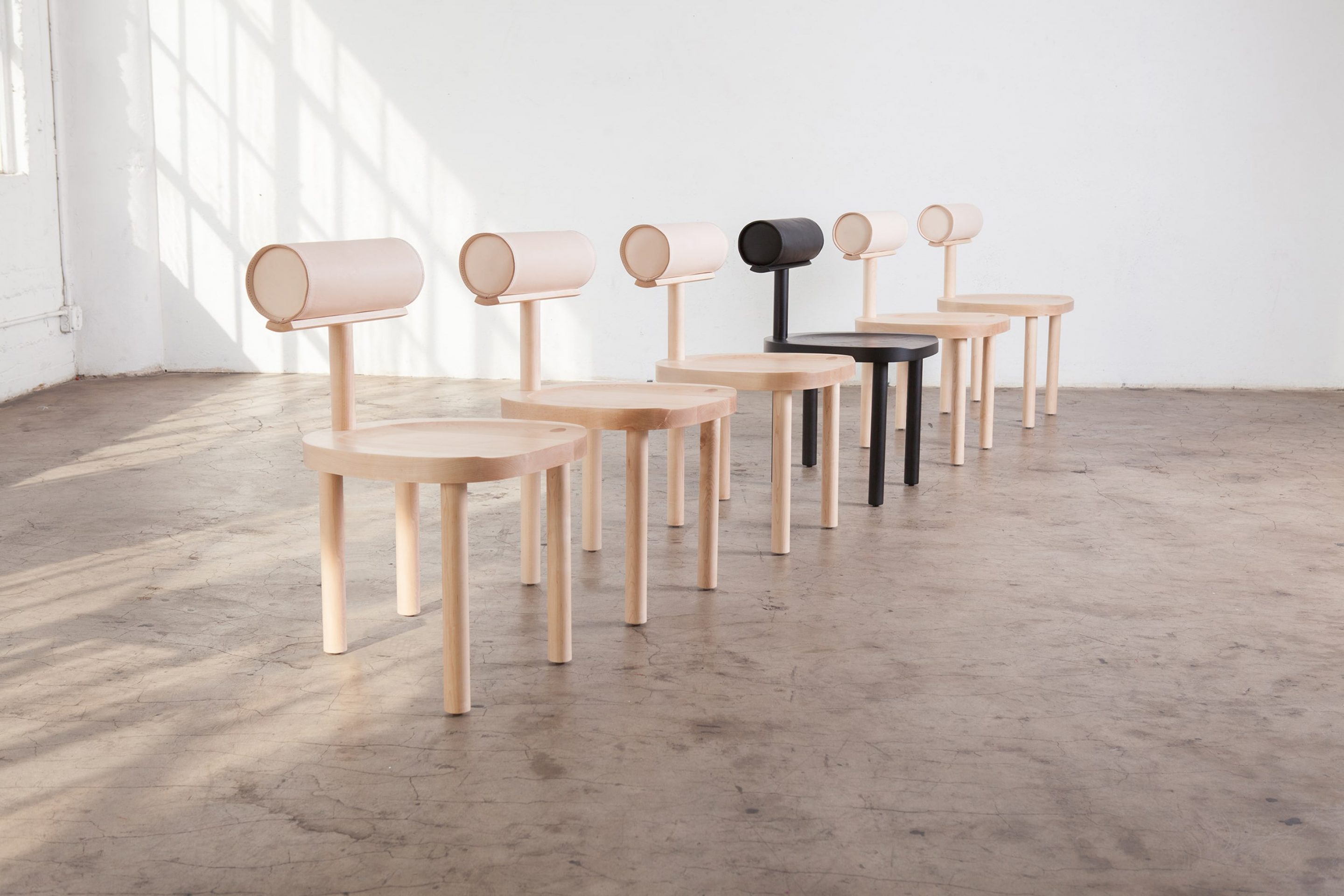
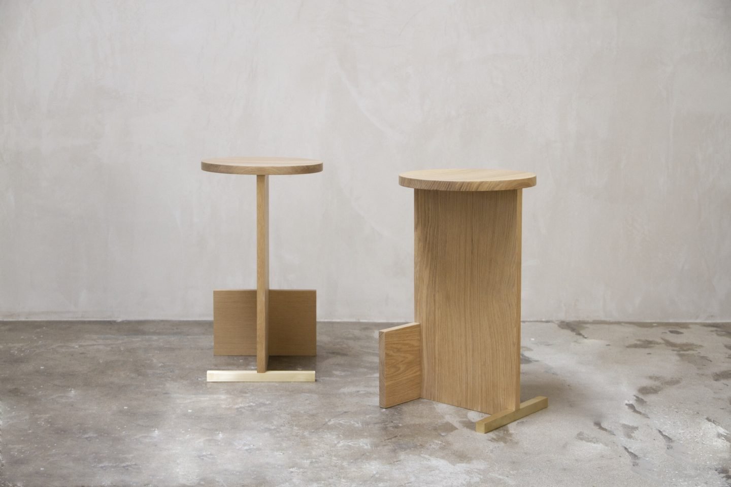
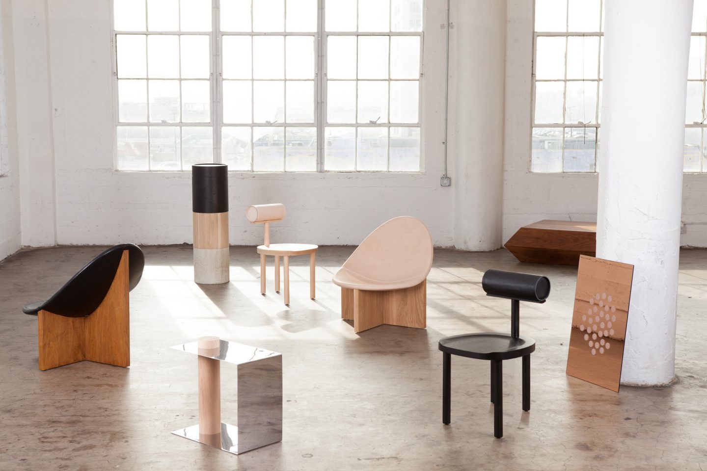
Aspects of late minimalism, including simple, uncomplicated designs and stylization impact your work. Your ‘T Counter Stool’ reminds us of Michael Marriott, your ‘Una Chair’ of Tom Dixon, your ‘Linea table’ of John Pawson. Do you agree with John Pawson’s statement that “minimalism is not defined not by what is not there, but by the rightness of what is there and by the richness with which it is experienced”? How do you ensure that your minimalism is not devoid of emotion?
We wholly concur with Pawson’s take on minimalism, but our philosophy is best ruled by Tadao Ando’s—one of the main inspirations for our first collection, ‘Vol.I’— following quote: “The essence of Minimalism is simplicity, but simplicity without depth is merely cheap. It is not enough.” As with any design process, we believe that emotions are carried into the final piece. If you successfully accomplish that, the sentiment will show, regardless of the style and design language that your furniture piece speaks.
Images © Estudio Persona
