The Changing Climate Of Design: In Conversation With Copenhagen Studio Aspekt Office
- Name
- Aspekt Office
- Images
- Rasmus Dengsø
- Words
- Steph Wade
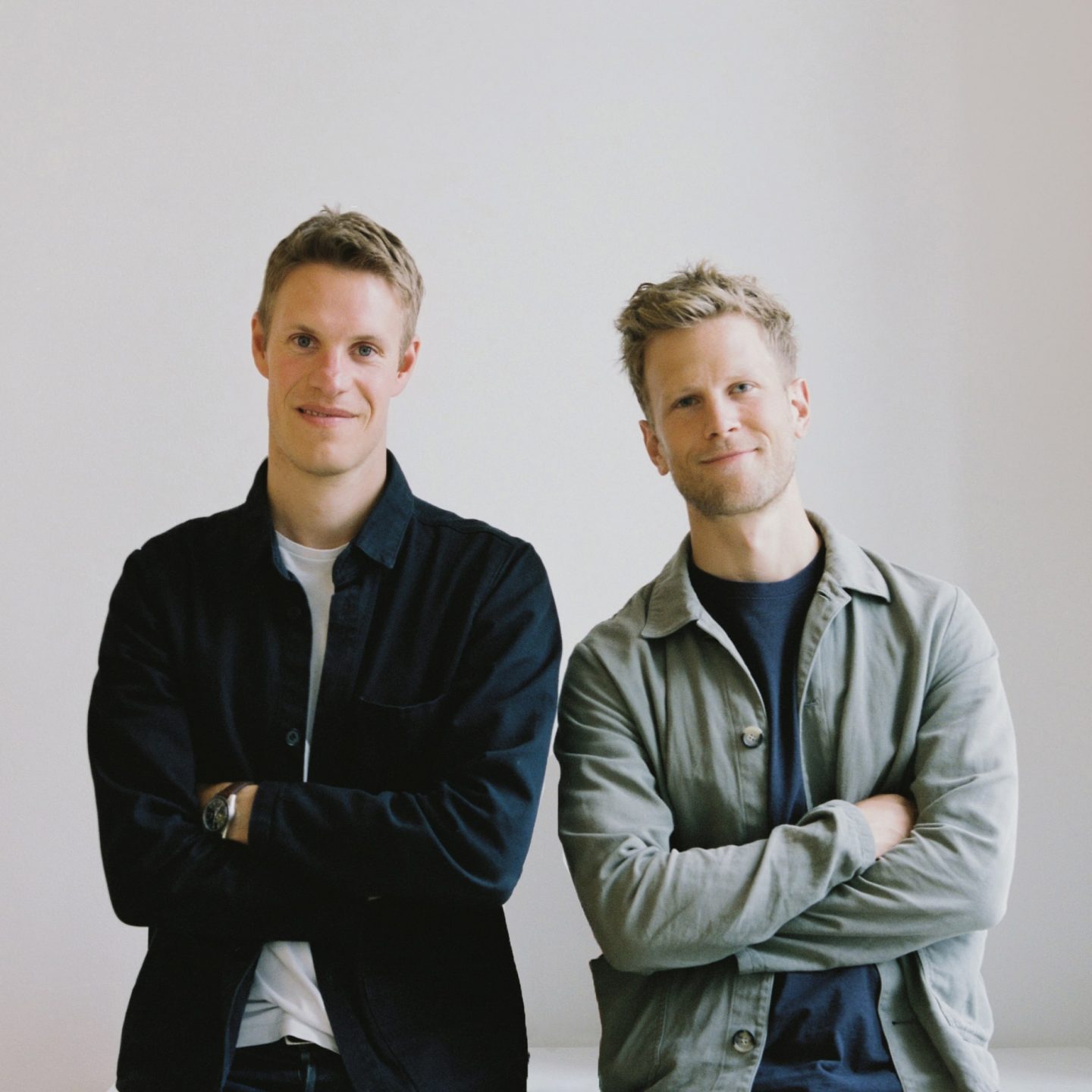
Meet Hans Toft Hornemann and Terkel Skou Steffensen: the faces behind a portfolio of thoughtfully refined yet playful furniture pieces and interior spaces designed for the future. Together, the life-long best friends co-founded Aspekt Office in 2018, a Copenhagen-based multidisciplinary design studio specializing in the fields of furniture, product, interior design, and creative direction.
For much of the Western world, there is an inherent charm to Nordic design—yet for Hornemann and Steffensen, it isn’t everything. “We don’t really relate to Danish principles while designing,” they explain to us from their studio, which is located in Copenhagen’s Meatpacking District. “Of course we take inspiration from it, but not more than other design principles. We believe there’s not one fixed direction for design nowadays,” they say. “We live in a global world; everything is easily accessible and quickly reachable. So we like to think more in the now.”
There is an inherent charm to Nordic design—yet for Hornemann and Steffensen, it isn’t everything.
Both born and raised in Ålborg, a small town in the north of Denmark, the pair have known each other since they were teenagers. Both teens always enjoyed drawing, using their passion for it as a basis for their creativity and technical skills. At the time of enrolling in their undergraduate degree at the same university in their hometown, Hornemann and Steffensen started up a small company together; it would be their first collaboration entailing some small-scale design projects. For a few years afterwards, the duo worked separately for various firms—Steffensen was a designer for renowned Danish brand HAY, while Hornemann worked as a senior designer for Normann Copenhagen. Less than three years ago they reunited in Copenhagen and decided to open their own studio together. “The way we approach design is spontaneous and intuitive, almost playful. We make a lot of models to test our ideas and to see what works best for the project we’re developing,” says Steffensen of their decision. “The ambition of the studio is to create something new on the design scene. We know that it sounds naïve, but it’s what we strive for with our studio… And of course to have fun while working!”.
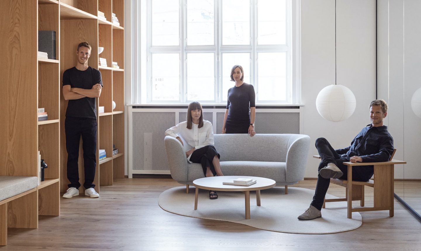
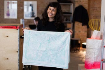
Hans Toft Hornemann and Terkel Skou Steffensen with the creative team behind Work&Co, Dever Thomas and Dawn Moses.
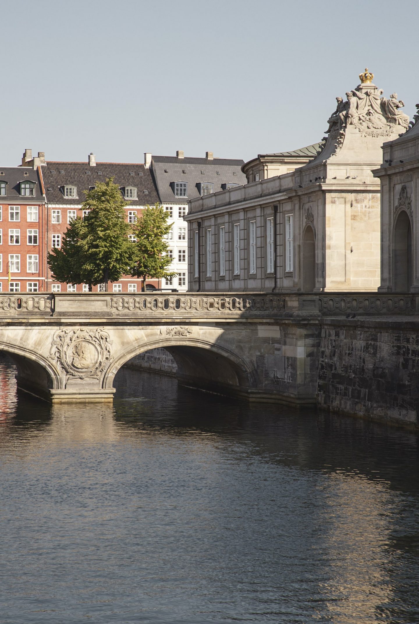
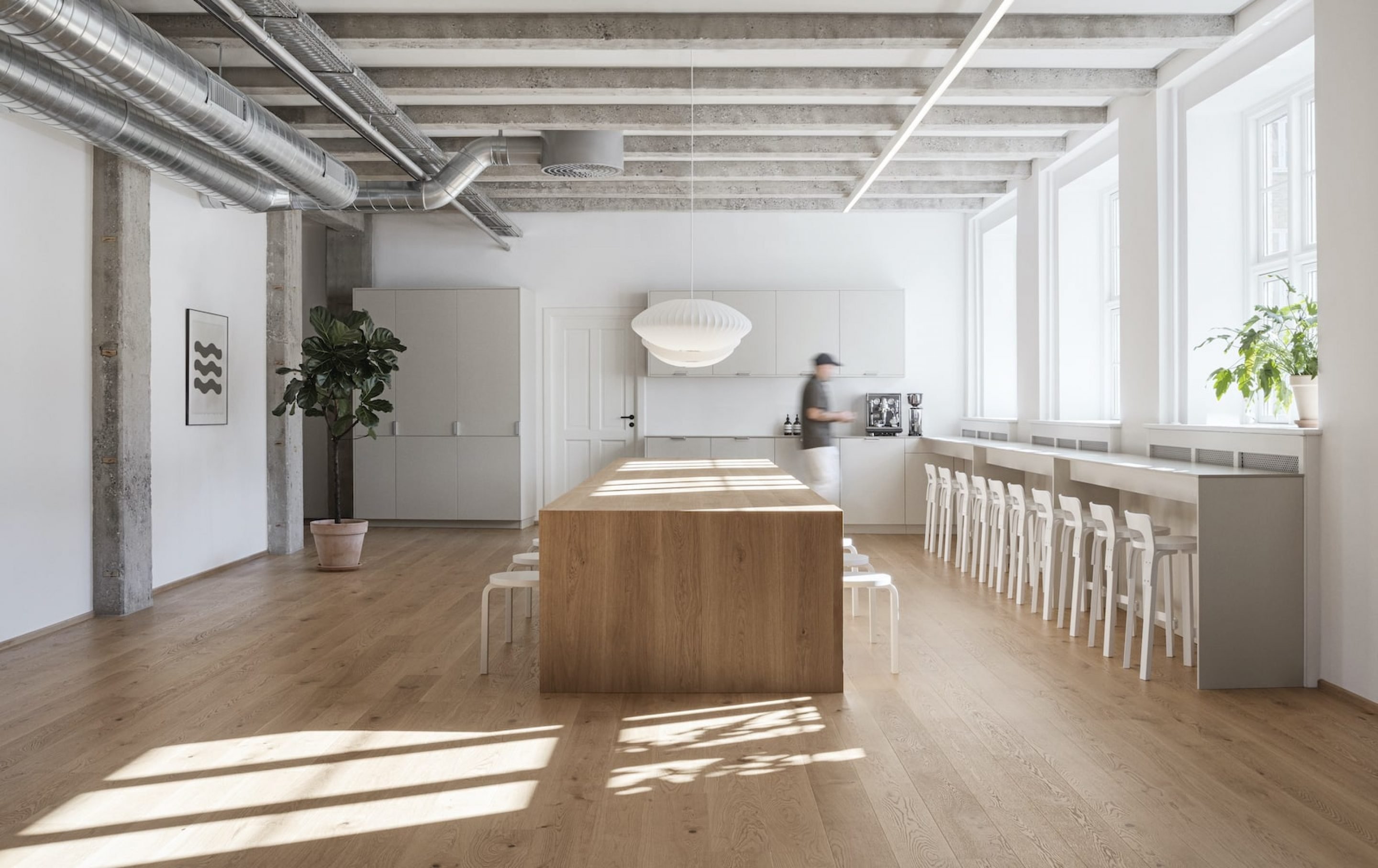
The centrally located Work&Co space in the heart of Copenhagen.
The pair want to put work out into the world that is practical and authentic. “Without sounding pretentious, we strive to create honest, simple, functional design. To us, objects, furniture, and projects should have a purpose,” says Hornemann. “And possibly being recognizable too—having an identity that is distinguishable amongst other designers is important,” adds Steffensen. To stand out amidst the huge amount of talent in the Danish design scene is no easy feat, yet the designers explain that it is possible. “You have to find your own identity and work hard to push boundaries,” says Steffensen. “But you also need a good dose of luck, meeting the right client, and getting into the right network. It’s definitely paramount in the design world, especially in a small city like Copenhagen.”
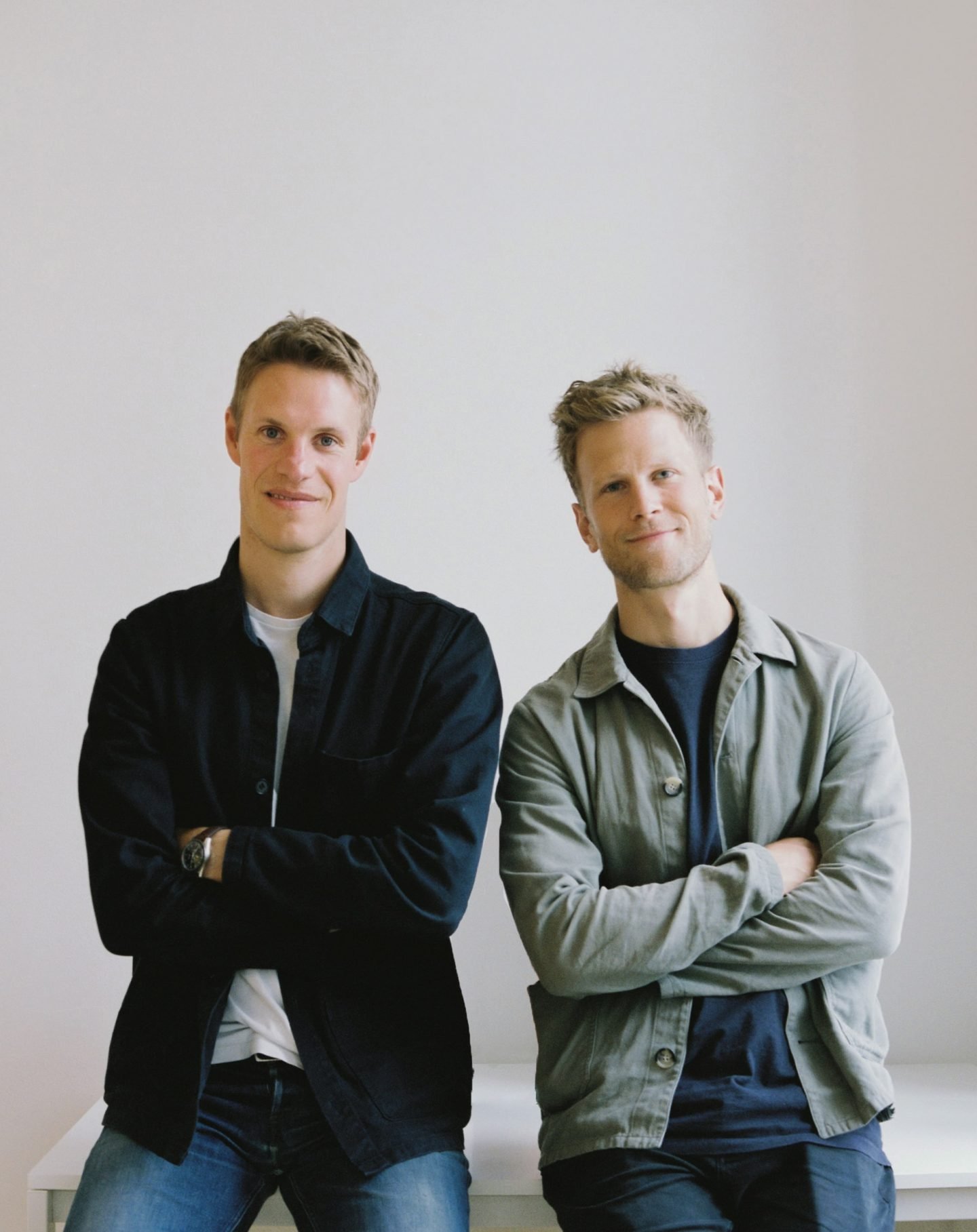
Hans Toft Hornemann and Terkel Skou Steffensen, the faces behind Aspekt Office.
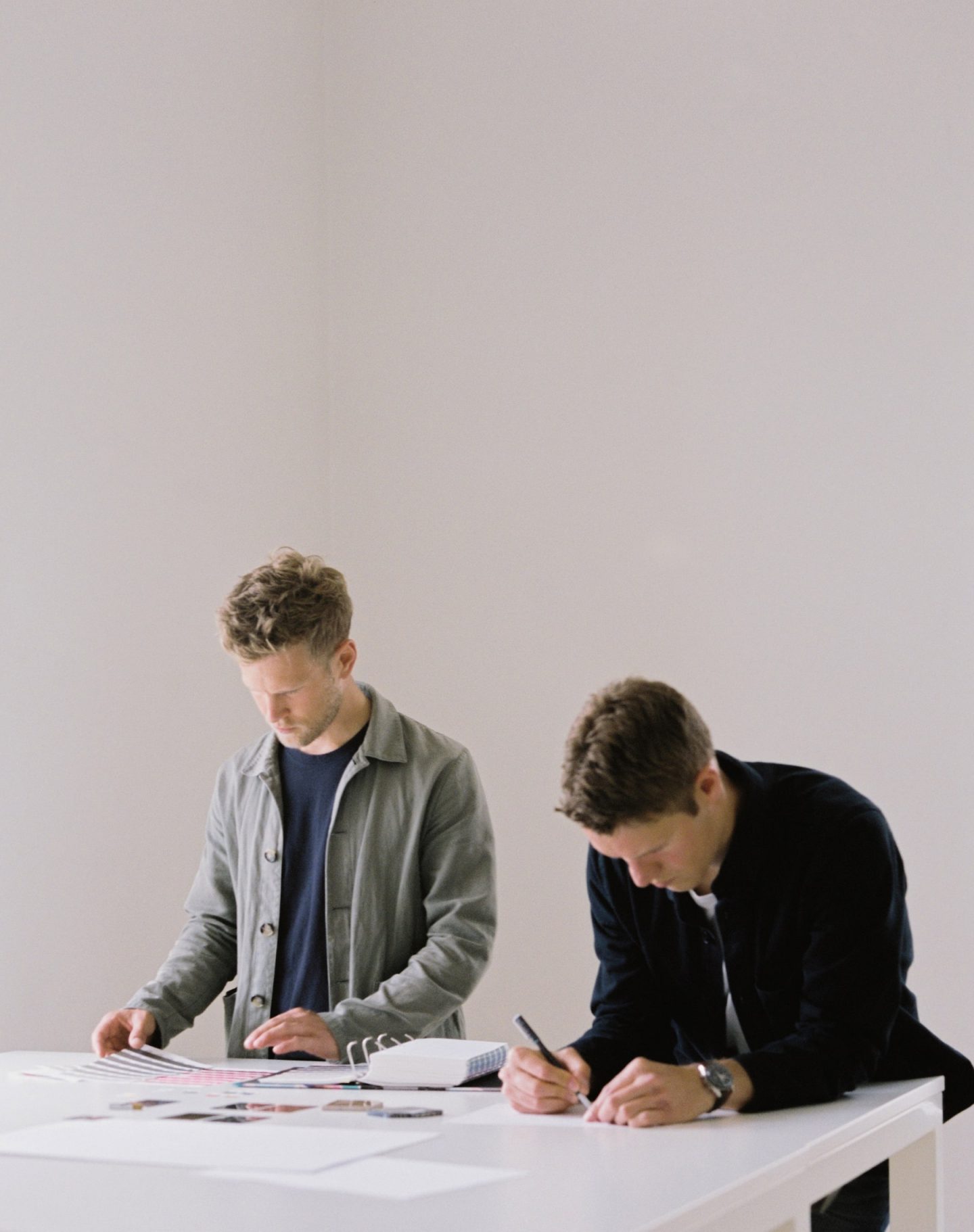
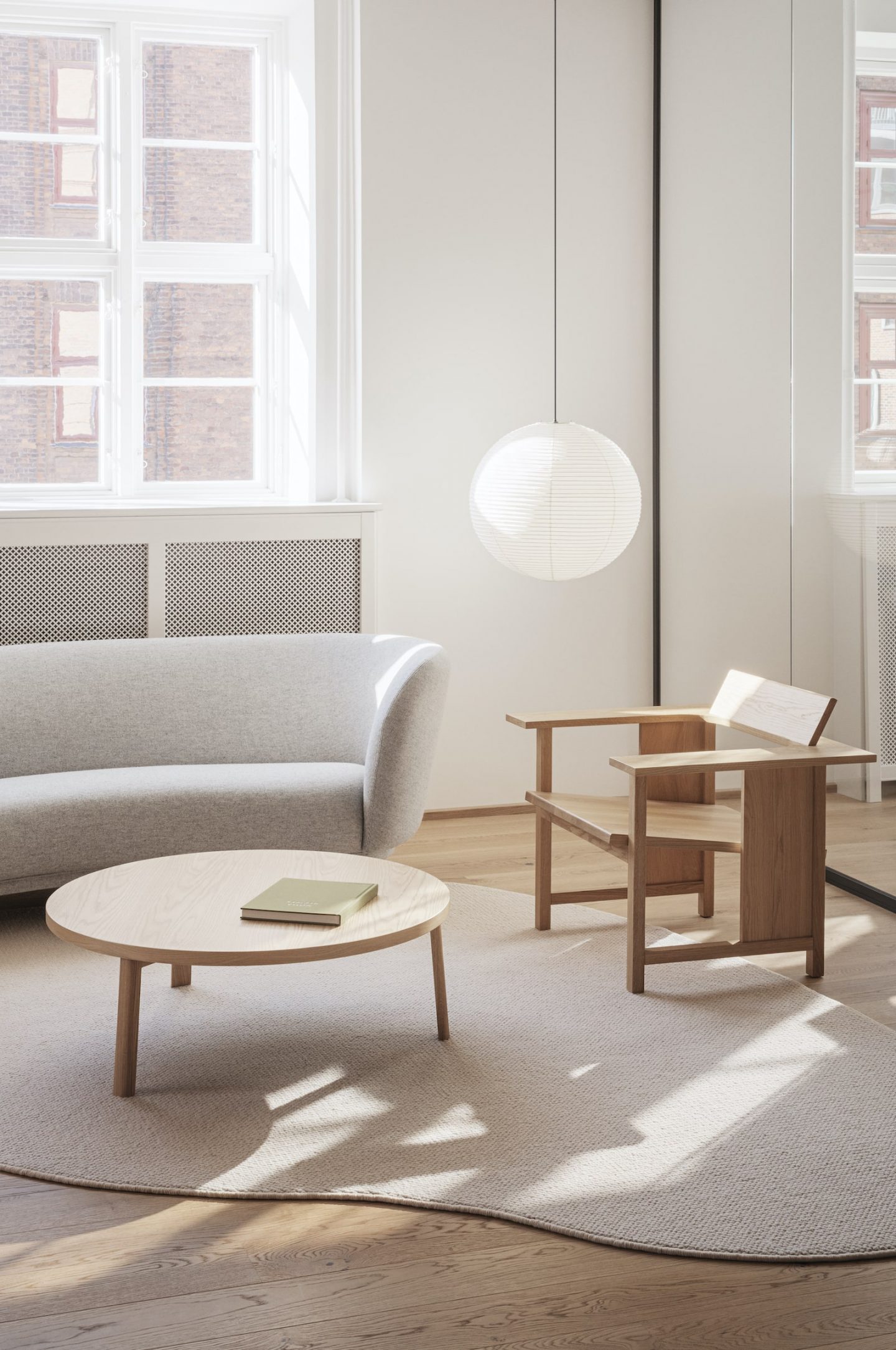
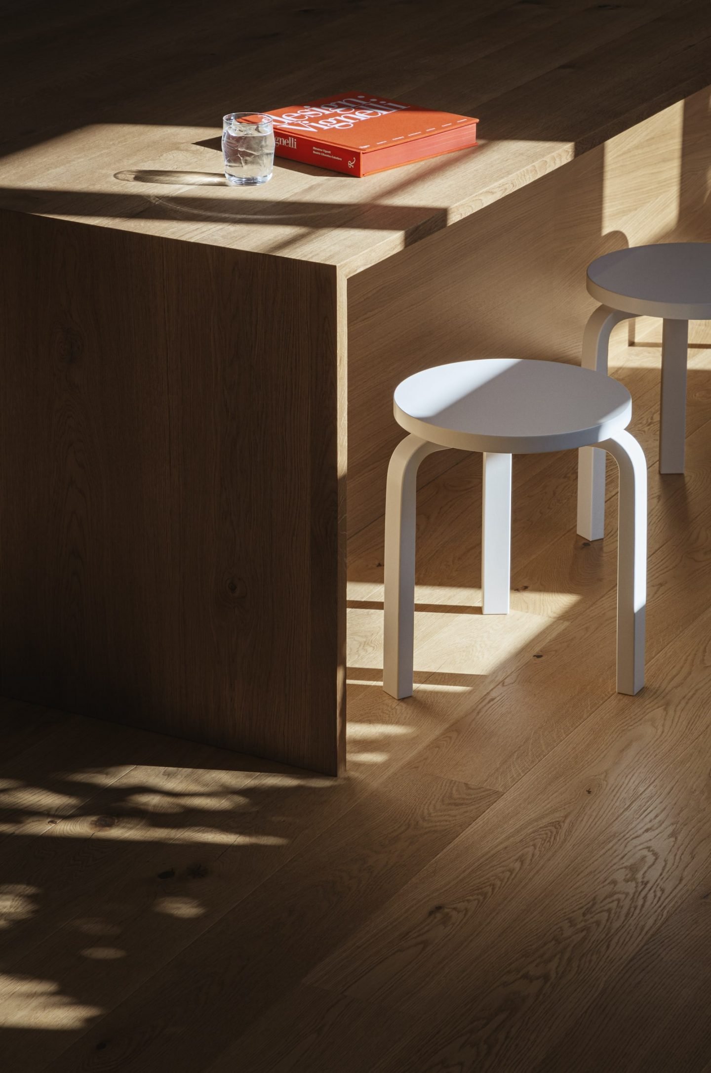
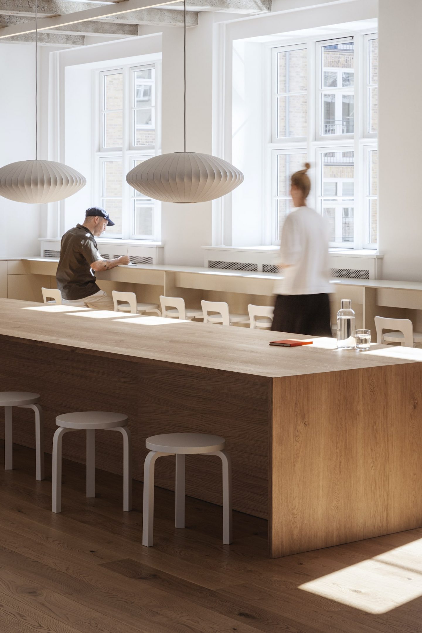
“We live in a global world; everything is easily accessible and quickly reachable. So we like to think in the now.”
The project that first put Aspekt Office’s aesthetic on the map is the Normann Copenhagen flagship store and showroom, a boldly colored artistic design concept for the Danish brand that sells furniture, lamps, and home accessories. Two more recent projects are the interior design of clothing brand BLS Hafnia’s retail space and the flagship store for Chinese retailer OCE, both located in Copenhagen. They are a visual treat that speak to the pair’s playful side, where aesthetic simplicity and high functionality are shown through expressive and sharp designs.
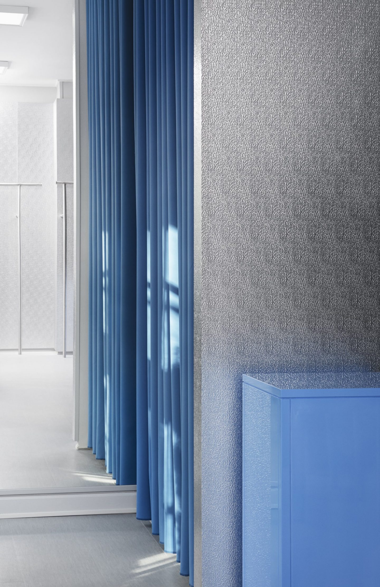
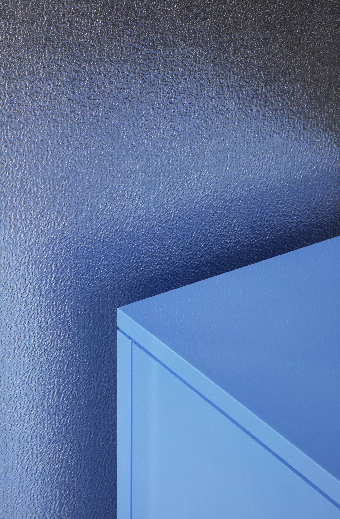
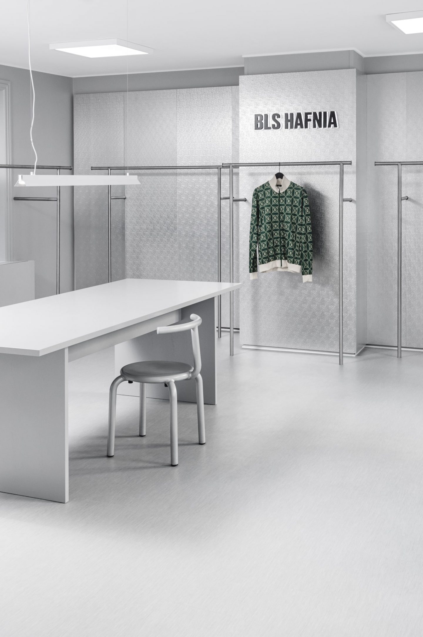
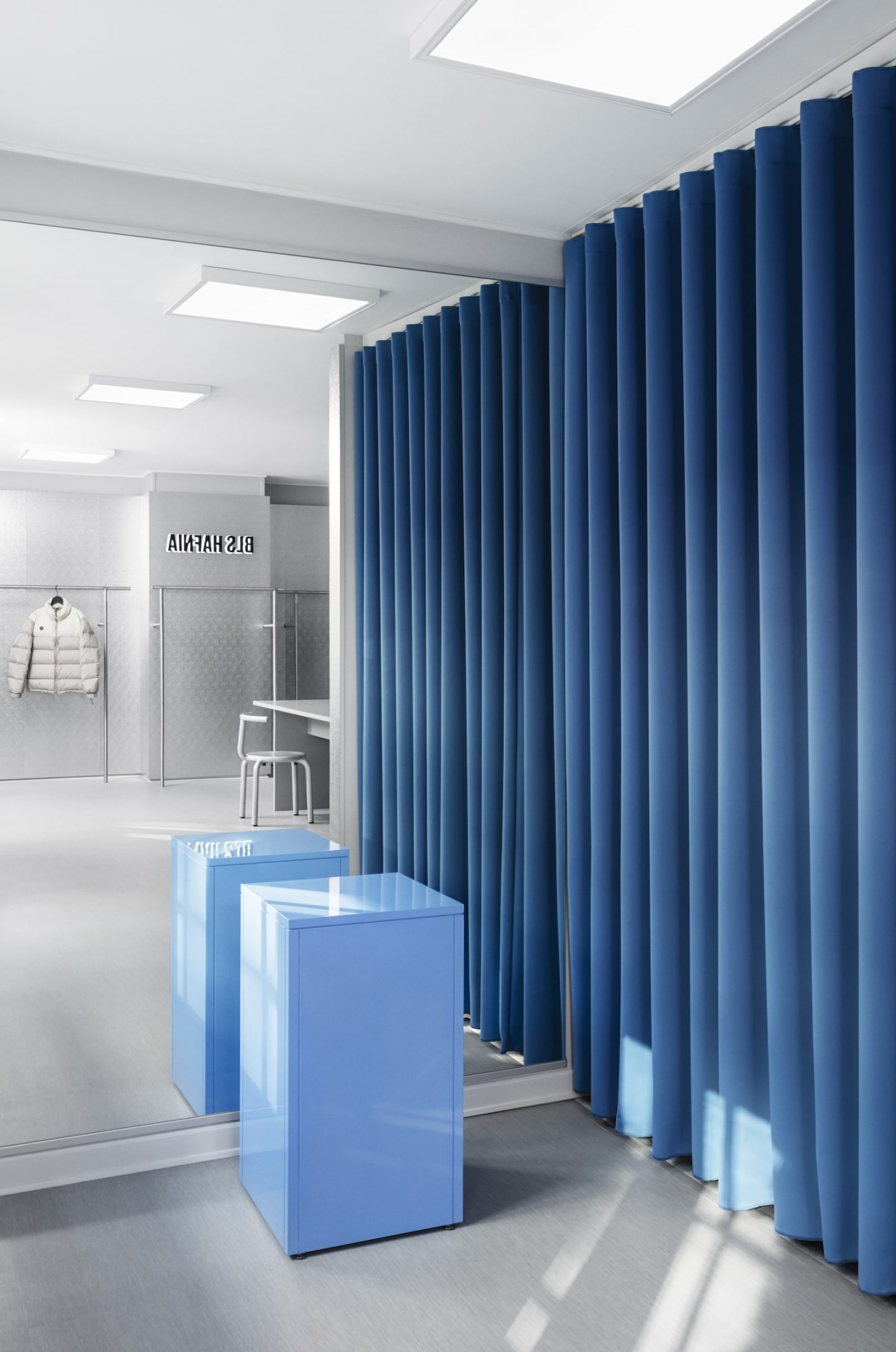
With BLS Hafnia, an industrial space prioritizing shades of gray provides a neutral backdrop for the brand’s offerings, except for a smackingly-vibrant blue changing room and podium that catch the eye. “The space is quite small, which is why we went straight into a light gray for most of the materials and surfaces involved, trying to make the space look bigger by alternating aluminum to gray floor, walls, and furniture,” explains Hornemann. “Besides, the choice of the color was purposely selected to keep faith in the BLS style: rough, understated, and essential,” adds Steffensen.
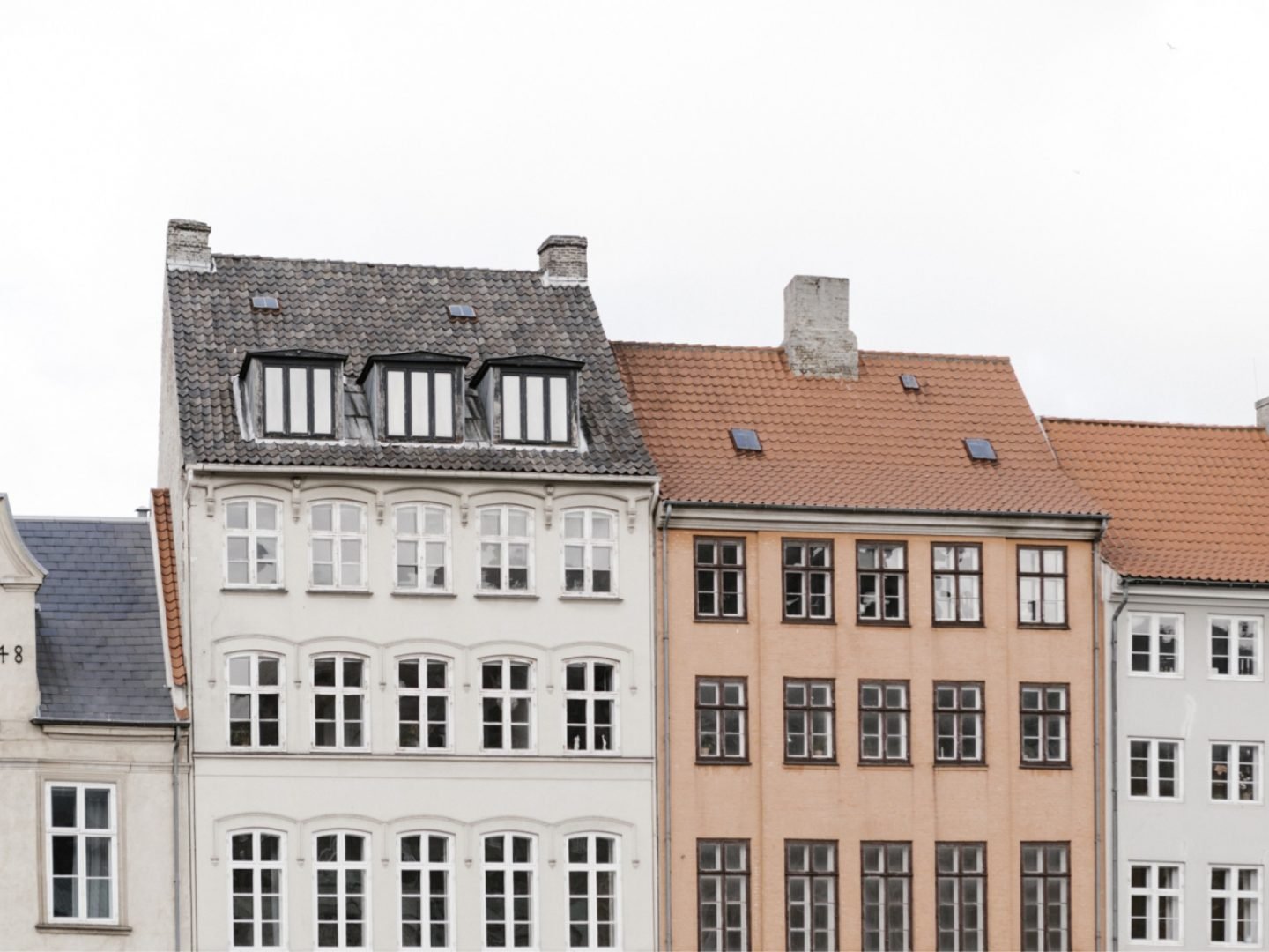
Work&Co's European outpost benefits from its location in a city with a rich design heritage.
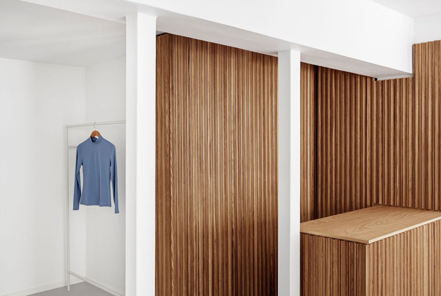
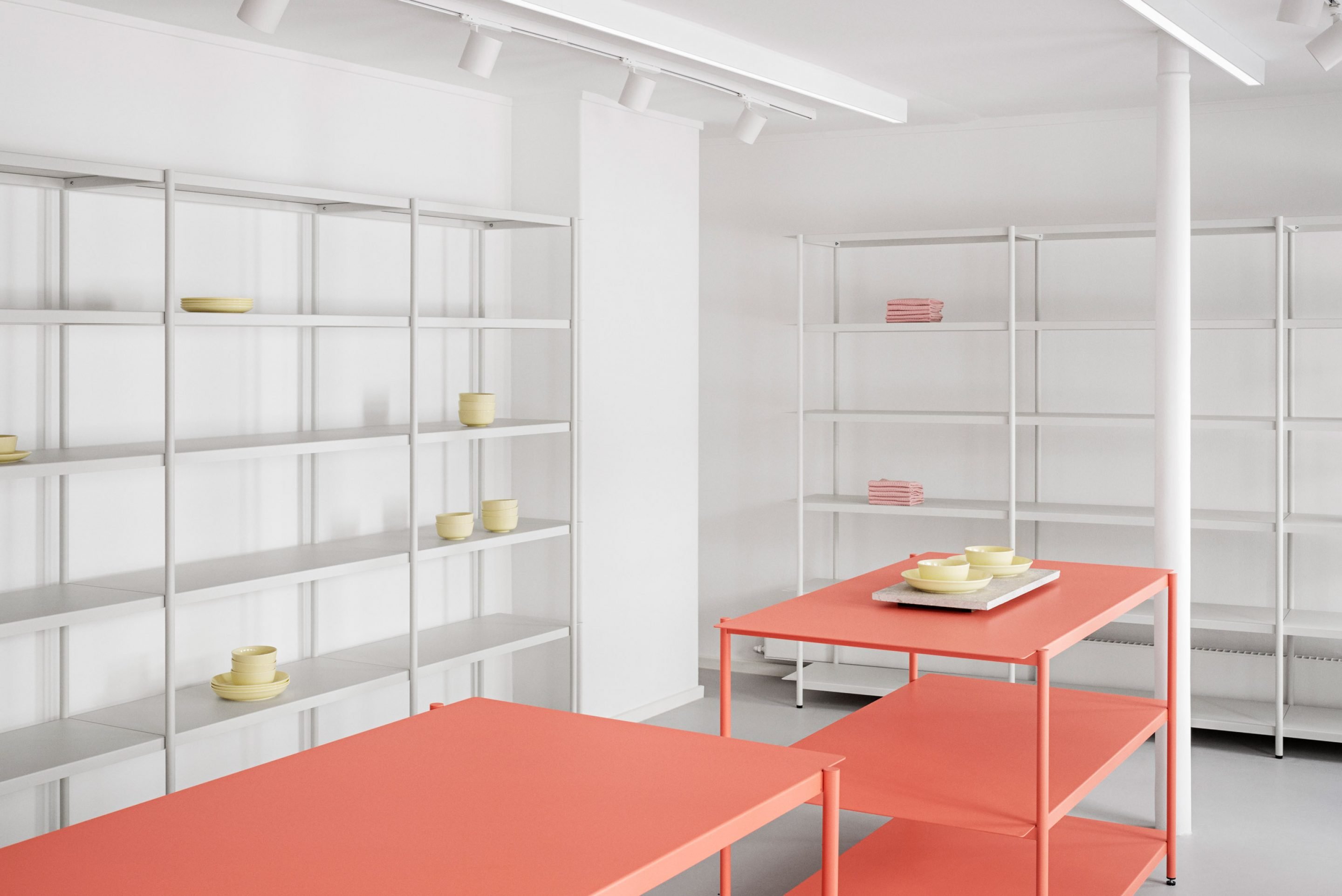
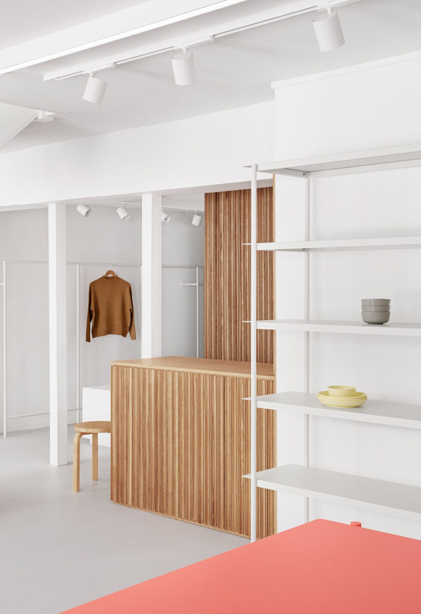
Oak panel details of the OCE retail space, located in Copenhagen.
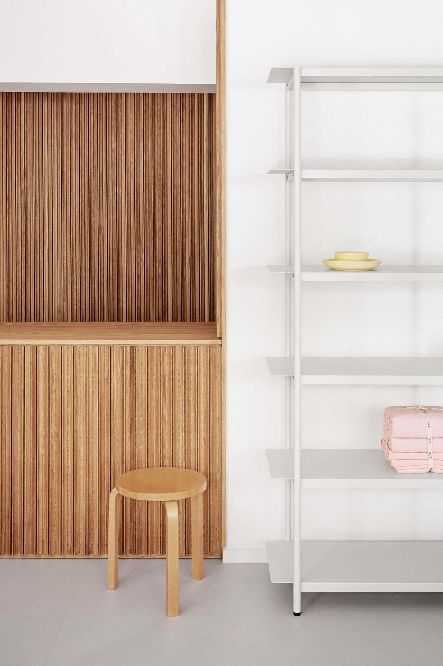
Similarly with OCE, Aspekt Office wanted to create a utilitarian interior, which, save for some coral-colored shelves and an oakwood-clad counter, would be as minimal as possible to let the clothes stand out themselves. “OCE wanted us to create a Nordic atmosphere and add a Scandinavian look, feel, and expression to their brand,” Steffensen says, “so the color and material palette are extremely minimal and simple, to some extent even sterile. But the soft palette fuses in with the surrounding environment, it is simple and discreet, yet modern and fresh.”
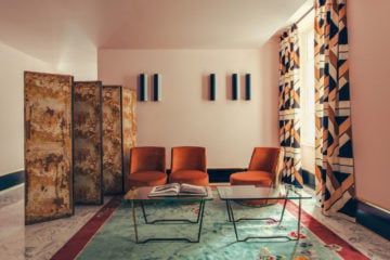
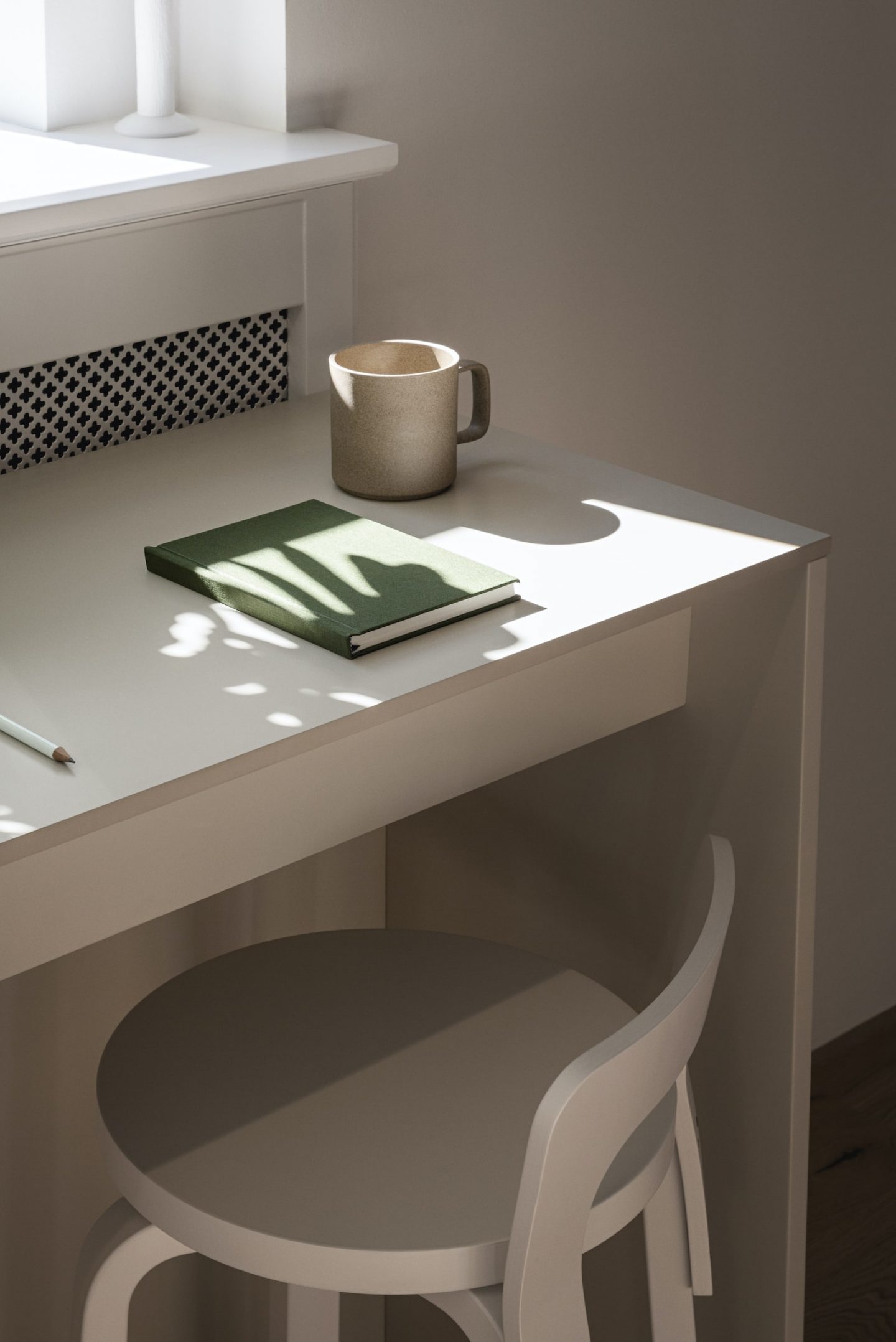
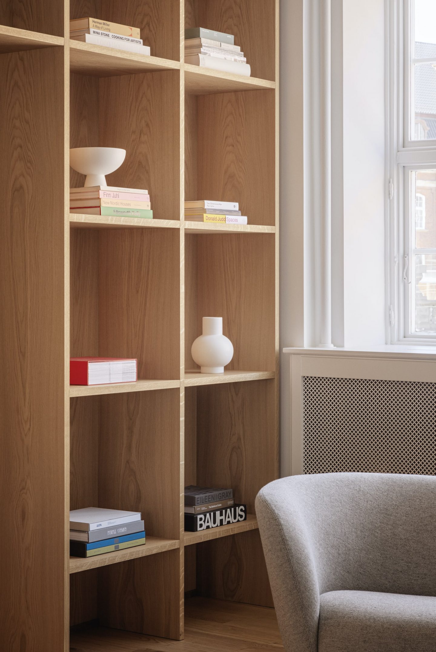
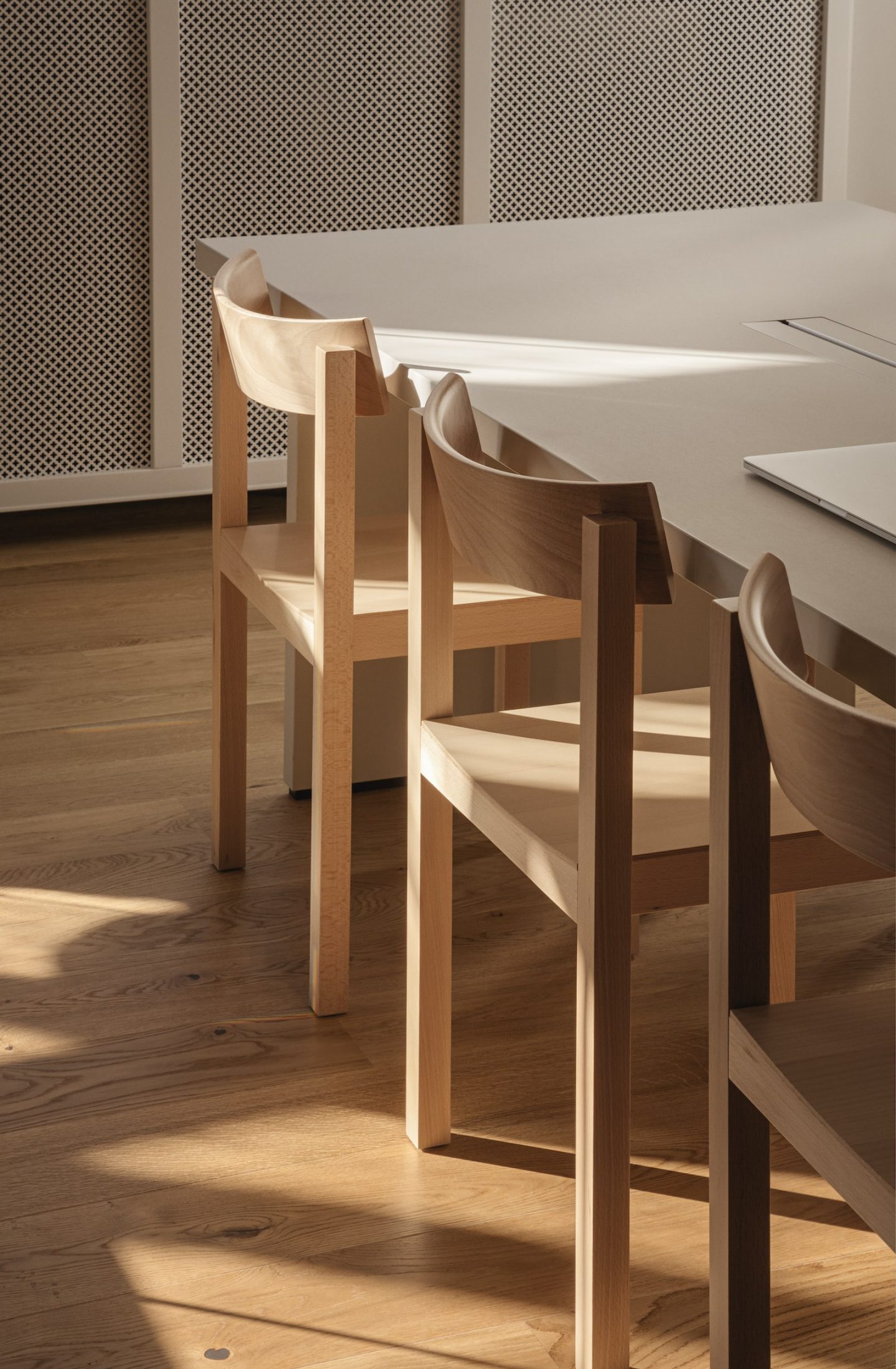
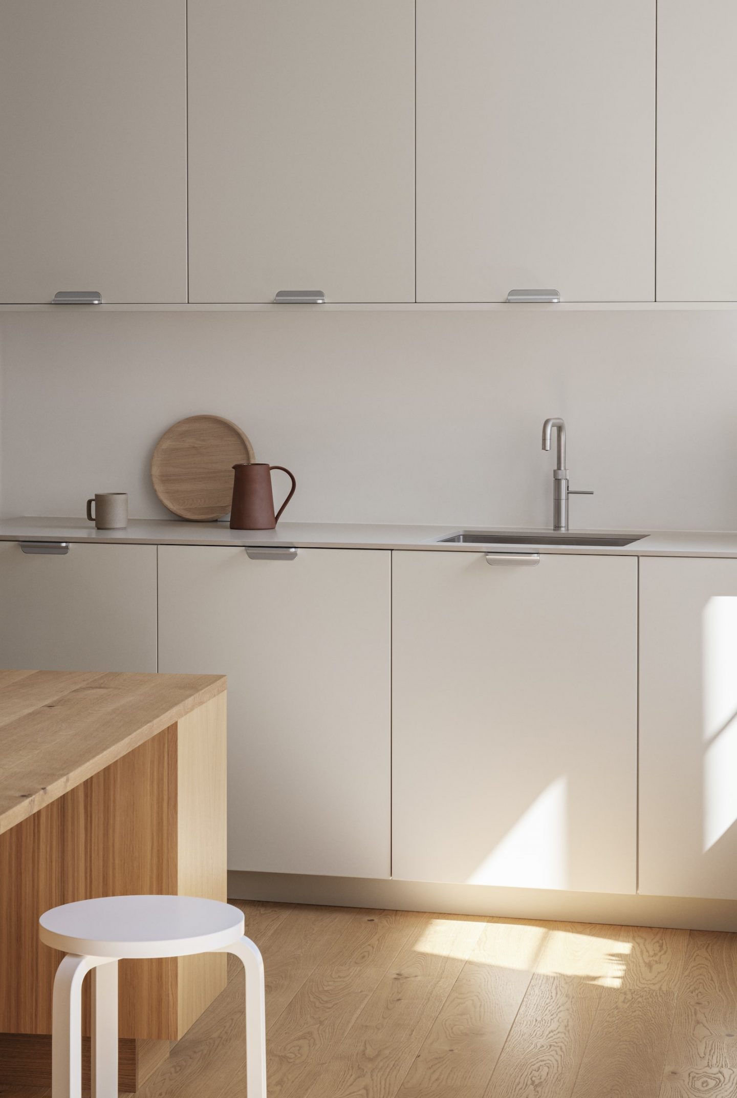
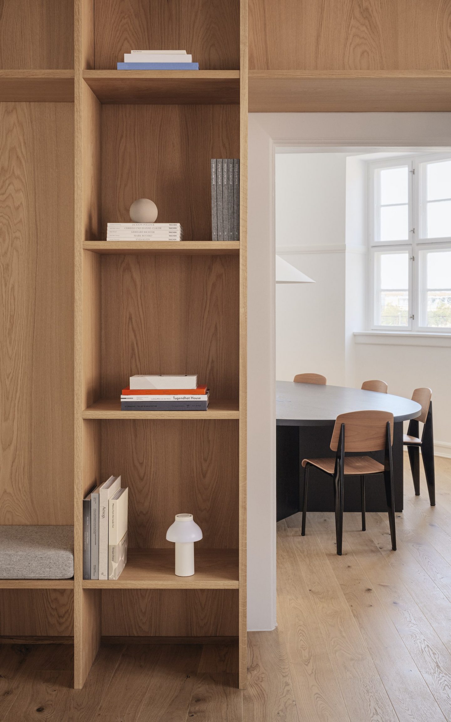
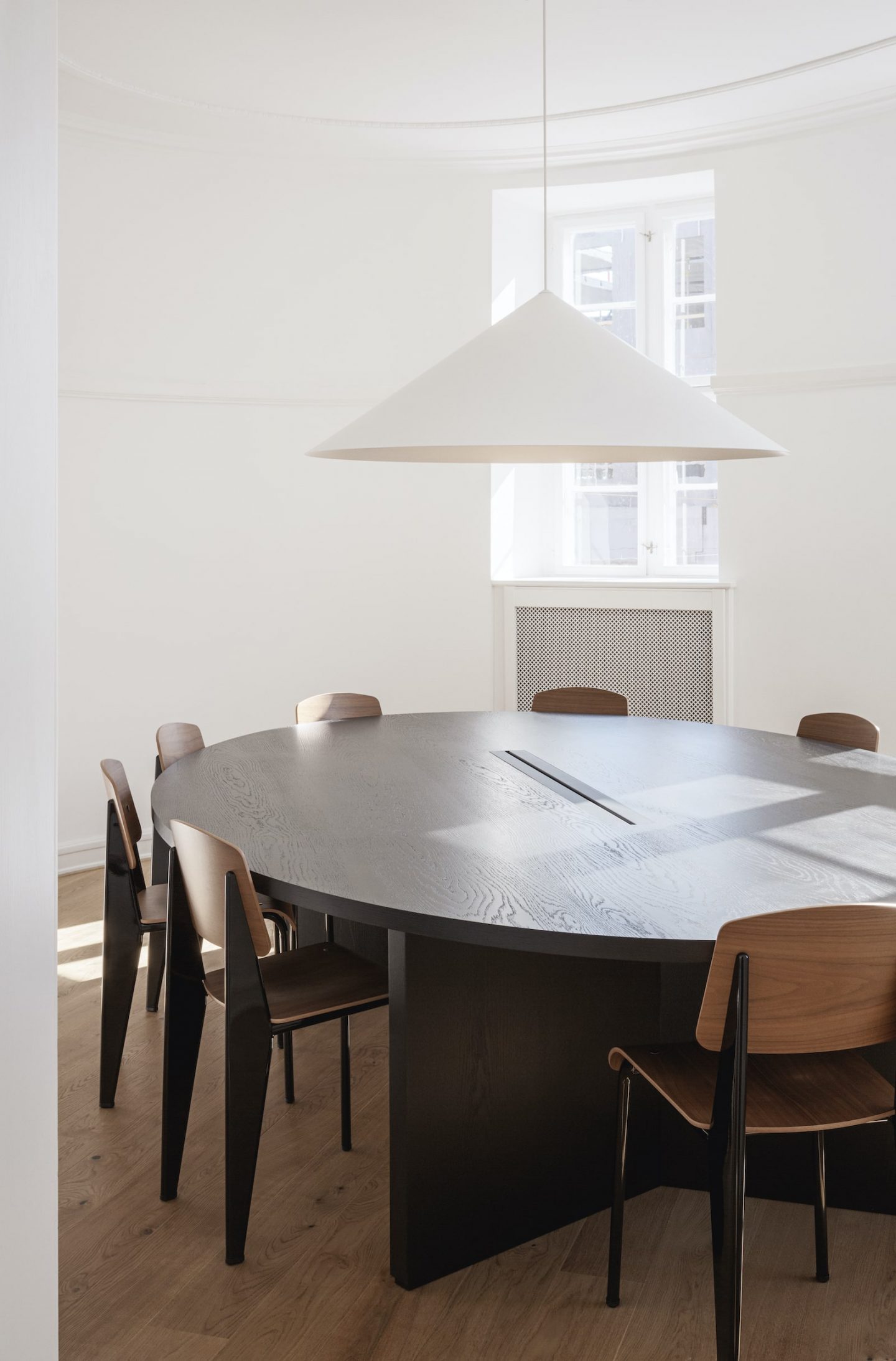
Another notable project by the studio is their office design for the new Work & Co outpost in Copenhagen, the design agency with headquarters in cities all over the world including Brooklyn, São Paulo, Belgrade, and Portland. The project is crisp and exudes tactility, focusing on quality materials and a sense of homeliness that would make employees feel comfortable. “With 600 square meters to work with, we had never worked on such a huge space,” explains Hornemann, “therefore there was a lot of room for our ideas.” The brief was to create a workspace that feels like home, where people can do their thing in a serene space that feels good. “We created a layout where social spaces like the kitchen and lounge areas are interspersed with meeting rooms, with common working spaces and private phone booths for one or two people.” To reinforce the homey atmosphere, ambience was a priority, with high-end furniture and bespoke tech solutions.
“We need to actually care for recycled materials, for sustainable production, and for durable goods”
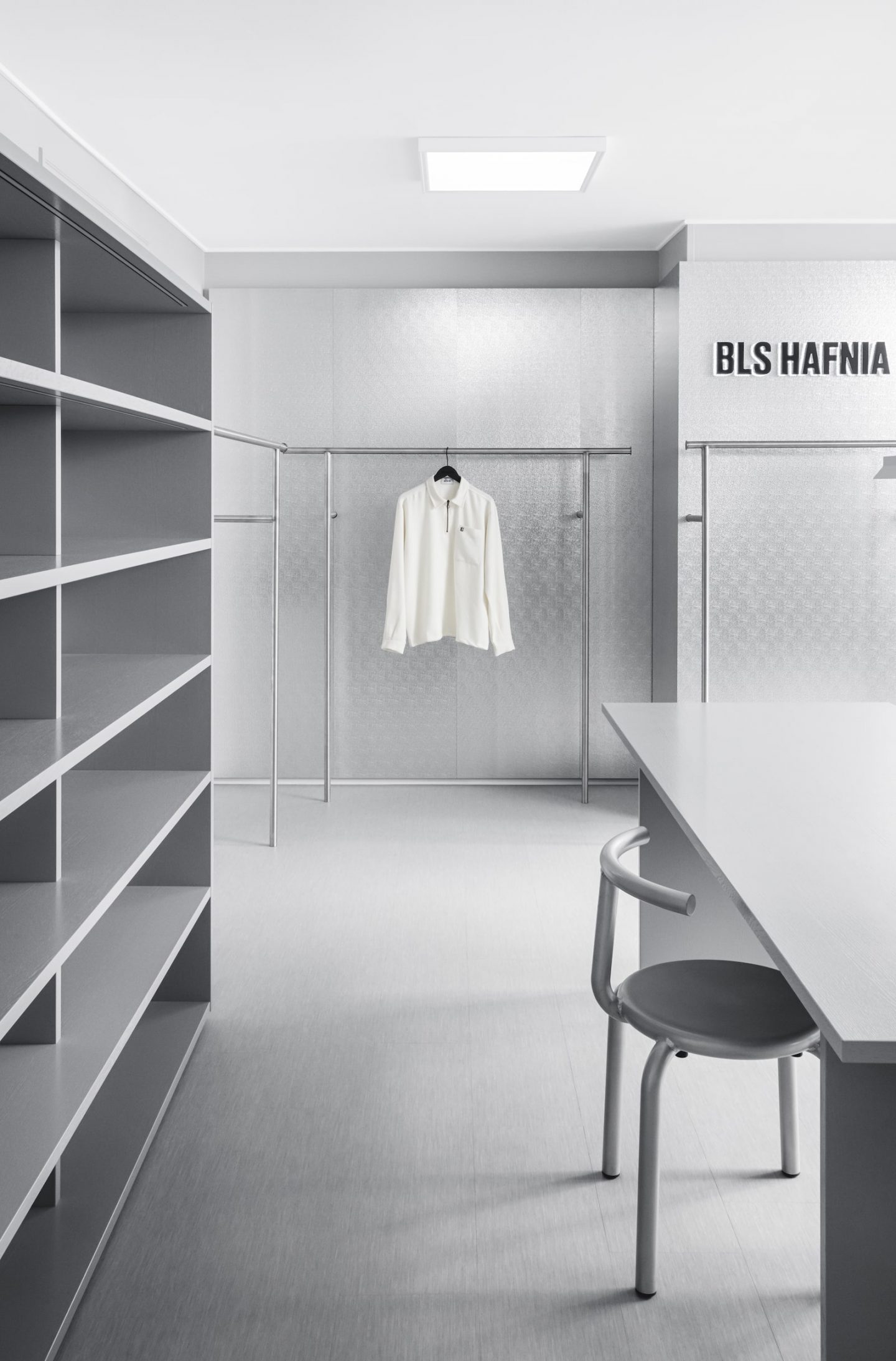
The all-gray BLS Hafnia retail space.
Aesthetically, Work & Co is an impressive and elegant project, yet is the way that a job looks ever an indication of how ‘good’ it is? “Not solely, it’s an indicator but not the reason,” says Steffensen. “A chair can look beautiful and comfortable but maybe it’s not, so what’s the purpose of it then? If you want to use it as a chair you need to be able to sit on it for a prolonged time, else you want to use it merely as a sculptural piece,” he says. This is why both designers believe the way we design in the current climate is changing. “The consumer has different needs today,” explains Hornemann. “We are all more attentive towards our purchases, caring about the material choices, and the producing process. The designer needs to be ahead of the customer, and to actually care for recycled materials, for sustainable production, and for durable goods.”
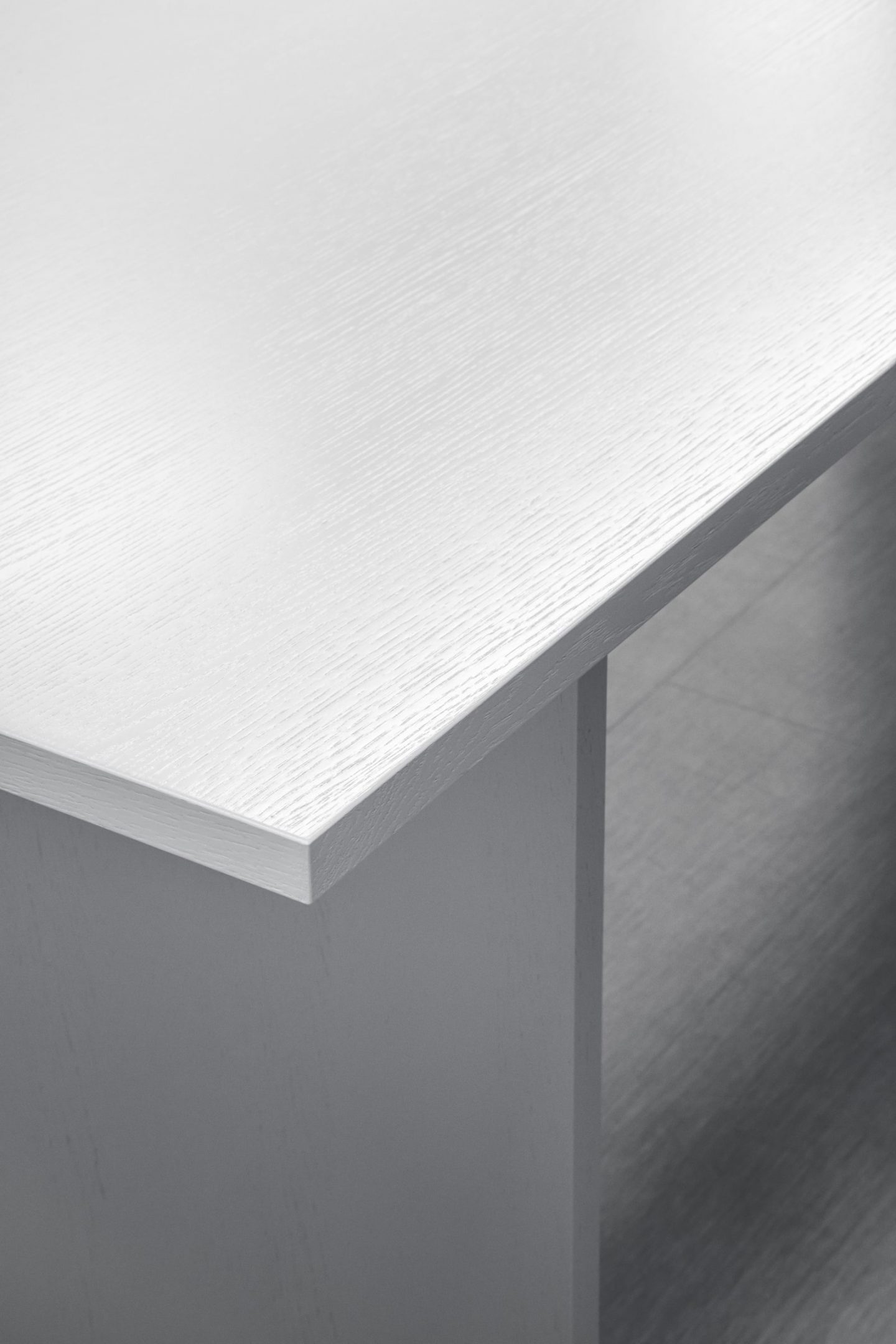
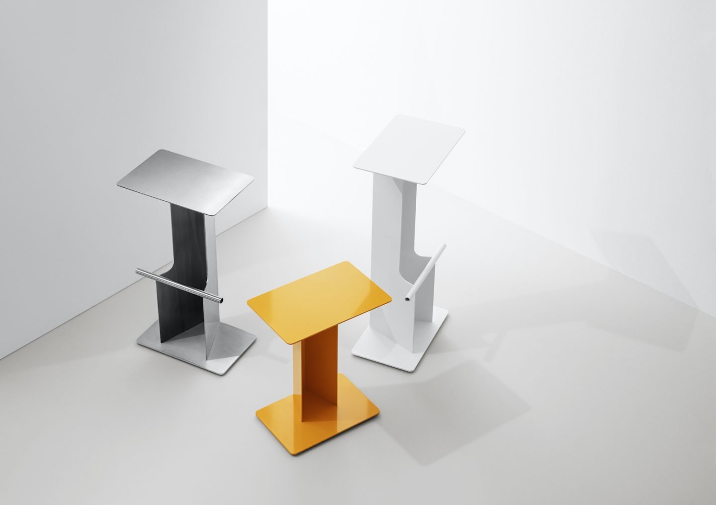
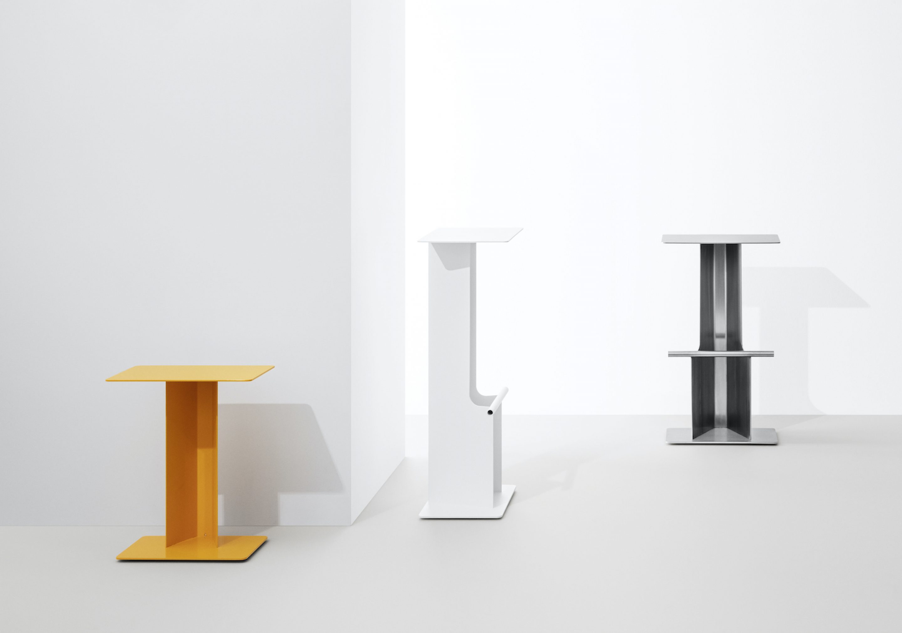
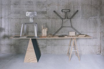
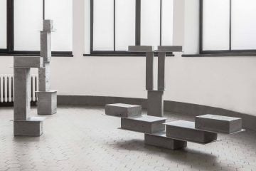
FOLD, the latest stool collection just realized by the studio.
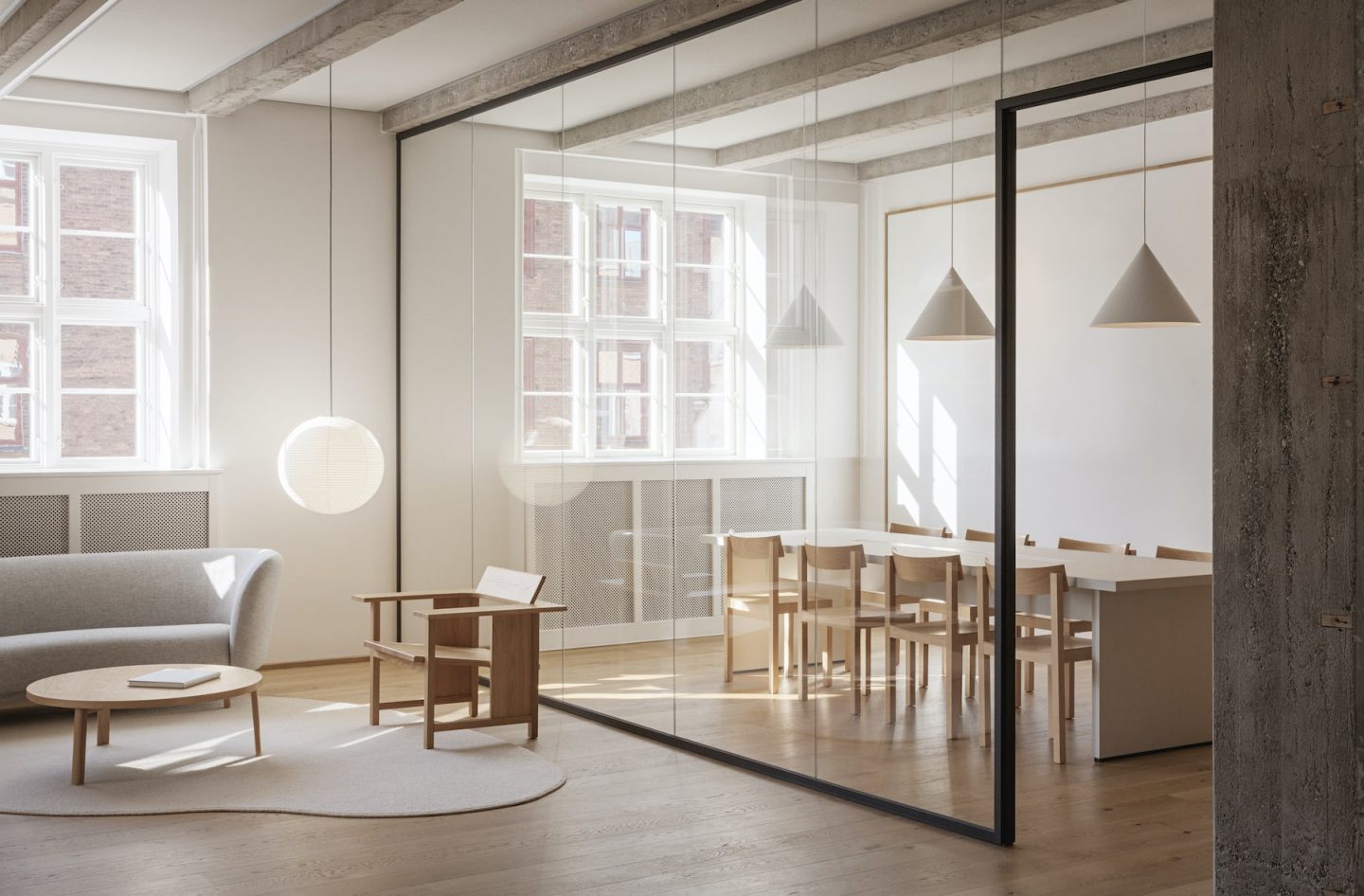
The Work&Co space aims to create a sense of homeliness that would make employees feel comfortable.
When asked how they unwind at the end of the work day, both designers begin to chuckle. “We both have a family with very young kids, so we don’t actually ever unwind,” says Hornemann. “But all jokes aside, I like to cycle in the outskirts of Copenhagen or in the countryside, while Terkel likes to chill with his phone,” he laughs. Steffensen clarifies: “I have a passion for weather forecasts—I have different thermometers placed both indoors and outdoors. You know, as a Dane you have to know how warm and sunny it’s going to be the next day,” he says. It is a fitting trait for a designer whose projects explore ideas that not only look good, but also feel good; following a broader movement that is characterized by purpose-driven consumer choices.
All images © Rasmus Dengsø
