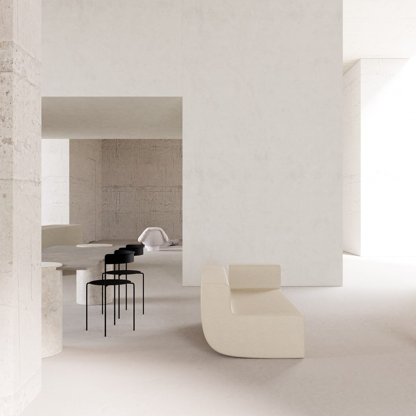
Finding Emotion In Minimalism: Russian Designer Maria Osminina On Her Predilection For Simplicity
- Name
- Maria Osminina
- Images
- Maria Osminina
- Words
- Devid Gualandris
Russian designer Maria Osminina creates contemplative interiors that are minimal and sleek yet exude sentiment, tradition, and serene beauty. As we chat with her from her studio in Saint Petersburg, she tells us about her attentive design method based on feeling and functionality; and how her search for pure sophistication moves fluently between objects, furniture, and interior spaces.
Osminina’s career started in the art world. A fine arts enthusiast since the age of 12, she graduated from the renowned Mukhina Academy of Arts and Saint Petersburg’s University of Technology and Design, before beginning to search for her place in the world as an art dealer. To complement her ambitious pursuit, in 2016, she opened the Inner Voice Gallery together with her partner Pavel Osminin, solidifying her entrepreneurial inclinations as curator, art director, and consultant. Her transition to interior design was organic and prescient. “While running the gallery, we bought an apartment in an old house and I immediately began to envision my new life and living place,” she tells us, adding “I was inspired by the opportunity to translate my design knowledge by creating a space for myself and my family.”
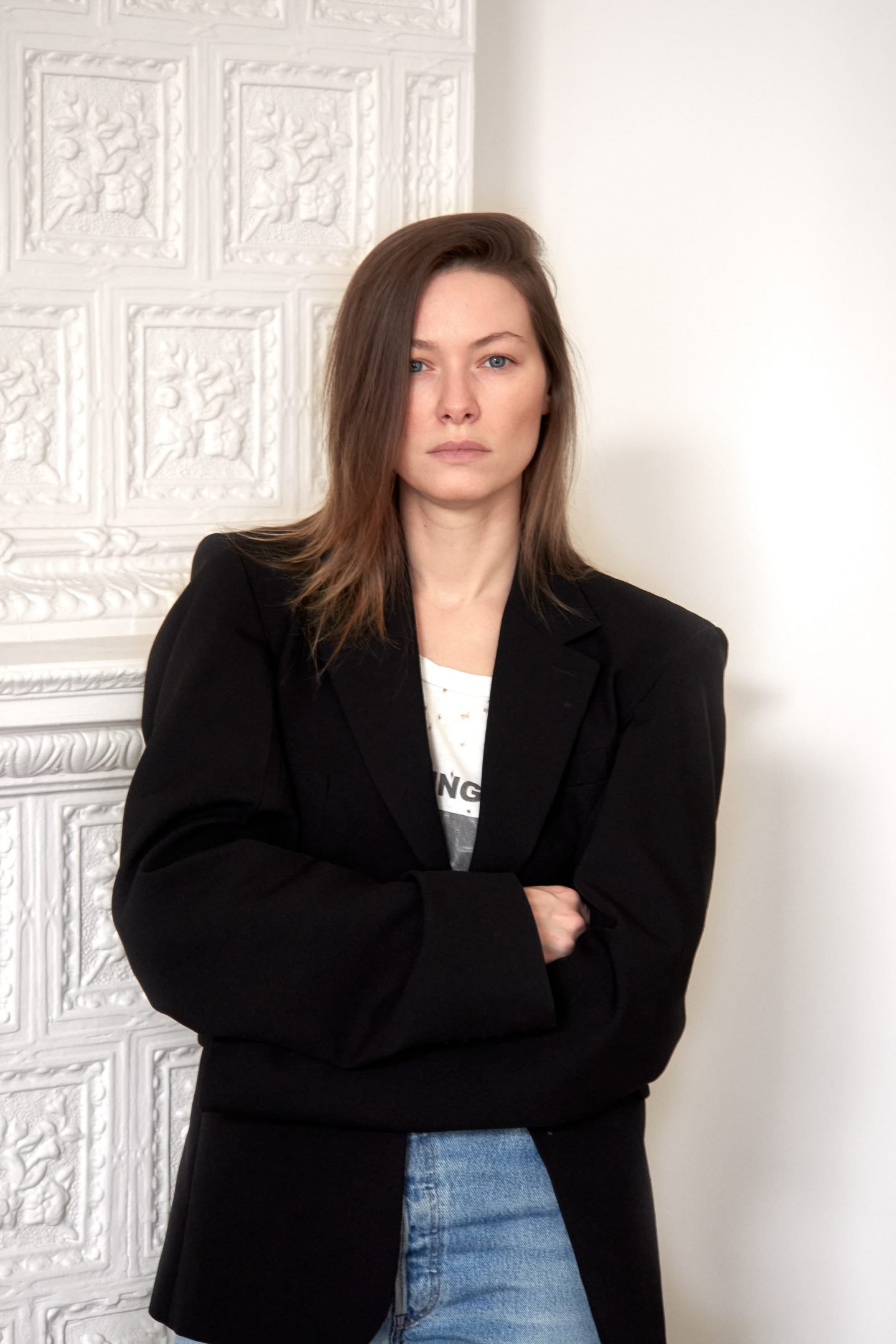
Project 'Timeless'
Osminina wanted the place to be a reflection of the calm sophistication of art galleries. “I wanted to create something minimal and sublime; a space where you can feel, with no distractions or fuss,” she shares. Minimalism has been Osminina’s philosophy since the beginning of her journey. “When I had to make decisions [in the apartment], I began to use the same principles I used when working with exposures. I thought about how important is the space we live in and the objects we surround ourselves with” she explains. “Walls, objects, color—everything has its own line and volume; each subject its own character. I placed these in space, in relation to my sense of composition,” she continues.
“I wanted to create a space where you can feel, with no distractions or fuss”
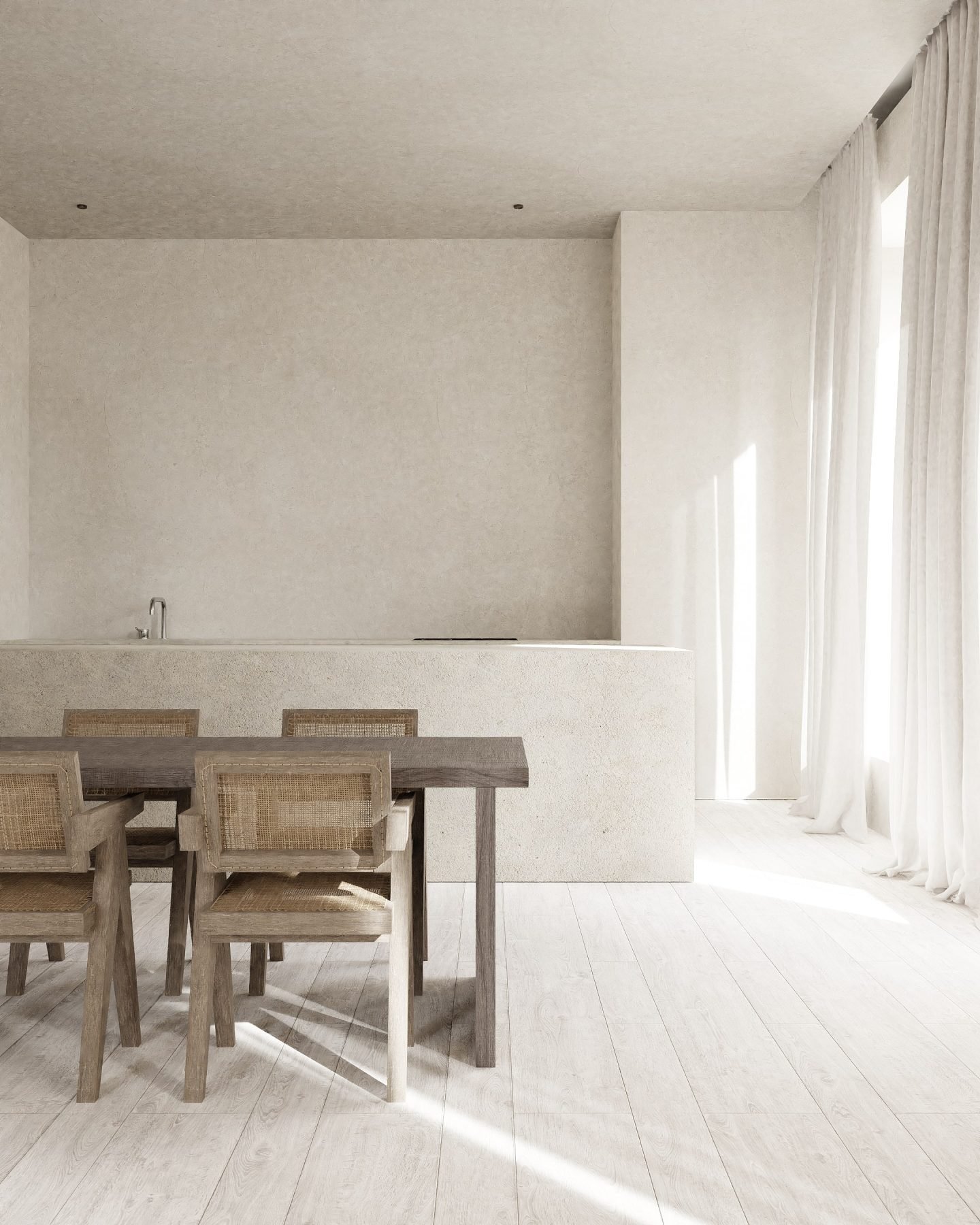
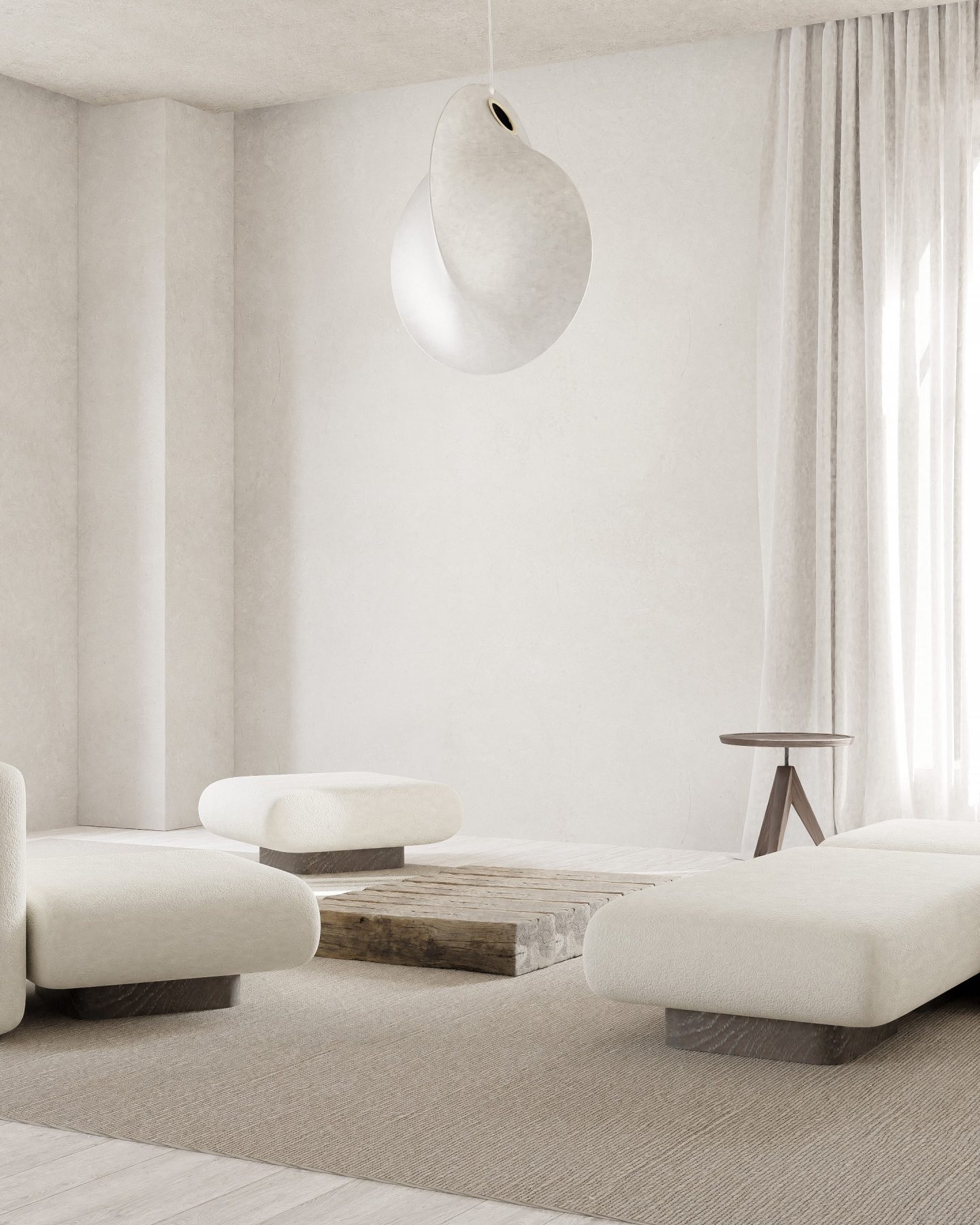
Project 'Timeless'
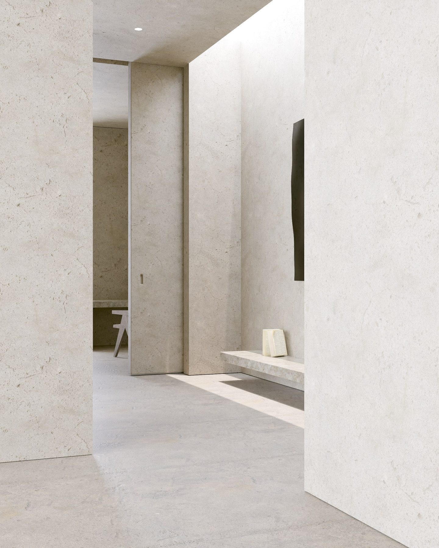
Project 'Timeless'
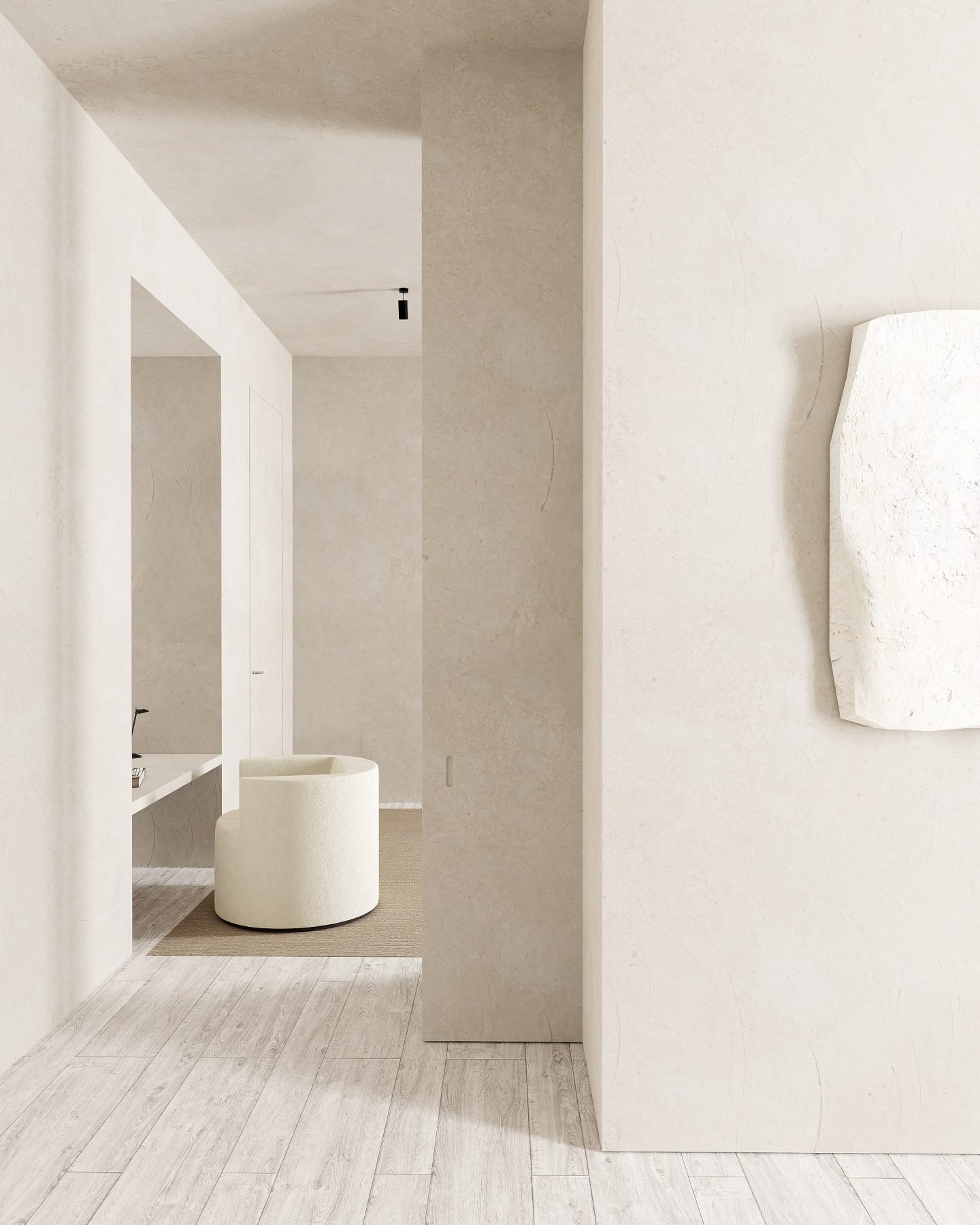
Project 'Timeless'
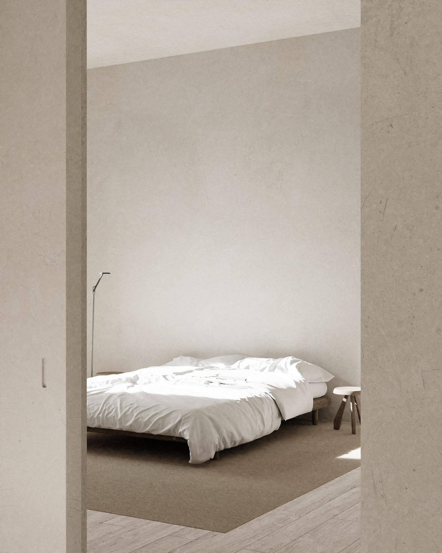
Project 'Timeless'
In design, minimalism can apply to many things; for Osminina it encompasses straight lines, clean geometries, and sparse yet functionally-loaded spaces. It means neutral walls, soft enveloping colors, natural materials, and uncomplicated solutions. “For me, a space must feel simple; the design must speak for itself,” she says. Simplicity is very difficult to create, especially when every single detail counts. “Paradoxically, simplicity is the hardest thing,” she adds. “Achieving it demands a lot of watching and studying,” she explains, adding “there is a lot of Eastern philosophy in this, in which deep and long contemplation lies.”
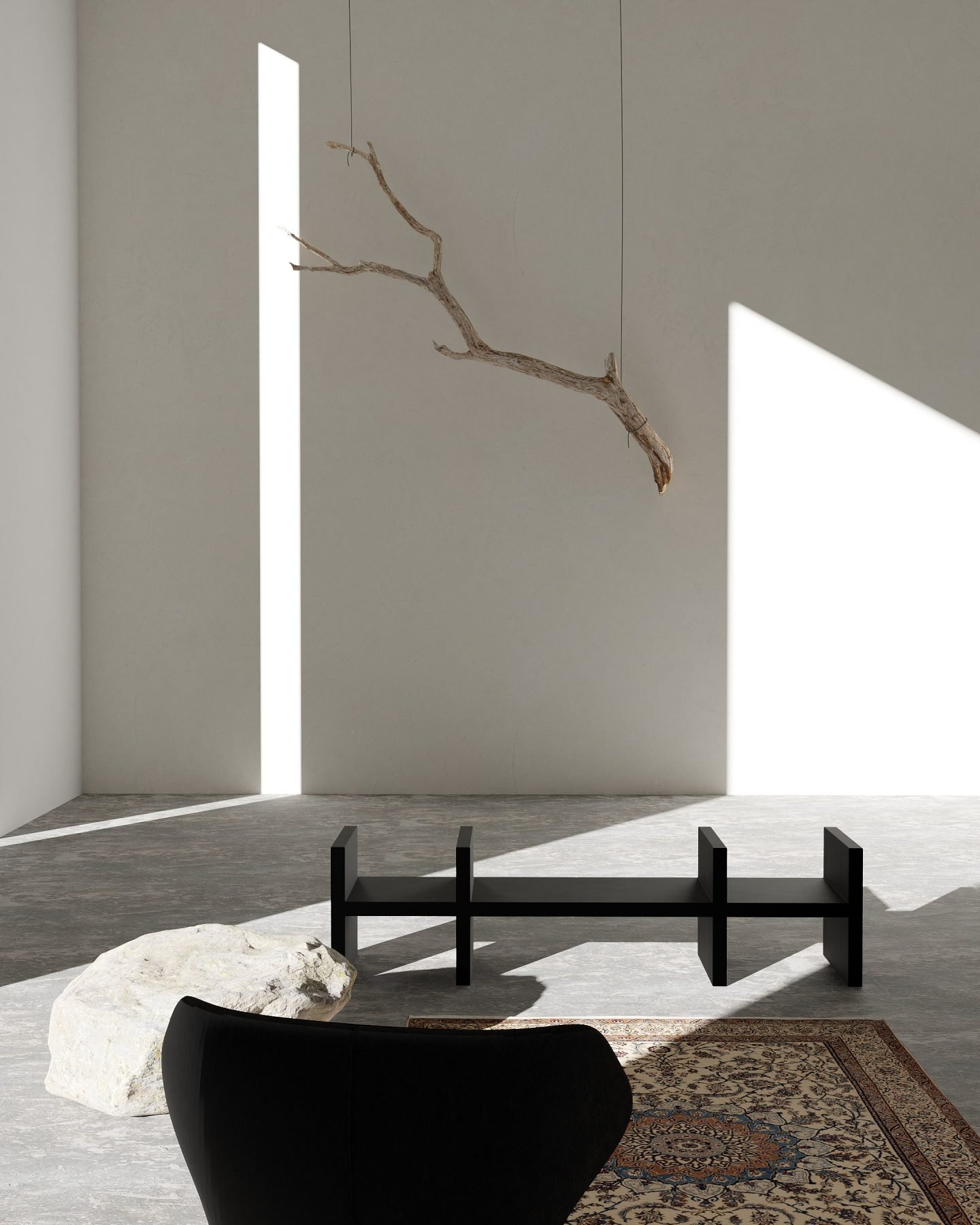
Project 'Nature'
Osminina’s design work tends to be residential interiors, yet it exists in a territory where the design of rooms and furniture intersects seamlessly with architecture. For the designer, the feeling and history of the place are of great personal significance. “I strive to preserve everything that is valuable, rather than recreating what is lost,” she says. “It is important to define the historical essence and meticulously follow it, so as to highlight the space’s special beauty.” Her projects arise from conceptual basis principles. “I start from the source and try to understand the space. What is its nature? What is everything built around? In which country, city, and street is the object located? Who built and designed it? These questions set the tone and frame of reference,” she explains.
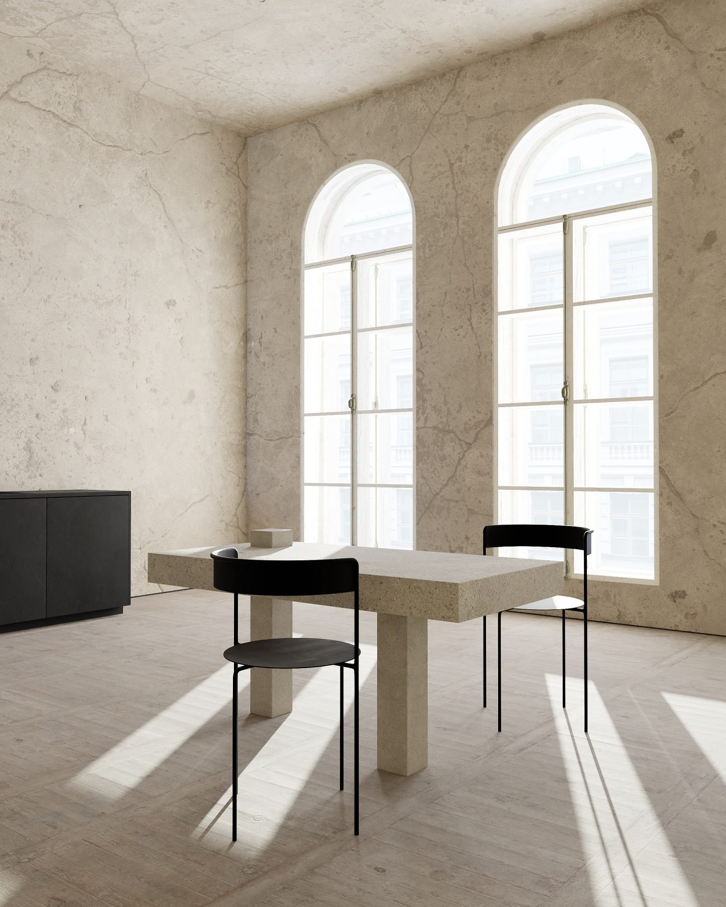
Project 'Time Boundaries'
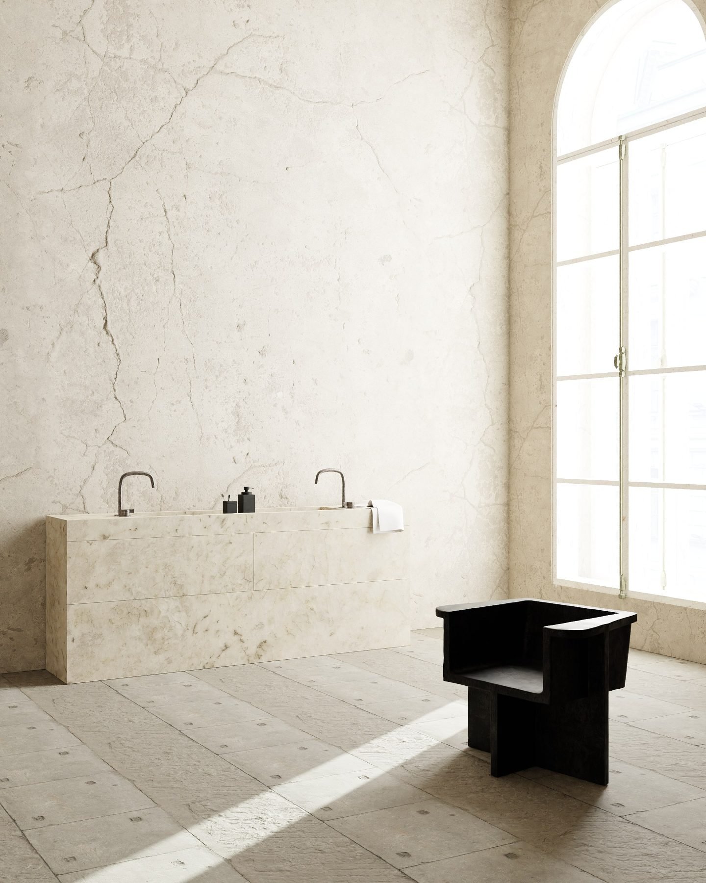
Project 'Time Boundaries'
Osminina works on every project with a remarkable attention to detail. These are compelling rooms and residences with monochrome finishes and large walls, sober yet never austere. “My ideal design is one where there is a feeling of calmness and naturalness, as if no one had worked on it, while you can still sense an underpinning visual concept for the entire space,” she shares. For the designer, real beauty lies in the natural. “I love to work with natural materials, such as concrete, wood, plaster, and metal. I like them to unfold as naturally as possible, without applying any additional effects,” she says.
“I like materials to unfold as naturally as possible, without applying any additional effects”
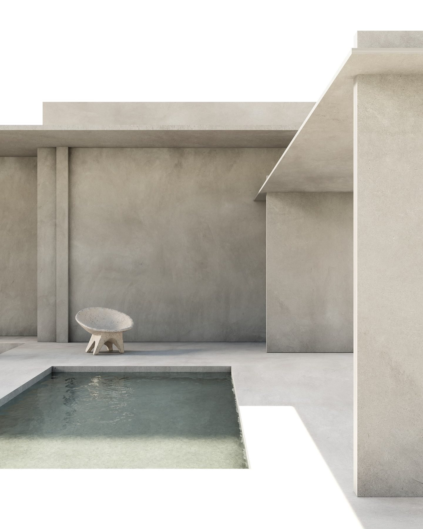
Project 'House'
In her practice, Osminina tends to go monochrome, using a one-color palette to intensify the overall look and feel of the space. “The feeling of the project is always built on color; one that emerges from materials and light,” she says. “There’s a lot of color in my works, but the nuances are so delicate that an overall feeling of a single color is created. This solution defeats the momentary and the influence of trends, yet it contains a much more valuable component that forms the essence of the space: timelessness,” she continues.
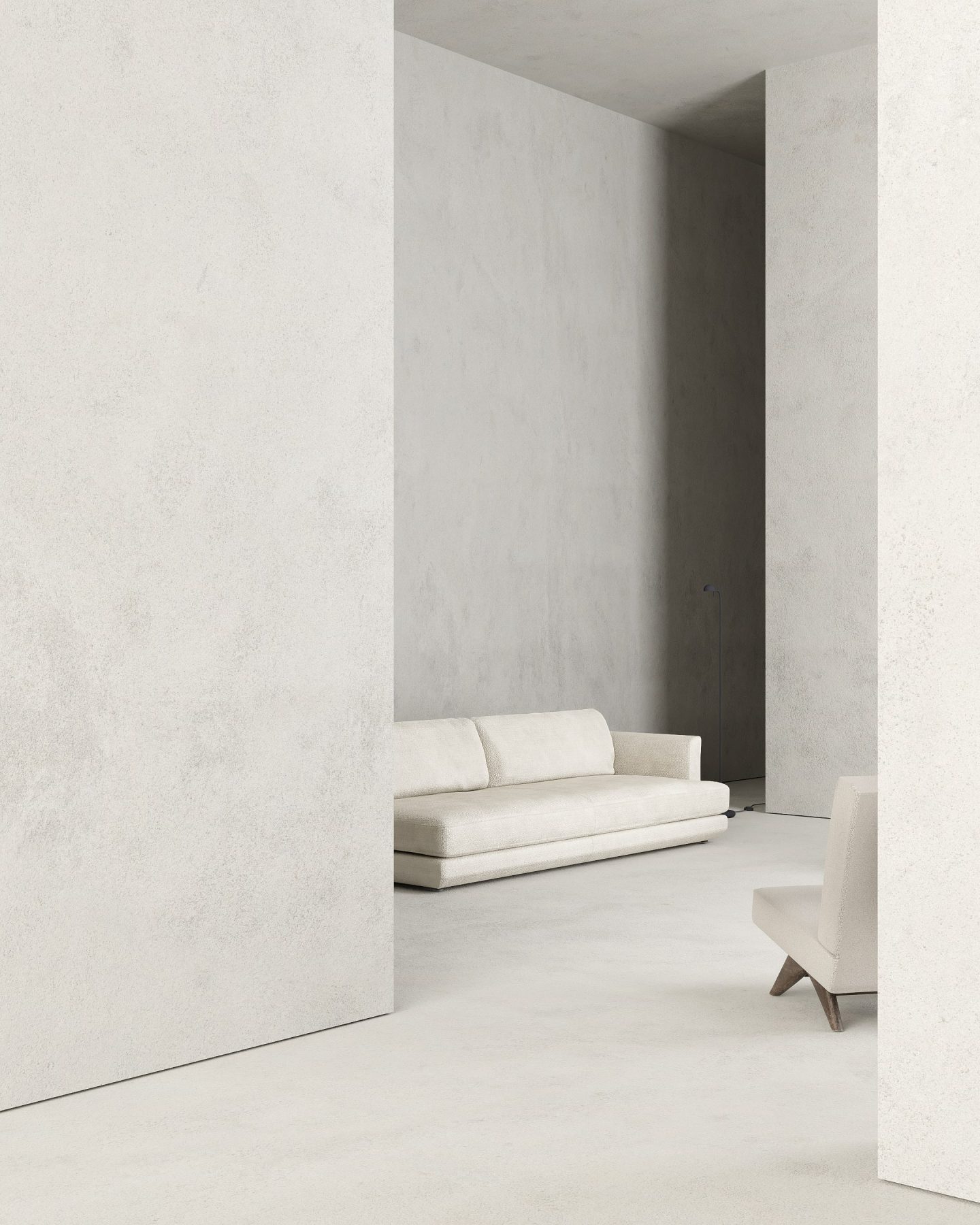
Project 'White'
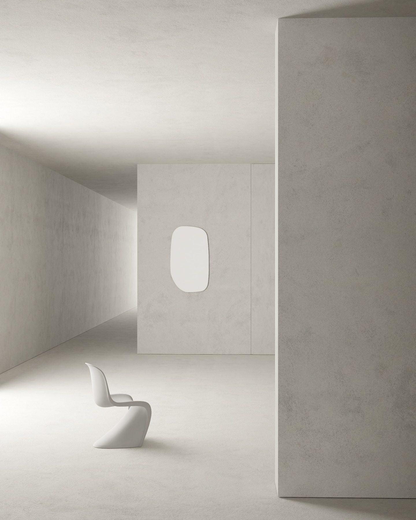
Project 'White'
Osminina fills her spaces with only the most necessary furniture. “Functionality is at the heart of my designs; these spaces have to be lived in,” she says. “It is thoughtful everyday solutions that allow us to preserve the feeling originally conceived when forming the design,” she continues, laughing, “I have two children, so I know what I’m talking about.” For the designer, visual comfort and practicality go hand-in-hand. “I pay a lot of attention to storage systems; they support a philosophy of minimalism, retaining air and emptiness in a space.”
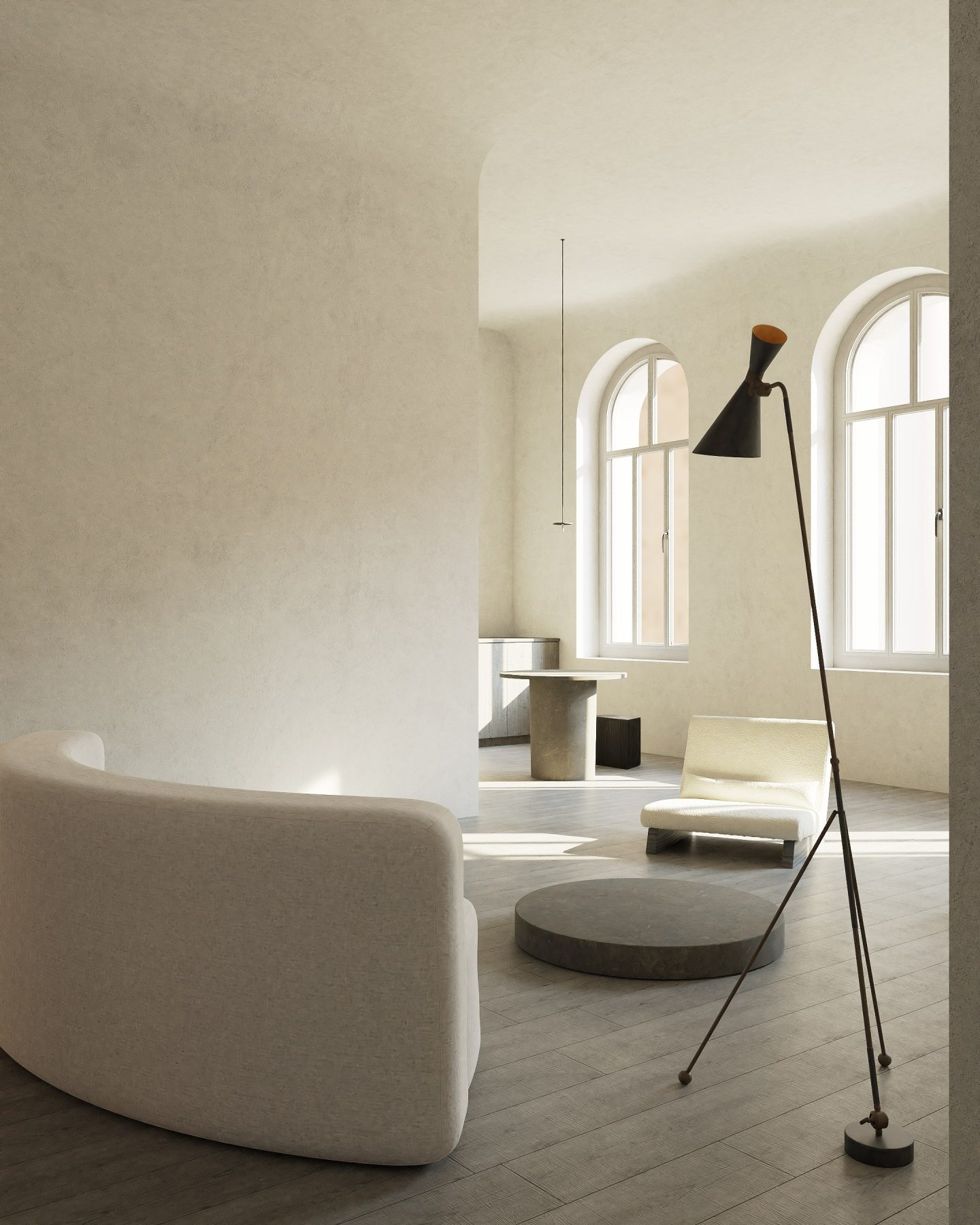
Project 'Venice'
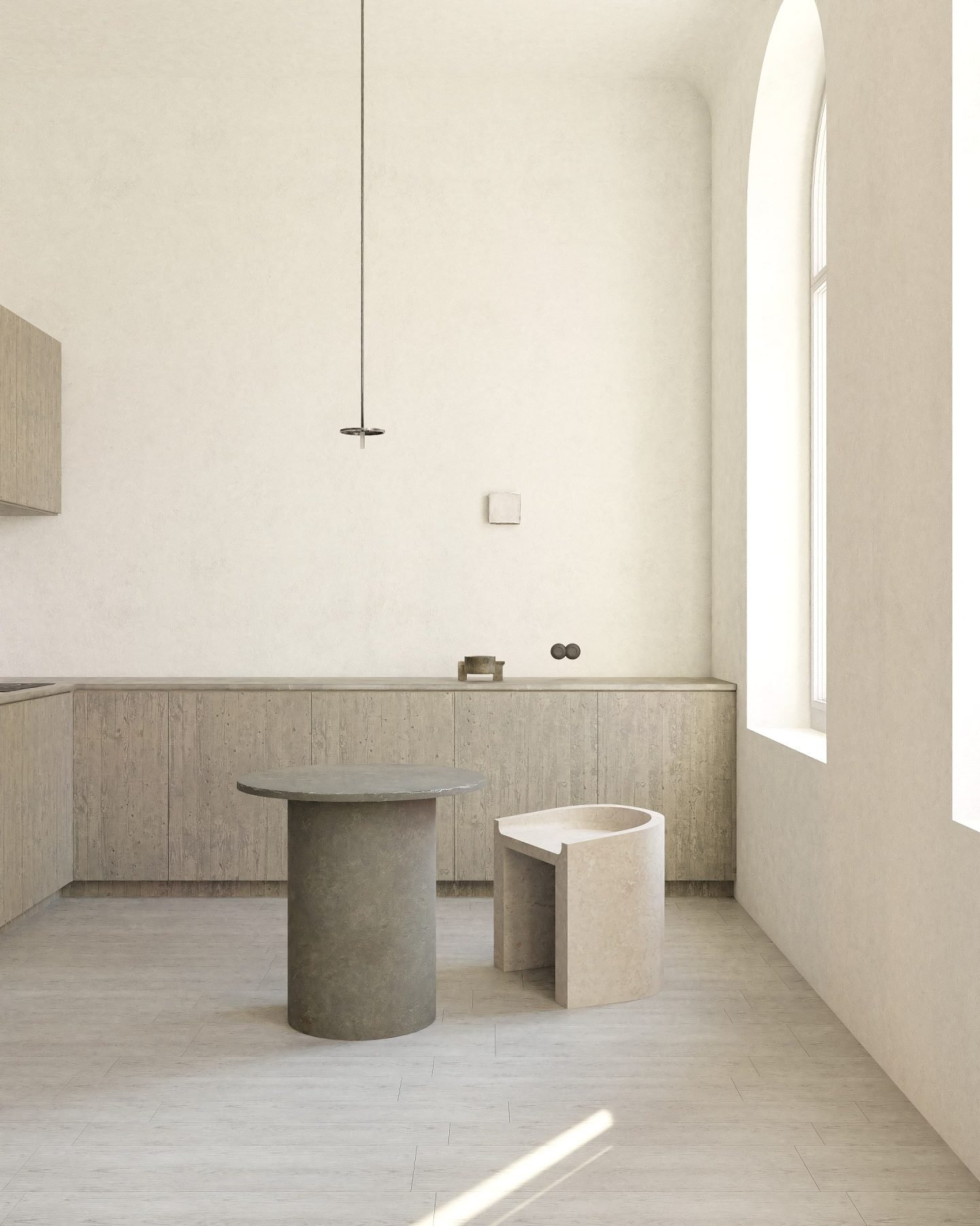
Project 'Venice'
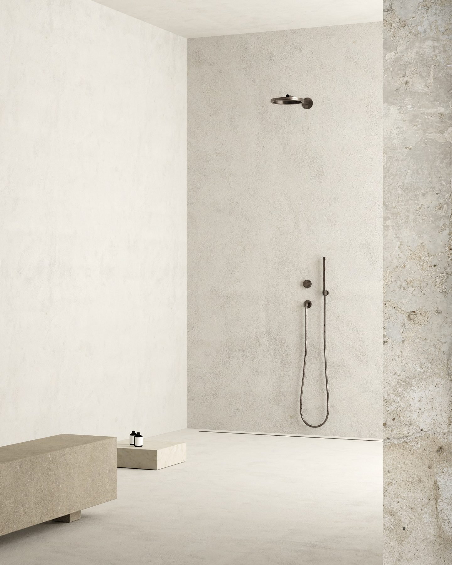
Project 'White'
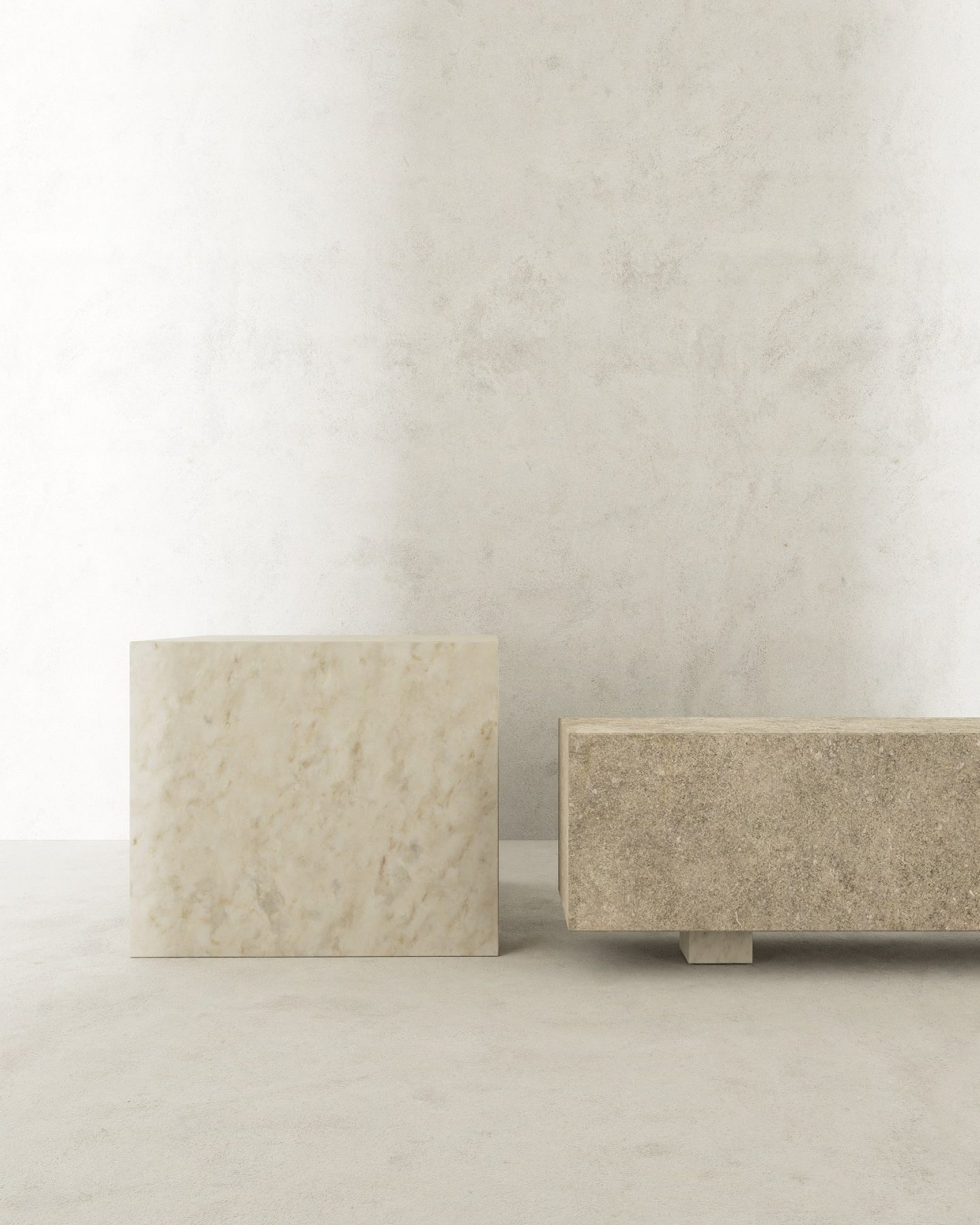
Project 'White'
“I pursue a sublime emptiness, one that is formed with sculptural precision”
Osminina demands creativity to have enough breathing room in a space. “Spaces in which there are many unnecessary objects cause anxiety and a sense of bustle,” she says. “For me, it is not a matter of ‘less is more’ or ‘less is better’; I adhere to a principle of ‘only necessary, but the best’ in everything I do,” she adds. Somewhere between a case of lacking and a case of lessing, between pure minimalism and essentialism, her guiding principle of functional emptiness is fascinating. “I pursue a sublime emptiness, one that is formed with sculptural precision,” she declares.
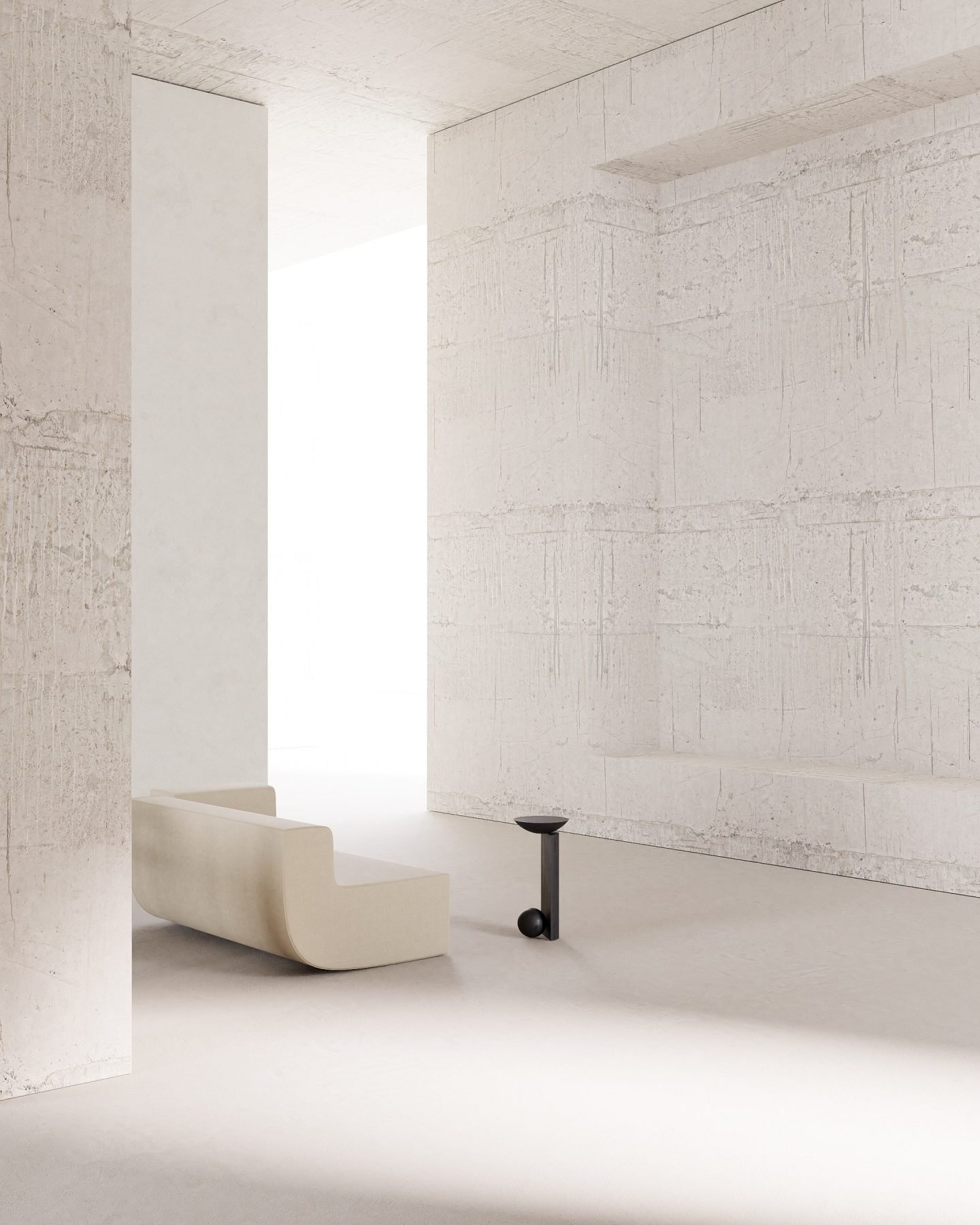
Project 'Silence'
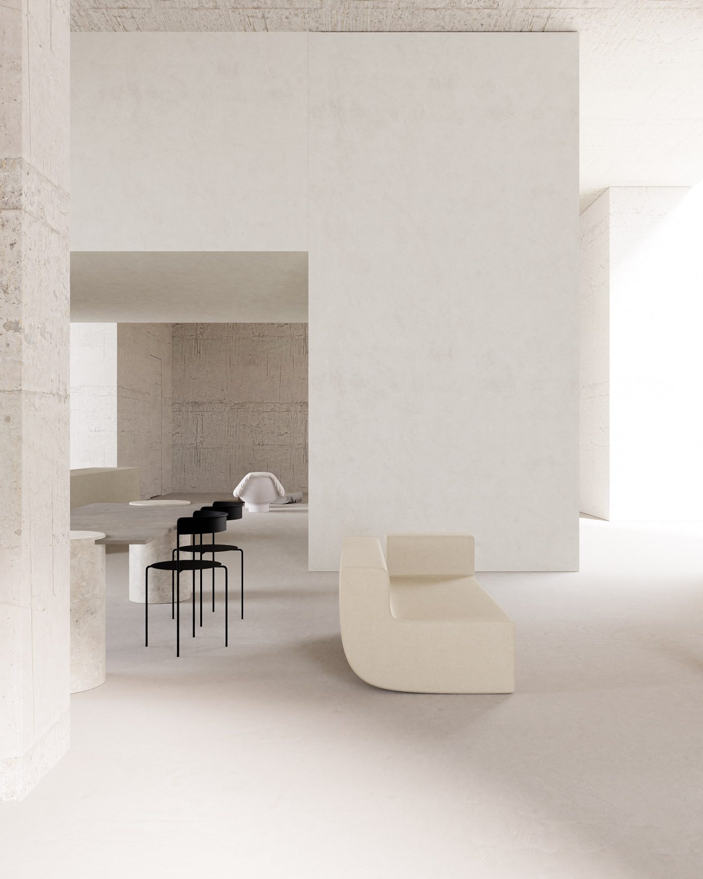
Project 'Silence'
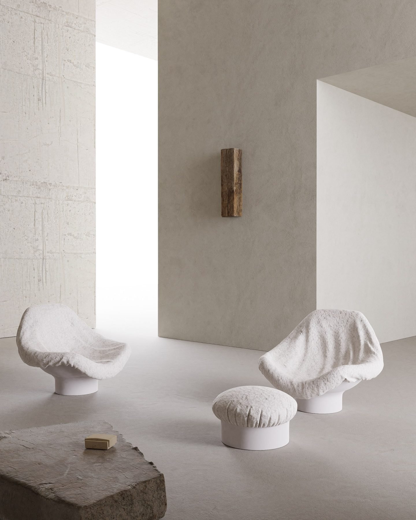
Project 'Silence'
The designer inserts herself into a continuous narrative between the past and the contemporary, finding a sense of poetry in the balance of the two.
Her minimalist revamp of ‘Beige’—an early 20th-century apartment located in Saint Petersburg—highlights her mastery in conceptualizing contemporary solutions, such as white cubist volumes and smooth concrete, while preserving the space’s architectural heritage and its singularities, like the intricate decorative plasterwork and elaborate cornices. Juxtaposed to the polished finesse of the overall composition, the discordant note in her projects, often an antique furnishing or ornamental element, is paradoxically what reinforces the overall sense of harmony.
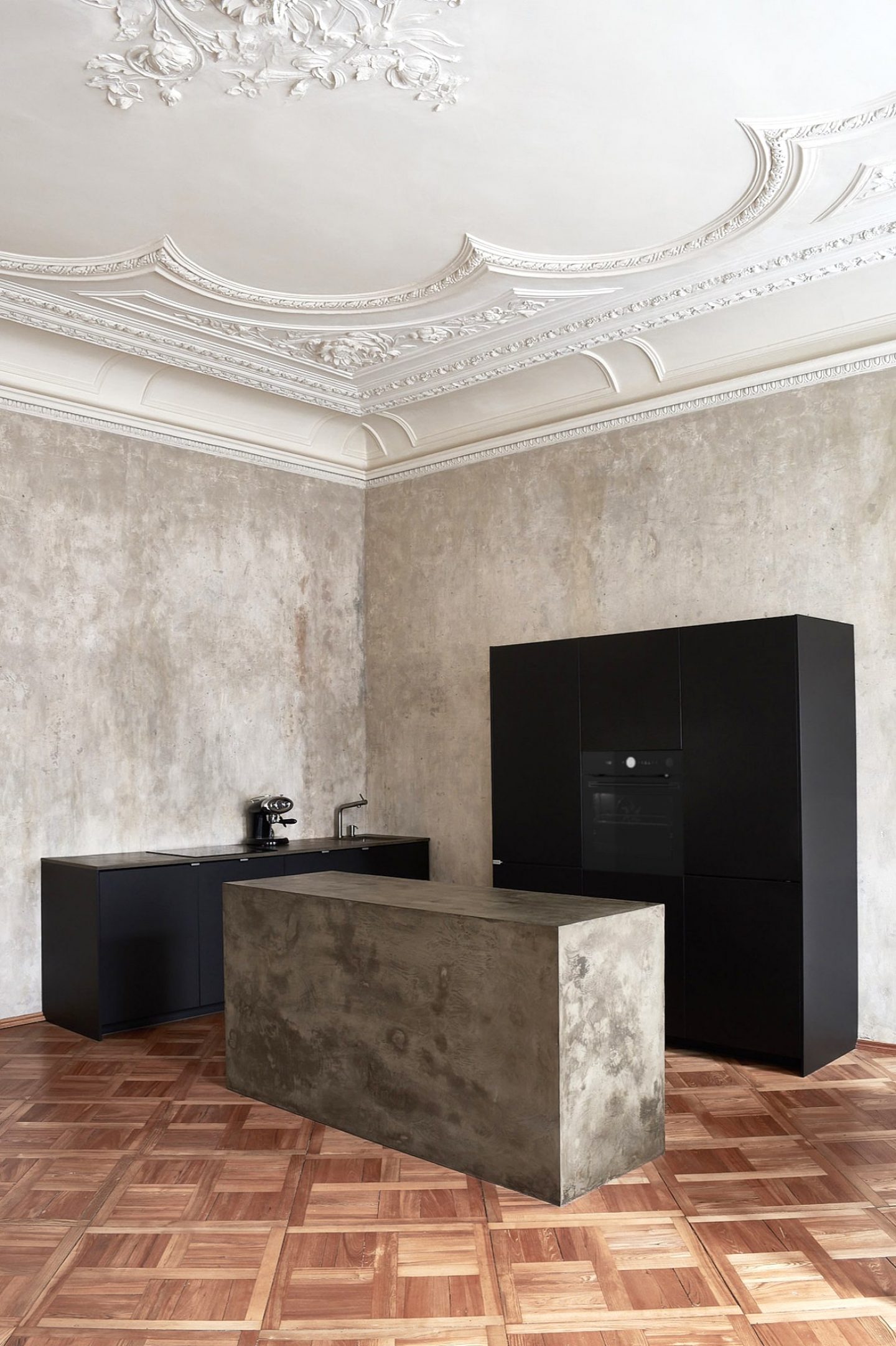
Project 'Beige'
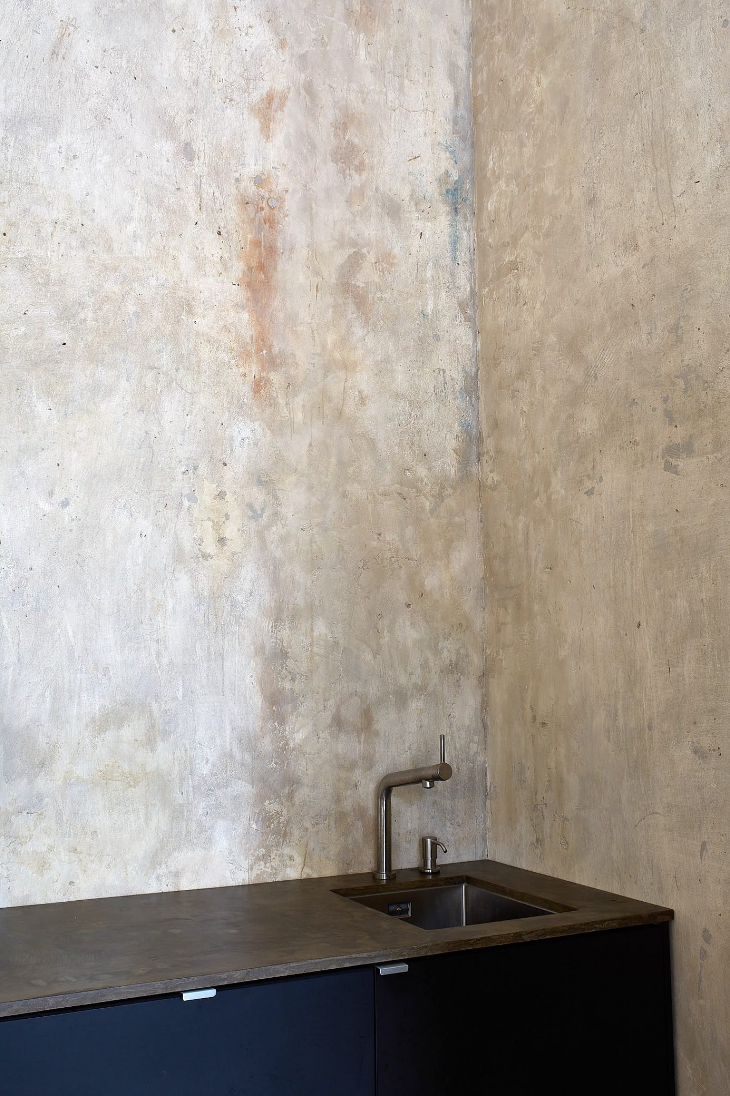
Project 'Beige'
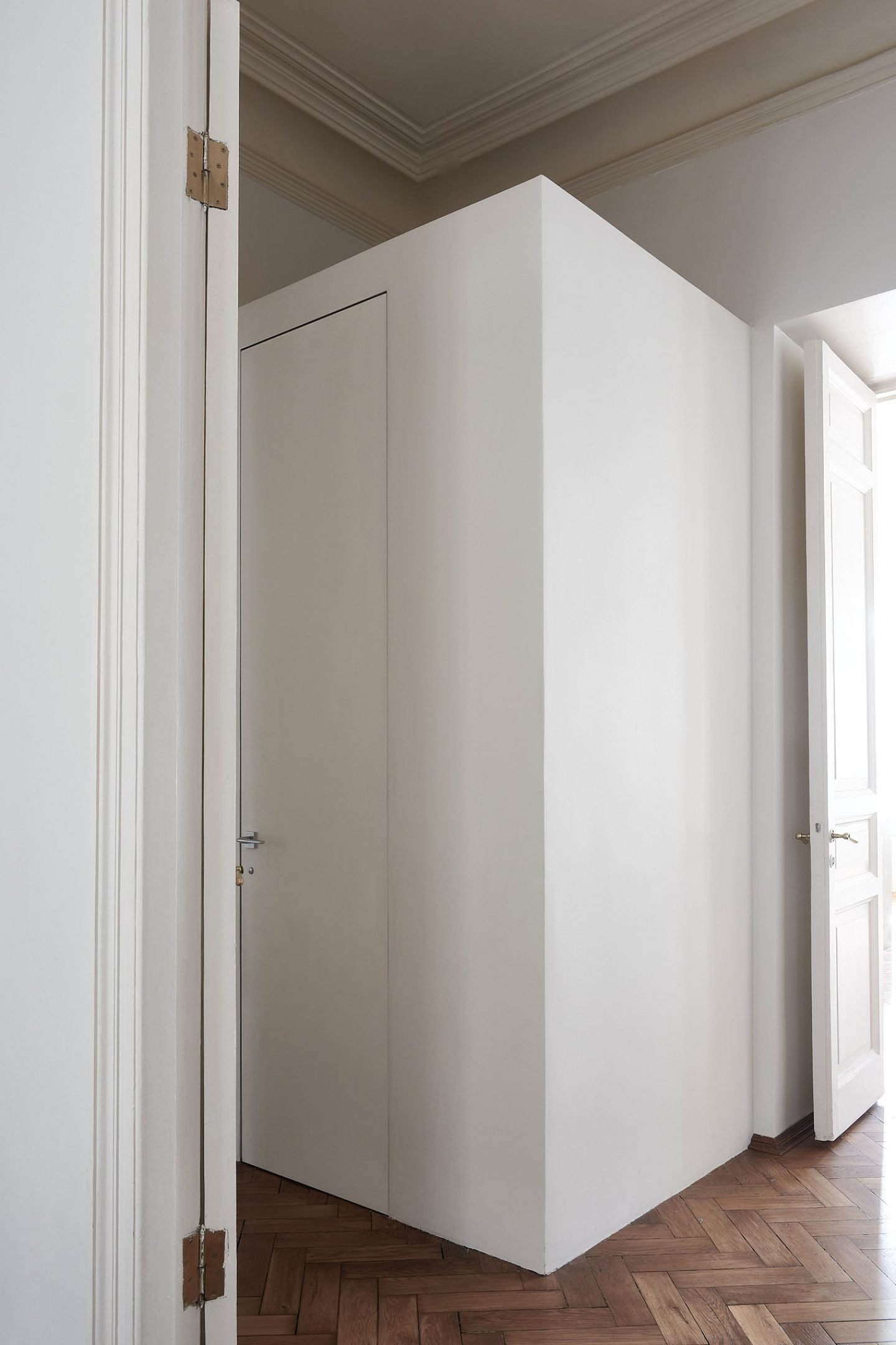
Project 'Beige'
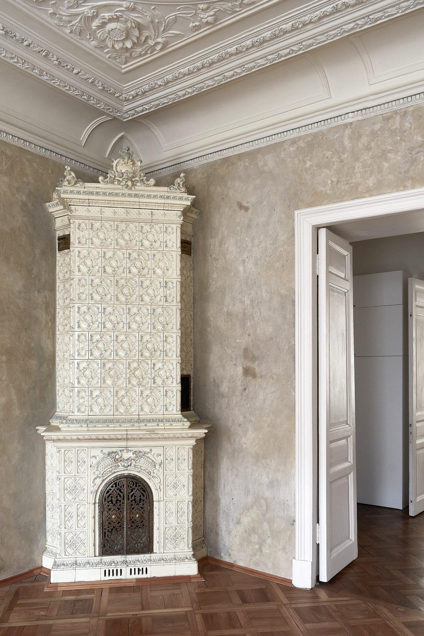
Project 'Beige'
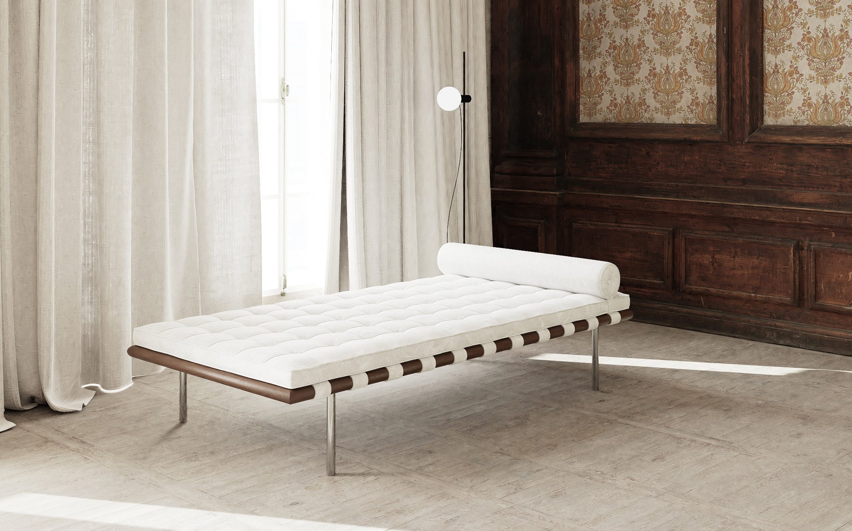
Many of Osminina’s projects, including ‘Vibrance’ and ‘Time Boundaries’ combine objects and furniture from different eras with intentional meaning, further endowing the space with a sense of historical balance and serenity. “Every piece of furniture in my interiors matters, they change and shape the space in which they are located,” she says. “I like to find the balance of forms, color, and emptiness, so that each element feels like an integral part [of the room].” In ‘Vibrance’, the intricate lines of new and vintage furniture, which includes designs by Eileen Grey, Gepo, Ubald Klug, Rick Owens, and artworks by Lucio Fontana, all add a sculptural feeling to the space; each item enhancing the personality of the other. “When I feel that the necessary shapes are missing, I create pieces of furniture myself,” Osminina adds, hinting at her ‘Timeless’ object collection.
”When I feel that the necessary shapes are missing, I create pieces of furniture myself”
“For me, each object has its own emotional wave,” Osminina says, as she reveals her fascination for collectible objects on the border of art and design. “I love objects that evoke feelings; items that sensually color the environment that surrounds them. In life, the most valuable is the moment of contemplating beauty. To me, that is what fills life,” she says, a closing statement as resonant and personal as her design ethos.
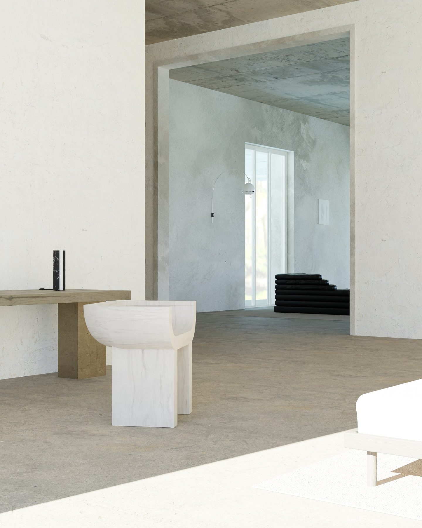
Project 'Vibrance'
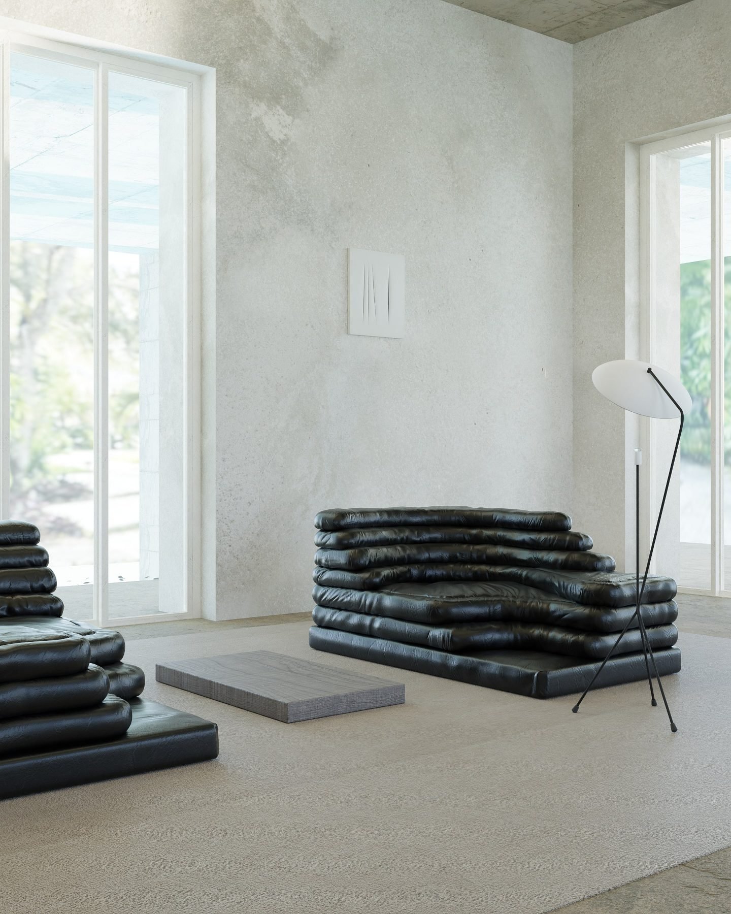
Project 'Vibrance'
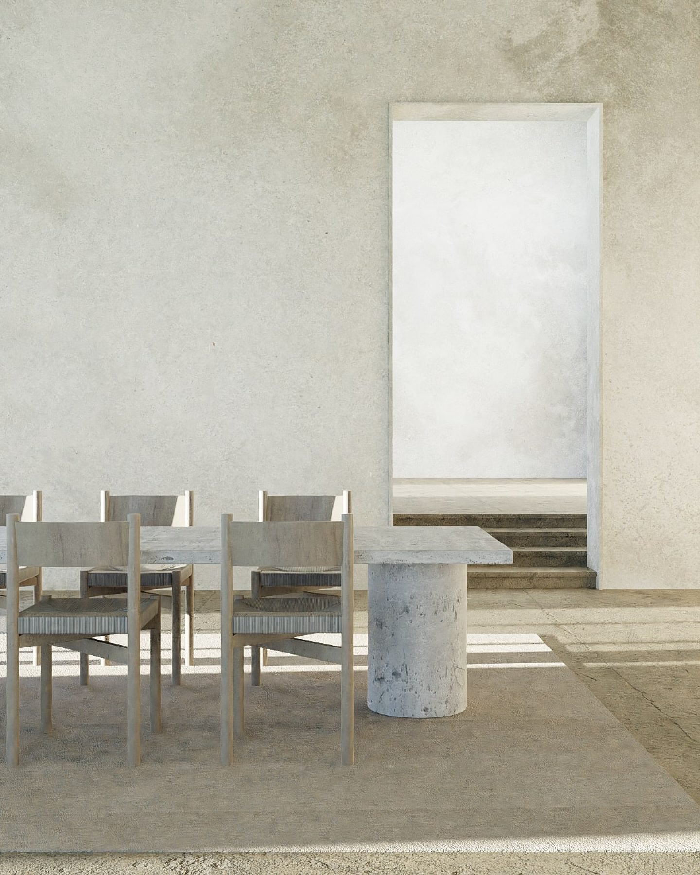
Project 'Vibrance'
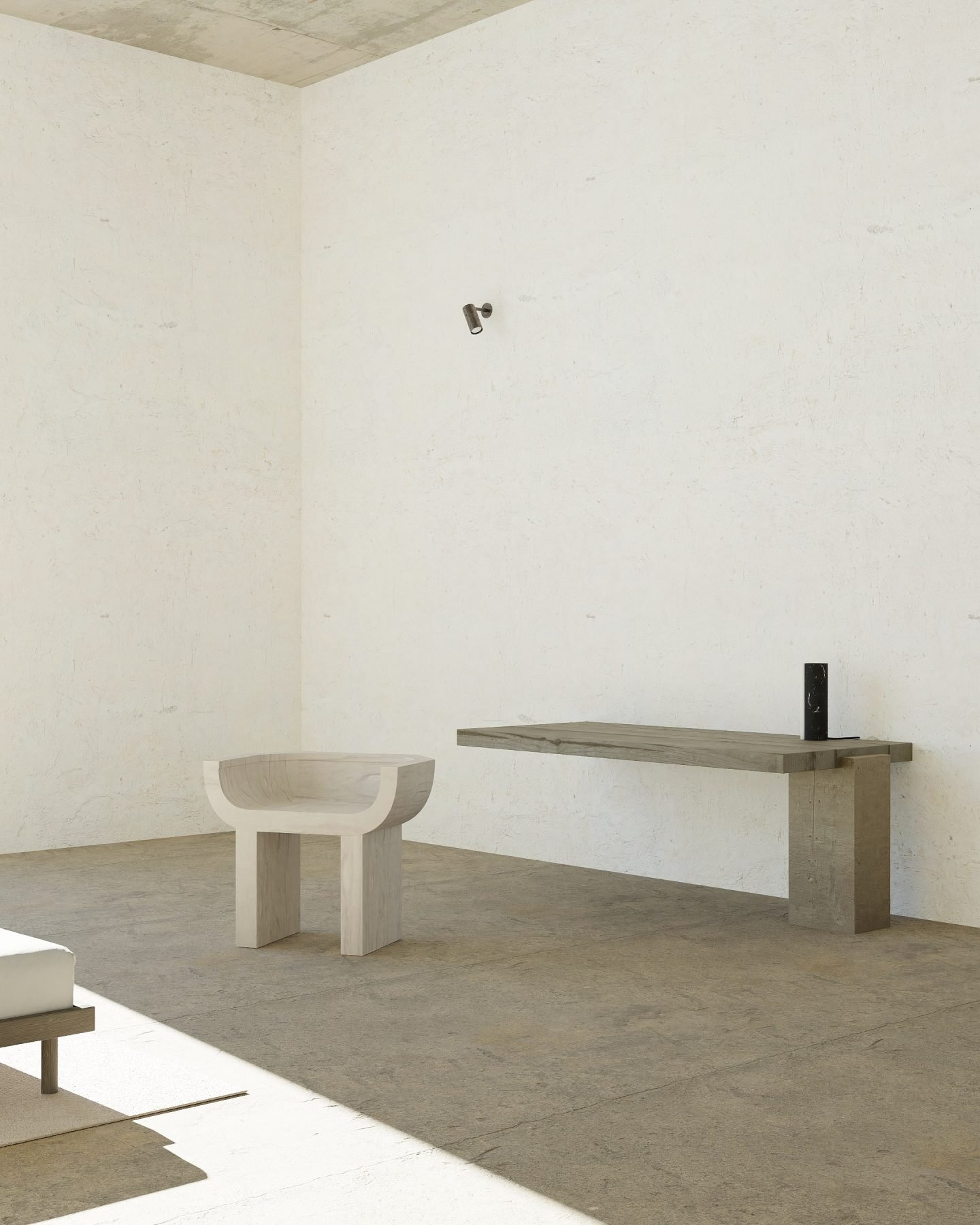
Project 'Vibrance'
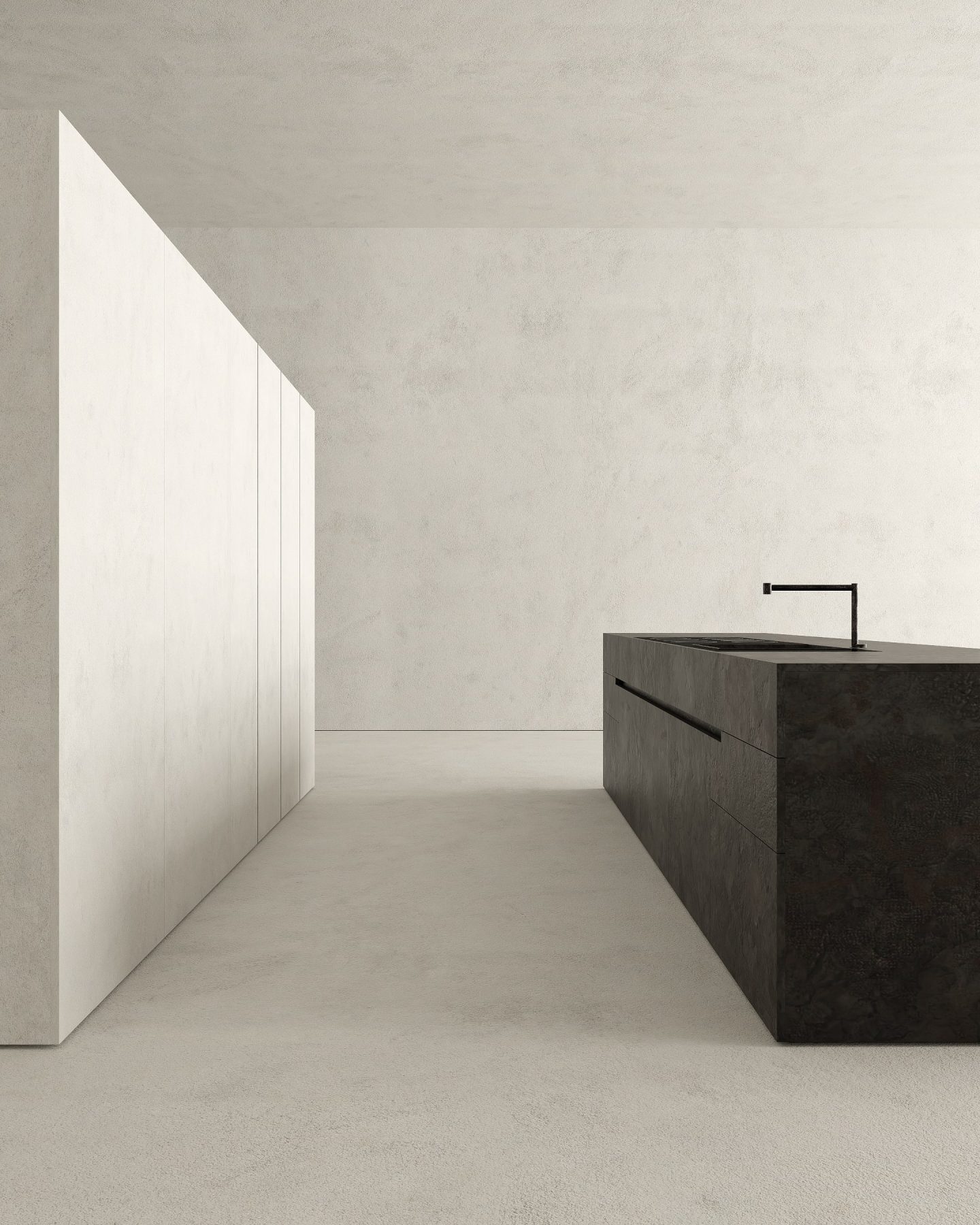
Project 'White'
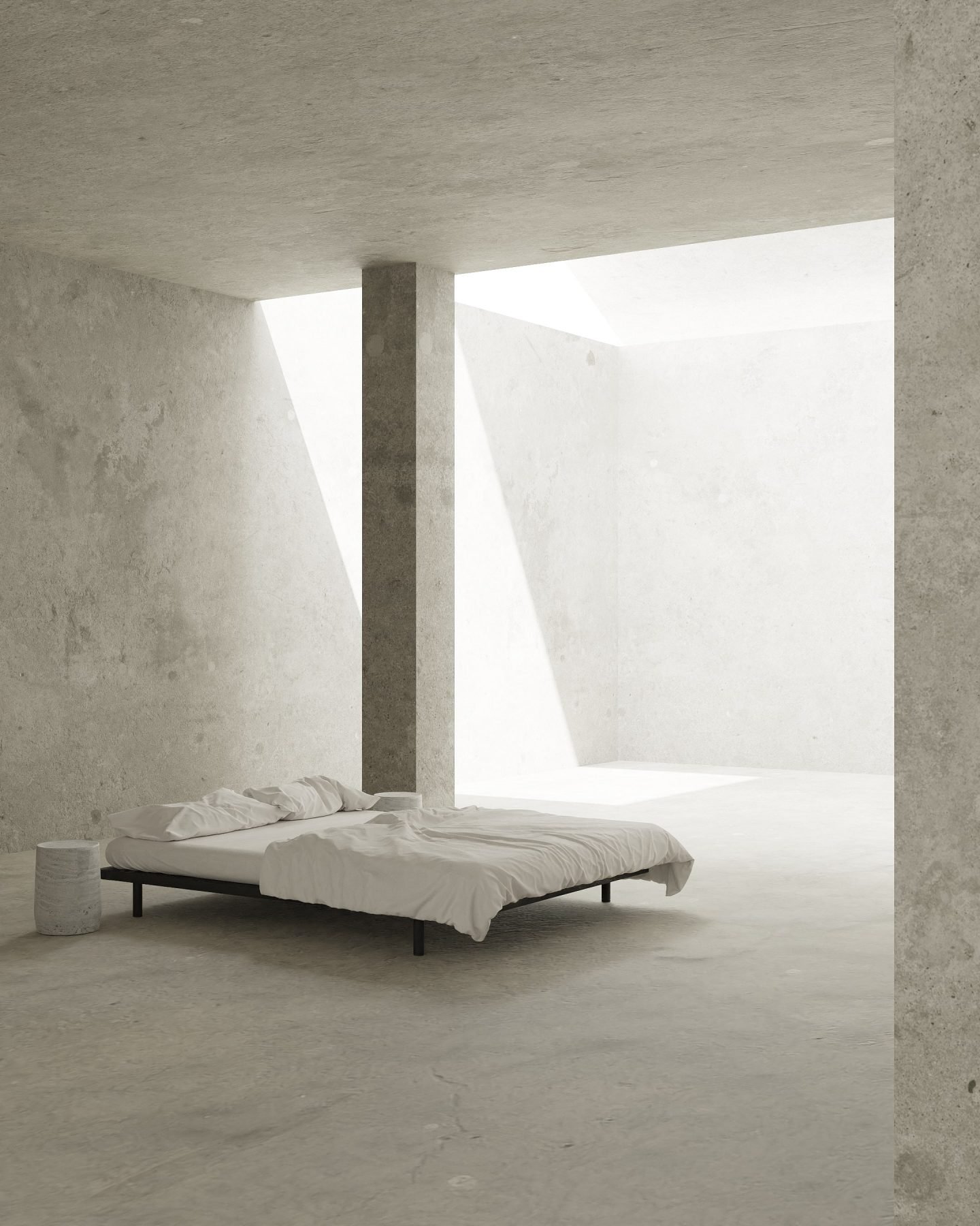
'Timeless' Furniture Collection
Images © Maria Osminina
