Vaust Studio’s Sculptural Jigi Poke Restaurant Cultivates Berlin’s Penchant For Brutalism
- Name
- Vaust Studio
- Project
- Jigi Poke
- Images
- Robert Rieger
- Words
- Steph Wade
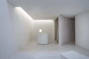
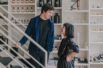
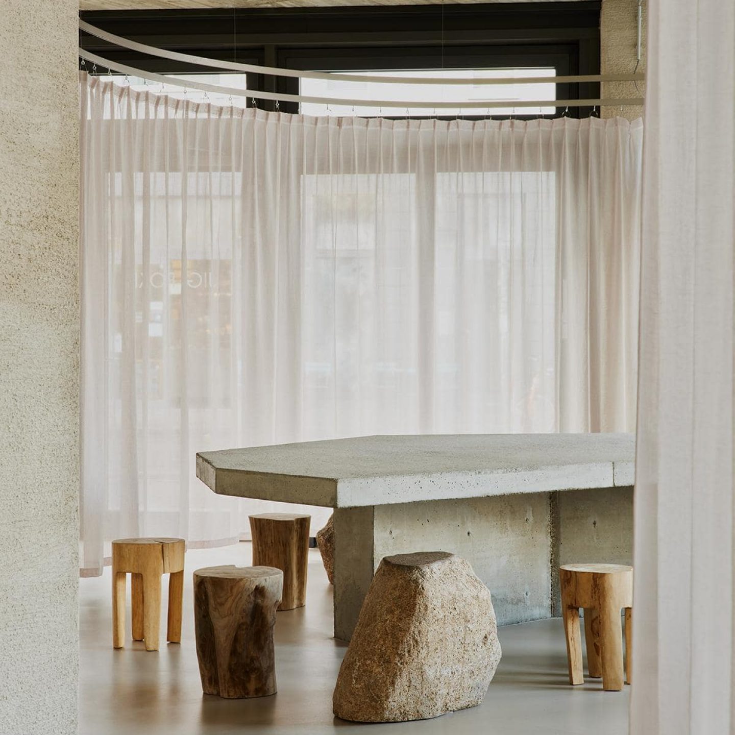
When founders of German design studio Vaust Joern Scheipers and David Kosock were tasked to design the interior of a new Poke restaurant in Berlin’s central district of Mitte, the pair decided to part ways with any typical visual motifs associated with the Native Hawaiian dish. The resulting project, ‘Jigi Poke’ in Rosenthaler Strasse, is a sleek and raw monochromatic space that defers any ostentatious color for the vibrant bowls that are on offer.
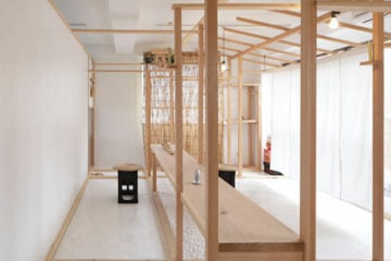
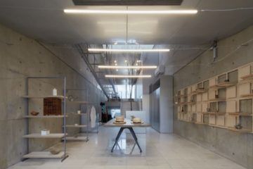
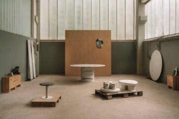
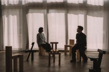
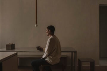
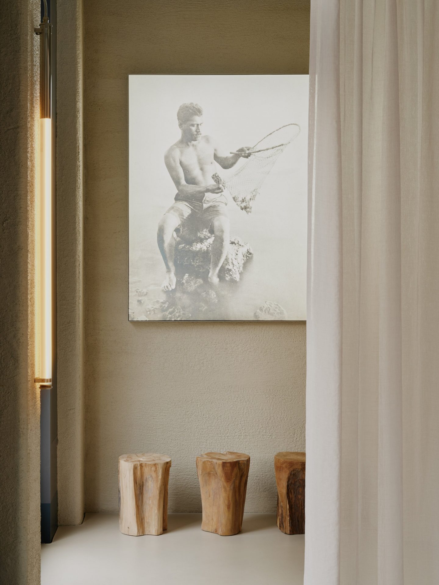
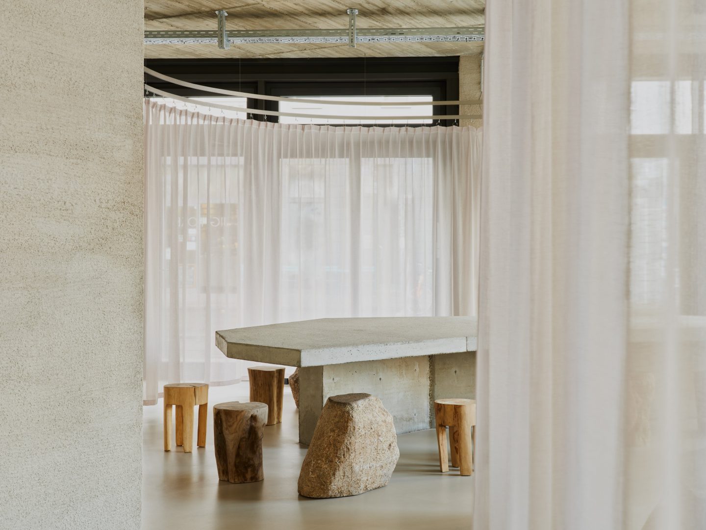
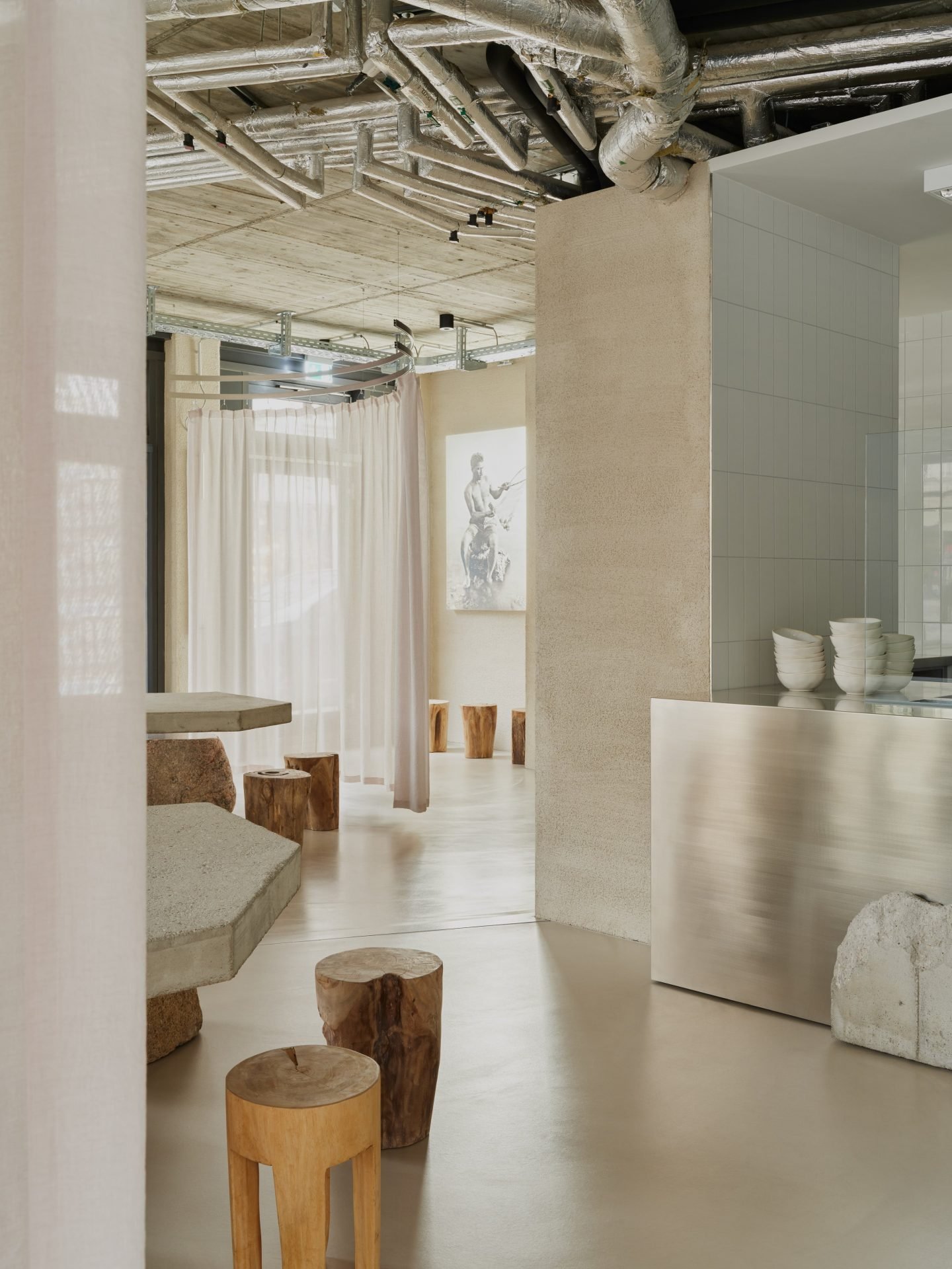
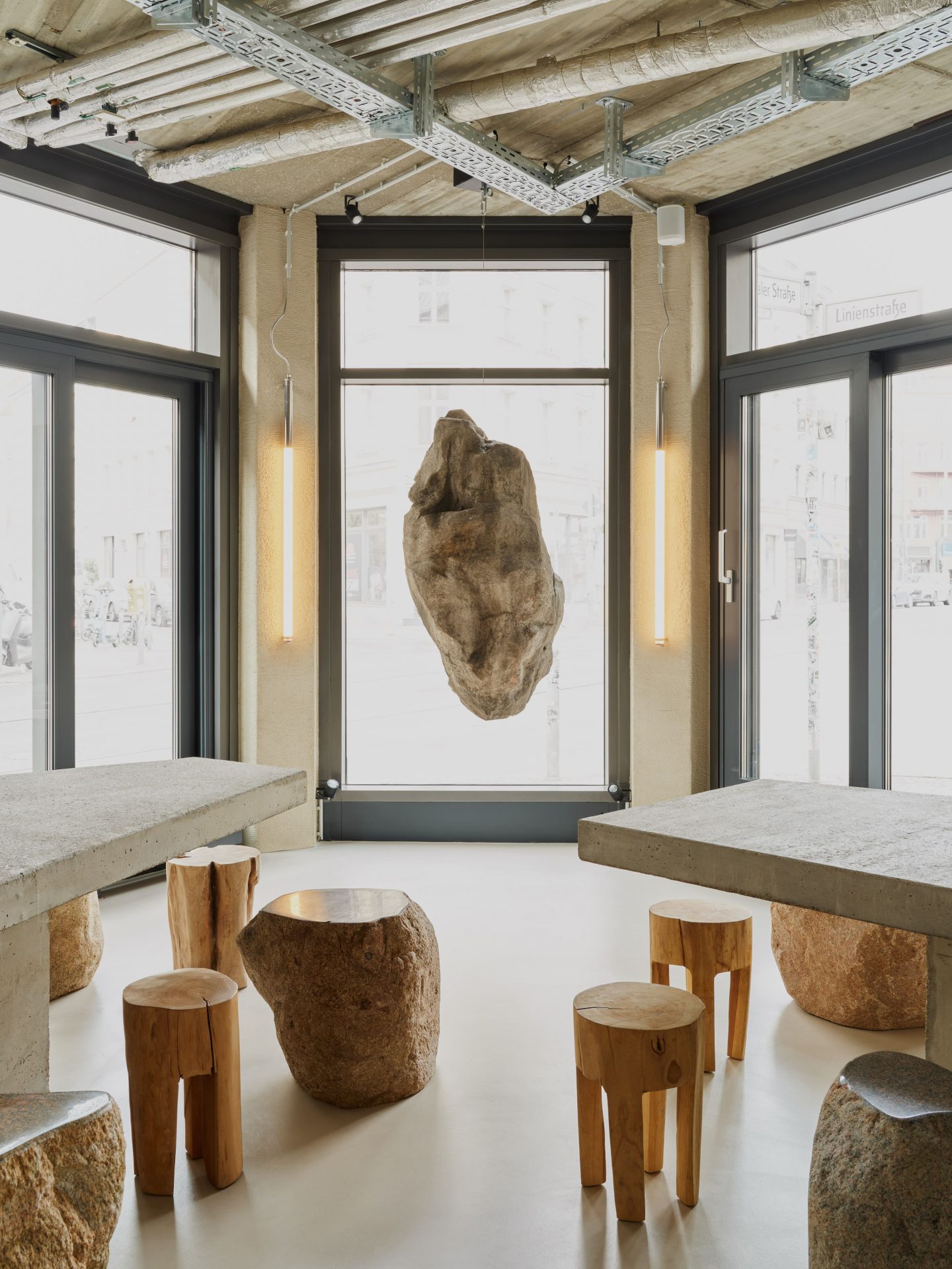
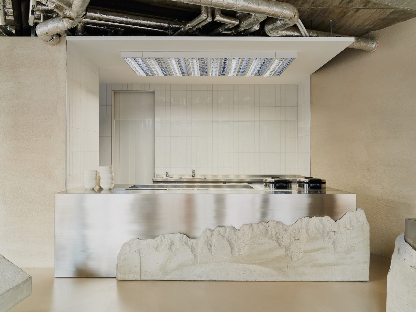
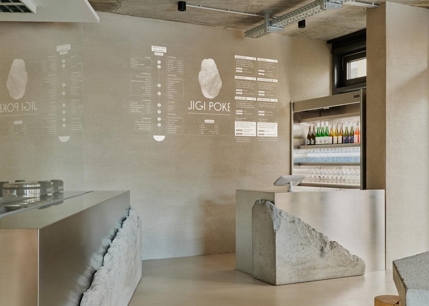
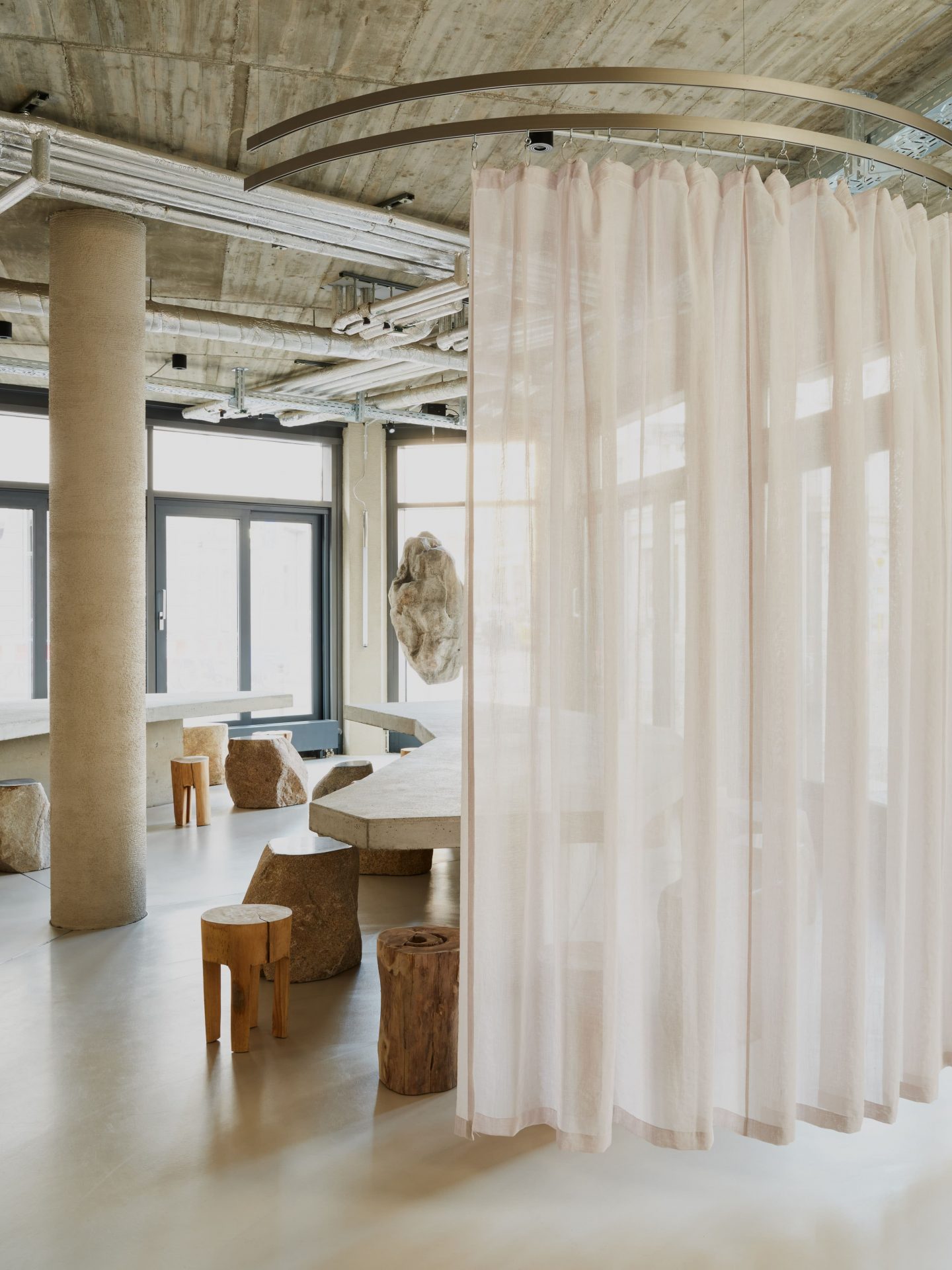
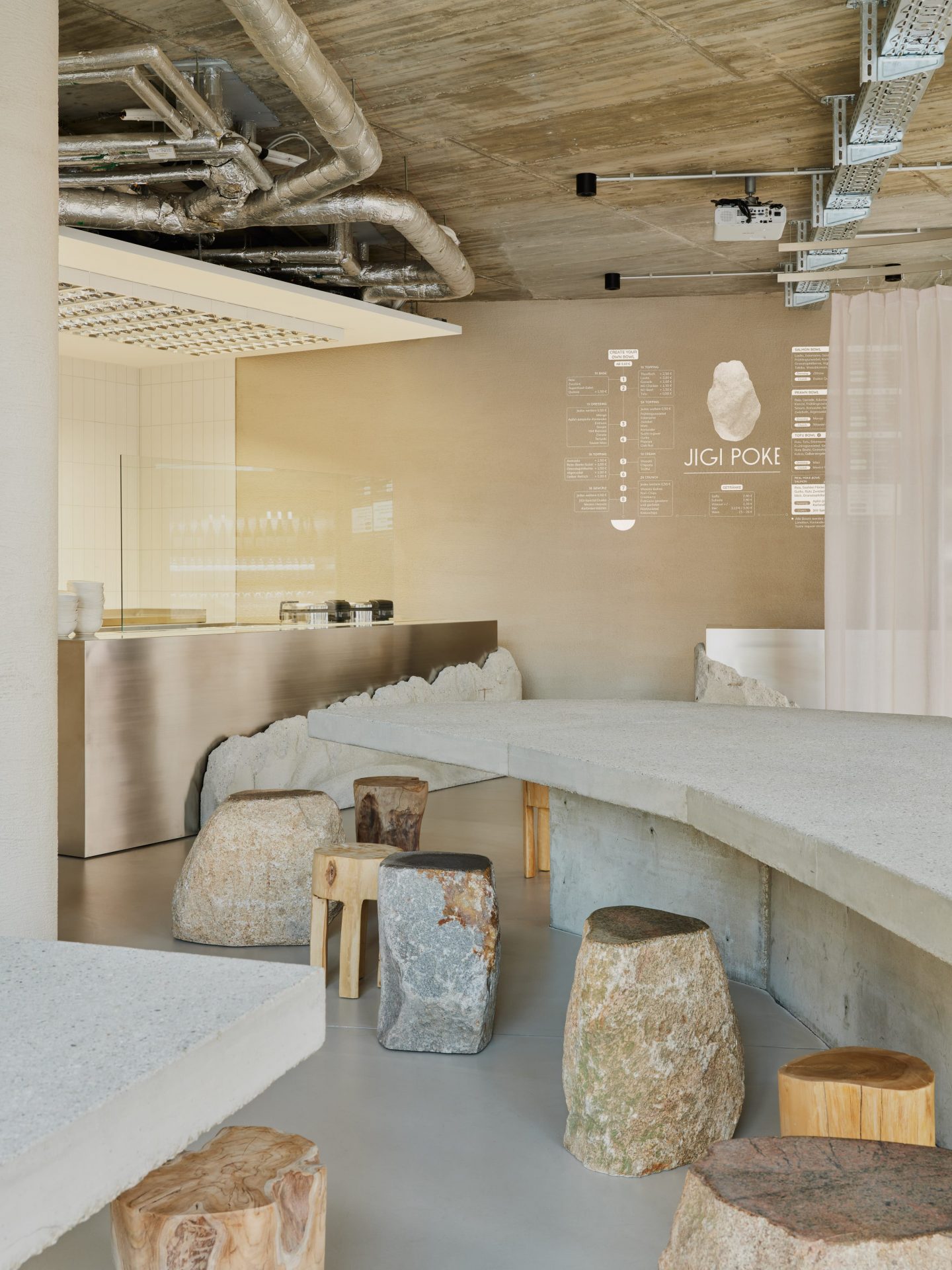
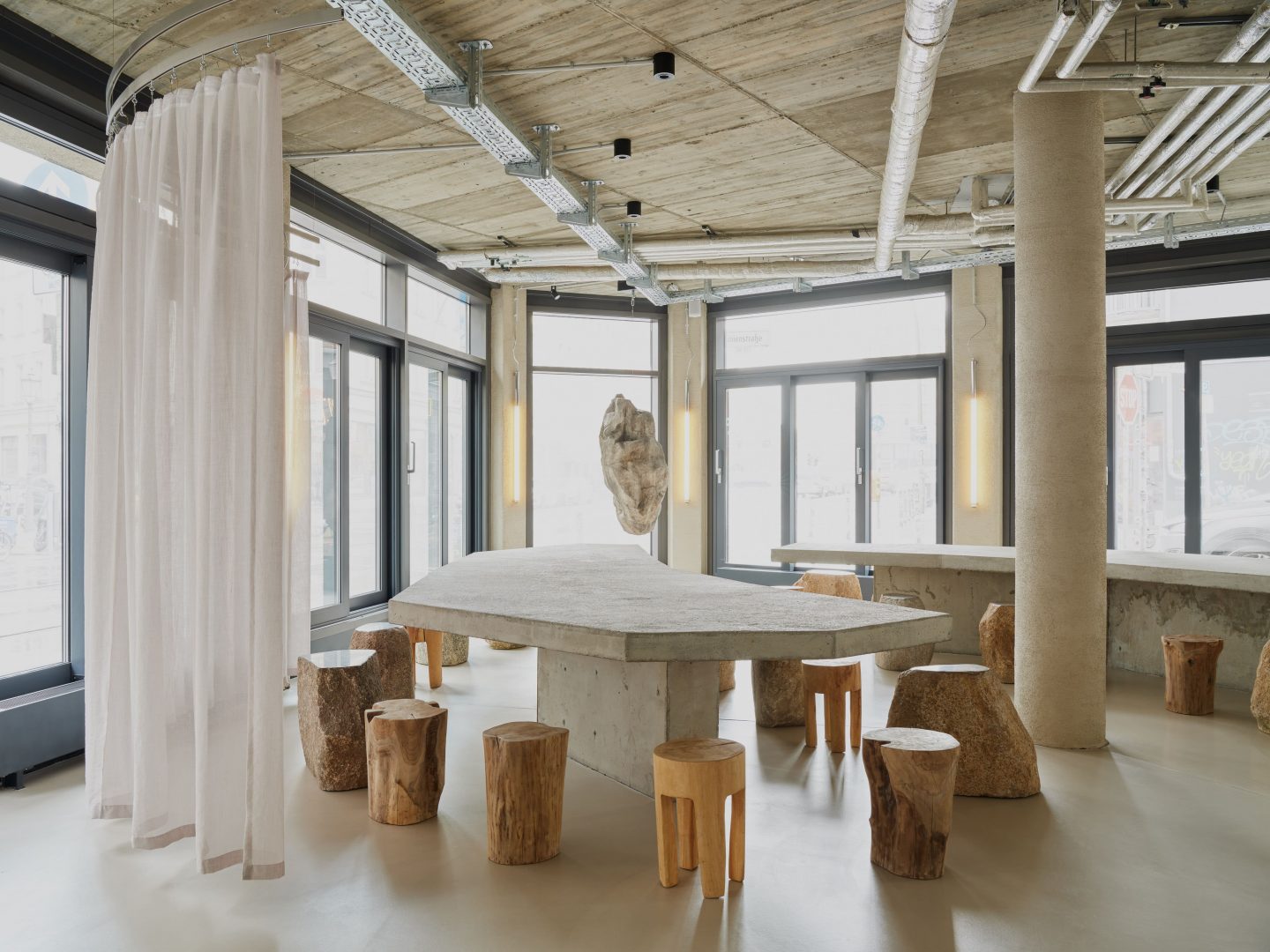
“Not only is it interesting and fun to do some research for a new project, it is necessary to understand and feel the substance of its matter,” explains Kosock of the initial phase of the task. One of the key moments was finding an original photograph of a Hawaiian fisherman from 1925, which was provided by the National Museum of Natural History in the United States, now mounted on one of the restaurant’s concrete walls. This image served as inspiration for Jigi Poke’s interior, which features a textural combination of concrete and weighty stone that comprises the communal tables, countertop, and roughly cut granite stools for customers to sit on. A huge hanging stone, which is part of the restaurant’s corporate identity, slowly spins in the window, existing as a prominent and eye-catching sculpture on display. Natural and earth-colored boulders offset the gray-toned aesthetic to provide a warmer palette.
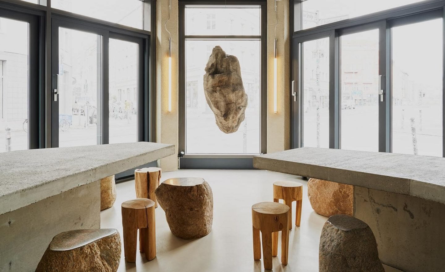
Further to this, the project is about reevaluating the idea of how hospitality spaces are organized in a post-pandemic world. “We strongly reduced the number of possible guests taking a seat at the same time, and increased the distances of people sitting across from each other,” explains the pair. This setup allows for plenty of space, while still providing an intimate and welcoming atmosphere in the venue. We briefly caught up with the studio’s founders to discuss this latest venture, which is an organic continuation of their practice that demonstrates their industrial, monochromatic aesthetic.
Is this your first gastronomy project? How would you describe your experience of designing a space whereby its key element is food?
David: It is indeed and it was great fun. While our client was putting a lot of emphasis in creating the dish and sourcing the right products with loads of love, we did the same. Food is such joy and an amazing experience when done with ambition. More than that, we loved the challenge to create an interior setting where the protagonist is not the interior object itself, but something else. I would say we did our best to create the perfect stage for the products to tell their own story.
Moving away from stereotypical Hawaiian tropes, how has the influence of local fishermen shaped the vision of this restaurant?
Joern: We were very much driven by the historical roots of the dish. During the process of investigating the cultural origin we came across a certain simplicity and honesty. We translated those creative values into a concept. The result has led to raw materials, such as cut off boulders and an earthy tone palette. We found this original photo of a Hawaiian fisherman from 1925 which was then kindly provided by the National Museum of Natural History, United States.
You have a compelling approach to design that explores sculptural forms and raw materiality. What is your criteria when choosing the materials you use?
David: When it comes to choosing a material for any kind of topic, whether it is for a current interior project or one of our studio’s own object series, we think a lot about haptics. I guess we use the sense of touch with the same intensity as the sense of sight. When both the visual and the haptic approach suit our understanding for an artistic outcome then we’ll start deep diving into the potentials of that specific material.
You’ve mentioned that the pandemic has impacted the spatial arrangement of Jigi Poke. Can you talk a little more about this?
Joern: When facing the task of designing a restaurant during a critical peak within the pandemic, it was a no-brainer to move in a different direction and rethink hospitality as a concept. Usually you would go for maximum utilization and organize as many seats as possible; we created a different concept. The idea is to create desire through well thought-out design and to focus on the out-of-home business: the take-away. We didn’t want to host too many people at the same time and therefore reduced the number of seats down to a third of what was initially planned. At the same time, we optimized the kitchen process with a focus on delivery people.
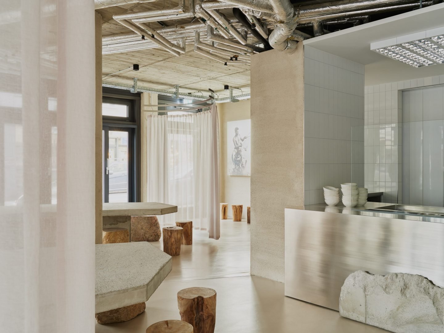
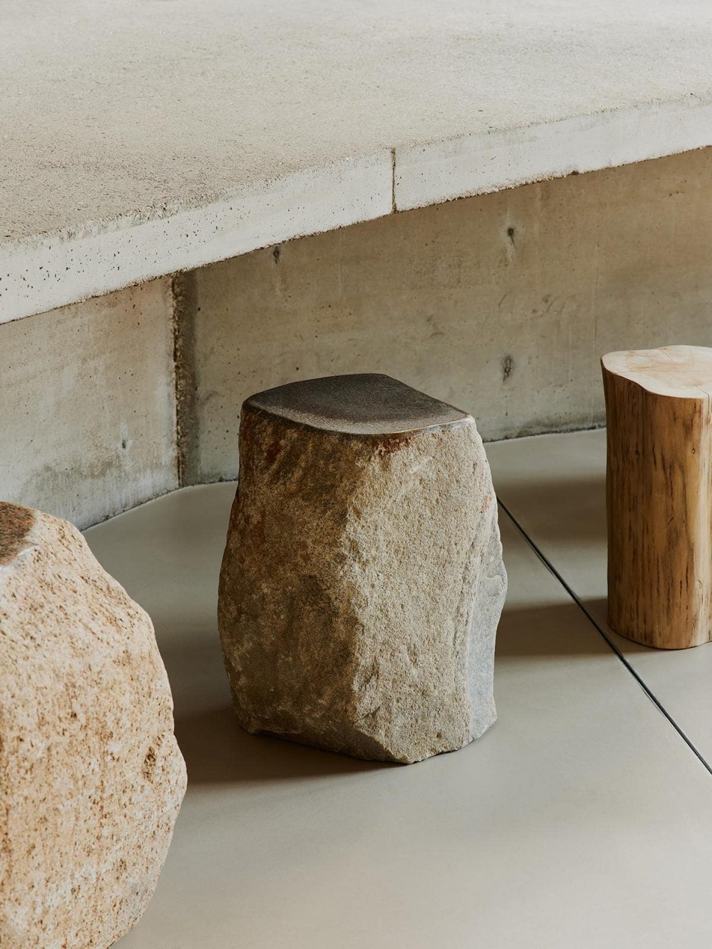
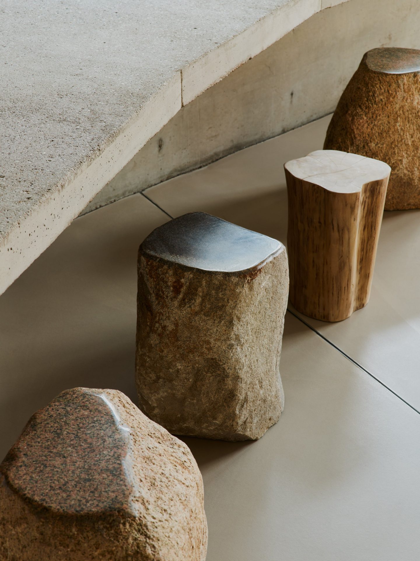
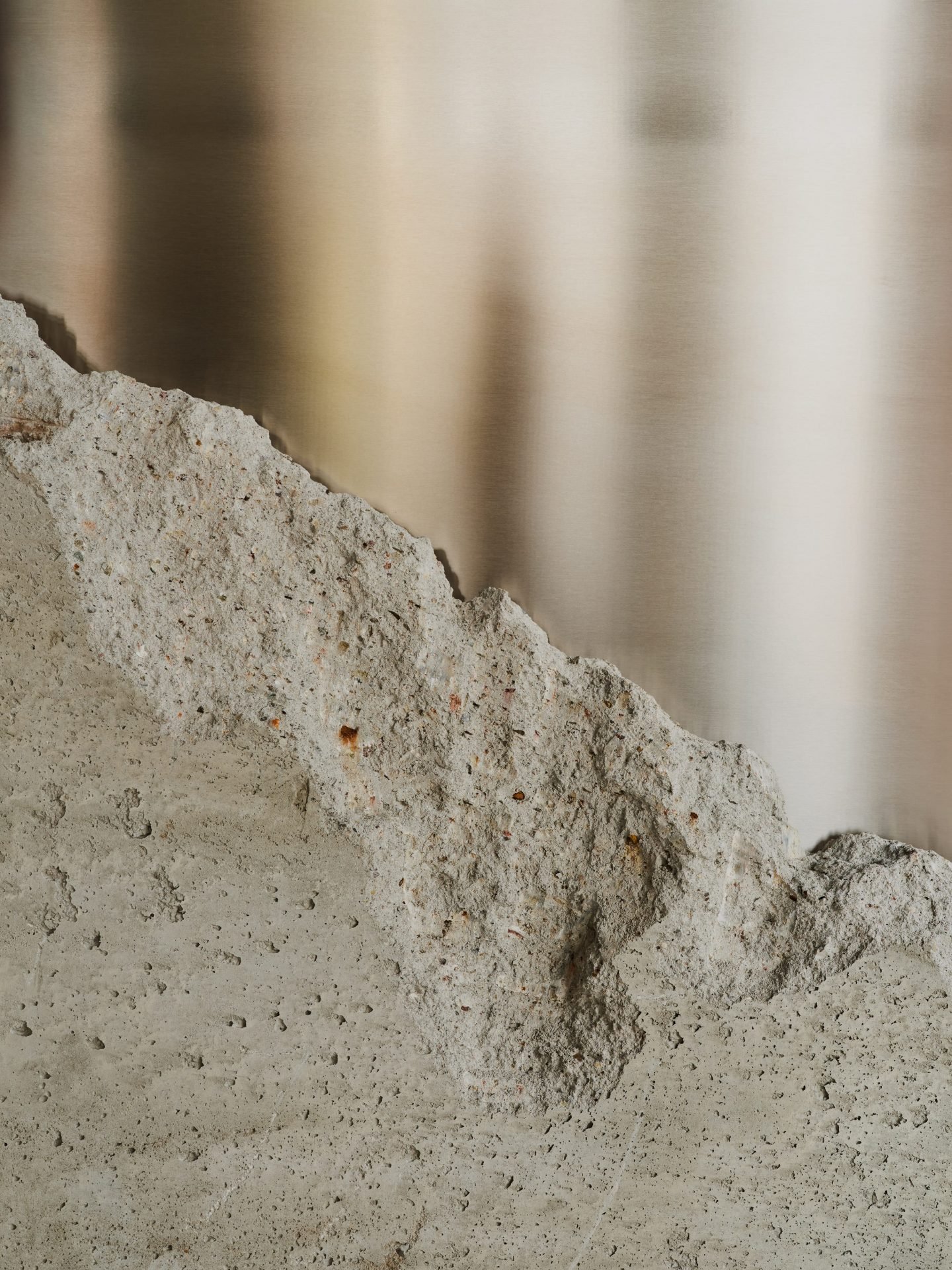
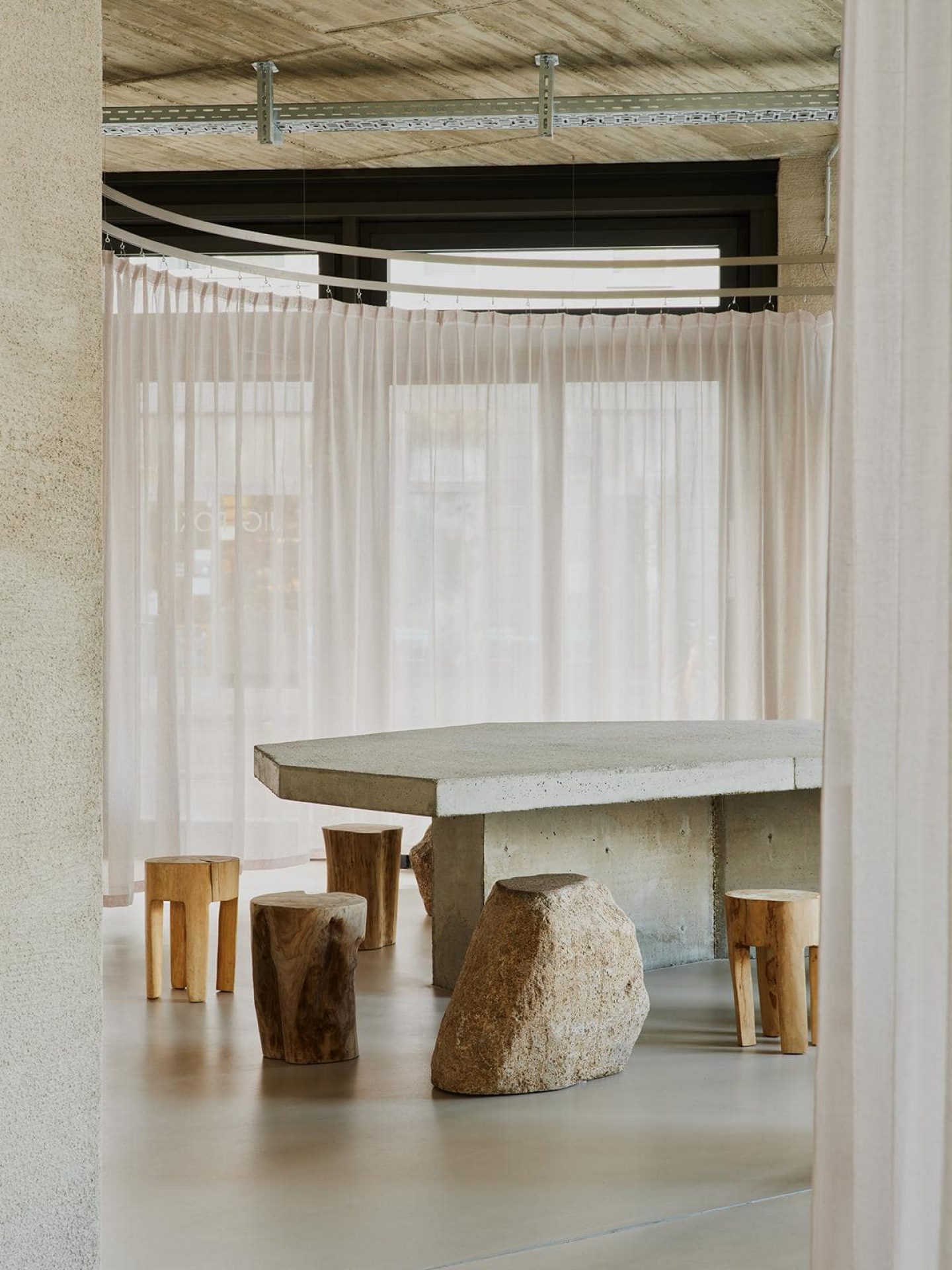
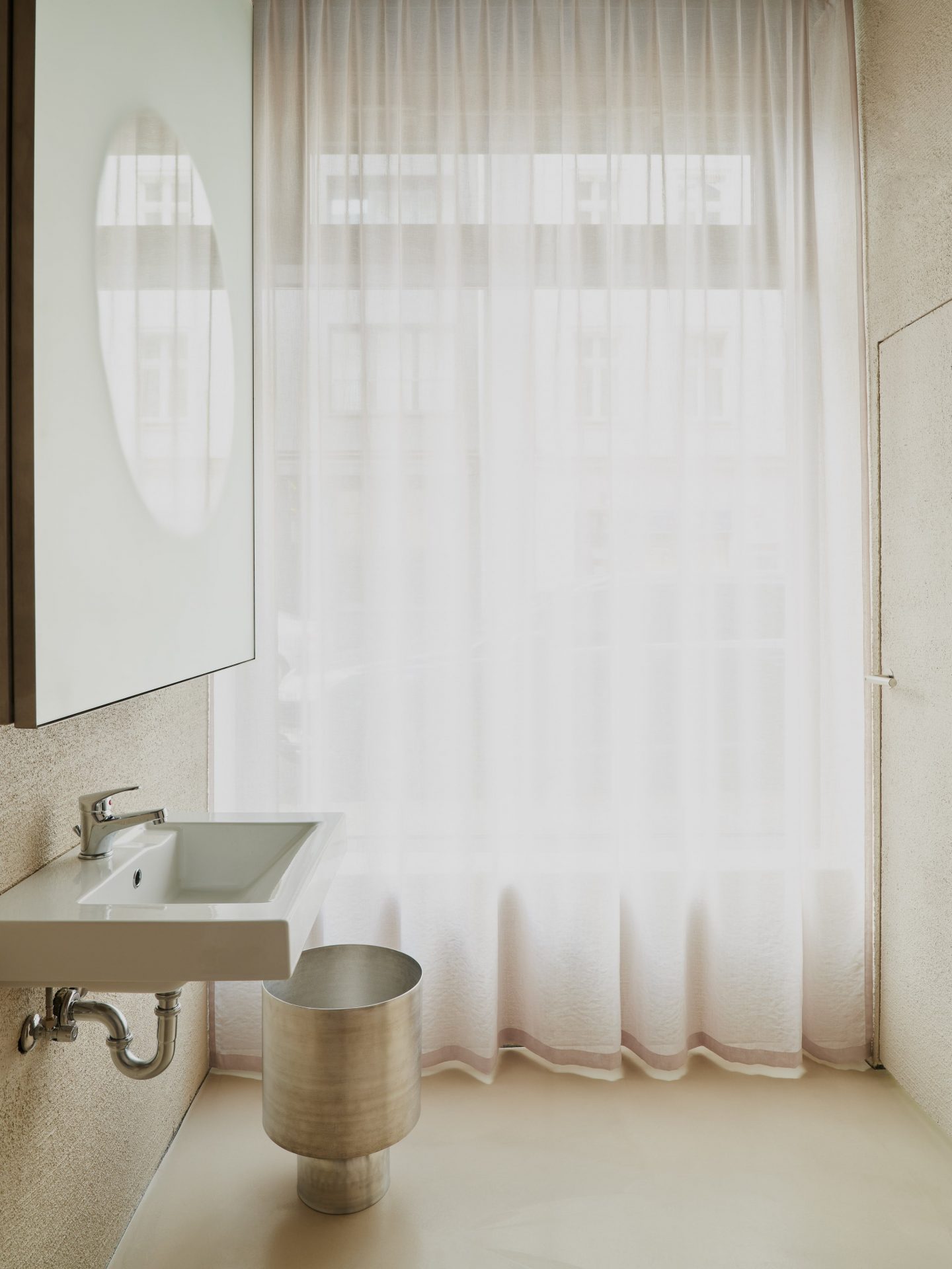
The interior explores the dialog between contrasting materials, such as raw concrete tables and wooden stools, with refined textures like smooth steel countertops and transparent curtains. Can you talk a little more about the materials used?
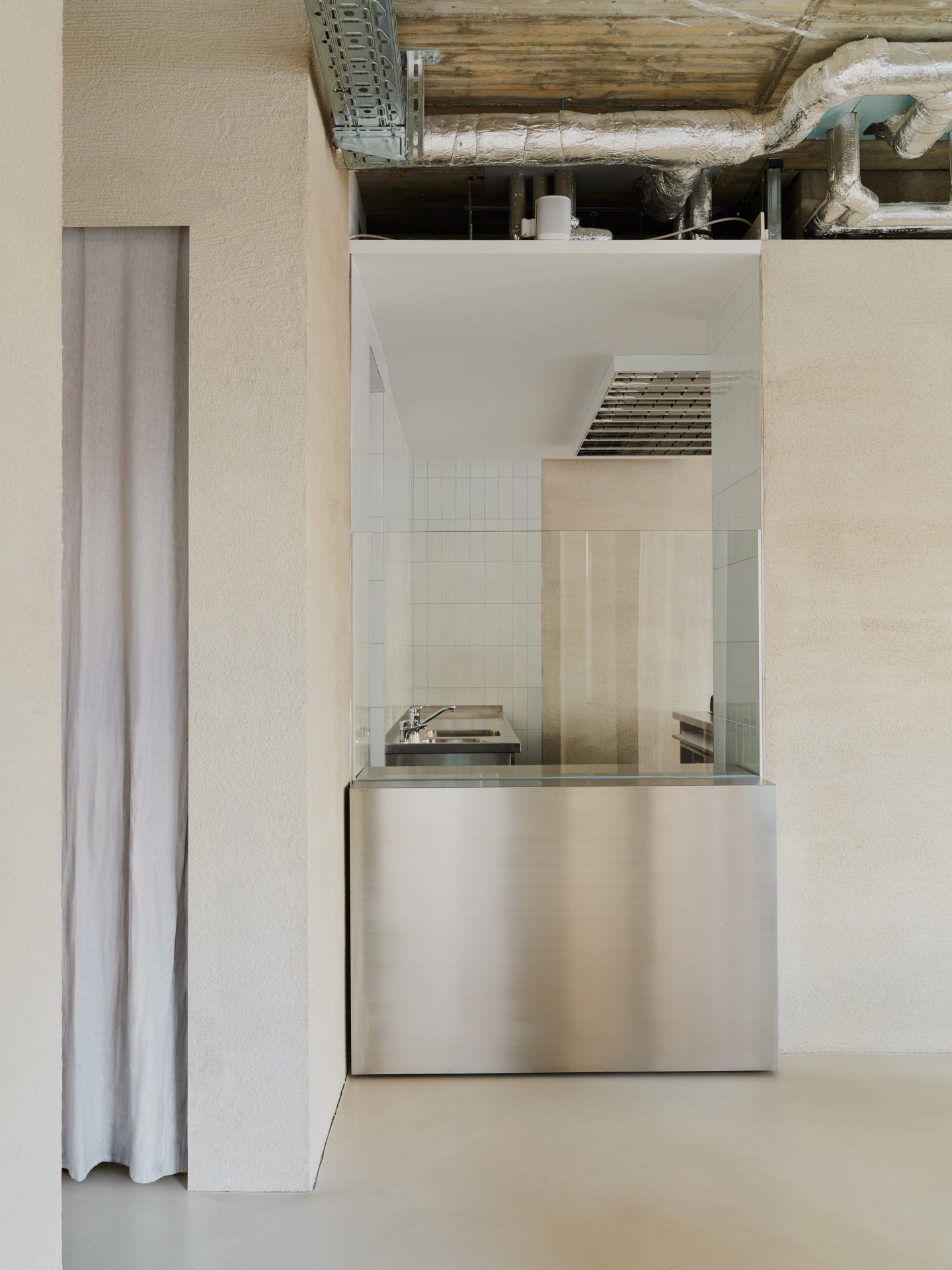
Joern: The restaurant can be divided into two functional concepts of codependency. On the one hand we have the dining area with its warm and earthy tones, inspired by the photograph of the fisherman. On the other hand, we have the food prep-area which takes its role model in classical fish markets. The white tiles and stainless steel surfaces are an homage to those trading places where the raw fish was processed.
How do you appeal to the customer’s senses and emotions through the design of this space?
David: Since traditional Poke has been popular in Europe for a while now, we wanted to rethink the way people approach the product and put it in a new perspective. And in saying that, we don’t mean overwhelming the customer with tons of impressions of noisy design, bold layouts, or fancy colors, but invite people to interpret this setting and ask themselves the question: What is it that makes this place feel different, and why?
All images © Robert Rieger
