Abstract Furnishings And Natural Tonalities Inform The Interior Of Maison Margiela Shanghai
- Name
- Studio Anne Holtrop
- Project
- Maison Margiela Shanghai Reel
- Images
- Studio Anne Holtrop
- Words
- Devid Gualandris
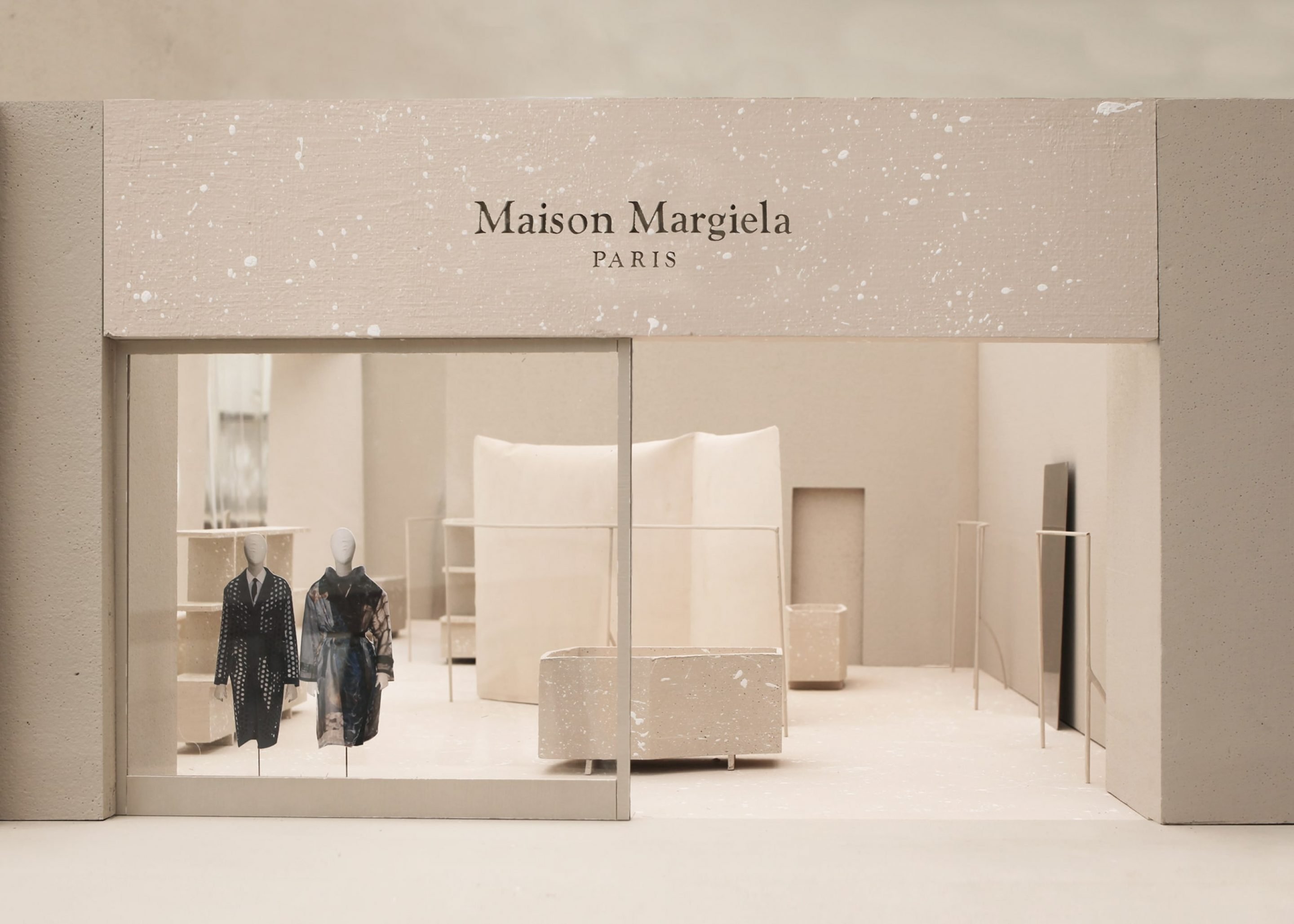
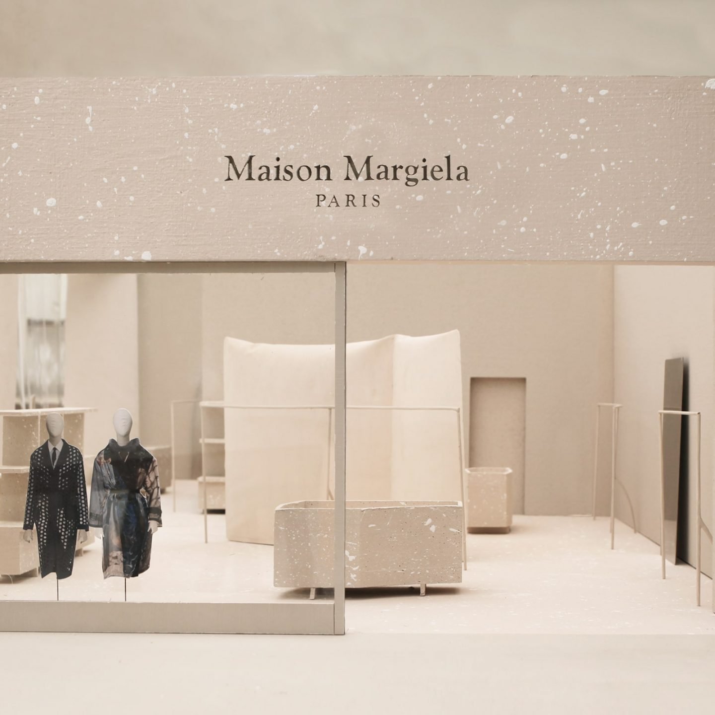
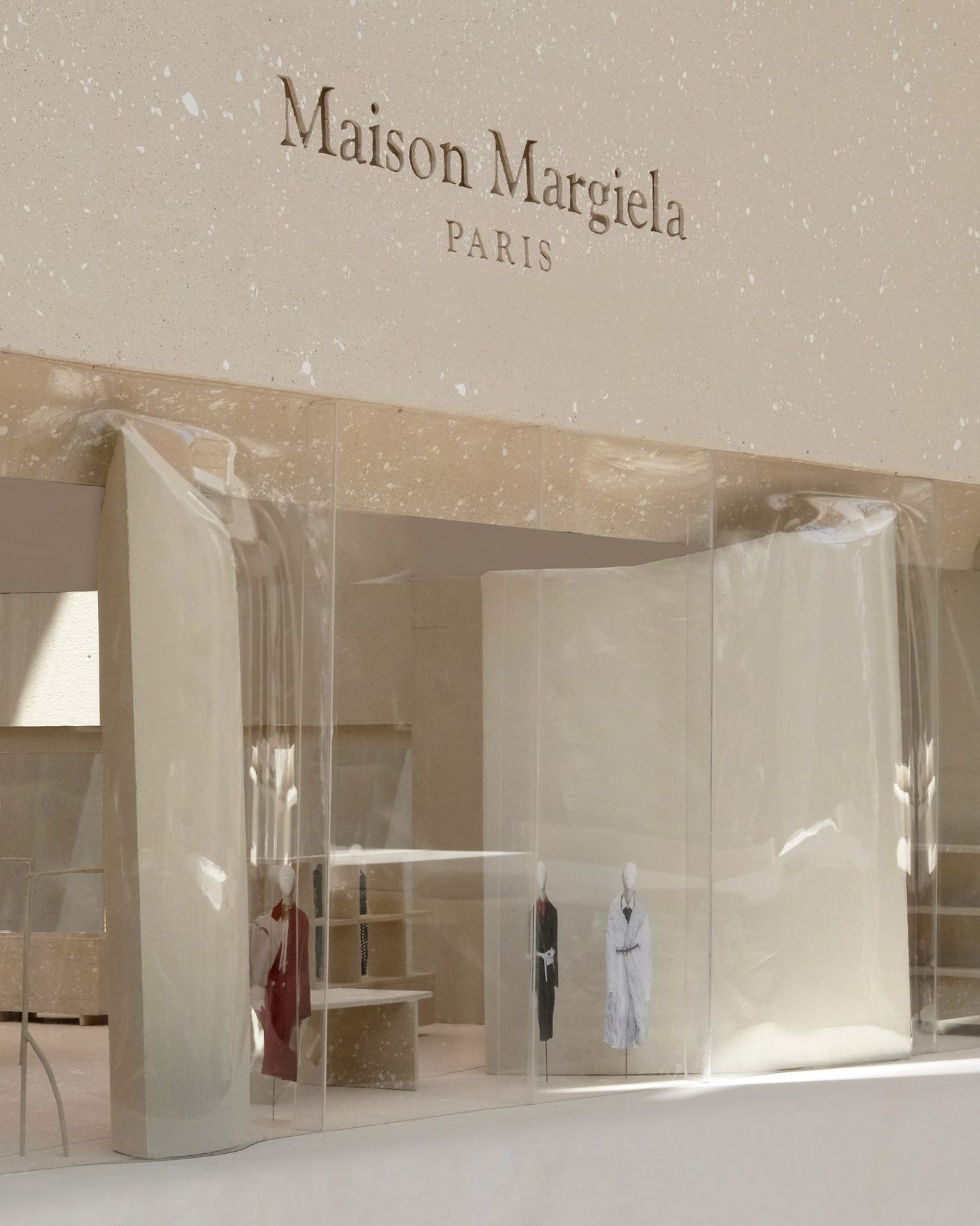
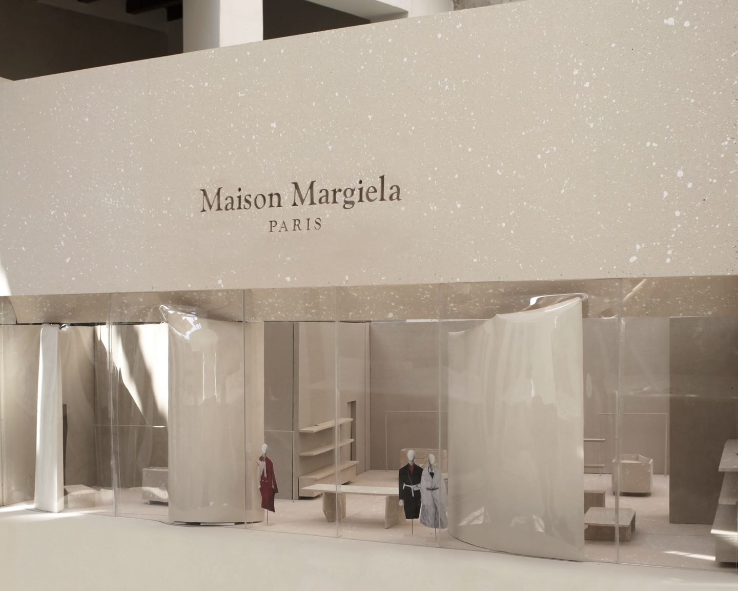
In Shanghai, China, Dutch architecture firm Studio Anne Holtrop has designed the retail space of luxury brand Maison Margiela as an abstract and deconstructed environment. Fitted with artisanal furnishings and hand-cast textile molds, the boutique’s interior design illustrates the Maison’s signature codes of ‘dressing in haste’, ‘the memory of’, and ‘décortiqué’.
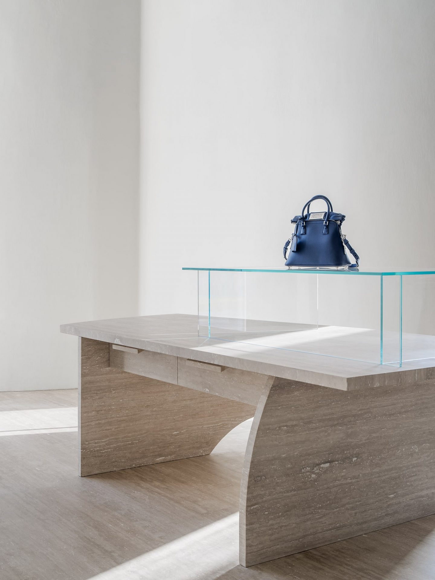
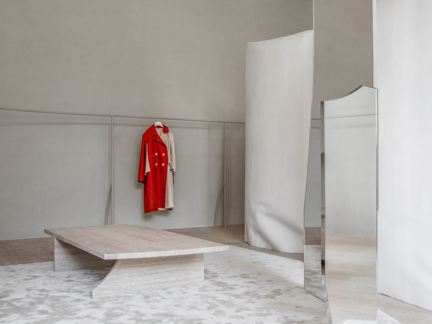
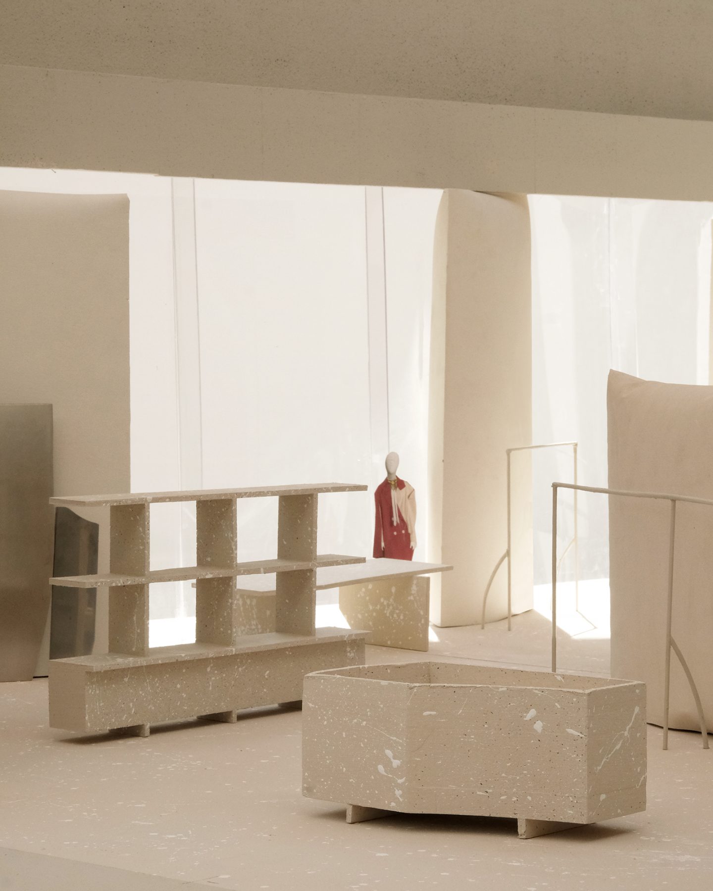
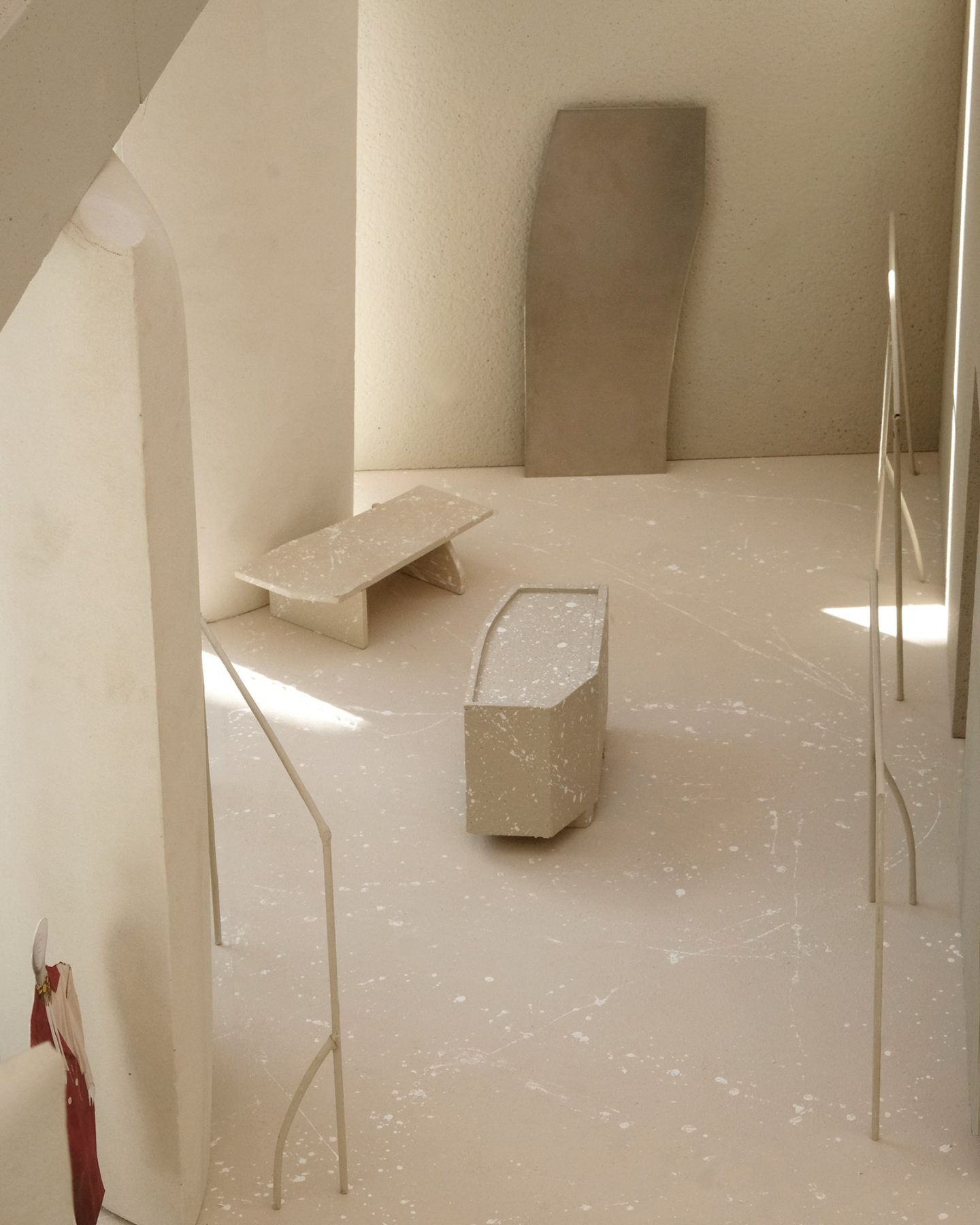
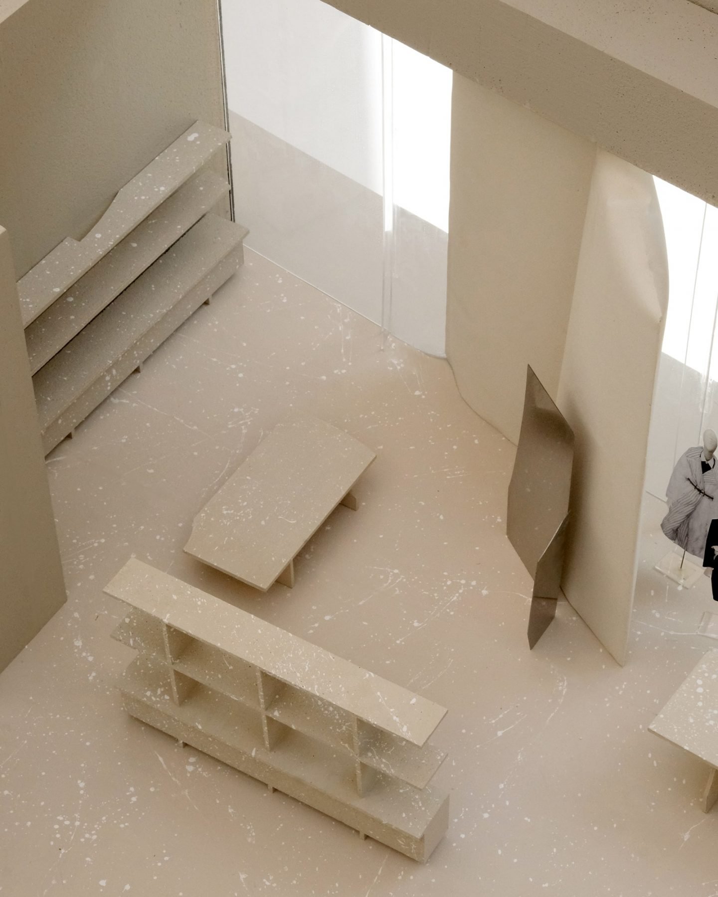
Located in the Reel Department Store, the 160-square-meter boutique carries the full range of Maison Margiela’s Co-Ed collections, men’s and women’s ready to wear, accessories, shoes, and small leather goods, as well as jewelry, eyewear, and fragrances. Reflecting the evolved visual language established by creative director John Galliano, the retail space is primarily defined by plaster walls and columns, which appear as detached objects. “One of the core elements are the gypsum casts in textile formwork,” explains the firm, adding that after removing the textile formwork, “the imprint of the textile remains visible on the surface of the walls and columns.” Retaining the memory of fabric texture and sculpting dents, the molds’ surfaces evoke the emotion of a hand-spun tactility, while the plaster’s natural tonality further echoes the signature white of the Paris-based fashion house.
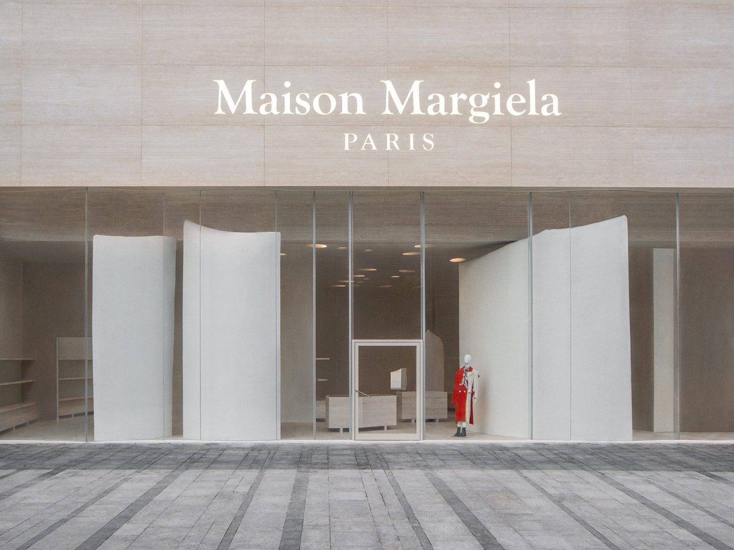
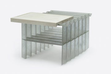
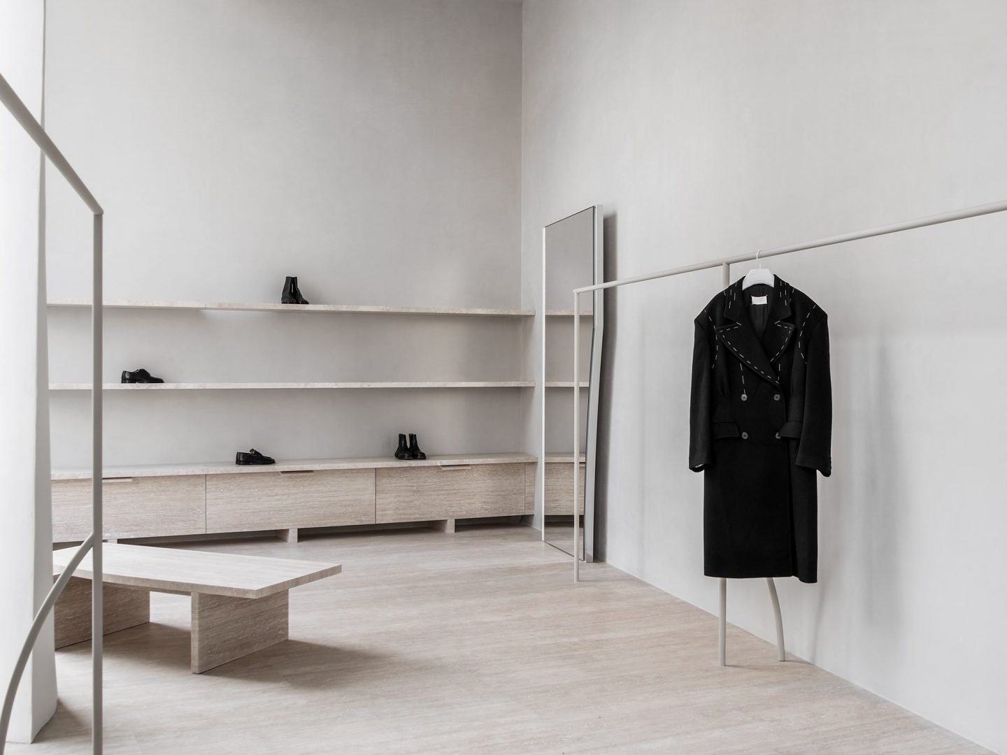
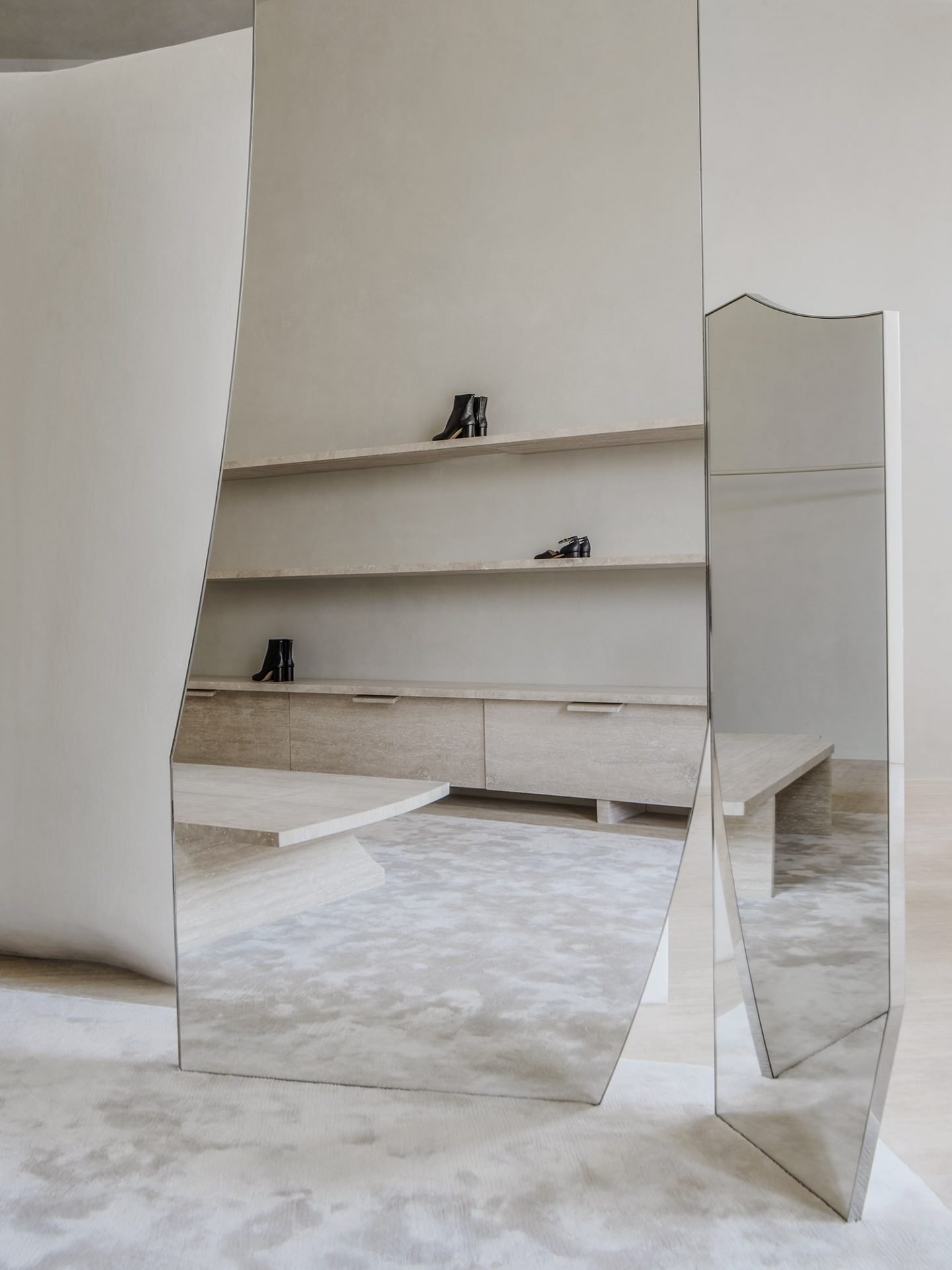
Leaning and folding around the demarcation of the space, familiar shapes appear asymmetric in form and draw on the idea of dressing in haste, which is native to Maison Margiela’s quintessence. “In reference to the décortiqué technique by John Galliano, we made a language of incomplete rectangular forms based on paper cuts,” adds the firm. Designed in the memory of classic objects, the misfit furniture is deconstructed in form and includes shelves, display tables, and seats carved in stained travertine. The natural indentations are filled with color-contrasting epoxy resin in optical white—“the porosity of the stone adds an exaggerative drawing, a staining, of the material itself,” explains the firm. The ceilings and walls of the fitting rooms contrast against the muted tonality of the space; painted in a dark-green high gloss, they are reminiscent of Japanese lacquer cabinets and convey sentiments of glamour and allure to the overall design.
Images © Studio Anne Holtrop
