In Conversation With Umberto Bellardi Ricci, The Designer Elevating Materials And Elementary Forms
- Name
- Umberto Bellardi Ricci
- Words
- Devid Gualandris
With a captivating body of work that includes architectural projects, minimalist furniture, lighting solutions, and decorative objects, there is hardly any limit to the creativity of New York-based sculptor and architect Umberto Bellardi Ricci. It is in this interdisciplinary space that his design sensibility thrives, one that is driven by an intrigue for juxtapositions and a fascination for the spatial aspects of sculpture.
Born in Luxembourg, educated in anthropology in the UK, and having crafted furniture in New York, the life journey of Bellardi Ricci is anything but conventional. From teaching architecture in Ithaca, N.Y, to his educational venture at Edward James’ sculptural garden Las Pozas in central Mexico, he has transformed himself into an all-rounder in the design world. If his extensive travels and experiences have blossomed into a distinctive talent for seeing things with fresh eyes, it’s Bellardo Ricci’s outstanding skills in geometric abstraction that make him really stand out. Delineated by an interest in Mexican Modernism and built on the legacy of Minimalism, his practice centers on the dialog between raw fragmented elements and refined textures to achieve monumental forms, inviting comparisons to the iconic works of Richard Serra and Donald Judd.
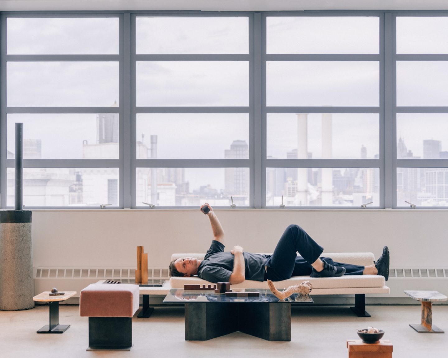
Image © Tommy Kha
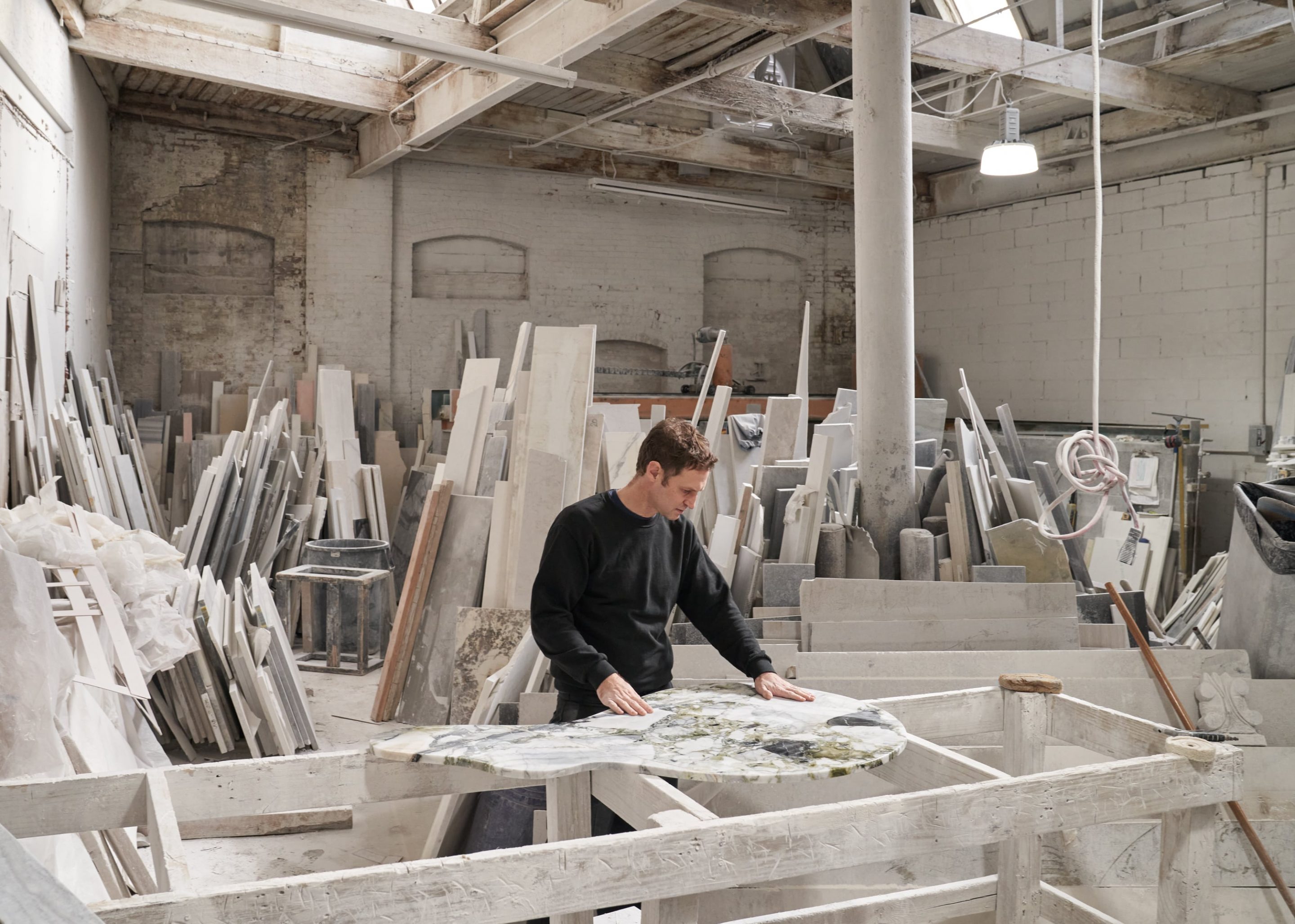
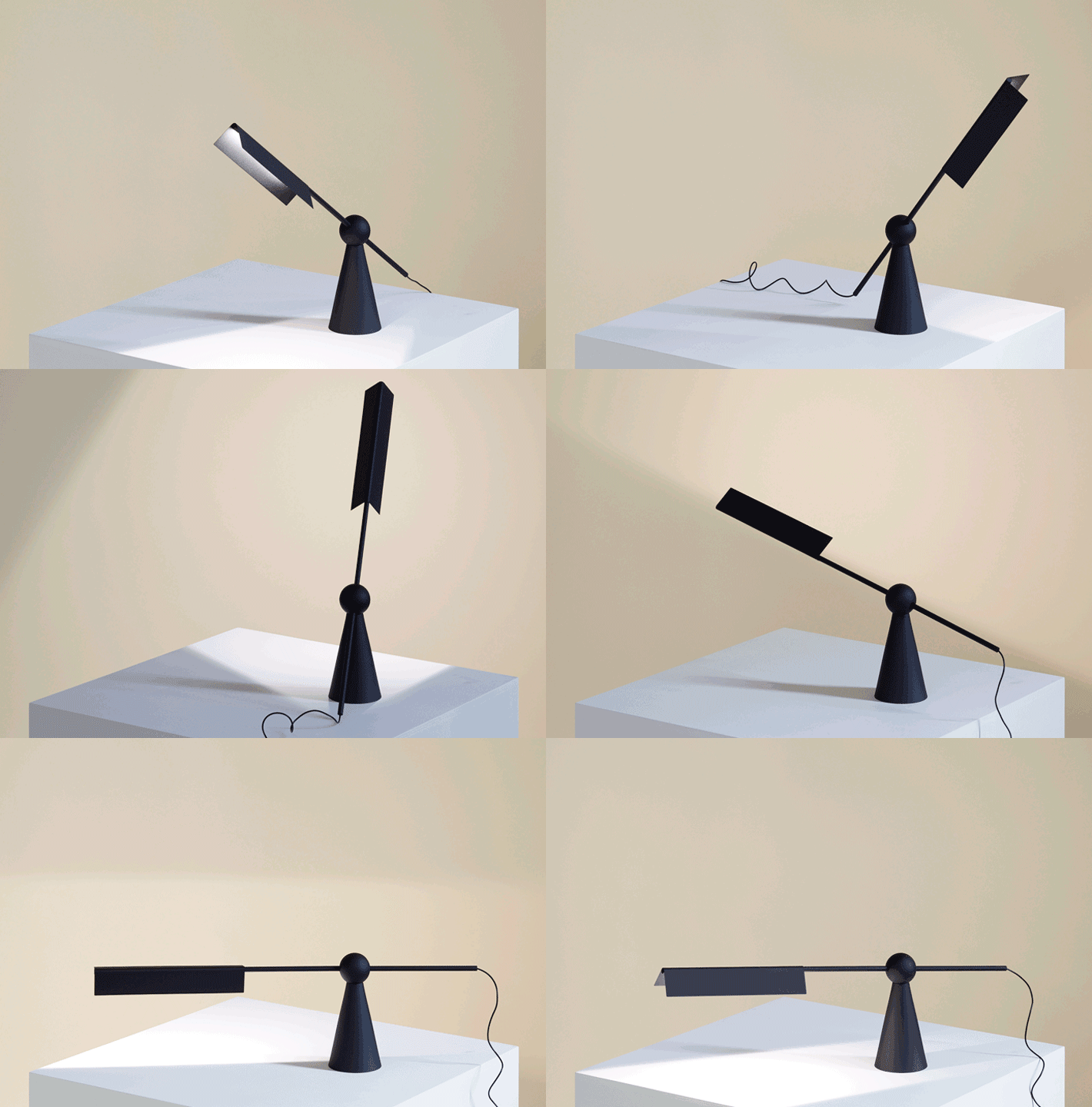
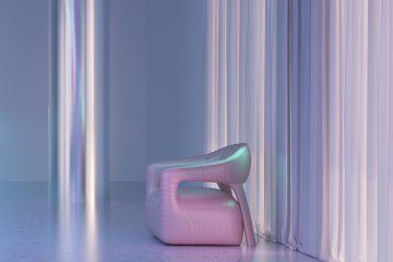
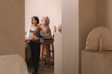
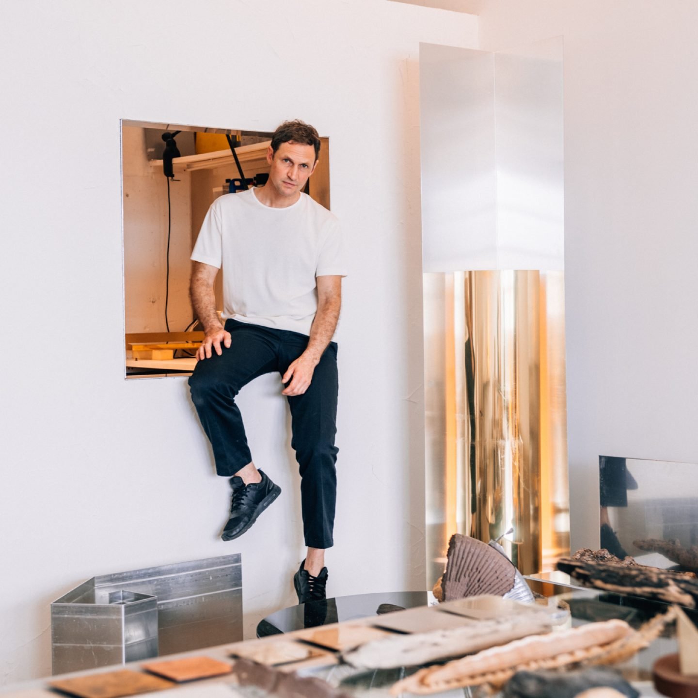
Today, a light-filled, white-walled loft studio on the 13th floor of the Navy Yards building in Brooklyn is where much of the magic happens. Here, the designer makes sketches and models, turning ideas into pared-back tables, chairs, and lamps that merge precious materiality with functional and contemplative purposes. With a pandemic raging on outside, Ricci Bellardi has spent the last few years focusing on what his intimate studio could offer: an exclusive view of the Manhattan skyline. “All I look at are the metal facades of the city which enter my studio, functioning as a theatrical backdrop to my work,” he tells IGNANT. Earlier this year, the designer unveiled a furniture and lighting collection inspired by the city’s material palette and work culture at Matter Gallery in New York, to much acclaim. Titled DAWN, it explored the refractive qualities of bent metal and the relationship between space, light, and material. As he takes a moment to reflect on this peculiar yet successful year, we ask him about the design sensibilities and experiences condensed in his minimalist forms and their relationship to the space he resides in.
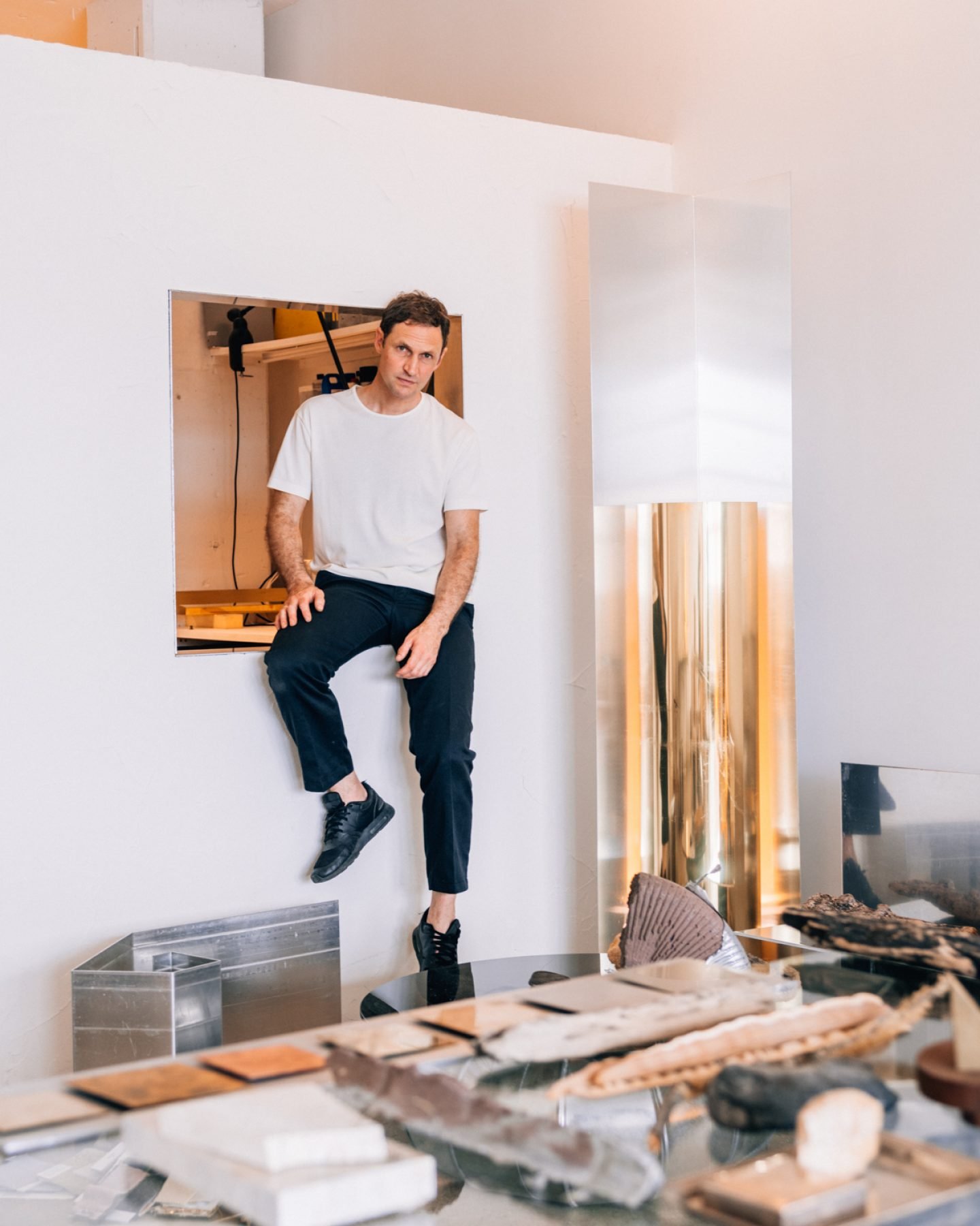
Image © Tommy Kha
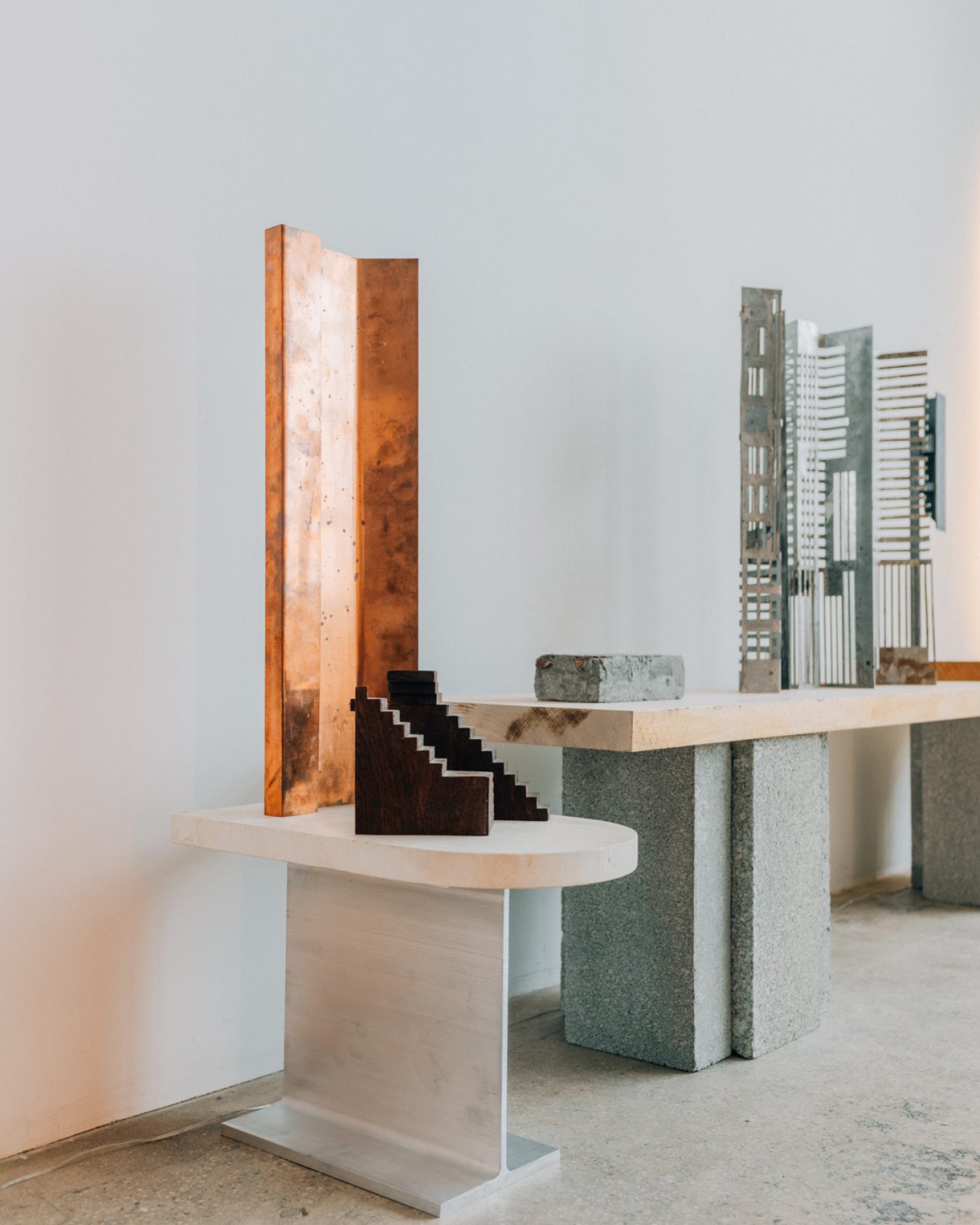
Image © Tommy Kha
How would you describe your journey to where you are now? Did you ever imagine yourself here?
I did not plan to end up in Brooklyn doing furniture or objects. Within a two-year period I moved from London to Mexico City, then to New York City, and to Ithaca, Upstate New York, for a job at Cornell University. After moving across metropolises in different continents, the move to the little Ivy League University town felt like a monastic retreat. I rented a little house next to a waterfall where I quickly set up a studio in the basement, with the pieces which I could mock up at the wood and metal workshops of the University. The only constant element back then was that I was teaching form and space in universities from London to the Mexican jungle, where we had set up this elaborate experimental concrete sculpture workshop and school.
Mexican modernism, American Minimalism, and artists like Richard Serra, James Turrell, and Dan Flavin count among your main influences. How have these shaped your vision? Do you still reference them in your work?
Coexisting almost with a delirious stream of surrealism—André Breton, the leader of the surrealist movement, called Mexico the most surreal country in the world—Mexican Modernism was very interesting to me as it had a more unconventional approach. It was also in Mexico that I first experienced sculpture at an architectural scale and landscape as a sculptural tool which had no other functional purpose than to be designed as purely experiential and experimental. The freedom and playfulness that I experienced in Mexico City I tried to take with me to NYC, which was less easy as the city is essentially a factory. Minimalism happened out of necessity—while in Mexico I would be heavily involved in casting and mold making, the speed and demand of NYC forced me to work and think faster and more restrained, which led me to readymades and folded metals. While I think of my work at the moment as ‘domestic Serra’s’, light and color as experienced in Turrell and Flavin are very important for me in the experience. In my case, I do steel pieces that hold light like you would hold the flame of a match in a hand.
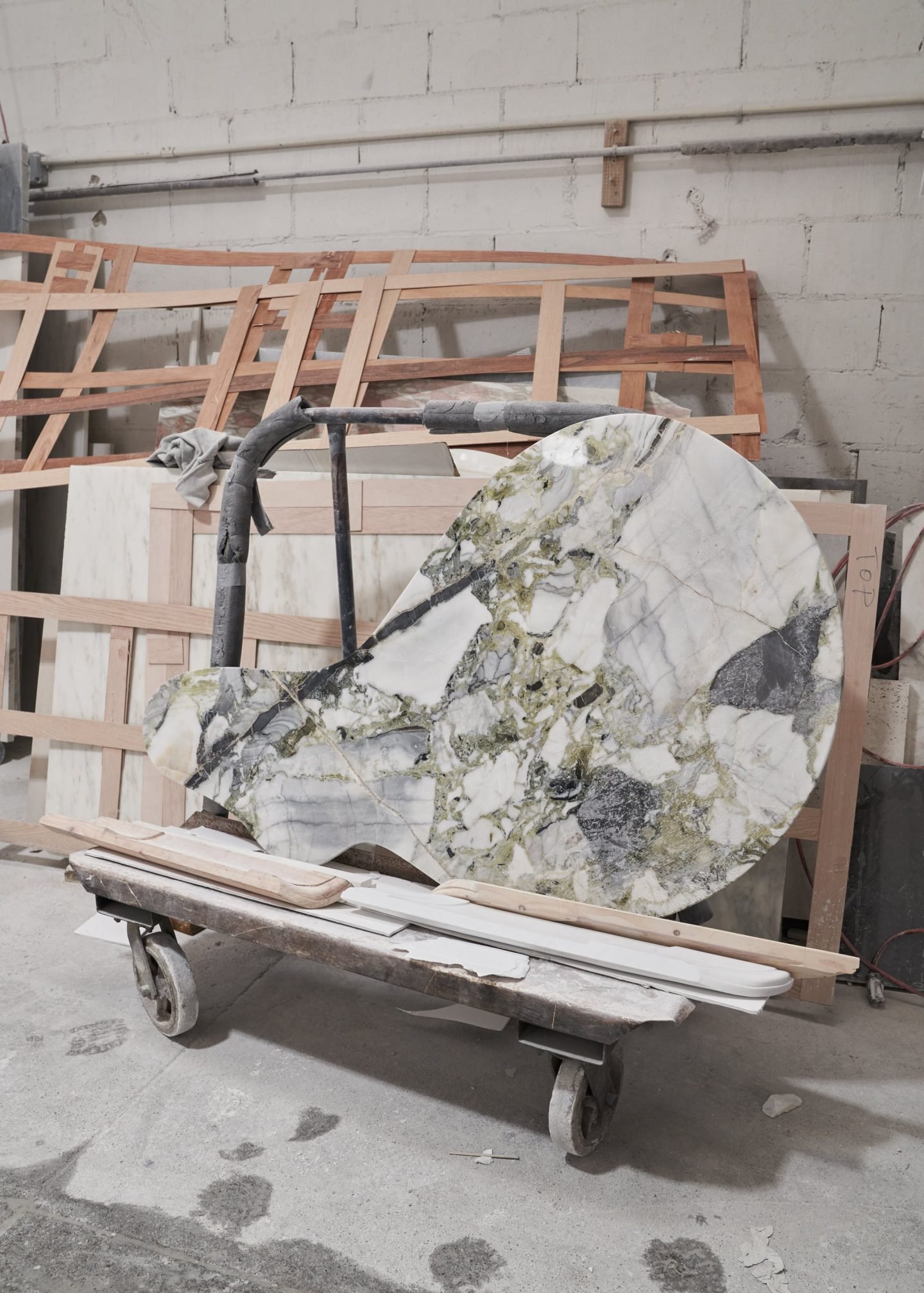
Image © Martien Mulder
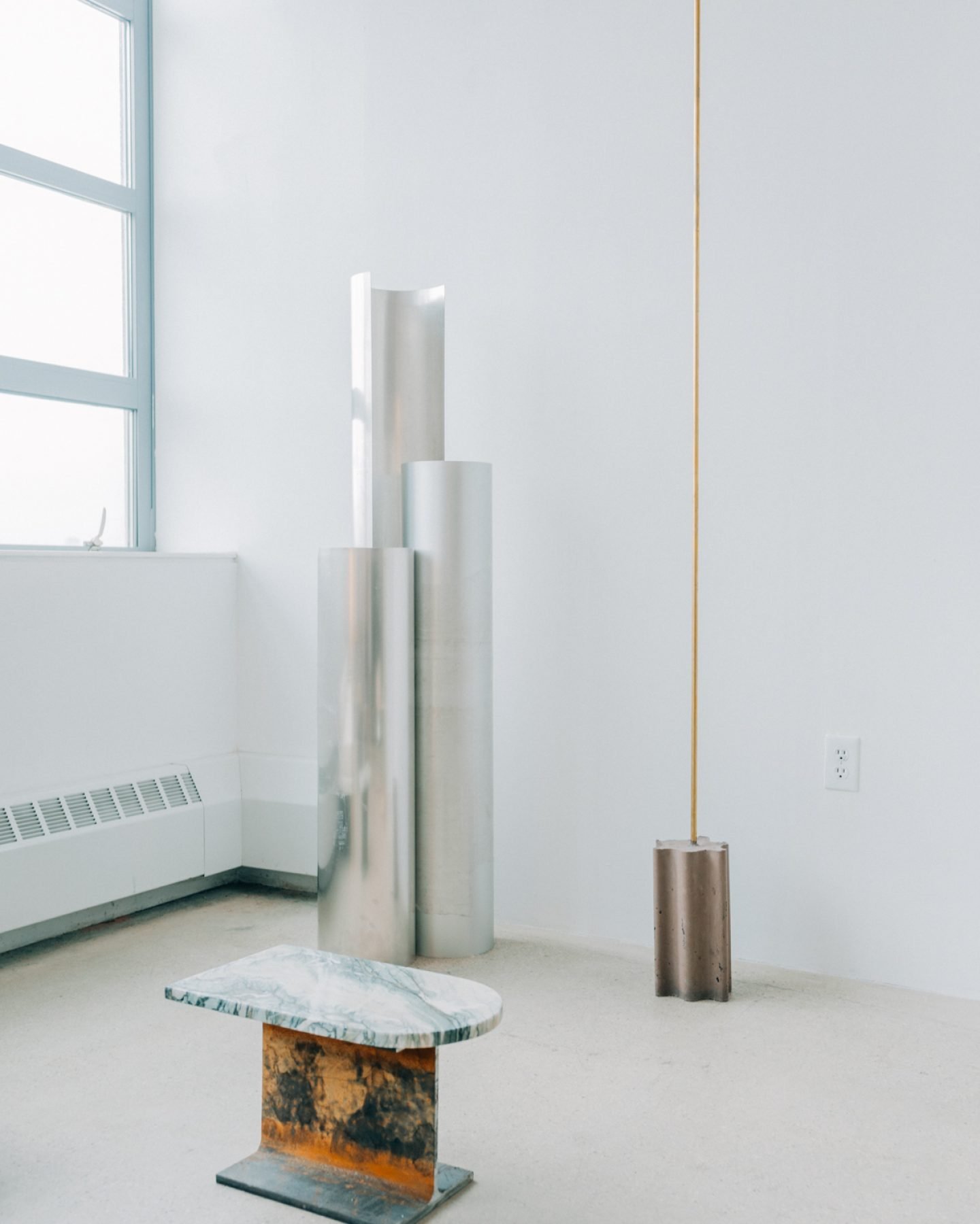
Image © Tommy Kha
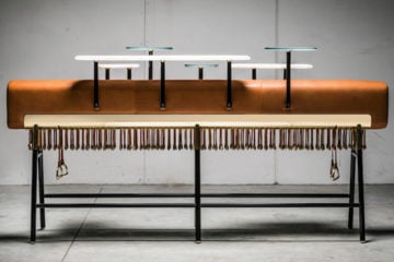
Your furniture pieces explore the dialog between mundane elements, such as I-beams and concrete blocks, and elevated, refined textures like marble and glass. What intrigues you about contrasts and dualities?
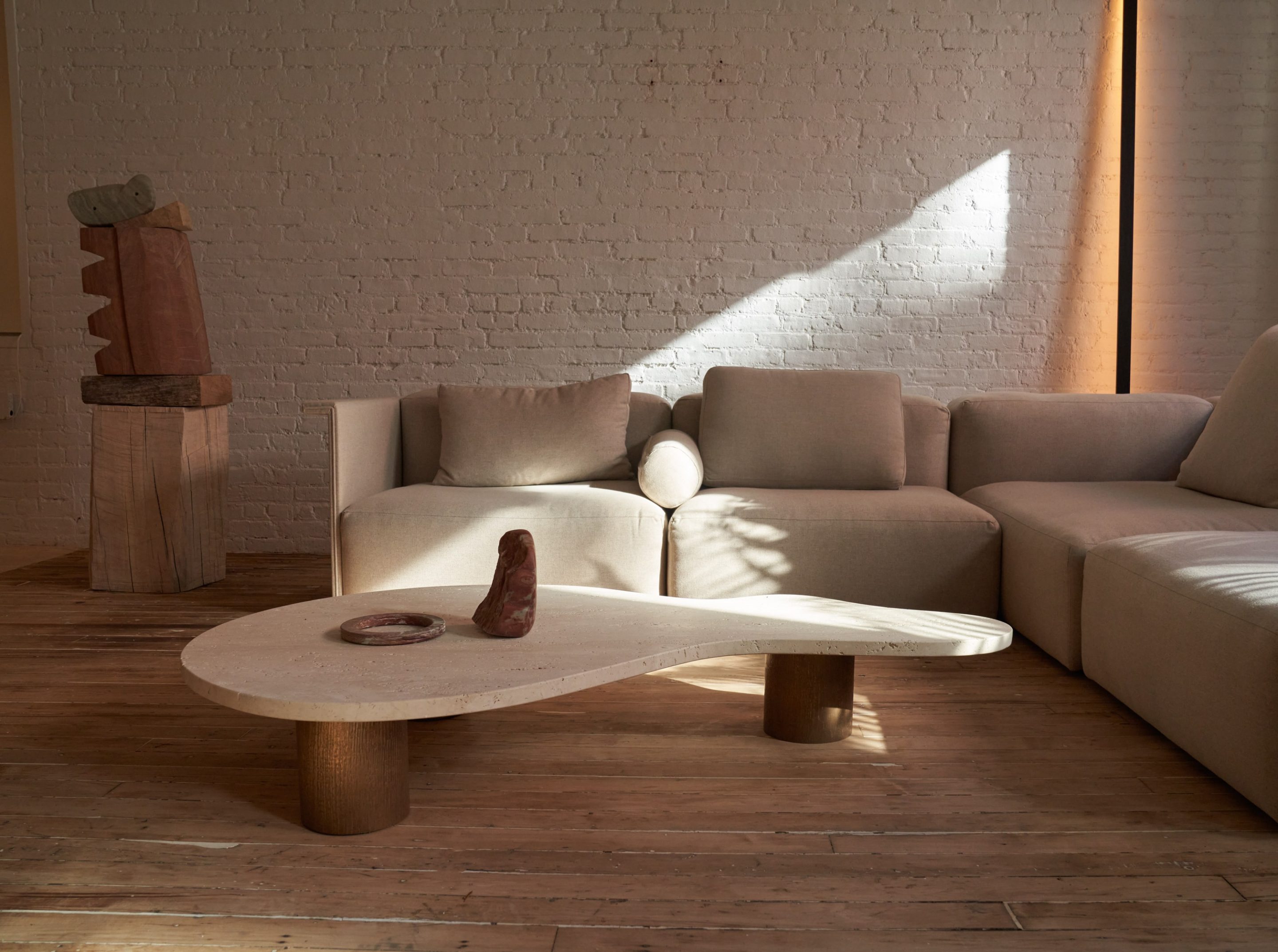
I am German-Italian which I always think of as chaos and order and they somehow work well together. I almost need contrast in order to appreciate something—Rome for example is totally overwhelming to me as everything is just so ‘beautiful’. Also, historically the contrast of something of a modern era such as an I-beam, or a rolled bronze piece with a million years old piece of stone or a vernacular wood fabric really works well; it can touch upon multiple contexts and references at the same time.
Scale, material, visual delight, or purpose—what comes first?
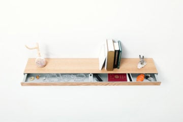
I love to experiment in non-scale, meaning working out good proportions, moving back and forth in the dialectical process of 2D and 3D, the translation of which may result in some beautiful accidents and findings. One of my favorite moments with one of my mentors, the Japanese architect and professor Shin Egashira, was in Brussels when, looking at a radical building project from the 1950s, he pointed at a beautifully intricate drawing in a small old book and asked the Belgian professor ‘Where is this space?’. The confused man replied ‘But Monsieur, this is not a space, this is a window detail’. Admiring Shin’s ability to read beautiful space in a window detail, I am always trying to see possibilities when jumping in scale and materiality. Function almost comes last but I like to keep that open to whoever will take the object into their lives and decide how to engage with it.
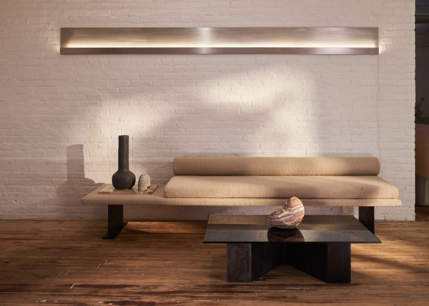
Image © Martien Mulder
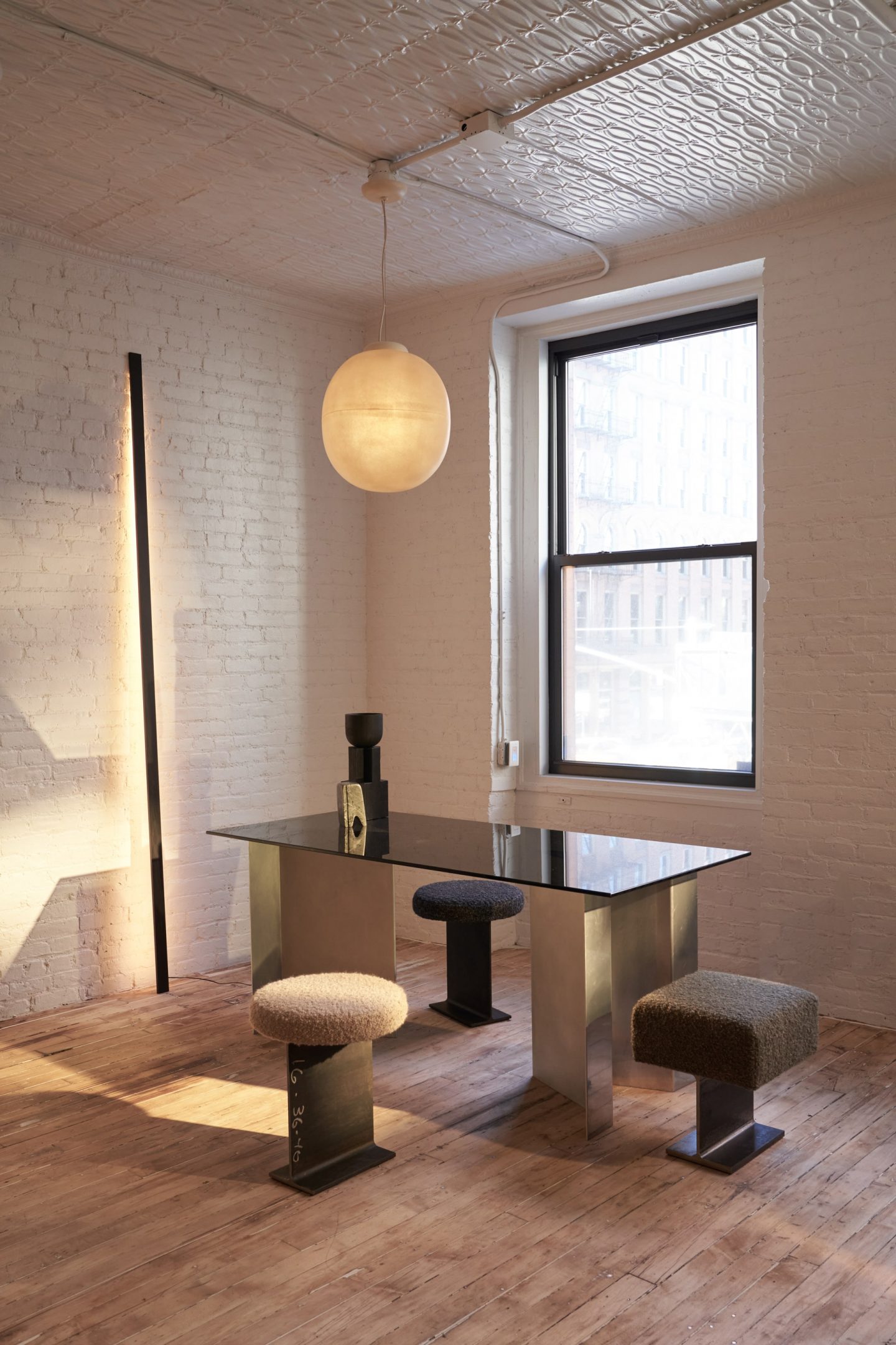
Image © Martien Mulder
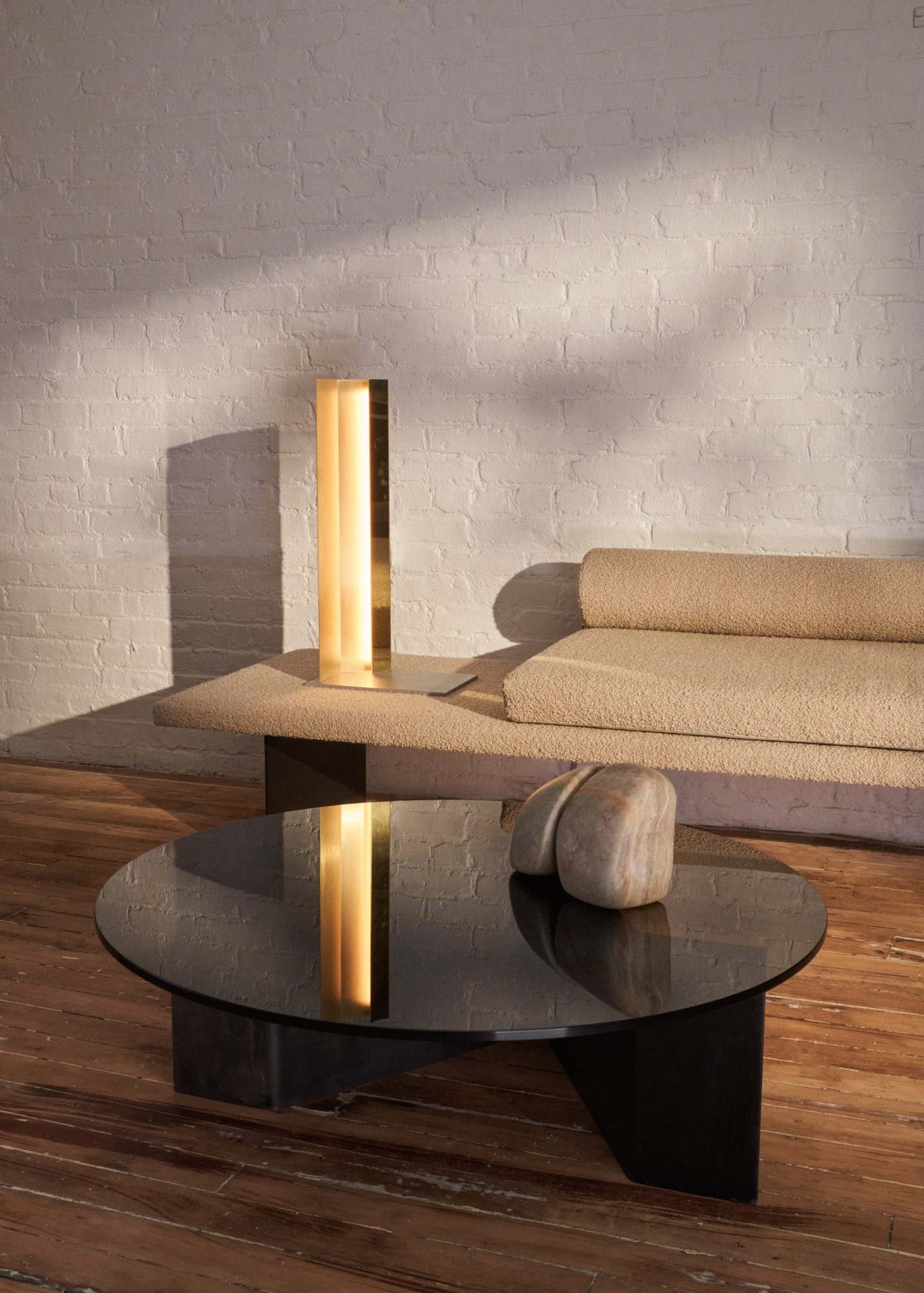
Image © Martien Mulder
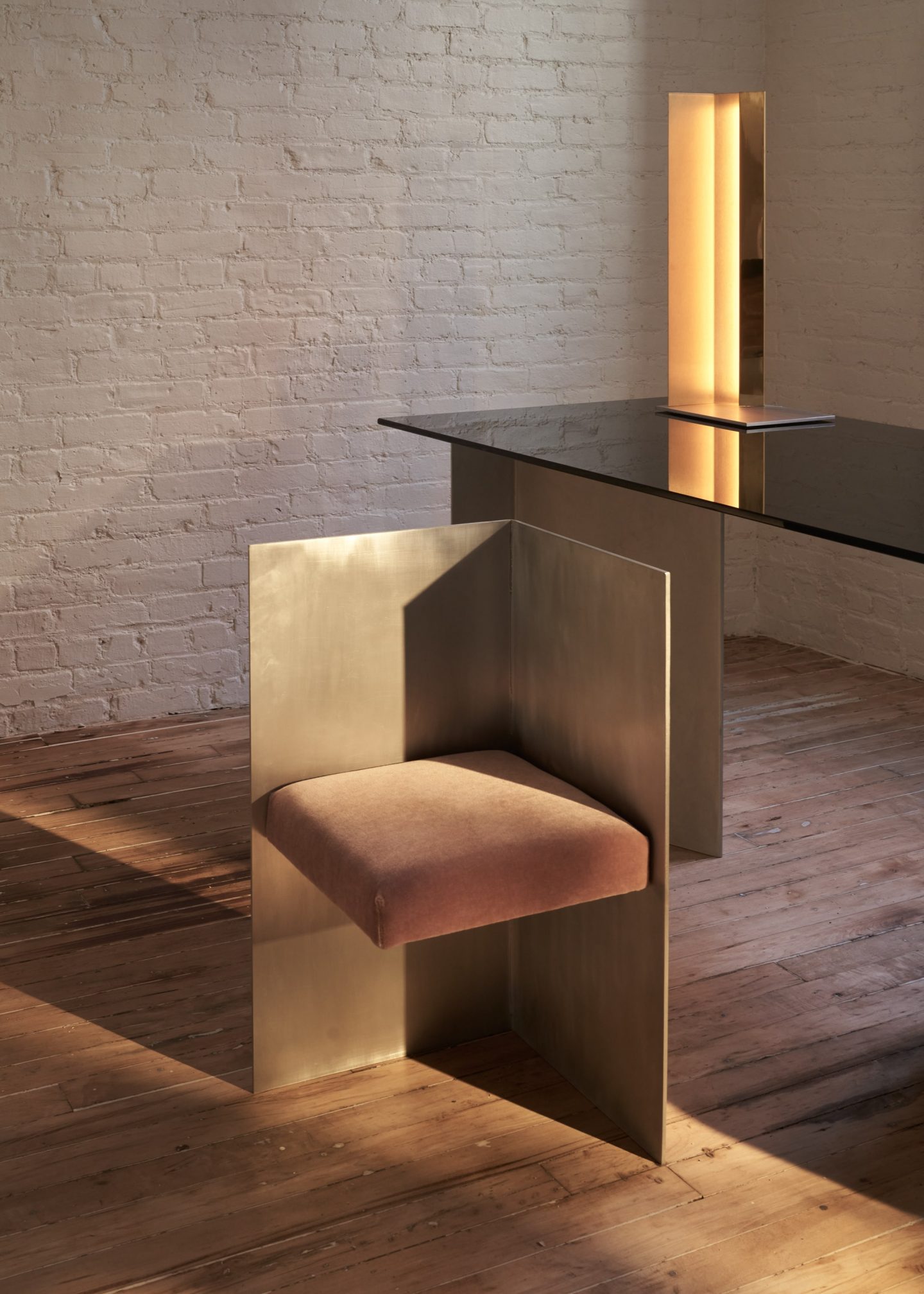
Image © Martien Mulder
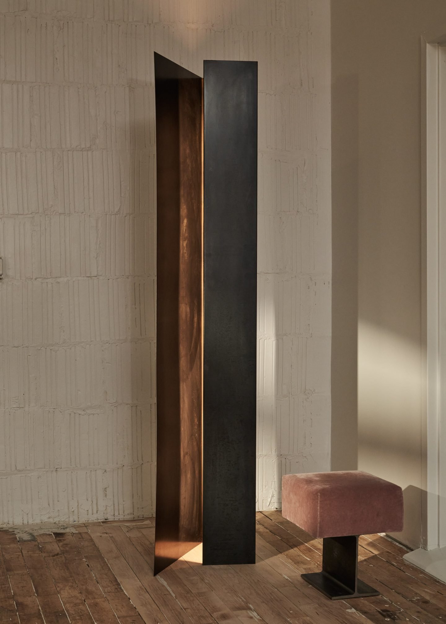
Image © Martien Mulder
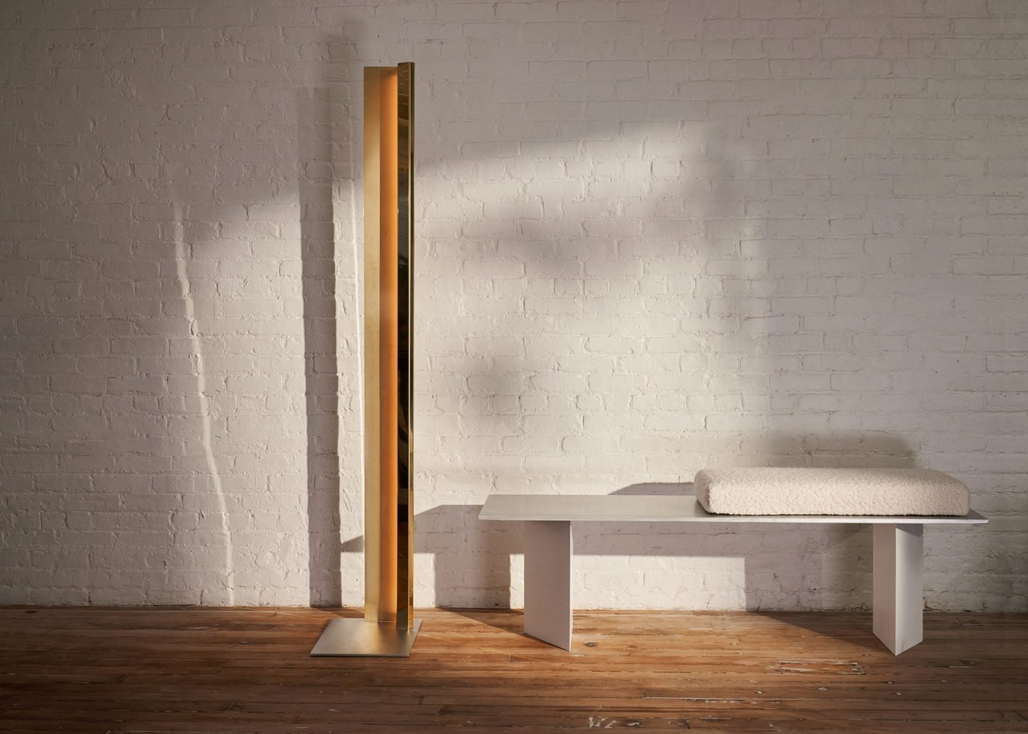
Image © Martien Mulder
Since its inception, your practice has been focused on pushing reductionism and geometric abstraction further. How do you appeal to the people’s senses and emotions through abstract design?
The beauty of abstraction is that it allows a lot of mental freedom. It is not didactic, about the human form; it is about finding a geometric system that soothes the eye and the mind. Compared to the literalness of figurativeness, abstraction is very poetic as it does not try to mimic but to freely associate, which has a very consciously subjective element in it.
In your recent debut collection DAWN, you have incorporated reflective light sources. How would you describe your experience of working with an intangible element like light?
Light is the most important aspect in experiencing space. DAWN was very much about the morning, the first light of a new day, and the warm glow that sets a new beginning. It was very timely to show DAWN which really signified a new beginning in the city after the long night of COVID-19 that we went through. Architecture is always about light and shadow and somehow I ended up doing light, I don’t even know how that happened.
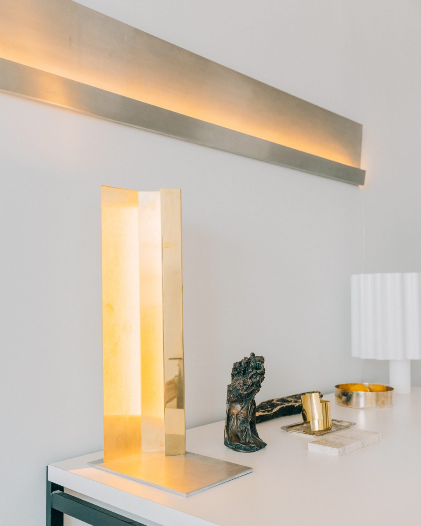
Image © Tommy Kha
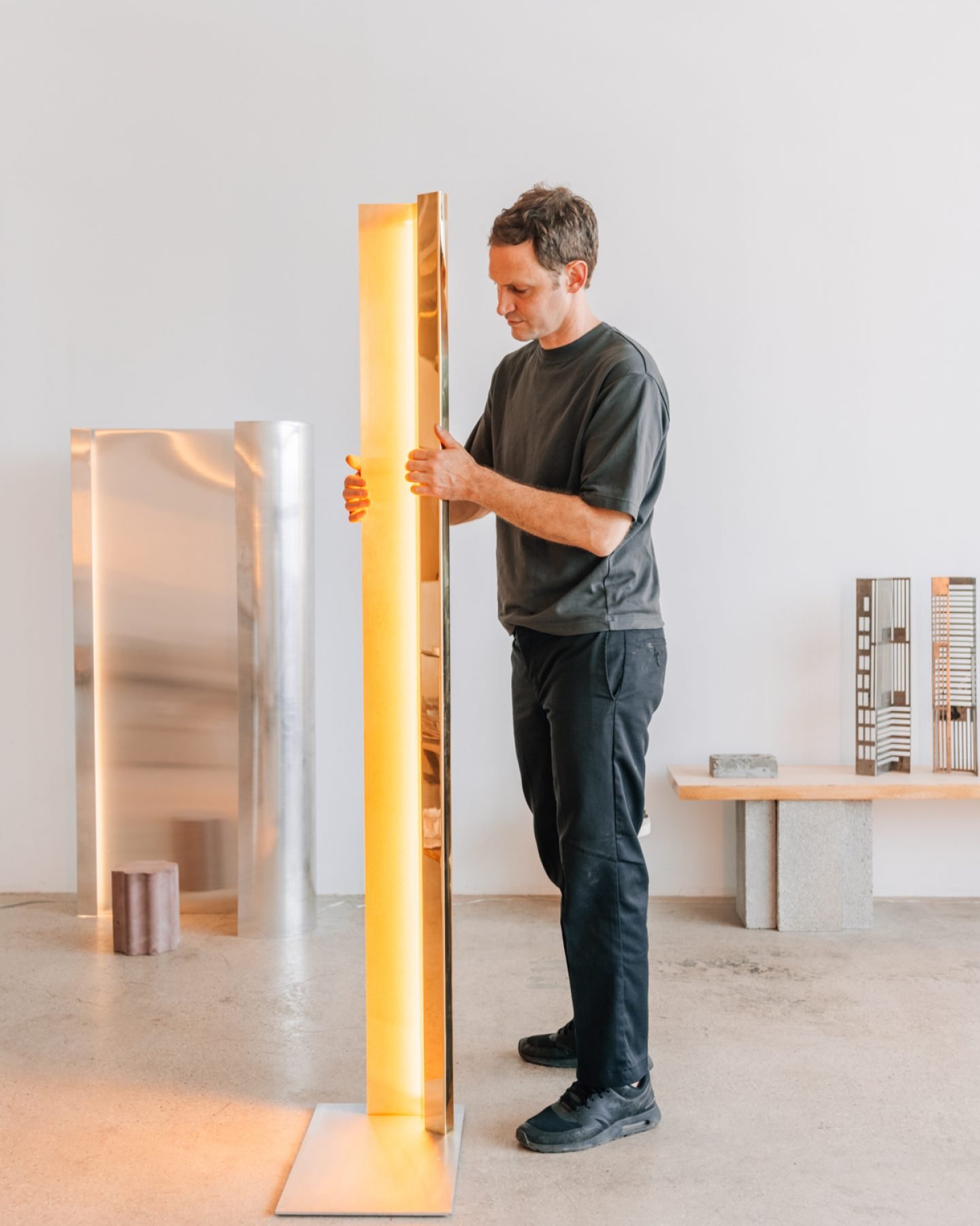
Image © Tommy Kha
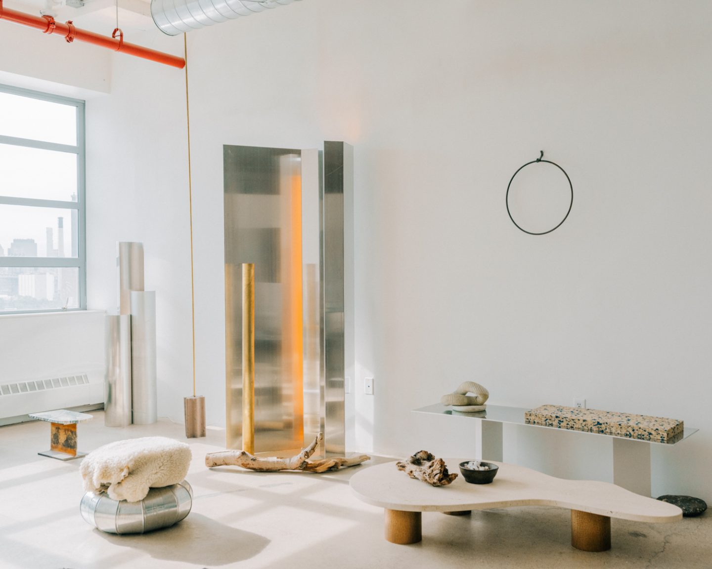
Image © Tommy Kha
Take us inside your loft studio. What was the intention for the space? How has the space transformed your method and relationship to design?
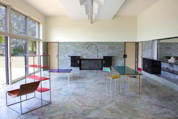
The purpose of the studio was always just for me to see and look at what is going through my mind, formally and in three dimensions. I first started with building two cubic volumes and rendered them in travertine plaster like a palazzo in Venice. The studio is essentially a white cube but the fourth wall is a glass facade open to the Manhattan skyline. From my studio, I imagine an ideal city that actually does not exist—a place full of reflective steel and light, of no-scale and minimalism, of no joints and age, like a romantic modernist from the 1920s. The space has changed my relationship to design by essentially making everything possible. In the space I can build perfect geometric pieces that need to serve no planning department or developer, but my own aesthetic pleasure.
As both an architect and designer, how do you envision an ideal living space?
Like Heidegger wrote in the article ‘Bauen Denken Wohnen’ (Building, thinking, living), a space that somehow engages with nature, even if just through the view. As a father of two, the ideal living space really is a home for me and my family, but also a place where we can dream and play and which, like a set, can be constantly changed and adapted to the evolving necessities and aesthetics of our lives.
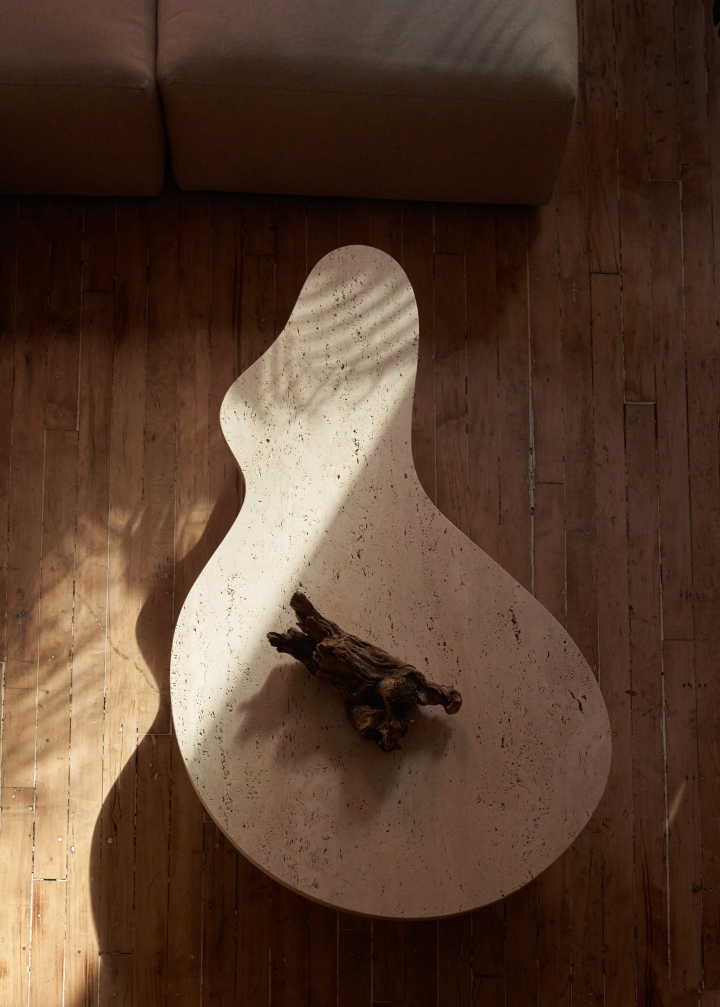
Image © Martien Mulder
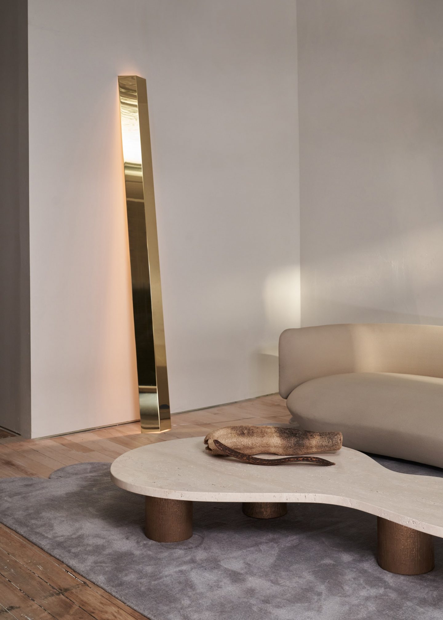
Image © Martien Mulder
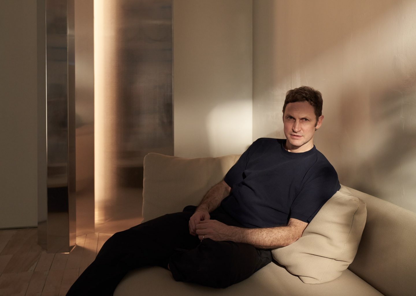
Image © Martien Mulder
Studio images by Tommy Kha | Gallery images, at Matter Loft © Martien Mulder
