Architect and Designer Sam Chermayeff: Playing Around With The Rules
- Name
- Sam Chermayeff
- Images
- Clemens Poloczek
- Words
- Marie-Louise Schmidlin
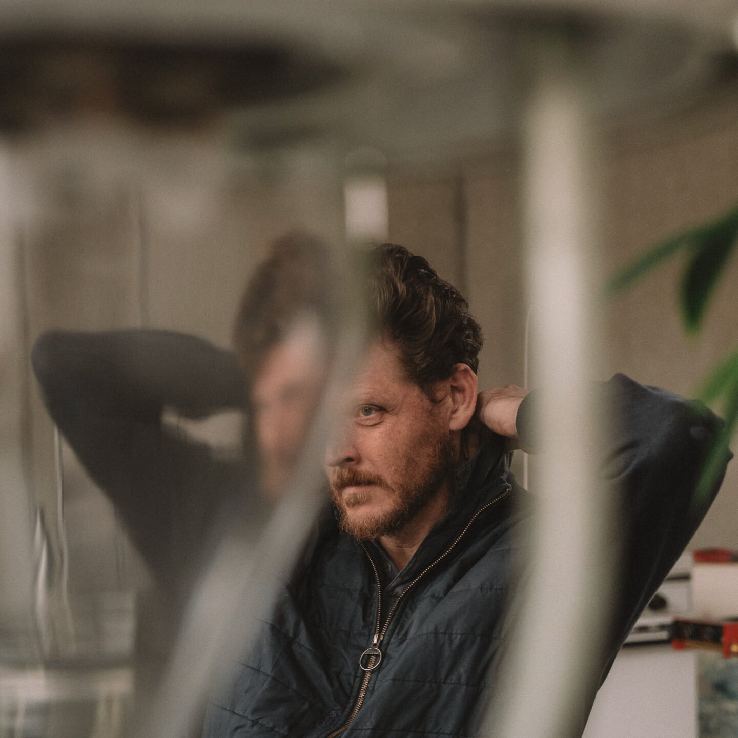
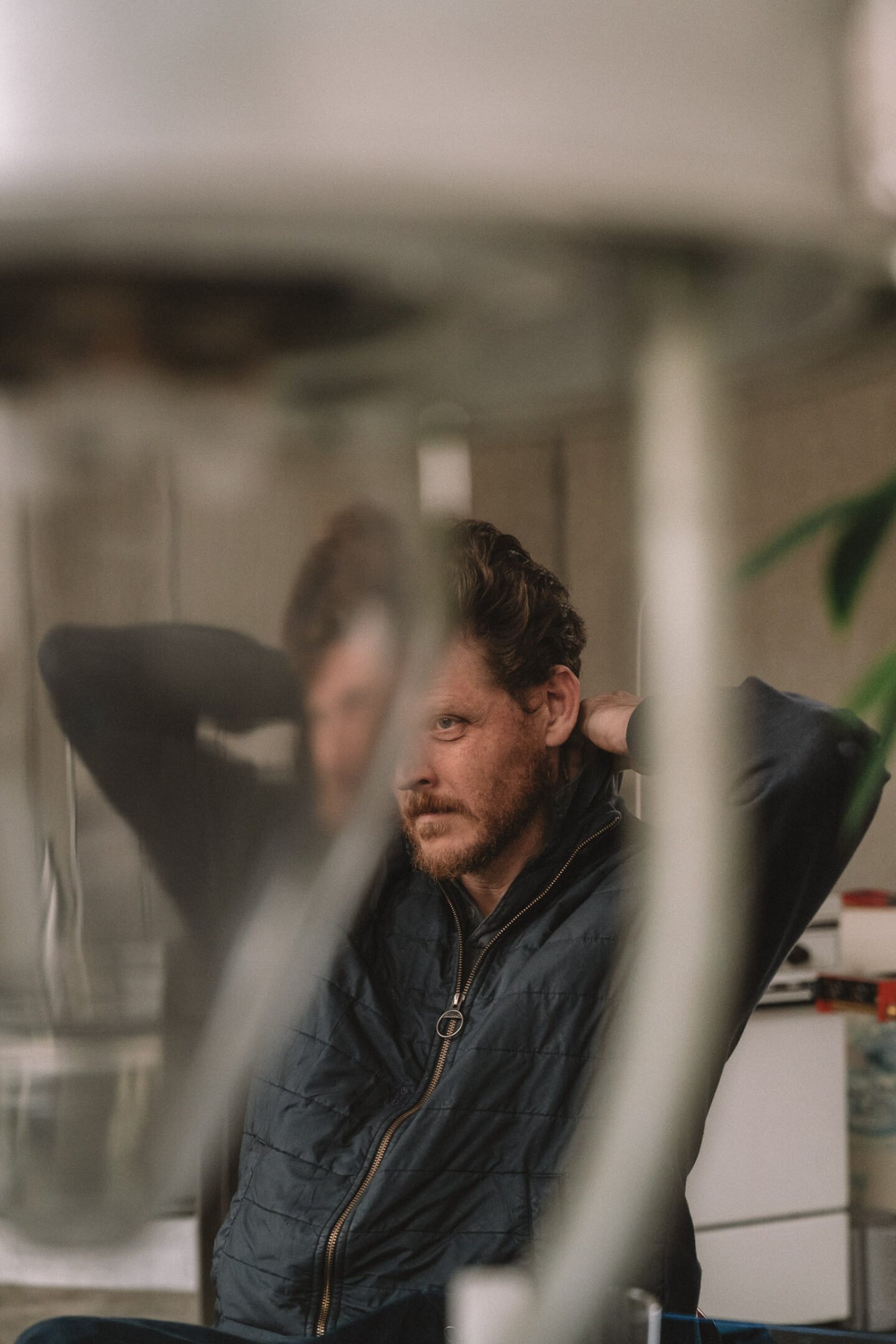
Being curious about humans and their habits has proven to be a valuable quality for architects and designers. This is no different for Sam Chermayeff, who dedicates his attention to exploring how we live alone and together. In his practice, he is interested in creating spaces and objects that allow people to merge and meet in new ways. The most ambiguous manifestation of his research is the Kufu 142 building in the center of Berlin. Ignant visited the native New Yorker there to find out how his thoughts and observations translate to his practice.
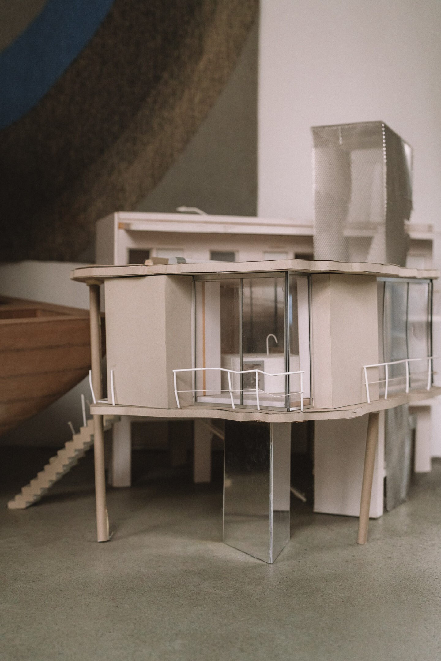
Completed in 2021, Kufu 142 is located on Kurfürstenstraße and was designed by Sam Chermayeff’s architecture firm June 14 Chermayeff Meyer-Grohbrügge which he co-founded with Johanna Meyer-Grohbrügge. To fully comprehend the construction of the building, a bird’s-eye view turns out to be helpful. From this perspective, it becomes apparent that the structure comprises six overlapping towers forming a spatial arrangement of 25 intersecting units. The expansive glass facade enveloping the structure mirrors the sky and the nearby architecture while offering peeks into the building’s interior.
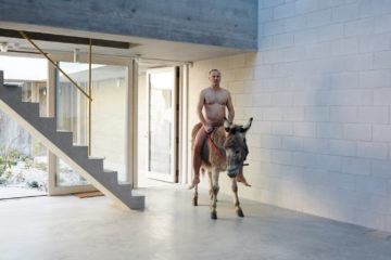
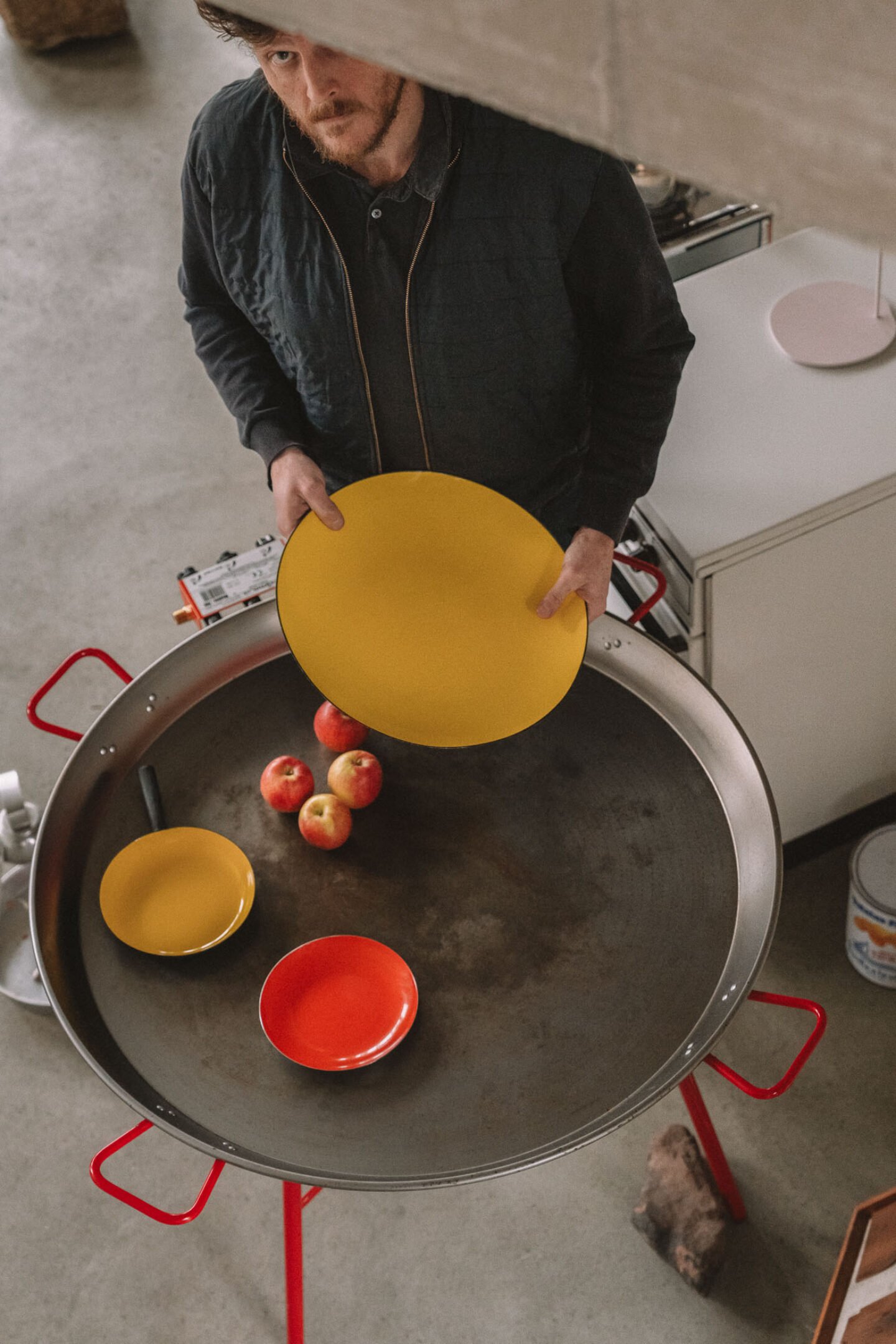
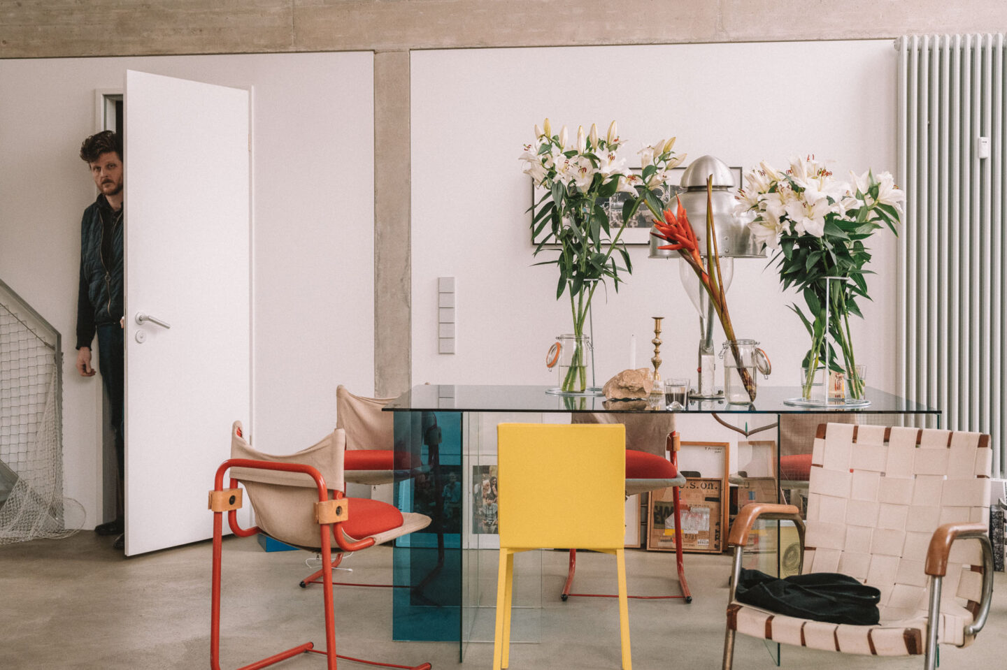
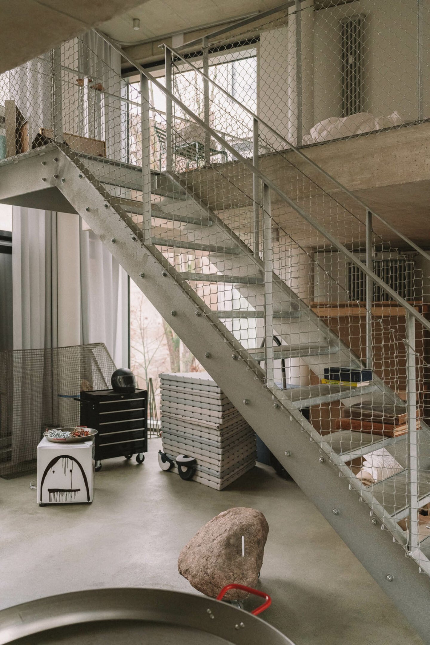
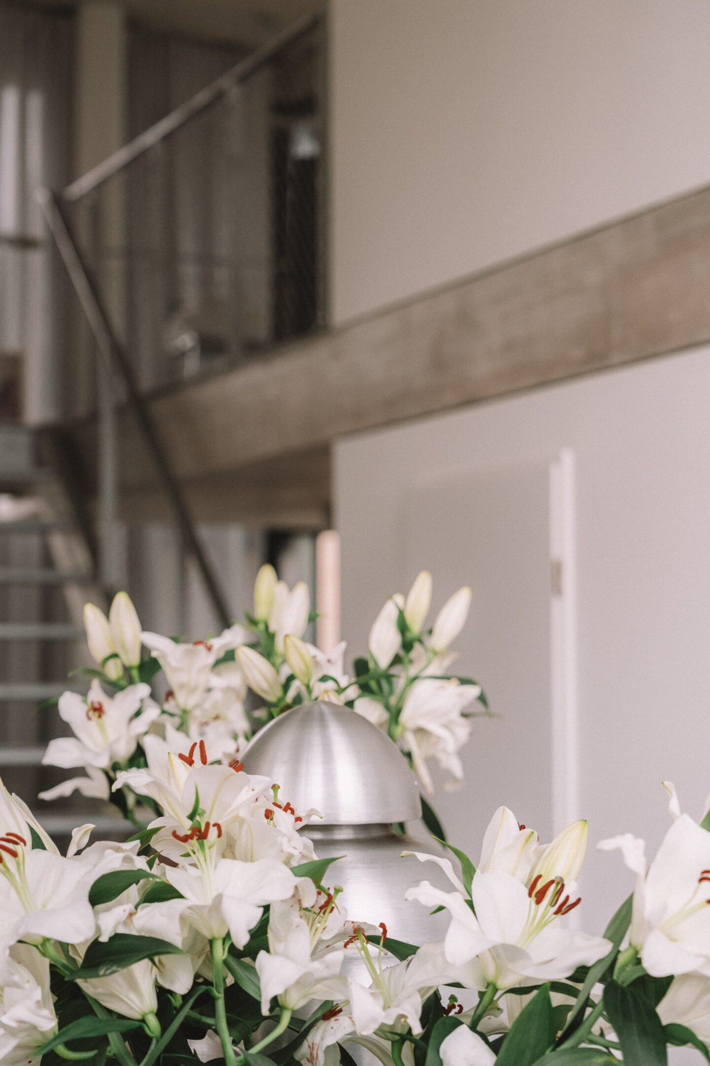
In one of the units on the fifth floor, Sam Chermayeff welcomes us with the relaxed familiarity one reserves for an old friend. In his apartment, a particular chaos prevails—the good kind. Exposed concrete floors, walls, and ceilings radiate a sleek coolness, while the glass front allows the gray December light to enter and flood the space. Magazines and books are stacked in little towers, spread across the ground and interspersed with toys of Chermayeff’s children. A few apples roll around in a giant Paella pan—the one serving 16 people—and visually mark the beginning of the unconventional kitchen we’ll revisit later. Small vases on the large glass table overflow with lilies, filling the air with a pleasant scent. As Chermayeff clears a few coffee cups beside the flowers, he casually notes, “This is probably as organized as it gets.”
As he prepares us a new cup of coffee, he continues, “This is by far the biggest project I have ever been working on. It took us about ten years to build it. We got this piece of land and found a lot of people interested in forming this kind of community, this Baugruppe.”
Each unit in the building faces the busy street on one side and the quiet backyard on the other. Except for the bathrooms, the two-story apartments have no internal walls, which results in open spaces. The diverse ceiling heights, extending up to five meters, add a distinct character to each unit. “My and all the other apartments are sort of snaking past each other. This here, for example, is someone else’s bedroom,” Chermayeff tells us, pointing at the lowered ceiling in the middle of the space. “And just two and a half meters from that is yet another person’s bedroom,” he adds, underlining how the conceptual approach of overlap plays out in practice.
Through the generous use of glass, the connection to other residents of the building has also been established on a visual level. “You can see eight other apartments from inside here and vice versa. First, I was concerned that this might cause discomfort, but it is nice to see your neighbor come home and turn the light on. You could not read from the amount of light that enters, but you can sense it,” he adds. “It’s like a nod to village life, where you know if your neighbors are home or not. Being aware of each other’s existence in that way creates something that I think is quite powerful. It creates a pretty strong bond between people.”
While most of the units in Kufu 142 function as residential spaces, the ground floor hosts three commercial units and two lobbies that offer direct access to a communal garden. “The building was designed for interconnectedness in every sense: living units, offices, and commercial spaces. One of these units is currently available. I would like for it to be a Späti or something similar that speaks to a broader audience [editor’s note: “Späti” is the abbreviated German word for “corner store”],” Chermayeff shares. He also points out that the street on which the building is located is known for its prominence of sex workers, acknowledging it as one of the city’s rougher corners. “It’s somewhat unusual that the most transparent and open building is situated on such a street,” Chermayeff observes. Instead of concealing the facade and blocking views to and from the streets, however, the structure intentionally opens up, promoting transparency not just internally but also within the immediate environment. He goes on to add, “It’s about mutual respect and acknowledging our coexistence, both literally and architecturally.”
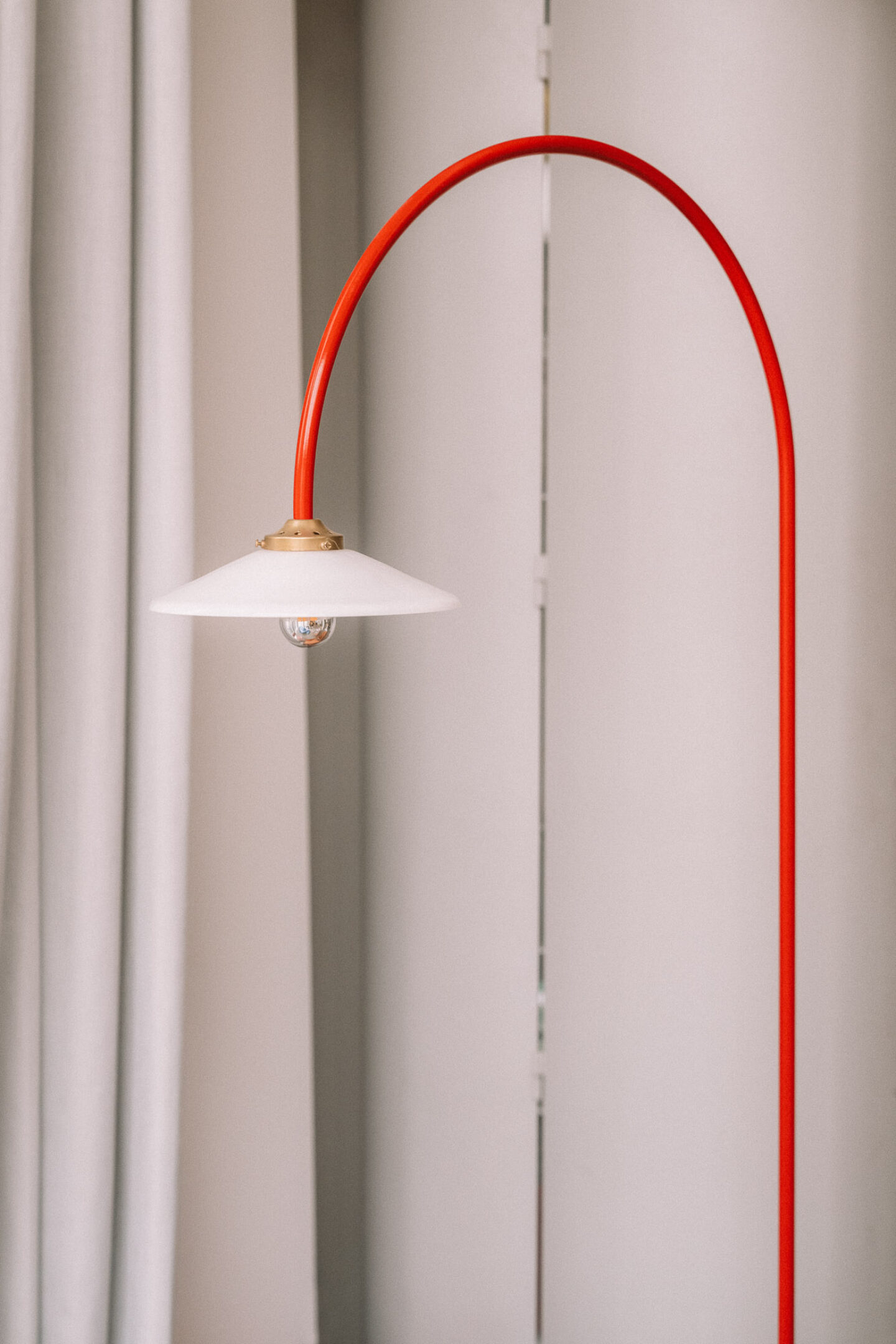
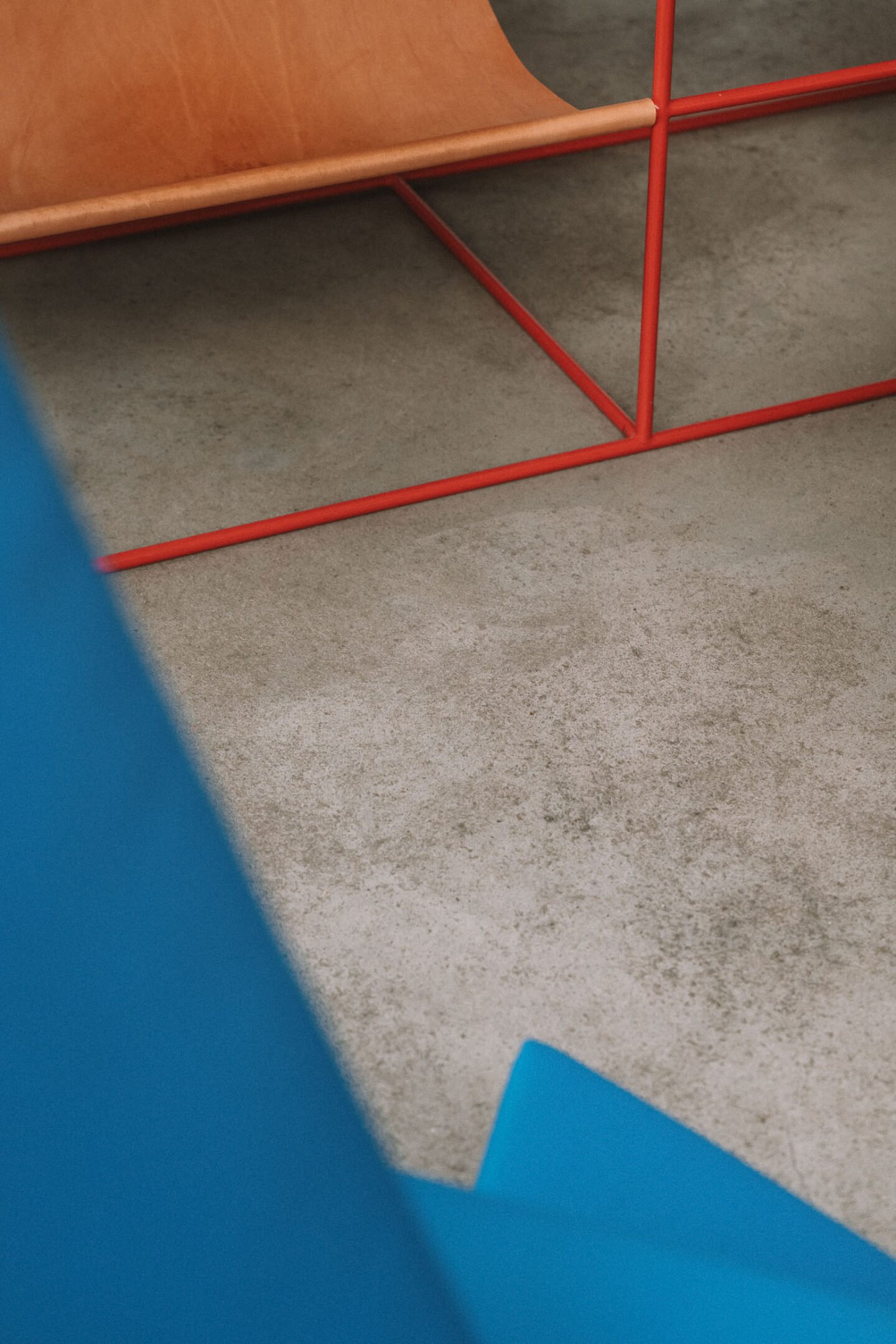
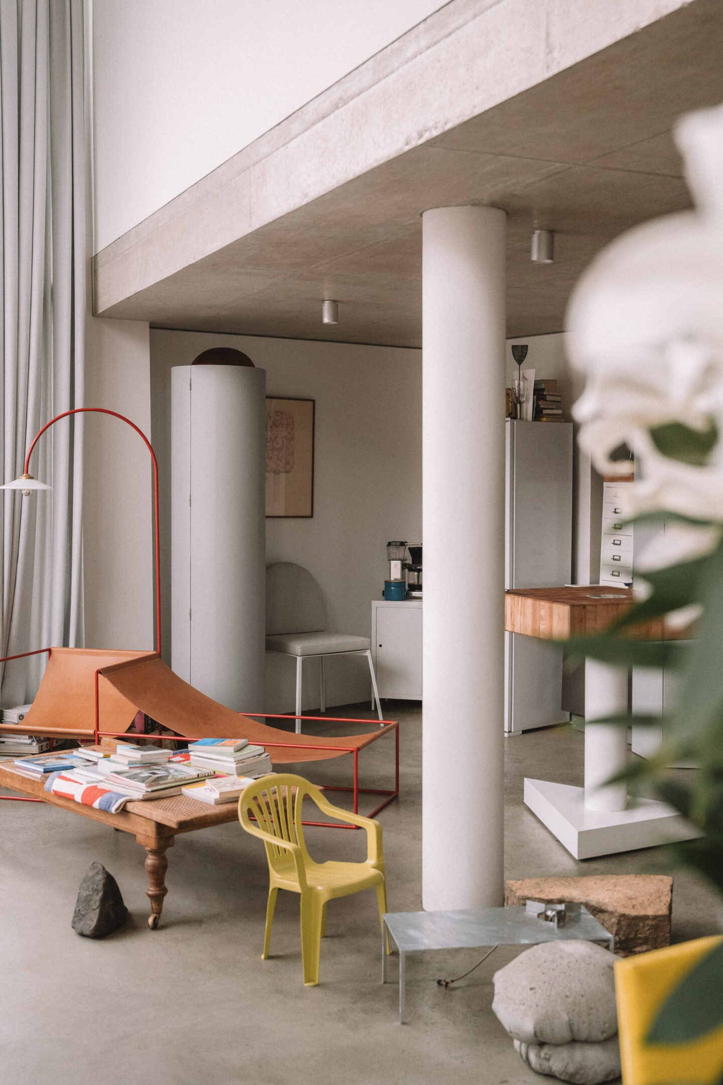
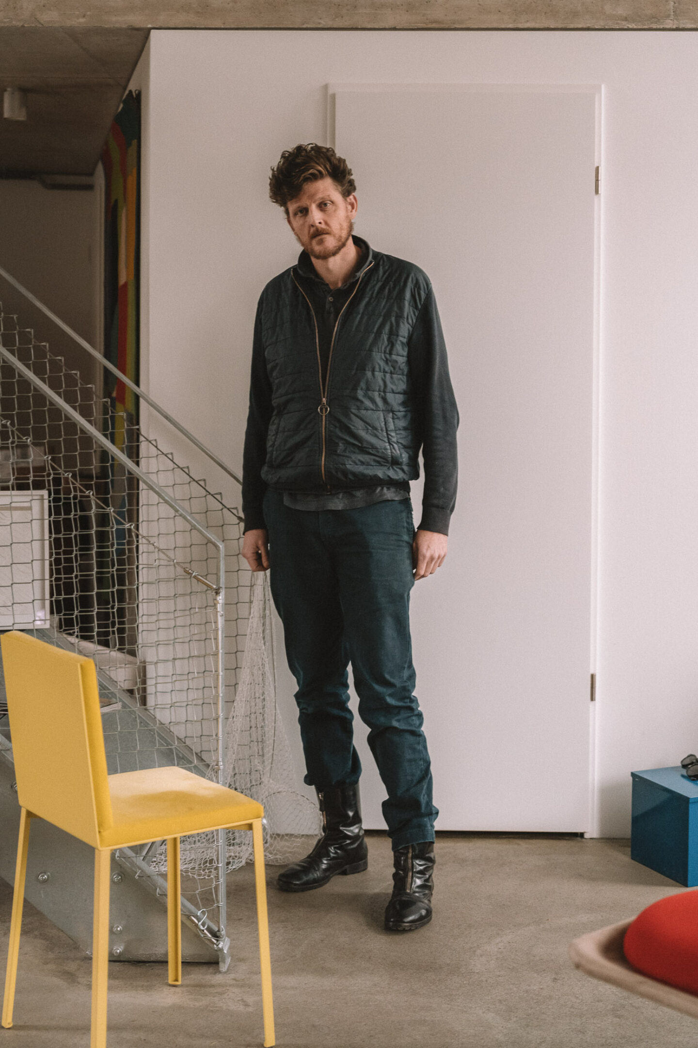
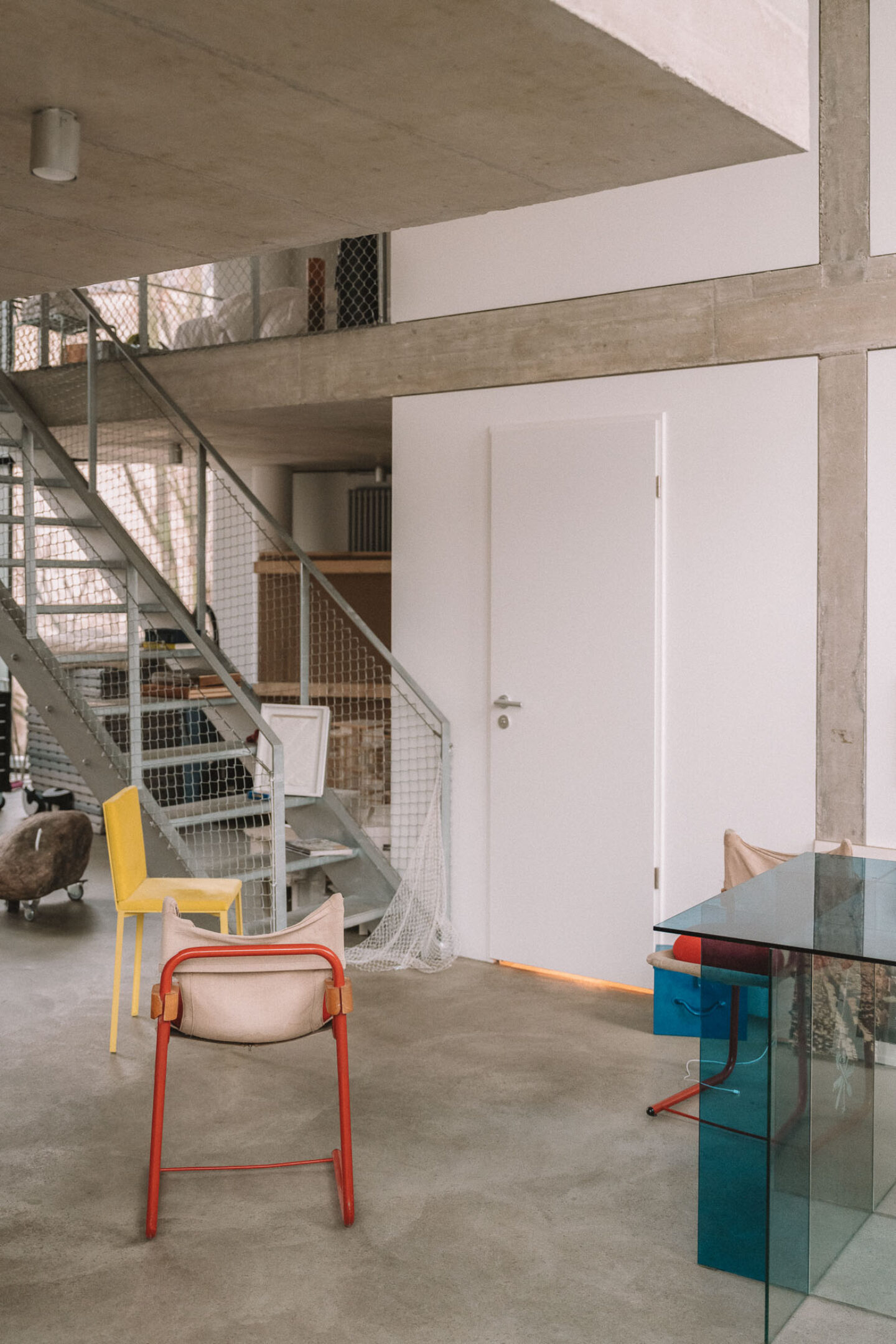
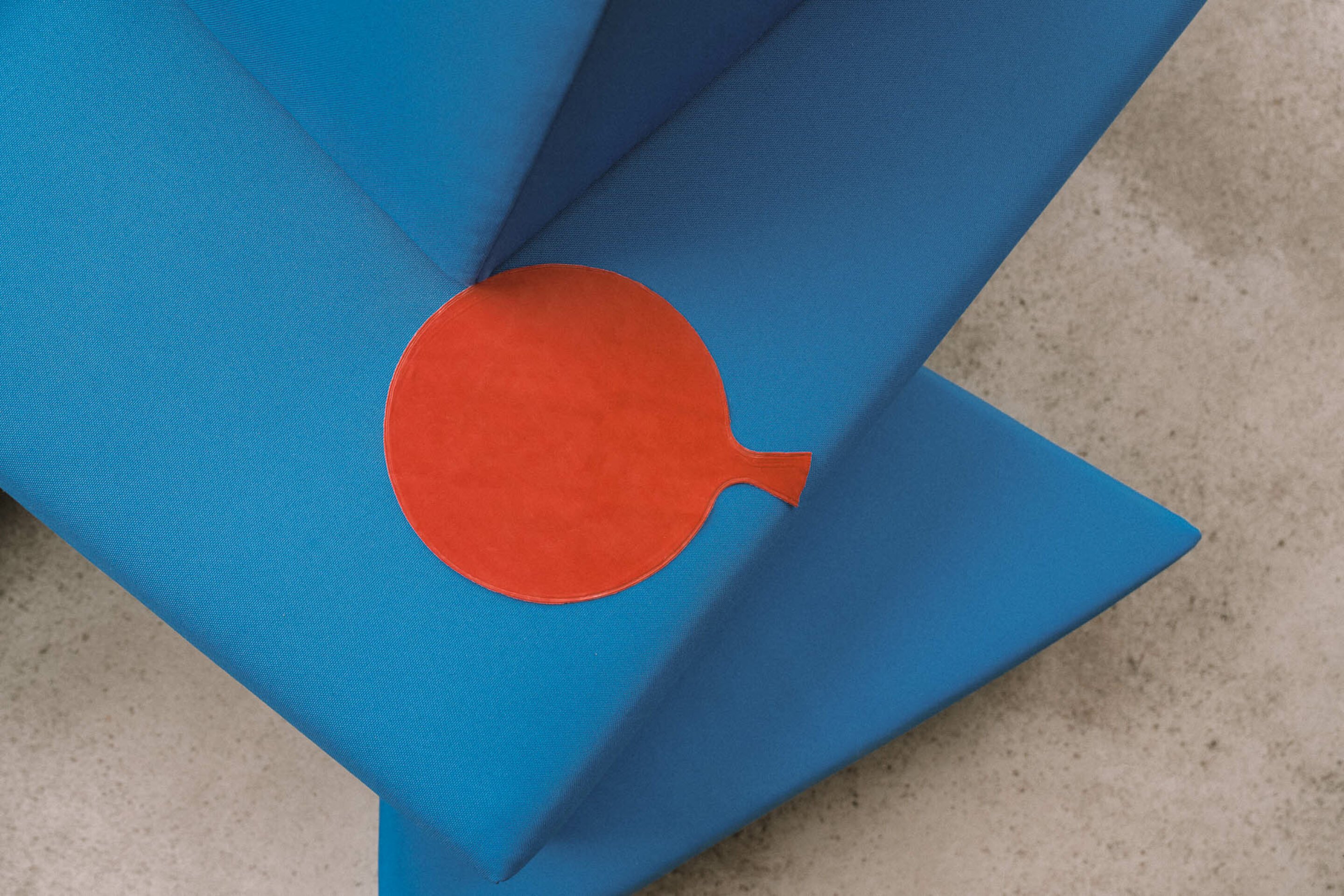
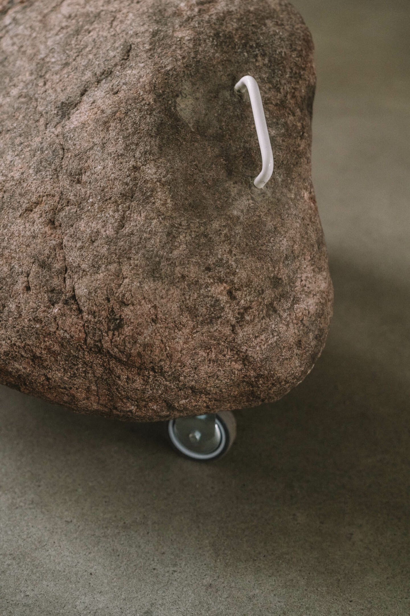
While the dynamics between the inside and the outside, the self and the other, play an essential aspect in Chermayeff’s architectural practice, exploring these dynamics also extends to his designs. The names of his furniture series, such as “Beasts” or “Creatures,” already indicate that he attaches a significance to furniture beyond purely rational functionality. Instead, he aims to give them their own personality. Chermayeff and his design studio achieve this through the fusion of typologies (a wardrobe that doubles as a chair), altering details to offer fresh perspectives on familiar objects (a triangular bed that inspires one to sleep facing a different direction each night), or incorporating elements from the outside into the interior (a living room table combined with a true-to-size streetlamp). “Furniture that comes with its own character also gives us a chance to find out who we are. If they have a character, you can identify with it and engage in a little dialogue, a little dance.”
“Furniture that comes with its own character also gives us a chance to find out who we are."
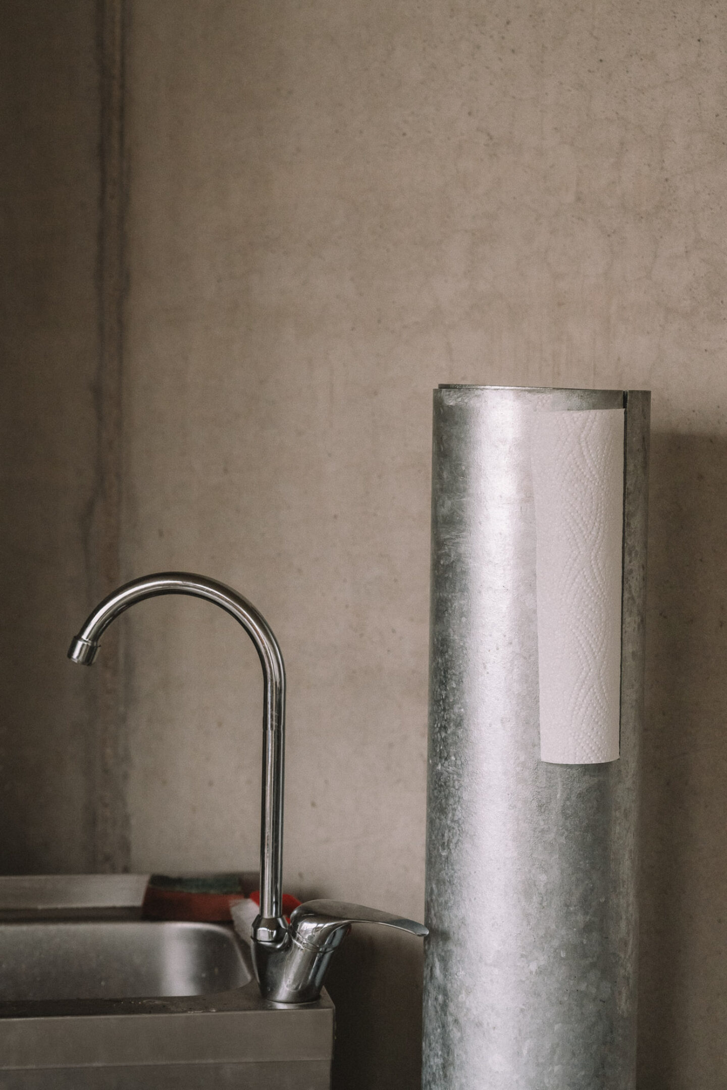
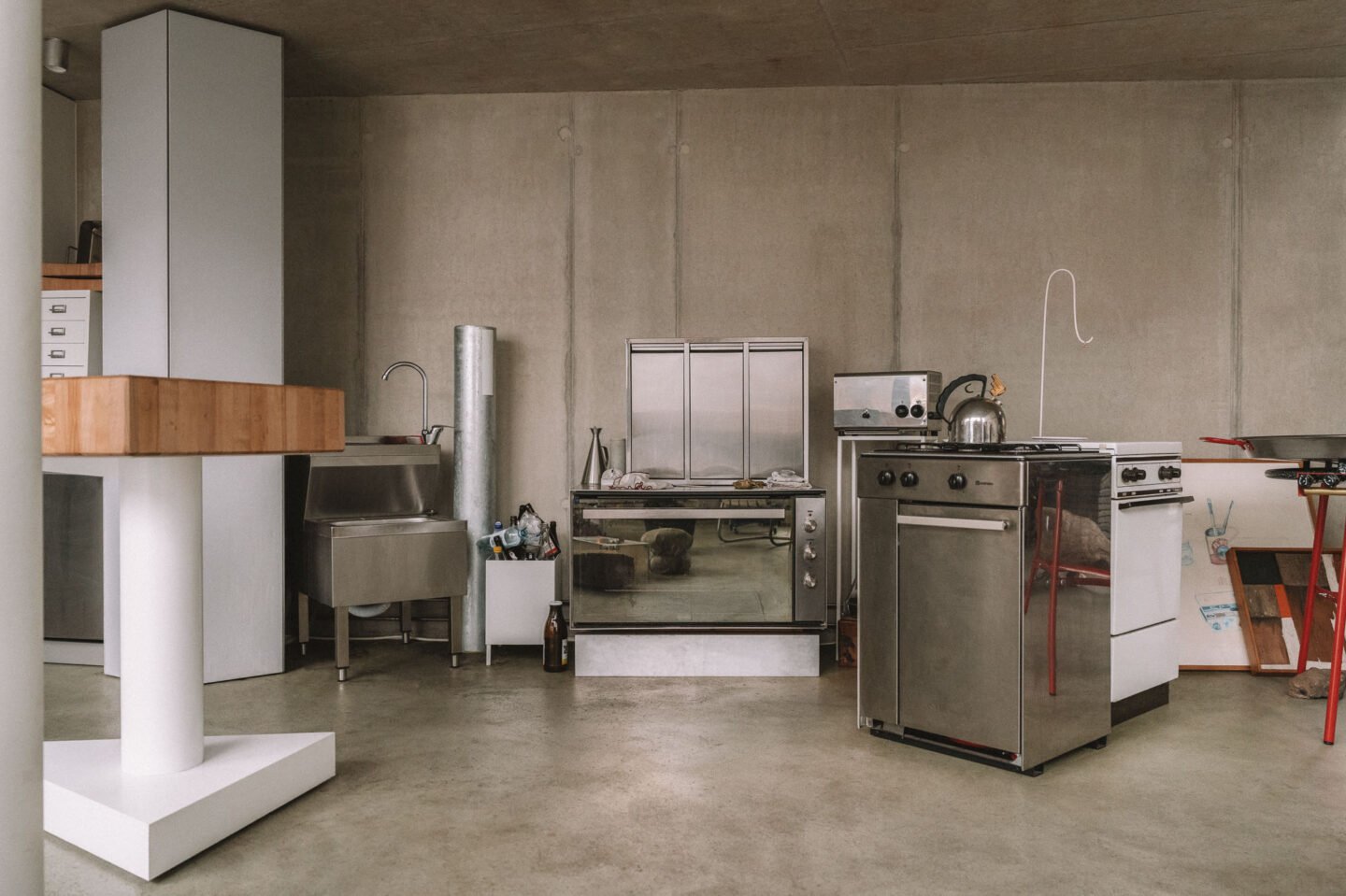
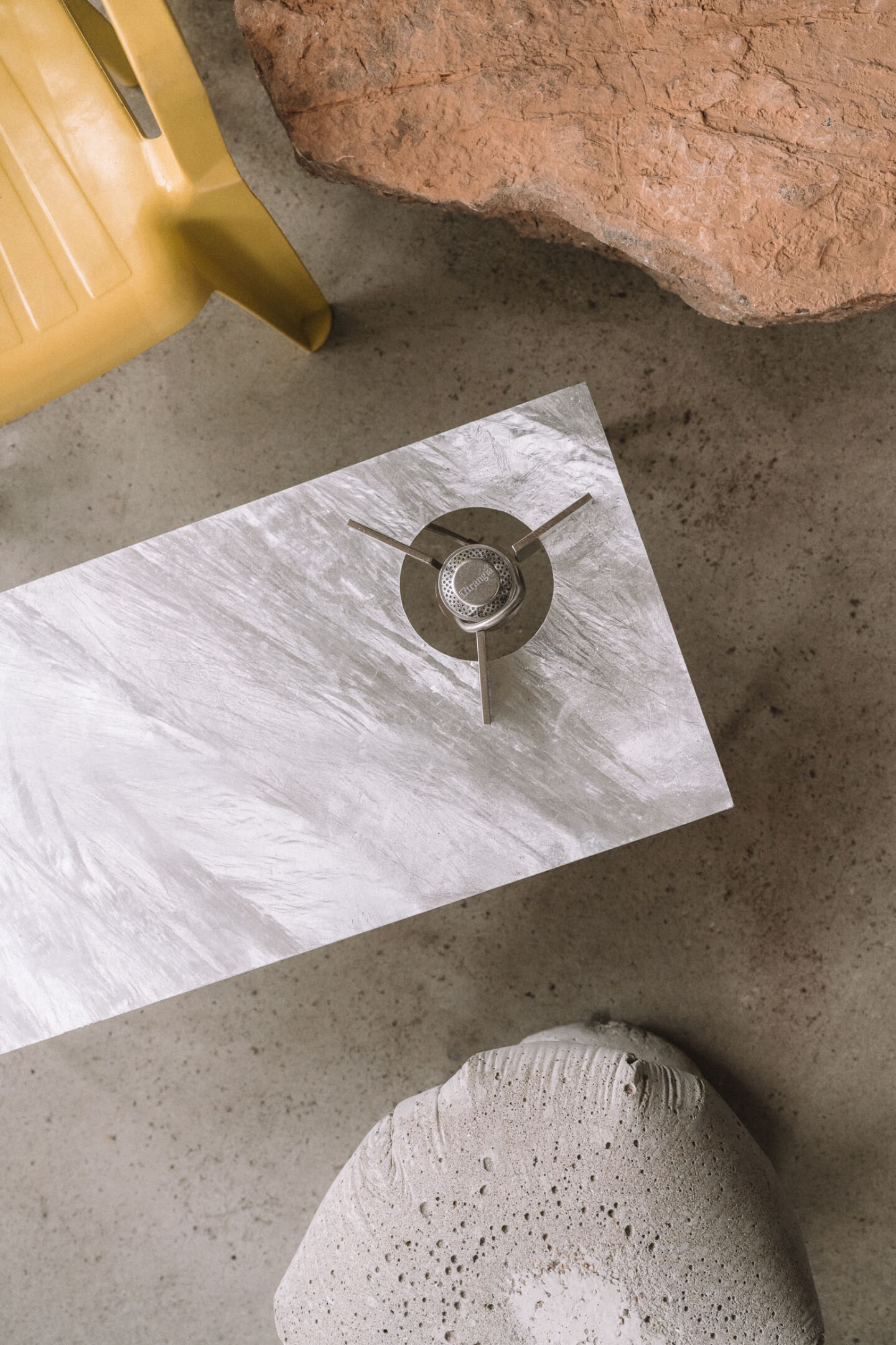
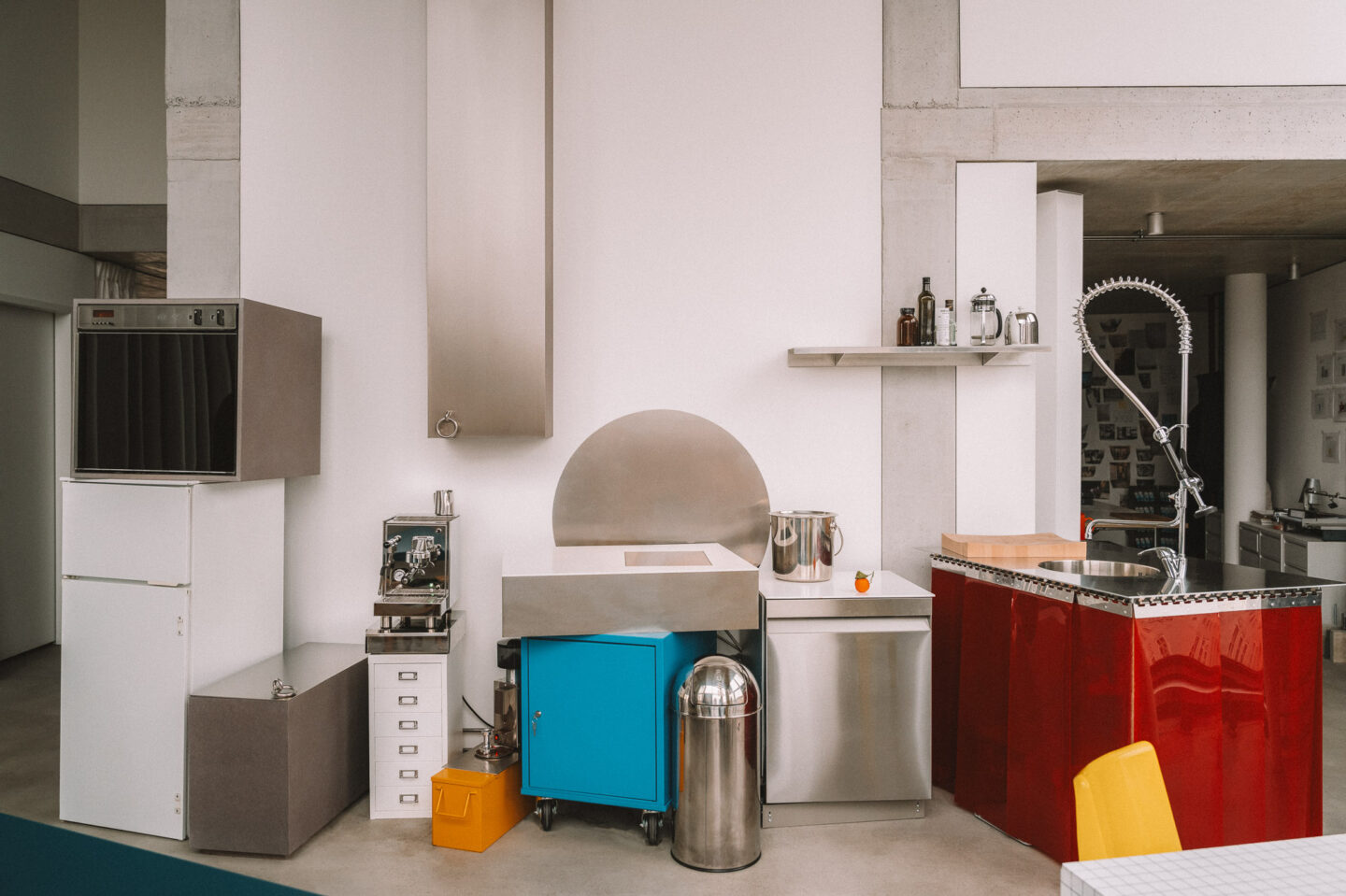
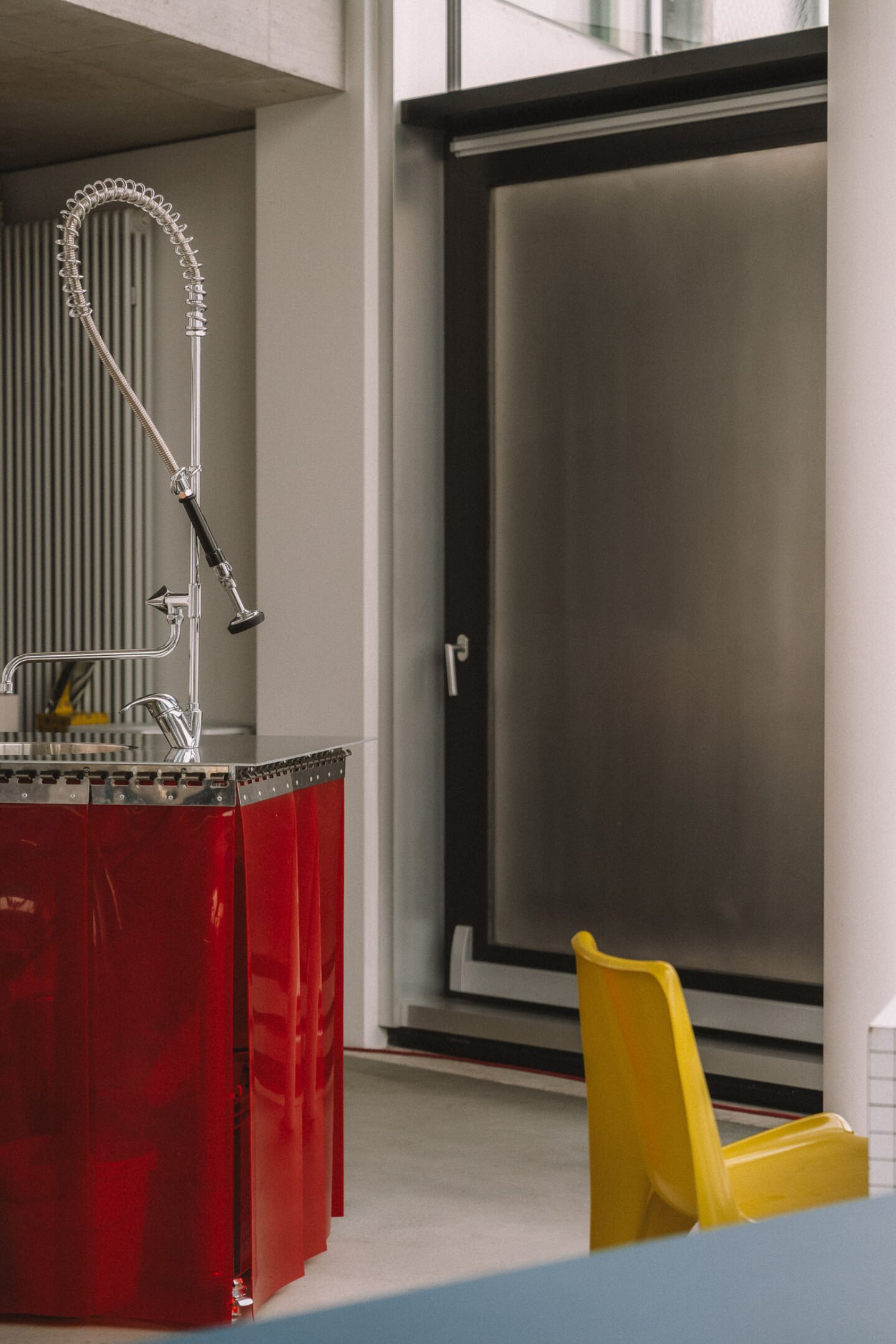
This approach of reimagining the objects surrounding us also aligns with Chermayeff’s passion for undogmatic kitchens. His own, and the one we find in his office next door, are composed of various separate elements. A freestanding sink, a cutting unit, a hotplate, a shelf positioned so high you need a ladder to reach it properly, and a coffee grinder placed so low you that one could also sit on the floor to use it. With nothing being rigidly fixed or tucked away in a corner, a flexible and effortless quality surrounds the entire setup. Each kitchen Chermayeff designs for himself or his clients is unique. What connects them is that they are also designed to be a tool for communication. “We started to deconstruct kitchens and think about what we need so that people are more fluid and together. It all came from cooking and playing around with the rules.” Rather than standardized kitchen arrangements that streamline imaginary workflows, Chermayeff’s versions remind of a modular dollhouse kitchen that can be playfully arranged in any corner of the house. While the setups still read as a kitchen, they prioritize the people that move within them over efficiency: “If you have efficiency while you cook: what are you going to do with the other time? Why would you be efficient about the one thing that can be a real pleasure?”
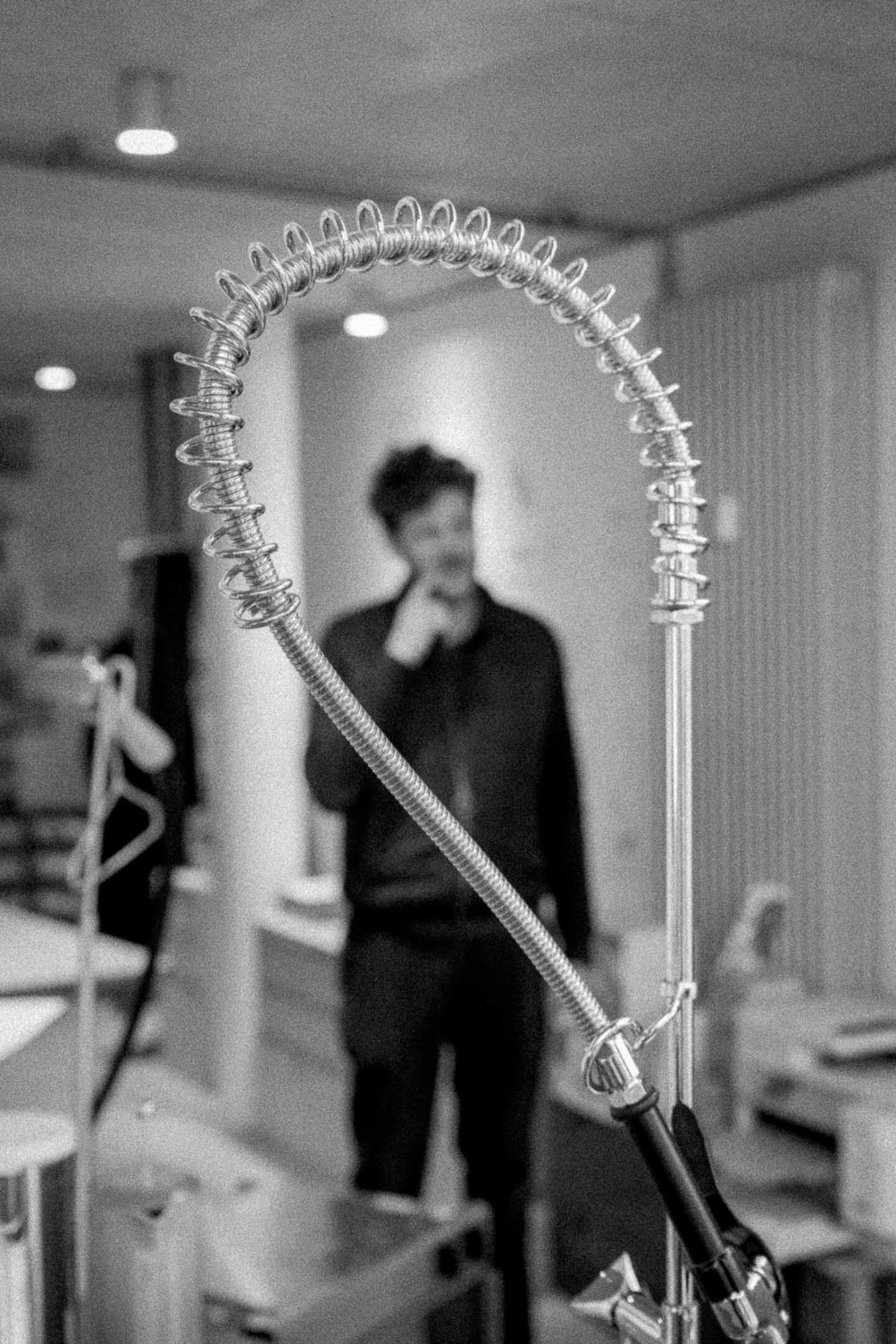
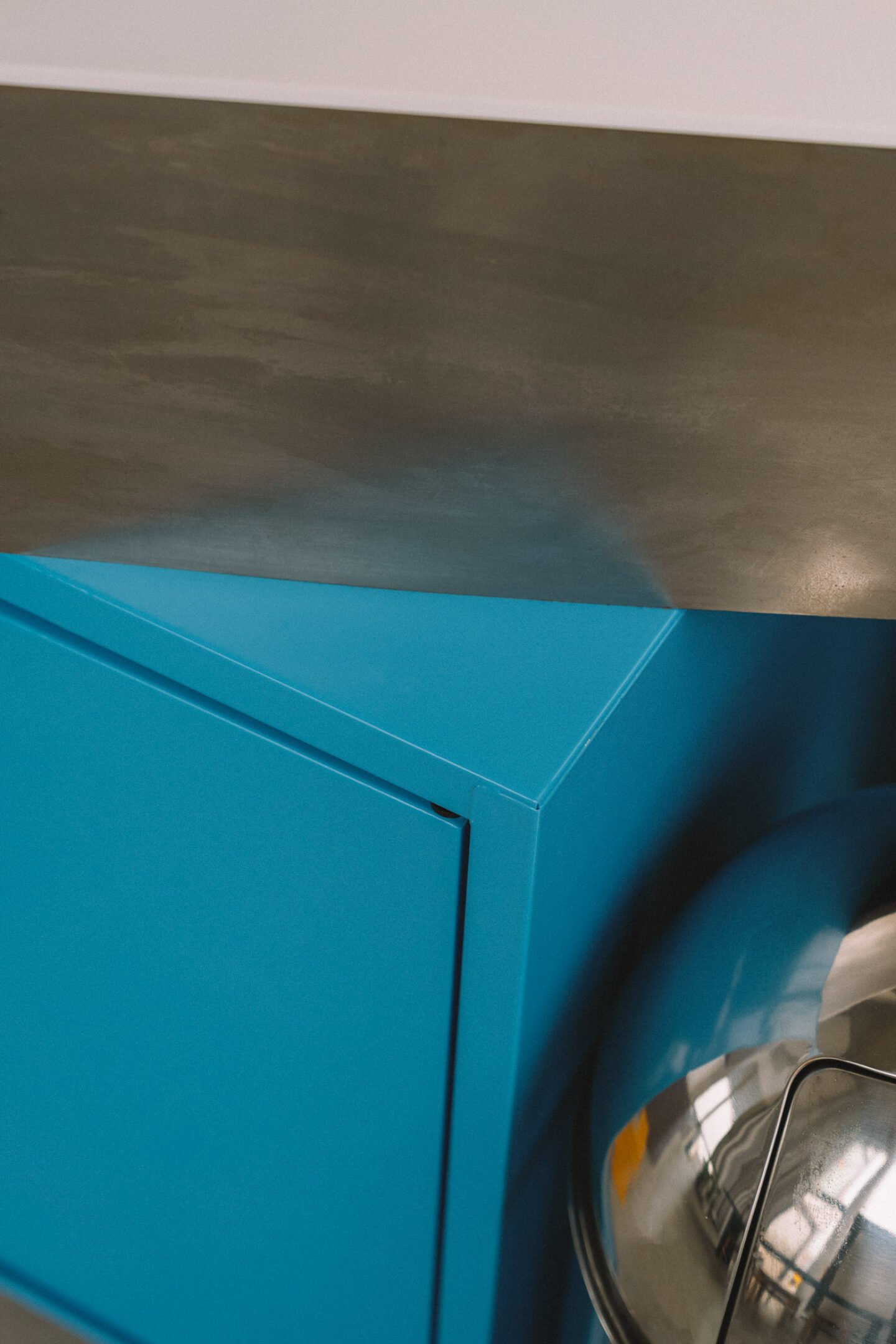
Chermayeff’s confidence in challenging such norms is the product of his careful study of them. Through deconstructing the elements of the everyday and exploring how they can work differently, his architecture and design projects radiate a fearlessness of overcoming standards. Rather than concealing the aspects that make us human through, for example, placing a bed behind a bedroom wall, squeezing a kitchen block into a corner, or even hiding a used coffee cup from visitors, Chermayeff embraces all of those aspects in his life and practice and therefore tackles modern anxieties thoughtfully but still with a dash of humor. At the same time, he and his work are surrounded by a lightness that is truly contagious.
Images © Clemens Poloczek | Text: Marie-Louise Schmidlin
