Zean Macfarlane: On Minimalism And The Evolving Sector Of Architecture
- Name
- Zean Macfarlane
- Images
- Zean Macfarlane
- Words
- IGNANT
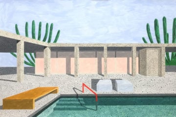
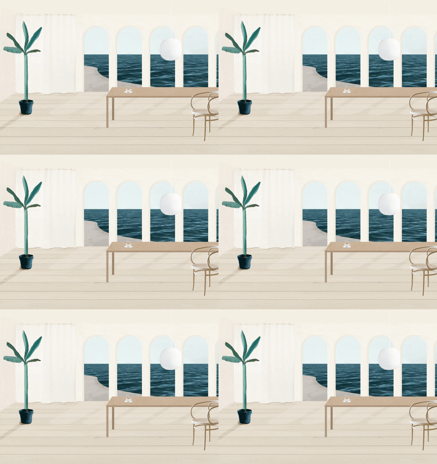
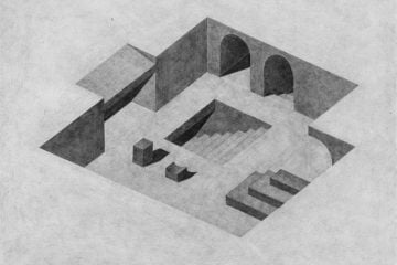
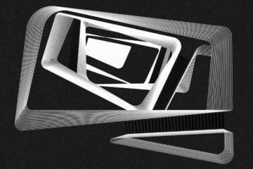
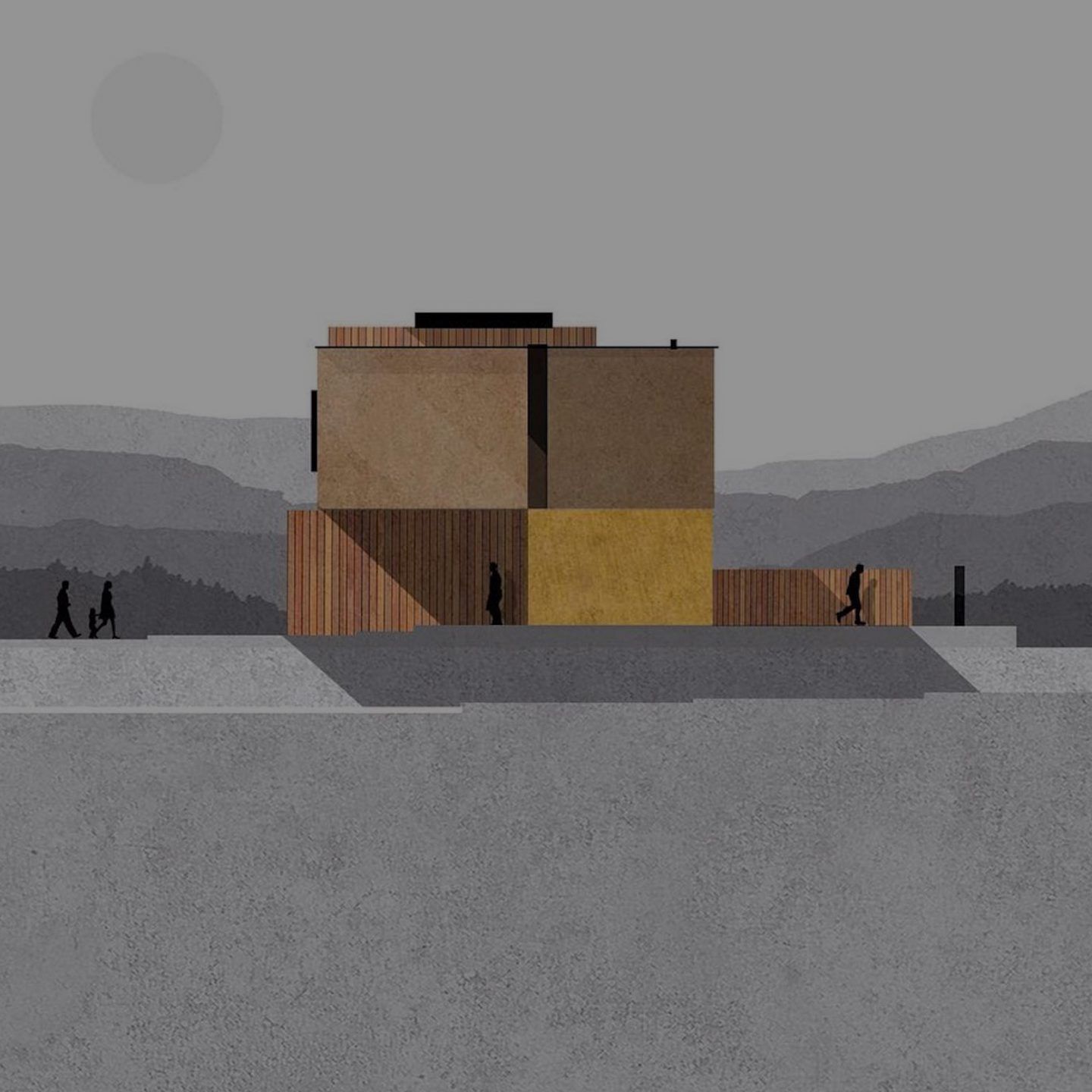
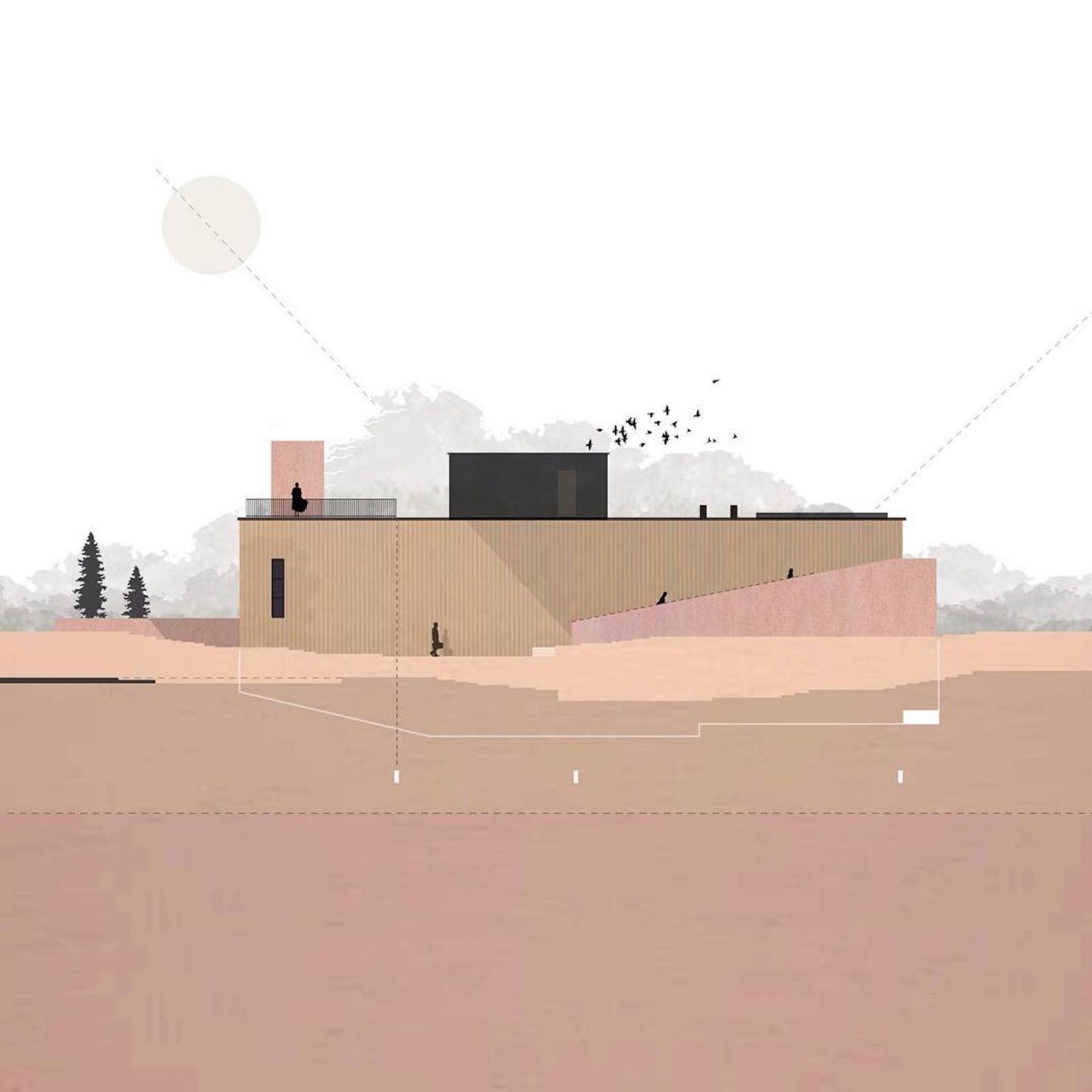
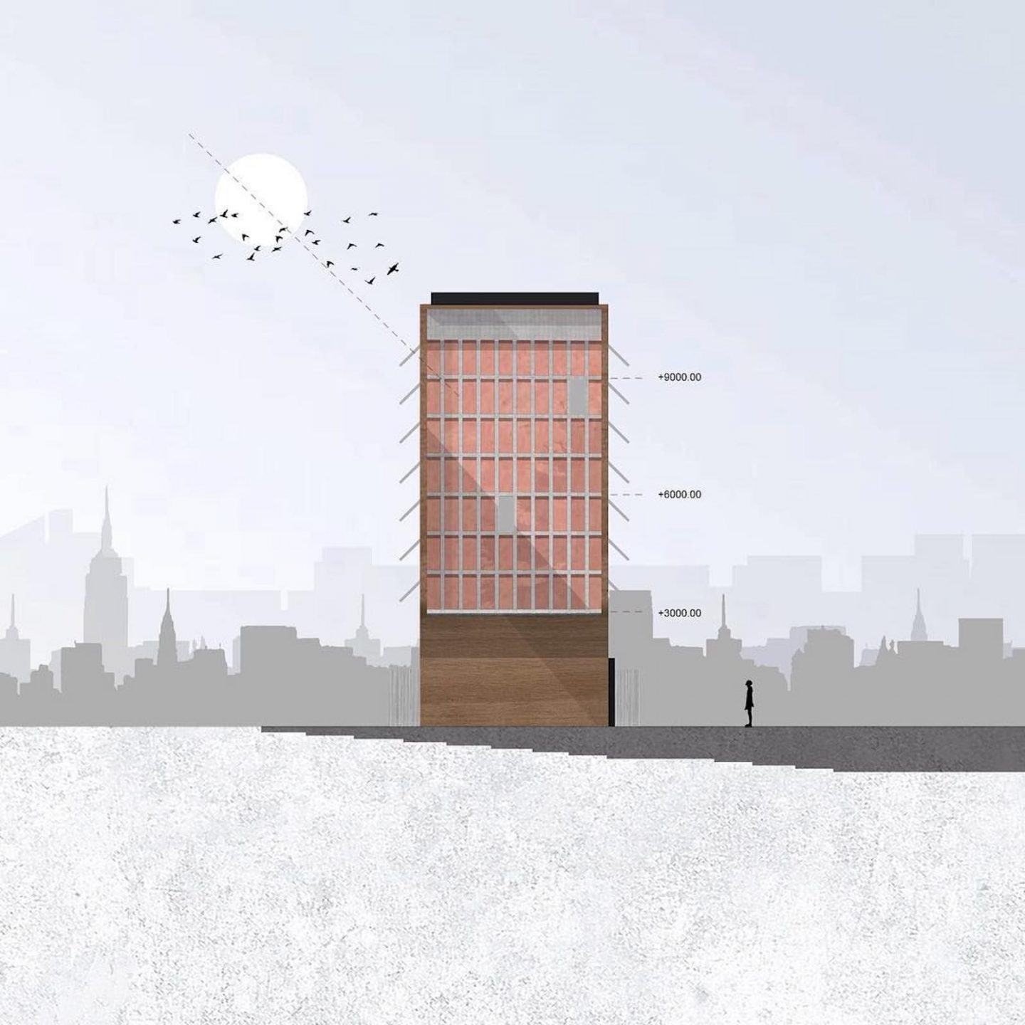
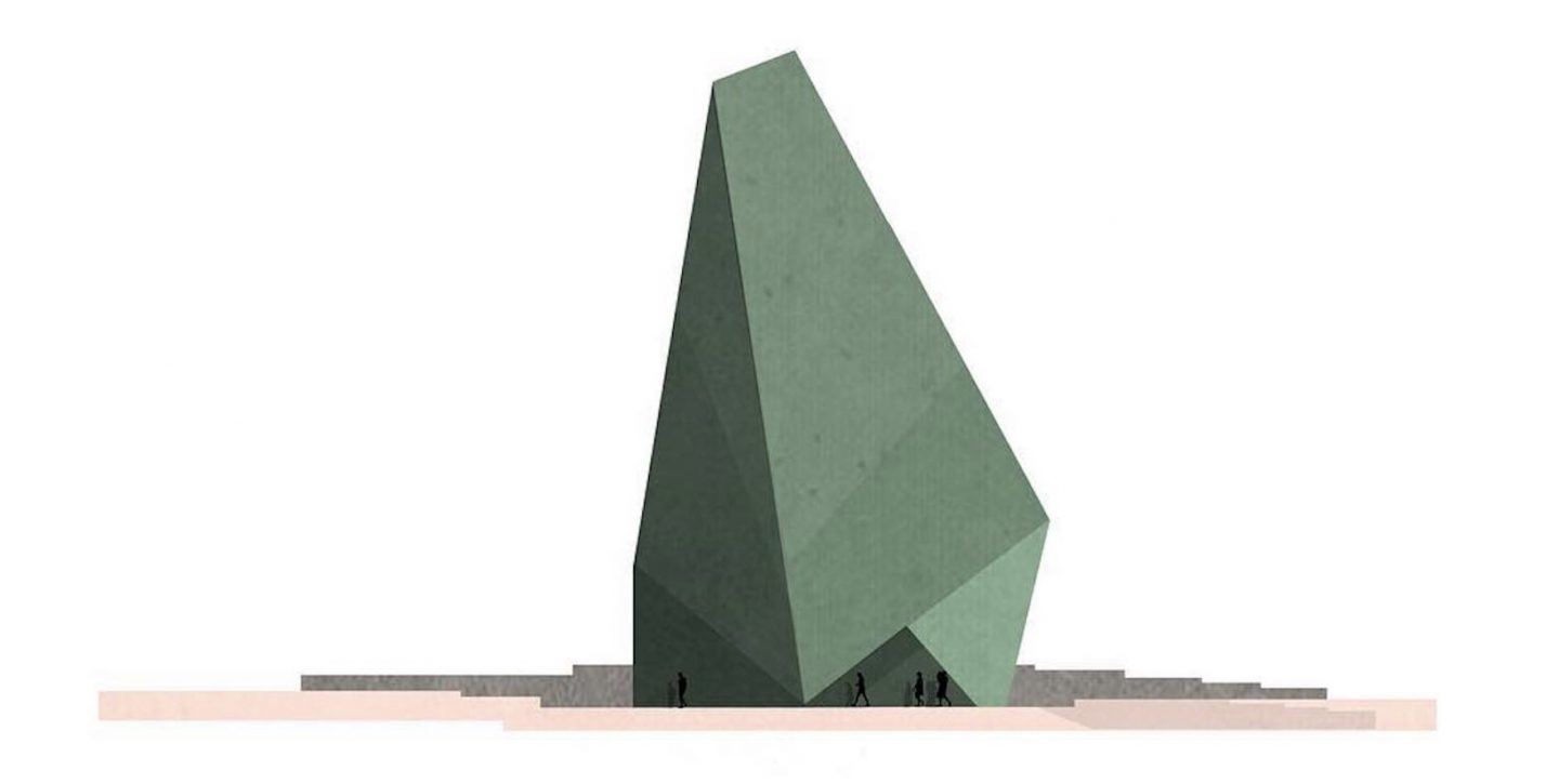
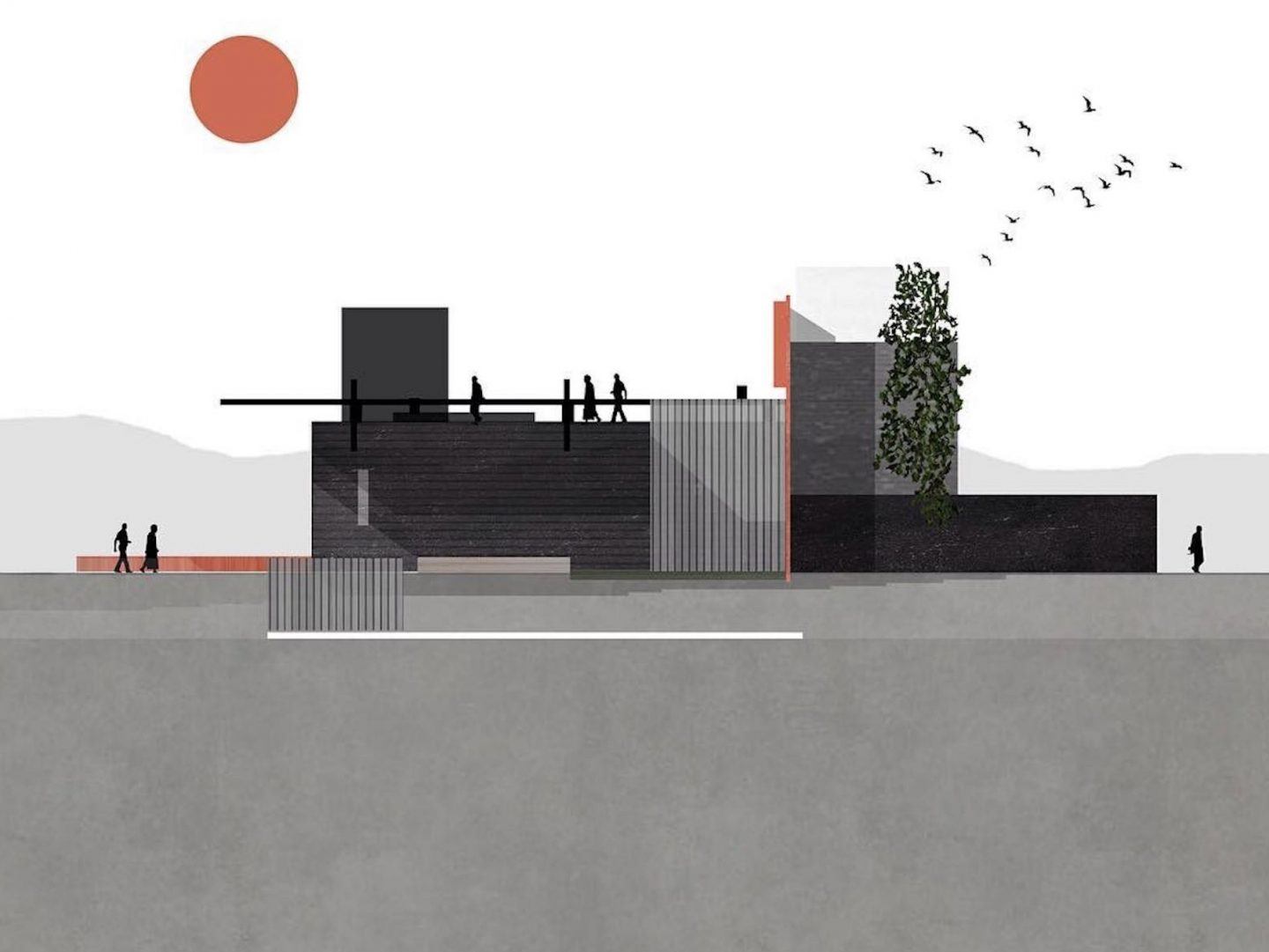
London-based architectural designer Zean Macfarlane blends art and architecture in work that spans illustration and education, enabling a visualisation of the link that exists between concept and construction.
Now a specialist in the science of architecture, building design and construction, Macfarlane was disillusioned by the lack of resources available during his own years of academic pursuit. Consequently, he decided to extend his illustrative practice beyond drawings, creating tutorial ebooks on topics as wide ranging as photoshop rendering, drawing light and shadows, and basic architectural facts not commonly taught in design school.
We spoke to Macfarlane about his multifaceted work, why architectural education needs to be overhauled, and why minimalism is actually quite hard to pull off.
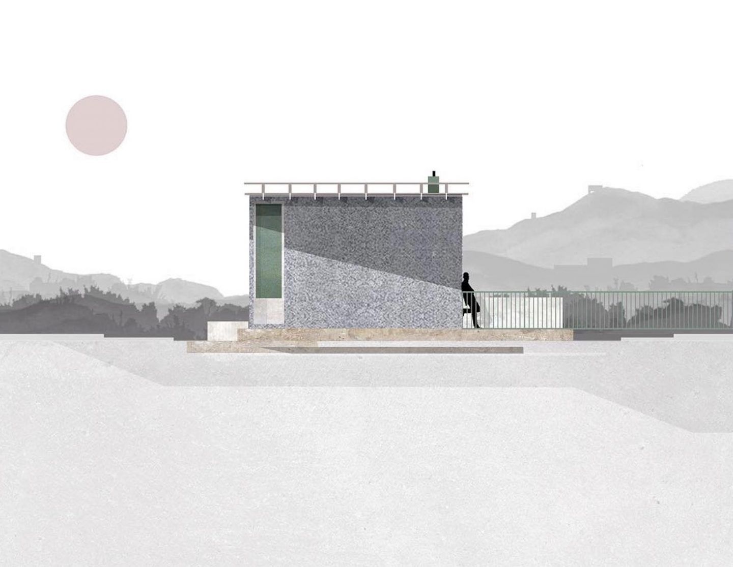
As an architectural designer, can you explain a little about what your job entails?
In short, it’s similar to being an architect. Essentially the work I design varies from community centers to residential refurbishments and micro-homes. From concept and construction drawings to on-site visits. But like most creatives I also get my hands stuck into other industries too. Although I’ve got a masters degree in architecture, I’ve not yet completed my certification here in England. Optimistically I tell myself it’s something I’ll get around to when my workload dies down.
How does your creative process for illustrative designs come together? Is it all done with graphics or do you begin by hand?
It depends on the piece. My illustration style actually came to fruition by trying to be as efficient as possible. In the architecture industry peers are obsessed with the newest trending software. And although the software you are using does have importance, I was more concerned about finding the most efficient way of getting my ideas across. For example if a sketch without Photoshop does the idea justice, I’ll leave it as a sketch. If the idea needs more information I might have to mockup a 3D model. It’s more about finding the right tool for the job, in my opinion. But to answer your question, more often than not the illustrative drawings are visualized in my head as opposed to on paper, and I then develop the idea on screen.
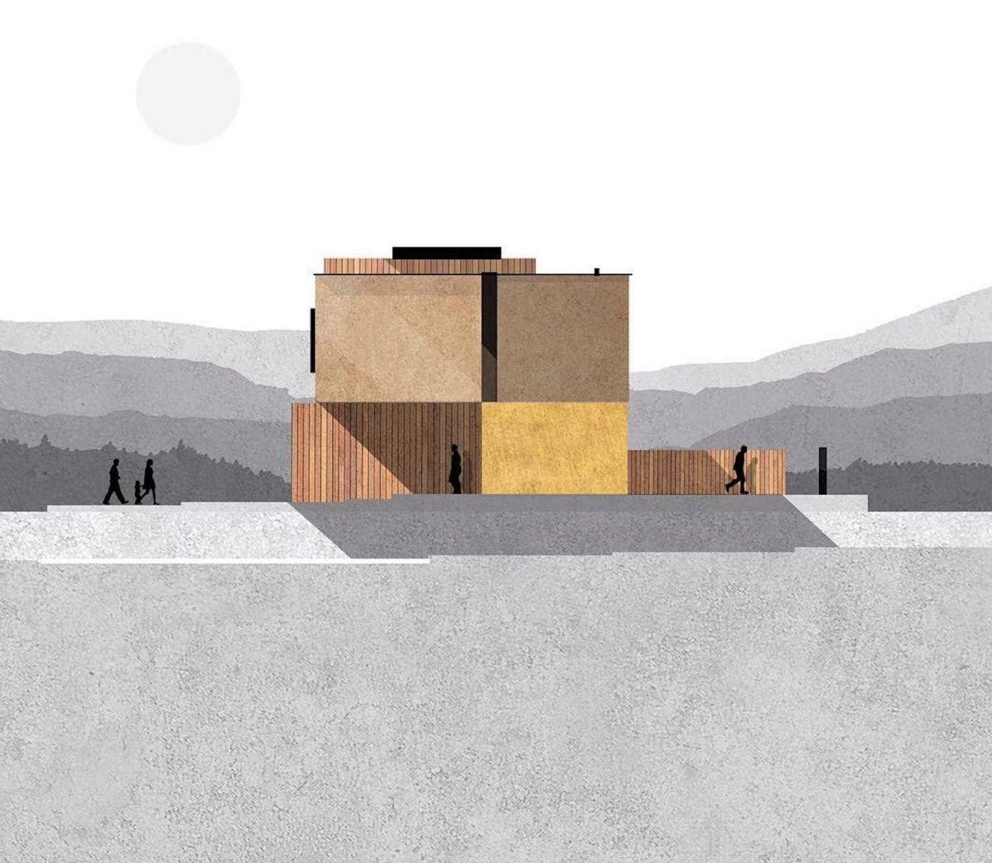
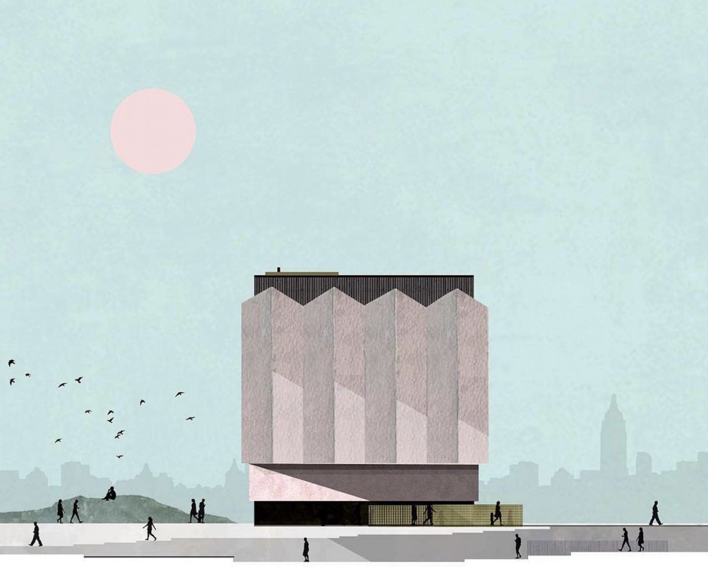
It’s been said that whilst the world has changed in recent times, architectural education has not. Is this something that informed your decision to create ebooks for architecture and design students?
Absolutely. I think architectural education has a long way to go. I’m also hoping that my journey inspires the more entrepreneurial designers who study architecture. I currently lecture part time at Coventry University so I’m able to understand students current mindset. Part of the issue is that the industry has evolved into so many sectors. Understandably universities struggle to keep up with the many routes architecture can take you.
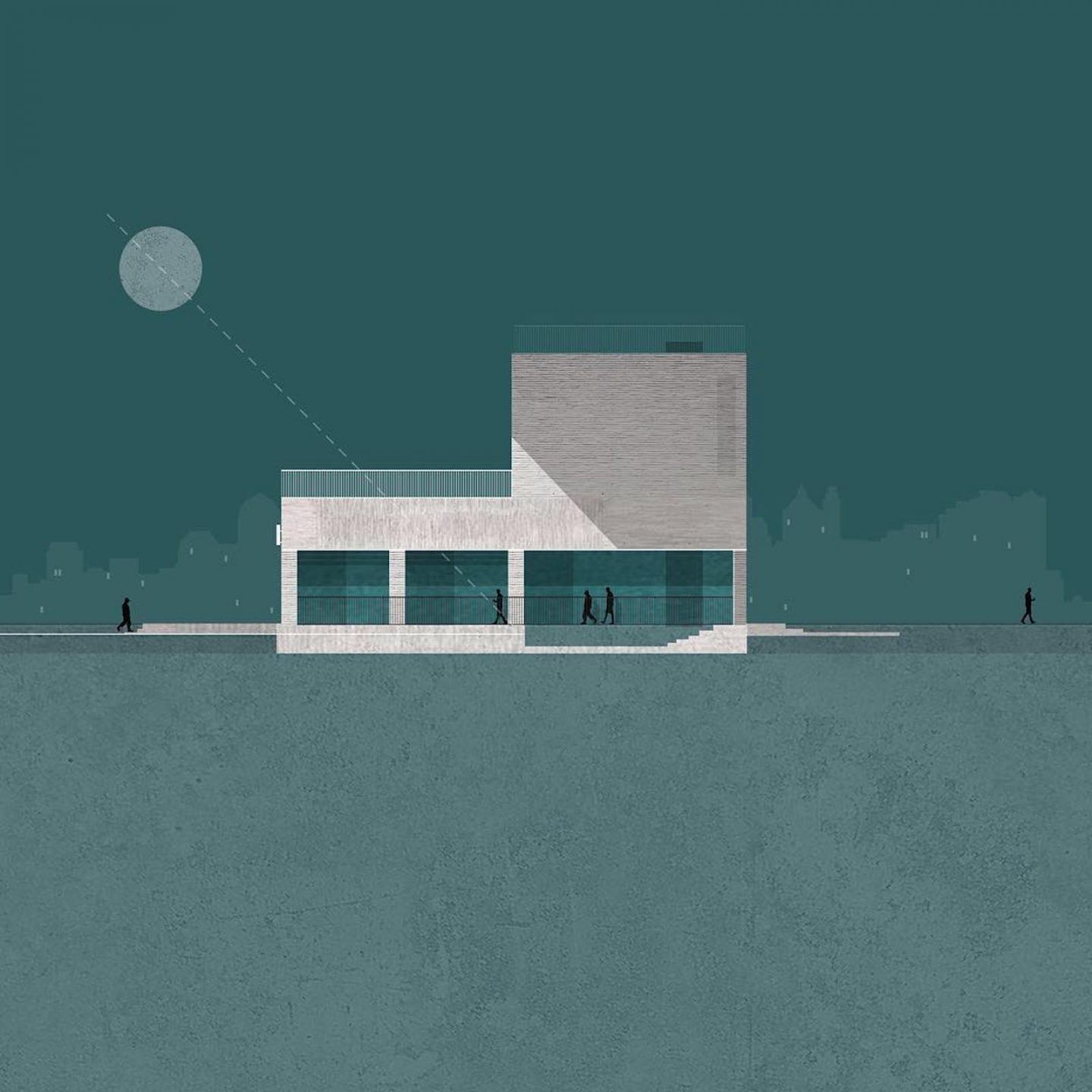
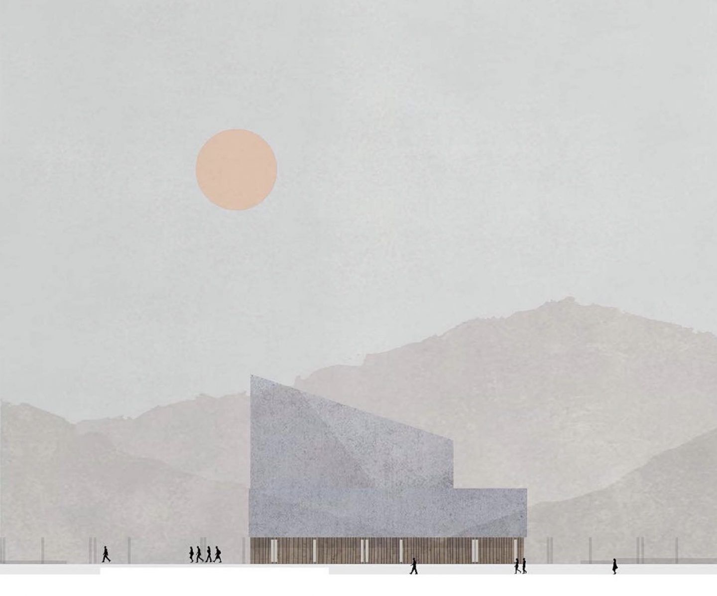
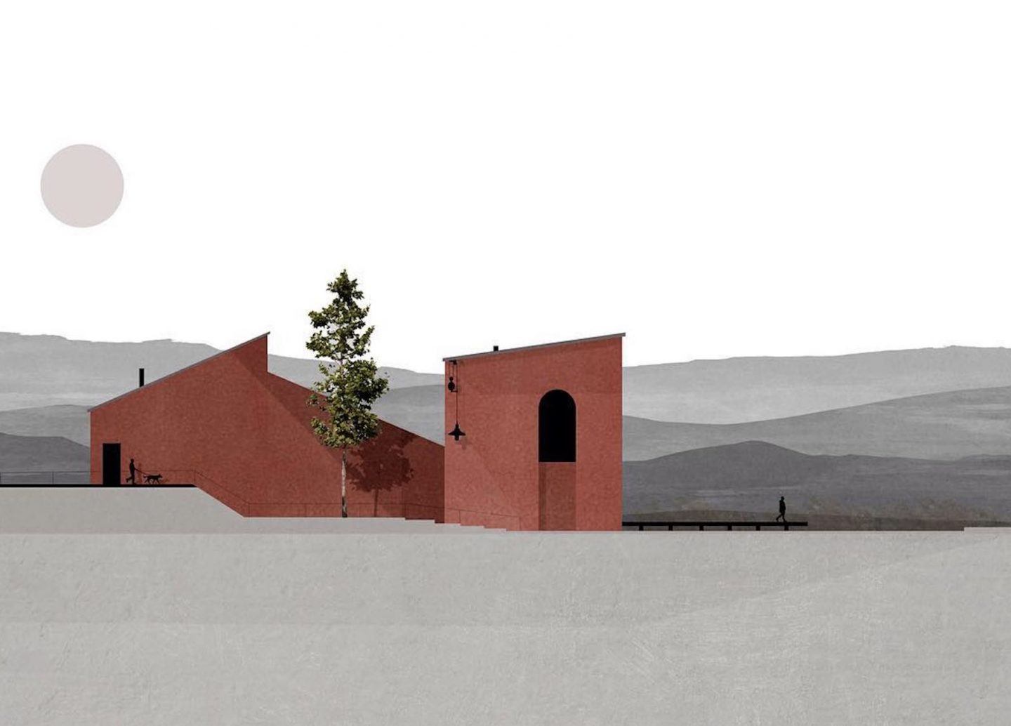
Your design aesthetic is noticeably modern and minimalist. Are there any specific design elements or architects that inform the “less is more” style that is characteristic of your illustrations?
Maybe too many architects to list here. I also study the architects that have an aesthetic that doesn’t resonate with me. That normally leads me to find out why I don’t like the composition and maybe if there’s some information that I do like. I’m also in love with collecting books and finding inspiration from the things around me. Key words include mathematics, geometry and cubism.
Is your style a response to the rise in some arguably superfluous architecture in our current day?
Not necessarily. My motto is more along the lines of affordable architecture can look nice too. Minimalism is quite hard to pull off, meaning that although costs can be saved in materials, those same savings are cancelled out by the time it takes to perfect the design. Sadly that part of my plan still needs work!
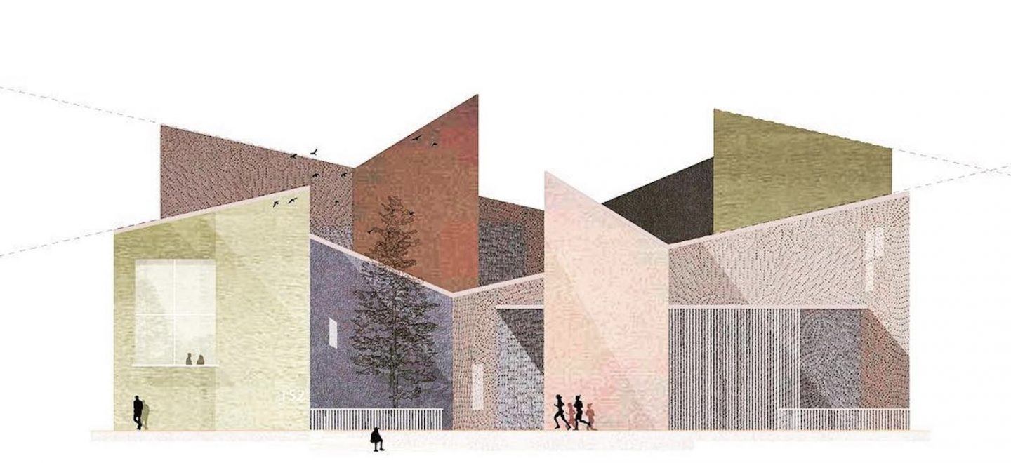

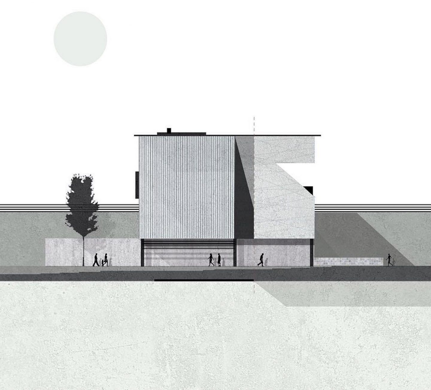
All images © Zean Macfarlane
